Episodic Pivot / Power Earnings Gap / Buyable Gap Up Explained

Traders know these events by a few different names. Perhaps you’ve heard of Stockbee and Qullamaggie’s Episodic Pivot? Or you’ve seen @traderstewie refer to his Power Earnings Gap (PEG) plays. If not, then Gil Morales and Dr. Chris Kacher simply call them “Buyable Gap Ups.”

Some other names that get tossed around are “post-earnings drift,” and “momentum gaps.” Regardless of whose team you’re on or what you prefer to call it, they are all representative of a powerful momentum trading strategy. And in this post, we’ll teach you how to recognize them all, with each guru’s spin on how to enter, manage, and exit the trade.

For all intents and purposes, we’ll use the different names interchangeably throughout the post.

The Episodic Pivot

What a cool name, eh? Pradeep Bonde (aka Stockbee) definitely takes home the crown for creativity on coming up with the best name for this strategy. Bonde is a prolific teacher, sharing his wisdom on this strategy and a handful of others on his site, stockbee.biz.

His 2010 blog post on the subject has recently been revived by the popularity of one of his early pupils, Kristjan Kullamägi. Kullamägi, also known as Qullamaggie, is a Swedish trader who started with only a few thousand dollars (after a few blowups) that he saved while working as an overnight security guard. He has since turned this into around $100 million in about a decade.

Qullamaggie’s recent fame came after an accidental $1.5 million dollar loss in a single day on $KODK last year while live streaming on Twitch, and an appearance on the Chat with Traders podcast. Both are worth watching.

Together, these two men teach the following criteria for the Episodic Pivot.

Episodic Pivot Criteria

As the name suggests, there is some kind of episode or event that must occur for the pivot to form. A pivot is an important inflection point in a stock’s history. Many use pivot points on their charts ranging from prior day highs, closes, lows, and even volume markers.

The significance of the episodic pivot is that it generates a massive amount of demand based upon some sort of catalyst, thereby increasing the odds that it will continue the upward momentum for some time.

Typical Catalysts for the Episodic Pivot:

Here are a handful of potential catalysts to consider for episodic pivots:

  • Earnings beat
  • FDA news
  • Media mention
  • Analyst upgrade
  • CEO change
  • New product
  • PR release
  • Twitter pump
  • Trump tweets
  • Sales numbers
  • Sector/Industry boost

While this is not an exhaustive list, you can see that any number of catalysts can ignite an episodic pivot. The trick is to find the type of pivots that could potentially “drift” higher in the coming days, weeks, or months. The news or event must be very valuable for the company.

Fundamentals and Technicals to look for:

According to Qullamaggie and Bonde, the gap needs to be considerable: 8-10% or more. Not only that, but volume must be a multiple of the average daily volume, like 2x, 3x, 4x or more. Likewise, this volume needs to come in early (think pre-market or first 30 minutes). In other words, you should see the demand in the tape, tangibly.

To that point, entries can often be made in the post- or pre-market depending on the demand and ability to manage risk. We’ll cover entry strategies in a moment.

Other factors to consider are how well the earnings report compared to prior results. Was it a surprise blowout? Also, what was the stock doing leading up to the gap? Was it consolidating in a constructive range, or was it over-extended to begin with? Social sentiment might also be a factor. There are great services available like Investors Business Daily, which may offer a more in-depth look at fundamentals and outlook.

Lower float stocks may have bigger moves (IPOs etc.), according to Stockbee. So, consider the size of the float and the short interest in the stock at the time of the gap.

Consider all these when backtesting to understand why institutions will want to accumulate shares in the stock.

How To Enter Episodic Pivots

When a stock has outlier momentum, it can be difficult to catch the train before it leaves the station. If you’re not keen to fling yourself into the stock after hours or premarket, you might look to enter at the open. Let’s look at how you might do that.

If you’ve been stalking a stock for earnings, you might have it on watch for momentum after the announcement is made at the end of the day or in the pre-market.

Zooming in on an earnings play, we can see what this might look like in order to find a logical entry point.

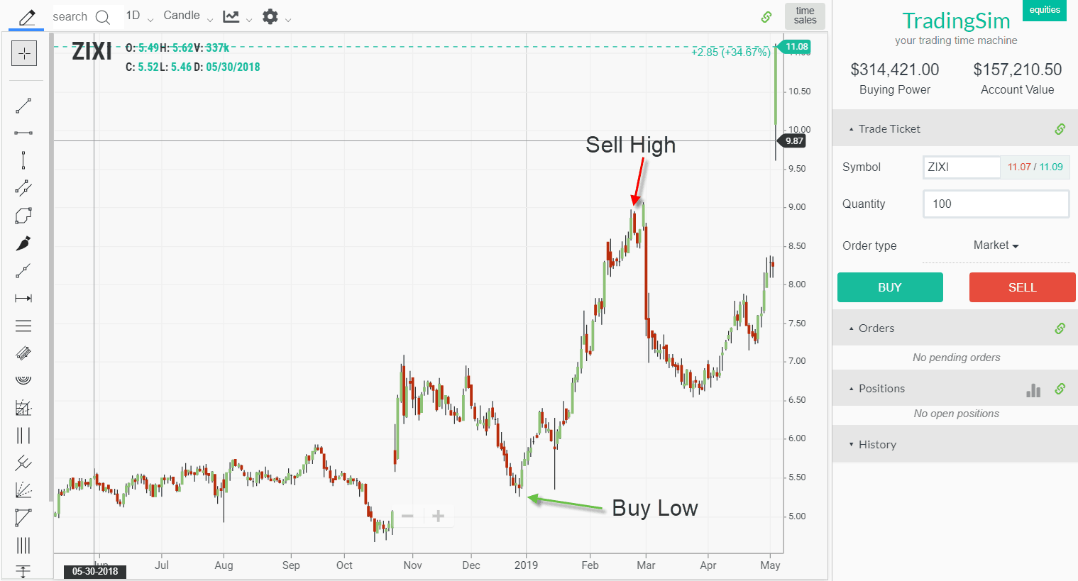
APPS was a lower priced stock in 2019 that was doing really well gaining market share. After the Covid crash, it had been putting in a fairly long consolidation period. However, in June, it reported stellar earnings and gapped up over 9%.

APPS Episodic Pivot on Earnings

Notice how the stock closed in the upper range of the day. This is what you really want to see as strength continues to build. Also, note that the volume signature was higher than any prior day in the stocks history, another good sign.

Intraday, we can now dial into the opening range strategy.

The Opening Range Entry

APPS intraday opening range breakout

We’ve numbered the 1 minute candles so that you can see the high of what would be the first 5-minute candle. The stock consolidates here off the open, and then breaks out. You now have a low risk entry at the low of the day.

Noticeably, the stock pulled back the next day, but never would have triggered a stop loss order. As a swing, this would have been a stellar move:

APPS post earnings drift

APPS went on a post earnings drift of massive proportions. In fact, it put in another Power Earnings Gap in the next quarter. As the company’s revenue expanded, so did its valuation, all the way to over $100.

APPS $90 gain in less than one year.
1170% from Episodic Pivot in less than one year

An insane move, APPS went well over 1000% in 2020 and 2021, less than a year. Clearly, there is something to these Episodic Pivots, Power Earnings Gaps, and Buyable Gap Ups.

Entering the Power Earnings Gap (PEG) on a Consolidation

Not everyone is cut out for the fast paced entry requirements of buying a gap up on the day of earnings. If this is you, then @traderstewie‘s strategy of waiting for the first constructive base may be a better fit.

TraderStewie likes to look for flags, wedges, or volatility contraction patterns after the PEG has formed. Using APPS, let’s see what this might have looked like.

2-day flag on APPS after Episodic Pivot
2-day flag on APPS

The first opportunity for a flag occurred the 2nd day after the Power Earnings Gap. Notice that the stock is minding the lows of the prior inside candle. If we zoom into the 30-minute chart, we can see a nice flag forming.

30-minute Flag on APPS after Power Earnings Gap
30-minute Flag on APPS

Hopefully you can see that APPS is retesting the middle of the largest 30-minute candle on the chart. This is a very common occurrence to retest supply into a significant candle. This candle corresponded with the Opening Range Breakout on the PEG day.

If you missed that entry, entry could be made here on the wedge breakout with risk defined at the wedge lows.

Also of note, the lows of the wedge corresponded with the VWAP Boulevard for the initial gap day, a very reliable pivot that is worth studying.

Larger Time-Frame Consolidation Entries for the Power Earnings Gap

Larger consolidations may also occur after a stock has taken off from a Power Earnings Gap. Just a few weeks after the PEG, APPS put in two beautiful Volatility Contraction Patterns.

APPS Power Earnings Gap Secondary Entries

Your typical consolidation strategy, like flags, pennnants, cups with handles, can be used for these entries. Again, the idea is that the stock is now entering a growth phase with the initial Power Earnings Gap / Episodic Pivot behind it.

Using the Buyable Gap Up Intraday Low as Risk

What happens if a buyable gap up fades off intraday or never gives us an opening range breakout or flag pattern for entry? Fortunately, there is a strategy for this as well.

Often times a stock will retest the supply levels from the intraday low of the gap day. Gil Morales teaches that if a stock retests the gap, give it a good 3-4% on the downside as a way to manage risk buying the pullback to the low.

Example of a BGU

As a good example, Restoration Hardware (RH) has a habit of doing this for earnings. On June 13th, 2019, we see that RH was trending downward, but launched on a 27% earnings surprise. However, as you can see from the intraday chart, it never broke the opening range. In fact, it faded for the remainder of the day. Despite this, news that Buffett was heavily investing in the stock surfaced and RH never actually filled the gap on the daily chart.

RH Earnings Gap
RH Daily Earnings Gap
RH fades intraday on earnings

Notice how, if you were employing the Qullamaggie opening range breakout strategy, you would have likely avoided any stop outs. This stock never broke the opening range. However, larger cap stocks are often wont to pull back like this. To that end, they are worth keeping on your watchlist for a bottoming pattern near the intraday low.

Now, let’s look at what occurred in the coming days:

RH holds intraday buyable gap up and then breaks out
RH holds intraday gap and then breaks out

Once the bottom is set on the Buyable Gap Up, you now have an area to risk off of. Morales’s 3-4% “porosity” rule on the downside would have been enough to keep you in the stock if entering at the reclaim of the intraday low. Here is another example of Facebook after earnings:

FB Buyable Gap Up Pullback

As the stock pulled back to the intraday buyable gap up low, it held that level as support. Notice also that the stock is emerging from a sound basing structure in the preceding months.

Managing and Exiting the Trade

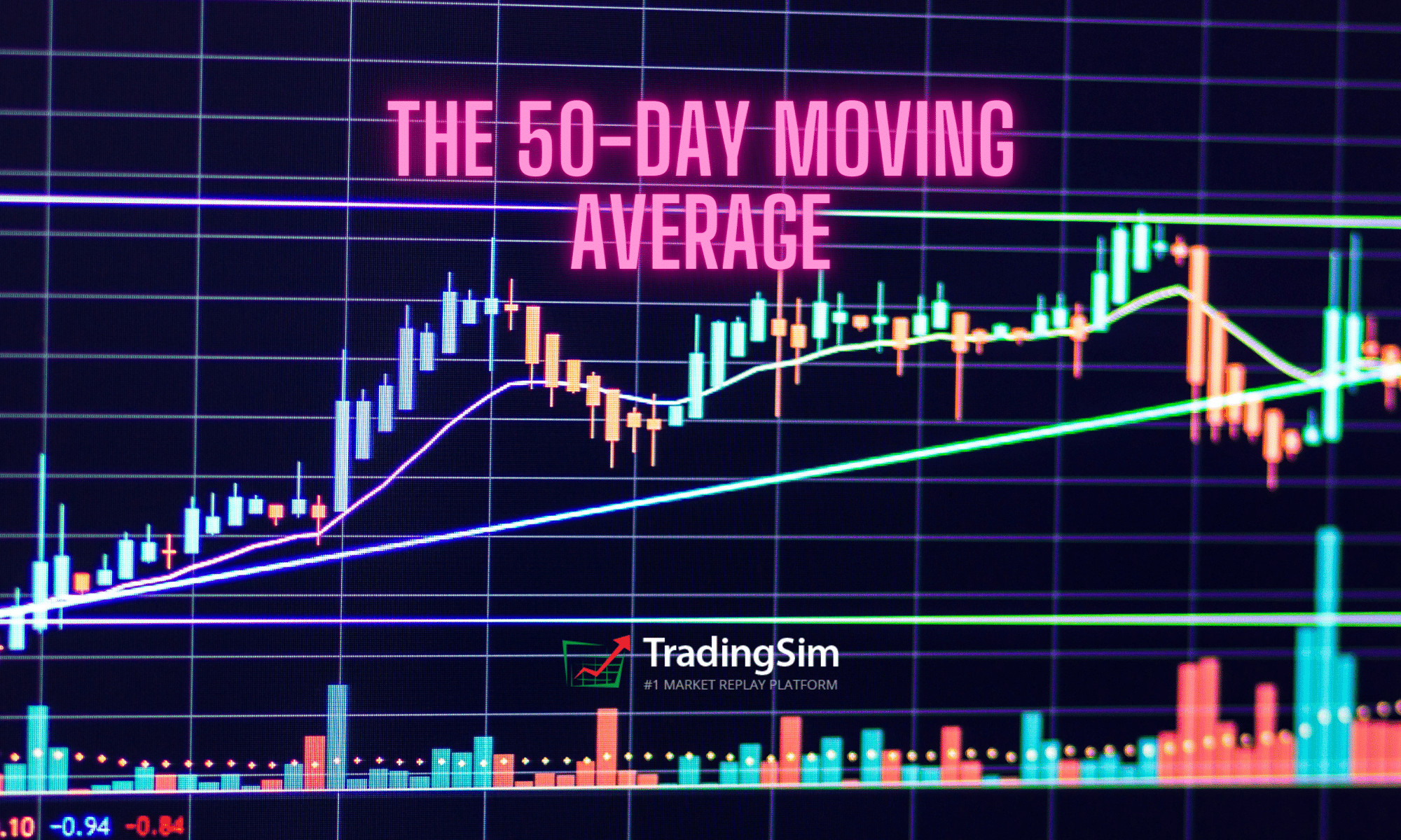
Most of the educators who teach these strategies recommend a trailing stop using moving averages. This really depends on whether or not you want to hold the stock for a longer time frame. Generally speaking the 10, 20, and 50 moving averages are the more popular averages to manage the position.

Similarly, legendary trader, Bill O’Neil was known for using the weekly charts on stocks he felt could make significant moves. To that point, you might employ the 10-week moving average to keep you in the stock for longer.

In addition, educators like O’Neil and Qullamaggie recommending taking some profits like 1/3 to 1/2 at 20% or 3-5 days into the uptrend. There are a lot of management rules you can employ and it’s best to backtest what works.

Let’s go in reverse order of the examples above and see how this might have played out for each management strategy after the Episodic Pivot / Power Earnings Gap / Buyable Gap Up.

Managing a Trade Using the 10 Moving Average

Using the 10 or 20ma as a trailing stop is Qullamaggie’s recommendation. However, this can be tricky if the 10ma is nearby. Do you close as it touches the 10ma, or closes below it? Morales likes to use a moving average “violation” that he defines as a second close below the moving average as well as below the first candle that violated the moving average. This way, if the stock dips below and then reclaims the moving average, you would still be in the position.

However you want to use this strategy, it’s worthwhile to test in the sim.

Notice how Facebook rides the MA on the first pullback but never closes below. We then get a another run that pulls back dramatically and breaks the 10ma.

10ma cross after buyable gap up
10ma break after buyable gap up

One could have also employed Livermore’s Century Rule here as FB hit resistance at the $300 level. Morales preaches this as a popular psychological support and resistance level. Had you taken half at the century mark, and trailed half at the 10ma, you might have increased your gains.

Managing a Trade using the 20 Moving Average

Let’s look at managing our RH example given above using the 20 moving average. Notice how if you simply had a trailing stop, you might have triggered a sell as it tested the 20sma. However, using the “violation rule” of Morales, you’d have a larger gain of around 63%.

RH trade management using the 20ma

Granted, not all episodic pivots are going to “drift” this well. The catalyst for earnings and forecasts should be exceptionally good. But as you can see, a strong trend should mind the 20 moving average well, and in some cases, this might extend your gains on the stock instead of taking profits at the first 10ma break.

Longer Term Management Using the 10-Week Moving Average

As we mentioned above, Bill O’Neil loved to trade on weekly charts in order to cut down on the noise of daily charts. For his management strategy, Bill liked to use the 10-wk moving average to add to his positions for longer term swings.

Let’s use APPS as our example and see what this could have yielded for us.

Longer term trade management using the 10 week moving average

Bill was wont to add to his position on the first few pullbacks to the 50-week average. Often times this is used by institutions as a buy point. If you have a longer-term vision for a company, you can use this to trail like Qullamaggie suggests, or you wait for a “violation” that actually closes below the first candle that violates the moving average.

If you wait for the violation, the stock would not have stopped you out until the $78 level, a much bigger gain.

You might also note that the stock was approaching the Livermore $100 mark as well, a logical area to take gains.

How to Practice this Strategy

Like all strategies, it takes time to study the subtle nuances of how they work. Qullamaggie suggests at least 2 years. To that end, we suggest starting in the simulator or a backtesting engine to find the biggest winning gaps over a broad time stamp.

Once you identify 100s or 1000s of these examples, dial into what made them work. How did their earnings or news change the character of the stock? What was the size of the float? How big was volume?

Also, dig into the intraday data using our simulator/replay and figure out the best way to enter the stock visually.

Once you have enough of these examples, you’ll drastically increase your confidence in trading them.

Here’s to good fills!

The Liquidity Trap Banner

In the sordid world of low float, lower-priced stocks, a lot of what goes on often defies typical volume and price logic. Often, you’ll see trading firms and high-net-worth traders going head to head in a battle for control of these highly volatile stocks. Retailers, too, like to jump in the mix and get their piece of the pie. It’s like a feeding frenzy of sharks when these stocks go. Yet after the melee, when the feeding frenzy is over, there often remains a strategy lurking just a few days later called the liquidity trap.

What is a Liquidity Trap?

Most fickle traders move on for the next big trade, quickly forgetting even the ticker they traded the prior day. But for veteran day trader and purveyor of InvestorsUnderground.com, Nate Michaud, the excitement is just getting started.

Traders like Nate continue circling the prey from the day before, watching for any signs of life.

https://twitter.com/InvestorsLive/status/1382696579497394185?s=20

In his Sunday Scan and other free material, Nate describes it as a liquidity event that creates a problem for heavy-handed short sellers to cover inconspicuously.

Volume Drop Off

Think about it this way. Stock XYZ trades 70 million shares on a momentum day — way above average for its normal volume. News is wonky, maybe it’s earnings, perhaps it’s just a press release to pump momentum into the stock for the very purpose of selling it back down.

Here’s what one of these days might look like:

While this creates a fantastic intraday long and then short on the backside, it can put overnight short sellers on thin ice the next day because the volume falls off. You might only see 700,000 shares traded the very next day. Now imagine a handful of short sellers holding a million shares. That isn’t going to be easy to cover without shoving the price back up.

Days to Cover

There is some possibility that the days to cover from the day of heightened trading activity may affect the need to cover. If unfamiliar with the concept, here is the formula:

Days to Cover = Current Short Interest ÷ Average Daily Share Volume

It is essentially a formula to determine how long it would take shorts to cover without really affecting the price of the stock.

The difficult thing to determine is the current short interest on such short notice (no pun intended). This information isn’t readily available and only updated bi-monthly. However, by putting two and two together, one could discern that a heavy amount of shorts entered the stock on the day of the momentum gap. If the volume then falls back to average levels, the Days to Cover could have increased significantly.

However, a lot of this will depend on the size of the float and the amount of volume traded.

Here is a visual example showing $OCGN short interest at around 49 million shares:

Short interest graph
Short interest of $OCGN taken from WeBull

At the time of this post, there are 193 million shares available in the float for OCGN. It has an average 3-month daily volume of around 16 million. Given this information, it would take around 3-6 days for shorts to cover all their shares.

The implication that this has for liquidity traps is that it will take large short sellers quite a few days to offload their short positions. Their ideal situation would be a slow steady fade lower over a longer time frame.

The Trap

Where things get interesting are on day 2, 3, or 4.

If the price of the stock begins to rise again on lower volume, it gets closer and closer to the average price of the short sellers’ positions. In other words, the water gets hotter and hotter beneath them.

As astute traders take note of the price action, they begin to smell blood in the water once again. What was considered dead just a few days before has been resurrected. Only this time, the violence could be twice as bad.

Let’s look at a few examples of this and how to build a low risk long strategy around this theory.

Liquidity Trap Example #1: HLBZ

HLBZ was a recent example of a liquidity trap. We referenced it above in Nate Michaud’s tweet. Let’s look at the charts to see what we can glean from the setup.

HLBZ day before liquidity trap

Notice the callouts on the chart. We get the big outlier day with a reversal. This pulls us into an area of prior resistance, which could become support.

Paying attention the next morning, we can look to enter this stock as it crosses the pivot low of the gap day. Our risk is defined below the second candle. Otherwise, you could simply set a 3-4% risk below the intraday low of the outlier day. This is discretionary and will depend upon your position size and the volatility of the stock.

Let’s now look at what happens the next morning pre-market, and how we end the day:

HLBZ Liquidity Trap
HLBZ Liquidity Trap

Sure enough, the next morning a catalyst came in the form of positive news for the company. As demand piled into the premarket, shorts were left scrambling to either cover or average up their positions from two days prior. The price of the stock quickly surpassed all resistance areas from that day.

Similar to VWAP Boulevard

We’d like to note before moving forward that this setup is somewhat rooted in the theory of vwap boulevard. The correlation here lies with the “average” of the shorts that pile in on day one. Using vwap from that high volume day can give us a gauge as to where shorts starts sinking. Think of it like a watermark.

If unfamiliar with this strategy, definitely check out our guide and give AllDayFaders a follow on Twitter for more info.

Liquidity Trap Example #2: WHLM

WHLM provided another great liquidity trap opportunity in 2021. Volume dropped from 17 million on the momentum gap to less than 600k the next day. But notice the key levels that held so well:

WHLM Liquidity Trap
WHLM Liquidity Trap

Just like the prior example, on the second day we hold a prior area of resistance and close near the intraday low of the big gap. As price increases, we see it touch vwap boulevard from the gap day, denoted by the purple line at $8.21. The third day, shorts can no longer hold the line.

The rest is history.

If you had initiated a position near the pivot low on the second day, your risk/reward would have been phenomenal. You might have started in that day, and set price alerts as key price levels held, adding along the way.

Ultimately, vwap boulevard could have provided another low risk add-on buy as it held the fourth day, giving us a spring board for the breakout.

More Liquidity Trap Examples

Now that you have the basics of the strategy, let’s see if you can test your own “chart eye” with the following examples:

SENS gap and go two weeks later
JFIN liquidity trap
JFIN liquidity trap
KPLT shorts get stuck the first day
SPRT squeeze
SPRT squeeze

Notice how with each of these examples, we have an igniting gap that gets sold into. The days following are low volume compared to that day as price inches upwards toward a new breakout.

Your goal as a trader is to find the best risk to reward entries and ride this momentum while managing risk if it fails. You can do this any number of ways as we have mentioned above.

If the stock doesn’t pull all the way back to the gap intraday low, you might consider using the lows of the second and third pull-back day as your risk.

Things to Consider

As with any strategy, there are always a lot of caveats. Liquidity traps don’t work 100% of the time. It is up to you to study the strategy and find the subtle nuances that may help your success.

Along those lines, the following are worth considering when identifying these traps:

Managing Your Position

A great thing to do with this strategy is to start in small and add if the trade continues in your favor. As you study charts, you may identify certain criteria for starters, adds, and removing shares if the stock hits targets or fails to meet your expectations.

As we discussed above, it’s best to use your daily levels to give yourself a bigger picture idea of support and resistance near term. You might even use a lower time frame like a 30-minute or 1-hour chart to identify key levels.

Keep in mind, this is a short term swing trading strategy. To that end, be sure to pay yourself along the way.

Practicing in the Sim

One of the best ways to spot these opportunities is by using TradingSim‘s scanner. You can run through over 3 years of data identifying daily gappers, filtering your results by float size and other criteria.

TradingSim Scan Filter

As you run through charts, identify those gaps that ran, pulled back, then found support and carried higher.

Make notes and screenshots of all the candidates you find, save them in a OneNote or other platform, and discover your edge criteria.

Golden Cross Banner

In this article, we’ll uncover one of the most important and popular setups using moving averages – the golden cross.

We’ll provide an explanation of the signal and then dive into three trading examples.

What Is a Golden Cross?

A golden cross occurs when a faster-moving average crosses a slower moving average. Sounds simple enough right? However, the key point is the moving averages which constitute the cross, and the direction in which they cross.

Specifically, you need the 50-period and 200-period simple moving averages. Anything other than these two periods and it is not a true golden cross.

Directionally, a golden cross happens when a 50-day moving average for an asset trades higher than a 200-day moving average. In other words, prior to the the cross, the 50 moving average would have been below the 200sma. You can see this in the example below:

AMC 200 and 50 moving average cross

What this tells traders and investors is that momentum could be changing when the cross occurs. When the speed of the upward movement in a shorter time-frame is faster than the longer-term speed, that’s taken as a sign that investors might want to buy.

That is, with high trading volumes and higher trading prices, the golden cross is possibly a sign that the stock market, and individual stocks, are poised for recovery.

What are the three stages of a golden cross?

There are three stages of a golden cross.

  1. As the downtrend in the stock market ends, the short-term 50-day moving average moves below the 200- day moving average.
  2. In a crossover, when a stock recovers,  the short-term moving average crosses over the long-term moving average. That’s where the term golden cross comes from, when the two average lines cross on a chart.
  3. In the last stage, the short-term moving average continues to move upward.  That’s usually a sign that the stock market is on a bullish trend.
The three stages of the golden cross

Is a golden cross a sign that investors should buy?

Golden crosses are not a guarantee of a bullish future in the stock market. Ari Wald is head of Technical Analysis at Oppenheimer & Co. He doesn’t see golden crosses as an absolutely bullish signal for the markets.

“All big rallies start with a golden cross, but not all golden crosses lead to a big rally,” he says.

Brian Shannon is the founder of AlphaTrends.net. He also agrees that golden crosses are not a definite timing signal to buy.

According to Shannon, “They tend not to be timing signals, but more for confirmation of a move that has been in place.”

In contrast, Jon Boorman sees golden crosses as good trading indicators. However, he also advises caution for investors as well.

“They’re perfectly valid, but people treat them all as individual trades rather than being part of a system. If you’re going to take one trade, take them all. You can’t pick one and then when it doesn’t work say ‘so much for that’. It’s an absurd thing for short-term traders and business TV to take notice of,” said Boorman.

“Just like any trend-following system, it will have plenty of whipsaw losing trades, but the winners will more than make up for those. It’s easy to pick holes in it, but very few have the discipline to execute it. Which is why it works,” added Boorman.

Is the golden cross an indicator of a bull market?

While financial analysts are skeptical about the golden cross being the start of a bull market, there is data to support the belief that it could be a good indicator. Schaeffer’s Senior Quantitative Analyst Rocky White found that there were gains in the stock market after a golden cross

White found that the S&P 500 had healthier returns a few months after the first golden cross.

“The S&P has averaged healthier-than-usual returns looking one, three, six, and 12 months out, ” said Schaeffer’s Senior Quantitative Analyst Rocky White.

“For instance, the index has averaged a three-month gain of 4.07% after a golden cross, and was higher more than three-quarters of the time. That’s compared to an average anytime three-month return of 2.12% since 1950, with a positive rate of just 65.9%,” said White.

Financial expert Jeffrey Marcus also noted the positive impact on the stock market after golden crosses. 

“On Thursday, the S&P 500’s 50-DMA crossed above the 200-DMA . Such is known as a “Golden Cross” and has now happened 25-times over the past 50-years. The long term performance of the S&P 500 following such an occurrence is unabashedly positive,” said Marcus.

“TPA calculated the performance of the S&P 500 10, 20, 40, 80, 160, and 320 days following each of the 25 Golden Crosses since 1970. The average performance is 0.88%, 0.98%, 3.25%, 6.73%, 9.57%, and 15.70%, respectively.

“The positive cross has happened 6-times in the past 10-years. The averages for 10, 20, 40, 80, 160, and 320 days following each was 0.53%, 0.89%, 2.64%, 8.17%, 10.45%, and 20.95%, respectively,” added Marcus.

Golden Cross Signal

Golden Cross Example

The above chart of $TSLA displays a classic golden cross trading example. The blue line on the chart is a 50-period SMA and the red line is the 200-period SMA.

The chart begins with a strong downtrend, where the price action stays beneath both the 50-period and 200-period SMA.

Suddenly, the direction of the trend changes and price begins making a move to the upside. Naturally, the 50-period SMA reacts faster to the price change as it has a greater sensitivity to the most recent price action.

Once the 50-period SMA crosses the 200-period SMA to the upside, we have a golden cross.  We have highlighted this in the grey circle.

Profit Potential of the Golden Cross Pattern

The profit potential will depend on the stock and the setup going into the trade. Sorry to be so vague, but that’s the reality of trading.

Death Cross

One option is to wait for a cross of the 50 back below the 200 as another selling opportunity. The only issue with this approach is you are likely to give back a sizeable portion of your profits since moving averages are a lagging indicator.

Death Cross

Here is an example of the “Death Cross” after riding a nice gain in Chipotle (CMG).

Golden and Death Cross Buy/Sell Signals

Notice that the sell signal comes as the market was already plunging. While you would have still had a nice gain, you must be ok with not “selling at the top.”

Prior Support

What you can also do is look for areas of resistance overhead which will act as selling opportunities for longs that have been holding the stock for a long period of time. Typically, bag holders from higher prices will be glad to get out at break-even.

Here is an example with CMG. We took the daily chart Golden Cross entry from above, then flipped to a weekly to see the target areas. Notice how close the exit would have been to the death cross still circled.

Selling at Resistance

A caveat to this strategy is that the stock may consolidate and push higher. You may want to hold part of your position and consider a potential breakout from the prior resistance area.

Trendline Break

If the golden cross is real, the signal will likely generate a strong buying opportunity. You can then use the first couple of reactionary lows to create an uptrend line. You then hold the stock until this trendline is broken.

Let’s look at an example of this below.

Bullish Golden Cross Pattern Example

Here we have a bullish golden cross stock pattern when the faster SMA on the chart breaks up and through the slower SMA in a bullish direction.

Trend Break Sell Signal

This is the same type of golden cross trading signal from the previous chart. However, this time we demonstrate the strength of the signal and the potential run a stock can make after a golden cross materializes.

If you don’t want to wait for the 50sma to break the 200sma on a death cross, you could have taken gains on the trend line break.

In this particular example for NVR, the stock went on a 100% run in 7 months.

Not a bad 7-month return for all you swing traders out there!

3 Strategies for Trading the Golden Cross

Strategy #1 – Look for Setups After a Long Down Trend

All golden cross setups are not equal. One method you can use is to wait for a stock that has had a long sustainable downtrend and then look for a stock that is ready to make a move higher.

There is so much bearishness in the stock that the signal has tremendous significance as a reversal.

Long down trend leads to bullish cross

The power of this signal is that the cross happens after a multi-month downtrend. By having such a long bearish trend, in order to get a bullish cross, there has to be a basing period. This basing period is the battle between the bulls and the bears.

Therefore, once the stock breaks to the upside, you know there is juice behind the move.

You can buy that initial breakout after the base, but realize you could still be in the thick of a bear market, so don’t get married to the stock. Look for opportunities as the stock rises to secure your gains.

Strategy #2 – Avoid Wide Spreads Between Moving Averages

At times the averages will have a wide spread. This will present a cup-and-handle-like formation of the averages. On the surface, it’s going to look really bullish.

However, if you look at the price action, you will notice the pattern is unhealthy. First, the price is shooting straight up. What happens when a stock goes parabolic into a strong primary trend? It usually reverses.

Golden Cross to avoid

What does this chart example teach us?

You cannot ignore price action. Parabolic reversals should be treated with caution. This is especially true when you have a large overhead gap acting as resistance.

For these types of golden crosses, you may want to avoid them. While it might be considered a valid golden cross, there are better opportunities in the market with smoother, less volatile entry signals.

So, what’s the trade here? Well, there isn’t one.

As traders, we have to remember that sometimes the best action is no action at all.

Strategy #3 – Combine Double Bottom Pattern with Golden Cross

The last strategy we will cover combines the double bottom chart formation with the golden cross.

Here is the setup.

  1. Look for a double bottom on the chart. The second low should be lower than the first.
  2. Next wait for the golden cross formation. Lastly, wait for the price to retest the 200 simple moving average.
  3. You want to buy the test of the 200 moving average with a stop below the low of the double bottom.

The below chart illustrates this formation.

Golden Cross + Double Bottom

Conclusion

The golden cross is a powerful trade signal, but this does not mean you should buy every cross of the 50-period moving average and the 200.

You will need to bring a higher level of sophistication to the setup, to ensure you are buying into a trade with real opportunity.

How Can Tradingsim Help?

Tradingsim is the best market replay platform on the web. You can cycle through thousands of charts and replay the data to see which golden cross setup works best for your trading style.

the 50-day moving average banner chart

The 50-day moving average indicator is one of the most important and commonly used tools in stock trading. Considered an “intermediate term” indicator, it is a multiple of the longer-term 100 and 200 moving averages. It’s use is ubiquitous on any time frame.

Therefore it goes without saying we need to unpack the relevance of this average and how you can use it when trading.

To this point, we will give a brief overview, elaborate on the six tips, and then show some real trading examples using the indicator. Lastly, we will show you where the indicator can fail you, so you are prepared for when things do not go as planned.

Why Use a Moving Average?

The moving average is a trading indicator used to smooth the price action on the chart. The moving average indicator takes into account a certain number of periods when calculating its value.

These periods can be adjusted, which also modifies the appearance of the line on the chart. The more periods it takes into consideration, the smoother the line.

Let’s say we want to calculate the 5-period moving average for the following values:

3.00
4.00
8.00
10.00
12.00

The 5-period simple moving average would equal:

(3+4+8+10+12)/5 = 7.4

For each new period, the formula accounts for the additional data point.

Therefore, the moving average is a lagging indicator. [1] The reason for this is that the moving average needs a given number of data points based on prior periods to print a value.

5-Day Moving Average
5-Day SMA

The purple curved line on the chart is a 5-period simple moving average. This line is not smooth at all. This is because five periods is such a small time frame and will result in many trade signals; more signals than most would care to track.

Now that we have provided a visual of a moving average let’s dig into the 50-day to see a longer time frame.

What is a 50-Day Moving Average?

The 50-day moving average indicator is one of the most common SMAs in stock trading.

This makes trade signals around this line pretty reliable based on the number of eyes monitoring the trading activity at this level. Not only will retail traders be watching this indicator, but professionals and institutions use it as wel.

Below, you will see a 50-day moving average on the chart.

50-Day Moving Average

As you can see, the 50-day SMA is much smoother than the 5-period moving average.  This will naturally result in less trading signals and an increased significance on breaches of the average. [2]

6 Tips for How to Use the 50-Day Moving Average

Now that we have discussed the structure of the 50-day moving average, let’s dive into the six essential tips for how to use the indicator.

  1. Stock price above the 50-day moving average is usually considered bullish.
  2. Stock price below the 50-day moving average is usually considered bearish.
  3. If the price meets the 50 day SMA as support and bounces upwards, consider a long entry.
  4. Stock price meets the 50-day SMA as resistance and bounces downwards, consider a short entry.
  5. If the price breaks the 50-day SMA downwards, you should switch your opinion to bearish.
  6. If the price breaks the 50-day SMA upward, you should switch your opinion to bullish.

These six rules are crucial for understanding the character of the 50-day simple moving average indicator. They may sound like they are all saying the same thing, but they’re not.

Notice how we never said that you should just buy and sell based on the 50 moving average. Trading doesn’t require an advanced degree, but we are here to tell you that buying and selling solely on the 50 is not a strategy for success.

However, having a base understanding of these six principles will help you better navigate how to trade with the average. Next, we will explore these strategies and areas where the indicator can fail you if not used properly.

50-Day Moving Average Trading Strategy

In this trading strategy, we will layout the entry, exit and stop loss when trading. You’ll likely notice that this strategy resembles a trend following strategy.

50-Day Moving Average Trade Entry

To enter a 50-day moving average trade, you should wait for a breakout.

Whenever the price breaks the 50-day SMA, you should open a trade in the direction of the breakout. In most cases, the price action will continue in the direction of the breakout.

50-Day Moving Average Stop Loss

Every 50-day moving average trade should be protected with a stop-loss order. Nothing is sure in stock trading. The 50-day moving average strategy is no different. In the long-term, we expect the price action to continue in the direction of the breakout. However, there will be cases when the price action will surprise us.

The price action could sometimes rapidly shoot in the opposite direction with a big candle. This could happen due to the release of some unexpected report.

The ideal place for our stop loss is beyond a price edge created prior to the signal we use to enter the trade.

If the price breaks the 50 SMA upwards, we need to go long, placing a stop below a bottom prior to the breakout. The opposite is true for bearish trades.

If the price breaks the 50 SMA downwards, we need to short the stock placing a stop below the bottom prior to the breakout.

50-Day Moving Average Profit Targets

The rule to close 50-day moving average trades is very simple. Hold your trades until the price action breaks your 50-day moving average in the direction opposite to your trade.

If you are long, you close the trade when the price breaks the 50-day SMA downwards. If you are short, you close the trade when the price breaks the 50-day SMA upwards.

Trading Example with the 50-Day Moving Average

Now let’s approach a real 50-day moving average trading example:

50 Day Moving Average Trading Example

Above you see the 50-day moving average chart of Bank of America. The blue curved line on the graph is the 50-day SMA.

The action on the chart comes at the moment when the price breaks the 50-period SMA downwards. The breakout is shown in the red circle on the image. See that the price first attempts a couple of times to break the SMA downwards.

However, we need to wait until the price action breaks the level in order to get a valid bearish signal. Therefore, we short the stock when we see a sharp decrease through the last two price bottoms below the 50-day SMA.

Stop Loss Order

We place a stop-loss order above the last big top on the chart. The right location of your stop-loss order is shown with the red horizontal line on the chart.

See that the price creates a very sharp decrease afterward and enters a bearish trend. We need to stay in the trade as long as the price is located below the 50-period SMA.

The blue channel on the chart displays when the price breaks the 50-day SMA and we close the trade.

However, this is also a long signal and we enter the market with a new trade, which is bullish. We place a stop-loss order below the last major bottom on the chart as shown on the image.

The price then returns and tests the SMA as support. A bullish bounce appears afterward, which resumes our bullish hopes. The price experiences a few bumps along the way, but the 50 SMA sustains the price action.

The price then creates a top, which is lower than the previous on the chart (pink line). Then we see a breakout through the 50-day moving average. Therefore, we close the trade on the assumption that the price action will reverse and this is exactly what happens.

This case is an example of two 50 day moving average trades, which differ in terms of their profitability.

The first trade is short and it brings a solid profit of 15.60% for three-and-a-half months. However, the second trade brings only 0.22% for about three months.

Your trading results will vary.  This is a cost of doing business and is simply unavoidable in the market.

The key is knowing that your system will win in the long run and sticking to your convictions.

50-Day Moving Average vs. 200-Day Moving Average

Another important moving average is the 200-day moving average. We mention this tool because it creates a very strong signal when used in conjunction with the 50-day moving average.

This signal is known as the golden cross.

The golden cross is a signal created by the 50-day moving average crossing through 200-day moving average to the upside [3].

A good golden cross trading strategy is to open trades in the direction of the golden cross and to hold them until a break in the opposite direction.

Golden Cross - Trading Example
Golden Cross – Trading Example

Above is the daily chart of Google. The blue line on the chart is a 50-day moving average. The red line on the chart is the 200-day moving average.

In the green circles, we have highlighted golden crosses.

The first golden cross is bullish and we use it to buy Google.

We place a stop-loss order below the bottom prior to the cross. The trade needs to be held until the two moving averages create a bearish sell signal.

This long trade with Google generates a profit of 22.28% for one year.

50-Period Moving Average on Intraday Charts

The one area you may not think of the 50-day moving average indicator is on intraday charts. This is because when you think of day trading, you think of fast-paced trades going in and out of stocks all day.

And technically, it would no longer be called the 50-Day Moving Average. It would simply be called the 50-period SMA.

So, where does the 50-period moving average indicator come into play? Well, the 50 can be used as a larger time frame to keep an eye on for support and or resistance intraday.

50 Moving Average Intraday

Above is a 5-minute chart of Apple. Whether you know it or not, the 50-period average is a big deal as you can see by the price action on the chart.

You can see that even during pre-market trading price respected the 50-period moving average. After crossing lower, Apple respected the average all the way into late-day trading.

Where the 50-Day Moving Average is Likely to Fail

Breaking the Average

The 50 is a major trend following average to use on the chart. To this point, what you do not want to do is overreact if a stock breaks the average on one or two candlesticks. We like to call this “porosity”.

It’s like a cow leaning through the fence to see if the grass is greener on the other side, only to return back to the same pasture.

This is often a rookie mistake to make as the stock will likely recover and continue in the direction of the primary trend.

Minor Breach of the Average

Do you see how the traders “in the know” might play these silly games with you? A way to handle these situations denoted by the circles on the chart is to give a certain amount of wiggle room where you will allow the stock to go beyond the moving average and you stick to your guns.

Many traders will continue to hold as long as a stock does not close beyond the average. This is also great advice. However, over time you will notice that stocks will close beyond the average literally one or two candlesticks, then return.

The real kicker is that after this close beyond the average and subsequent continuation of the primary trend – this is where the lion share of the profits are made in the trade. Think of it like a shake out.

Day Trading Breakouts in the Morning

If you are trading volatile stocks in the morning, you have no business trading with a moving average above 20, to be honest. The price action is so fast that you’ll want to use a lower time frame and moving average to catch the right moves.

While you can use a 50sma or higher to gauge the strength of the market, you should not use the average to make buy and sell decisions.

This becomes overly apparent when you trade extremely volatile stocks as the 50-period average will likely push your risk parameter beyond any acceptable level.

50-period moving average and volatility

As you can see, giving this much space on a trade is not a good idea. Do yourself a favor and do not try and force a longer-term average on a short-term volatile stock. Again, the 50 moving average can work as long as you use the indicator on stocks with less volatility.

It is better suited to trending stocks.

Conclusion

  • The moving average is an indicator which smoothes the price action on the chart by averaging previous periods.
  • The 50-day moving average is one of the most commonly used indicators in stock trading.
    1. It averages 50 periods of a stock on any time frame.
    2. Many investors and traders look at the 50-day moving average.
    3. Therefore, the 50-day SMA is a psychological level, which can act as a support and resistance.
  • To trade with the 50-day SMA, you should remember these rules:
    1. When the price breaks the 50-period SMA, you should trade in the direction of the breakout.
    2. You should place a stop-loss order beyond a bigger top/bottom before the breakout.
    3. You should stay in the trade until the price action breaks the 50-day moving average in the opposite direction.
  • The 50 day SMA combines well with the 200 day SMA:
    1. The crossover of the 50-day moving average vs. 200-day moving average is called a golden cross.
    2. When you see a golden cross, you should look to get long.
    3. You should place a stop loss beyond a bigger top/bottom prior to the cross.
    4. You should hold the trade until the 50-period SMA is broken to the downside.

Additional Resources

Check out this great case study on both the 50-day and 200-day moving averages on the S&P 500 if you want to learn more. The study covers a longer-term view of the indicator but it is still a great read and will provide some insights into your trading activity.

In addition, you can practice trading the strategies listed in this article by using Tradingsim. You can apply the 50-day moving average to both stocks and futures to get a feel for what works for you.

Better yet, we’ve added a new scan filter that allows you to filter stocks to within a certain percentage of the 10, 20, 50 or 200 moving averages.

Take a look:

Scan filter for 50 moving average

Using this great tool can help you narrow your results and scan specifically for stocks nearing their 50-day moving average. This way, you can practice your edge and analyze your trades more efficiently.

Be sure to check out our post on the 20 Moving Average Pullback Strategy, it really complements the 50ma and might help you discover an edge. Also, How to Catch Trending Stocks builds on the 50 moving average and offers even more examples of great trades.

External References

  1. Parets, JC. (2017). This is How I Use Moving Averages. allstarcharts.com
  2. Moving Averages. FinViz.com
  3. Golden Cross Signals. Yahoo Finance

Overview of Swing Trading

Swing trading is a form of active trading. The goal is to make a profit on a trade from a time span as short as a few days to a few months.

You can place trades on both the short and long side to make profits and can do so in any market.

For the purpose of this article, I will discuss how to make money in the stock market.

#1 – What is Considered a Swing Trade?

The first question I need to address up front is what constitutes a swing trade? You first have two options; you can either go long or short.

If you are just starting out in trading I would recommend you stick to the long side of the house. This is because there is unlimited risks on the short side and requires different money management skills.

So, a swing trade is where you purchase a stock with hopes of selling it at a higher price in a short period of time for a profit.

Examples of a Swing Trade

Swing Trade
Swing Trade

Please note this is the ideal trade setup, but no one is able to nail the tops and bottoms cleanly. Your goal is to profit on the action between these two points.

Does this make sense?

#2 – How Much Money Do You Need to Swing Trade?

This is going to come down to a number of variables, which we will breakdown below.

Are You Swing Trading for a Living?

First, you need to prove to yourself that you are able to make consistent profits at scale for at least 6 months to a year. Trading for yourself as an independent business owner sounds very glamorous, but if not done properly can lead to a lot of emotional and financial pain.

If you are trading for a living you will need to have multiples more of your living expenses before stepping out on your own.

Unlike day trading, you will not be able to see how much you have made on a daily or weekly basis. Therefore, you will need to have the concept of float like a traditional business, where it may take weeks before you see profits from a trade.

The last thing you will want is to kill a trade prematurely because you need to pay bills and are short on cash.

So, I would recommend you have ten times what you need in monthly expenses in trading cash. Therefore, if your monthly expenses are 2,500, you should have $250,000 cash.

This sounds like a lot and it should. This will ensure that you have enough cash to weather any downturns in the market and also give you enough cushion that you are able to hold your positions for the necessary time to let them play out. Most importantly, it will allow you to not concentrate your cash into a few positions in order to turn a healthy profit.

Having this much cash will allow you to trade from a place of strength versus trying to swing for home runs and turn a small amount of money into some massive fortune.

The other option, of course, is to drastically lower your monthly expenses, which will reduce this figure.

Are You Swing Trading on the Side?

This is a much better approach for getting started in swing trading. Unlike day trading, you do not need to sit there monitoring the trade to look for signs to exit.

Most importantly, you have another income source which doesn’t make trading the only way you feed yourself. Now, this has many pros of course but has a few cons.

One major con is that since you have a job, the money from the market may not be your top priority. From my personal experience, unless you have real skin in the game, whatever goal you are trying to achieve will have a tough time coming to fruition.

So, you will have to create personal hacks that give you the same passion to master the craft of swing trading, even though you know everything will be ok financially whether you make money or not.

#3 – What is the Profile of a Swing Trader?

If you are thinking about swing trading but are trying to figure out if it’s a good fit for you, below are a few questions you should ask yourself to see if it’s right for you.

  1. Does day trading feel too fast or risky?
  2. Do you like your day job or run a business and don’t have the time to monitor the market frequently throughout the day?
  3. Do you have less than 25,000 you want to use towards swing trading (highly recommended)?
  4. Would you feel more comfortable analyzing the market after the close or on the weekend?

If you have answered yes to all of these questions, swing trading on the surface is likely a good fit.

#4 – What is the Best Time Frame for Swing Trading?

There are a few time frames you will want to focus on. Below are those timeframes listed in priority:

  • Daily
  • Weekly
  • One Hour
  • Four Hour

You may be surprised to see the two intraday timeframes listed. The reason is you need to have some idea of what traders are thinking on different time frames.

One Hour Facebook Chart

Four Hour Facebook Chart

The daily chart is your primary, as you will need some compass of where things are going over the next few days or weeks.

Daily Facebook Chart

Lastly, the weekly chart view will allow you to see the bigger picture in order to know where to exit your position.

Weekly Facebook Chart

#5 – How Long Should You Hold a Swing Trade?

This all comes down to the data you collect. Traders always want a holy grail indicator or some guru to tell them where to get in and out of trades.

Trading is completely mental for discretionary traders. The way you perceive risks or profits is completely different than the next trader.

Therefore, you have to put in the hard work of tracking each one of your trades to figure out what price action rules make sense for your trading styles.

#6 – What are Some Swing Trading Strategies?

There are a few strategies that are very popular.

  1. There is the golden cross which tracks when the 50-period moving average crosses above the 200-period moving average. This is a major bullish signal that can produce trading opportunities.
  2. There is the opposite of the death cross which is the inverse of the golden cross.
  3. There is the break of the 200-day moving average by the price. This is another major signal which is tracked by the street for the major indexes to determine if the market is in a bullish or bearish trend.
  4. Focus trading during earnings season. Earnings season can provide volatility which can provide great trading opportunities.

#7 – Swing Trading versus Day Trading

You can check out my article here where I go into depth about this topic, but to quickly summarize this is purely a personal decision.

For me, I like day trading because I like to know each day whether I have won or lost.

Again, this is completely a personal decision and comes down to which makes you money and which one gives you a sense of joy.

How Can We Help

We have daily and weekly charts in Tradingsim which you can use to practice trading. Remember, learning to trade is a process and you need to give yourself time to see if swing trading matches your trading style.

In this article we are going to cover methods you can use today to begin forecasting market direction with the Russell 2000 Index.

Before we dive into the meat of the article, for those of you unfamiliar with the Russell 2000, I will provide a brief overview to ground you on the Index.

Russell 2000 Index Key Facts

The Russell 2000 Index is the list of small and mid-size companies from the United States.

For those of you that did not know, the Russell 2000 index is not managed by a US company, but is actually managed by the London based firm FTSE Russell, a subsidiary of the London Stock Exchange Group (LSE Group).

Another key fact about the Russell 2000 Index is that it is the bottom or smallest stocks in the Russell 3000 index.

Here are a few additional key stats from the FTSE Russell as of April 30, 2018:

Russell 2000 Key Facts
Russell 2000 Index Key Facts

  • The average market cap is 2.5 billion dollars
  • Median market cap is 862 million
  • Largest Stock Market Cap is 13 billion dollars
  • There are 1,974 stocks on the Index (not exactly 2000)

For more facts on the Russell 2000 Index, please visit the FTSE.com website and review their wealth of fact sheets (no pun intended).

In addition to these stats, what makes the Russell 2000 Index unique is the types of stocks that make up the 1,974 companies listed. Remember, small and mid-size companies are the engine that fuel growth.

No one expects the next technological innovation to come from IBM. It’s likely going to be some college kids in their garage thinking of some “crazy” idea.

Also, the Russell 2000 Index has stocks from all types of industries: retail, housing, technology, finance, etc. So again, more representative of the entire U.S. economy.

Lastly, the Russell 2000 Index value is weighted by the total number of shares outstanding by the price value of the stock. This is different than most other Indexes which base their value on the full market capitalization.

Why the Russel 2000 for Forecasting?

You can use any Index to try and gauge the direction of the market. However, I would much rather use the Index with a large number of healthy stocks to determine where things are going.

The below table illustrates the number of stocks for each of the major US Indexes.

Number of Stocks by Index

So this graphic clearly contradicts my point about the Russell 2000 having so many stocks, because the NYSE has just as many and the Nasdaq has more stocks listed.

The key difference which is not represented in this graphic is the Russell 2000 again has small and midcap stocks. The NYSE has mostly large companies and the Nasdaq is heavily weighted in the Technology space.

The ability for the Russell 2000 to cover a large breadth of stocks that haven’t hit “Too Big to Fail Status” is what gives the Russell its powerful forecasting abilities.

Now that you have an idea of the size and scope of the Russell 2000 Index, let’s talk about three methods you can use to forecast major market moves.

Strategy #1 – Locate Divergences of the Large Cap Indexes and the Russell 2000

For this first strategy, the first part of our hypothesis is that divergence between the Russell 2000 Index and other Indexes lead to changes in market trend.

Please do not interpret this to mean if the Russell 2000 Index is up at noon, then the Dow Jones is surely to follow suit by end of day.

Think of the leading indicator in the context of when major lows and highs present themselves in the market.

Instead of just reviewing the Russell Index, let’s take a look at the Russell ETF (IWM) since it mirrors the price action and you can actually purchase shares.

Russell 2000 and Dow Jones Price Divergence

The above charts are of the Russell 2000 ETF and the Dow Jones ETF from early 2016. Notice how the Russell 2000 continued pushing to new lows in mid-February, while the Dow Jones held up.

This was a clear sign that the market was not aligned.

Here comes the tricky part – you need to decide which way the market is going to break. From this example you can see that the bears were unable to keep the Index beneath its prior low. This bit of data in combination with the higher highs in the Dow Jones were your clues it was time to get long.

Strategy #2 – Trend Lines (Painfully Obvious)

Trading really isn’t that complicated. When you strip it down to the brass knuckles, tactics that worked 50 years ago are still in play today.

Now, I’m not talking about day trading techniques but the ability to identify major trends and forecasts in the market.

When it comes to identifying the direction of the market and its likely path going forward, trend lines are still at the top of the heap in terms of providing quality signals.

Let’s review the chart we used previously to identify the divergence between the Russell 2000 and the Dow Jones.

Russell 2000 Oversold - Trend Lines
Russell 2000 Oversold – Trend Lines

As you can see from this image there was no need for fancy algorithms or complicated Fibonacci analysis. The Russell 2000 honored the support line while in a downtrend almost to the penny.

For those of you that think this was some sort of fluke, try explaining how the trend line was able to provide the support for almost 10 months. That’s more time than some people spend on a job.

Still not a believer, let’s take a look at what happened after the Russell 2000 broke out of the down trend and how the index is trading up to today.

Russell 2000 Uptrend - Trend Lines
Russell 2000 Uptrend – Trend Lines

I’m pretty sure my first grader can draw that uptrend channel. It’s just too clean.

If there is any thought the trend was a fluke; well this time the trend has held for over 9 months and is still going strong today.

So, from the uptrend line and price action on this chart, where do you think the Russell 2000 will be headed in the next one to three months? That’s right – higher.

Strategy #3 – Keep an Eye on Mutual Fund Rotation

It’s wildly known in the trading community that mutual fund managers and hedge funds rotate between large and small cap stocks depending on market conditions.

To do this, we do not need a quant analyst.

All you need to do is track the percentage gain and loss for the Russell 2000 against the Dow Jones.

You want to identify when for example the Russell 2000 goes from underperforming the Dow to flipping to positive.

This is an indication that investors are now shifting funds away from blue chips and into small and mid-cap stocks. This generally occurs when fund managers are open to taking more risks in order to maximize returns for their clients.

This also can occur when market sentiment is overly bullish and all boats are rising.

Russell 2000 versus S&P 500

These little blue and green lines hold a lot of truth to the trained eye.

The blue line represents the Russell 2000 and the green represents S&P 500 Value ETF.

Notice how the two Indexes were tracking closely to one another into early February. Then the Russell began to outperform the S&P 500.

The pullback in early April presented a great buying opportunity for entering into small and mid-cap stocks. As you can see the Russell has outperformed the S&P 500 by nearly 10%.

You will want to keep a close eye on the light green line. Once it crosses through the blue line, the smart money is now shifting funds back into the large cap plays.

In Summary

The Russell 2000 is an index and on many levels can act as a market breadth indicator to gauge the overall strength of the market. Even as an active trader you must keep an eye on the broad market in order to take a top down approach of (1) identifying the strongest markets, (2) finding the hottest stocks and (3) nailing the timing aspect of the trade.

Below is a quick recap of the three strategies:

  • You can use divergences between the Russell 2000 Index and other major Indexes to anticipate a change in trend
  • Trend lines don’t lie. Draw channels on daily and weekly charts to keep you on the right side of the market
  • Fund Rotation – keep an eye when money is flowing out of large cap and into small cap stocks. Once you see one improving relative to the other, it’s likely time ot shift your funds around.