Absolute Breadth Index – See How to Identify Trading Opportunities
Category: Breadth Indicators
Learn how you can use market breadth indicators to gauge the health of the overall market. Browse over 7+ posts that can help you determine what strategies you should use for trending and flat markets.
Absolute Breadth Index Overview
The Absolute Breadth Index or ABI measures market volatility.
Unlike other technical tools, the ABI does not forecast market direction. Hence the indicator is also known as the going nowhere indicator.
The creator of the indicator, Norman G. Fosback, first introduced the indicator in the book “Stock market logic”. If you want to go deeper into the book, check it out on Amazon.
How to Calculate the ABI
The ABI is a simple calculation and is as follows:
(Number of Advancing Issue – Number of Declining Issue)/(Number of Advancing Issue + Number of Declining Issue)
This value is expressed as a number.
Absolute Breadth Index Readings
While the ABI does not make any market predictions, extremely high readings often lead to a pause in market direction.
In the below chart we have Visa Inc. (V) on the left and QQQ Powershares ETF on the right.
Notice how the high ABI readings lead to pauses in trend during market selloffs.
This makes perfect sense as a market can rise with low volatility, but these selloffs can product high volatility bottoms as weak longs start panic selling.
Absolute Breadth Index Example
Absolute Breadth Index versus Advance/Decline Index
The Absolute Breadth Index looks similar to the advance/decline index. However, the main difference is the ABI uses absolute values.
Therefore, the advance/decline index can rise and fall around the zero-line.
Trading with the Absolute Breadth index
Exchanges and Sectors
It is important to note that the ABI is ideally for the NYSE.
Traders can also build their own absolute breadth index for example such as looking at the number of advancing and declining stocks within a portfolio or within a sector.
Weekly ABI Readings
Fosback theorizes in his book there was a higher level of confluence when you divide the weekly ABI by the total issues traded.
Historically, higher values on the weekly ABI suggest prices are likely to rise over the next three to twelve months.
Best Timeframe for the Indicator
The absolute breadth index is best for long-term trading. This is due to the fact the indicator is tied to the overall market and extreme readings need time to develop.
Hence the indicator is better for swing traders and long-term traders.
Trading Example with ABI
Below is a daily chart of Microsoft (MSFT) and the Absolute Breadth index with the 50 and 200-day simple moving averages.
After the first bullish crossover of the SMA, the question is where to get long?
Extreme ABI Readings
When looking back at the chart, a value of 3,800 on the ABI would trigger a move higher in MSFT.
For each extreme ABI reading, we circle the breach of 3,800 value in red.
Notice how these extreme readings lead to some sort of rally in the stock. Before you run out there and start buying every extreme reading, you need to remember you have to combine the extreme reading with other trade signals.
For example, you can see how MSFT was hitting price support with some of the readings. You can also see there is a golden cross in the chart as well, where the 50-period SMA crosses above the 200.
These examples of confluence on the chart in combination with extreme ABI readings will increase the likelihood of a successful trade.
Trading with the Absolute Breadth Index
ABI with Bollinger Bands
Bollinger bands are a volatility indicator and therefore is a great match for the ABI.
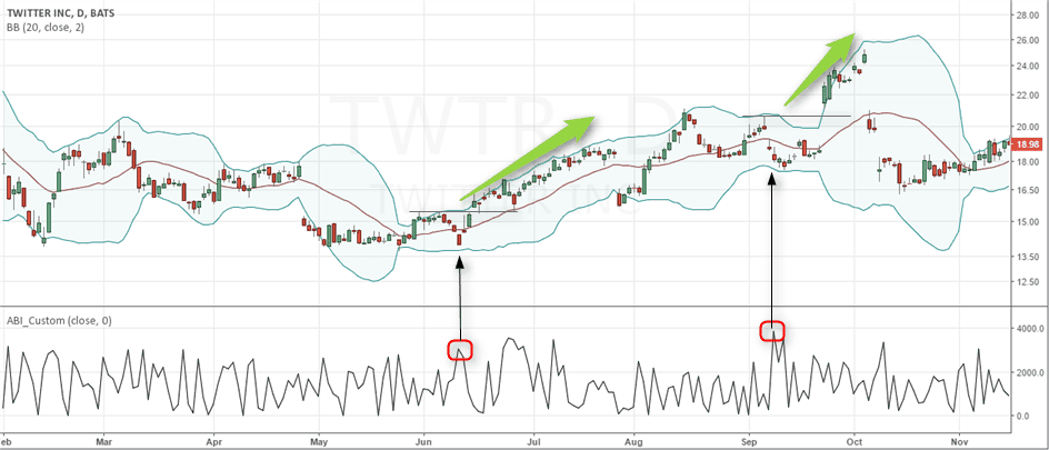
Below is the daily chart of Twitter with both Bollinger Bands and the ABI.
Bollinger bands with ABI
In the above example, there are two instances of a long position. In each scenario, it wasn’t like the candlesticks were closing outside of the bands.
The signals really are about the price hitting support, high ABI readings and the candlestick getting close to the lower bands.
After this level of confluence, there were short-term price increases which are great for swing traders.
In Summary
The absolute breadth index is great when you combine signals with blue-chip stocks. This is because large-cap stocks are most likely to be impacted by movement in the broad market.
Using the ABI to identify trade opportunities for low float stocks is likely a nonstarter. Not because the ABI is wrong, it’s more about the volatility of penny stocks cares little with broad market activity.
Breadth Thrust Indicator Overview
Dr. Marty Zweig, a Wallstreet legend is the creator of the indicator.
The Breadth Thrust indicator measures market breadth by dividing the advancing issues by the sum of the advancing and declining issues on the New York Stock Exchange. The output of this calculation is a ratio is then calculated over the last 10 periods to give you the value of the indicator.
The indicator can work as an intermediate timing tool and it can also identify long-term buying opportunities.
Why is the Indicator So Popular?
Dr. Zweig was known for combining both fundamentals and technical analysis when making market forecasts. Zweig used the Breadth Thrust indicator to pinpoint major shifts from a bear to a bull market.
The Trigger
The Breadth Thurst indicator is oversold below 40 and overbought above 61.5. When the indicator is able to move from 40 to 61.5 in less than 10 days, this is a sign of a major shift to the long side in the market.
This bullish signal is so popular, it is covered by major financial news outlets, in the same manner, these shows report when the market breaks the 200-day moving average.
How Does the Breadth Thrust Indicator work?
Unlike other oscillators, the indicator focuses on the rate of change from oversold to overbought.
Zweig theorized that a rapid rate of change of money from bear to bull increases the likelihood stocks will push higher over the long-term.
1984 to 2009
There were no signals for 25 years (1984 through 2009). This is undeniable proof this signal is for long-term moves.
Do you think you can wait that long for a trade signal? Make sure you set up an auto alert. Who can remember to look for a signal every day for 25 years!
The signal finally showed up after the 2008 global financial crisis and the market hasn’t looked back since.
The chart below shows this major market bottom that was called by the Breadth Thrust indicator.
Zweig Breadth Thrust Indicator gives a major signal in March 2009
The indicator made the move in just eight trading days.
Another Major Buying Opportunity Example
In addition to identifying market bottoms, the indicator can also inform investors when they should stay long in the market.
During October 2015, the markets were in a state of uncertainty with the China slowdown and the possible tightening from the U.S. Federal Reserve. Some investors viewed this data as a reason for trimming their exposure to equity markets.
However, the Breadth Thrust indicator was giving a different trade signal.
The chart below shows the period between September and October 2015. As the market put in a double bottom, the indicator also gave a buy signal.
Zweig Breadth Thrust Indicator, September 2015
Within a span of 8 trading days, the indicator shot up from below 0.40 to above 0.615 – signaling a buy. The S&P500 rallied nearly 4% before stalling near the 2100 level.
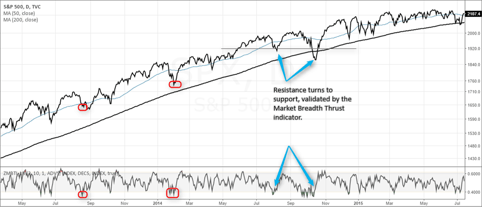
How To Use the Market Breadth Indicator to Validate Trend Strength
The market breadth indicator can also help validate trends and turning points in the market.
To better understand how to use the market breadth indicator as a confirmation tool, let’s look at an example.
Zweig Breadth Thrust indicator as a market confirmation tool
Two Trade Signals
First, when the market slips below the 50-day moving average, you wait for the Breadth Thrust indicator to trend up again to validate the buy signal.
Next, you can identify support on the chart and then look to the indicator to validate if the support will hold. Please see in the above chart how previous resistance later turns to support.
The indicator then gives a major buy signal after briefly penetrating the level.
Should Day Traders Use the Signal
Since the indicator has such a long-term perspective, day traders should not obsess over watching the ratio.
However, once day traders see the sign of strength, they will want to utilize more of their long strategies as there are greater opportunities on the bull side.
In Summary
Between 1945 and 2000, the indicator signaled fourteen buy signals.
The average gain for each signal was 24%!
The question now is will the indicator continue to provide accurate forecasts for turning points in the market and will the average gain continue at these levels?
Highs Lows Ratio Overview
The new highs lows indicator ratio measures the number of securities trading on the New York Stock Exchange (NYSE) that are hitting a 52-week high or 52-week low.
The indicator performs this calculation for stocks, preferred stocks, closed-end funds, and ETFs.
Traders and investors have used the new highs lows indicator ratio to gauge market sentiment.
The greater the number of stocks reaching a new 52-week high, the greater the bullish sentiment. The opposite is true when stocks are hitting 52-week lows.
Divergence Signals
The indicator is most popular for its ability to give a clue into the topping and bottoming process.
For example, when the market is making new highs, but there are fewer stocks moving the market – something is off.
The less participation in the move the greater the likelihood of a pending correction.
The hard part like anything else in trading will be timing the correction.
From the Perspective of a Day Trader
As an active trader, divergence in the broad market is not your primary concern.
You are likely in trades for a few minutes to hours. Therefore, a pending selloff in the broad market is not your concern.
Swing Traders
For swing traders, the new high/low ratio is worth a glance at the beginning of each trading week.
How to Calculate the New High New Low Indicator
You can view the new highs lows indicator on a weekly basis on many financial websites. Below are a few general rules of thumb:
The market is positive when the NH/NL ratio is trending towards the upside. Ex: 400 new highs to 45 new lows
A negative NH/NL ratio means the market is trending towards the downside. Ex: 40 new highs to 350 new lows
The market is churning or is split if the NH/NL ratio is even. Ex: 400 new highs and 400 new lows
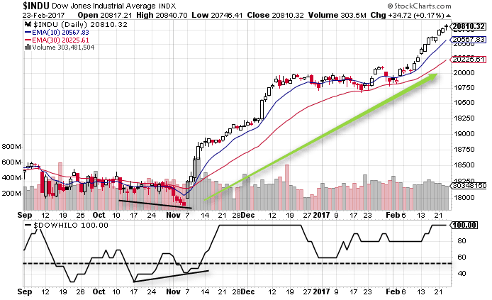
The picture below shows the weekly number of new highs and new lows across the different exchanges, published by Barrons (click here to access).
Barrons’ Weekly new highs and lows indicator (source)
As an example, the above data for the week ending 23rd February 2017 shows 403 Nasdaq stocks making a new 52-week high against 36 Nasdaq stocks making a 52-week low. The NH/NL ratio, in this case, happens to be 11.19.
Applying this to the Nasdaq composite index you can see that the ratio of highs and lows coincide with the high in the index, thus implying the markets are rallying with broad participation.
Nasdaq Composite index (23-02 Closing)
Different Names – Same Indicator
The new highs and new lows indicator go by different names, depending on your charting platform. You will also notice certain platforms applying various configurations, but these all essentially get you to the same place.
For example, stockcharts.com calls the new highs lows indicator as the High-Low index.
The high low index is a version of the indicator which uses a 10-day average of the record high percent.
You calculate the record high percent by dividing the number of stocks making a 52-week high by the sum of all stocks making a 52-week high and a 52-week low.
For example, if you look back at the previous data for Nasdaq, (403 NH and 36 NL), then the record high percent is 403/(403+36) which is 0.917 or 91.7%.
The chart below shows the S&P500 stock chart with the SPX HI-LO indicator. The indicator shows extremes, which coincide with the peaks and troughs in the index.
SPX Stock Chart with the SPX Hi-Low indicator (Source – Stockcharts.com)
Strategies to use the new highs lows indicator
Here are three ways traders can use the new high new low indicator.
1. Timing the Markets
50 NH/NL Reading + 10-Period Simple Moving Average
Because the indicator tracks the components of the exchange, it is best used on an index like the Nasdaq or S&P 500.
By tracking an index you can invest in the broad market by buying an ETF or futures contract.
You can use a sign of 50+ on the new high new low indicator in combination with a cross above the 10-period simple moving average.
The chart below shows the SPX applied with the 10-day simple moving average with the new high new low indicator. In the region marked, you can see that the indicator is above 50, and this is later confirmed by price trading above the 10-day moving average.
Timing the market with the New High New Low Indicator
It is up to the trader from here on as to whether they want to hold their position or book profits quickly.
In this strategy, the focus is not to confirm whether the market high is validated by the number of stocks making new 52-week highs but to use the 50-level in the oscillator to see which way the market is biased.
A reading between 50 and 75 is a fairly good indicator that the market sentiment is bullish and thus traders can buy into the rally. The bullish bias is even stronger when other indicators such as moving averages validate the move.
2. Buying Channel Breakouts
The Donchian channel indicator makes for a great addition that compliments the new high new low indicator.
The chart below shows the 20-period Donchian Channel applied as an overlay on the chart with the new high new low indicator.
Donchian Channel with New High New Low Indicator
With the Donchian channel strategy, the trading rules are simple.
Buy when price breaks out above the 20-period high and the new high new low indicator is above 90. You can, of course, configure this value to fit your trading style.
The blue arrows show potential levels where you would have been long.
Once the new highs lows indicator ratio is above 90, in this example and price breaks above the 20-period Donchian channel, you can place a long position and hold until the new high new low indicator dips below 90.
The first section shows a long position from around 2180 on November 21. The position was held until we got an exit trigger at 2240 around December 27, thus giving a 40 point move.
Following, the red arrow shows the area where you would have remained on the sidelines as there was no breakout in the Donchian channel at the time the new high/new low indicator was above 90 or vice versa.
The more recent signal came around 12th or 13th of February with a long position at 2310 with the long position still held while the S&P500 is at 2363.81.
3. Divergence and moving average confirmation
The new highs lows indicator can also be used as a divergence indicator to spot any discrepancies while also applying as a confirmation for a bullish moving average crossover.
The next chart below shows the divergence as the Dow Jones Index falls to make a new low, but the new high new low indicator shows a higher low.
This is later followed up by the bullish moving average crossover and validated by the new high new low indicator above 50 and rising.
New high new low indicator as a bullish confirmation indicator
In Summary
As you have heard in the above strategies, there are many different uses with the new highs lows indicator. As a day trader, you don’t need to obsess the movement of the indicator.
Regardless of which approach you land on, you will need to go back and test the signals. You may uncover signs that will help navigate the current market uncertainty.
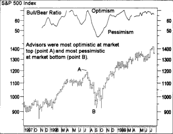
Bull bear ratio is a technical indicator that is not quite technical. Unlike most other indicators you might have come across, the bull bear ratio is quite different.
Most traders tend to get lost in the world of technical indicators. As you might know, most of these indicators are based on price. The indicators derive their value based on a formula. These formulae can vary to give you different market information.
Therefore, you have indicators to help you gauge the momentum of the markets. You also have indicators to gauge the market trend and so on.
This is where the bull bear ratio is different. The bull bear ratio is a market opinion indicator. It tells you the opinion of those who are directly dealing with the markets. These include investment advisors, hedge fund managers and so on.
As a trader, understanding how the bull bear ratio indicator works can be of great help. With this indicator, you will know what the opinion is. As you might already know, the markets can be irrational. The irrationality comes from the people behind the markets. These are the investment managers and hedge funds and other similar experts or professionals.
In this article, we look at what the bull bear ratio is and how it works. You will also learn how to use the information from the Bull bear ratio to apply to your day to day trading.
Bull bear ratio – How it works?
The bull bear ratio is a survey that is put into visually understandable data.
Every week, Investor Intelligence conducts a survey of over 100 top investment advisors. The survey asks the investors their opinion about the market.
The responses can be bullish, bearish or neutral. The survey is then complied and released every Wednesday.
The data is quantified into the bull bear ratio.
The formula used to quantify the bull bear ratio is as follows:
[Number of Bullish views/ (Bullish + Bearish views)] x 100
Looks very simple right?
Let’s illustrate this with an example.
Say there are 45 advisors who are bullish, 30 who are bearish and 25 advisors are neutral on the market. We can now quantify this by using the above formula.
[45/(45+30)] x 100 = 60%
This means that overall, investors are 60% bullish.
Now if you keep a record of the values over time, you can get a bigger overview of the markets. If the bull bear ratio was seen consistently rising over the past five or ten weeks, you can see that the optimism is rising.
When you use this information and apply to the index chart such as the S&P500 you get some interesting results. Using the bull bear ratio, you can see how the market views coincide with turning points in the stock index.
But there is something you should know. Don’t expect the investment advisors to be honest in their responses. This is where things could go wrong. For example, an investment advisor might just tick a box randomly.
A few such responses could lead to an incorrect reading on the index. However, as long as you don’t totally rely on the bull bear ratio as the Bible, you should be fine.
How to use this information, you ask?
Bull bear ratio – How to interpret the data?
You might have heard about this, but there is a frequent saying on Wall Street about making money. Sure, there are many phrases alright. One common saying is that to make money in the stock market, you only have to go against the crowd.
The ironic part though is that even the experts in the field are also wrong most of the times. If you read in the previous section about how the bull bear ratio works, it should be evident by now. The survey is based on the responses from the experts.
The experts are none but the hedge fund managers and investment advisors. The bull bear ratio is built on the responses from these so called market experts, you can see the irony.
Using the bull bear ratio is very simple. Every time the reading reaches an extreme, you can expect the market to turn around. For example, when the bull bear ratio hits an extremely low reading you can anticipate the stock market to bounce.
Conversely, when the bull bear ratio has an extremely high reading, you can expect a market correction. There is some subjectivity is involved though. In the general market practice is to stay cautious when the indicator rises above 60 percent or below 40 percent.
These levels start to show how extreme the optimism or the pessimism can get.
Bear in mind though that using the bull bear indicator will not make you rich. Sometimes, the corrections can be brief and you could end up getting caught on the wrong side. Therefore, the information you get using the bull bear ratio should be used along with other indicators.
You should apply fundamental analysis along with market psychology and technical indicators can of great help.
Bull bear ratio – Does it even matter?
This is a valid question to ask. After all, can you really base your investment decisions on a survey?
But here’s the thing. The bull bear ratio is a quantitative measure of market opinion. These are opinions about people working the market. As you might know, market psychology plays a big role.
Market psychology is so important that there are some people who research into this field as a full time study. This article is a great starting point to understand market psychology. The 14 stages of emotions an investor goes through, is applicable for everyone.
If you still didn’t believe in market psychology, then bubbles are a great example. Take the example of the most recent bubble in the cryptocurrency market. The euphoria drove prices so high that evidently it became too hard to resist.
This article from Stanford Business looks at the relationship between price and psychology. The study looks at a Palm Inc. which was a spinoff from 3Com. At one point the market opinion pushed the price of Palm Inc. even higher than its parent company.
Coming back to the topic of why the bull bear ratio matters think of it as an indicator of the “feel” from the people who are closest to the markets. But again, note that opinions and feelings can change. So by the time the survey is published, the sentiment could easily change.
The sentiment can change for a number of reasons. Perhaps some investment advisors had a bad day, or perhaps there was big news that brought cheer. For example, the stocks initially fell when Trump became President.
But the next day, the sentiment changed on just a speech by the new President.
The bull bear ratio is just an indicator of what the people in the markets feel.
How to use the bull bear ratio in trading?
First off, you should know that the bull bear ratio is not an indicator day traders would use. Because the data is published weekly, sentiment changes take time. Just because investors felt bearish last week doesn’t mean you will profit shorting the market.
Therefore, the bull bear ratio is more suited for swing traders.
You can get the bull bear ratio indicator from most stock market screeners and some charting platforms. There are also many companies that publish the bull bear ratio every week, such as this one.
Bull bear ratio report (Source: Yardeni.com)
Click on Stock market indicators and then click on Bull/Bear ratio to get the latest weekly data.
The chart below shows an illustration of the S&P500 index with the Bull bear ratio indicator on the lower part.
Bull bear ratio chart with S&P500 Index
The above chart illustrates how market opinion is quantified into a visually understandable form. The bull bear ratio in the above chart is at the lower part and the indicator oscillators within fixed values. In this chart, we use the levels of 0.60 and 0.40. This is nothing but the 60 percent and 40 percent levels of sentiment.
Whenever the indicator is extremely bullish or bearish you can see the markets turning. Of course, in the above chart, there are instances where the indicator did not exactly get it right. But the main take away from the above example is that you can use the bull bear ratio indicator to gauge the market activity.
When there is a steady increase in sentiment you need to ask yourself if it is a good time to buy. Or, if the indicator is steadily falling, should you be selling?
Bull bear ratio – Is it the right indicator to use for you?
What is certain is that you can use the bull bear ratio to time or even gauge the market. You can combine other aspects such as scaling in and out in order to build or decrease your positions in the market.
There are many ways one can use the bull bear ratio. You can for example time your entry into the market. Also, it is important that you do not use this indicator in isolation. You can get validity by using other similar indicators.
For example, the Chicago Board of Options Exchange (CBOE) publishes its famous volatility or VIX indicator. This gives you the actual position of the put and call ratios in the market.
When you combine the information from the bull bear ratio and the VIX index, you can get a fairly better idea of what is going on. From here on, you can then continue to narrow down by applying your technical strategy to swing trade the markets.
VIX with the bull bear ratio for S&P500
You should also know by now that the bull bear ratio is best used on an index. Therefore, you could look to trading the S&P500 futures or the Dow Jones futures or other derivatives. This way, the bull bear ratio will help you to trade the broader markets better.
Market sentiment indicators
Finally, the bull bear ratio is just one of the many market sentiment indicators that are available. The indicator in question is based on responses from the Investors Business Daily data. The IBD is just one of the many companies that publish the responses.
Other examples that are similar to the bull bear ratio is the survey published by the American Association of Individual investors (AAII). There are also other sentiment ratios published by large investment banks. However, no matter which way you look, you can almost see the different variations validating each other.
So don’t get too caught up with which data you are using.
As a swing trader, it is important that you stick to one and use that information.
For the most part, the average investor or swing trader often focuses on the day to day happenings in the market. However, there are now many different ways to get a good understanding of the market. Of course, this is by no means the way to get rich with stocks.
What the market sentiment indicator such as the bull bear ratio tells you is how you can avoid the traps in the market.
There is a saying about how the trend is your friend. There is also a saying about how the average investor always gets it wrong. With the market sentiment indicator such as the bull bear ratio, you can now get a leg into how the market is thinking.
ARMS Index – Brief Overview
The Arms index is a market breadth indicator used mostly by active traders to forecast intraday price movements. The Arms index was developed by Richard Arms in the 1960’s and is commonly referred to as the TRIN, which stands for Trading Index.
The TRIN or Arms index determines the strength of the market by taking into account the relationship between advancers, declineers, and their respective volume.
In theory, if there is broad market strength – all boats rise. Conversely, if the broad market is tanking, stocks are likely going lower on the sh0rt-term.
In this article, you will learn key factors and strategies for how to use the Arms Index to help with your trading.
4 Quick Things to Know About the ARMs Index
#1 – Understanding the Arms Index (TRIN)
For all its complexity in terms of number of calculations performed in real-time, the Arms Index is pretty simple to visually understand.
The indicator fluctuates around the zero-line. Depending on where the TRIN indicator is relative to the zero-line, the market can be viewed as either overbought or oversold.
In this regard, the Arms index is similar to other oscillators in that it fluctuates around fixed values and provides overbought and oversold conditions.
One of the most important aspects of the TRIN/Arms index is that it not only shows how many stocks are advancing and declining but also includes volume which brings additional confidence to signals.
Think about it, would you want to take a buy or sell signal if a stock is up 100% on 100 shares? I know this is an extreme example, but imagine if a few thinly traded stocks had the ability to wildly swing the values on the Arms Index.
#2 – 4 Components of Arms Index
While it is not important to know the intricate details on how the TRIN index is formed, it is important that a trader knows the basic components.
Four major components:
Advancing issues: This is the indicator that shows the number of stocks (on the exchange) that closed higher
Declining issues: Number of stocks (on the exchange) that closed lower
Advancing volume: This shows the summed up volume of all stocks (on the exchange) that closed higher
Declining volume: This shows the summed up volume of all stocks (on the exchange) that closed lower
I’m not going to go any further than this on calculations – this is why God made Wikipedia.
#3 – How to read data from the TRIN or Arms Index?
When there is a strong up day in the markets (advancing issues are higher than declining issues), the TRIN index falls below 1.0. Conversely, when there is a strong down day in the markets (declining issues are more than advancing issues), the TRIN or Arms index moves above 1.0
There are also times when there are high readings on the Arms index – meaning there is extreme bullish or bearish sentiment. These extreme levels are often an early indication a reversal is likely on the horizon.
Once the TRIN signals these extreme positions, traders can wait for price confirmation and act accordingly.
While the TRIN or the Arms index has a neutral point of 1.0, the extreme values can vary from one exchange to another. Ideally, the extreme values are read as 2.0 which usually signal that the market has formed a short term bottom.
#4 – TRIN vs TRINQ
The TRIN indicator is available in two formats.
The TRIN displays data for stocks on the NYSE and the TRINQ shows data for NASDAQ stocks.
The next chart shows the TRINQ applied to the Nasdaq 100 index to get a better idea on the indicator and its application to the stock chart.
TRINQ and NDX chart
Notice how as the Nasdaq 100 spikes to the downside the TRINQ also reaches levels above 1.5.
Please do not read this and start placing buy orders every time the TRINQ spikes. Remember there is no ceiling on how high the indicator can jump.
Day Trading with the Arms Index (TRIN)
#1 – Trades Based on Arms Readings Intraday
Now that we have dived into the technical aspects of the ARMs indicator and some quick facts, let’s now shift gears into trading strategies.
The below chart depicts key turning points in the Nasdaq 100 Index and how these correlate with the Arms index.
Arms index (TRIN Indicator) shows turning points in prices
From the above example we can make a number of observations.
For starters, when the Arms index is above 1.0 (the neutral point) but below 2.0 it signals that stocks are under pressure and a short-term decline is near. This is the time when day traders need to exit their long positions if any, or short sell the stock in question.
Similarly, when the Arms index is below 1.0 it signals buying pressure in the markets and thus, day traders can expect to see a short-term reversal. In this scenario short positions are off the table.
In the above chart, there are three instances highlighted where the TRIN signaled a short-term correction in prices. On the price chart, the sessions or candlesticks marked by the red arrow indicate the price action which signals the upside move in prices.
In the first instance, we had a morning star type of candlestick pattern. The second instance, we had a harami type of candlestick pattern with support from the 50 and 200 period EMAs. In the final scenario we had a bullish reversal candlestick pattern after the TRIN indicated a decline.
What’s common to all these signals is a three-step process.
TRIN signals a correction and price falls accordingly
Price confirms a reversal (which could also be validated by the respective volume of the security being analyzed)
Exceed the previous high – signaling a continuation
#2 – Detecting Extreme Readings in the Arms Index
One of the drawbacks of the TRIN or the Arms index is that the turning points are not exact. Therefore, traders should look at entering the trade when there are more validations to the bias.
Sometimes, the Arms index can also post extreme readings. The next chart below shows the AAPL stock chart with the TRIN index.
Extreme readings in TRIN coincide with sharp reversal in prices
Here you can see in the first instance where the Arms Index posted an extreme reading above 1.75 and below 0.5. These extreme readings usually coincide with sharp reversal in prices.
You will want to combine these extreme readings with high market cap stocks, since these securities will likely respond the most to shifts in the Arms index.
These are symbols like Apple, Google, and IBM.
#3 – Day Trading with the Arms Index and Bollinger Bands
In this day trading strategy, speculators can use the Arms Index alongside Bollinger Bands to short or go long when the Arms index spikes and the market is testing the upper or lower bands.
Please see the below chart for examples.
TRIN Indicator with Bollinger bands
Traders will need to keep tight stops to avoid scenarios where the market begins to run away from you and ride the bands.
However, in choppy or markets where the overall trend is flat, you can use the spike in volatility to go counter to the market for a scalp trade.
Is the Arms Index a good indicator for Day Trading?
Seems like a funny question since we just posted a day trading strategy with Bollinger Bands.
I think a better way of answering this question is what are all the key ways the Arms index can help with your trading.
Oversold/Overbought Levels
For one, traders can use the oversold and overbought levels as a confirmation to enter into a trade based on the analysis of their own trading strategy. Here, the TRIN can be a helpful tool to validate these turning points in prices.
Extreme Readings
Another way is to look for the extreme readings in the indicator. Depending on the stock or the security in question, an extreme reading can typically signal a strong price movement that day traders are alerted to ahead of time.
Trend Trading
The TRIN indicator is also ideal for trend traders. Although this would mean that traders need to keep an eye on the long term charts as well as the short term charts in order to pick the intraday or the short term reversals indicated by the Arms index.
Remember that prices can continue to post reversals when moving within a trend. Therefore, day traders should not mistake this to be a change of trend but rather the price corrections within a trend.
In Summary
The Arms index is not going to cook your dinner, but it can give you an idea of when it’s time to jump on or off a trend during the trading day.
If you swing trade or conduct long-term investing, you will likely want to ignore these readings unless you are looking for really extreme readings to gauge if a market is shifting.
In this article we are going to cover methods you can use today to begin forecasting market direction with the Russell 2000 Index.
Before we dive into the meat of the article, for those of you unfamiliar with the Russell 2000, I will provide a brief overview to ground you on the Index.
Russell 2000 Index Key Facts
The Russell 2000 Index is the list of small and mid-size companies from the United States.
For those of you that did not know, the Russell 2000 index is not managed by a US company, but is actually managed by the London based firm FTSE Russell, a subsidiary of the London Stock Exchange Group (LSE Group).
Another key fact about the Russell 2000 Index is that it is the bottom or smallest stocks in the Russell 3000 index.
Here are a few additional key stats from the FTSE Russell as of April 30, 2018:
Russell 2000 Index Key Facts
The average market cap is 2.5 billion dollars
Median market cap is 862 million
Largest Stock Market Cap is 13 billion dollars
There are 1,974 stocks on the Index (not exactly 2000)
For more facts on the Russell 2000 Index, please visit the FTSE.com website and review their wealth of fact sheets (no pun intended).
In addition to these stats, what makes the Russell 2000 Index unique is the types of stocks that make up the 1,974 companies listed. Remember, small and mid-size companies are the engine that fuel growth.
No one expects the next technological innovation to come from IBM. It’s likely going to be some college kids in their garage thinking of some “crazy” idea.
Also, the Russell 2000 Index has stocks from all types of industries: retail, housing, technology, finance, etc. So again, more representative of the entire U.S. economy.
Lastly, the Russell 2000 Index value is weighted by the total number of shares outstanding by the price value of the stock. This is different than most other Indexes which base their value on the full market capitalization.
Why the Russel 2000 for Forecasting?
You can use any Index to try and gauge the direction of the market. However, I would much rather use the Index with a large number of healthy stocks to determine where things are going.
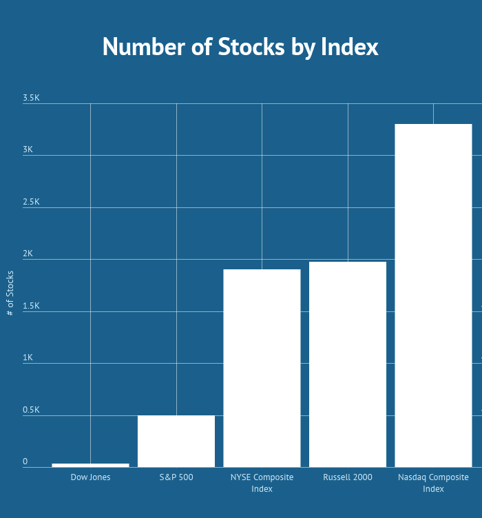
The below table illustrates the number of stocks for each of the major US Indexes.
Number of Stocks by Index
So this graphic clearly contradicts my point about the Russell 2000 having so many stocks, because the NYSE has just as many and the Nasdaq has more stocks listed.
The key difference which is not represented in this graphic is the Russell 2000 again has small and midcap stocks. The NYSE has mostly large companies and the Nasdaq is heavily weighted in the Technology space.
The ability for the Russell 2000 to cover a large breadth of stocks that haven’t hit “Too Big to Fail Status” is what gives the Russell its powerful forecasting abilities.
Now that you have an idea of the size and scope of the Russell 2000 Index, let’s talk about three methods you can use to forecast major market moves.
Strategy #1 – Locate Divergences of the Large Cap Indexes and the Russell 2000
For this first strategy, the first part of our hypothesis is that divergence between the Russell 2000 Index and other Indexes lead to changes in market trend.
Please do not interpret this to mean if the Russell 2000 Index is up at noon, then the Dow Jones is surely to follow suit by end of day.
Think of the leading indicator in the context of when major lows and highs present themselves in the market.
Instead of just reviewing the Russell Index, let’s take a look at the Russell ETF (IWM) since it mirrors the price action and you can actually purchase shares.
Russell 2000 and Dow Jones Price Divergence
The above charts are of the Russell 2000 ETF and the Dow Jones ETF from early 2016. Notice how the Russell 2000 continued pushing to new lows in mid-February, while the Dow Jones held up.
This was a clear sign that the market was not aligned.
Here comes the tricky part – you need to decide which way the market is going to break. From this example you can see that the bears were unable to keep the Index beneath its prior low. This bit of data in combination with the higher highs in the Dow Jones were your clues it was time to get long.
Strategy #2 – Trend Lines (Painfully Obvious)
Trading really isn’t that complicated. When you strip it down to the brass knuckles, tactics that worked 50 years ago are still in play today.
Now, I’m not talking about day trading techniques but the ability to identify major trends and forecasts in the market.
When it comes to identifying the direction of the market and its likely path going forward, trend lines are still at the top of the heap in terms of providing quality signals.
Let’s review the chart we used previously to identify the divergence between the Russell 2000 and the Dow Jones.
Russell 2000 Oversold – Trend Lines
As you can see from this image there was no need for fancy algorithms or complicated Fibonacci analysis. The Russell 2000 honored the support line while in a downtrend almost to the penny.
For those of you that think this was some sort of fluke, try explaining how the trend line was able to provide the support for almost 10 months. That’s more time than some people spend on a job.
Still not a believer, let’s take a look at what happened after the Russell 2000 broke out of the down trend and how the index is trading up to today.
Russell 2000 Uptrend – Trend Lines
I’m pretty sure my first grader can draw that uptrend channel. It’s just too clean.
If there is any thought the trend was a fluke; well this time the trend has held for over 9 months and is still going strong today.
So, from the uptrend line and price action on this chart, where do you think the Russell 2000 will be headed in the next one to three months? That’s right – higher.
Strategy #3 – Keep an Eye on Mutual Fund Rotation
It’s wildly known in the trading community that mutual fund managers and hedge funds rotate between large and small cap stocks depending on market conditions.
To do this, we do not need a quant analyst.
All you need to do is track the percentage gain and loss for the Russell 2000 against the Dow Jones.
You want to identify when for example the Russell 2000 goes from underperforming the Dow to flipping to positive.
This is an indication that investors are now shifting funds away from blue chips and into small and mid-cap stocks. This generally occurs when fund managers are open to taking more risks in order to maximize returns for their clients.
This also can occur when market sentiment is overly bullish and all boats are rising.
Russell 2000 versus S&P 500
These little blue and green lines hold a lot of truth to the trained eye.
The blue line represents the Russell 2000 and the green represents S&P 500 Value ETF.
Notice how the two Indexes were tracking closely to one another into early February. Then the Russell began to outperform the S&P 500.
The pullback in early April presented a great buying opportunity for entering into small and mid-cap stocks. As you can see the Russell has outperformed the S&P 500 by nearly 10%.
You will want to keep a close eye on the light green line. Once it crosses through the blue line, the smart money is now shifting funds back into the large cap plays.
In Summary
The Russell 2000 is an index and on many levels can act as a market breadth indicator to gauge the overall strength of the market. Even as an active trader you must keep an eye on the broad market in order to take a top down approach of (1) identifying the strongest markets, (2) finding the hottest stocks and (3) nailing the timing aspect of the trade.
Below is a quick recap of the three strategies:
You can use divergences between the Russell 2000 Index and other major Indexes to anticipate a change in trend
Trend lines don’t lie. Draw channels on daily and weekly charts to keep you on the right side of the market
Fund Rotation – keep an eye when money is flowing out of large cap and into small cap stocks. Once you see one improving relative to the other, it’s likely time ot shift your funds around.


 shows turning points in prices")