RSI Trade Settings Explained + 4 Unique Trading Strategies

RSI image

The relative strength index (RSI) is one of the most popular oscillators in all of trading. You have likely read some general articles on the RSI in your trading career, or have at least heard about it. However, in this post, we’ll present four unique, profitable RSI trading strategies you can use when trading.

Before we dive into the RSI trading strategies, let’s first ground ourselves on the basics of the RSI indicator. Then, we’ll provide you with a few relatively unknown techniques.

Relative Strength Index Definition

The Relative Strength Index (RSI) is a basic measure of how well a stock is performing against itself by comparing the strength of the up days versus the down days.  This number is computed and has a range between 0 and 100. 

A reading above 70 is considered bullish, while a reading below 30 is an indication of bearishness. Generally speaking, it helps to measure periods of overbought or oversold conditions.

Why the RSI?

As traders, our job is to look for an edge in the market. Indicators can certainly help with this if used correctly.

The RSI is no different. When used properly, it can help predict rising momentum, underlying demand or supply, and shifts in sentiment.

Using the indicator can also help predict trends, trend reversals, trend continuations, or stagnate corrections.

With practice, and in combination with a firm understanding of volume and price action, the RSI indicator can simply be a helpful tool in your trading arsenal.

Relative Strength Index Formula

The RSI was developed by J.Welles Wilder and detailed in his book New Concepts in Technical Trading Systems in June of 1978.

The default setting for the RSI is 14 days. You would calculate the relative strength index formula as follows:

Relative Strength =

1.25 (Avg. Gain over last 13 bars) +. 25 (Current Gain) / (.75 (Avg. Loss over last 13 bars) + 0 (Current Loss))

Relative Strength = 1.50 / .75 = 2

RSI = 100 – [100/(1+2)] = 66.67[1]

We certainly don’t recommend doing these calculations while you’re trading. After all, most charting platforms have an RSI indicator that does all the math for you.

The result is a plot on subchart that indicates the oversold and overbought conditions, like the one below this chart in this example:

NVDA RSI chart
NVDA RSI chart

How NOT To Use the Formula

Most traders use the relative strength index simply by buying a stock when the indicator hits 30 and selling when it hits 70. You can see these levels on the RSI indicator above.

However, if you remember anything from this article, remember that if you buy and sell based on this relative strength index trading strategy alone, “YOU WILL LOSE MONEY”.

The market does not reward anyone for trading the obvious. Now that doesn’t mean that simple methods don’t work. But simple methods that everyone else is following typically have low odds.

With that in mind, let’s discuss how to properly use this dynamic formula.

Finding RSI Indicator Settings

For every platform, the settings may be different. However, most platforms should have an RSI indicator.

Once you find the RSI indicator in your platform’s indicator index, you can edit the settings according to whichever relative strength index trading strategy you want to employ.

RSI Indicator Settings

In the screenshot above, you can see inside the TradingSim RSI settings. The default parameters are usually set for a 14 period and 80/20 upper and lower threshold.

Within, you can change the period from the standard 14 to whatever you prefer. You can also change the “overbought” and “oversold” parameters as you wish.

To that point, we’ll discuss different RSI trading strategies that may require you to modify these settings.

How to Use RSI Trade Signals

The RSI provides several signals to traders. In this next section we’ll explore the various trade setups using the indicator.

Defining the Current Trend

The RSI is much more than a buy and sell signal indicator. The RSI can provide you with the ability to gauge the primary direction of the trend.

So how do we do this?

First, we define the range where the RSI can track bull and bear markets.

Uptrends

For bull markets, you want to be on the lookout for signals of 66.66 and bear markets at 33.33 [2].

You’re probably noticing that this is slightly less than the normal 80/20 or 70/30 readings. These readings of 33.33 and 66.66 were presented by John Hayden in his book titled ‘RSI: The Complete Guide’.

John theorizes throughout the book that these levels are the true numbers that measure bull and bear trends and not the standard extreme readings.

rsi defining trend
RSI Defining Trend

Again, the RSI is not just about buy and sell signals. The indicator is about showing “strength,” particularly as a measure of the strength of the trend.

In the above chart example, the RSI shifted from a weak position to over 66.66. From this point, the RSI stayed above the 33.33 level for days and would have kept you long in the market for the entire run.

Downtrends

As you can see below, the RSI can also define downtrends. You just want to make sure the security does not cross 66.66.

Defining Downtrend
Defining Downtrend

Now, should you make buy or sell signals based on crosses of 33.33 and 66.66? Not too fast, there is more to the RSI indicator which we will now dive into.

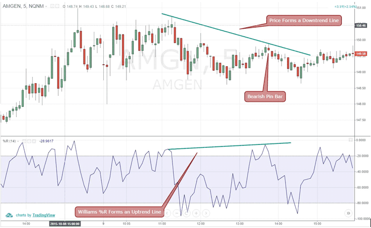
RSI Support and Resistance

Did you know the RSI can display the actual support and resistance levels in the market? These support and resistance lines can come in the form of horizontal zones, or as we will illustrate shortly, sloping trendlines.

Breakouts

In the example below, the RSI predicts a breakout.

RSI Breakout
RSI Breakout

You may not know this, but you can apply trend lines to indicators in the same manner as price charts. In the above chart, Stamps.com was able to jump significant resistance on the RSI indicator and the price chart.

This breakout resulted in a nice run of over 7%.

Breakdowns

Let’s take a look at another example. This time, the RSI was able to call a top.

In this example, the RSI had a breakdown and backtest of the trendline before the fall in price. While the stock continued to make higher highs, the RSI was starting to slump.

RSI Trend Breakdown
RSI Trend Breakdown

The challenging part of this method is identifying when a trendline break in the indicator will lead to a major shift in price. As expected, you may have several false signals before the big move.

There is no such thing as easy money in the market. It only becomes easy after you have become a master of your craft.

RSI Divergence with Price

This is an oldie but goodie, and is still applicable to the RSI indicator. Building upon the example from the last section, you want to identify times where price is making new highs, but the Relative Strength Indicator is unable to make new highs.

RSI Divergence
RSI Divergence

This is a clear example where the indicator is starting to roll as the price inches higher.

RSI Double Bottom Signal

The Relative Strength Index can also be used for typical patterns like double bottoms.

For the example below, the first price bottom is made on heavy volume. This occurs after the security has been in a strong uptrend for some period.

Note that the RSI has been above 30 for a considerable amount of time. Nonetheless, after the first price sell-off, which also results in a breach of 30 on the RSI, the stock also has a snapback rally.

Double Bottom
Double Bottom

This rally is short lived and is then followed by another pullback, which breaks the low of the first bottom.

This second low is where stops are raided from the first reaction low. Shortly after breaking the low by a few ticks, the security begins to rally sharply.

Consequently, the second low not only forms a double bottom on the price chart but the relative strength index as well.

The reason this second rally has strength is (1) the weak longs were stopped out of their position on the second reaction, and (2) the new shorts are being squeezed out of their position.

The combination of these two forces produces sharp rallies in a very short time frame.

Exercise Caution

The tricky part about finding these double bottoms is timing. After the formation completes, the security may be much higher.

You are going to need tight stops to avoid ending up on the wrong side of the trade.

As mentioned earlier, it is easy to see these setups and assume they will all work. What people do not tell you is that for every one of these charts that play out nicely, there are countless others that fail.

It only takes one trader with enough capital and conviction to make mincemeat out of your nice charts and trendlines.

To that point, be sure to test your RSI trading strategies in a simulator first. This way you have an understanding of your probability for success.

RSI and the Broad Market

If you want to assess the broader market, there is an interesting approach of applying the RSI to the McClellan Oscillator.

Essentially, the McClellan measures the advancing and declining issues across the NYSE.

RSI Broad Market
RSI Broad Market

This won’t help you much day trading, as this sort of weakness in the broad market only occurs a few times a year.

However, if you are in the middle of a day trade, it might prepare you for the tidal wave that’s coming.

It’s amazing how applying a strength measurement to a broad market indicator can reveal when weakness hits a tipping point.

If you find this interesting, here is a post that analyzed the return of the broad market since 1950 after the RSI hit extreme readings of 30 and 70.

In the post [3], senior quantitative analyst Rocky White makes the case that over the short-term after a reading below 30, the bears are still in control. However, if you look a little further to the intermediate-term, the bulls will surface and a long move is in play.

Trading Strategies Using the Relative Strength Index Indicator

Although the RSI is an effective tool, it is always better to combine it with other technical indicators to validate trading decisions. The relative strength index trading strategies we will cover in the next section will show you how to reduce the number of false signals so prevalent in the market.
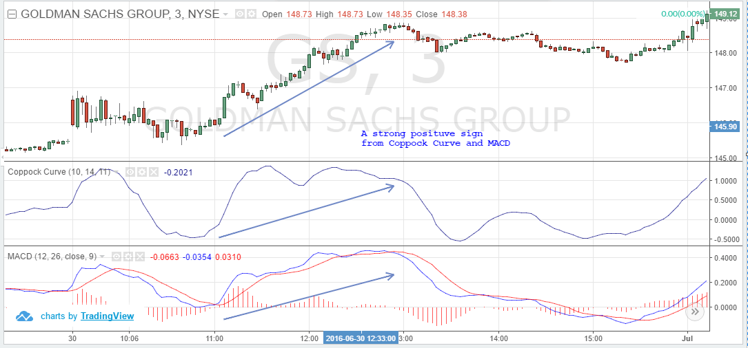
#1 – RSI + MACD

In this trading strategy, we will combine the RSI indicator with the very popular MACD.

In short, we enter the market whenever we receive an overbought or oversold signal from the RSI supported by the MACD. We close our position if either indicator provides an exit signal.
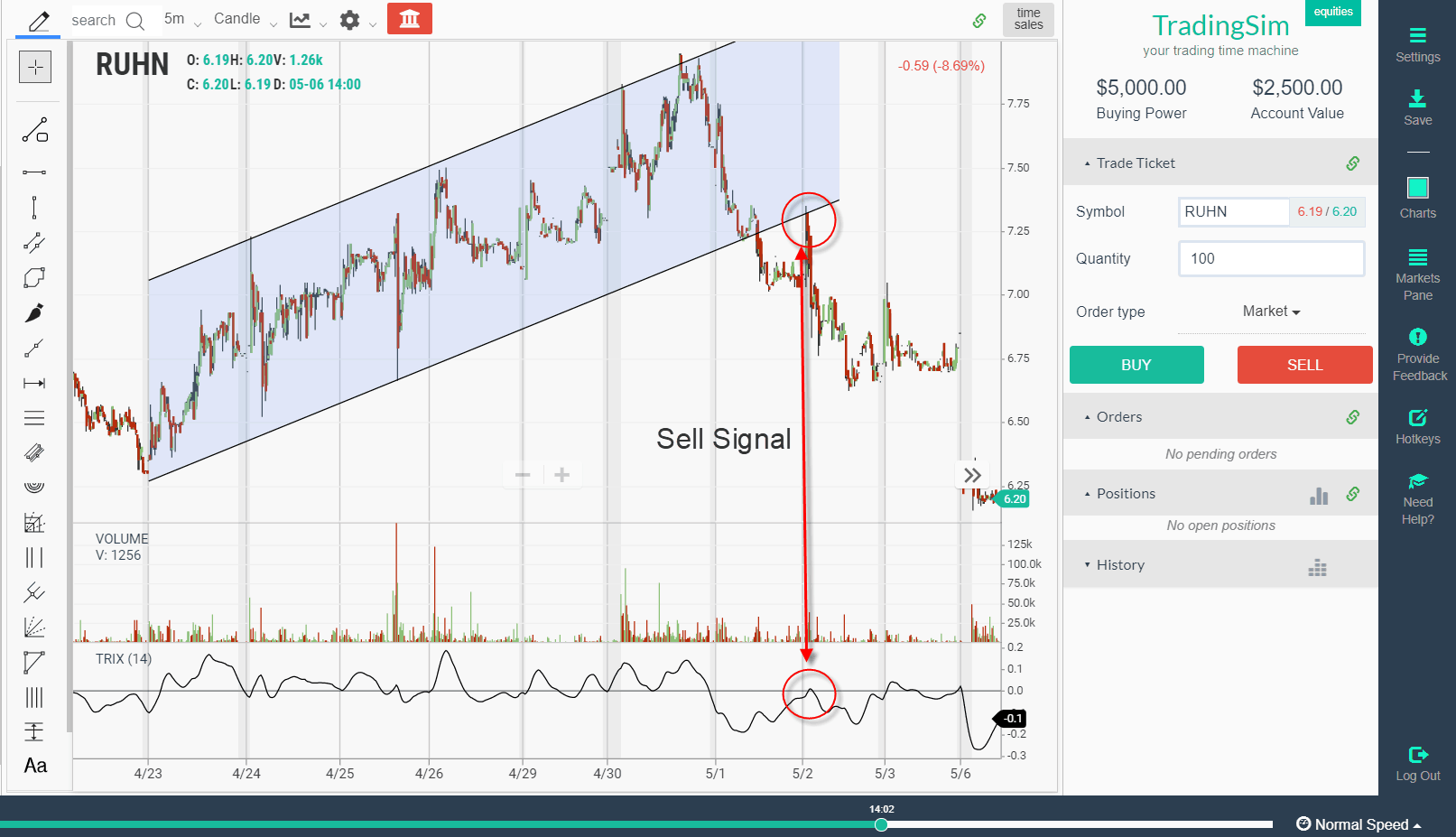
Example

This is the 10-minute chart of IBM. In this relative strength index example, the green circles show the moments where we receive entry signals from both indicators. The red circles denote our exit points.

Relative Strength Index + MACD

Slightly more than an hour after the morning open, we notice the relative strength index leaving an oversold condition, which is a clear buy signal. The next period, we see the MACD perform a bullish crossover – our second signal.

Since we have two matching signals from the indicators, we go long with IBM. We appear to be at the beginning of a steady bullish trend.

Five hours later, we see the RSI entering oversold territory just for a moment. Since our strategy only needs one sell signal, we close the trade based on the RSI oversold reading.

This position generated $2.08 profit per share for approximately 6 hours of work.

#2 – RSI + MA Cross

In this trading strategy, we will match the RSI with the moving average cross indicator. For the moving averages, we will use the 4-period and 13-period MAs.

We will buy or sell the stock when we match an RSI overbought or oversold signal with a supportive crossover of the moving averages. On that token, we will hold the position until we get the opposite signal from one of the two indicators or divergence on the chart.

First, let’s clarify something about the MA cross exit signals.

A regular crossover from the moving average is not enough to exit a trade. We recommend waiting for a candle to close beyond both lines of the moving average cross before exiting the market.

Example

To illustrate this RSI trading strategy, please have a look at the chart below:

Moving average cross
Moving Average Cross Divergence

This is the 15-minute chart of McDonald’s.

The RSI enters the oversold area with the bearish gap the morning of Aug 12. Two hours later, the RSI line exits the oversold territory generating a buy signal.

An hour and a half later, the MA has a bullish cross, giving us a second long signal. Therefore, we buy McDonald’s as a result of two matching signals between the RSI and the MA Cross. McDonald’s then enters a strong bullish trend, and 4 hours later, the RSI enters the overbought zone.

At the end of the trading day, we spot a bearish divergence between the RSI and McDonald’s price. Furthermore, this happens in the overbought area of the RSI. This is a very strong exit signal, and we immediately close our long trade.

This is a clear example of how we can attain an extra signal from the RSI by using divergence as an exit signal. This long position with MCD made us a profit of $2.05 per share.

#3 – RSI + RVI

For this RSI trading strategy, we’ll combine the relative strength index with the relative vigor index.

In this setup, you will enter the market only when you have matching signals from both indicators. Hold the position until you get an opposite signal from one of the tools – pretty straightforward.

Example

This is the 15-minute chart of Facebook. In this example, we take two positions in Facebook.

Relative Strength Index - RVI
Relative Strength Index – RVI

First, we get an overbought signal from the RSI. Then the RSI line breaks to the downside, giving us the first short signal.

Two periods later, the RVI lines have a bearish cross. This is the second bearish signal we need and we short Facebook, at which point the stock begins to drop.

After a slight counter move, the RVI lines have a bullish cross, which is highlighted in the second red circle and we close our short position. This trade generated a profit of 77 cents per share for a little over 2 hours of work.

Facebook then starts a new bearish move slightly after 2 pm on the 21st. Unfortunately, the two indicators are not saying the same thing, so we stay out of the market.

Later the RSI enters the oversold territory. A few periods later, the RSI generates a bullish signal.

Relative Strength Index - RVI
Relative Strength Index – RVI

After two periods, the RVI lines also have a bullish cross, which is our second signal and we take a long position in Facebook. Just an hour later, the price starts to trend upwards.

Notice that during the price increase, the RVI lines attempt a bearish crossover, which is represented with the two blue dots.

Fortunately, these attempts are unsuccessful, and we stay with our long trade. Later the RVI finally has a bearish cross, and we close our trade. This long position with FB accumulated $2.01 per share for 4 hours.

In total, the RSI + RVI strategy on Facebook generated $2.78 per share.

#4 – RSI + Price Action Trading

For this strategy, we’ll use the relative strength index overbought and oversold signal in combination with any price action indication, such as candlesticks, chart patterns, trend lines, channels, etc.

To enter a trade, you will need an RSI signal plus a price action signal – candle pattern, chart pattern or breakout. The goal is to hold every trade until a contrary RSI signal presents, or price movement confirms that the move is over.

Price Action Trading Strategy

This is the 30-minute chart of Bank of America.

The chart starts with the RSI in overbought territory. After an uptrend, BAC draws the famous three inside down candle pattern, which has a strong bearish potential.

With the confirmation of the pattern, we see the RSI also breaking down through the overbought area.

With matching bearish signals, we short BAC.

The price starts a slight increase afterward. Perhap we wonder if we should close the trade or not. Fortunately, we spot a hanging man candle, which has a bearish context.

We hold our trade and the price drops again.

Notice the three blue dots on the image. These simple dots are enough to confirm our downtrend line. After we entered the market on an RSI signal and a candle pattern, we now have an established bearish trend to follow!

Later on, the trend resists the price rally (yellow circle), and we see another drop in our favor. After this decrease, BAC breaks the bearish trend, which gives us an exit signal.

We close our position with BAC, and we collect our profit. This trade made us 20 cents per share.

Which Trading Strategy Is Best?

If you are new to trading, combining the relative strength index with another indicator like volume or moving averages is likely a great start.

Pairing with the indicator will give you a set value with you can make a decision. It also removes a lot of the gray areas associated with trading.

Once you progress in your trading career, you may want to look to methods using price action that are more subjective. At this point, you may be able to apply techniques specific to the security you are trading, which could increase your winning percentages over time.

But again, this level of trading takes a ton of practice over an extended period.

Examples of where the Relative Strength Indicator Fails

I think it’s important to highlight where indicators can fail you as a trader and the RSI is no different.

At best you may achieve a 60% win rate with any strategy, including one with the RSI.

With that in mind, let’s layout the likely ways the RSI could burn you when trading.

#1 – The Stock Keeps Trending

The textbook picture of an oversold or overbought RSI reading will lead to a perfect turning point in the stock. This is what you will see on many sites and is even mentioned earlier in this very post.

However, we all know things rarely go as planned in the market.

False Sell Signals
False Sell Signals

As you see, there were multiple times that BFR gave oversold signals using the relative strength indicator. The stock continued higher for over three hours.

So how do you avoid such an unfortunate event if you are going short in the market?

Simple, you have to include a stop loss in your trade. This will be a common theme as we continue to dissect how the RSI can fail you.

#2 – Divergences Do Not Always Lead to Meltdowns

The tricky thing about divergences is that the reading on the RSI is set by price action for that respective swing.

Unfortunately, there are times where the price action itself changes from one of impulse to a slow grind.

Divergence False Signals

To this point, look at the above chart and notice that after the divergence takes place the stock pulls back to the original breakout point. But then something happens, the stock begins to grind higher in a more methodical fashion.

If you are long the market, it doesn’t mean you should panic and sell if the high is broken with a lower RSI reading. What it means is that you should take a breath and observe how the stock behaves.

If the stock beings to demonstrate trouble at the divergence zone, look to tighten your stop or close the position.

However, if the stock blasts through a prior resistance level with a weaker RSI reading, who are you to stop the party?

#3 – Tight Ranges

Extreme Readings
Extreme Readings

In some RSI examples, you may find scenarios where the indicator bounces from below 30 to back above 70 violently.

Well, all you have to do is buy the low reading and sell the high reading and watch your account balance increase. Right? Not exactly.

There are times when the ranges are so tight you might get an extreme reading. But it might not have the volatility to bounce to the other extremity.

So, like in the above example, you may buy the low RSI reading but have to settle for a high reading in the 50s or 60s to close the position.

Conclusion

By now we hope you have a much better understanding of the relative strength index indicator. Here are a few important takeaways to remember for this tool:

  • The RSI is a momentum indicator.
  • RSI oscillates between 0 and 100 providing overbought and oversold signals.
  • Readings above 70 are considered bullish.
  • Readings below 30 are considered bearish.
  • John Hayden promotes two key levels of 33.33 and 66.66.
  • The default RSI formula is calculated based on:
    • Gains over the last 13 periods
    • Current gain
    • Average loss over the last 13 periods
    • Current loss
  • Stop loss orders are recommended when trading with the RSI.
  • RSI should be combined with other trading tools for better signal interpretation.
  • Some of the successful RSI trading strategies are:
    • MACD + RSI
    • MA Cross + RSI
    • RVI + RSI
    • Price Action + RSI

More Resources

For more information on the RSI, check out this YouTube video which provides further clarification.

On that note, if you are interested in a master class on the relative strength index, feel free to visit our friends over at Mudrex.

To practice all of the trading strategies detailed in this article, please visit our homepage at tradingsim.com.

It’s really easy to see the perfect RSI setups, but the real success begins once you practice how to handle the situations which you don’t expect. As with any strategy, we recommend a minimum of 20 trades before employing real money.

External References

  1. Relative Strength Index. Wikipedia
  2. Hayden, John. (2004). ‘John Hayden in his book titled ‘RSI: The Complete Guide‘. Traders Press, Inc. pg. 66
  3. White, Rocky. (2019). Trading the Relative Strength Index (RSI): Does it Work?. moneyshow.com


Are you an indicator trader? If yes, then you will enjoy this comprehensive guide to one of the most widely used technical trading tools – the moving average convergence divergence (MACD).

In this tutorial, we will cover 5 trading strategies using the indicator and how you can implement these methodologies within your own trading system.

Beyond the strategies, we will explore if the MACD stock indicator is appropriate for day trading and how well the MACD stock indicator stacks up against moving averages.

How To Pronounce “MACD”

There are two ways you can pronounce MACD.

The first is by spelling out each letter by saying M – A – C – D. The more popular option is to say “MAC-D”.

In order for the trading community to take you seriously, these are the sorts of things we have to get right off the bat!

With that aside, let’s dig into the content.

Chapter 1: What is the MACD Stock Indicator?

moving average convergence divergence

The moving average convergence divergence calculation is a lagging indicator used to follow trends. It consists of two exponential moving averages and a histogram.

Formula & Period

The default values for the indicator are 12,26,9.

It is important to mention many traders confuse the two lines in the indicator with simple moving averages. Remember, the lines are exponential moving averages and thus will have a greater reaction to the most recent price movement, unlike the simple moving average (SMA).

Thus, the MACD lines are represented as follows:  12-period EMA and 26-period EMA.

If you want to learn more about the MACD stock indicator formula, check out the early part of this blog post [1] from Rayner over at TradingwithRyner.com.

This period can be changed to represent a slower or faster moving average (i.e. 5-minute, 60-minute, daily).

Smooth Line and Trigger Line

The MACD calculation generates a smoothed line as depicted by the blue line in the chart below.

MACD Line

Next up is the red line in the chart, is most commonly referred to as the trigger line.

The red line is the 9-period EMA of the MACD line.

This may sound a little confusing, but it’s simply an average of an average. This 9-EMA is then plotted on the chart with the MACD line. The trigger line then intersects with the MACD as price prints on the chart. 

To learn more about how to calculate the exponential moving average, please visit our article which goes into more detail.

Trigger Line
Trigger Line

The last component of the MACD is the histogram, which displays the difference between the two EMAs of the indicator (12 and 26). Thus, the histogram gives a positive value when the fast EMA (12) crosses above the slow EMA (26) and negative when the fast crosses below the slow.

Histogram
Histogram

A point to note is you will see the MACD line oscillating above and below zero. We will discuss this in more detail later, but as a preview, the size of the histogram and whether the MACD stock indicator is above or below zero speaks to the momentum of the security.

Chapter 2: Proper MACD Settings

Here is a chart of Amazon with default MACD stock indicator settings applied below the price action.

Standard MACD - Amazon
Standard MACD w/ 12,26,9 – Amazon

What would happen if we were to lower the settings on the trigger line to a shorter period?

As you can see from the revised AMZN chart below, the number of trade signals increased when we lower the moving average period from 12,26,9 to 6,20,10.

Fast MACD w/ 6,20,10 - Amazon
Fast MACD w/ 6,20,10 – Amazon

Generally speaking, more trade signals is not always a good thing and can lead to overtrading.

On the flip side, you may want to consider increasing the trigger line period, so you can monitor longer-term trends.

Just make sure the context matches the MACD parameters if you decide to play around with the default time periods. Otherwise, this can lead down a slippery slope of “analysis paralysis.”

Chapter 3: MACD Stock Indicator Trading Signals

moving average convergence divergence Stock Indicator Trading Signals

Moving Average Cross

You have likely heard of the popular golden cross as a predictor of major market changes. Well, when it comes to the MACD trading strategy we don’t need such a significant crossing to generate valid trade signals.

The most important signal of the moving average convergence divergence is when the trigger line crosses the MACD up or down. This gives us a signal that a trend might be emerging in the direction of the cross.

Context is everything, though. While the MACD may provide many cross signals, you do not want to act on every signal.

Have you ever heard of the quote “The Trend is Your Friend”?

Well, the MACD trading strategy is firmly rooted in this old trading adage.

Zero Line Filter

As a general rule of thumb, if the MACD is below the zero line, do not open any long positions. Even when the trigger line crosses above the MACD line.

Conversely, if the MACD stock indicator is above the zero line, do not open any short positions. Even when the trigger crosses below the MACD line.

To further illustrate this point, let’s check out a chart of Bitcoin.

Bitcoin MACD Signals

Notice how the MACD stock indicator stayed above the zero line during the entire rally from the low 6000 range all the way above 11,600.

No doubt many traders would have thought Bitcoin was way overbought and would have potentially shorted every time the trigger line crossed below the MACD stock indicator. This approach would have proven disastrous as Bitcoin kept grinding higher.

What would have kept you from being squeezed?

That’s right, you should ignore sell signals when the MACD stock indicator is above zero.

Divergences

Does a divergence between the MACD and stock price lead to trend reversals?

If you see price increasing and the MACD recording lower highs, then you have a bearish divergence.

Conversely, you have a bullish divergence when the price is decreasing and the moving average convergence divergence is recording higher lows.

Out of the three basic rules identified in this chapter, this can be the most difficult to interpret. Not that it doesn’t work, but you can receive multiple divergence signals before price ultimately shifts.

Therefore, if your timing is slightly off, you could get stopped out of a trade right before price moves in the desired direction.

moving average convergence divergence
MACD Divergence

This is a one-hour chart of Bitcoin. The selloff in Bitcoin was brutal. As the price of Bitcoin continued lower, the MACD was making higher highs.

Divergence may not lead to an immediate reversal, but if this pattern continues to repeat itself, a change is likely around the corner.

Moving Average Overbought/Oversold Conditions

Since the MACD stock indicator has no upper or lower limit, traders do not often think of using the tool as an overbought/oversold indicator.

However, to identify when a stock has entered the overbought/oversold territory, you can look for a large distance between the fast and slow lines of the indicator. 

According to Charles Langford, PhD., when the price increases between the short and long average, [2] “the price trend is solid and continues in the same direction.”

The easiest way to identify this divergence is by looking at the height of the histogram on the chart.

MACD Extension

This divergence can lead to sharp rallies counter to the preceding trend.  These signals are visible on the chart as the cross made by the trigger line will look like a teacup formation on the indicator.

Again, the MACD stock indicator has no limits, so you need to apply a longer look-back period to gauge if the security is overbought or oversold.

To illustrate this point, let’s take a look at the S&P 500 E-mini Futures contract.

moving average convergence divergence Overbought vs Oversold
MACD Overgought_Oversold

We’ve selected the S&P 500 E-mini contract because the security is less volatile and has consistent price moves. This will help reduce the extreme readings of the MACD.

Next, we looked for levels above and below the zero line where the histogram would retreat in the opposite direction. This is where using the MACD trading strategy as an overbought/oversold indicator gets tricky.

At any given point, a security can have an explosive move and what historically was an extreme reading, no longer matters.

If you decide to use the MACD trading strategy as a means to gauge overbought/oversold areas, you must adhere to strict stops. Again, the MACD is a momentum indicator and not an oscillator – there is no “stop button” once things get going.

To find more information on stops, you can check out this post on how to use the parabolic SAR to manage trades. The indicator’s sole purpose is to provide stop protection when in a trade.

Chapter 4: 5 Trading Strategies Using the MACD:

Now that we understand the basics of the MACD stock indicator, let’s dive into five simple strategies you can test out. We’ve decided to take the approach of using less popular indicators for these strategies to see if we can uncover some hidden gems.

5 Unique moving average convergence divergence Trading Strategies

Feel free to stress test each of these strategies to see which one works best with your trading style. For each of these entries, we recommend you use a stop limit order to ensure you get the best pricing on the execution.

#1 – MACD + Relative Vigor Index

Why the Relative Vigor Index (RVI)? The RVI is an oscillator that correlates a security’s closing price to its price range.

The calculation is a bit complicated. but to simplify things, think of the RVI as a second cousin of the Stochastic Oscillator. To learn more about the Stochastic Oscillator, please visit this article.

By adding an oscillator in the mix, it can provide greater context of overbought/oversold conditions. This adds context to the MACD stock indicator which confirms if the momentum or strength of the trend is intact.

The basic idea behind combining these two tools is to match crossovers.

In other words, if one of the indicators has a cross, we wait for a cross in the same direction by the other indicator. When this happens, we buy or sell the equity.

To manage the position, we hold until the moving average convergence divergence gives us a signal to close the trade.

The below image illustrates this strategy:

MACD + Relative Vigor Index

This is the 60-minute chart of Citigroup. It shows two short and one long positions. Each were opened after a crossover from the MACD and the RVI.

These crossovers are highlighted with the green circles. Also note the red circles on the MACD highlight where the position should have been closed.

From these three positions, we would have gained a profit of $3.86 per share.

#2 – MACD + Money Flow Index

Next up, the money flow index (MFI). The money flow index is another oscillator, but this oscillator focuses on both price and volume.

The MFI will generate less buy and sell signals compared to other oscillators because the money flow index requires both price movement and surges in volume to produce extreme readings.

In this strategy, we will combine the crossover of the MACD stock indicator with overbought/oversold signals produced by the money flow index (MFI).

When the MFI gives us a signal for an overbought stock, we wait for a bearish cross of the MACD lines. If this happens, we go short.

Similarly, it acts the same way in the opposite direction. An oversold MFI reading and a bullish cross of the MACD lines generates a long signal.

Therefore, we stay with our position until the signal line of the MACD breaks the trigger line in the opposite direction. The below image illustrates this strategy:

MACD + MFI
MACD + MFI

This is the 10-minute chart of Bank of America.

The first green circle highlights the moment when the MFI is signaling that BAC is oversold. 30 minutes later, the MACD stock indicator has a bullish signal and we open our long position at the green circle highlighted on the MACD.

We hold our position until the MACD lines cross in a bearish direction as shown by the red circle on the MACD. This position would have brought us profits of 60 cents per share for about 6 hours of work.

#3 – MACD + TEMA

Let’s turn our attention now to the Triple Exponential Moving Average (TEMA) indicator!

We decided to go with the TEMA because as traders we love validation. What better tool for this than an indicator that smooths out 3 exponential moving averages?

We also went with 50-period moving averages to capture the bigger moves. To that end, we reduce the number of trade signals provided with this strategy.

Trade signals are generated when the fast line crosses the MACD stock indicator and the security price breaks through the TEMA.

We will exit our positions whenever we receive contrary signals from both indicators.

Although the TEMA can produce more signals in a choppy market, we will use the moving average convergence divergence to filter these down to the ones with the highest probability of success.

The image below gives an example of a successful MACD + TEMA signal:

MACD + TEMA
MACD + TEMA

This is the 10-minute chart of Twitter.

In the first green circle, we have the moment when the price switches above the 50-period TEMA. The second green circle shows when the bullish TEMA signal is confirmed by the MACD stock indicator. This is when we open our long position.

The price increases and in about 5 hours we get our first closing signal from the MACD stock indicator. 20 minutes later, the price of Twitter breaks the 50-period TEMA in a bearish direction and we close our long position.

This trade would have brought us a total profit of 75 cents per share.

To learn more about the TEMA indicator, please read this article.

#4 – MACD + TRIX indicator

Building upon the concept of a triple exponential moving average and momentum, we introduce to you the TRIX indicator.

The TRIX is a nice pairing with the MACD stock indicator because it is an oscillator, but more importantly, it is a momentum oscillator. To learn more about the TRIX, please read this article.

This time, we are going to match crossovers of the moving average convergence divergence formula and when the TRIX indicator crosses the zero level. When we match these two signals, we will enter the market and await the stock price to start trending.

Exits

This strategy gives us two options for exiting the market:

  • Exiting the market when the MACD stock indicator makes a cross in the opposite direction

This is the tighter and more secure exit strategy. We exit the market right after the trigger line breaks the MACD in the opposite direction.

  • Exiting the market after the MACD stock indicator makes a cross, followed by the TRIX breaking the zero line

This is a riskier exit strategy. If there is a significant change in trend, we are in our position until the zero line of the TRIX is broken. Since the TRIX is a lagging indicator, it might take a while for that to happen.

At the end of the day, your trading style will determine which option best meets your requirements.

Here is an example of these two scenarios:

MACD + TRIX
MACD + TRIX

This is the 30-minute chart of eBay.

The first green circle shows our first long signal, which comes from the MACD stock indicator. The second green circle highlights when the TRIX breaks zero and we enter a long position.

The two red circles show the contrary signals from each indicator. Note in the first case, the moving average convergence divergence gives us the option for an early exit, while in the second case, the TRIX keeps us in our position.

Using the first exit strategy, we would have generated a profit of 50 cents per share. The alternative approach would have yielded 75 cents per share.

#5 – MACD + Awesome Oscillator

This strategy requires the assistance of the well-known Awesome Oscillator (AO).

For those unfamiliar with the awesome oscillator, it is obviously an oscillator. But it’s an oscillator without boundaries. It’s simply the difference of a 5-period simple moving average and a 34-period simple moving average.

To learn more about the awesome oscillator, please visit this article.

We will both enter and exit the market only when we receive a signal from the MACD stock indicator, confirmed by a signal from the AO.

The challenging part of this strategy is that often we will receive only one signal for entry or exit, but not a confirming signal. Have a look at the example below:

MACD + Awesome Oscillator

This is the 60-minute chart of Boeing. The two green circles give us the signals we need to open a long position. After going long, the awesome oscillator suddenly gives us a contrary signal.

Yet, the moving average convergence divergence does not produce a bearish crossover, so we stay in our long position.

The first red circle highlights when the MACD has a bearish signal.  The second red circle highlights the bearish signal generated by the AO. Thus, we close our long position.

Furthermore, notice that during our long position, the moving average convergence divergence gives us a few bearish signals. Yet, we hold the long position since the AO is pretty strong.

This long position would have brought us a profit of $6.18 per share.

Chapter 5: Is the MACD Trading Strategy appropriate for Day Trading?

The simple answer is yes; the MACD trading strategy can be used to day trade any security.

The MACD stock indicator is based on whatever time frame you are trading. Therefore, it’s effectiveness or lack thereof has nothing to do with intraday trading versus daily charts.

The one thing you should be concerned about is the level of volatility a stock or futures contract exhibits. The greater the volatility, the less likely the MACD stock indicator or any other indicator, for that matter, will accurately forecast price movement.

Chapter 6: MACD vs. MA (Bonus Strategy)

How do these two indicators compliment one another?

You can use the moving average as a validation tool for the price action in conjunction with the MACD indicator.

In the below trading example of the S&P500 E-mini futures, notice how the contract performs as it approaches the 20-period moving average.

MACD vs MA
MACD vs MA

Simply wait for the security to test the 20-period moving average and then wait for a cross of the trigger line above the MACD.

This basic strategy will allow you to buy into the pullbacks of a security that has strong upward momentum.

Chapter 7: Best MACD Trading Strategy Books

We had a tough time finding the best MACD book on Amazon. Mos were self-published. There was no obvious MACD trading strategy evangelist like John Bollinger with Bollinger Bands.

So if you are looking to dominate the space with a good book – now is the time.

However, here are a few you might consider:

MACD Book
MACD Book
MACD Book
MACD Book
 
The best information on MACD trading strategy still appears in chapters in popular technical analysis books, or via online resources like the awesome article you are reading now. At any rate, I want to be as helpful as possible, so check out the below carousel which has 10 MACD trading strategy books you can check out for yourself.
 
To view more information about these books, please check out the external links in the external resources [3-8] section at the end of the article.

Chapter 8: Using MACD to Forecast Major Trend Changes

Whatever time frame you use, you will want to take it up 3 levels to zoom out far enough to see the larger trends. For example, if you are using a 5-minute chart, you will want to jump up to the 15-minute view.

It is extremely difficult to predict major market shifts. For example, there have been bears calling for the collapse of the current bull run in US equities for nearly every year since the market began.

With that in mind, let’s look at the sell-off in early 2016 with the S&P500 E-mini Futures.

MACD Forecasting Major Price Moves

The E-mini had a nice W bottom formation in 2016. Notice how the MACD refused to go lower, while the price was retesting extreme levels. This divergence ultimately resulted in the last two years of another major leg up of this bull run.

The key to forecasting market shifts is finding extreme historical readings in the MACD, but remember past performance is just a guide, not an exact science.

For more information on calling major market bottoms with the MACD stock indicator, check out this article published by the Department of Mathematics from Korea University.[9]

Within the study, the authors go through painstaking detail of how they optimized the MACD stock indicator to better predict stock price trends.

In summary, the study further illustrates the hypothesis of how, with enough analysis, you can use the MACD stock indicator for macro analysis of the market.

Chapter 9: Recommendations

  • We prefer combining the MACD stock indicator with the Relative Vigor Index or with the Awesome Oscillator may .
    • The RVI and the AO do not diverge greatly from the moving average convergence.
    • RVI and AO are less likely to confuse you, yet provide the necessary confirmation to enter, hold or exit a position.
  • The TEMA also falls in this category, but I believe the TEMA could get you out of the market too early and you could miss extra profits.
  • Regrettably, we find the MACD + TRIX indicator strategy too risky. Yet, it could be suitable for traders with a greater appetite for risk.
  • All things considered, the Money Flow index + MACD generates many false signals, which we clearly want to avoid.

    Independent of these 5 strategies, our personal favorite is the bonus strategy, which combines the MACD trading strategy with the 20-period moving average.

Conclusion

We hope you’ve found the information in this guide helpful. Indicators and strategies can be a bit daunting when first starting out as a trader. Yet, with the proper education and experience, they can be helpful tools to augment our trading.

As with any strategy, we recommend practicing with a simulator before putting real money to work. If you don’t have a subset of trades and a known probability of success for each strategy, you’re just gambling.

Here’s to good fills and trading success! Stay in touch!

External References

  1. Dr. Langford. (2010). The MACD Indicator [Blog post]. Desjardins – Online Brokerage
  2. Raynor Teo. (2019). The Complete Guide to MACD Indicator. tradingwithraynor.com
  3. Patterson, Jackie. ( 2014).’ Truth About MACD, What Didn’t Work, And How to Avoid Mistakes Even Experts Make (Beat The Crash)‘. Own Mountain Trading Company
  4. Appel, Gerald. (2008). ‘Understanding MACD (Moving Average Convergence Divergence)‘. Trader Press Inc.
  5. Wilhelm, John. (2014). ‘MACD/Divergence Trading: How to Build a Profitable Trading System Using Moving Average Convergence-Divergence‘. Zantrio, LLC.
  6. Abraham, Andrew. (2013) MACD Trading Indicator – Follow the Trend & Where Trends Possibly Start and Stop (Trend Following Mentor).
  7. Wheatley, Dale. (2009). MACD Paycheck: Simple Trading Laws for Extraordinary Wealth 1st Edition [DVD-ROM]. Wiley Trading Video
  8. Sincere, Michael. (2011) ‘All About Market Indicators’. McGraw Hill
  9. Wang, Jian & Kim, Junseok. (2018). Predicting Stock Price Trend Using MACD Optimized by Historical Volatility [Study]. Korea University
  10. External Link – create the moving average convergence divergence formula in excel.  This one is for all you bookworms that need to see exactly how the indicator works.

In this article, I will cover the TRIX indicator and the many trade signals provided by the indicator.

What is the TRIX indicator?

The TRIX is a momentum oscillator. [1] This means the indicator has no limits on the upside or downside.

The TRIX indicator consists of three major components:

  • Zero line
  • TRIX line
  • Percentage Scale

TRIX
TRIX

How is the TRIX calculated?

Triple Smoothed Exponential Moving Average

The curved line of the indicator shows the percentage change of a triple smoothed exponential moving average. This is just a fancy way of saying each average is an average of the prior average. You then smooth them out to create one line – the TRIX.

Formula

EMA 1 = 15-period closing price EMA
EMA 2 = 15-period EMA of Single-Smoothed EMA
EMA 3 = 15-period EMA of Double-Smoothed EMA
TRIX = 1-period percent change in Triple-Smoothed EMA

Where Does the Name Come From?

Trix Cereal
Trix Cereal

One, two, TRIX! Well, sort of.

It’s a play on words (Tri from triple and X from the exponential moving average). It’s not a tribute to TRIX cereal for all my 80s kids out there.

What signals does the TRIX indicator provide?

Cross of Zero Line

A cross of the zero line to the upside generates a buy signal. Conversely, a cross below the zero line generates a sell signal. [2] Now, this does not mean you should go out there and just start buying and selling every signal. This is a sure way to drain your account and make your broker rich.

Zero Line Cross Buy Signal Chart Example

Cross of Zero Buy Signal

As I mentioned earlier in the article, buying every cross of the line is not a good idea.

In the above chart example, the stock DK crossed the zero line a number of times before the bottom was put in place. This is where you want to wait until the indicator makes a significant bottom relative to recent swings of the indicator.

You then enter a buy order after the breach of the zero line. Now, here is the tricky part, instead of selling on the break of the zero line place your stop below the recent low before the cross up through the zero line.

This way you are relying on the price action for when to exit the position and not solely the indicator. It’s a slight twist on how other sites are suggesting to stop out a TRIX long trade, but this approach will help reduce some of the noise.

Zero Line Cross Sell Signal Chart Example

Sell Signal
Sell Signal

The above chart example demonstrates the power of confluence between price and an indicator like the TRIX.

The indicator backtests the zero line.

Notice how the backtest occurs as the price action is backtesting a 7-day price channel.

After this backtest, notice how the price accelerates to the downside and ultimately gaps lower.

You can see how trading with the indicator goes much further than simply buying and selling crosses of the zero line.

Divergence Signals

This is always a favorite go-to for any indicator. This occurs when the price action and indicator are not aligned which is a precursor of a momentum shift.

Higher TRIX Reading
Higher TRIX Reading

Do you see how the indicator puts in a retest of its lows, but the indicator on the second test is above the zero line. This ultimately leads to a massive run higher, where the indicator makes fresh new intraday highs on each push higher.

The second high had a lower reading on the indicator, which is a precursor for a likely pullback.

Where the TRIX Fails

The TRIX indicator will have the same trouble as any other oscillator – range-bound trading.

Once price action begins to coil the three EMAs that make up the indicator begins to overlap. This creates a tight range in the indicator which will generate crosses above and below the zero line without a major price move.

This is where momentum indicators get in trouble. Therefore, if a stock or market is not in an impulse trend move, the indicator begins to pump out false signals.

TRIX False Signals
False Signals

TRIX versus Price Oscillator

In addition to making observations of the TRIX indicator, it’s always good to measure one oscillator against another. Therefore, I wanted to take some time to perform a comparison of the TRIX indicator with price oscillator. The price oscillator is made up of the 12 and 26 EMA lines, so like the TRIX, the price oscillator relies on the EMA.

Price Oscillator Leads TRIX

As you can see in the above chart, the signals are very similar.

However, the price oscillator is slightly leading over the TRIX. So, if you want to lead price the PO will provide you the ability to jump the market over the TRIX.

In Summary

In short, the TRIX indicator is not the holy grail of oscillators. The indicator has its flaws but it also is able to provide extremes in price action. In addition, you can measure impulse moves relative to historical price activity.

How Can Tradingsim Help?

If you are interested in the indicator, you can use Tradingsim to practice trading with the indicator to determine if it is able to give you an edge.

External References

  1. Achelis, Steven. (1995). Technical Analysis from A to Z. Mc-Graw Hill. p. 207
  2. TRIX. Wikipedia

I feel like I am on an oscillator craze lately, but if it feels right, why fight it?

The Williams %R indicator is pronounced Williams Percent R. The indicator is the creation of famous technical analyst and charting enthusiast Larry R. Williams. [1]

The Williams %R is a momentum indicator, which gauges if a stock is overbought or oversold.

In this post, we will discuss how to calculate the indicator and 3 trading strategies you can test in the market.

How to Calculate the Williams %R

I am the first to say not to worry about remembering an equation by heart. However, I do believe it is important to understand its underlying components.

Williams %R Formula [2]

(Highest Highn – Closecurrent period) ÷ (Highest Highn – Lowest Lown) x -100

As you can see above, the indicator is all about the high, close and low prices. Another way of thinking about the indicator at a high-level is that its primary focus is to identify the volatility and momentum for a security.

The n in the formula is the number of periods or candlesticks in the equation.

Although Larry Williams initially calculated the indicator using 10-periods, your charting package will likely use 14 periods. The number of periods is configurable by you; however, it’s a slippery slope once you start mucking around with the settings.

Williams%R Chart Example

Williams %R Readings

The oscillator has a range of -100 to 0. Readings below -80 represent oversold territory and readings above -20 represent overbought.

Now, this does not mean you should buy readings below -80 and sell readings above -20.

During a strong uptrend, a stock can hover around -20. Conversely, in a strong downtrend, a stock can stay in the -80 territory.

Relationship between Williams %R and the Stochastic Oscillator

No discussion about the indicator would be complete if you do not compare the indicator to the Stochastic Oscillator.

Stochastic Oscillator

While there are two variants of the Stochastic Oscillator, the formula below is for the Fast Stochastic Oscillator [3].

As it has two plotted lines, %K and %D, the formula to calculate these two data points are as follows:

%K = (CloseCurrent Period – Lowest Lown) ÷ (Highest Highn – Lowest Lown) * 100

%D = 3-Day Simple Moving Average (SMA) of %K

As you can see, the Williams %R is the inverse of the Fast Stochastic Oscillator.

The Williams %R indicator represents the level of the closing price to the highest price for “x” number of periods. By contrast, the Fast Stochastic Oscillator represents the level of the closing price to the lowest price for “x” periods.

Different Ranges

The Williams %R multiplies the formula by -100 whereas the Stochastic Oscillator multiplies the formula by 100.

Figure 1: Comparing Williams %R and (fast) Stochastic Oscillator
Comparing Williams %R and (fast) Stochastic Oscillator

As you can see the movement is essentially the same. The one major difference is the stochastic oscillator gives you a trigger line which you can use to execute entries and exits.

Three Trading Strategies

Strategy #1 – Cross of -50

Instead of using the indicator for simply identifying overbought and oversold market conditions, you can develop a trading plan around the -50 line cross.

Example of Taking a Short Position with Williams %R Momentum Strategy

Example of -50 Line Cross Strategy

After becoming overbought and oversold, if the indicator crosses the -50 line, it generally indicates a shift in momentum. At this point, you can start to look for opportunities to trade the stock direction of the cross.

In the above chart example, the %R of MSFT was overbought. The stock price then began to decline and the %R crossed below the -50 line.

Once crossing below -50, you then wait for the bar to close to place a sell order.

Combine Price Action to Increase Odds of Success

As you can see, the bar that pushed the indicator reading below -50 was a bearish outside (BEOB). If you simply placed a sell stop order below the low of this bar, you would have entered the market when the bearish momentum was at its highest. Hence, you could have gotten away with placing a smaller stop loss, which would, in turn, increase your risk to reward ratio on this particular trade.

You can use this same strategy to take a long position when the %R crosses above -50 from after being oversold for some period of time.

Strategy #2 – Divergence Trading Strategy

Trading the Divergence
Trading Williams %R Divergence

If you are familiar with divergence, you essentially want to find points areas where price and the indicator are in conflict.

Williams %R divergences are very powerful you should pay attention to these when it happens. In the above chart, you can see AMGN formed a clear downtrend; however, the Williams %R made a higher high.

This kind of divergence suggests a trend continuation. As you can see, after forming a bearish price action bar, the AMGN price shortly resumed the downtrend and you could have easily placed a sell stop below the bearish bar to capture this short swing.

Strategy #3 – Ride the Williams

Have you ever heard of the strategy where you ride Bollinger Bands? Well, you can do the same thing with the Williams %R.

Here is the setup and you will love its simplicity.

First look for the indicator to break -20 to the upside, so the shading kicks in. Then wait to see if the indicator can stay below -30 for 10 periods in a row.

If the stock is able to show this level of strength you can then use the first dip as a buying opportunity to jump on the primary trend.

Ride the Williams
Ride the Williams

As you can see in the above chart, once you are in the position, you can then ride the stock until the stochastics breaks -30 on the way down.

The hardest part of this strategy is not pulling the trigger too soon.

Conclusion

Since Williams %R lines are similar to the Fast Stochastic Oscillator, you can simply use the Stochastic Oscillator. But, remember that the intended trading strategy of the Williams %R is completely different compared to the Stochastic Oscillator.

Like other momentum indicators, it has its flaws, as it can remain extremely overbought during an uptrend and vice-versa [4]. However, as we showed here, you should not use the Williams %R to blindly take a position in the market based on its overbought and oversold readings.

Instead, if you trade smartly by combining price action and use the indicator to confirm the momentum in the market, your chance of ending up with a profitable trade would increase tremendously.

How Can Tradingsim Help?

If you are interested in the Williams %R, you can practice trading with the indicator against real-tick data within Tradingsim. First, see if the indicator works for your trading style before placing real trades in the market.

External References

  1. Larry R. Williams. Wikipedia
  2. Williams, Larry. Williams Percent Indicator (%R). williamspercentr.com
  3. Stochastic Fast (StochF). tradingtechnologies.com
  4. Trading with Stochastics. fidelity.com

In this article, I will cover how to trade with the Coppock curve. You will be able to use these techniques and strategies on any timeframe.

Topics will cover a brief overview, how to identify signals and also where the indicator can fail you when trading.

What is the Coppock Curve?

The indicator can credit its name to its founder Edwin Sedge Coppock.

He created the indicator in 1965 as a momentum indicator to identify long-term buying opportunities in the S&P 500 and Dow Industrials.

Coppock Curve Formula

Coppock Curve = 10-period weighted moving average of the 14-period RoC + 11-period RoC

The RoC is the Rate of Change momentum oscillator which moves above and below the zero line. The default setting for the indicator is 11 and 14 periods.

Configuring Settings

Depending on your strategy, you can adjust the settings of the indicator to greater price sensitivity.

For example, instead of using 11 or 14, if you were to use 7 and 10, the curve would give more weight to recent price action.

How to Identify Signals

A cross above the zero line calls for a buy. Conversely, a break of zero triggers a sell.

Easy enough right?

If the indicator crosses zero and enters into positive territory than a buy signal is generated.

If the indicator falls below zero and enters into negative territory than a sell signal is generated.

Below is a chart of Amazon. Buy signals are in blue and sell in red.

Coppock Curve
Coppock Curve

Let’s take a look at another example.

Buy Trigger on Cross Above Zero

Below is a 3-minute chart of the PowerShares QQQ Trust. On the open, the ETF moved higher, and the Coppock curve crossed the zero line. This cross to the upside gave us the trigger to enter a long position at $107.61.

Sell Trigger on Cross Below Zero

In true morning breakout fashion, the QQQ began to trade sideways after the open, and the indicator dropped below zero. This drop below zero is our sign to exit the position at $108.20.

Coppock Curve Long Position

Coppock Chart with Daily Charts

Below is a daily chart of Goldman Sachs.

On the last day of March, the indicator is trending higher and above zero.

We open a long position at $156.02 and hold until the indicator breaks zero to the downside over $160.

Coppock Curve Long Trade Signal

Divergence with the Coppock Curve

Like every other indicator divergence with price is a possibility. Instead of running from this occurrence, let’s discuss how we can profit when these situations arise in the market.

Bullish Divergence

A bullish divergence occurs when the market makes a higher high, but the indicator is unable to exceed its previous high.

Coppock Curve Bullish Divergence

Notice how the stock continues to make lower lows while the indicator was making higher highs. This is a sign that the internals are stronger than the price is indicating.

Sure enough, the bullish divergence resulted in price shooting higher.

When looking at price divergence a key point is recognizing you may not have a clear inflection point like a double bottom. The divergence is something that may take many periods to develop.

Trading Coppock Curve with other Indicators

At this point I need to make one thing clear, simply buying and selling on moves around the zero line is a sure way to achieve lackluster results.

Hence, we need to combine other indicators and tools to validate trade signals.

Here Comes the Hull MA

For those of you unfamiliar with the Hull MA, it is a moving average which reacts closely to price like an exponential average but also is smoothed.

This presents a clean average which tracks price nicely.

Well in the below graphic is a three-minute chart of Alphabet Inc. with a Hull MA overlay.

For this strategy, we will use a cross above the Hull MA with a positive uptick in the indicator as a sign to get long.

Notice how both indicators are giving positive signs and thus can keep you in the trade.

Coppock Curve and Hull MA

Trading Coppock Curve with KST

Now let’s combine the Coppock Curve with the Know Sure thing indicator (KST). The know sure thing indicator is momentum oscillator

In the below image, you can see the bullish crossover in the Know Sure Thing indicator around the same time the Coppock curve crossed above zero.

Again, notice how each indicator is telling the same story.

Coppock Curve and KST

Trading Coppock Curve with the MACD

Let’s now combine the Coppock Curve with one of the most popular indicators – the MACD.

In the below chart, the MACD histogram was above the zero line, and the Coppock curve was also trending strongly above zero.

For this example, you simply fire and forget. The trend was so strong you could let the market do all of the heavy lifting.

Coppock Curve and MACD

In Summary

  • The Coppock Curve was developed by Edwin Sedge Coppock in 1965 to identify long-term buying opportunities in the S&P 500 and Dow Industrials.
  • A buy signal is generated when the indicator crosses zero and enters into positive territory, while a sell signal is generated when the Coppock Curve falls below zero and enters into negative territory.
  • The Coppock Curve could also be traded based on divergences, but we think it’s not a good idea for intraday traders as this could lead to many false signals.
  • The Copper Curve also comes with its shortcomings and gives a relative weak sell or short position signals as compared to the buy or long positions signal.
  • The indicator could be used by intraday traders to identify bullish trends. The indicator could also be traded along with Hull MA, Know Sure Thing Indicator and MACD.

How Can Tradingsim Help?

If you are thinking about trading with the Coppock curve, you can try it out with the best market replay platform in the world – Tradingsim.

You can also practice combining the indicator with other tools or chart patterns to work in increasing your accuracy.

What is the Know Sure Thing Indicator?

The Know Sure Thing (KST) indicator is a two-line indicator similar to the MACD developed by Martin Pring. The oscillator swings above and below zero, and accordingly gives trade signals to traders.

Buy Signals

If the Know Sure Thing crosses above the zero line, then a buy signal is triggered. If the KST holds above the zero line for an extended period, an uptrend is confirmed.

Sell Signals

Conversely, if the KST crosses below the zero line, then a sell signal is triggered. Also, if the KST remains below the zero line, then the downtrend is confirmed.

Now, let’s see how the Know Sure Thing indicator is calculated.

How to Calculate the Know Sure Thing Indicator

Four-Time Frames

The Know Sure Thing indicator uses four different time frames to gauge momentum. Below are the four different time frame calculations:

#1 – Rate of Change Moving Average 1= 10-Period Simple Moving Average of 10-Period Rate-of-Change

#2 – Rate of Change Moving Average 2 = 10-Period Simple Moving Average of 15-Period Rate-of-Change

#3 – Rate of Change Moving Average 3 = 10-Period Simple Moving Average of 20-Period Rate-of-Change

#4 – Rate of Change Moving Average 4 = 15-Period Simple Moving Average of 30-Period Rate-of-Change

Know Sure Thing Formula

Indicator Line

Know Sure Thing Indicator Line = (Rate of Change Moving Average 1 x 1) + (Rate of Change Moving Average 2 x 2) + (Rate of Change Moving Average 3 x 3) + (Rate of Change Moving Average 4 x 4)

Signal Line

Know Sure Thing Indicator Signal Line = 9-period Simple Moving Average of Know Sure Thing Indicator

How to Plot the KST

Let’s have a look at an example of how to plot the KST indicator.

The below image is the 30-minute chart of Alcoa from June 1st to June 23rd.

With the default Know Sure Thing indicator line, there are 9 periods that have been selected-

KST (10, 15, 20, 30, 10, 10, 10, 15, 9).

Traders can choose their periods based on their preference and trading style.

Know Sure Thing Indicator

KST Buy Signal

In the above image, we have highlighted the bullish trends from KST with a blue line. We have identified the first cross over, where Alcoa has remained above zero. Accordingly, we enter Alcoa at $9.22 and the stock rallied.

The bullish trend holds until the price reaches $9.80 and the downtrend was confirmed as the KST began trending downwards and ultimately fell below zero.

Again, we got a buy signal on June 15th, 2016, and accordingly, KST has been rising above zero, confirming a bullish trend.

Remember, you cannot trade one indicator blindly on each buy and sell signal; however, you can see how the KST helps tell the story or a potential buy opportunity. You will want to, of course, use other signals to validate your decision such as trendlines,

Divergence with the KST Indicator

Like other technical indicators, the KST also has divergences.

If the prices are falling while the Know Sure Thing indicator is rising, there is a bullish KST divergence. This indicates that the stock is likely to recover in the near future. The below chart example demonstrates how the bullish KST divergence works.

KST Bullish Divergence

This is the 5-minute chart of Citigroup from June 13th to June 15th. The blue line indicates where the KST is rising post a crossover. However, the price was falling during the same period, showing divergence.

Similarly, if the stock price is rising while the KST indicator is falling there is a bearish KST divergence.

The stock could fall after the KST indicator has confirmed a bearish trend by falling below zero. The below example shows the bearish KST divergence in action.

Below is a 2-minute Alibaba chart from June 21 thru June 22, 2016. We have highlighted the divergence in orange.

The Alibaba stock was surging while the KST indicator was falling. Ultimately, you can see that the stock breaks down, thus confirming the bearish trend.

KST Bearish Divergence

Trading Morning Breakouts with the KST

The Know Sure Thing indicator can be an effective tool for intraday traders.

In the below image, we have selected an intraday 2-minute chart of Alibaba from June 22nd. We have identified several crossover signals. For instance, the KST indicator is signaling a bullish trend in the morning session at around 10:15 am.

A long entry could have been initiated at $78.50 and held until a crossover to the downside at $79.

This would have resulted in a 50 cent per share profit in less than two hours.

KST Morning Breakouts

Trading Double Bottoms with the KST

Now, let’s combine the Know Sure Thing indicator with a double bottom on the chart.

Let’s take a look at Ford’s 5-minute chart.

We have identified the first bottom in the morning session at nearly 9:35 am. We have confirmed the second double bottom at around 1:25 pm.

After half an hour, a bullish crossover develops in the KST confirming the bullish trend. Accordingly. We take a long position at $13.18. On June 23rd, Ford made a gap up and crossed $13.40. We get a bearish crossover from KST and sold our position at around $13.36.

In this example, you would have held a position overnight.  I do not hold positions; however, you will need to determine if this makes sense for your trading style.

KST Double Bottom
KST Double Bottom

Day Trading Ranges with the KST

Now, let’s have a look at an Apple chart on a 1-minute interval. We have highlighted buy signals in blue and sell signals in orange.

For instance, in the below chart you could see that we received a buy signal from KST on June 23rd at $95.50. Then we receive a sell signal from the KST indicator after over half an hour and accordingly at $95.80.

These range-bound trading signals work best right after the first hour of trading into lunch.

KST Range Bound Trading

How to Avoid False Signals with the KST

KST gives false signals like any other indicator and hence day traders should use another method for validating setups.

Combining the KST with the volume indicator is an effective way of entering into strong trends.

In the below image, we have selected a 2-minute chart of Apple from June 23rd.

We received a buy signal from the KST indicator in the morning session at approximately 9:58 am. This trend was confirmed with the volume increase along with price expansion. Hence, we open a position at $95.50.

We later received a sell signal at $95.77 from the KST in less than an hour. Therefore, we exit the position and book a small gain.

We then enter the waiting game for another trade signal to develop.

Near the end of the day, Apple displayed a strong buy signal from the KST as well as a huge increase in volume. Accordingly, we opened a long position at $95.45 and the stock rallied to the end of the day near $96.05.

KST False Signals
KST False Signals

Conclusion

  • The Know Sure Thing (KST) Indicator is a two-line indicator similar to the MACD.
  • A buy signal is generated when the Know Sure Thing crosses above the zero line or makes a crossover above its signal line.
  • If the KST crosses below the zero line or makes a crossover below the signal line a sell signal is generated.
  • The KST Indicator signal line is calculated based on the 9-period Simple Moving Average of the KST Indicator.
  • The default setting of the KST indicator is KST (10, 15, 20, 30, 10, 10, 10, 15, 9).
  • If prices are falling and the KST indicator is rising, this is a bullish divergence.
  • If the stock price is rising while the KST indicator is falling this is a bearish divergence.
  • The KST indicator can be an effective tool for intraday traders.
  • The indicator is prone to giving false signals like any other trading tool.
  • The KST along with the volume indicator is one of the effective ways of knowing and validating trends.

Lastly, here is a link to a pdf written by Martin Pring which covers the KST and asset allocation.

How Can Tradingsim Help?

If you are thinking of using the KST indicator to trade, you can test drive your strategies in the most realistic market replay platform – Tradingsim.

You can practice using all of the strategies identified here with over three years of market data.