Awesome Oscillator: 4 Day Trading Strategies

What was Bill Williams [1] thinking when he came up with the name awesome oscillator?

With names floating around as complex and diverse as moving average convergence divergence and slow stochastics, perhaps Bill was attempting to separate himself from the fray. To learn more about the awesome oscillator indicator from its creator, check out Bill’s book [2] titled ‘New Trading Dimensions:  How to Profit from Chaos in Stocks, Bonds, and Commodities‘.

In this article, we are going to attempt to better understand why Bill felt his indicator should be considered awesome by evaluating the three most common AO trading strategies and a bonus strategy, which you will only find here at Tradingsim.

So, what is the Awesome Oscillator Indicator?

Awesome Oscillator
Awesome Oscillator

Well by definition, the awesome oscillator is just that, an oscillator.  Unlike the slow stochastics, which is range bound from +100 to -100, the awesome oscillator is boundless.

While on the surface one could think the awesome oscillator indicator is comprised of a complicated algorithm developed by a whiz kid from M.I.T., you may be surprised to learn the indicator is a basic calculation of two simple moving averages. That’s right folks, not an EMA or displaced moving average, but yes, a simple moving average.

Awesome Oscillator Indicator Formula

If you have a basic understanding of math, you can sort out the awesome oscillator equation. The formula compares two moving averages, one short-term and one long-term. Comparing two different time periods is pretty common for a number of technical indicators.

The one twist the awesome oscillator adds to the mix, is that the moving averages are calculated using the mid-point of the candlestick instead of the close.

The value of using the mid-point allows the trader to glean into the activity of the day. If there was a ton of volatility, the mid-point will be larger. If you were to use the closing price and there was a major reversal, you would have no way of capturing the volatility that occurred during the day.

The fact Bill saw the need to go with the mid-point, well is a bit awesome.

Fast Period = (Simple Moving Average (Highest Price + Lowest Price)/2, x periods)

Slow Period = (Simple Moving Average (Highest Price + Lowest Price)/2, x periods)

Awesome Oscillator = Fast Period – Slow Period

One point to clarify, while we listed x in the equation, the common values used are 5 periods for the fast and 34 periods for the slow.

Williams stated in his book, “It is, without doubt, the best momentum indicator available in the stock and commodity markets. It is as simple as it is elegant. Basically, it is a 34-bar simple moving average subtracted from a 5-bar simple moving average.” [3]

You, however, reserve the right to use whatever periods work for you, hence the x in the above explanation.

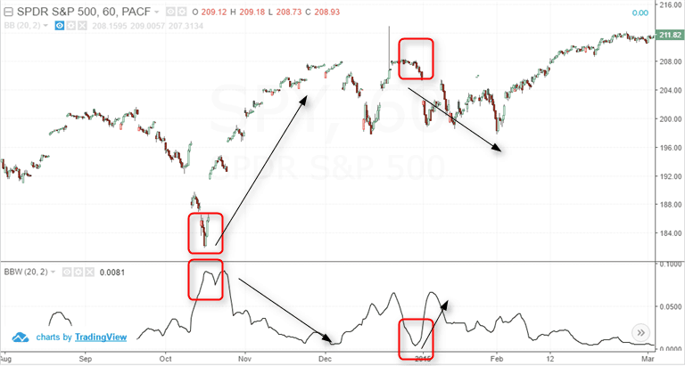
Awesome Oscillator on the Chart

Depending on your charting platform, the awesome oscillator indicator can appear in many different formats.  Nevertheless, the most common format of the awesome oscillator is a histogram.

The awesome oscillator indicator will fluctuate between positive and negative territory.  A positive reading means the fast period is greater than the slow and conversely, a negative is when the fast is less than the slow.

The one item to point out is that the color of the bars printed represent how the awesome oscillator printed for a period.  Hence, you can have a green histogram, while the awesome oscillator is below the 0 line.

Awesome Oscillator Histogram

Basic Awesome Oscillator Trading Strategies

Now that we are all grounded on the awesome oscillator, let’s briefly cover the 4 most common awesome oscillator strategies for day trading.

#1 – Cross Above or Below the Zero Line

If you use this strategy by itself, you will lose money. To trust an indicator blindly without any other confirming analysis is the quickest way to burn through your cash.

Therefore, the strategy, if you want to call it that, calls for a long position when the awesome oscillator goes from negative to positive territory. Conversely, when the awesome oscillator indicator goes from positive to negative territory, a trader should enter a short position.

Without doing a ton of research, you can only imagine the number of false readings you would receive during a choppy market.

Let’s look at a chart example to see the cross of the 0 line in action.

Awesome Oscillator 0 Cross

In the above example, there were 7 signals where the awesome oscillator indicator crossed the 0 line.  Out of the 7 signals, 2 were able to capture sizable moves.

This 5-minute chart of Twitter illustrates the main issue with this strategy, which is that the market will whipsaw you around like crazy.  Choppy markets plus oscillators equal fewer profits and more commissions.

For this reason, we give the cross of the 0 line an F.

#2 – Saucer Strategy

The saucer strategy received its name because it resembles that of a saucer.  The setup consists of three histograms for both long and short entries.

Long Setup

  1. Awesome Oscillator is above 0
  2. There are two consecutive red histograms
  3. The second red histogram is shorter than the first
  4. The third histogram is green
  5. A trader buys the fourth candlestick on the open

Short Setup

  1. Awesome Oscillator is below 0
  2. There are two consecutive green histograms
  3. The second green histogram is shorter than the first
  4. The third histogram is red
  5. Trader shorts the fourth candlestick on the open

Without going into too much detail, this sounds like a basic 3 candlestick reversal pattern that continues in the direction of the primary trend.

Awesome Oscillator Saucer Strategy

Explanation:

In the above example, AMGN experienced a saucer setup and a long entry was executed. The stock drifted higher; however, we have noticed from glancing at a number of charts, the buy and sell saucer signals generally come after a little pop. If you trade the saucer strategy, you have to realize you are not buying the weakness, so you may get a high tick or two when day trading.

The saucer strategy is slightly better than the 0 cross, because it requires a specific formation across three histograms.  Naturally, this is a tougher setup to locate on the chart.

However, you can find this pattern when day trading literally dozens of times throughout the day.

Although we are attempting to locate a continuation in the trend after a minor breather in the direction of the primary trend, the setup is just too simple. It doesn’t account for trend lines or the larger formation in play.

Due to the number of potential saucer signals and the lack of context to the bigger trend, we give the saucer strategy a D.

#3 – Twin Peaks

Now, this is not the restaurant for all you chicken wing and brew fans out there.

This is a basic strategy, which looks for a double bottom in the awesome oscillator indicator.

Bullish Twin Peaks

  1. The awesome oscillator is below 0
  2. There are two swing lows of the awesome oscillator and the second low is higher than the first
  3. The histogram after the second low is green
Twin Peaks
Twin Peaks

Bearish Twin Peaks

  1. The awesome oscillator is above 0
  2. There are two swing highs of the awesome oscillator and the second high is lower than the first
  3. The histogram after the second peak is red
Bearish Twin Peaks Example

As you have probably already guessed, of the three most common awesome oscillator strategies, we vote this one the highest. The reason being, the twin peaks strategy accounts for the current setup of the stock.  The twin peaks are also a contrarian strategy as you are entering short positions when the indicator is above 0 and buying when below 0.

Therefore, the verdict is in and we give the twin peaks strategy a solid C+.

#4 – Bonus Strategy

You will not find this strategy anywhere on the web, so don’t waste your time looking for it.

Going back to the crossing of the 0 line, what if we could refine that a little to allow us to filter out false signals, as well as buy or short prior to the actual cross of the 0 line.

This approach would keep us out of choppy markets and allow us to reap the gains that come before waiting on confirmation from a break of the 0 line.

We’re going to coin the setup as the Awesome Oscillator (AO) Trendline Cross

Long Setup – AO Trendline Cross

  1. Awesome Oscillator has two swing highs above the 0 line
  2. Draw a trendline connecting the two swing highs down through the 0 line
  3. Buy a break of the trendline
AO Trendline Cross
AO Trendline Cross

As you can see in the above example, by opening a position on the break of the trendline prior to the cross above the 0 line, you are able to eat more of the gains.

The other point to note is that the downward sloping line requires two swing points of the AO oscillator and the second swing point needs to be low enough to create the downward trendline.

Bearish Setup – AO Trendline Cross

  1. Awesome Oscillator has two swing lows below the 0 line
  2. Draw a trendline connecting the two swing lows up through the 0 line
  3. Sell Short a break of the trendline
Bearish AO Trendline Cross

In this example the cross down through the uptrend line happened at the same time there was a cross of the 0 line by the AO indicator. After the break, the stock quickly went lower heading into the 11 am time frame.

Where Can the Awesome Oscillator Go Wrong?

When testing strategies, we like to go through indicators and find where things fail. Finding the blind spots of an indicator can be just as helpful as displaying these beautiful setups that always work out.

So, to this point, let’s walk through a few examples where the trusted awesome oscillator indicator will have you on the wrong side of the trade.

#1 High Awesome Oscillator Values Beget Higher Price Values

If you are a contrarian trader, a high value in the AO may lead you to want to take a trade in the opposite direction of the primary trend.

It’s natural to see the extremely high reading and then say to yourself, there is no way the stock can go any higher.

This is where things can get really messy for you as a trader. Even if the AO keeps you on the right side of the trade with a high winning percentage, you only need one trade to get away from you and blow up all of your progress for the month.

Papa John's Failed Short
Papa John’s Failed Short

Can you identify the three peaks in the AO indicator? As you can see in the chart, we entered the trade on the open at $50.62.

Any short trader would have had enough reason with the negative news on Papa John’s founder at the time to short the morning pop. In addition, the AO was spiking like crazy and the rally did appear sustainable.

Well, guess what happened – Papa John’s peaked at $55.83 before consolidating. This would have represented a move against us of 10.2%. Now if you are day trading and using a lot of leverage, it goes without saying how much this one trade could hurt your bottom line.

How to prevent yourself from getting caught in this situation? First, a major expansion of the awesome oscillator indicator in one direction can signal a really strong trend. So, do yourself a favor and do not stand in front of the bull.

Secondly, use stops when you are trading. There is no reason you should ever let the market go against you this much.

#2 AO Readings on Low Float Stocks Can Get Tricky

Many of you may trade larger caps rather than low float stocks, because you’re able to scale in with larger size with low volatility plays. However, we know low float movers are a big deal in the day trading community.

So, how does the AO indicator handle low float movers?

Well like most indicators – not well.

Low Float - False Signals
Low Float – False Signals

This is one of those charts that would have you pulling your hair out. It’s like everything that could go wrong with the indicator did, in fact, go wrong!

First, if you shorted the opening spike, similar to our Papa John’s example, this would have caused you serious pain. Next, EGY spikes lower giving the impression the stock was going to fill the gap. Wrong again, as EGY only consolidates leaving you with a short position that goes nowhere.

Lastly, EGY breaks the morning high all the while displaying a divergence with the awesome oscillator and the price action.

In every instance, the indicator is giving off false signals and leaving you on the wrong side of the trade.

Well, it’s not all the fault of the AO indicator.

You as a trader need to be prepared for the harsh reality of trading low float stocks. These securities will move erratically, with volume and in a very short period of time.

In a related article on Stocktwits Blog [4], see how day trader Dave Kelly describes trading low float stocks and the level of volatility with these securities.

We’re not saying ditch the AO indicator altogether but be prepared to combine the AO with other indicators. Also, lower your expectations about how accurately the oscillator can create price boundaries which a low float will respect.

Awesome Oscillator and the Futures Markets

Shifting gears to where the awesome oscillator is likely to give you more consistent signals – the futures markets. More specifically the S&P E-mini futures contracts.

The reason the awesome oscillator indicator works so well with the e-Mini is that the security responds to technical patterns and indicators more consistently due to its lower volatility.

Sell Signals
Sell Signals

Notice how these AO high readings led to minor pullbacks in price. Now, these are not going to make you rich, but you can capitalize on these short-term trends.

There were still a few signals that did not work out, so you will need to keep stops as a part of your trading strategy to make sure your winners are bigger than your losers.

In Summary

So out of the trading strategies detailed in this article, which one works best for your trading style?

You may find that you like the idea of drilling into where the awesome oscillator indicator fails to uncover trading opportunities.

No matter what strategy you lock in on, you will want to make sure you use stops in order to protect your profits. Also, be sure to look at different types of securities to see which one fits you the best.

To recap these types of securities, please see the below list:

  • low float
  • low volatility
  • futures contracts

Here’s to good fills!

External References

  1. Bill Williams. Wikipedia
  2. Williams, Bill. (1998). ‘New Trading Dimensions:  How to Profit from Chaos in Stocks, Bonds, and Commodities‘. John Wiley and Sons, Inc.
  3. Williams, Bill. (1998). ‘New Trading Dimensions:  How to Profit from Chaos in Stocks, Bonds, and Commodities‘. John Wiley and Sons, Inc., pg. 85
  4. A Conversation About Low Float Stocks and Why Traders Should Understand Them [Blog Post]. Stocktwits.com
RSI image

The relative strength index (RSI) is one of the most popular oscillators in all of trading. You have likely read some general articles on the RSI in your trading career, or have at least heard about it. However, in this post, we’ll present four unique, profitable RSI trading strategies you can use when trading.

Before we dive into the RSI trading strategies, let’s first ground ourselves on the basics of the RSI indicator. Then, we’ll provide you with a few relatively unknown techniques.

Relative Strength Index Definition

The Relative Strength Index (RSI) is a basic measure of how well a stock is performing against itself by comparing the strength of the up days versus the down days.  This number is computed and has a range between 0 and 100. 

A reading above 70 is considered bullish, while a reading below 30 is an indication of bearishness. Generally speaking, it helps to measure periods of overbought or oversold conditions.

Why the RSI?

As traders, our job is to look for an edge in the market. Indicators can certainly help with this if used correctly.

The RSI is no different. When used properly, it can help predict rising momentum, underlying demand or supply, and shifts in sentiment.

Using the indicator can also help predict trends, trend reversals, trend continuations, or stagnate corrections.

With practice, and in combination with a firm understanding of volume and price action, the RSI indicator can simply be a helpful tool in your trading arsenal.

Relative Strength Index Formula

The RSI was developed by J.Welles Wilder and detailed in his book New Concepts in Technical Trading Systems in June of 1978.

The default setting for the RSI is 14 days. You would calculate the relative strength index formula as follows:

Relative Strength =

1.25 (Avg. Gain over last 13 bars) +. 25 (Current Gain) / (.75 (Avg. Loss over last 13 bars) + 0 (Current Loss))

Relative Strength = 1.50 / .75 = 2

RSI = 100 – [100/(1+2)] = 66.67[1]

We certainly don’t recommend doing these calculations while you’re trading. After all, most charting platforms have an RSI indicator that does all the math for you.

The result is a plot on subchart that indicates the oversold and overbought conditions, like the one below this chart in this example:

NVDA RSI chart
NVDA RSI chart

How NOT To Use the Formula

Most traders use the relative strength index simply by buying a stock when the indicator hits 30 and selling when it hits 70. You can see these levels on the RSI indicator above.

However, if you remember anything from this article, remember that if you buy and sell based on this relative strength index trading strategy alone, “YOU WILL LOSE MONEY”.

The market does not reward anyone for trading the obvious. Now that doesn’t mean that simple methods don’t work. But simple methods that everyone else is following typically have low odds.

With that in mind, let’s discuss how to properly use this dynamic formula.

Finding RSI Indicator Settings

For every platform, the settings may be different. However, most platforms should have an RSI indicator.

Once you find the RSI indicator in your platform’s indicator index, you can edit the settings according to whichever relative strength index trading strategy you want to employ.

RSI Indicator Settings

In the screenshot above, you can see inside the TradingSim RSI settings. The default parameters are usually set for a 14 period and 80/20 upper and lower threshold.

Within, you can change the period from the standard 14 to whatever you prefer. You can also change the “overbought” and “oversold” parameters as you wish.

To that point, we’ll discuss different RSI trading strategies that may require you to modify these settings.

How to Use RSI Trade Signals

The RSI provides several signals to traders. In this next section we’ll explore the various trade setups using the indicator.

Defining the Current Trend

The RSI is much more than a buy and sell signal indicator. The RSI can provide you with the ability to gauge the primary direction of the trend.

So how do we do this?

First, we define the range where the RSI can track bull and bear markets.

Uptrends

For bull markets, you want to be on the lookout for signals of 66.66 and bear markets at 33.33 [2].

You’re probably noticing that this is slightly less than the normal 80/20 or 70/30 readings. These readings of 33.33 and 66.66 were presented by John Hayden in his book titled ‘RSI: The Complete Guide’.

John theorizes throughout the book that these levels are the true numbers that measure bull and bear trends and not the standard extreme readings.

rsi defining trend
RSI Defining Trend

Again, the RSI is not just about buy and sell signals. The indicator is about showing “strength,” particularly as a measure of the strength of the trend.

In the above chart example, the RSI shifted from a weak position to over 66.66. From this point, the RSI stayed above the 33.33 level for days and would have kept you long in the market for the entire run.

Downtrends

As you can see below, the RSI can also define downtrends. You just want to make sure the security does not cross 66.66.

Defining Downtrend
Defining Downtrend

Now, should you make buy or sell signals based on crosses of 33.33 and 66.66? Not too fast, there is more to the RSI indicator which we will now dive into.

RSI Support and Resistance

Did you know the RSI can display the actual support and resistance levels in the market? These support and resistance lines can come in the form of horizontal zones, or as we will illustrate shortly, sloping trendlines.

Breakouts

In the example below, the RSI predicts a breakout.

RSI Breakout
RSI Breakout

You may not know this, but you can apply trend lines to indicators in the same manner as price charts. In the above chart, Stamps.com was able to jump significant resistance on the RSI indicator and the price chart.

This breakout resulted in a nice run of over 7%.

Breakdowns

Let’s take a look at another example. This time, the RSI was able to call a top.

In this example, the RSI had a breakdown and backtest of the trendline before the fall in price. While the stock continued to make higher highs, the RSI was starting to slump.

RSI Trend Breakdown
RSI Trend Breakdown

The challenging part of this method is identifying when a trendline break in the indicator will lead to a major shift in price. As expected, you may have several false signals before the big move.

There is no such thing as easy money in the market. It only becomes easy after you have become a master of your craft.

RSI Divergence with Price

This is an oldie but goodie, and is still applicable to the RSI indicator. Building upon the example from the last section, you want to identify times where price is making new highs, but the Relative Strength Indicator is unable to make new highs.

RSI Divergence
RSI Divergence

This is a clear example where the indicator is starting to roll as the price inches higher.

RSI Double Bottom Signal

The Relative Strength Index can also be used for typical patterns like double bottoms.

For the example below, the first price bottom is made on heavy volume. This occurs after the security has been in a strong uptrend for some period.

Note that the RSI has been above 30 for a considerable amount of time. Nonetheless, after the first price sell-off, which also results in a breach of 30 on the RSI, the stock also has a snapback rally.

Double Bottom
Double Bottom

This rally is short lived and is then followed by another pullback, which breaks the low of the first bottom.

This second low is where stops are raided from the first reaction low. Shortly after breaking the low by a few ticks, the security begins to rally sharply.

Consequently, the second low not only forms a double bottom on the price chart but the relative strength index as well.

The reason this second rally has strength is (1) the weak longs were stopped out of their position on the second reaction, and (2) the new shorts are being squeezed out of their position.

The combination of these two forces produces sharp rallies in a very short time frame.

Exercise Caution

The tricky part about finding these double bottoms is timing. After the formation completes, the security may be much higher.

You are going to need tight stops to avoid ending up on the wrong side of the trade.

As mentioned earlier, it is easy to see these setups and assume they will all work. What people do not tell you is that for every one of these charts that play out nicely, there are countless others that fail.

It only takes one trader with enough capital and conviction to make mincemeat out of your nice charts and trendlines.

To that point, be sure to test your RSI trading strategies in a simulator first. This way you have an understanding of your probability for success.

RSI and the Broad Market

If you want to assess the broader market, there is an interesting approach of applying the RSI to the McClellan Oscillator.

Essentially, the McClellan measures the advancing and declining issues across the NYSE.

RSI Broad Market
RSI Broad Market

This won’t help you much day trading, as this sort of weakness in the broad market only occurs a few times a year.

However, if you are in the middle of a day trade, it might prepare you for the tidal wave that’s coming.

It’s amazing how applying a strength measurement to a broad market indicator can reveal when weakness hits a tipping point.

If you find this interesting, here is a post that analyzed the return of the broad market since 1950 after the RSI hit extreme readings of 30 and 70.

In the post [3], senior quantitative analyst Rocky White makes the case that over the short-term after a reading below 30, the bears are still in control. However, if you look a little further to the intermediate-term, the bulls will surface and a long move is in play.

Trading Strategies Using the Relative Strength Index Indicator

Although the RSI is an effective tool, it is always better to combine it with other technical indicators to validate trading decisions. The relative strength index trading strategies we will cover in the next section will show you how to reduce the number of false signals so prevalent in the market.

#1 – RSI + MACD

In this trading strategy, we will combine the RSI indicator with the very popular MACD.

In short, we enter the market whenever we receive an overbought or oversold signal from the RSI supported by the MACD. We close our position if either indicator provides an exit signal.

Example

This is the 10-minute chart of IBM. In this relative strength index example, the green circles show the moments where we receive entry signals from both indicators. The red circles denote our exit points.

Relative Strength Index + MACD

Slightly more than an hour after the morning open, we notice the relative strength index leaving an oversold condition, which is a clear buy signal. The next period, we see the MACD perform a bullish crossover – our second signal.

Since we have two matching signals from the indicators, we go long with IBM. We appear to be at the beginning of a steady bullish trend.

Five hours later, we see the RSI entering oversold territory just for a moment. Since our strategy only needs one sell signal, we close the trade based on the RSI oversold reading.

This position generated $2.08 profit per share for approximately 6 hours of work.

#2 – RSI + MA Cross

In this trading strategy, we will match the RSI with the moving average cross indicator. For the moving averages, we will use the 4-period and 13-period MAs.

We will buy or sell the stock when we match an RSI overbought or oversold signal with a supportive crossover of the moving averages. On that token, we will hold the position until we get the opposite signal from one of the two indicators or divergence on the chart.

First, let’s clarify something about the MA cross exit signals.

A regular crossover from the moving average is not enough to exit a trade. We recommend waiting for a candle to close beyond both lines of the moving average cross before exiting the market.

Example

To illustrate this RSI trading strategy, please have a look at the chart below:

Moving average cross
Moving Average Cross Divergence

This is the 15-minute chart of McDonald’s.

The RSI enters the oversold area with the bearish gap the morning of Aug 12. Two hours later, the RSI line exits the oversold territory generating a buy signal.

An hour and a half later, the MA has a bullish cross, giving us a second long signal. Therefore, we buy McDonald’s as a result of two matching signals between the RSI and the MA Cross. McDonald’s then enters a strong bullish trend, and 4 hours later, the RSI enters the overbought zone.

At the end of the trading day, we spot a bearish divergence between the RSI and McDonald’s price. Furthermore, this happens in the overbought area of the RSI. This is a very strong exit signal, and we immediately close our long trade.

This is a clear example of how we can attain an extra signal from the RSI by using divergence as an exit signal. This long position with MCD made us a profit of $2.05 per share.

#3 – RSI + RVI

For this RSI trading strategy, we’ll combine the relative strength index with the relative vigor index.

In this setup, you will enter the market only when you have matching signals from both indicators. Hold the position until you get an opposite signal from one of the tools – pretty straightforward.

Example

This is the 15-minute chart of Facebook. In this example, we take two positions in Facebook.

Relative Strength Index - RVI
Relative Strength Index – RVI

First, we get an overbought signal from the RSI. Then the RSI line breaks to the downside, giving us the first short signal.

Two periods later, the RVI lines have a bearish cross. This is the second bearish signal we need and we short Facebook, at which point the stock begins to drop.

After a slight counter move, the RVI lines have a bullish cross, which is highlighted in the second red circle and we close our short position. This trade generated a profit of 77 cents per share for a little over 2 hours of work.

Facebook then starts a new bearish move slightly after 2 pm on the 21st. Unfortunately, the two indicators are not saying the same thing, so we stay out of the market.

Later the RSI enters the oversold territory. A few periods later, the RSI generates a bullish signal.

Relative Strength Index - RVI
Relative Strength Index – RVI

After two periods, the RVI lines also have a bullish cross, which is our second signal and we take a long position in Facebook. Just an hour later, the price starts to trend upwards.

Notice that during the price increase, the RVI lines attempt a bearish crossover, which is represented with the two blue dots.

Fortunately, these attempts are unsuccessful, and we stay with our long trade. Later the RVI finally has a bearish cross, and we close our trade. This long position with FB accumulated $2.01 per share for 4 hours.

In total, the RSI + RVI strategy on Facebook generated $2.78 per share.

#4 – RSI + Price Action Trading

For this strategy, we’ll use the relative strength index overbought and oversold signal in combination with any price action indication, such as candlesticks, chart patterns, trend lines, channels, etc.

To enter a trade, you will need an RSI signal plus a price action signal – candle pattern, chart pattern or breakout. The goal is to hold every trade until a contrary RSI signal presents, or price movement confirms that the move is over.

Price Action Trading Strategy

This is the 30-minute chart of Bank of America.

The chart starts with the RSI in overbought territory. After an uptrend, BAC draws the famous three inside down candle pattern, which has a strong bearish potential.

With the confirmation of the pattern, we see the RSI also breaking down through the overbought area.

With matching bearish signals, we short BAC.

The price starts a slight increase afterward. Perhap we wonder if we should close the trade or not. Fortunately, we spot a hanging man candle, which has a bearish context.

We hold our trade and the price drops again.

Notice the three blue dots on the image. These simple dots are enough to confirm our downtrend line. After we entered the market on an RSI signal and a candle pattern, we now have an established bearish trend to follow!

Later on, the trend resists the price rally (yellow circle), and we see another drop in our favor. After this decrease, BAC breaks the bearish trend, which gives us an exit signal.

We close our position with BAC, and we collect our profit. This trade made us 20 cents per share.

Which Trading Strategy Is Best?

If you are new to trading, combining the relative strength index with another indicator like volume or moving averages is likely a great start.

Pairing with the indicator will give you a set value with you can make a decision. It also removes a lot of the gray areas associated with trading.

Once you progress in your trading career, you may want to look to methods using price action that are more subjective. At this point, you may be able to apply techniques specific to the security you are trading, which could increase your winning percentages over time.

But again, this level of trading takes a ton of practice over an extended period.

Examples of where the Relative Strength Indicator Fails

I think it’s important to highlight where indicators can fail you as a trader and the RSI is no different.

At best you may achieve a 60% win rate with any strategy, including one with the RSI.

With that in mind, let’s layout the likely ways the RSI could burn you when trading.

#1 – The Stock Keeps Trending

The textbook picture of an oversold or overbought RSI reading will lead to a perfect turning point in the stock. This is what you will see on many sites and is even mentioned earlier in this very post.

However, we all know things rarely go as planned in the market.

False Sell Signals
False Sell Signals

As you see, there were multiple times that BFR gave oversold signals using the relative strength indicator. The stock continued higher for over three hours.

So how do you avoid such an unfortunate event if you are going short in the market?

Simple, you have to include a stop loss in your trade. This will be a common theme as we continue to dissect how the RSI can fail you.

#2 – Divergences Do Not Always Lead to Meltdowns

The tricky thing about divergences is that the reading on the RSI is set by price action for that respective swing.

Unfortunately, there are times where the price action itself changes from one of impulse to a slow grind.

Divergence False Signals

To this point, look at the above chart and notice that after the divergence takes place the stock pulls back to the original breakout point. But then something happens, the stock begins to grind higher in a more methodical fashion.

If you are long the market, it doesn’t mean you should panic and sell if the high is broken with a lower RSI reading. What it means is that you should take a breath and observe how the stock behaves.

If the stock beings to demonstrate trouble at the divergence zone, look to tighten your stop or close the position.

However, if the stock blasts through a prior resistance level with a weaker RSI reading, who are you to stop the party?

#3 – Tight Ranges

Extreme Readings
Extreme Readings

In some RSI examples, you may find scenarios where the indicator bounces from below 30 to back above 70 violently.

Well, all you have to do is buy the low reading and sell the high reading and watch your account balance increase. Right? Not exactly.

There are times when the ranges are so tight you might get an extreme reading. But it might not have the volatility to bounce to the other extremity.

So, like in the above example, you may buy the low RSI reading but have to settle for a high reading in the 50s or 60s to close the position.

Conclusion

By now we hope you have a much better understanding of the relative strength index indicator. Here are a few important takeaways to remember for this tool:

  • The RSI is a momentum indicator.
  • RSI oscillates between 0 and 100 providing overbought and oversold signals.
  • Readings above 70 are considered bullish.
  • Readings below 30 are considered bearish.
  • John Hayden promotes two key levels of 33.33 and 66.66.
  • The default RSI formula is calculated based on:
    • Gains over the last 13 periods
    • Current gain
    • Average loss over the last 13 periods
    • Current loss
  • Stop loss orders are recommended when trading with the RSI.
  • RSI should be combined with other trading tools for better signal interpretation.
  • Some of the successful RSI trading strategies are:
    • MACD + RSI
    • MA Cross + RSI
    • RVI + RSI
    • Price Action + RSI

More Resources

For more information on the RSI, check out this YouTube video which provides further clarification.

On that note, if you are interested in a master class on the relative strength index, feel free to visit our friends over at Mudrex.

To practice all of the trading strategies detailed in this article, please visit our homepage at tradingsim.com.

It’s really easy to see the perfect RSI setups, but the real success begins once you practice how to handle the situations which you don’t expect. As with any strategy, we recommend a minimum of 20 trades before employing real money.

External References

  1. Relative Strength Index. Wikipedia
  2. Hayden, John. (2004). ‘John Hayden in his book titled ‘RSI: The Complete Guide‘. Traders Press, Inc. pg. 66
  3. White, Rocky. (2019). Trading the Relative Strength Index (RSI): Does it Work?. moneyshow.com

In this article, I will cover the TRIX indicator and the many trade signals provided by the indicator.

What is the TRIX indicator?

The TRIX is a momentum oscillator. [1] This means the indicator has no limits on the upside or downside.

The TRIX indicator consists of three major components:

  • Zero line
  • TRIX line
  • Percentage Scale

TRIX
TRIX

How is the TRIX calculated?

Triple Smoothed Exponential Moving Average

The curved line of the indicator shows the percentage change of a triple smoothed exponential moving average. This is just a fancy way of saying each average is an average of the prior average. You then smooth them out to create one line – the TRIX.

Formula

EMA 1 = 15-period closing price EMA
EMA 2 = 15-period EMA of Single-Smoothed EMA
EMA 3 = 15-period EMA of Double-Smoothed EMA
TRIX = 1-period percent change in Triple-Smoothed EMA

Where Does the Name Come From?

Trix Cereal
Trix Cereal

One, two, TRIX! Well, sort of.

It’s a play on words (Tri from triple and X from the exponential moving average). It’s not a tribute to TRIX cereal for all my 80s kids out there.

What signals does the TRIX indicator provide?

Cross of Zero Line

A cross of the zero line to the upside generates a buy signal. Conversely, a cross below the zero line generates a sell signal. [2] Now, this does not mean you should go out there and just start buying and selling every signal. This is a sure way to drain your account and make your broker rich.

Zero Line Cross Buy Signal Chart Example

Cross of Zero Buy Signal

As I mentioned earlier in the article, buying every cross of the line is not a good idea.

In the above chart example, the stock DK crossed the zero line a number of times before the bottom was put in place. This is where you want to wait until the indicator makes a significant bottom relative to recent swings of the indicator.

You then enter a buy order after the breach of the zero line. Now, here is the tricky part, instead of selling on the break of the zero line place your stop below the recent low before the cross up through the zero line.

This way you are relying on the price action for when to exit the position and not solely the indicator. It’s a slight twist on how other sites are suggesting to stop out a TRIX long trade, but this approach will help reduce some of the noise.

Zero Line Cross Sell Signal Chart Example

Sell Signal
Sell Signal

The above chart example demonstrates the power of confluence between price and an indicator like the TRIX.

The indicator backtests the zero line.

Notice how the backtest occurs as the price action is backtesting a 7-day price channel.

After this backtest, notice how the price accelerates to the downside and ultimately gaps lower.

You can see how trading with the indicator goes much further than simply buying and selling crosses of the zero line.

Divergence Signals

This is always a favorite go-to for any indicator. This occurs when the price action and indicator are not aligned which is a precursor of a momentum shift.

Higher TRIX Reading
Higher TRIX Reading

Do you see how the indicator puts in a retest of its lows, but the indicator on the second test is above the zero line. This ultimately leads to a massive run higher, where the indicator makes fresh new intraday highs on each push higher.

The second high had a lower reading on the indicator, which is a precursor for a likely pullback.

Where the TRIX Fails

The TRIX indicator will have the same trouble as any other oscillator – range-bound trading.

Once price action begins to coil the three EMAs that make up the indicator begins to overlap. This creates a tight range in the indicator which will generate crosses above and below the zero line without a major price move.

This is where momentum indicators get in trouble. Therefore, if a stock or market is not in an impulse trend move, the indicator begins to pump out false signals.

TRIX False Signals
False Signals

TRIX versus Price Oscillator

In addition to making observations of the TRIX indicator, it’s always good to measure one oscillator against another. Therefore, I wanted to take some time to perform a comparison of the TRIX indicator with price oscillator. The price oscillator is made up of the 12 and 26 EMA lines, so like the TRIX, the price oscillator relies on the EMA.

Price Oscillator Leads TRIX

As you can see in the above chart, the signals are very similar.

However, the price oscillator is slightly leading over the TRIX. So, if you want to lead price the PO will provide you the ability to jump the market over the TRIX.

In Summary

In short, the TRIX indicator is not the holy grail of oscillators. The indicator has its flaws but it also is able to provide extremes in price action. In addition, you can measure impulse moves relative to historical price activity.

How Can Tradingsim Help?

If you are interested in the indicator, you can use Tradingsim to practice trading with the indicator to determine if it is able to give you an edge.

External References

  1. Achelis, Steven. (1995). Technical Analysis from A to Z. Mc-Graw Hill. p. 207
  2. TRIX. Wikipedia

I feel like I am on an oscillator craze lately, but if it feels right, why fight it?

The Williams %R indicator is pronounced Williams Percent R. The indicator is the creation of famous technical analyst and charting enthusiast Larry R. Williams. [1]

The Williams %R is a momentum indicator, which gauges if a stock is overbought or oversold.

In this post, we will discuss how to calculate the indicator and 3 trading strategies you can test in the market.

How to Calculate the Williams %R

I am the first to say not to worry about remembering an equation by heart. However, I do believe it is important to understand its underlying components.

Williams %R Formula [2]

(Highest Highn – Closecurrent period) ÷ (Highest Highn – Lowest Lown) x -100

As you can see above, the indicator is all about the high, close and low prices. Another way of thinking about the indicator at a high-level is that its primary focus is to identify the volatility and momentum for a security.

The n in the formula is the number of periods or candlesticks in the equation.

Although Larry Williams initially calculated the indicator using 10-periods, your charting package will likely use 14 periods. The number of periods is configurable by you; however, it’s a slippery slope once you start mucking around with the settings.

Williams%R Chart Example

Williams %R Readings

The oscillator has a range of -100 to 0. Readings below -80 represent oversold territory and readings above -20 represent overbought.

Now, this does not mean you should buy readings below -80 and sell readings above -20.

During a strong uptrend, a stock can hover around -20. Conversely, in a strong downtrend, a stock can stay in the -80 territory.

Relationship between Williams %R and the Stochastic Oscillator

No discussion about the indicator would be complete if you do not compare the indicator to the Stochastic Oscillator.

Stochastic Oscillator

While there are two variants of the Stochastic Oscillator, the formula below is for the Fast Stochastic Oscillator [3].

As it has two plotted lines, %K and %D, the formula to calculate these two data points are as follows:

%K = (CloseCurrent Period – Lowest Lown) ÷ (Highest Highn – Lowest Lown) * 100

%D = 3-Day Simple Moving Average (SMA) of %K

As you can see, the Williams %R is the inverse of the Fast Stochastic Oscillator.

The Williams %R indicator represents the level of the closing price to the highest price for “x” number of periods. By contrast, the Fast Stochastic Oscillator represents the level of the closing price to the lowest price for “x” periods.

Different Ranges

The Williams %R multiplies the formula by -100 whereas the Stochastic Oscillator multiplies the formula by 100.

Figure 1: Comparing Williams %R and (fast) Stochastic Oscillator
Comparing Williams %R and (fast) Stochastic Oscillator

As you can see the movement is essentially the same. The one major difference is the stochastic oscillator gives you a trigger line which you can use to execute entries and exits.

Three Trading Strategies

Strategy #1 – Cross of -50

Instead of using the indicator for simply identifying overbought and oversold market conditions, you can develop a trading plan around the -50 line cross.

Example of Taking a Short Position with Williams %R Momentum Strategy

Example of -50 Line Cross Strategy

After becoming overbought and oversold, if the indicator crosses the -50 line, it generally indicates a shift in momentum. At this point, you can start to look for opportunities to trade the stock direction of the cross.

In the above chart example, the %R of MSFT was overbought. The stock price then began to decline and the %R crossed below the -50 line.

Once crossing below -50, you then wait for the bar to close to place a sell order.

Combine Price Action to Increase Odds of Success

As you can see, the bar that pushed the indicator reading below -50 was a bearish outside (BEOB). If you simply placed a sell stop order below the low of this bar, you would have entered the market when the bearish momentum was at its highest. Hence, you could have gotten away with placing a smaller stop loss, which would, in turn, increase your risk to reward ratio on this particular trade.

You can use this same strategy to take a long position when the %R crosses above -50 from after being oversold for some period of time.

Strategy #2 – Divergence Trading Strategy

Trading the Divergence
Trading Williams %R Divergence

If you are familiar with divergence, you essentially want to find points areas where price and the indicator are in conflict.

Williams %R divergences are very powerful you should pay attention to these when it happens. In the above chart, you can see AMGN formed a clear downtrend; however, the Williams %R made a higher high.

This kind of divergence suggests a trend continuation. As you can see, after forming a bearish price action bar, the AMGN price shortly resumed the downtrend and you could have easily placed a sell stop below the bearish bar to capture this short swing.

Strategy #3 – Ride the Williams

Have you ever heard of the strategy where you ride Bollinger Bands? Well, you can do the same thing with the Williams %R.

Here is the setup and you will love its simplicity.

First look for the indicator to break -20 to the upside, so the shading kicks in. Then wait to see if the indicator can stay below -30 for 10 periods in a row.

If the stock is able to show this level of strength you can then use the first dip as a buying opportunity to jump on the primary trend.

Ride the Williams
Ride the Williams

As you can see in the above chart, once you are in the position, you can then ride the stock until the stochastics breaks -30 on the way down.

The hardest part of this strategy is not pulling the trigger too soon.

Conclusion

Since Williams %R lines are similar to the Fast Stochastic Oscillator, you can simply use the Stochastic Oscillator. But, remember that the intended trading strategy of the Williams %R is completely different compared to the Stochastic Oscillator.

Like other momentum indicators, it has its flaws, as it can remain extremely overbought during an uptrend and vice-versa [4]. However, as we showed here, you should not use the Williams %R to blindly take a position in the market based on its overbought and oversold readings.

Instead, if you trade smartly by combining price action and use the indicator to confirm the momentum in the market, your chance of ending up with a profitable trade would increase tremendously.

How Can Tradingsim Help?

If you are interested in the Williams %R, you can practice trading with the indicator against real-tick data within Tradingsim. First, see if the indicator works for your trading style before placing real trades in the market.

External References

  1. Larry R. Williams. Wikipedia
  2. Williams, Larry. Williams Percent Indicator (%R). williamspercentr.com
  3. Stochastic Fast (StochF). tradingtechnologies.com
  4. Trading with Stochastics. fidelity.com

Ultimate Oscillator Overview

Take a guess what type of indicator the ultimate oscillator is? That’s right, an oscillator.

It was created by none other than Larry Williams the king of oscillators. Larry is also known for the Williams %R and the Stochastics oscillators. To learn more about Larry and his other indicators, check out his Wikipedia page here.

The indicator was first released in 1976 and at the time, “ultimate” was a really catchy way to brand a new indicator. Remember at this time, Larry had already released a number of other indicators and he needed to make sure this one stood out.

How to Calculate the Ultimate Oscillator

The one immediate standout for the ultimate oscillator is that it factors in 3 input periods 7, 14 and 28. This is different from other oscillators that have one input period, for example, 14 that looks back over “x” range.

The indicator is centered around two key inputs – buying pressure and true range.

Ultimate Oscillator Formulas

[1]
Buying Pressure (BP) = Close – Min (Low or Previous Close)

True Range (TR) = Max (High or Previous Close) – Min (Low or Previous Close)

Average 7 Periods = Sum of BP over the last  7 periods / Sum of TR over the last 7 periods
Average 14 Periods  = Sum of BP over the last 14 periods / Sum of TR over the past 14 periods
Average 28 Periods = Sum of BP over the last 28 periods / Sum of TR over the past 28 periods

Ultimate Oscillator = 100 * [(4 * Average 7 Periods) + (2 * Average 14 Periods) + Average 28 Periods] / (4 + 2 + 1)

What is Buying Pressure?

The buying pressure is all about seeing how well a stock closes relative to its current low and the previous low. This lets you know if there is any buying interest in the security. If the close is near the low point of both the current and previous period, then that’s an indication there is little to no buying pressure.

What is the True Range?

The true range measures the high to low range of the current high or prior close to the current low or prior close. [2]

How is the Ultimate Oscillator Plotted?

The indicator oscillates between 0 and 100. When the indicator is said to have a high reading over 70 and a low reading below 30.

Ultimate oscillator
Ultimate oscillator

Above is a 5-minute chart and you can see the clear overbought and oversold readings on the chart. Seems simple enough right?

Just buy when the indicator is below 30 and sell when the indicator is over 70? Wrong.

Since we know this is a bad idea, let’s walk through 2 strategies you can test out.

Strategy #1 – Exploit the Divergence

Let’s first start with how to use the indicator with trending markets. This is where oscillators have the toughest time forecasting market direction.

A stock could give a sell signal as the indicator goes well above 70, but this does not mean the stock is going to roll over immediately. A stock can remain in an overbought state for an extended period of time.

Overbought Stays Overbought

This is where oscillators can really get you in trouble. An overbought stock can stay just that – overbought. Now in defense of the ultimate oscillator, you are going to face this reality regardless of your oscillator of choice. It’s just the nature of the beast.

The reason is that a stock can oscillate from overbought to the midline around 50 indefinitely. This is great if you are long and riding the trend higher.

However, if you are short, it can lead to the death of a thousand cuts as the stock drags higher, slowly draining your account value.

This can also play out on the downside as well. If you step out front and catch a falling knife, it can just continue lower and if you are long it’s not a good feeling.

The Setup

So, how do you use the oscillator when the stock is trending hard? Simple, you don’t assume just because the ultimate oscillator is above 70 you should go out there and start shorting.

So, instead of just selling because the stock is overbought on the oscillator, use it as an opportunity to see if you can jump on board with the trend.

Divergence is About Timing

It’s going to feel counterintuitive, but if a stock makes a high and then breaches that high again, it could be ripe for a breakout trade. The problem is that the ultimate oscillator may have a lower reading on the break of the recent high.

All of the experts will tell you that you should sell the divergence, but it’s not that simple. While divergence is in play, who knows when the divergence will lead to a selloff.

Therefore, you could try buying the break and then using a stop management system to protect yourself and then ride the wave higher. Even in the example above, there was a clear divergence but the stock nevertheless climbed higher.

Defy Divergence
Defy Divergence

Remember It’s About Timing

Again, please do not read this and say divergence means buy or sell. You have to size up the trade. But what I am saying is that if a divergence presents itself, it does not mean it is going to instantly playout in the market. The divergence could be a result of the fact the first move was so strong, it reflects a significant change in trend that is not meant to be exceeded by the indicator on the short-term.

Strategy #2 – Buy or Sell the Panic

One of the hardest things to do is to buy the panic. I don’t have the right mindset to jump out in front of the train, but if you do it can prove valuable.

It’s rather simple, you are buying as everyone is panic selling and once the panic selling subsides, the stock will make some sort of run higher.

This does not mean it will exceed the days high if you are day trading, but it does mean you are likely to see a move.

The Setup

One strategy you can use when trading with the ultimate oscillator is to identify a panic selling point at support. You want to see a spike down in the ultimate oscillator to extreme levels. It’s not enough for the oscillator to hit 45. You need to see it tank.

Then wait for the stock to reclaim the level. You then buy the break back into that level and place your stop below the recent low.

The stop is critical because if the stock rolls over and goes lower, you have to take your lumps in order to live to fight another day.

Chart Example

Here is a chart example of the stock VRAY. The stock was in a clear trading range for 5 days before having a panic selloff on the sixth day. This panic selling quickly subsided and the stock was able to regain the prior support level. Guess what happened next?

That’s right, the stock stabilized and moved higher. Ultimately the next day the stock shot up in a parabolic fashion

Buy the Panic
Buy the Panic

In Summary

While the name may make you feel it’s beyond reproach, the ultimate oscillator is just like any other indicator. It has its strengths and weaknesses. As you can see from this article we took a different approach rather than reciting the same strategies repeated over and over again on the internet. It doesn’t mean those can’t work but in trading, you will need to find an edge.

It’s not enough to just sell divergence or place a buy order just because the indicator goes below 30. You have to be smarter than that and you are.

How Can Tradingsim Help?

Interested in exploring the ultimate oscillator further but need a place to test your ideas? You can use Tradingsim to practice trading with the indicator using real tick data for the past 2 years.

You can test the strategies detailed in this article as well as make up your own.

External References

  1. Bhandari, Bramesh. (2017). Trading the Ultimate Oscillator. futuresmag.com
  2. True Range and How it Differs From Rangemacrooption.com

In this article, I am going to cover some basic trading techniques you can use with the Bollinger Bandwidth indicator. Before we dive into the strategies, let’s first discuss the indicator.

Bollinger Bandwidth Overview

The Bollinger Bandwidth was first introduced by John Bollinger in the book, Bollinger on Bollinger Bands.

The indicator measures the percentage difference between the upper and lower Bollinger Bands. Most chart engines plot the indicator as an oscillator beneath the price chart.

For a quick refresher, Bollinger Bands encapsulate price and are two standard deviations from the 20-period simple moving average (SMA).

How to Calculate the Bollinger Bandwidth

First, subtract the values of the lower band from the upper band. The difference is then divided by the value of the middle band which is the 20-period SMA.

The result is a normalized bandwidth value.

Bollinger Bandwidth Chart Example

Bollinger bandwidth indicator with Bollinger bands on SPY ETF Chart

In the above chart, when the distance between the two outer Bollinger bands contract, the Bandwidth indicator falls and when the upper and the lower Bollinger Bands expands, the Bandwidth indicator rises.

The Bollinger bandwidth provides a visual of price consolidation (low bandwidth values) and periods of volatility (high bandwidth values).

As a trader, you can zoom out on your chart to get a sense of the volatility within context to prior moves.

Interpreting Bollinger Bandwidth Indicator Signals

When the upper and lower bands are far apart, it indicates the current trend is nearing an end.

Conversely, when the upper and lower Bollinger bands tighten, an impulsive move is likely right around the corner.

Bollinger bandwidth and market volatility

The above chart shows how lows on the Bollinger bandwidth signal a potential strong move in the markets. In the first instance, the low period of consolidation was marked by a strong breakout in prices.

In the second scenario, the low bandwidth reading called the short-term top and subsequent price selloff.

Lastly, the third example shows triggered a rally.

Bollinger Bandwidth Does Not Forecast Market Direction

As you can see, the low points do not predict which way the market is going to break. You will need to use other analysis techniques to identify your edge.

3 Bollinger Bandwidth Trading Strategies

The most common way to trade with the Bollinger bandwidth indicator is breakouts. As previously discussed, low periods of volatility precede high periods of volatility.

#1 – Bollinger Bandwidth and the Broad Market

According to John Bollinger, the fall in the Bollinger Bandwidth indicator below 2% or 0.02 has led to big moves in the S&P500 index.

Bollinger bandwidth indicator and the 2% threshold

In all the three instances price fell 5.6%, 3.6% and 7.6% from the short term market tops when the indicator dipped below 2%.

To profit on this setup, you can buy futures contracts or an ETF that mirrors the broad market. To determine your potential profit potential, review prior rallies to determine the mean.

#2 – Double Bottom Trade Signals

In the following chart, we have the SPDR S&P500 SPY ETF intraday chart. Here we can see that while prices posted a low it was marked by a low in the Bollinger bandwidth.

Bollinger bandwidth and price trends

This low was also a test of a prior low with the candle completely outside of the Bollinger band.

So, you have multiple signals confirming the index is oversold. While we only cover double bottoms, you can apply the Bollinger bandwidth indicator to validate other chart patterns.

#3 – Major Trend Reversals

In the below chart of the SPDR 500 the market put in a major low in the first red box. In this setup, you want to wait for volume and price to go parabolic to the downside.

If you notice the volatility easing the initial push could be enough for the security to climb the wall of worry. You can jump onboard the trend with a close stop below the most recent low.

You will want to apply trendlines or another indicator to follow price higher. When you are buying securities with such high volatility on a countertrend move, you have to hold on to your position a little longer, so the risk-reward works out on the trade.


Bollinger bandwidth indicator at extremes

Next up, the market formed a top with another extreme reading of the Bollinger bandwidth indicator.

Here you can go short with a stop above the most recent high. You can trail the position using trendlines or price action.

How Can Tradingsim Help?

If you are thinking about trading with the Bollinger bandwidth indicator, you can do so within Tradingsim. You can practice placing trades and identify which strategy works best with your trading style.

To learn additional Bollinger bandwidth strategies, learn from the master himself – John Bollinger on his website.

Good Luck!