Trend Trading Explained + Chart Examples and Video Scanning Guide
Category: Trend Indicators
Browse over 18 posts covering trend following indicators. Learn how to trade the market by understanding how to measure its movements in order to gauge future price movements.
Trend Trading Overview
Trend trading is the practice of riding a security during a strong move up or down.[1] Now, what one person calls a trend can vary from trader to trader.
For example, a penny stock trader may expect a massive move higher of 20% or more intraday before considering a stock in an uptrend.
Conversely, a low volatility trader may need minor price expansion before declaring a new trend in play.
Whatever the time frame or strategy, the goal with trend trading is to identify the trend and find a way to jump on board with least amount of risk. To that end, in this post will discuss a few of these strategies and reveal how you can scan for trending stocks.
First, let’s talk about to discover the trend.
Trend Trading Indicators
When trading, the less subjectivity you have about the markets the better. Therefore, you can use technical indicators to gauge market trends.
Trend lines
Trend lines are a great way to clearly define the market trend. This can still prove to be somewhat subjective as you are required to identify the start and endpoints for the lines. But for all intents and purposes, with a little practice you should be able to identify the prevailing points of support and resistance for a clear trend.
For bullish trends, you want to connect the low points and high points to develop an up channel. [2] After all, an uptrend is only confirmed once you have a series of higher lows and higher highs.
As the stock is on its upward trajectory, the stock should not breach the prior low on its way up.
Bullish Trendlines
Likewise, for a bearish trend you’ll simply reverse your low and high points.
Bearish Trendlines
Notice that this is the exact same stock, just on the backside of the intraday trade. Trends can really help uncover which side of the trade you’re on. And the great thing about trend lines is that the more you draw with them, the more you train your eye to anticipate the direction of a stock.
This can help with setting targets and reversals as your trading develops.
Trend Channels
To take it a step further, you can use the trend channels drawing tool. These channels create a clean parallel line. However, these channels will not allow you to create wedge patterns or diamond formations.
Often, trend channels work best for more natural price action in larger cap stocks: bigger, more liquid companies.
Uptrend Channel
Slope of the Line
The other point to note is that you need to identify a minimum slope of the line, which will trigger a trend for you.
A strong trend will usually have a slope north of 50 degrees to generate the level of an impulse move higher.
This is completely subjective. Nonetheless, if you are trend trading, the move should be strong enough for you to care.
Moving Averages
Moving averages are another great indicator you can use to measure the strength of a trend.
On the bigger time frame, you can take the simple approach of waiting to see if the stock is above or below its 200-day moving average. However, another approach is to look for a strong trend where the averages do not intersect on the way up. This spread of the averages shows you that the stock is trending hard for all periods (short and long).
To that point, we’ve created a scanning filter in the TradingSim application that, when checked, will eliminate stocks on a daily chart whose 20, 50, and 200 moving averages are stacked on top of each other. In other words, the 20 is above the 50, and the 50 is above the 200.
This tells us that the shorter time frames are above the longer time frames, revealing the uptrend. Of course, reverse this and you get a downtrend.
Here is what that scan filter looks like:
Trend Trading scan filter
When one of these is checked, it will filter the results to only those stocks trending bullishly or bearishly.
You may be thinking, “why is this important?”
Well, the great thing about trending stocks is that they can offer short term traders great opportunities with pullback buys. If you’re not familiar with this strategy, be sure to check out our post on the 20 Moving Average Pullback.
Example of an Up-trending Stock
To illustrate the results from the scanning filter, here is just one stock that was populated from that list.
GOOGL Bullish Trend
From the chart above, you can see that the purple 20 moving average is trending nicely above the red 50 moving average. And, down below, the 200 moving average is pointing upward as well.
All three are in alignment giving us the indication that the trend is strong.
Example of a Non-trending Stock
Now that you know what a strong uptrend looks like, notice the difference between GOOGL and this XNCR trend.
Plenty of chop, right?
Too Much Overlap
The above chart has two moving averages the 10 and 20 EMA. You can see the level of backtesting the 10 has with the 20, which is a clear sign the stock is not trending hard.
Example of a Down-trending Stock
ABIO has a clear sell off after reaching climactic highs around $18. From there the stock never recovered.
Spread of Averages
The above chart is a clear example of when a stock is trending really hard. Notice how the averages do not cross at all. To add more validity to the trend, the averages are also far apart all the way down.
Just to level-set your expectations, these sort of trends are hard to find. You certainly don’t want to be on the wrong side of this trade. And, unfortunately, some selloffs never pullback for low risk entries.
Momentum Oscillators
Another indicator you can use to analyze the markets are momentum oscillators. These indicators have no upward or lower bound which allows the oscillator to run with the stock. [3]
The TRIX indicator is a momentum oscillator that moves above and below a zero line. In the next chart, we will cover a stock that is in a strong downtrend.
As this stock continue its downward momentum, notice that the TRIX is practically living below zero.
TRIX Below Zero
That being said, the TRIX does not react quickly because it smoothes out three exponential moving averages, so it’s a great indicator for measuring trends.
Notice how as the stock moved lower the TRIX respects the zero line. This does not mean there aren’t moments when the TRIX breaks zero by a hair or two.
Remember, in the market rarely does the price action fit nicely into a box dictated by technical analysis books.
More Trend Trading Examples
For our first example, we have a stock in a clear downtrend. You can see how the stock is making lower lows and lower highs.
Downtrend
Next up, we have a strong bullish uptrend with higher highs and higher lows.
Bullish Uptrend
Hopefully examples are helping you to see the difference. How about one more:
No Clear Trend
Can you see how the above chart lacks any trend? This is what we would call a choppy market or a security that lacks a clear trend. Most of these stocks are range bound.
Where Trend Trading Fails
Trend trading is like any other strategy in the markets. There will never be a 100% success rate. Often times a bullish trend will fail when a stock has reached a climax top, overthrows its channel, or supply becomes too heavy.
Conversely, a down trend will end when a stock has a climactic selloff, or demand comes in to support the stock.
The key is to study the trends to find consistencies in the volume and price action. [4]
Not Honoring Your Stops
When you are trading a stock that is trending, it feels great. You don’t have to do much and the money just flows into your account. However, if you jump into a trending stock at the time it reverses, you can find yourself in a pickle.
This is because being late to the party can lead to a nasty reversal as the stock could drop back down to its origination point.
So, you have to use your stops or the trending move will become your worst nightmare.
If you find yourself buying at a top of a strong trend, do not add to the position as it violates each swing low on the way back down. This is called averaging down, and it can be devastating.
Not honoring your stops
In the above chart example, we’re pointing out what happens if you were to buy support in a channel of a strong uptrend that fails.
As you can see, if you did not place a stop below the low of the test, things got ugly fast and in a hurry.
Strategies to Join a Trend
Now that you know what not to do, let’s look at a few strategies to help you join the trend.
The Moving Average Pullback
Many times during a strong trend, stocks will pullback to an important moving average like the 20 or the 50 moving average. These pullbacks can provide a great opportunity to join the trend if it continues higher, all while keeping your risk low.
Because institutions love to buy at lower prices, often stocks will find support at this levels.
Let’s use our GOOGL example from above and see how buying at the 50 moving average would have been a great decision.
Trend Trading the 50 moving average
We were given three great opportunities to buy the pullback in GOOGL at the 50 moving average, noted by the arrows on the chart. Each one of these buys would have been a great opportunity to profit.
You could have placed a stop loss just below each consolidation if the trade didn’t work out for a small risk.
Mean Regression Trend Trading
If you don’t like using the moving averages, sometimes a channel works better. Taking the moving averages off the chart of GOOGL, we’ll add a channel this time.
Notice how the buys correspond with the channel lows, and the sells correspond with an overthrow of the channel highs.
GOOGL Trend Channel
This can be a great and easy way to manage short-term positions. Basically, you’re buying the dips at support, and selling the rips at the highs.
How Can Tradingsim Help with Trend Trading?
If you are looking to practice trading trending stocks, it will come down to your entries, stops and the method of choice. Whether it’s moving averages, channels or oscillators, you’ll need to master each method in order to develop an edge.
This is where you can use Tradingsim to practice with over 11,000 stocks and 1,000 ETFs. Be sure to drop us a line and let us know how your edge is developing!
The Darvas Box was a fascinating trading discovery in the mid 1900s. Eponymously named, Nicolas Darvas was able to devise a system to trade the markets from anywhere in the world with only a magazine and telegrams.
A truly captivating story, and one that is recounted in his book How I Made $2,000,000 in the Stock Market, it is a worthwhile read for any trader.
Despite the use of his system as a swing trader, the Darvas Box indicator can be used in today’s markets on any timeframe. And to that end, we’ll discuss the strategy, rules, and best practices for the Darvas Box in this post.
Who is Nicolas Darvas?
Nicolas Darvas was a professional dancer that traveled the world with his sister in their own dance company during the 1950s. At one point, after receiving shares of a stock as a gift, he became obsessed with the markets and put countless hours into the study of market movements and internal mechanics.
It’s really fascinating to think that he was able to teach himself how to trade the markets just by reading books and newspapers. In fact, his favorite two were The Battle for Investment Survival by Gerald M. Loeb and Tape Reading and Market Tactics by Humphrey Bancroft Neill. He also took Barron’s magazine publication and regularly searched for up-and-coming companies.
Nicolas Darvas studying the markets
It was this intuition on up-and-coming companies that benefitted Darvas greatly. He was a master of “social arbitrage,” before that was even a term. Yet, his strategy for entering the market was so simple that he could enter orders from anywhere in the world his dancing profession took him.
All he had to have was access to a telegram service. From there, he’d wire his orders to his broker.
To learn more about Nicolas Darvas check out his Wikipedia page.
What is a Darvas Box?
The Darvas box is a trend following system. A trend following system is one that does not try to anticipate a market move. Another way of saying this is that the system is reactive versus predictive.
Darvas would only enter stocks that were in confirmed uptrends and breaking out of consolidation patterns to make new highs. His boxes helped him visualize this while he was on the road dancing for a living.
Essentially, if a stock on his watchlist was bouncing around inside a “price box” of say $35 and $40, then he knew if it broke to $40.50, it was time to buy.
Likewise, if the stock retreated back into the box, it hit his stop loss orders. He wanted to make sure the uptrend was confirmed with higher prices.
Darvas Box Rules
Darvas’s rules were fairly simple, as stated in his book How I Made $2,000,000 in the Stock Market. You can find his book on any digital platform. Again, it’s a quick and fascinating read and worth your time.
Okay, back to the rules.
A stock is making a new 52-week high
After the high is set, there are three consecutive days that do not exceed the high
The new high becomes the top of the box and the breakout point leading to the new high becomes the low of the box
Buy the break of the box once it exceeds the high by a few points
Sell the low of the box if it is breached
Add to your position as it moves into each new box
This sounds like a lot, but it’s honestly straightforward. You have 7 steps which prescribe how to find the stock and also provides entry and exit criteria.
How to Draw a Darvas Box
Keep in mind that Darvas did not have a computer. They hadn’t been invented. He had to rely soley on data from newspapers and needed to manually track his trades after the market close later that day or even the next morning when he could get his hand on a newspaper.
In fact, he recounts that the worst trading he ever did was when he was “close” to the action in New York. Something about the proximity to Wall Street and the instant availability of information made him overtrade and over think. For that reason, he went back to his “detached” style of trading while on the road and found success again.
Thankfully for us, we live in a time where computers do all of the heavy lifting for us. On that token, the Darvas Box indicator is prevalent on many charting systems.
Within Tradingsim, it is one of our standard indicators which you can select from our list of studies. Below is an example of a Darvas Box on an intraday chart of SOS
SOS Darvas Boxes
Notice how the blue box identifies a new high, the consolidation, and the subsequent breakout levels.
Darvas Box Settings
Darvas used three bars consolidating under the first high bar to construct the box. However, you can now configure the boxes to your liking with a few clicks of the mouse.
Here’s an example of how you might change these settings inside TradingSim:
Darvas Box Settings
You may be wondering, “why do we need these settings and offsetting levels?”
Many traders have a tough time surrendering to any method without adapting to the original technique.
For example, Darvas clearly says buy the new 52-week high, so the look-back period is honestly irrelevant. Do what feels right to you, but we would recommend you stick as close as possible to Darvas’s original intent to see what part of the strategy works for your trading style.
Where Darvas Works the Best
Without a doubt, the Darvas box strategy works best in strong bull markets. The market simply goes higher and you just keep buying the strength. If you are swing trading and you can catch the right symbol, profits can get out of hand quickly.
The hard part though is finding, buying, and managing these homerun trades.
Example of Darvas Box Working
Below is a weekly chart of Microsoft, which is a large stock that often mirrors the movement of the Nasdaq or S&P 500. There were at least three clear long entries in the bull market from 2016-2019. You would have added to your position at both the second and third breakout zones, perhaps more.
Darvas Box – Strong Bullish Trend
There is also a spot on the chart which says “no entry.” This is because the breakout was not convincing and Darvas requires the price to leave the box by a few points. Darvas avoided placing trades when a security was only able to slightly tick over the most recent high.
Do you see how by adding to your position and letting your profits run, you are able to reap significant rewards?
Now let’s review the hard part of the system, which requires tremendous discipline — the ability to not only pick the right stock but to also understand when market conditions are ripe.
Risks of Trading the Darvas Box
The Darvas box can put you in a tight spot under the following scenarios:
Buying breakouts into stocks that are near 52-week lows
Buying breakouts during bear markets
Scaling too heavily when adding to your position
Using the Darvas Box within sideways markets
Ignoring Your Stop Levels
Ignoring Your Stop Level
There aren’t many examples on the web discussing the issue of not honoring your stop levels when trading Darvas boxes. But because we like to be thorough, here is a fine example of what could happen when you neglect your stop.
Not honoring your stop can be disastrous!
Let’s say you were able to ride VCNX up and you also were adding to your position as the stock went in your direction. Then the inevitable happens, the stock breaks major support.
By not honoring the stop, you actually could end up in a catastrophic situation. Remember, you are trading stocks that are trending strongly, so when things go wrong, they can go horribly wrong.
Sideways Markets Hurt Darvas Traders
Sideways markets can drain you dry using the Darvas box method. This is because you will find yourself buying the breakout and then consequently selling the breakdown at the bottom of the box.
Choppy Darvas Signals
In the above stock of ROKU, the first breakout felt like the start of a new trend. Well, each signal thereafter would have taken you on a 2-3 day grind of wasted time and high commissions.
The market only trends about 20% of the time. Be sure to determine when the market is in a strong bull trend. More importantly, the sector you are trading should also be outperforming.
Can you Day Trade with Darvas Boxes
Darvas boxes can work on any timeframe. So, yes, you can day trade with the Darvas Box. However, you will need to define your “look back” period. This will allow you to collect trade data, so you can begin to assess the right configuration.
For example, Darvas stuck to new 52-week highs with three consecutive bars below the high to establish a new box.
You will need to define similar parameters for yourself that work. We suggest playing with the indicator settings and figuring out what works for your style. By default, the look back period for intraday 100 bars. You may also want to turn off the green “ghost boxes” to declutter your charts.
How Can Tradingsim Help?
All of the above examples were taken directly from Tradingsim. You can use Tradingsim to practice your strategies using the Darvas box. You can also test Darvas’s original strategy using daily and weekly bars.
If you are more interested in day trading with Darvas boxes, you can test out the system with a number of intraday timeframes as well.
Best of luck!
Are you an indicator trader? If yes, then you will enjoy this comprehensive guide to one of the most widely used technical trading tools – the moving average convergence divergence (MACD).
In this tutorial, we will cover 5 trading strategies using the indicator and how you can implement these methodologies within your own trading system.
Beyond the strategies, we will explore if the MACD stock indicator is appropriate for day trading and how well the MACD stock indicator stacks up against moving averages.
How To Pronounce “MACD”
There are two ways you can pronounce MACD.
The first is by spelling out each letter by saying M – A – C – D. The more popular option is to say “MAC-D”.
In order for the trading community to take you seriously, these are the sorts of things we have to get right off the bat!
With that aside, let’s dig into the content.
Chapter 1: What is the MACD Stock Indicator?
The moving average convergence divergence calculation is a lagging indicator used to follow trends. It consists of two exponential moving averages and a histogram.
Formula & Period
The default values for the indicator are 12,26,9.
It is important to mention many traders confuse the two lines in the indicator with simple moving averages. Remember, the lines are exponential moving averages and thus will have a greater reaction to the most recent price movement, unlike the simple moving average (SMA).
Thus, the MACD lines are represented as follows: 12-period EMA and 26-period EMA.
If you want to learn more about the MACD stock indicator formula, check out the early part of this blog post[1] from Rayner over at TradingwithRyner.com.
This period can be changed to represent a slower or faster moving average (i.e. 5-minute, 60-minute, daily).
Smooth Line and Trigger Line
The MACD calculation generates a smoothed line as depicted by the blue line in the chart below.
Next up is the red line in the chart, is most commonly referred to as the trigger line.
The red line is the 9-period EMA of the MACD line.
This may sound a little confusing, but it’s simply an average of an average. This 9-EMA is then plotted on the chart with the MACD line. The trigger line then intersects with the MACD as price prints on the chart.
To learn more about how to calculate the exponential moving average, please visit our article which goes into more detail.
Trigger Line
The last component of the MACD is the histogram, which displays the difference between the two EMAs of the indicator (12 and 26). Thus, the histogram gives a positive value when the fast EMA (12) crosses above the slow EMA (26) and negative when the fast crosses below the slow.
Histogram
A point to note is you will see the MACD line oscillating above and below zero. We will discuss this in more detail later, but as a preview, the size of the histogram and whether the MACD stock indicator is above or below zero speaks to the momentum of the security.
Chapter 2: Proper MACD Settings
Here is a chart of Amazon with default MACD stock indicator settings applied below the price action.
Standard MACD w/ 12,26,9 – Amazon
What would happen if we were to lower the settings on the trigger line to a shorter period?
As you can see from the revised AMZN chart below, the number of trade signals increased when we lower the moving average period from 12,26,9 to 6,20,10.
Fast MACD w/ 6,20,10 – Amazon
Generally speaking, more trade signals is not always a good thing and can lead to overtrading.
On the flip side, you may want to consider increasing the trigger line period, so you can monitor longer-term trends.
Just make sure the context matches the MACD parameters if you decide to play around with the default time periods. Otherwise, this can lead down a slippery slope of “analysis paralysis.”
Chapter 3: MACD Stock Indicator Trading Signals
Moving Average Cross
You have likely heard of the popular golden cross as a predictor of major market changes. Well, when it comes to the MACD trading strategy we don’t need such a significant crossing to generate valid trade signals.
The most important signal of the moving average convergence divergence is when the trigger line crosses the MACD up or down. This gives us a signal that a trend might be emerging in the direction of the cross.
Context is everything, though. While the MACD may provide many cross signals, you do not want to act on every signal.
Have you ever heard of the quote “The Trend is Your Friend”?
Well, the MACD trading strategy is firmly rooted in this old trading adage.
Zero Line Filter
As a general rule of thumb, if the MACD is below the zero line, do not open any long positions. Even when the trigger line crosses above the MACD line.
Conversely, if the MACD stock indicator is above the zero line, do not open any short positions. Even when the trigger crosses below the MACD line.
To further illustrate this point, let’s check out a chart of Bitcoin.
Bitcoin MACD Signals
Notice how the MACD stock indicator stayed above the zero line during the entire rally from the low 6000 range all the way above 11,600.
No doubt many traders would have thought Bitcoin was way overbought and would have potentially shorted every time the trigger line crossed below the MACD stock indicator. This approach would have proven disastrous as Bitcoin kept grinding higher.
What would have kept you from being squeezed?
That’s right, you should ignore sell signals when the MACD stock indicator is above zero.
Divergences
Does a divergence between the MACD and stock price lead to trend reversals?
If you see price increasing and the MACD recording lower highs, then you have a bearish divergence.
Conversely, you have a bullish divergence when the price is decreasing and the moving average convergence divergence is recording higher lows.
Out of the three basic rules identified in this chapter, this can be the most difficult to interpret. Not that it doesn’t work, but you can receive multiple divergence signals before price ultimately shifts.
Therefore, if your timing is slightly off, you could get stopped out of a trade right before price moves in the desired direction.
MACD Divergence
This is a one-hour chart of Bitcoin. The selloff in Bitcoin was brutal. As the price of Bitcoin continued lower, the MACD was making higher highs.
Divergence may not lead to an immediate reversal, but if this pattern continues to repeat itself, a change is likely around the corner.
Moving Average Overbought/Oversold Conditions
Since the MACD stock indicator has no upper or lower limit, traders do not often think of using the tool as an overbought/oversold indicator.
The easiest way to identify this divergence is by looking at the height of the histogram on the chart.
MACD Extension
This divergence can lead to sharp rallies counter to the preceding trend. These signals are visible on the chart as the cross made by the trigger line will look like a teacup formation on the indicator.
Again, the MACD stock indicator has no limits, so you need to apply a longer look-back period to gauge if the security is overbought or oversold.
To illustrate this point, let’s take a look at the S&P 500 E-mini Futures contract.
MACD Overgought_Oversold
We’ve selected the S&P 500 E-mini contract because the security is less volatile and has consistent price moves. This will help reduce the extreme readings of the MACD.
Next, we looked for levels above and below the zero line where the histogram would retreat in the opposite direction. This is where using the MACD trading strategy as an overbought/oversold indicator gets tricky.
At any given point, a security can have an explosive move and what historically was an extreme reading, no longer matters.
If you decide to use the MACD trading strategy as a means to gauge overbought/oversold areas, you must adhere to strict stops. Again, the MACD is a momentum indicator and not an oscillator – there is no “stop button” once things get going.
To find more information on stops, you can check out this post on how to use the parabolic SAR to manage trades. The indicator’s sole purpose is to provide stop protection when in a trade.
Chapter 4: 5 Trading Strategies Using the MACD:
Now that we understand the basics of the MACD stock indicator, let’s dive into five simple strategies you can test out. We’ve decided to take the approach of using less popular indicators for these strategies to see if we can uncover some hidden gems.
Feel free to stress test each of these strategies to see which one works best with your trading style. For each of these entries, we recommend you use a stop limit order to ensure you get the best pricing on the execution.
#1 – MACD + Relative Vigor Index
Why the Relative Vigor Index (RVI)? The RVI is an oscillator that correlates a security’s closing price to its price range.
The calculation is a bit complicated. but to simplify things, think of the RVI as a second cousin of the Stochastic Oscillator. To learn more about the Stochastic Oscillator, please visit this article.
By adding an oscillator in the mix, it can provide greater context of overbought/oversold conditions. This adds context to the MACD stock indicator which confirms if the momentum or strength of the trend is intact.
The basic idea behind combining these two tools is to match crossovers.
In other words, if one of the indicators has a cross, we wait for a cross in the same direction by the other indicator. When this happens, we buy or sell the equity.
To manage the position, we hold until the moving average convergence divergence gives us a signal to close the trade.
The below image illustrates this strategy:
MACD + Relative Vigor Index
This is the 60-minute chart of Citigroup. It shows two short and one long positions. Each were opened after a crossover from the MACD and the RVI.
These crossovers are highlighted with the green circles. Also note the red circles on the MACD highlight where the position should have been closed.
From these three positions, we would have gained a profit of $3.86 per share.
#2 – MACD + Money Flow Index
Next up, the money flow index (MFI). The money flow index is another oscillator, but this oscillator focuses on both price and volume.
The MFI will generate less buy and sell signals compared to other oscillators because the money flow index requires both price movement and surges in volume to produce extreme readings.
In this strategy, we will combine the crossover of the MACD stock indicator with overbought/oversold signals produced by the money flow index (MFI).
When the MFI gives us a signal for an overbought stock, we wait for a bearish cross of the MACD lines. If this happens, we go short.
Similarly, it acts the same way in the opposite direction. An oversold MFI reading and a bullish cross of the MACD lines generates a long signal.
Therefore, we stay with our position until the signal line of the MACD breaks the trigger line in the opposite direction. The below image illustrates this strategy:
MACD + MFI
This is the 10-minute chart of Bank of America.
The first green circle highlights the moment when the MFI is signaling that BAC is oversold. 30 minutes later, the MACD stock indicator has a bullish signal and we open our long position at the green circle highlighted on the MACD.
We hold our position until the MACD lines cross in a bearish direction as shown by the red circle on the MACD. This position would have brought us profits of 60 cents per share for about 6 hours of work.
#3 – MACD + TEMA
Let’s turn our attention now to the Triple Exponential Moving Average (TEMA) indicator!
We decided to go with the TEMA because as traders we love validation. What better tool for this than an indicator that smooths out 3 exponential moving averages?
We also went with 50-period moving averages to capture the bigger moves. To that end, we reduce the number of trade signals provided with this strategy.
Trade signals are generated when the fast line crosses the MACD stock indicator and the security price breaks through the TEMA.
We will exit our positions whenever we receive contrary signals from both indicators.
Although the TEMA can produce more signals in a choppy market, we will use the moving average convergence divergence to filter these down to the ones with the highest probability of success.
The image below gives an example of a successful MACD + TEMA signal:
MACD + TEMA
This is the 10-minute chart of Twitter.
In the first green circle, we have the moment when the price switches above the 50-period TEMA. The second green circle shows when the bullish TEMA signal is confirmed by the MACD stock indicator. This is when we open our long position.
The price increases and in about 5 hours we get our first closing signal from the MACD stock indicator. 20 minutes later, the price of Twitter breaks the 50-period TEMA in a bearish direction and we close our long position.
This trade would have brought us a total profit of 75 cents per share.
To learn more about the TEMA indicator, please read this article.
#4 – MACD + TRIX indicator
Building upon the concept of a triple exponential moving average and momentum, we introduce to you the TRIX indicator.
The TRIX is a nice pairing with the MACD stock indicator because it is an oscillator, but more importantly, it is a momentum oscillator. To learn more about the TRIX, please read this article.
This time, we are going to match crossovers of the moving average convergence divergence formula and when the TRIX indicator crosses the zero level. When we match these two signals, we will enter the market and await the stock price to start trending.
Exits
This strategy gives us two options for exiting the market:
Exiting the market when the MACD stock indicator makes a cross in the opposite direction
This is the tighter and more secure exit strategy. We exit the market right after the trigger line breaks the MACD in the opposite direction.
Exiting the market after the MACD stock indicator makes a cross, followed by the TRIX breaking the zero line
This is a riskier exit strategy. If there is a significant change in trend, we are in our position until the zero line of the TRIX is broken. Since the TRIX is a lagging indicator, it might take a while for that to happen.
At the end of the day, your trading style will determine which option best meets your requirements.
Here is an example of these two scenarios:
MACD + TRIX
This is the 30-minute chart of eBay.
The first green circle shows our first long signal, which comes from the MACD stock indicator. The second green circle highlights when the TRIX breaks zero and we enter a long position.
The two red circles show the contrary signals from each indicator. Note in the first case, the moving average convergence divergence gives us the option for an early exit, while in the second case, the TRIX keeps us in our position.
Using the first exit strategy, we would have generated a profit of 50 cents per share. The alternative approach would have yielded 75 cents per share.
#5 – MACD + Awesome Oscillator
This strategy requires the assistance of the well-known Awesome Oscillator (AO).
For those unfamiliar with the awesome oscillator, it is obviously an oscillator. But it’s an oscillator without boundaries. It’s simply the difference of a 5-period simple moving average and a 34-period simple moving average.
To learn more about the awesome oscillator, please visit this article.
We will both enter and exit the market only when we receive a signal from the MACD stock indicator, confirmed by a signal from the AO.
The challenging part of this strategy is that often we will receive only one signal for entry or exit, but not a confirming signal. Have a look at the example below:
MACD + Awesome Oscillator
This is the 60-minute chart of Boeing. The two green circles give us the signals we need to open a long position. After going long, the awesome oscillator suddenly gives us a contrary signal.
Yet, the moving average convergence divergence does not produce a bearish crossover, so we stay in our long position.
The first red circle highlights when the MACD has a bearish signal. The second red circle highlights the bearish signal generated by the AO. Thus, we close our long position.
Furthermore, notice that during our long position, the moving average convergence divergence gives us a few bearish signals. Yet, we hold the long position since the AO is pretty strong.
This long position would have brought us a profit of $6.18 per share.
Chapter 5: Is the MACD Trading Strategy appropriate for Day Trading?
The simple answer is yes; the MACD trading strategy can be used to day trade any security.
The MACD stock indicator is based on whatever time frame you are trading. Therefore, it’s effectiveness or lack thereof has nothing to do with intraday trading versus daily charts.
The one thing you should be concerned about is the level of volatility a stock or futures contract exhibits. The greater the volatility, the less likely the MACD stock indicator or any other indicator, for that matter, will accurately forecast price movement.
Chapter 6: MACD vs. MA (Bonus Strategy)
How do these two indicators compliment one another?
You can use the moving average as a validation tool for the price action in conjunction with the MACD indicator.
In the below trading example of the S&P500 E-mini futures, notice how the contract performs as it approaches the 20-period moving average.
MACD vs MA
Simply wait for the security to test the 20-period moving average and then wait for a cross of the trigger line above the MACD.
This basic strategy will allow you to buy into the pullbacks of a security that has strong upward momentum.
Chapter 7: Best MACD Trading Strategy Books
We had a tough time finding the best MACD book on Amazon. Mos were self-published. There was no obvious MACD trading strategy evangelist like John Bollinger with Bollinger Bands.
So if you are looking to dominate the space with a good book – now is the time.
However, here are a few you might consider:
MACD BookMACD Book
The best information on MACD trading strategy still appears in chapters in popular technical analysis books, or via online resources like the awesome article you are reading now. At any rate, I want to be as helpful as possible, so check out the below carousel which has 10 MACD trading strategy books you can check out for yourself.
To view more information about these books, please check out the external links in the external resources[3-8] section at the end of the article.
Chapter 8: Using MACD to Forecast Major Trend Changes
Whatever time frame you use, you will want to take it up 3 levels to zoom out far enough to see the larger trends. For example, if you are using a 5-minute chart, you will want to jump up to the 15-minute view.
It is extremely difficult to predict major market shifts. For example, there have been bears calling for the collapse of the current bull run in US equities for nearly every year since the market began.
With that in mind, let’s look at the sell-off in early 2016 with the S&P500 E-mini Futures.
MACD Forecasting Major Price Moves
The E-mini had a nice W bottom formation in 2016. Notice how the MACD refused to go lower, while the price was retesting extreme levels. This divergence ultimately resulted in the last two years of another major leg up of this bull run.
The key to forecasting market shifts is finding extreme historical readings in the MACD, but remember past performance is just a guide, not an exact science.
For more information on calling major market bottoms with the MACD stock indicator, check out this article published by the Department of Mathematics from Korea University.[9]
Within the study, the authors go through painstaking detail of how they optimized the MACD stock indicator to better predict stock price trends.
In summary, the study further illustrates the hypothesis of how, with enough analysis, you can use the MACD stock indicator for macro analysis of the market.
Chapter 9: Recommendations
We prefer combining the MACD stock indicator with the Relative Vigor Index or with the Awesome Oscillator may .
The RVI and the AO do not diverge greatly from the moving average convergence.
RVI and AO are less likely to confuse you, yet provide the necessary confirmation to enter, hold or exit a position.
The TEMA also falls in this category, but I believe the TEMA could get you out of the market too early and you could miss extra profits.
Regrettably, we find the MACD + TRIX indicator strategy too risky. Yet, it could be suitable for traders with a greater appetite for risk.
All things considered, the Money Flow index + MACD generates many false signals, which we clearly want to avoid.
Independent of these 5 strategies, our personal favorite is the bonus strategy, which combines the MACD trading strategy with the 20-period moving average.
Conclusion
We hope you’ve found the information in this guide helpful. Indicators and strategies can be a bit daunting when first starting out as a trader. Yet, with the proper education and experience, they can be helpful tools to augment our trading.
As with any strategy, we recommend practicing with a simulator before putting real money to work. If you don’t have a subset of trades and a known probability of success for each strategy, you’re just gambling.
Here’s to good fills and trading success! Stay in touch!
External Link – create the moving average convergence divergence formula in excel. This one is for all you bookworms that need to see exactly how the indicator works.
If you are wondering what the Volume Weighted Average Price (VWAP) is or how to use the VWAP indicator, then wait no more. We’ve created this ultimate guide to help you understand the ins and outs of VWAP, and how to trade with it.
The material is organized into 11 chapters, so be sure to take your time as you move through it. Toward the end, we will also explore the seven reasons day traders love using the VWAP indicator and why the indicator is a key component of many trading strategies. [1]
Learn How to Day Trade with the VWAP – Video
Before we dive into the reasons day traders love the volume weighted average price (VWAP), we’ve put together a short video to help you understand this indicator.
This video is a great primer before for the advanced techniques and strategies that we will cover later.
Chapter 1: VWAP Overview
VWAP identifies the true average price of a stock by factoring the volume of transactions at a specific price point and not based on the closing price. For this reason it is a great tool for understanding the current and future trend of a security, and the weight of where most traders are priced in.
Finding the average price of a security based solely on the closing value often provides an inaccurate picture of a stock’s health. This doesn’t take into consideration multiple time-frames and fluctuations in price and volume.
Did the stock close at a high with low volume? Did the stock move to a new low on light volume?
These are all critical questions you would want to be answered as a day trader before pulling the trigger on a trade.
This is where VWAP comes into play.
VWAP can add more value than your standard 10, 50, or 200 moving average indicators because VWAP reacts to price movements based on the volume during a given period.
VWAP for Day or Swing Traders
While we are highlighting VWAP for day traders, what we will discuss in this article is also applicable for swing traders and those of you that love daily charts.
So, if you do not partake in the world of day trading, no worries, you will still find valuable nuggets of information in this post.
Now that your expectations are set, let’s first walk through a few key concepts when using the indicator.
Most importantly, we want to make sure we have an understanding of where to place entries, stops, and targets using VWAP.
Chapter 2: VWAP Setups
After studying the VWAP on thousands of charts, we have identified two basic setups: pullbacks and breakouts.
By far, the VWAP pullback is the most popular setup for day traders hoping to get the best price before a stock continues higher.
Remember, day traders have only minutes to a few hours for a trade to work out. To that end, the closest entry at a support level can mean the difference between success or failure in a trade.
On the other hand, the VWAP breakout setup is not what you may be thinking. Instead of looking for a breakout to new highs, what we look for is a break above the VWAP itself, ideally with strength.
Now, let’s dig into the entry points for these setups.
VWAP Pullback Entry
Entry Option 1 – Aggressive Traders
Aggressive VWAP Trade
The first option is for the more aggressive traders and would consist of watching the price action as it is approaching the VWAP.
For this, you wait for a break of the VWAP and then look at the tape action on the time and sales.
You will need to identify when the selling pressure is spiking. Usually the time and sales (the tape) is going crazy when this happens. It looks like a flashing Christmas lights, orders are going in so quickly.
If tape reading is new to you, understand that it is more art than science and will require you to practice.
The goal is to identify when the selling pressure is likely to subside and then enter the trade.
Unorthodox Entry
This approach will break most entry rules found on the web of simply buying on the test of the VWAP. The problem with this approach is you don’t know if the price will breach VWAP by 1% or 4%, or greater.
After all, VWAP is a popular indicator. Too often the most obvious becomes too obvious and requires a shake out.
As an example of this, if the VWAP were at $10 and you place your limit order at $10, what can happen next? At times, it will slice right through the indicator swiftly.
This technique of using the tape is not easy to illustrate. We recommend practicing this approach using Tradingsim with Level II access.
Assess how close you can come to calling the turning point based on order flow, before you try the setup with real money.
VWAP Breakout Entry
Entry Option 2 – Risk Averse Traders
Conservative VWAP Entry
VWAP breakout entries are a great option for newer traders and those who are new to the VWAP indicator. It requires less proficiency with tape reading.
Essentially, you wait for the stock to test the VWAP to the downside. Next, you will want to look for the stock to close above the VWAP.
You will then place your buy order above the high of the candle that closed above the VWAP.
While this is a simpler approach for trade entry, it may open you up to more risk as you will likely be a few percentage points off the low. However, your success rate may eliminate the risk involved.
You will need to determine where you are in your trading journey and your appetite for risk to assess which entry option works best for you.
It goes without saying that while we have covered long trades, these trading rules can apply for short trades as well. Just do the inverse.
Nevertheless, let’s move to the next step. Now that you are in the trade, where should you place your stop?
Aggressive Trade Stop
Aggressive Stop Price
If you take the aggressive approach for trade entry, you will want to place your stop at your daily max loss or a key level (i.e., morning gap).
Again, this can work, but be prepared for wild swings that can occur if you get things wrong.
Pullback Stop
Conservative Stop Order
The pullback stop may be simpler to identify; it is the most recent low point.
If the stock begins to roll over and breaks the VWAP along with the most recent low – the odds are you have a problem.
At this point, you will want to close the trade and protect your capital. Your initial thesis was likely wrong.
Chapter 3: VWAP Target
Setting targets can be exciting. Everyone loves making money in trading, right? With a profitable target area, this is where the fun begins.
Realistically, you have a few ways to determine your profit potential on each trade.
Selling at the Daily High
Sell at High of the Day
This is a popular approach for exiting a winning trade. After entering the trade, you look for the high of the day to close the position. You place your stop below the most recent low.
After years of trading, you may notice that after the morning breakouts that occur within the first 20-40 minutes of the market opening, the next round of breakouts often fails.
This is because seasoned traders are selling their long positions into strength. On the flip side, novice day traders are trying to buy these breakouts. This gives the seasoned traders the liquidity to unload their shares to the unsuspecting public.
As with any trade, it’s always a good idea to imagine who and where the strong hands are averaged in. Not to mention, who and where the bag-holders are averaged in.
VWAP helps with this.
Selling at a Fibonacci Extension Level
Fibonacci Extension + VWAP
This is for the more bullish investors that are looking for larger gains.
Fibonacci levels are based on the hypothesis that the stock will break the high of the day and run higher.
If the target is it, it can bring huge gains, often in the 4% to 10% realm for day trades. This, of course, means the odds of hitting this larger target is less likely. To that end, you’ll need to the right mindset to handle the low winning percentage that comes with this approach.
Selling Into Climactic Price Action
There are times when the price action of the stock shows no sign of weakness. As buyers continue to buy, buy, buy, and short sellers continue to cover, the price pushes higher.
Eventually, what you might see is a parabolic chart. Here is an example below:
Parabolic Chart
As you see the stock running to climactic highs on climactic volume, it is time to sell. Maintaining that amount of price increase in such a short amount of time is not likely.
Take your profits and let the stock consolidate for another entry later down the road.
Whichever methodology you use for taking profits, just remember to keep it simple. The market is the one place where really smart people often struggle.
Chapter 4: Psychology of the VWAP Trade
If you have been trading for some time, you know that indicators alone are mostly smoke and mirrors. Ultimately, your success will come down to your frame of mind and a winning attitude. [2]
On that token, let’s take a break from the technical side, and get more into the fuzzy area of “mindset.”
Everything you need to make money is between your two ears
Think about the psychological benefit of VWAP pullback trades for just a moment.
A pullback trade just makes sense when you look at it on paper, right?
Why?
If it’s a morning gap, you are not buying at the highs. You are actually lowering the distance from your entry to the gap below.
Why is this important? You are reducing your risk on the trade as opposed to just buying the breakout blindly.
This will allow you time to analyze the price action before you add to the trade. As you monitor your trade entry, you can “size up” as the stock find its footing near VWAP.
Things are all well and good if the stock acts well. But, let’s discuss what you will likely be thinking if a VWAP pullback does not go in your favor.
When Things Don’t Go Well
With such a good average price, you can make the decision to kill the trade if need be. Assuming the volume and price action dictates more serious trouble on the horizon.
The important thing you will be faced with is when to exit the position. If the stock shoots straight up, it will be tough to find a pivot point to risk against. That is, without opening yourself up to a significant stop loss.
However, if the stock does have a close pivot point, you may be in luck. Nonetheless, you’ll need to watch for the price to close below the VWAP, or reverse and hold its ground.
What should you do in that situation?
These are the type of answers you need to have completely fleshed out in your trading plan before you even think of entering the trade.
It is the perfect reason to practice in a simulator as well. This way, you’ll know a multitude of scenarios before you make a decision.
VWAP, nor any other indicator will address the internal questions/conflicts you will be facing.
These are things that you need to manage if you want to have any success in the markets. And that success will come through exposure and experience.
When things go just right
The opposite side to this scenario is when you get it just right.
The stock pulls back to VWAP and you nail the entry. The stock runs back to the previous high and then breaks that high.
Talk about a feeling of mastery; it’s all profits and excitement.
In this instance, the trade goes in your favor. Depending on the volatility of the stock; you will find yourself up 2% to 3% without even blinking.
The money will literally fall into your account.
Why have we laid out these two psychological scenarios?
So that you get a feel for what it means to be in a losing and winning VWAP trade.
Simply knowing when you are in a winner or a loser and how quickly it takes you to come to that conclusion can be the deciding factor between an up-sloping equity curve and one that runs into the ground.
Chapter 5: Real-Life Trading Examples
Now that you have a handle on the basics and psychology behind the setup, let’s dig into a number of real-life trading examples.
Example 1 – VWAP Pullback Trade
In this trade example, we will review a historical example of the Financial Sector ETF (XLF).
If you were long the banking sector when you woke up on November 9th, 2017, you would have been pretty happy with the price action.
That morning XLF had a bullish gap. However, right off the open there was a very dramatic pullback.
VWAP Pullback Trade
Notice the huge red candle on the open as it gave back the gains from the premarket. The chart doesn’t show the premarket, but you see the $0.60 gap.
As a trader, could you anticipate whether or not XLF was going to crash back through the VWAP on the second crossing?
Remember, trading is about probabilities. Often we don’t know what will happen after the open.
As you can see, XLF experiences a slight rally, only to rollover again and retest the VWAP. Should you have bought XLF on this second test?
Porosity – Flexibility
Notice how the XLF doesn’t hold the VWAP and actually trades below the indicator.
This is an important example to highlight that stocks don’t always honor VWAP as if it is some impenetrable wall.
If you read other posts on the web about VWAP, it may give you the impression that if a stock closes below VWAP you need to run for the hills.
This is the furthest thing from the truth.
There are automated systems that push prices below these obvious levels (i.e. VWAP) to trip retail trader’s stops. They do this in order to pick up shares below market value.
Not to mention, many traders do not have the indicator on their chart.
Therefore, what is so apparent to you may not even be on another trader’s radar.
Back to the trade.
VWAP Pullback Trade
The last thing that made this trade difficult is the volume action on the VWAP breakout. Compared to most breakouts, it wasn’t screaming “buy me.”
However, if you look a little deeper into the technicals, you can see XLF made a higher low. The volume, albeit lighter than the open, is still trending higher. This is noted on the chart.
Once XLF was able to get back above VWAP with steadily increasing volume, it never looked back.
Remember as a trader, we are not here to guess how the news will affect prices. Our job is to trade the price action in front of us.
Example 2 – VWAP Breakout Trade
We’ll now move on to VWAP breakout trades and the volume associated with these moves.
Volume is a lot like a lens you can apply to the market. It helps make sense of all the chaos.
VWAP Trade
Notice this trade of Buckeye Partners, LLP. Clearly you can see the stock stayed below the VWAP indicator for some period of time.
BPL was eventually able to climb above the indicator, and stalled.
At this point, you could jump into the trade. After all, the stock has been able to reclaim VWAP. Just be aware that price movement can trend sideways for a considerable amount of time.
Remember, it’s not just about placing trades; the goal is to place trades that will make the best use of your time and money.
The Impact of Volume
The key thing you want to see is a price increase with significant volume.
Will you get the lowest price for a long entry — probably not.
However, if you wait, you will receive confirmation that the stock is likely to run in your desired direction. The volume is your tell-all that demand is behind the move.
In this specific trading example, wait for the price to move above the high volume bar bouncing off VWAP. This is a sign to you that the odds are in your favor for a sustainable move higher.
Chapter 6: VWAP and Confluence
So, you could be asking yourself. “What do peanut butter and jelly have to do with trading?”
Everything.
In trading, one signal is okay. But if multiple indicators from varying methodologies are saying the same thing, then you have something special.
Confluence is essentially an opportunity where another technical support factor is at the same price as VWAP.
For example, a Fibonacci level or a major trend line coming into play at the same time.
Confluence
This confluence can give you more confidence to pull the trigger. The more entry signals confirming, the better.
This brings us to another key point regarding the VWAP indicator.
There are many great traders that use the VWAP exclusively. However, these traders have been using the VWAP indicator for an extended period of time.
When starting out with the VWAP, you will not want to use the indicator blindly.
While we’re not suggesting you throw 10 indicators on your chart for confirmation, you will need to use some other validation tool to ensure you are seeing the market clearly.
Trading on price action alone takes many years of experience.
Chapter 7: Finding VWAP Trades
Timing is everything in the market, and VWAP trades are no different.
While stocks are always trading above, below, or at the VWAP, you really want to enter trades when stocks are making a pivotal decision off the level.
To do this, you need to have the ability to scan for these setups in real-time.
Likewise, you’ll want to have more than one criterion for filtering your scans. This helps dwindle down the huge universe of stocks to a much more manageable list of 10 or less.
However, if you purely trade with VWAP, you’ll need a way to quickly see what stocks are in play.
To do this, you will need a real-time scanner that can display the VWAP value next to the last price. You then cross-reference the VWAP value with the current price to identify volatile stocks that are close to the indicator.
VWAP Scanner
While not all examples are highlighted, we have circled a few examples for you. Notice the “Last” and the “VWAP” columns and how closely the values align. This is what you’re looking for.
Another option if you have the ability to develop a custom scan is to take the difference of the VWAP and the current price and display an alert when that value is close to zero.
Essentially, this is the numerical representation that the price and VWAP are overlapping.
Chapter 8: 7 Reasons Day Traders Love the VWAP
Hopefully the information thus far has increased your level of understanding when it comes to the VWAP indicator.
Now, we can shift into what first caught your attention – the 7 reasons day traders love the VWAP!
7 Reasons Day Traders Love the VWAP
Reason # 1: VWAP Calculation Factors in Volume
For the record, the VWAP formula is:
∑ Number of Shares Purchased x Price of the Shares ÷ Total Shares Bought During the Period
By multiplying the number of shares by price, then dividing it by the total number of shares, you can easily find out the volume weighted average price of the stock.
Since the VWAP takes volume into consideration, you can rely on this more than the simple arithmetic mean of the transaction prices in a period.
To learn more about the VWAP formula, check out this article from Wikipedia. [4]
Theoretically, a single person can purchase 200,000 shares in one transaction at a single price point, but during that same time period, another 200 people can make 200 different transactions at different prices that do not add up to 100,000 shares.
In that situation, if you calculate the average price, it could mislead as it would disregard volume.
Reason 2 #: VWAP Can Enable Day Traders to Buy Low and Sell High
If your technical VWAP trading strategy generates a buy signal, you probably execute the order and leave the outcome to chance.
However, professional day traders do not place an order as soon as their system generates a trade signal. Instead, they wait patiently for a more favorable price before pulling the trigger.
Price of AAPL Compared to Its 5-Minute VWAP
If you find the stock price is trading below the VWAP indicator and you buy the stock at market price, you are not paying more than the average price of the stock for that given period.
With VWAP trading, know you’re always getting a lower price than average.
By knowing the volume weighted average price of the shares, you can easily make an informed decision about whether you are paying more or less for the stock compared to other day traders.
Reason # 3: A VWAP Cross Can Signal a Change in Market Bias
Buying low and selling high can be a great strategy. However, as a momentum trader, you’re looking to buy when the price goes up and sell when the price goes down.
AAPL Crossing Above VWAP
A VWAP trading strategy called the VWAP cross can help you locate and trade momentum in the market.
Since the VWAP indicator resembles an equilibrium price in the market, when the price crosses above the VWAP line, you can interpret this as a signal that the momentum is going up and traders are willing to pay more money to acquire shares.
Conversely, when the price crosses below the line, consider this a signal that the momentum is bearish and act accordingly.
Reason # 4: VWAP Can Act as Dynamic Support and Resistance
BONT Price Respecting VWAP Resistance
Day traders love the VWAP indicator because more often than not, the price finds support and resistance around this level.
Some might argue that this can be a self-fulfilling prophecy. Other traders and algorithms are buying and selling around the VWAP line, after all.
Nonetheless, if you combine the VWAP with simple price action, a VWAP trading strategy can help you find dynamic support and resistance levels in the market.
The likelihood of a VWAP line becoming a dynamic support and resistance zone becomes higher when the market is trending.
Reason # 5: VWAP Can Help You Confirm Counter Trend Trading Opportunities
VWAP Confirms the Oversold Signal Generated By the RSI Indicator
Ever wonder if a stock is overbought or oversold and if it’s time to take a counter trend trade?
Just looking at the RSI or Stochastics and guessing can often throw false signals. You need concrete evidence of whether there is a strong trend or a chance the market will turn back. Adding the VWAP indicator on your chart can make your life much easier, in this regard.
To that end, professional day traders have a rule of thumb when using the VWAP.
If the line is flatlining, but the price has gone up or down impulsively, the price will likely return to VWAP.
However, if the line is starting to gradually move up or down in a new trend, it is probably not a good idea or good time to take a counter-trend position.
Reason # 6: VWAP Can Help You Reduce Market Impact
Most day traders do not affect the market much because we often trade our personal funds at the retail level.
However, hedge funds and pension funds are much bigger. Their decision to buy a stock can drive up the price considerably.
Just imagine for a second you are day trading and want to buy 5,000 shares of Apple (AAPL).
AAPL is a fairly popular stock and traders rarely face any liquidity problems when trading it. Hence, you will quickly find a seller willing to sell his 5,000 AAPL shares at your bid price.
However, if you want to buy 1 million AAPL shares it will take more time. Your broker will likely have to fill a good portion of your order at a price higher than the current market price.
If that’s you, congratulations, you have just bid the price up and impacted the market!
Placing a large market order can be counterproductive. You will end up paying a higher price than you originally intended.
Institutional Buying
For that reason, when funds want to buy large quantities of a stock, they typically spread their orders throughout the day and use limit orders.
If they find the stock price is trading below VWAP, they are able to pay a lower price compared to the average price, right? This way, VWAP acts as a guide and helps them reduce market impact while dividing up large orders.
You may think this example only applies to big traders. However, in the world of low float stocks, even small orders can make an impact on price movement.
Be sure you know what you’re trading.
Reason # 7: VWAP Can Help Beat High-Frequency Algorithms
They are watching you.
When we say they, we mean the high-frequency trading algorithms.
Have you ever wondered why the liquidity levels in the stock market have gone up over the last few years?
The high-frequency algorithms can act as little angels when liquidity is low. But these angels can turn into devils as they attempt to bid up the price of a stock by placing fake orders only to cancel them right away.
If you are emotionally following the tape, you may start executing market orders because you are worried the price will run away from you.
We call this Fear of Missing Out (FOMO). Don’t fall prey to it.
This is where the VWAP can come into play. Instead of focusing on the level 2, you can place limit orders at the VWAP level to slowly accumulate your shares without chasing these phantom orders.
Chapter 9: Bonus Content: Low Volatility Stocks and VWAP
Here at TradingSim, we like to scan for highly volatile stocks and then apply the VWAP to the chart.
This approach put us in the best position to turn a big profit. But one thing we noticed is that highly volatile stocks have less respect for indicators – including VWAP.
Let’s look at a few of these highly volatile stocks and their action around VWAP lines.
Example #1: RIOT Blockchain
Hard Break of VWAP
At first glance, you are likely thinking what’s the big deal with RIOT here?RIOT blockchain did exactly what we would expect stocks to do when interacting with the VWAP.
Or did it?
In the morning the stock broke out to new highs and then pulled back to the VWAP. This pullback to VWAP would have been a good opportunity to get long on the stock for a rebound trade.
However, this lack of a bounce produced a violent selloff from $7.70 to $7.20. This represented a sell-off of almost 7% in 40 minutes.
Do you think you would have what it takes to sit through a 7% beat down?
Only you can answer that question.
Violent price swings, even when allocating small amounts of cash, can be very difficult to sit through.
Example #2: MBI
Failed at Test Level
In the next example, MBI had an explosive move up through the VWAP indicator. The stock then came right back down to earth in a matter of 4 candlesticks.
4 candlesticks were literally a 10% down move in 20 minutes. You can see MBI did not recover to the VWAP level even as time pushed beyond 12 noon.
Goldman Sachs mentioned in an article that with higher volatility in the S&P 500, traders have “drawn back from using VWAP algorithms.” [5]
This is not to say the indicator doesn’t work, it’s just that the level of volatility can decrease the accuracy of the indicator.
They are plenty of day traders who trade volatility. You’ll just have to ask yourself it this fits your personality.
Chapter 10: VWAP and Futures Contracts
Building upon the concept of securities with more predictable volatility, let’s turn our focus to how VWAP performs with the S&P E-mini futures contract.
For those of you that trade the S&P E-mini, you know all too well the contract moves in a familiar pattern.
S&P VWAP Retest
The dramatic Covid-19 sell-off in February of 2020 felt extreme after the low volatility the S&P had experienced over the prior 5 months.
Yet, after the selloff began, for VWAP traders it was clear the 2,570 level would provide significant volume and price support for the S&P 500 E-mini contract. This is the blue line on the chart above.
As you can see, VWAP does not perform magic. However, it clearly did a good job of identifying where the bulls were likely to regain control.
S&P VWAP Retest #2
The S&P rallied more than 10% from the lows.
What do you think happened when the S&P 500 E-mini took another breather?
That’s right, the futures contract ran right back down to the VWAP for support. The VWAP provided support over the last few tests.
Keep in mind, though, that more tests can weaken the resolve of the bulls.
I this case, the S&P went lower.
Chapter 11: VWAP Futures Case Study
So far we have covered trading strategies and how the VWAP can provide trade setups.
Now, let’s discuss a case study to highlight how price interacts with the VWAP to help formulate a trading strategy.
Many traders will have their own hypothesis in place and subject that hypotheses on the market.
Our approach is to observe the market’s behavior and apply rules that can construct an objective system for trading.
Methodology
Analyze the S&P 500 E-mini contract for this case study. We did this because the E-mini has high volume, tight spreads and consistent price movement. This way we would have an increased likelihood of a repeatable pattern in the contract.
Use the 5-minute time frame to increase the number of trade signals
Observe price action from 1/1/2018 – 1/31/2018
Track price movement once spread between VWAP and S&P 500 E-mini reached .4% or greater.
Note where counter price move ended to calculate potential gains
Here is what we found. Take a look at the below table of the observations.
Data
Let’s unpack the data in this table further.
Date – captures the time when the spread between the Price and VWAP was greater than .4%
E-mini value – either the low or high point reached once the spread between price and VWAP hits .4%
VWAP – the value of the VWAP when the low or high is registered after the spread between price and VWAP hits .4%
Spread – absolute value of the difference between VWAP and Price
Percentage Spread – percentage value of the difference between the VWAP and Price
Peak/Low – peak high point or low value of swing low
%Gain – represents the move from the high or low pivot point
The point of the study is to illustrate that as the S&P pulls away from the VWAP, at some point it has a sharp correction back to the indicator.
Clearly, VWAP can provide a a significant impact on the movement of a stock. It is up to you to find ways of trading around it consistently.
When trading this strategy remember to account for slippage as you will not get the highs and lows for entry/exit.
Other VWAP Strategies
For those inclined to trade small cap and low float stocks, we’ve put together an in depth guide to a strategy caled VWAP Boulevard.
Essentially, it is a lot like a pivot point, or area of long term resistance. What happens during the trading day at these levels can determine huge gains on the long or short side depending on the context.
To that point, VWAP Boulevard is somewhat similar to another strategy popularized by Brian Shannon, CMT. It’s called Anchored VWAP.
This strategy “anchors” the volume weighted average price on daily charts to special “events” days. Those events could be lows on the chart, high volume days, earnings, news releases, etc.
The theory is that the volume anchored to these particular days will either provide support or resistance in the future.
As Shannon describes it:
In a trending market, the classic horizontal support and resistance levels are not always obvious. If we want to measure price memory from an “event” the Anchored Volume Weighted Average Price tool is the most effective means to accomplish this task.
Brian Shannon, CMT
Conclusion
Once you apply the VWAP to your day trading, you will soon realize that it is like any other indicator. There are some stocks and markets where it will nail entries just right and others it will appear worthless.
If you use the VWAP indicator in combination with price action or any other technical trading strategy, it can simplify your decision-making process to a certain extent.
For example, when trading large quantities of shares, using the VWAP can ensure you are paying a fair price.
Just remember, the VWAP will not cook your dinner and walk your dog. You need to make sound trading decisions with what the market is showing you at any given moment.
If you have questions about the VWAP or want to discuss your experiences, please share in the comments section below.
Today we will dive deep into the significance of Pivot Points for day trading. When you finish reading this article, you will understand the 5 reasons why day traders love using them for entering and exiting positions, and how you can employ them as a part of your overall trading plan.
Feel free to watch our free tutorial on Pivot Points by in-house daytrading expert, Al Hill. Al is a 20-year trading veteran.
What Are Pivot Points
As a technical analysis indicator, a pivot point uses a previous period’s high, low, and close price for a specific period to define future support. In addition, other small calculations determine the “outside” points.
Together, these can determine the bounds of a stock price over different time periodsgiving traders an edge on the market.
7 Pivot Point Levels Explained
There are seven basic pivot levels on the chart:
7 key Pivot Points explained
History of Pivot Points
Pivot points were originally used by floor traders on stock exchanges. They used the high, low, and close prices of the previous day to calculate a pivot point for the current trading day.
This calculation helped them notice important levels throughout the trading day. Pivot points have predictive qualities, so they are considered leading indicators to traders.
The main pivot point is the most important price level for the day. Essentially, it represents the balance between bullish and bearish forces.
In other words, when prices are above the pivot point, the stock market is considered bullish. If prices fall below the pivot point, the market is considered bearish.
While pivot points were originally used by floor traders, they’re now used by many retail traders, especially in equities and forex.
5 Reasons Why Day Traders Love Pivot Points
1) Unique for Day Trading
The pivot points formula takes data from the previous trading day and applies it to the current trading day. In this manner, the levels you are looking at are applicable only to the current trading day. This makes the pivot points the ultimate unique indicator for day trading.
2) Short Time Frames
Since the pivot points data is from a single trading day, the indicator can only be applied to shorter time frames. The daily and the 30-minute chart will not work, because it will show only one or two candles.
The best timeframes for the pivot point indicator are 1-minute, 2-minute, 5-minute, and 15-minute. Hence, its use for day traders.
3) High Accuracy
The pivot point indicator is one of the most accurate trading tools. The reason for this is that the indicator is used by many day traders, professional and retail alike.
This will allow you to trade with confidence and the flow of the market.
4) Rich Set of Data
Pivot points on charts provide a rich set of data. As we discussed above, the indicator gives seven separate trading levels. This is definitely enough to take a day trader through the trading session.
5) Easy to Use
The PP indicator is an easy-to-use trading tool. Most of the trading platforms offer this type of indicator. This means that you are not required to calculate the separate levels; in fact, the Tradingsim platform will do this for you. Your only job will then be to trade the bounces and the breakouts of the indicator.
Pivot Point Calculation
Daily pivot points are calculated based on the high, low, and close of the previous trading session.
When you add the seven pivot levels, you will see 7 parallel horizontal lines on the chart.
Pivot Points
The above chart is zoomed out in order to show all 7 pivot levels.
Let’s now discuss the way each of the seven pivot points is calculated. First, we need to start with calculating the basic pivot level (PP)– the middle line.
PP Calculation
Below is the formula [1] you should use to determine the PP level on your chart:
Pivot Point (PP) = (Prior Daily High + Low + Close) / 3
R1 R2 S1 S2 Pivot Levels Calculation
Now that we know how to calculate the PP level, let’s proceed with calculating the R1, R2, S1, and S2 pivot levels:
R1 = (2 x Pivot Point) – Prior Daily Low
R2 = Pivot Point + (Prior Daily High – Prior Daily Low)
S1 = (2 x Pivot Point) – Prior Daily High
S2 = Pivot Point – (Prior Daily High – Prior Daily Low)
R3 S3 Pivot Levels Calculation
We are almost done with the pivot point calculation. There are two more levels to go – R3 and S3.
R3 = Daily High + 2 x (Pivot Point – Prior Daily Low)
S3 = Daily Low – 2 x (Prior Daily High – Pivot Point)
See that the formulas for R1, R2, R3, S1, S2, and S3 all include the PP value.
This is why the basic pivot level is crucial for the overall pivot point formula. Therefore, you should be very careful when calculating the PP level. After all, if you incorrectly calculate the PP value, your remaining calculations will be off.
Pivot Points 2
You are now looking at a chart, which takes two trading days. Each trading day is separated by the pink vertical lines. We use the first trading session to attain the daily low, daily high, and close.
Daily High = 14.39
Daily Low = 14.28
Close = 14.37
Then we apply the three values in the formulas above, and we get the following results:
PP = 14.35
R1 = 14.42
R2 = 14.46
R3 = 14.53
S1 = 14.31
S2 = 14.24 (not visible)
S3 = 14.20 (not visible)
5 Different Kinds of Pivot Points
Here are five types of the most popular pivot points.
1. Standard pivot points
Standard pivot points are the most basic pivot points that day traders can calculate. First, traders start with a base pivot point. That’s the average of the high, low, and close from a previous period.
Below is the complete calculation for standard pivot points.
To calculate the Base Pivot Point:
(P) = (High + Low + Close)/3 calculate the First Support Level: Support 1 (S1) = (P x 2) – High
When calculating the Second Support Point:
Support 2 (S2) = P – (High – Low)
To calculate the First Resistance Level:
Resistance 1 (R1) = (P x 2) – Low
When calculating the Second Resistance Level:
Resistance 2 (R2) = P + (High – Low)
2. Fibonacci Pivot Points (The Most Popular)
The Fibonacci pivot point is perhaps the most popular among traders.
Fibonacci extensions, retracements, and projections are commonly used in forex, but are used with equities as well. The Fibonacci retracement levels are named after a mathematical sequence.
Ken Ribet is professor of mathematics at the University of California, Berkeley. He points out that a Fibonacci number started out having a simple formula.
“A lot of things in mathematics and probably in the real world are governed by simple recursive rules, where each occurrence is governed by a simple formula in terms of the previous occurrence. And a Fibonacci number has the simplest possible formula, just the sum of the previous two.”
In the her speech, Stockton points out that Fibonacci levels can become so “widely followed level that…there becomes some self-fulfilling property to it.”
Here is the calculation for the Fibonacci pivot point.
To calculate the Base Pivot Point:
Pivot Point (P) = (High + Low + Close)/3
When calculating the First Support Level:
Support 1 (S1) = P – {.382 * (High – Low)}
To calculate the Second Support Level:
Support 2 (S2) = P – {.618 * (High – Low)}
When calculating the First Resistance Level:
Resistance 1 (R1) = P + {.382 * (High – Low)}
To calculate the Second Resistance Level:
Resistance 2 (R2) = P + {.618 * (High – Low)}
When calculating the Third Resistance Level:
Resistance 3 (R3) = P + {1 * (High – Low)}
3. Woodie’s Pivot Point
Woodie’s pivot points place more weight on the closing price. However, the calculation is similar to the standard pivots formula.
The calculation is as follows:
R2 = PP + (High – Low)
R1 = (2 X PP) – Low
PP = (High + Low) + (2 x Closing Price) / 4
S1 = (2 X PP) – High
S2 = PP – (High + Low)
4. Camarilla Pivot Points
Another pivot point that traders use are Camarilla pivot points. Nick Scott invented the Camarilla pivot point in the 1980s.
It’s similar to the Woodie’s pivot point. However, there are four resistance levels and four support levels. In contrast, the Woodie pivot point has two Resistance levels and two Support levels.
This is the calculation for the Camarilla pivot point:
R4 = Closing + ((High -Low) x 1.5000)
R3 = Closing + ((High -Low) x 1.2500)
R2 = Closing + ((High -Low) x 1.1666)
R1 = Closing + ((High -Low x 1.0833)
PP = (High + Low + Closing) / 3
S1 = Closing – ((High -Low) x 1.0833)
S2 = Closing – ((High -Low) x 1.1666)
S3 = Closing – ((High -Low) x 1.2500)
S4 = Closing – ((High-Low) x 1.5000)
5. Demark Pivot Points
Demark pivot points have a different relationship between the opening and closing prices. Noted trader Tom Demark introduced this version.
The Demark pivot point uses the number X to calculate the lower level line and the upper resistance level. It also emphasizes recent price action. The calculation is as follows:
If Close > Open, then X = (2 x High) + Low + Close
If Close < Open, then X = High + (2 x Low) + Close
If Close = Open, then X = High + Low + (2 x Close)
Pivot Point = X/4
Resistance 1 = X/2 – Low
Support 1 = X/2 – High
How to Draw the Pivot Point Stock Market Indicator
The pivot point stock market indicator should be applied to the chart as follows:
PP level
R1 and S1
R2 and S2
R3 and S3
When you follow this order there is a small chance that you might mistakenly tag each level. To avoid this potential confusion, you will want to color-code the levels differently.
For example, you can always color the PP level black. Then the R1, R2, and R3 levels could be colored in red, and S1, S2, and S3 could be colored in blue. This way you will have a clear idea of the PP location as a border between the support and the resistance pivot levels.
Thankfully, these days many charting platforms have a built-in pivot point indicator. This means that the indicator could be automatically calculated and applied on your chart with only one click of the mouse.
This will definitely save you a ton of time.
How Pivot Points Work
Pivot points provide a standard support and resistance function [2] on the price chart.
When price action reaches a pivot level it could be:
Supported/Resisted
Extended (breakouts)
All things considered, if you see the price action approaching a pivot point on the chart, you should treat the situation as a normal trading level. Nonetheless, if the price starts hesitating when reaching this level and suddenly bounces in the opposite direction, you might then trade in the direction of the bounce.
However, if the price action breaks through a pivot, then we should expect the action to continue in the direction of the breakout. This is called a pivot point breakout.
Day Trading with Pivot Points
Now that we understand the basic structure of pivot points, let’s now review two basic trading strategies – pivot level breakouts and pivot point bounces.
1. Pivot Point Breakout Trading
To enter a pivot point breakout trade, you should open a position using a stop limit order when the price breaks through a pivot point level. These breakouts will mostly occur in the morning.
If the breakout is bearish, then you should initiate a short trade. If the breakout is bullish, then the trade should be long.
Always use a stop loss when trading pivot point breakouts.
A good place for your stop would be a top/bottom which is located somewhere before the breakout. This way your trade will always be secured against unexpected price moves.
You should hold your pivot point breakout trade at least until the price action reaches the next pivot level.
How it works:
Pivot Point Breakout Strategy
This is the 5-minute chart of Bank of America from July 25-26, 2016. The image illustrates bullish trades taken based on our pivot point breakout trading strategy.
The first trade is highlighted in the first red circle on the chart when BAC breaks the R1 level. We go long and we place a stop loss order below the previous bottom below the R1 pivot point. As you see, the price increases rapidly afterwards.
For this reason, we hold the trade until the price action reaches the next pivot point on the chart. When this happens, the price creates a couple of swing bounces from R2 and R1.
After bouncing from R1, the price increases and breaks through R2. This creates another long signal on the chart. Therefore, we buy BAC again.
There is a long lower candlewick below R2, which looks like a good place for our stop loss order.
The price then begins hesitating above the R2 level. In the last hours of the trading session, BAC increases again and reaches R3 before the end of the session.
This is an exit signal and we close our trade.
2. Pivot Point Bounce Trading
This is another pivot point trading approach. Instead of buying breakouts, in this pivot point trading strategy we emphasize the examples when the price action bounces from the pivot levels.
If the stock is testing a pivot line from the upper side and bounces upwards, then you should buy that stock.
Conversely, if the price is testing a pivot line from the lower side and bounces downwards, then you should short the security.
As usual, the stop loss order for this trade should be located above the pivot level if you are short and below if you are long.
To be clear, pivot point bounce trades should be held at least until the price action reaches the next level on the chart.
How it works:
Pivot Point Bounce Strategy
Above is a 5-minute chart of the Ford Motor Co. The image shows a couple of pivot point bounce trades taken according to our strategy.
Our pivot point analysis shows that the first trade starts 5 periods after the market opening. The price goes above R2 at the opening bell. Then we see a decrease in supply and a bounce from the R2 level. This creates a long signal on the chart and we buy Ford placing a stop loss order below the R2 level.
Immediately following, the price enters a bullish trend. Because of this, we stay with the trade until Ford touches the R3 level.
At this point, we close the trade.
However, the price bounces downwards from the R3 level after the second test. This is another pivot point bounce, so we short Ford security as stated in our strategy.
A stop loss order should be placed above the R3 level as shown on the chart.
After a short consolidation and another return and a bounce from the R3 level, the price enters a bearish trend. We hold the short trade until Ford touches the R2 level and creates our exit signal.
5 Common Mistakes when Trading with Pivot Points
Trades that Clear S4 or R4
These are the setups you really want to hone in on.
Think about it, why buy a stock that has resistance overhead. You can just as easily invest in a stock that has the wind to its back and you can ride the wave higher.
If there is no one looking to sell at a pivot point resistance level and there are no swing highs – that equals odds in your favor.
Even when things go wrong, you are still likely to come out even or at least have a fighting chance.
This going with the trend, of course, works just as well with shorts that clear S4 support.
Here is a real example of this pivot point trading strategy with Advanced Auto Parts (AAP).
Pivot Points and Fibonacci Levels
Is there anything different on the chart that you weren’t expecting to see?
If you can’t point it out, it’s the Fibonacci levels in the upper left of the chart.
Fibonacci Levels
Once a stock has cleared all of the daily pivot points, the next thing you need to look for are the overhead Fibonacci extension levels and swing highs from previous moves.
These levels can be used as your target areas for your trades. You can then use these levels to calculate your risk-reward for each trade.
After purchasing the stock on the break of both the pre-market and intra-day high, it’s now about holding on and riding the trend up to the next Fibonacci level at around 261.8% (2.618) retracement.
At this point, you do not want to get greedy. You should always look to clean off your trade slightly below that level.
Try applying these techniques to your charts to identify the levels tracked by professional traders.
Pivot Points and High Float Stocks
Nowadays many gurus are talking about low float, momo stocks that can return big gain. There may be a place for trading those stocks if you are highly experienced and accustomed to volatility and high risk.
However, when it comes to Pivot Points, high float stocks are still in vogue [3].
The beautiful thing about higher float stocks is that these securities will adhere to and trade in and around pivot point levels in a predictable fashion.
If you are a trader just starting out with pivot points and want to get a handle on things, you will want to start with these large-cap stocks. Once you get a handle on things, you can always progress to the penny stocks.
How Pivot Points Help Build Consistency
Do you find yourself obsessing about when to exit your trades. Maybe your entries are solid but you always have sellers remorse.
You either regret getting out too early or holding on too long.
This is something many traders struggle with for years.
To this point, including pivot points in your trading could be like going from the dark and stepping into the light. The beauty of using pivot points is that you have three clear levels:
where to enter the trade
when to exit the trade
how to place your stop
If you are the type of person that has trouble establishing these trading boundaries, pivot points can be a game-changer for you.
To further illustrate this point, check out the below charts
Entry, Exit, StopsEntry, Exit, Stops – 2
Do you see the beauty of the pivot points on the chart?
If you struggle with where to place your stops, entries and profit targets, pivot points take care of all of that for you.
You do not need an expensive trading system or AI program to accomplish this goal.
The other major point to reiterate is that you can quickly eyeball the risk and reward of each trade. Therefore over time, you will inevitably win more than you lose, and the winners will be larger.
This, my friend, is how you build wealth – one trade at a time.
Knowing When You are In a Losing Trade with Pivot Points
If you are going long in a trade on a break of one of the resistance levels and the stock rolls over and retreats below this level – you are likely in a bad spot.
Cannot Hold the Level
This should give you pause for concern when it doesn’t pan out the way you had planned.
This does not mean you need to run for the hills, but it does mean you need to give the right level of attention to price action at this critical point.
Time Lapse
The other point is to consider the amount of time that passes after you have entered your position.
If your position is sitting below or right around the breakout level 30 minutes after entering the trade – the stock is screaming warning signals.
Too Much Time
Do not over think exiting bad trades. If you find yourself in a trade that is stalling or not holding a level, just exit the trade. Waiting around for something to happen can lead to more losses.
Beyond the money, the major issue you will face is the emotional turmoil of tacking such a loss. Remember, do not think – just close the trade!
Pivot Points from Prior Days
Most charting software will allow you to select whether you want to see the current day’s pivot points or if you would like to see pivot points from prior days.
At first glance, it’s easy to want to focus on the current day levels as it provides a clean chart pattern; however, prior days levels can trigger resistance on your chart.
R4 Level Cleared
In the above chart of NANO you can see that the R4 level was cleared. The next question you are likely to ask yourself is where will NANO stop?
Unfortunately, simply looking at the pivot points for one day gives you no way of making that determination.
Multiple Days of Pivot Point Levels
Now, let’s take another look at that example with more than one day’s worth of pivot point data.
Multiple Days of Pivot Points
As you can see in the chart, there are a number of resistance levels near our closing price on the day. Like any other indicator, there is no guarantee the price will stop on a dime and retreat.
The point of highlighting these additional resistance levels is to show you that you should be aware of the key levels in the market at play.
You will need to look at the level 2 or time and sales to see which level you need to focus on. This is the real challenge. If you immediately sell you might possibly forego big profits.
As an option, you could sell out at the next resistance level up. You might be leaving money on the table, but there is a greater risk of being greedy and looking for too much in the trade.
Placing Stops
Trading with pivot points allows you the ability to place clear stops on your chart. What you do not want to do is simply place your stops in line with the next level up or down.
You have to take more care when identifying your stop placement.
Remember, you are not the only one that is able to see pivot point levels.
Anyone with a charting application can know the R1, R2 and R3 levels.
So, how do you still protect your trade but without risking too much?
Beyond Key Psychological Price Levels
For starters, you could place your stop just beyond the levels. In other words, you will want to hide the stop behind logical price levels.
For example, if you have an S1 level at $19.65, then you will want to place your stop at $19.44. Why at this level? 50 cents is a big mental price level for stocks under $20 bucks.
Therefore, you will likely have a large number of stops right at the level. Therefore, if you place your stop slightly beyond this point, you might avoid being stopped out of the trade as a shake out.
Volume at Price
Another method is to look at the amount of volume at each price level. If you are long and are eyeing an S1 level to stop the selling pressure, you can also see how much volume has been traded at a certain price level.
The idea is to then place your stop slightly below or above these levels. Let’s look at a chart to illustrate this point.
Volume at Price – Pivot Points
In the above example, notice how the volume at the support level was light. This shows you that there was not a lot of selling pressure at this point and a rebound was likely to occur at this level.
Next, notice how the price barely breached the S3 level and then reversed higher. For this type of setup, you want to see the price hold support and then set your target at a resistance level that has accompanying volume.
After BLFS bounced, it ran up to the R1 resistance before consolidating which coincidentally had a decent amount of volume at the $19.15 price level.
If you were long, a stop directly below the S3 level would have kept you in the trade.
How to Practice with Pivot Points
Hopefully you now have an intimate knowledge about Pivot Points: their formulas, strategies, and usefulness for day traders.
As with any trading strategy, it takes time and practice to really gain the upper hand on the market. For this reason, there is no better way to practice Pivot Points than in a simulator.
We suggest trying at least a 20-trade sample of this strategy and analyzing those trades before putting real money to work.
The 10-day moving average is one of those indicators that everyone knows about. From the new trader to the 30-year seasoned veteran.
What makes it so popular?
The quick answer is that it’s simple to understand and it does an awesome job tracking price movement.
In this article, I will discuss the 10-day moving average and how it applies to trading. The article will have a heavy focus on day trading, but these principles can be applied to any timeframe.
How to Calculate the 10-Day Moving Average
The 10-day moving average is something straight out of elementary school, again which is what makes it so great.
The average is based on the closing price of a security over the last 10 periods. You can check out this online moving average calculator here if you would like to perform the calculations yourself. [1]
10-period simple moving average formula
Day 1 Closing Price – 100
Day 2 Closing Price – 102
Day 3 Closing Price – 99
Day 4 Closing Price – 104
Day 5 Closing Price – 103
Day 6 Closing Price – 107
Day 7 Closing Price – 105
Day 8 Closing Price – 110
Day 9 Closing Price – 111
Day 10 Closing Price – 112
Once you add up all of these closing prices and divide them by 10, you get $105.3o. Well now that you feel comfortable with the math, let’s complicate things a little.
Different Types of 10-Day Moving Averages
The technical analysis world wouldn’t exist if there weren’t people trying to make things more complicated. The 10-day moving average is not immune to this problem.
These additional 10-day moving averages go beyond the scope of this post, so I’m not going to do deep dives, but I want to make you are aware of their existence.
10-Day Exponential Moving Average
The exponential moving average uses the SMA as the base of the calculation and then applies a smoothing factor. The EMA is for traders that want to reduce the lag of the simple moving average. [2]
10-Day Weighted Moving Average
The weighted moving average applies more weight to the most recent price action within the formula. It’s similar to the exponential, except it’s not a smoothing factor. Therefore, you can configure the indicator in terms of which periods you weight the most.
For example, if you want to create more of a lag, you could even place more weight on historical periods and not the most recent.
[Video] How to Add the 10-Period Simple Moving Average to Your Chart
Below is a quick video of how to add a 10-day simple moving average to your chart.
When is the Best Time to Use the 10-Day Moving Average?
The 10-day moving average is a trend following indicator. This means the indicator is not going to tell you where price is headed but rather gives you a visual of how strong a security is trending.
To this point, it’s best to use the 10-period moving average to gauge the health of a stock on the move.
Morning Trades
in the morning stocks will trend and trend hard. This is where the 10-period SMA comes in handy. This is because the 10-day moving average keeps you close to the action. If you were to use a 20 or 50-day moving average, it would give the stock too much room to go against you.
The morning is a funny time in the market. Stocks pretty much move in the same patterns.
If a stock is breaking out or down, they will run from the open into the 10:30 am timeframe and at times until 11:30 or so but then something happens.
The volume starts to dry up and the ranges of the periods begin to decrease. This pausing of the action can take shape in the form of sideways action for the remainder of the day or the stock may make a move to test its highs between 1 pm and 2 pm.
Nevertheless, the strong moves are likely done for the day.
10-Period SMA Chart Example
This pattern above of Google is what plays out in the market every day.
As a day trader or active trader, the 10-day moving average trails the price action closely. This ensures that if you are a momentum trader, you are only staying in a position if it is moving in your desired direction.
Once you see the moving average broken to the downside, you can close the position or at a minimum lighten up your size.
Short Example
The moving average works the same on short trades as well.
Short Example
It is literally the same setup, just the inverse.
In this example, GLUU which is a pretty volatile stock had a nice breakdown in the morning. The stock stayed below the 10-period SMA all the way down into that 11:30 am time zone before basing out.
When can the 10-day Moving Average Fail You?
Late Entries on Breakouts
The 10-day moving average is a lagging indicator. This means the indicator will not do you any good in forecasting a major price move. By the time the average catches up to the price, you would have already missed the move.
So, if you are waiting for a signal from a moving average before entering a morning breakout or breakdown, you will be behind the eight ball.
Sideways Markets
Sideways markets are a slow bleed for trend following systems. The reason being, sideways markets have no real trend. These setups come down to buying support and selling the high.
However, the moving averages within ranges are a mess. [3]
The price will cross the averages multiple times on its move up to resistance and back down to support.
Therefore, it’s not a great idea to even base exits on moving average crosses.
10-day moving average
Above is a chart example of UBER. As you can see on this 5-minute chart, once in a trading range, the price action moves above and below the average with ease and does not give any clear direction of which way price will ultimately break.
[Video] Comparison of Different Moving Average Periods
As mentioned earlier in this article, there are different types of averages. But there are also different periods.
A general rule of thumb is that you want to use a shorter time period (1o or less) to gauge short-term moves. That’s why, thus far in this article, we have discussed morning trades and momentum setups since we are using the 10-period SMA.
However, if you are looking to trade intermediate trends you will want to use the 20 or even 50-period moving average.
Lastly, if you are looking at long-term trends you will want to bump it up to 100 or even 200 periods.
In the next video, we are going to discuss the differences between the 10-period SMA and 100-period SMA when looking at Netflix. This is a morning breakdown trade.
How Can Tradingsim Help?
If you are interested in trading with the 10-day moving average, try using the indicator within Tradingsim. We have a market replay platform that allows you to trade real data from the past two years, tick-by-tick.
You can then see if the indicator is a good fit for you and your trading style.


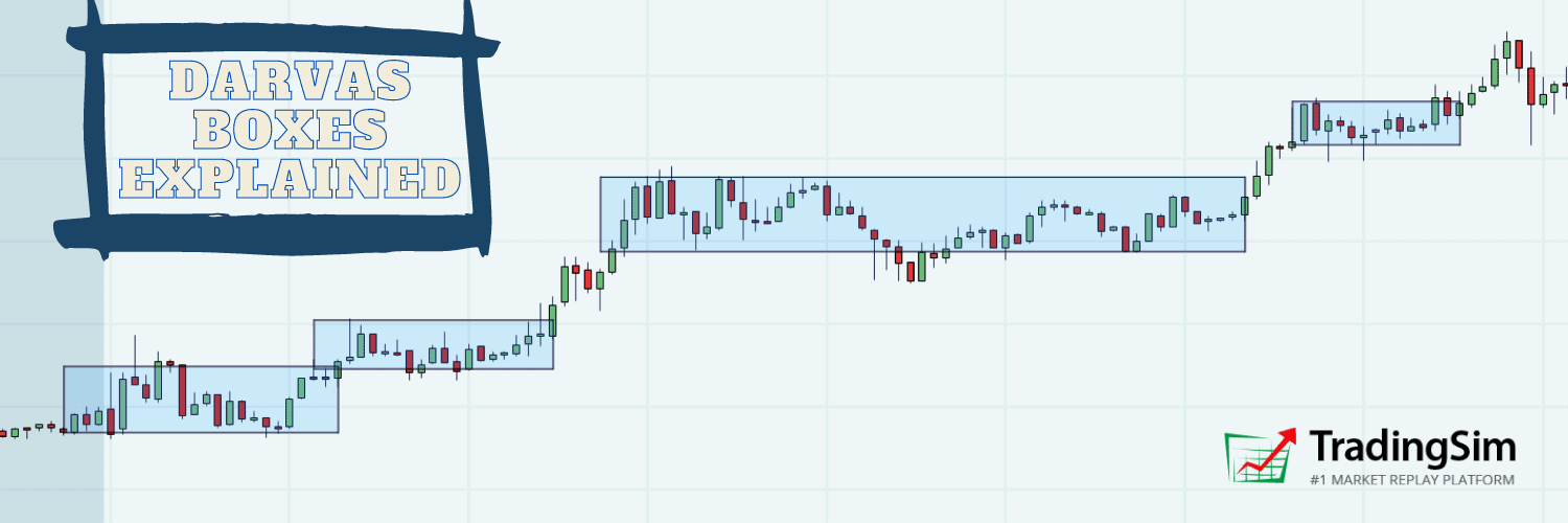


![MACD Ultimate Guide + 5 Profitable Trading Strategies [Video]](https://app.tradingsim.com/wp-content/uploads/2021/07/image-1.png)


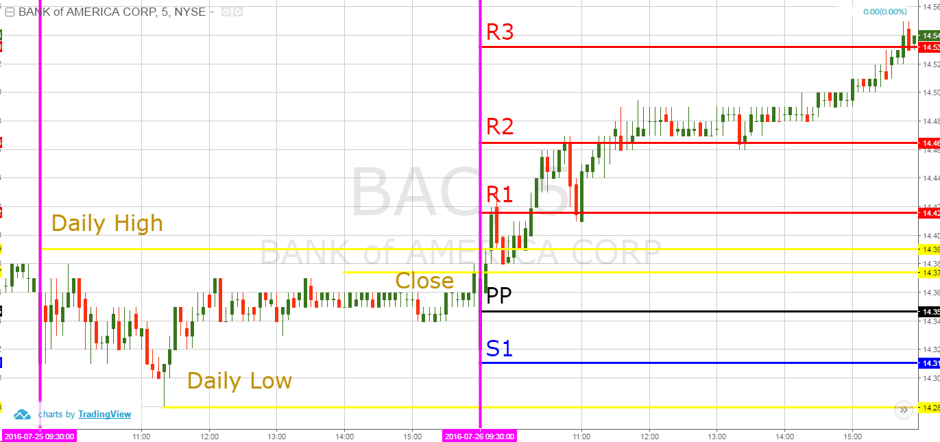


![10 Day Moving Average – How to Trade with the Indicator [Video]](https://app.tradingsim.com/wp-content/uploads/2019/06/8rygs4wdjyw.jpg)


