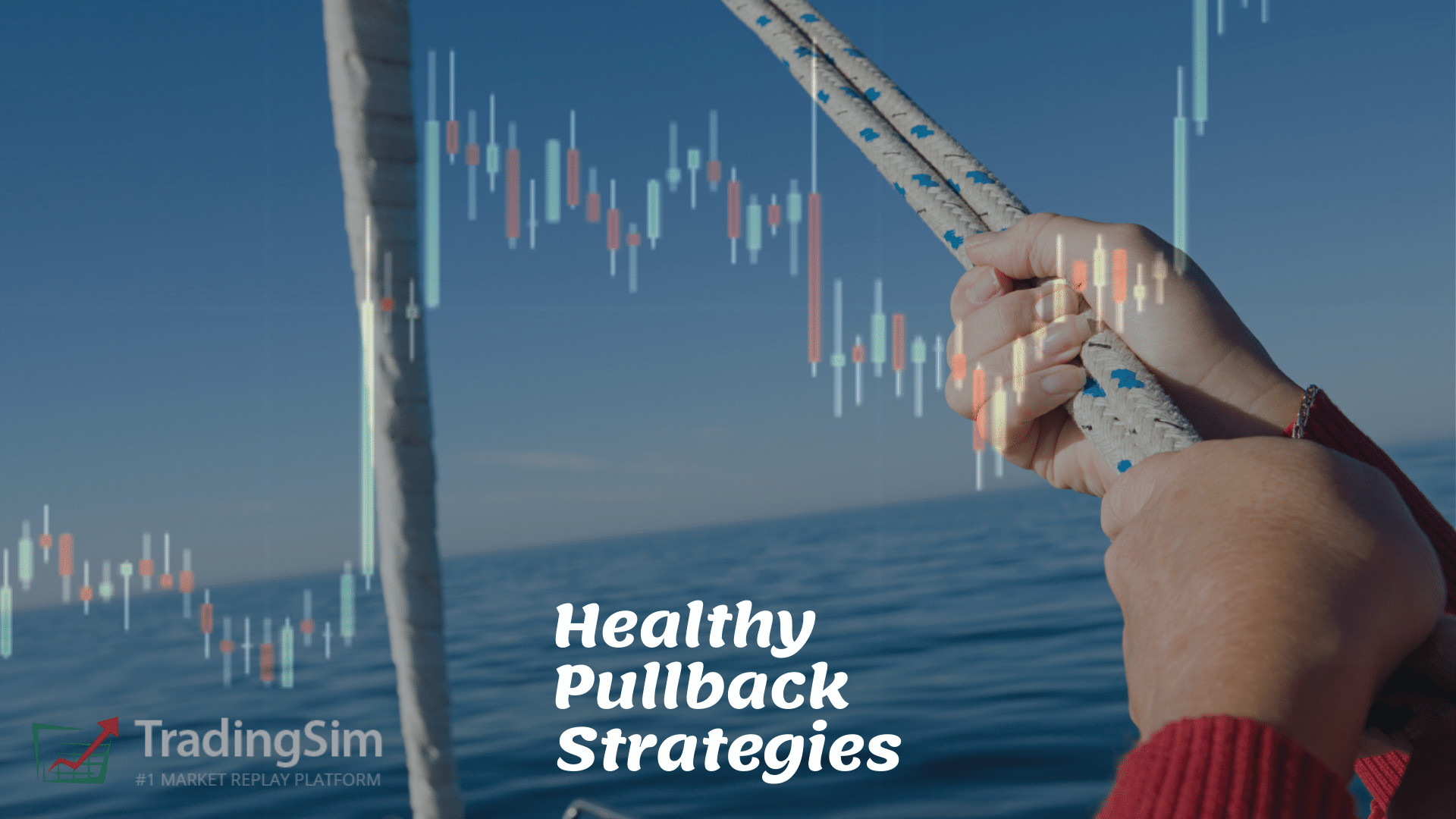
How to Spot a Healthy Pullback Opportunity while Trading Stocks
Category: Trends
Pullback opportunities are great for adding to or initiating positions while trading. However, not all pullbacks are created equal. In this post, we’ll show you a handful of ways to qualify a healthy pullback vs. a not so healthy one.
Once you you nail the basics in this tutorial, be sure to check out our other posts for advanced strategies like the 20 moving average pullback strategy.
What Are Pullbacks?
Very simply, a pullback is a temporary pause in a stock that is otherwise trending. The trend can be up or down, it really doesn’t matter, so long as there are a series of higher highs and higher lows being made — or vice versa.
Generally speaking, pullbacks do not occur in range-bound stocks. Despite this, some may consider a retest of a sideways channel a “pullback”.
Here is what you might call a series of pullbacks for an up-trending stock using symbol $CEI as an example:
Pullbacks in an uptrend
We’ve circled a handful of the pullbacks just to give you an idea of what they might look like. Granted, this is being done on a 1 minute chart, but their are plenty of other pullbacks not circled that might be considered healthy. It will all depend upon the time frame you are trading on and how long term you expect the trade to last.
Pullbacks in a down trend look very similar, just mirrored. Here is an example with $IRNT
Pullbacks in a down trend
While all of these look great in hindsight, the question is whether or not you can decipher a “healthy pullback” in real time. To that end, in just a moment we’ll discuss a handful of ways to determine the health of a pullback when actively trading.
Before we do, we’d like to show you the difference in what we consider a pullback and range bound stock. Here is an example of what you wouldn’t consider a pullback in ticker $DATS:
Range-bound stock DATS
The difference should be quite clear. We are not really putting in higher lows and higher highs, or vice versa. In other words, we are not trending.
What is a Healthy Pullback?
In order to know whether or not you want to place a trade into a pullback, it would behoove us to know the difference between a healthy pullback or one liable to fail.
Let’s start by analyzing the bigger picture first.
1. The Big Picture Sets up the Healthy Pullback Intraday
Every big move typically starts with a move based on larger time frame levels on a chart. Yes, even the moves that seem to come out of “no where.”
Even day traders should be aware of how to read key levels on a daily chart. Let’s take the following move in $PALT for example. Notice the daily chart first.
Big Picture for Big Moves
This example of $PALT is a perfect example of a liquidity trap. As shorts try to catch the climactic gap the day prior, their average price is somewhere around the closing vwap for that day. We call that VWAP Boulevard, and it is annotated on the chart using our vwap boulevard drawing tool at around $5.19.
As the stock rallies the day after the big gap, albeit on lower volume, shorts are now in hot water. Essentially, the tide is coming back in, pushing price higher and higher towards their average from the day before. What happens the 3rd day will give us an indication of whether or not we could have solid momentum to push us higher for a breakout here.
The Breakout
Sure enough, the third day is a charm:
PALT breakout
Ridiculously, the momentum carried this stock almost 3x higher than the previous day. Most traders wouldn’t expect a move like this. Yet, while this may be an “outlier” type of move, it is these big picture type of trades that reward those who study the dynamics of moves like liquidity traps.
Better yet, these traders know how to spot the momentum and jump on the train on healthy pullbacks.
Here is what the intraday of this $PALT looked like:
Three solid healthy pullbacks in the uptrend
Each of the three major pullbacks in $PALT proved buyable as the stock catapulted off the prior day’s vwap boulevard area of support. Be sure to read that article if you want to better understand why vwap boulevard is so important.
Other Big Picture Ideas that can Precede Big Moves
While we won’t discuss the myriad of opportunities you can find for big moves, here is a quick list of setups you might study:
2. Momentum and Direction as a Backdrop to Healthy Pullbacks
As we stated above, a healthy pullback tends to work best in trending environments. The theory behind this is that there is upward or downward momentum that is going to continue carrying the stock along the path of least resistance.
The thing you need to do as a trader is to decide how much momentum is behind the move. In other words, if the rocket boosters have been ignited from a sound base, will they carry the stock higher from each consecutive pullback. Not only that, but do you have after burners kicking in the higher it goes.
Volume is King
When making this determination, volume is king. Think of it like the effort that creates the result you want. But you must understand that not all volume is the same. It’s not as simple as green and red on the chart and assuming that means good volume and bad volume. The quality of the effort and the ensuing result of the price are what you want to pay close attention to.
For example, you could have a stock rocketing higher, but the amount of selling pressure going into that could be so severe that the stock stalls and falls back to earth.
In order to envision this, let’s look at a few examples of sound pullbacks vs. pullbacks that have failed due to a lack of volume. For each, we’ll analyze the volume and price to see whether we had the momentum we needed for the pullback opportunities.
Healthy Pullback Example:
Healthy pullbacks in $PALT
Pay close attention to the volume annotations in the chart above. To start with, we have a huge igniting bar off the open that sends us into a halt. This then expands on volume as price moves upward. As shorts try to average up here hoping that the stock will fail in the morning, it simply pulls back and holds the area of “large volume” that came in after the halt around 9:45am.
This is what we call volume expansion and contraction. On a healthy pullback, you want to see the significant areas of support holding, and this is based on the volume of those areas. Likewise, you want the pullback volume to contract, or diminish. This indicates supply is drying up.
Because we are viewing this early in the trading day, it is a fresh base, and the first pullback of the day. This is important. We’ll see later that the more mature the trend becomes, the more likely pullbacks are to fail.
Sympathy Moves
As you can see, given the “big picture” on the daily of $PALT, the momentum was really strong. On a similar note, there was another stock that had been running in recent days that was similar to $PALT. This ticker was $DATS. Both tickers are symbols for chat platforms. Here was $DATS on this day:
DATS sympathy move
It can often help with the big picture if you have a sympathy play going on at the same time. You can find these with similar stocks in the same industry or with thematic similarities.
Unhealthy Pullback Example 1:
Let’s rewind $DATS on the simulator just a few weeks prior to the example given above. Notice how we are consolidating after a prior run. We’ve drawn a few lines on the chart to indicate a “range bound” area that the chart is trading within.
Range-bound trading action
Although we haven’t annotated it on the chart, look very closely at how the volume has been diminishing each day after the large red reversal candle on the daily. We consider that “overhead supply” in that candle. In order to overcome that supply, we’ll need a big effort in volume.
On the intraday chart on top, that volume never comes. The volume on the left side of the chart is much greater than on the day we are trading. Hence, we don’t get the rocketing momentum we need for a solid trend. On the same token, we don’t get a continued selloff either.
Unhealthy Pullback Example 2:
Unlike trying to find a pullback within a trading range, you may also find unhealthy pullbacks at climactic tops. Let’s use the example from $PALT again. Only this time, we’ll look at the top.
Unhealthy Pullback at the top
Don’t fall prey to fomo. There comes a time when a stock has to stop going up. Supply eventually wins. Along those lines, this example shows you what to look for when a strong stock is starting to stall.
We’ve tried to give you a visual measure here of each “thrust” higher from the pullbacks. As the price rises, gravity takes effect and begins to stall the upward momentum. While there are three fantastic pullbacks on the way up, it is at these high levels that you want to be cautious buying yet again.
In another article, we discuss how to judge the backside of a trade. We suggest you have a read if you want to learn more about using moving averages or other trend indicators to help find the top.
3. Using Multiple Time Frames and Moving Averages to Find Healthy Pullbacks
If you don’t want to rely completely on the volume and price action, you may find that popular moving averages like the 20ma or 50ma provide good support along the way.
To that end, let’s overlay a few of these using the 1, 3, and 5 minute charts of $PALT:
Moving averages help find healthy pullbacks
From the top left and going clockwise, we have a 1 minute chart, 3 minute, and 5 minute. The 1 minute has a 50 simple moving average overlayed. The 3 minute chart has a purple 20 simple moving average. And lastly, we have the 5-minute chart with a blue 10sma.
Notice how each one of these corresponds with the pullbacks. While this isn’t an exact science, moving averages can often help you discover when and where to expect pullbacks to find support.
4. When to Add or Re-enter on a Healthy Pullback
Now that we have the basics covered. Let’s try to put it all together with a chart of where we might find specific entry criteria for taking a position in a pullback.
Here are a few things to look for:
Look for a potential support area using prior high volume bars
Watch for volume to dry up into an area of support like a moving average
Look for confirmation on the higher time frames.
Add as volume expands away from the support area
Let’s look at the above chart with all of our data now:
VDU Entries on Healthy Pullbacks
What you see in the 1, 3, and 5 minute charts above are entry signals based on the concept of VDU and Pocket Pivots. What you’re essentially waiting for are the areas of support to line up with lack of supply in the price action and volume.
VDU simply stands for Volume Dry Up. And Pocket Pivots are just expansion pivots away from this area of diminishing supply as demand returns and shorts cover.
You might even consider them descending wedges or flag patterns. And, technically, they are. However, the VDU and Pocket Pivots are a great way to signal your entries.
How to Practice Your Own Pullback Strategy
Just as we have mentioned above, our suggestion is to start in the simulator and find the days on your charts with the largest candles. At some point, those stocks had to have momentum.
Start with the daily chart and ask yourself, “why did this move the way it did?” Was it a news related event? Perhaps it a technical break out or break down? Was it a gap and go? Whatever the reason you come up with, note that, and see if you can find common patterns that lead to big moves.
Once you have your playbook of daily chart patterns, dial into the intraday action. How much volume is necessary to overcome any downward force of supply? Maybe you need to keep an eye on the Relative Volume (RVOL) for that day? Or, perhaps volume forecasting would help? What about oversold/overbought conditions?
As you can see, there are a lot of ways to find good criteria for strongly trending stocks. It’s your job to find a big move, and catch the meat of it.
Study your best simulated examples for at least 20 trades to determine whether or not you have a high probability of success before trading with real money.
Here’s to good fills!
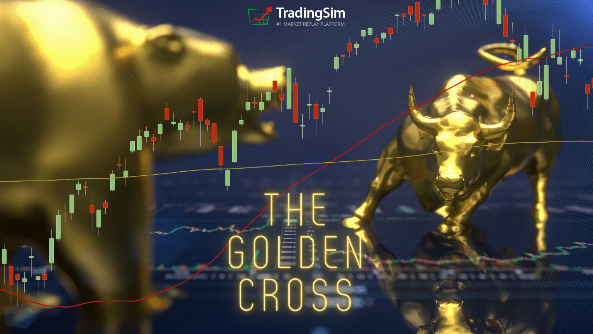
In this article, we’ll uncover one of the most important and popular setups using moving averages – the golden cross.
We’ll provide an explanation of the signal and then dive into three trading examples.
What Is a Golden Cross?
A golden cross occurs when a faster-moving average crosses a slower moving average. Sounds simple enough right? However, the key point is the moving averages which constitute the cross, and the direction in which they cross.
Specifically, you need the 50-period and 200-period simple moving averages. Anything other than these two periods and it is not a true golden cross.
Directionally, a golden cross happens when a 50-day moving average for an asset trades higher than a 200-day moving average. In other words, prior to the the cross, the 50 moving average would have been below the 200sma. You can see this in the example below:
AMC 200 and 50 moving average cross
What this tells traders and investors is that momentum could be changing when the cross occurs. When the speed of the upward movement in a shorter time-frame is faster than the longer-term speed, that’s taken as a sign that investors might want to buy.
That is, with high trading volumes and higher trading prices, the golden cross is possibly a sign that the stock market, and individual stocks, are poised for recovery.
What are the three stages of a golden cross?
There are three stages of a golden cross.
As the downtrend in the stock market ends, the short-term 50-day moving average moves below the 200- day moving average.
In a crossover, when a stock recovers, the short-term moving average crosses over the long-term moving average. That’s where the term golden cross comes from, when the two average lines cross on a chart.
In the last stage, the short-term moving average continues to move upward. That’s usually a sign that the stock market is on a bullish trend.
The three stages of the golden cross
Is a golden cross a sign that investors should buy?
Golden crosses are not a guarantee of a bullish future in the stock market. Ari Wald is head of Technical Analysis at Oppenheimer & Co. He doesn’t see golden crosses as an absolutely bullish signal for the markets.
“All big rallies start with a golden cross, but not all golden crosses lead to a big rally,” he says.
Brian Shannon is the founder of AlphaTrends.net. He also agrees that golden crosses are not a definite timing signal to buy.
According to Shannon, “They tend not to be timing signals, but more for confirmation of a move that has been in place.”
In contrast, Jon Boorman sees golden crosses as good trading indicators. However, he also advises caution for investors as well.
“They’re perfectly valid, but people treat them all as individual trades rather than being part of a system. If you’re going to take one trade, take them all. You can’t pick one and then when it doesn’t work say ‘so much for that’. It’s an absurd thing for short-term traders and business TV to take notice of,” said Boorman.
“Just like any trend-following system, it will have plenty of whipsaw losing trades, but the winners will more than make up for those. It’s easy to pick holes in it, but very few have the discipline to execute it. Which is why it works,” added Boorman.
Is the golden cross an indicator of a bull market?
While financial analysts are skeptical about the golden cross being the start of a bull market, there is data to support the belief that it could be a good indicator. Schaeffer’s Senior Quantitative Analyst Rocky White found that there were gains in the stock market after a golden cross.
White found that the S&P 500 had healthier returns a few months after the first golden cross.
“The S&P has averaged healthier-than-usual returns looking one, three, six, and 12 months out, ” said Schaeffer’s Senior Quantitative Analyst Rocky White.
“For instance, the index has averaged a three-month gain of 4.07% after a golden cross, and was higher more than three-quarters of the time. That’s compared to an average anytime three-month return of 2.12% since 1950, with a positive rate of just 65.9%,” said White.
“On Thursday, the S&P 500’s 50-DMA crossed above the 200-DMA . Such is known as a “Golden Cross” and has now happened 25-times over the past 50-years. The long term performance of the S&P 500 following such an occurrence is unabashedly positive,” said Marcus.
“TPA calculated the performance of the S&P 500 10, 20, 40, 80, 160, and 320 days following each of the 25 Golden Crosses since 1970. The average performance is 0.88%, 0.98%, 3.25%, 6.73%, 9.57%, and 15.70%, respectively.
“The positive cross has happened 6-times in the past 10-years. The averages for 10, 20, 40, 80, 160, and 320 days following each was 0.53%, 0.89%, 2.64%, 8.17%, 10.45%, and 20.95%, respectively,” added Marcus.
Golden Cross Signal
Golden Cross Example
The above chart of $TSLA displays a classic golden cross trading example. The blue line on the chart is a 50-period SMA and the red line is the 200-period SMA.
The chart begins with a strong downtrend, where the price action stays beneath both the 50-period and 200-period SMA.
Suddenly, the direction of the trend changes and price begins making a move to the upside. Naturally, the 50-period SMA reacts faster to the price change as it has a greater sensitivity to the most recent price action.
Once the 50-period SMA crosses the 200-period SMA to the upside, we have a golden cross. We have highlighted this in the grey circle.
Profit Potential of the Golden Cross Pattern
The profit potential will depend on the stock and the setup going into the trade. Sorry to be so vague, but that’s the reality of trading.
Death Cross
One option is to wait for a cross of the 50 back below the 200 as another selling opportunity. The only issue with this approach is you are likely to give back a sizeable portion of your profits since moving averages are a lagging indicator.
Here is an example of the “Death Cross” after riding a nice gain in Chipotle (CMG).
Golden and Death Cross Buy/Sell Signals
Notice that the sell signal comes as the market was already plunging. While you would have still had a nice gain, you must be ok with not “selling at the top.”
Prior Support
What you can also do is look for areas of resistance overhead which will act as selling opportunities for longs that have been holding the stock for a long period of time. Typically, bag holders from higher prices will be glad to get out at break-even.
Here is an example with CMG. We took the daily chart Golden Cross entry from above, then flipped to a weekly to see the target areas. Notice how close the exit would have been to the death cross still circled.
Selling at Resistance
A caveat to this strategy is that the stock may consolidate and push higher. You may want to hold part of your position and consider a potential breakout from the prior resistance area.
Trendline Break
If the golden cross is real, the signal will likely generate a strong buying opportunity. You can then use the first couple of reactionary lows to create an uptrend line. You then hold the stock until this trendline is broken.
Let’s look at an example of this below.
Bullish Golden Cross Pattern Example
Here we have a bullish golden cross stock pattern when the faster SMA on the chart breaks up and through the slower SMA in a bullish direction.
Trend Break Sell Signal
This is the same type of golden cross trading signal from the previous chart. However, this time we demonstrate the strength of the signal and the potential run a stock can make after a golden cross materializes.
If you don’t want to wait for the 50sma to break the 200sma on a death cross, you could have taken gains on the trend line break.
In this particular example for NVR, the stock went on a 100% run in 7 months.
Not a bad 7-month return for all you swing traders out there!
3 Strategies for Trading the Golden Cross
Strategy #1 – Look for Setups After a Long Down Trend
All golden cross setups are not equal. One method you can use is to wait for a stock that has had a long sustainable downtrend and then look for a stock that is ready to make a move higher.
There is so much bearishness in the stock that the signal has tremendous significance as a reversal.
Long down trend leads to bullish cross
The power of this signal is that the cross happens after a multi-month downtrend. By having such a long bearish trend, in order to get a bullish cross, there has to be a basing period. This basing period is the battle between the bulls and the bears.
Therefore, once the stock breaks to the upside, you know there is juice behind the move.
You can buy that initial breakout after the base, but realize you could still be in the thick of a bear market, so don’t get married to the stock. Look for opportunities as the stock rises to secure your gains.
Strategy #2 – Avoid Wide Spreads Between Moving Averages
At times the averages will have a wide spread. This will present a cup-and-handle-like formation of the averages. On the surface, it’s going to look really bullish.
However, if you look at the price action, you will notice the pattern is unhealthy. First, the price is shooting straight up. What happens when a stock goes parabolic into a strong primary trend? It usually reverses.
Golden Cross to avoid
What does this chart example teach us?
You cannot ignore price action. Parabolic reversals should be treated with caution. This is especially true when you have a large overhead gap acting as resistance.
For these types of golden crosses, you may want to avoid them. While it might be considered a valid golden cross, there are better opportunities in the market with smoother, less volatile entry signals.
So, what’s the trade here? Well, there isn’t one.
As traders, we have to remember that sometimes the best action is no action at all.
Strategy #3 – Combine Double Bottom Pattern with Golden Cross
The last strategy we will cover combines the double bottom chart formation with the golden cross.
Here is the setup.
Look for a double bottom on the chart. The second low should be lower than the first.
Next wait for the golden cross formation. Lastly, wait for the price to retest the 200 simple moving average.
You want to buy the test of the 200 moving average with a stop below the low of the double bottom.
The below chart illustrates this formation.
Golden Cross + Double Bottom
Conclusion
The golden cross is a powerful trade signal, but this does not mean you should buy every cross of the 50-period moving average and the 200.
You will need to bring a higher level of sophistication to the setup, to ensure you are buying into a trade with real opportunity.
How Can Tradingsim Help?
Tradingsim is the best market replay platform on the web. You can cycle through thousands of charts and replay the data to see which golden cross setup works best for your trading style.
Trend Trading Overview
Trend trading is the practice of riding a security during a strong move up or down.[1] Now, what one person calls a trend can vary from trader to trader.
For example, a penny stock trader may expect a massive move higher of 20% or more intraday before considering a stock in an uptrend.
Conversely, a low volatility trader may need minor price expansion before declaring a new trend in play.
Whatever the time frame or strategy, the goal with trend trading is to identify the trend and find a way to jump on board with least amount of risk. To that end, in this post will discuss a few of these strategies and reveal how you can scan for trending stocks.
First, let’s talk about to discover the trend.
Trend Trading Indicators
When trading, the less subjectivity you have about the markets the better. Therefore, you can use technical indicators to gauge market trends.
Trend lines
Trend lines are a great way to clearly define the market trend. This can still prove to be somewhat subjective as you are required to identify the start and endpoints for the lines. But for all intents and purposes, with a little practice you should be able to identify the prevailing points of support and resistance for a clear trend.
For bullish trends, you want to connect the low points and high points to develop an up channel. [2] After all, an uptrend is only confirmed once you have a series of higher lows and higher highs.
As the stock is on its upward trajectory, the stock should not breach the prior low on its way up.
Bullish Trendlines
Likewise, for a bearish trend you’ll simply reverse your low and high points.
Bearish Trendlines
Notice that this is the exact same stock, just on the backside of the intraday trade. Trends can really help uncover which side of the trade you’re on. And the great thing about trend lines is that the more you draw with them, the more you train your eye to anticipate the direction of a stock.
This can help with setting targets and reversals as your trading develops.
Trend Channels
To take it a step further, you can use the trend channels drawing tool. These channels create a clean parallel line. However, these channels will not allow you to create wedge patterns or diamond formations.
Often, trend channels work best for more natural price action in larger cap stocks: bigger, more liquid companies.
Uptrend Channel
Slope of the Line
The other point to note is that you need to identify a minimum slope of the line, which will trigger a trend for you.
A strong trend will usually have a slope north of 50 degrees to generate the level of an impulse move higher.
This is completely subjective. Nonetheless, if you are trend trading, the move should be strong enough for you to care.
Moving Averages
Moving averages are another great indicator you can use to measure the strength of a trend.
On the bigger time frame, you can take the simple approach of waiting to see if the stock is above or below its 200-day moving average. However, another approach is to look for a strong trend where the averages do not intersect on the way up. This spread of the averages shows you that the stock is trending hard for all periods (short and long).
To that point, we’ve created a scanning filter in the TradingSim application that, when checked, will eliminate stocks on a daily chart whose 20, 50, and 200 moving averages are stacked on top of each other. In other words, the 20 is above the 50, and the 50 is above the 200.
This tells us that the shorter time frames are above the longer time frames, revealing the uptrend. Of course, reverse this and you get a downtrend.
Here is what that scan filter looks like:
Trend Trading scan filter
When one of these is checked, it will filter the results to only those stocks trending bullishly or bearishly.
You may be thinking, “why is this important?”
Well, the great thing about trending stocks is that they can offer short term traders great opportunities with pullback buys. If you’re not familiar with this strategy, be sure to check out our post on the 20 Moving Average Pullback.
Example of an Up-trending Stock
To illustrate the results from the scanning filter, here is just one stock that was populated from that list.
GOOGL Bullish Trend
From the chart above, you can see that the purple 20 moving average is trending nicely above the red 50 moving average. And, down below, the 200 moving average is pointing upward as well.
All three are in alignment giving us the indication that the trend is strong.
Example of a Non-trending Stock
Now that you know what a strong uptrend looks like, notice the difference between GOOGL and this XNCR trend.
Plenty of chop, right?
Too Much Overlap
The above chart has two moving averages the 10 and 20 EMA. You can see the level of backtesting the 10 has with the 20, which is a clear sign the stock is not trending hard.
Example of a Down-trending Stock
ABIO has a clear sell off after reaching climactic highs around $18. From there the stock never recovered.
Spread of Averages
The above chart is a clear example of when a stock is trending really hard. Notice how the averages do not cross at all. To add more validity to the trend, the averages are also far apart all the way down.
Just to level-set your expectations, these sort of trends are hard to find. You certainly don’t want to be on the wrong side of this trade. And, unfortunately, some selloffs never pullback for low risk entries.
Momentum Oscillators
Another indicator you can use to analyze the markets are momentum oscillators. These indicators have no upward or lower bound which allows the oscillator to run with the stock. [3]
The TRIX indicator is a momentum oscillator that moves above and below a zero line. In the next chart, we will cover a stock that is in a strong downtrend.
As this stock continue its downward momentum, notice that the TRIX is practically living below zero.
TRIX Below Zero
That being said, the TRIX does not react quickly because it smoothes out three exponential moving averages, so it’s a great indicator for measuring trends.
Notice how as the stock moved lower the TRIX respects the zero line. This does not mean there aren’t moments when the TRIX breaks zero by a hair or two.
Remember, in the market rarely does the price action fit nicely into a box dictated by technical analysis books.
More Trend Trading Examples
For our first example, we have a stock in a clear downtrend. You can see how the stock is making lower lows and lower highs.
Downtrend
Next up, we have a strong bullish uptrend with higher highs and higher lows.
Bullish Uptrend
Hopefully examples are helping you to see the difference. How about one more:
No Clear Trend
Can you see how the above chart lacks any trend? This is what we would call a choppy market or a security that lacks a clear trend. Most of these stocks are range bound.
Where Trend Trading Fails
Trend trading is like any other strategy in the markets. There will never be a 100% success rate. Often times a bullish trend will fail when a stock has reached a climax top, overthrows its channel, or supply becomes too heavy.
Conversely, a down trend will end when a stock has a climactic selloff, or demand comes in to support the stock.
The key is to study the trends to find consistencies in the volume and price action. [4]
Not Honoring Your Stops
When you are trading a stock that is trending, it feels great. You don’t have to do much and the money just flows into your account. However, if you jump into a trending stock at the time it reverses, you can find yourself in a pickle.
This is because being late to the party can lead to a nasty reversal as the stock could drop back down to its origination point.
So, you have to use your stops or the trending move will become your worst nightmare.
If you find yourself buying at a top of a strong trend, do not add to the position as it violates each swing low on the way back down. This is called averaging down, and it can be devastating.
Not honoring your stops
In the above chart example, we’re pointing out what happens if you were to buy support in a channel of a strong uptrend that fails.
As you can see, if you did not place a stop below the low of the test, things got ugly fast and in a hurry.
Strategies to Join a Trend
Now that you know what not to do, let’s look at a few strategies to help you join the trend.
The Moving Average Pullback
Many times during a strong trend, stocks will pullback to an important moving average like the 20 or the 50 moving average. These pullbacks can provide a great opportunity to join the trend if it continues higher, all while keeping your risk low.
Because institutions love to buy at lower prices, often stocks will find support at this levels.
Let’s use our GOOGL example from above and see how buying at the 50 moving average would have been a great decision.
Trend Trading the 50 moving average
We were given three great opportunities to buy the pullback in GOOGL at the 50 moving average, noted by the arrows on the chart. Each one of these buys would have been a great opportunity to profit.
You could have placed a stop loss just below each consolidation if the trade didn’t work out for a small risk.
Mean Regression Trend Trading
If you don’t like using the moving averages, sometimes a channel works better. Taking the moving averages off the chart of GOOGL, we’ll add a channel this time.
Notice how the buys correspond with the channel lows, and the sells correspond with an overthrow of the channel highs.
GOOGL Trend Channel
This can be a great and easy way to manage short-term positions. Basically, you’re buying the dips at support, and selling the rips at the highs.
How Can Tradingsim Help with Trend Trading?
If you are looking to practice trading trending stocks, it will come down to your entries, stops and the method of choice. Whether it’s moving averages, channels or oscillators, you’ll need to master each method in order to develop an edge.
This is where you can use Tradingsim to practice with over 11,000 stocks and 1,000 ETFs. Be sure to drop us a line and let us know how your edge is developing!
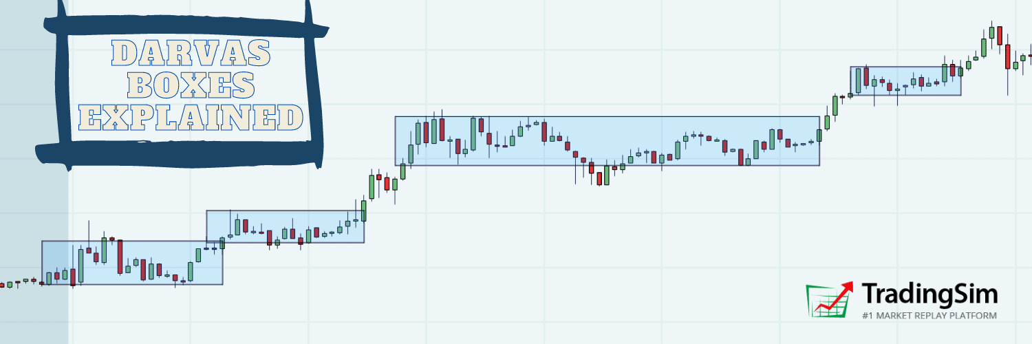
The Darvas Box was a fascinating trading discovery in the mid 1900s. Eponymously named, Nicolas Darvas was able to devise a system to trade the markets from anywhere in the world with only a magazine and telegrams.
A truly captivating story, and one that is recounted in his book How I Made $2,000,000 in the Stock Market, it is a worthwhile read for any trader.
Despite the use of his system as a swing trader, the Darvas Box indicator can be used in today’s markets on any timeframe. And to that end, we’ll discuss the strategy, rules, and best practices for the Darvas Box in this post.
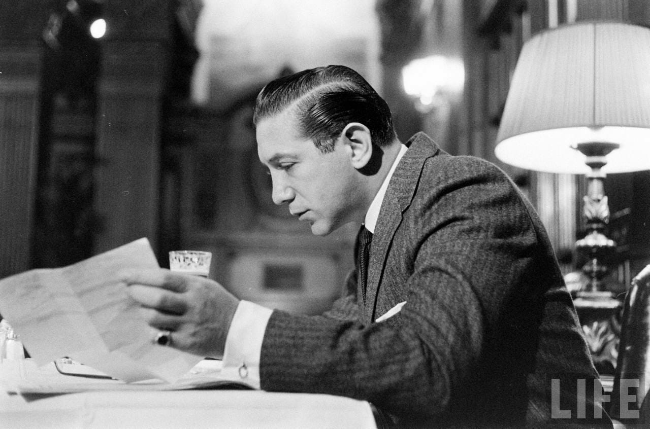
Who is Nicolas Darvas?
Nicolas Darvas was a professional dancer that traveled the world with his sister in their own dance company during the 1950s. At one point, after receiving shares of a stock as a gift, he became obsessed with the markets and put countless hours into the study of market movements and internal mechanics.
It’s really fascinating to think that he was able to teach himself how to trade the markets just by reading books and newspapers. In fact, his favorite two were The Battle for Investment Survival by Gerald M. Loeb and Tape Reading and Market Tactics by Humphrey Bancroft Neill. He also took Barron’s magazine publication and regularly searched for up-and-coming companies.
Nicolas Darvas studying the markets
It was this intuition on up-and-coming companies that benefitted Darvas greatly. He was a master of “social arbitrage,” before that was even a term. Yet, his strategy for entering the market was so simple that he could enter orders from anywhere in the world his dancing profession took him.
All he had to have was access to a telegram service. From there, he’d wire his orders to his broker.
To learn more about Nicolas Darvas check out his Wikipedia page.
What is a Darvas Box?
The Darvas box is a trend following system. A trend following system is one that does not try to anticipate a market move. Another way of saying this is that the system is reactive versus predictive.
Darvas would only enter stocks that were in confirmed uptrends and breaking out of consolidation patterns to make new highs. His boxes helped him visualize this while he was on the road dancing for a living.
Essentially, if a stock on his watchlist was bouncing around inside a “price box” of say $35 and $40, then he knew if it broke to $40.50, it was time to buy.
Likewise, if the stock retreated back into the box, it hit his stop loss orders. He wanted to make sure the uptrend was confirmed with higher prices.
Darvas Box Rules
Darvas’s rules were fairly simple, as stated in his book How I Made $2,000,000 in the Stock Market. You can find his book on any digital platform. Again, it’s a quick and fascinating read and worth your time.
Okay, back to the rules.
A stock is making a new 52-week high
After the high is set, there are three consecutive days that do not exceed the high
The new high becomes the top of the box and the breakout point leading to the new high becomes the low of the box
Buy the break of the box once it exceeds the high by a few points
Sell the low of the box if it is breached
Add to your position as it moves into each new box
This sounds like a lot, but it’s honestly straightforward. You have 7 steps which prescribe how to find the stock and also provides entry and exit criteria.
How to Draw a Darvas Box
Keep in mind that Darvas did not have a computer. They hadn’t been invented. He had to rely soley on data from newspapers and needed to manually track his trades after the market close later that day or even the next morning when he could get his hand on a newspaper.
In fact, he recounts that the worst trading he ever did was when he was “close” to the action in New York. Something about the proximity to Wall Street and the instant availability of information made him overtrade and over think. For that reason, he went back to his “detached” style of trading while on the road and found success again.
Thankfully for us, we live in a time where computers do all of the heavy lifting for us. On that token, the Darvas Box indicator is prevalent on many charting systems.
Within Tradingsim, it is one of our standard indicators which you can select from our list of studies. Below is an example of a Darvas Box on an intraday chart of SOS
SOS Darvas Boxes
Notice how the blue box identifies a new high, the consolidation, and the subsequent breakout levels.
Darvas Box Settings
Darvas used three bars consolidating under the first high bar to construct the box. However, you can now configure the boxes to your liking with a few clicks of the mouse.
Here’s an example of how you might change these settings inside TradingSim:
Darvas Box Settings
You may be wondering, “why do we need these settings and offsetting levels?”
Many traders have a tough time surrendering to any method without adapting to the original technique.
For example, Darvas clearly says buy the new 52-week high, so the look-back period is honestly irrelevant. Do what feels right to you, but we would recommend you stick as close as possible to Darvas’s original intent to see what part of the strategy works for your trading style.
Where Darvas Works the Best
Without a doubt, the Darvas box strategy works best in strong bull markets. The market simply goes higher and you just keep buying the strength. If you are swing trading and you can catch the right symbol, profits can get out of hand quickly.
The hard part though is finding, buying, and managing these homerun trades.
Example of Darvas Box Working
Below is a weekly chart of Microsoft, which is a large stock that often mirrors the movement of the Nasdaq or S&P 500. There were at least three clear long entries in the bull market from 2016-2019. You would have added to your position at both the second and third breakout zones, perhaps more.
Darvas Box – Strong Bullish Trend
There is also a spot on the chart which says “no entry.” This is because the breakout was not convincing and Darvas requires the price to leave the box by a few points. Darvas avoided placing trades when a security was only able to slightly tick over the most recent high.
Do you see how by adding to your position and letting your profits run, you are able to reap significant rewards?
Now let’s review the hard part of the system, which requires tremendous discipline — the ability to not only pick the right stock but to also understand when market conditions are ripe.
Risks of Trading the Darvas Box
The Darvas box can put you in a tight spot under the following scenarios:
Buying breakouts into stocks that are near 52-week lows
Buying breakouts during bear markets
Scaling too heavily when adding to your position
Using the Darvas Box within sideways markets
Ignoring Your Stop Levels
Ignoring Your Stop Level
There aren’t many examples on the web discussing the issue of not honoring your stop levels when trading Darvas boxes. But because we like to be thorough, here is a fine example of what could happen when you neglect your stop.
Not honoring your stop can be disastrous!
Let’s say you were able to ride VCNX up and you also were adding to your position as the stock went in your direction. Then the inevitable happens, the stock breaks major support.
By not honoring the stop, you actually could end up in a catastrophic situation. Remember, you are trading stocks that are trending strongly, so when things go wrong, they can go horribly wrong.
Sideways Markets Hurt Darvas Traders
Sideways markets can drain you dry using the Darvas box method. This is because you will find yourself buying the breakout and then consequently selling the breakdown at the bottom of the box.
Choppy Darvas Signals
In the above stock of ROKU, the first breakout felt like the start of a new trend. Well, each signal thereafter would have taken you on a 2-3 day grind of wasted time and high commissions.
The market only trends about 20% of the time. Be sure to determine when the market is in a strong bull trend. More importantly, the sector you are trading should also be outperforming.
Can you Day Trade with Darvas Boxes
Darvas boxes can work on any timeframe. So, yes, you can day trade with the Darvas Box. However, you will need to define your “look back” period. This will allow you to collect trade data, so you can begin to assess the right configuration.
For example, Darvas stuck to new 52-week highs with three consecutive bars below the high to establish a new box.
You will need to define similar parameters for yourself that work. We suggest playing with the indicator settings and figuring out what works for your style. By default, the look back period for intraday 100 bars. You may also want to turn off the green “ghost boxes” to declutter your charts.
How Can Tradingsim Help?
All of the above examples were taken directly from Tradingsim. You can use Tradingsim to practice your strategies using the Darvas box. You can also test Darvas’s original strategy using daily and weekly bars.
If you are more interested in day trading with Darvas boxes, you can test out the system with a number of intraday timeframes as well.
Best of luck!
The recent downturn in the stock market has many investors concerned about a prolonged bear market. The Dow Jones recently plunged to its lowest levels since the “Black Monday” stock market crash of 1987. How did the bull run of the 2010’s come to end in 2020? And what does this current bear market mean for investors?
Bear Market
What is a bear market?
Before the bear market of today, the original bear market reportedly got its name from fur salesmen in colonial times. Investopedia noted that the bearskin sellers were similar to stock traders of today.
“Historically, the middlemen in the sale of bearskins would sell skins they had yet to receive. As such, they would speculate on the future purchase price of these skins from the trappers, hoping they would drop. The trappers would profit from a spread — the difference between the cost price and the selling price. These middlemen became known as ‘bears’, short for bearskin jobbers, and the term stuck for describing a downturn in the market,” noted Investopedia.
Today, a bear market definition is much different. A bear market is a time when major stock indexes drop from a high point by 20% for an extended period.
When was the longest bear market?
The worst bear markets occurred during the Great Depression in the 1930’s. During that time, the Dow Jones cratered by almost 34% after a decline in stocks. Many investors bought the stocks on margin, borrowing funds from brokers. When stocks fell and investors couldn’t pay back their loans, there was a run on banks. The resulting bank runs and uncertainty about the economy led to the great stock market crash of 1929. That subsequently led to the Great Depression that lasted for about a decade until the U.S. entered World War II in 1941.
When did other bear markets in history occur?
During the 1987 crash, the markets dropped 31%. That decline was likely caused by a decline in the U.S. dollar after a widening trade deficit with Asian countries. In addition to the decline of the dollar, the new technology of program trading orders led to the crash. The then-new technology of computer trading had an automatic system that liquidated stocks after price decline targets were met. However, the sell-off led to more panicked selling and stop-loss orders.
As a result, Black Monday on October 19, 1987 led to a 22.7% loss in the S &P. After Black Monday, circuit breakers were put in place on Wall Street. Once losses reach 7%, traders have time to stop trading to prevent the Dow Jones from falling further.
The latest bear market in 2008 saw the markets decline by almost 25%. The last bear market was during the 2008 Great Recession. The Great Recession started after banks started failing after a previous boom in the early 2000’s.
Banks started failing after many low-income homeowners couldn’t pay their subprime mortgage loans after adjustable interest rates rose. Ironically, banks pushed these high-risk loans to consumers that ultimately led to their decline. Homeowners defaulted on their loans and the housing bubble burst. Once the housing market and banking industries tumbled, the Dow Jones fell by double digits. The Great Recession lasted from 2008-2009.
How has coronavirus caused the latest bear market?
Coronavirus
Less than a month after hitting a record high of 29, 551. 42 on February 12, the Dow Jones sank 28%. The Dow Jones plummeted to 21,200. 62 on March 12. Fears about the spread of the coronavirus ( COVID-19) pandemic have caused a massive sell-off. The pandemic caused panic since February by spreading from China. The country is inextricably connected to the U. S. because of how many American goods are produced in China. The illness has spread to Europe and to America, with the world’s largest economy. Many other nations around the world have been impacted by the coronavirus.
Over 118,000 people have been diagnosed with coronavirus worldwide. The virus has claimed about 4,800 lives so far. The illness is apparently spread through large crowds. In the reaction to coronavirus has led to a global shutdown of nations affected, especially China and Italy. Coronavirus has caused the cancellation or slowdown of sporting events, travel, and other activities. These social activities that are driven by consumer spending throughout the globe are being disrupted.
The worries about the virus have caused a drastic downturn in trading. There was a halt in trading at the New York Stock Exchange for 15 minutes on several days the week of March 9 because stocks fell so low. The S & P 500 fell 10% on March 12 and triggered a “circuit breaker” that was supposed to halt trading and prevent a further decline. However, the Dow Jones continued to tumble and dropped 2,353 points on that one day alone.
Oil price war adds to Wall Street volatility
In addition to the coronavirus crisis, there have been wild swings in the stock market. The Dow Jones is rattled because of an impasse between Russia and Saudi Arabia, two of the world’s biggest oil producers. Russia refused to honor an agreement from the oil-producing countries of OPEC ( Organization of Petroleum Exporting Countries.) OPEC initially agreed to cut oil production by 1.5 million barrels a day to drive up prices. Russia refused to go along with the Saudi-led deal. As a result, Saudi Arabia increased its oil production and flooded the market.
Crude oil prices dropped 24% in response to the ramp-up of oil production. That decline was the worst since the start of the Persian Gulf War in 1991. The drop in oil prices led to more volatility on Wall Street. Foreign Policy columnist Jason Bordoff noted that Saudi Arabia could have an advantage over Russia in the oil price war.
“The problem for the kingdom is that Russia is more resilient to lower prices than it is, having added considerably to its foreign exchange reserves while Saudi Arabia’s fiscal cushion has dwindled since the 2014 oil price collapse,” wrote Jason Bordoff.
U.S. responds to global oil war
In response to the oil price war, President Donald Trump has ordered the U.S. Department of Energy to buy crude oil for the Strategic Petroleum Reserve. Trump made the decision after oil company stocks like Exxon and Chevron have plummeted by double digits. He also made the decision after crude oil prices dropped worldwide.
“Based on the price of oil, I’ve also instructed the Secretary of Energy to purchase at a very good price large quantities of crude oil for storage in the U.S. strategic reserve,” Trump said.
“We’re going to fill it right up to the top, saving the American taxpayer billions and billions of dollars, helping our oil industry [and furthering] that wonderful goal — which we’ve achieved,” added Trump.
The twin troubles of coronavirus and the decline in oil prices have led to volatility on Wall Street that ends the longest bull market in history.
Why did the bull market start?
The bull market ended after an impressive run before falling into a bear market. While the bear market comes when the market falls 20% below a peak, it’s the polar opposite of a bull market. The term bull market probably comes from the belief that bulls always charge upward with their horns. Therefore, when the stock market is doing well for an extended period of time, that is a bull market. A bull market means that the Dow Jones rises 20% above its current peak for an extended period of time. The latest bull market ran from 2009-2020.
Before the recent volatility, the Dow Jones was enjoying a record run of prosperity. The stock market rocketed 20% above its last peak in March 2009 and has soared ever since. The recent bear market ends the longest bull market that started in the spring of 2009.
How did the Fed help drive the bull market?
As the U.S. was surviving the Great Recession, the federal government’s $700 billion bank bailout helped revive the economy. In addition to the bank bailouts, the Federal Reserve helped lay the groundwork for the 2010’s bull market. The Federal Reserve spent $1 trillion on mortgage and government bonds to enable quantitative easing. The move pushed interest rates lower and enabled consumers to take out more bank loans and investors to buy more stocks.
The Fed also kept its federal funds target rate at a rock-bottom rate of 0%-0.25%. The federal funds target rate is the rate depository institutions charge for overnight lending to banks. That low rate empowered banks to borrow money at low rates and increase their profits.
In addition to the Fed’s dovish policy that led to helping businesses, the 2017 Tax Cuts and Jobs Act also boosted stocks. The business-friendly tax cuts helped lower the tax rate of corporations. Corporations participated in stock buybacks, which boosted companies’ stock prices.
As a result of all of those factors and a robust economy, Wall Street enjoyed 10 years of a skyrocketing economy amid rising stocks. As a result of the longest bull market, the S&P rose 330% over the last 11 years.
Why did the bull market end?
While the bull market had a long run, even before the coronavirus crisis, there were low points to the bull market wave. The recent Brexit controversy in the United Kingdom in 2019 temporarily caused a dip in the markets. Uncertainty about the United Kingdom leaving the European Union led a short-term dip in the global markets. The U.S.-China trade war started by President Trump also led to market volatility in 2019 as well. The U.S. and China engaged in a stand-off over tariffs led investors to worry about how international trade would be impacted.
With the latest volatility in the stock market, the bull market has officially ended. Coronavirus accelerated the Dow Jones’ decline. Just a month after reaching a record high, the Dow Jones has lost $6.7 trillion in value in the latest bear market. A mixture of a global economic slowdown and investor worries have led to a massive stock sell-off. The official end to the bull market was during the week of March 9.
What is the Fed’s response to the bear market?
Now that the Dow Jones in a bear market, many investors are watching to see what actions will be taken. In response to the Wall Street crash, government agencies are taking action again. The Federal Reserve lowered interest rates in an attempt to revive Wall Street. The U.S. central bank pumped up stocks by lowering its fund target rate to 0% in 2009.
Now the Fed is taking action a similar again a decade later. The Federal Reserve will cut interest rates down to the range of 0%-0.25%. That comes after concerns about the markets tanking the week of March 9. The Fed will also launch a $ 700 billion quantitative easing program. The Fed’s quantitative easing will be comprised of $500 billion of Treasury purchases. The Fed will also distribute $200 billion in mortgage-backed securities.
The Fed released a statement before lowering interest rates.
“The coronavirus outbreak has harmed communities and disrupted economic activity in many countries, including the United States,” noted the Federal Reserve.
The Federal Reserve added that it is making it easier for banks to issue loans to consumers. The U.S. central bank wants to help banks loan more to Americans. The Fed noted that it “is prepared to use its full range of tools to support the flow of credit to households and businesses and thereby promote its maximum employment and price stability goals.”
“These purchases are intended to address highly unusual disruptions in the market for Treasury securities associated with the coronavirus outbreak,” said the New York Fed in a statement.
The New York Fed will offer banks $1 trillion in loans in exchange for Treasury bonds.
“If the market feels the Fed is responding appropriately and is helping investors and consumers, and feel like somebody is in charge, maybe that can help settle things down,” said Delwiche.
While the action was meant to help the stock market, the bank assistance from the Federal Reserve has had a mixed effect. As of the week of March 16, the Dow Jones still shed another 1,000 points. However, by March 17, the market jumped 1,000 points. By March 18, the Dow dropped again, losing over 2,000 points.
What will be the government’s response to the bear market?
Government Response to Bear Market
The Trump administration is taking action to help boost the stock market. The government will offer paid leave to workers who have to stay home under quarantine. Congress is also in negotiations with Trump to offer a stimulus to help boost the Dow Jones. There will possibly a $1 trillion stimulus package that will give $1,000 to each American worker that has to work from home.
Some financial experts want the government to act more urgently to stop the bleeding on Wall Street. Joe Kalish, chief global strategist at Ned Davis Research wants the government to immediately pass a stimulus package to help the Dow Jones rebound.
“We need to see meaningful support for economic activity and credit backstops especially for small businesses, not a targeted approach executed only by the executive branch,” noted Joe Kalish.“We will likely need congressional involvement. This is a potential solvency problem.”
Should investing in a bear market include “buying the dip”?
Regardless of whether there is government intervention or not, investing in a bear market can either be financially savvy or a financial disaster. Many investors are encouraged to “buy the dip” and buy stocks during this huge sell-off. Buying the dip is buying stocks during a bull market when stock prices are lower.
Some financial experts like David Mazza say investors should buy the dip. The trading expert says investors should invest in stocks when they drop in a bear market. However, Mazza advises that investors should invest in a bear market under certain conditions. Mazza says investors should buy the dip only if they’re optimistic that the stock market will bounce back later.
“From a longer-term perspective, valuations across the market just got a lot more attractive. For investors that do not believe this will lead to a true 2008 type of global downturn, dipping your toes into the water does make some sense”, said Mazza.
Some financial advisors are against investing in a bull market
While some financial experts advocate being a bear investor, others are more hesitant. Mohamed El-Erian, chief economic advisor at Allianz, cautions against investors buying stocks in a bull market. El-Erian believes that investors are in for the long-haul should exercise caution before buying the dip because of the volatilty of the stock market.
“If you are a long-term investor, I would wait. I think fundamentals are going to deteriorate even faster. I think the policies and fundamentals are going to go in favor of bad fundamentals, unfortunately, initially,” said El-Erian.
Which stocks should investors buy in a bear market?
If investors want to make decisions on what stocks to invest in, there are stocks that are performing well in a bear market. Some stocks have been performing well as a result of the coronavirus outbreak. Costco ( NYSE:COST) stock has risen as shoppers have bombarded the store. They are panic shopping for items and emptying shelves to try to combat the coronavirus. The warehouse retailer’s stock surged 8% on March 13 and subscription numbers are up after shoppers rushed Costco stores.
Costco’s chief financial officer, Richard Galanti, noted that Costco members have bought many items during the coronavirus pandemic that have driven up sales.
“Members are turning to us for a variety of items associated with preparing for and dealing with the virus such as shelf-stable dry grocery items, cleaning supplies, Clorox and bleach,” said Galanti. He also noted that “water, paper goods, hand sanitizers, sanitizing wipes, disinfectants, health and beauty aids, and even items like water filtration and food storage items” are bestselling items in the stores.
Costco is selling out of Clorox ( NYSE: CLX), another stock that is performing well in a bear market. Clorox’s stock price rose by about 15% throughout 2020 as of March 13. The company that makes cleansing wipes and other disinfectant materials have been flying off store shelves in the wake of coronavirus. UBS analyst Steven Strycula believes that coronavirus (COVID-19) fears will continue to drive Clorox stock up.
“Based on conversations with retail buyers, we estimate COVID-19 related demand could boost baseline disinfectant category trends by 3-5x in the next few months as retailers work to rebuild inventory and stay in stock,” reasons UBS analyst Steven Strycula.
Working from home creates boom in Zoom stock
Another stock that has seen improvement in the wake of the coronavirus crisis is Zoom ( OTC: Zoom) . The videoconferencing software company has seen shares rise as more people are working from home. The stock surged by 24% over the last month. Zoom is continuing to show its strength a year after its IPO went public.
Zoom stock the week of March 9
What stocks should investors avoid in a bear market?
Airline stocks are performing poorly in the wake of coronavirus. Shares in those industries have tumbled as a result of the virus scare. Many people are traveling less in America and there is a travel ban from Europe. All of these factors are making airline stocks a risky investment. American Airlines (NYSE: AAL) stock is down 50% over the past month. The airlines are hoping that a $50 billion bailout from Congress will help the industry rebound from its current losses.
In addition to airline stocks, cruise line stocks are a poor option for investors. Similarly to airlines, restrictions on cruises and cancellations have hurt share prices. Cruise lines that have been breeding grounds for coronavirus have been deeply impacted. Shares of Norwegian Cruise Line ( NYSE:NCLH) have cratered by 72% since the global pandemic spread.
Norwegian Cruise Line stock the week of March 9
Restaurant stocks suffer from social isolation rules
Another industry that is struggling amid the economic downturn is in the restaurant industry. Darden Restaurants ( NYSE: DRI) stock is down by double digits. The stock of the parent company of Olive Garden has tumbled by at least 16% since coronavirus spread in the U.S. Social distancing caused many Americans to eat at home instead of eating out at chain restaurants. Many restaurants are closing around the country through state mandates, but chains like Olive Garden will remain open. Olive Garden noted in a statement that it is adding hand sanitizing locations and separating tables. Darden also said it will give paid sick leave to employees that are not well.
“We are proud of our 190,000 team members for the support they are providing to our communities. One of the most important things we can do is to care for those who care for you. Recently, we rolled out a paid sick leave policy to every one of our hourly team members, so they can stay at home until they feel better while still being compensated”, said Darden.
Despite the precautions and proactive steps to help employees, restaurant stocks like Darden are taking a hit during the coronavirus pandemic. Restaurant stocks may further decline if the stock market continues to experience volatility.
Should investors choose inverse ETF’s in a bear market?
In addition to individual stocks, ETF’s (exchange-traded funds) have been hit in the bear market. However, inverse ETF’s have become attractive in the current bear market. As ETF provider Direxion noted, the ETF’s can offer a quick return during a bear market.
“These tools may be used when seeking to hedge the market. As their name reveals, inverse ETFs go up when the market goes down, and they go down when the market goes up. Inverse ETFs allow you to seek the opposite return of specific sectors and asset classes; for instance, the S&P 500, and Financials, Energy and Technology sectors,” said Direxion.
“Again, the thing to remember about these funds is that they’ll lose value as long as the market keeps going up. But the potential rewards can be attractive if the market suffers a setback. At the very least, inverse ETFs may serve as a hedge. It’s important to note that an –1x ETF which seeks 100% of the inverse performance of an index, is subject to daily compounding. However, basic math dictates that the compounding would be less than the compounding in a -2x or -3x leveraged ETF,” added Direxion.
Which inverse ETF’s would be best for bear investors?
Some inverse ETF’s that investors may decide to invest include these top ETF’s. ProShares Short QQQ had a 26% return during the 2018 correction and has an annual dividend yield of 1.76%. Direxion Daily S&P 500 Bear 1x and ProShares Short S&P 500 also had double-digit returns during the 2018 turbulence of the U.S.-China trade war. Those ETF’s could perform well during a bear market.
What ETF’s should investors choose in a bear market?
ETF analysts believe that the ETF industry can withstand the volatility in the stock market. WallachBeth Capital’s Andrew McOrmand advocates choosing options for ETF investors. He also wants investors to research the ETF’s before choosing these funds.
“We do know very active traders that don’t use options. I think options are a great thing,” he said. “I would focus on listed options, listed index options and ETF options, but understand that vol[atility] is high and understand the pricing, meaning that you are going to pay up to put your idea on and, certainly, there’s risk in selling those ideas,” said McOrmand.
“For ETFs themselves as listed tickers, you could look at liquid alts[liquid alternative investments] like QAI and MNA, which are less correlated to the overall market and can dampen volatility,” said McOrmand.
Tom Lydon, CEO of ETF Trends, believes that the ETF’s are a safe option in the wake of the current bear market. He also agrees with McOrmand that staying calm in the face of Wall Street volatility is key.
“We’re cheering on the ETF business for sure. It’s doing what it’s supposed to do at this point. Going forward, I think [McOrmond’s] words of wisdom about being calm, sticking to your long-term model, is important. If you’re trading, make sure you’re efficient in your trading.
What should investors do in a bear market?
With the volatility in the stock market, these actions could be effective for investors. Investing in a bear market could be profitable with these strategies. Dollar-cost averaging is for risk-averse investors that want to remain steady in a bear market. Dollar-cost averaging means investing stocks at regular intervals at the same amount. This strategy can work effectively during a bear market. Investors put a certain amount into buying stocks. With a steady amount, there can be a pay-off during a bear market. If stock prices fall, your average cost can fall and investors can buy more shares of stocks.
Diversified portfolios would also be pivotal to investing in a bear market. Having a diverse mixture of stocks, bonds, and futures can help investors in a bear market. Futures can especially be an effective way to invest. Futures like the E-mini S & P 500 are one of the most trades indexes. Buying Treasury bills can be effective as well. The yields on 10-year Treasuries have skyrocketed 27.2 basis points in the past few days. Investors are likely investing in a perceived safety in Treasury bonds with the uncertainty of the stock market.
E-mini S&P Futures
Another investment strategy is to invest in stocks with high dividends. Some stocks with high dividend payouts include Big Pharma company Pfizer(NYSE:PFE) and storage company Public Storage (NYSE: PSA). These stocks often give investors high dividends of at least 3%.
Another bear market investing strategy that is effective is simple patience. Because of the volatility in the market, it’s impossible to time when the Dow Jones will enter a bear market. Riding out the wild swings of the stock market is key to investing in a bear market. By just waiting out the bear market investors can profit. Even for passive day trading, thinking carefully before investing will lead to better investment decisions.
Some financial experts see buying opportunities in bear market
While many financial advisors are pessimistic about the current stock market, investor Bill Miller says the bull market is a great time to invest. The chief investment officer of Miller Value Partners said that the bear market can be advantageous for savvy investors.
“I think this is an exceptional buying opportunity. I don’t mean to put all the money in at once but I do think layering it in right now is the way to go,” said Miller.
Financial experts believe bear market will last if no pharma breakthrough
Many other financial experts believe that the bear market will last longer than expected. Paul O’Connor, head of multi-assets at Janus Henderson Investors believes there is a medical component to the Dow Jones recovery. He says that unless coronavirus infection rates slow, Wall Street will continue to be nervous.
“The missing fundamental ingredient for a sustainable recovery in risk appetite is some evidence that the growth of global Covid-19 infection rates is peaking. Clearly, we are not there yet,” said O’Connor.
Tom Essaye, founder of the Sevens Report, also thinks that innovations in medicine is key to helping the skittish stock market.
“Volatility is not over yet,” said Essaye.“We also need to see more progress on the pharma side of things and above all else we need the growth rate of the virus to peak in the coming weeks.”
John Hill, interest-rate strategist at BMO Capital Markets, said that the government’s response is key. He believes the policies implemented will affect the stock market.
“Unless the White House and Congress significantly disappoint with their policy response, there is room for the bearishness to extend,” said Hill.
When will the bear market end?
For investors who want to be more aggressive during this bear market, there are many options. However, it remains unclear how long this downturn will last. The stock market has gone through wild up-and-down swings over the last few weeks. The S &P credit rating agency believes that the U.S. is headed toward a recession.
“The increasing restrictions on person-to-person contact in Europe and the United States have sent markets reeling as risk-aversion rises and views on economic activity, earnings, and credit quality deteriorate sharply,” S&P said in the note.
No matter what happens in the bear market, investors will be closely watching Wall Street. They will monitor what stocks they should buy or sell. The massive sell-off is part of a cycle of bull markets and bear markets. As long as investors are patient and wait out this current crisis, they can find the best stocks, ETF’s, and futures to add to increase their portfolios.
Today, were going to cover another low float parabolic stock, OPTT. There have been many of these types of trades in the last couple weeks. See our videos on HMNY and SGY for two additional examples. Day trading parabolic stocks can be very rewarding if you are patient, but here is the KEY.
Lets take a look at how you could have traded OPTT (subscribe to our Youtube channel to get updated every time we post a trade review):
You must not chase these types of stocks; they can rip your shirt off very quickly. I see many traders who see the glamour of trading a stock which is at $8 and up over 300% on the day but do not understand that you cannot trade these types of setups like you would others. The reason is VOLATILITY.
The biggest mistake I see many beginners make is over-leveraging into these trades. It can seem very appealing to throw 5000 shares into an $8000 (on margin) and then dream about how good you will feel when it hits $12. Day trading parabolic stocks can make you alot of money but they can also throw you off your rhythm and break your risk management rules if you are not careful. It is not uncommon to see 20% moves in a a couple minutes. Imagine how you would feel if you overleveraged into one of these stocks only to see your account drop $5000 or more in a matter of minutes. Your emotions will then take over even if the trade is still good and you will sell out for a big loss.
Our goal as traders is to trade volatility but to lower the risk of doing it. That means, we size our positions with respect for the volatility and also we do not get caught up in the hype and chase a stock. We wait for our setup. That is paramount when trading one of these high flying low-float parabolics. The opportunities will present themselves if you wait for them.