Volume Candlesticks – How to Trade with this Powerful Indicator
Category: Volume Indicators
Learn everything you need to know about trading with volume. Browse over 10+ posts detailing the best volume indicators and strategies you can use in the market.
Volume candlesticks may sound a bit odd at first. After all, most of us are used to seeing price candlesticks separate from volume bars below on a chart. Perhaps you’ve even tried Volume Profile before, where volume is displayed horizontally? If so, volume candlesticks are simply a combination of volume and price to show the emphasis on the amount of effort that goes into each candle.
What are Volume Candlesticks?
Volume candlesticks are comprised of the following information: open, high, low, close and volume. The one difference from the standard candlestick structure is the obvious volume aspect. The volume then drives the size of the width of the candlestick.
Examples of Volume Candlesticks on the Chart
Volume Candlesticks
What are some of things that pop out at you when reviewing the above chart?
First, the large size of the candlesticks in the morning. This is something you will consistently see when day trading.
The other thing to note is how you can have small candles right after large ones. These inside bars are moments of reflection where bulls and bears are trying to figure out which way the action will break.
The last thing you will notice is how volume slowly drifted lower into the close on the prior day. Comparing the size of the candles from the prior day to the current day should give you a clear indication that more effort, more shares, were being traded on the current day.
Breakouts with Volume Candlesticks
Breakouts are one of the hardest patterns to trade in the market, but they are also one of the most rewarding in terms of profit potential. The key challenge with breakouts is determining when the breakout is real versus when it’s simply professional traders selling into the hands of other less informed retail traders.
Let’s review a few examples of breakouts and how volume candlesticks can help us dissect the action.
Breakout Example #1
In this first example, we are going to review a breakout to the downside.
Valid Breakdown
In the above chart, notice that when price breaks down it is followed by red candlesticks that are also large and wide. If the second candlestick after the breakout candle was small and unable to go lower, this might be your first sign that a reversal or at least a pause could be around the corner.
Rather, the expanding candles and volume tell us that more downside is likely imminent. After all, we’re simply looking for clues as to the path of least resistance.
Let’s take a look at another valid breakout example.
Breakout Example #2
One of the hardest things to do when day trading is placing trades during the middle of the day. Head fakes and choppiness abound once you get past 10 – 10:30am. The breakout momentum from the opening bell has usually dissipated and moves higher are often where the newbies are stuck holding shares from professionals that have sold off into the morning strength.
That being said, there are times when mid-day or late morning breakouts occur. We discuss these in our discussion of our favorite small account strategy.
Midday Breakout
Notice in the example above how the candle breaks through the $6.40 level with a solid white candle after about ten smaller back-and-forth candlesticks.
This large white candle shows you that price was able to break with volume. As the market contracts and expands, volume expansion on a breakout is generally considered positive. This is especially true with follow-through expansion on more than one candle.
Unlike the morning trade where you can buy breakouts almost purely based on price action because you know the volume always comes in, you will need to obsess over volume during the midday in order to increase the odds of your trades working out.
False Breakouts with Volume Candlesticks
Not all breakouts work. That’s an understatement. It will be up to you to study the characteristics of what typically works and what doesn’t. To that end, volume candlesticks can help with your observation of whether or not expansion comes into a breakout.
Failed Breakouts
As you can see in this example, the volume and price do not accompany the breakout. As mentioned earlier, with the midday breakouts you have to be patient and let that first 5-minute bar develop.
The method is simple: if the candle is red on the breakout and the width is small, there is a high likelihood of a reversal coming. We call this failed-follow-through. At this point, your alarms should be going off and shifting from offense to defense.
Trend Continuation with Volume Candlesticks
Another method for using volume candlesticks is to determine when to enter continuation patterns. This is a great method for jumping into a strong trend.
Pullback/Continuation Example
Pullback Volume Candlestick
In this example, FRC had a nice runup in the morning and then formed a doji. As you can see, the doji was small relative to the large white candle from the opening bell. We call this a retest, when price pulls back to a heavy demand area to see if that demand is still present.
So, how do we set up this trade?
Well, the doji also presents itself after four black crows (I know the candles are red). You want to buy the break of the last red candle with a stop below the doji.
Your profit target is the most recent high, which will give you a 3 to 1 risk reward ratio. Check out the below visual which illustrates this setup.
Pullback Setup – Volume Candlestick
For more great tips on how to spot “constructive” or “bullish” pullbacks, be sure to check our recent post on the subject.
Ride the Trend with Volume Candlesticks
Let’s explore how volume candlesticks can potentially help identify when the market is trending hard and when you need to hold on to your position for larger gains.
Riding the Trend
In this example, you can see that there are some up candles and when red candles do present themselves, they do so with little volume.
In these scenarios, you want to sit back and let the candles do the hard lifting. We don’t receive a large red candle until near the close, at which point you have already made a sizeable profit.
Strong Uptrend
The market continues to go higher in this next example with a few red candlesticks. Again, the key point is that there are no large red candlesticks showing up on the chart.
Granted a large red candlestick can always show up out of nowhere. for this reason, it is best to keep stops beneath key price levels to ensure you don’t give back gains in minutes that you have been accumulating all day riding a strong wave. You might also consider a trailing stop in this environment.
Conclusion
We really hope this brief tutorial helps you understand not only the significance of volume candlesticks, but also how to trade with them. Like with any indicator on a chart, there is no “perfect” tool for divining the markets. However, with practice, you can find the tools that suit you best as you train your chart eye to read the volume and price action.
How Can Tradingsim Help?
Tradingsim provides the most realistic and user-friendly application for replaying the markets. We also have a large inventory of indicators including volume candlesticks. Here is where to find the volume candles in TradingSim:
Feel free to test drive the strategies you see in this article and others from around the web, which can help you achieve your trading goals.
To see more on volume candles and candlesticks in general, we recommend Steve Nison’s website.
Volume analysis is the technique of assessing the health of a trend based on volume activity. In fact, volume is one of the oldest day trading indicators in the market. The volume indicator is the most popular indicator used by market technicians as well. Trading platforms may lack certain other indicators; however, you would be hard-pressed to find a platform that does not include volume.
Why is Volume Analysis Important?
In addition to technicians, fundamental investors also analyze volume — taking notice of the number of shares traded for a given security. This gives them a sense of the supply and demand present.
Regardless of your style of trading or investing, volume analysis [1] is one of the simplest methods for observing buying and selling activity of a stock at key levels.
However, not all volume readings are straightforward. Many times volume can provide conflicting messages. To that end, your ability to assess what volume is telling you in conjunction with price action can be a key factor in your ability to turn a profit in the market.
In this article, we will cover how to assess the volume indicator to help us determine the market’s intentions across four common day trading setups:
In addition, we will discuss advanced volume analysis techniques and apply these methods to assess the strength of the equities and bitcoin markets. But before we do, take a few minutes to prime yourself for the content below by watching this video on volume analysis:
What is Volume?
Very simply, volume represents all the recorded trades for a security during a specified period. This specified period can range from monthly charts to 1-minute charts and everything in between.
Most trading platforms, Tradingsim included, print each volume bar as either green or red. Green bars are printed if the stock closes up in price for a period and red bars indicate a stock closed lower for a given period.
Volume Indicator
This color-coding need not mean there was more “down or up” volume for the period; it just represents how the stock closed.
One benefit of volume analysis is that it cuts through much of the noise in the Level 2 montage. It does so by giving you a visual representation of where traders are actually placing their money.
Strategy 1: Breakouts and Volume
Breakout trades are arguably the most recognizable strategy in all of trading. Every retail and professional trader knows from day one how to anticipate them. The strategy is simple.
There are two key components to confirm a breakout: price and volume [2]. Along those lines, when stocks break critical levels without volume, you should consider the breakout suspect and prime for a reversal off the highs/lows.
Breakout Example 1:
The below chart is of Facebook on a 5-minute time interval. You will notice that Facebook was up ~15% throughout the day after a significant gap up. Can you tell me what happened to Netflix after the breakout of the early 2015 swing high?
Breakout of Swing High
It just so happens that FB was making a new high on the daily chart, an all-time high to be exact. When you look for stocks that are breaking highs, just look for heavy volume. Volume that exceeds 100% or more of the average volume over the prior 30-90 days would be ideal.
However, a stock making a new a high with 50% or 70% less volume might still work. If we are within the margins, please do not beat yourself up over a few thousand shares.
Breakout Example 2:
In a perfect world, the volume will expand on the breakout and allow you to bag most of the gains on the impulsive move higher. Below is an example of this scenario on an AMD breakout using the 1m chart.
Valid Breakout
Hopefully this helps visualize what is happening intraday on these breakouts.
Test Example
On that token, let’s test to see if you are picking up the concepts of breakouts/breakdowns with volume. Take a look at the below chart without scrolling too far. Can you predict if the stock will continue in the direction of the trend or reverse?
Breakdown or not?
Come on, don’t cheat!
Ok, now you can look:
Volume analysis of a breakdown
The correct answer to the question is this: you really have no idea if the stock will have a valid breakout.
However, from the chart you could see that the stock had nice downward pressure on high volume and only one green candle before the breakdown started taking place. This is where experience and money management comes into play, because you have to take a chance on the trade.
You would have known you were in a winner once you saw the volume pick up on the breakdown as illustrated in the chart and the price action began to break down with ease.
Quick Summary
This concept of increasing volume on a breakout was also stated in the book Mastering Technical Analysis. In one excerpt, author Alan Northcott discusses how “[Charles] Dow recognized the importance of volume in confirming the strength of a trend. While a secondary indication, if the volume did not increase in the direction of the trend, this was a warning sign that the trend may not be valid.” [3]
As always, if you take a breakout trade, be sure to place your stops slightly below the high to ensure you are not caught in a trap. This strategy works for both long and short positions. The key is looking for the expansion in volume prior to entering the trade.
Keep these in mind:
The stock has volatile price action with most of the candle color mirroring the direction of the primary trend (i.e. red candles for a breakdown and green candles for a breakout).
On the breakout, volume should pick up.
The price action after the breakout should move swiftly in your favor.
Strategy 2: Trending Stocks and Volume
Trending Stocks
When a stock is moving higher in a stair-step approach, you will want to see volume increase on each successive high and decrease on each pullback. The underlying message is that there is more positive volume as the stock is moving higher, thus confirming the health of the trend.
This sort of confirmation in the volume activity is usually a result of a stock in an impulsive phase of a trend.
Trending Example 1:
JKS volume analysis – supply increasing
The volume increase in the direction of the primary trend is something you will generally see as stocks progress throughout the day. You will see the strong move into the 10 am time frame, a consolidation period and then acceleration from noon until the close.
For this strategy, you will want to wait for the trade to develop in the morning and look to take a position after 11 am. The idea is to wait for the trend to form, and then follow it with a low risk entry point.
As the stock moves in your favor, you should continuously monitor the volume activity to see if the move is in jeopardy of reversing. The speed of this setup is much slower versus the other strategies discussed in this article; however, the difficulty reveals itself in the increased number of false moves, which can be commonplace in the afternoon.
Failed Examples
To help train your chart eye, here are a few examples of “joining the trend” that didn’t work very well. Along these lines, it’s always best to have stops in play. It never pays to force a trade.
Here, JKS failed to continue breaking down and simply went sideways into the close:
JKS failed breakdown
And here is another example of a breakout that simply goes sideways as well.
JKS breakout goes flat
These charts are just a sample of what happens far too often when it comes to afternoon trading. Not all stocks will continue trending all day. It’s just a risk you must accept when trading late day setups. There are some exceptions to this with low float stocks, which we touch on in our vwap boulevard article.
In Summary
Look for volume to push the stock in the direction of the primary trend
You need to be prepared to hold a stock for multiple hours to reap the real rewards
Instead of using volume to predict which stocks will trend all day, simply use volume as an indicator that keeps you in a winning position
Strategy 3: Volume Spikes
Volume Spike
Volume spikes are often the result of news-driven events. But regardless of the cause, the spike is worthy of studying in relation to price action
For all intents and purposes, we define a spike as an increase of 500% or more in volume over the recent volume average. This volume spike will often lead to sharp reversals since the moves are unsustainable due to the imbalance of supply and demand. Trading counter to volume spikes can be profitable, but it requires enormous skill and mastery of volume analysis.
These volume spikes can also be an opportunity for you as a trader to take a counter move position. You need to know what you are doing if you are going to trade volume spikes. The action is swift and you have to keep your stops tight, but if you time it right, you can capture some nice gains.
Let’s walk through a few volume spike examples, which resulted in a reversal off the spike high or low.
In the below example we will cover the stock Amazon. The stock had a significant gap $20.
Volume Spike Reversal
Notice how the stock never made a new high even though the volume and price action was present. This is a key sign that the bears are in control.
In Summary
The high or low of the first candle is not breached
The first candle has significant volume
The subsequent heavy volume events further establish the reversal in trend from the initial spike after the opening range
Place your stops directly above the high or low of the first candle
Volume Spikes with Long Wicks
Another setup based upon volume spikes candlesticks with extremely long wicks.
In this scenario, stocks will often retest the low or high of the spike. You can take a position in the direction of the primary trend after the stock has had a nice retreat from the initial volume and price spike.
Below is an another example from a 3-minute chart of the stock Amazon, ticker AMZN. You will notice how the stock had a significant gap down and then recovered nicely. Once the recovery began to flatline and the volume dried up, you will want to establish a short position.
AMZN long wicks setup
Let’s take another look at a long wick setup. The below chart is of Tesla, ticker TSLA with a long wick down. The stock then recovered and flattened out, which was an excellent time to enter a short position.
Another Long Wick
In Summary
Identify a high volume gap with a long candlestick on the first bar
Wait for the stock to eat into the morning gap and volume to drop off
Take a position in the direction of the primary trend with a price target of the low or high of the wick
Strategy 4: Trading the Failed Breakout
Trading the Failed Breakout
We’d be remiss if we didn’t touch on the topic of failed breakouts. As a day trader, you’re going to have your fair share of trades that just don’t work out. It’s just part of the game.
So, how do you know when a trade is failing? Simple answer – you can see the warning signs in the volume.
Let’s dig into the charts a bit.
False Breakout 1
Above is the chart of Chipotle Mexican Grill. You can see the stock attempted to break out in the first hour of trading.
Notice how the volume on the breakout attempt started with good effort, but then faded off. With this signature, you shouldn’t be surprised when the stock begins to float sideways with no real purpose. While this would have been a break even trade, more or less, your money is idle. At least you wouldn’t have taken a loss on this one.
The next example was worse.
False Breakout 2
The above example of DKNG failed to follow through to the downside, despite gapping down on considerable volume.
Notice how the volume dries up as the stock attempts to make a lower low on the day and break the first bar. The key is to get out if the price action begins to chop sideways for many candles.
When you sit in a stock hoping things will go your way, you are better off making a donation to charity. At least the money will go to a worthy cause.
In Summary
Breakouts often fail
If the volume dries up on the breakout, look to get out within a few candles if things don’t turn around
If you want to play the reversal, wait for a few candles to see if the peak holds and enter a trade counter to the morning gap
You can use the peak of the first candlestick as a logical point to exit the trade
4 Strategies Conclusion
The strategies discussed in this article can be used with any stock and on any time frame. The most important point to remember is you want to see volume expand in the direction of your trade. Keep this in the back of your mind and you will do just fine.
Bonus Content – Bitcoin Volume Analysis
So far in this article, we have covered how to apply volume analysis to identify trading opportunities for day trading.
However, volume can be and is so much more.
To demonstrate the ability to analyze long-term trends, we will use volume to unpack the roaring cryptocurrency market.
Take a look at the infographic below where we have done some extensive research on volume trends across a four-year period of Bitcoin.
The answer to the question in the infographic has obviously been answered. In 2021 Bitcoin hit a record price of $64900. However, the real story in the infographic, which may not have jumped out is Japan makes up 57% of all the trading volume for Bitcoin, while only accounting for 1.7% of the global population.
Granted, wealth is largely concentrated in the G8 countries, but this sort of multiple is a bit ridiculous.
Early indications show that Japanese retail investors, mostly in their 30s and 40s are using leveraged accounts to trade cryptocurrencies.
This surge of cash inflows into the cryptocurrency market has resulted in the bitcoin blowing out record after record. While there is significant speculative trading going on to drive up the price, we cannot ignore the enormous value bitcoin may have in a global economy.
Volume Analysis for Two Blockchain ETFs
Shifting our focus back on the charts. Let’s take a look at the trading performance of two Blockchain ETFs.
The tickers for these ETFs are BLOK and BLCN. Do not be confused in thinking you are buying into the actual cryptocurrency market if you buy these ETFs.
In case you missed the video in the above infographic, the SEC has not approved ETFs that invest directly in the cryptocurrency market. Sounds a bit confusing right seeing how one of the ETF’s name is BLOK.
The two ETFs have stocks that are directly connected to the crypto industry. In both ETFs, you will find familiar names like Overstock, IBM, Square, and Nvidia.
Enough rambling about the makeup, let’s take it to the charts.
BLOK and BLCN daily charts
From the looks of things, there is little value in buying both ETFs for diversification as they are mirror images of one another. These similarities are still relevant in the realm of volume.
Notice how both BLOK and BLCN have enormous volume into the climactic push to new highs back in March. This coincides with Bitcoins highs as well.
BTC Futures
ETFs can be a good way for someone to get involved in the world of crypto, without buying an actual cryptocurrency.
Now, with that said, if you are looking to take a long shot over the next 5 to 10 years, these ETFs are not going to give you the desired home run affect you are looking for.
Overlay of Volume on Price
Shifting gears back into volume analysis with stocks, the next bonus technique we would like to cover is using a volume overlay with the price.
The overlay is slightly different from printing volume on the x-axis by allowing you to see where the concentration of orders took place.
This can provide you with a clear view into where there are many traders and you can then use this to validate a particular support or resistance level.
BTC futures with Volume Overlay on Price
The simple way of determining where to focus your attention is on the longest volume bar. Do you see how this view lets you know where all the trades were made for a given security? This layer of information is invisible with volume underneath the chart.
One slight twist to this indicator that you might want to try out is to combine these key volume levels with Fibonacci.
BTC futures with Fibonacci retracement
Notice in the above chart of Bitcoin futures that there was significant support around $30,000 recently.
This coincided with a 100% retracement off the highs. You can also see that significant support and resistance are occurring around the 38.2%, 50%, and 61.8% levels.
The point is you do not only want to use volume and price action. It is also great to add another validation technique like Fibonacci to the chart to gain clues of where the price is likely to break.
3-Year Dow Jones Analysis
3-Year Dow Analysis
These, folks, are not natural price movements for the index in historical terms.
On the slow run-up, there are many price swings, some of which might have thrown you for a loop in the last 3 years. Meaning, it would have taken serious self-control to stay in the trade.
However, once you overlay the volume you will see there are three key levels: 25,500, 27,000, and 30,000.
The 25,000 level has the most volume over the last 3 years. The index formed a nice triple bottom over a 24-month period leading up to the break of 27,000. For all the Wyckoff traders, the back and forth at the 25,000 level created a ton of cause, which ultimately fueled the rally.
The next level is 27000. Notice how the volume at the 27,000 level is high, but in relative terms over the last 3 years, the volume is light.
This is because the run-up to the high over 26,000 was done on light volume.
Once 27,000 was broken, the Dow then ran up to over 30,000. The Dow is now bouncing around the 35,000 level. In relative terms, the 35,000 level is now the high-level volume zone which may act as resistance.
Are you now able to see how volume on top of price allows you to cut through all the head fakes to see the same levels the smart money cares about?
In Summary
Volume alone cannot provide you buy and sell signals. Volume can, however, provide you with further insights into the internal health of a trend.
Remember, you can look at the volume on the x-axis (time) and on the y-axis (price) to identify potential changes in trend and support/resistance levels.
Tradingsim accelerates the steep learning curve of becoming a consistently profitable trader by allowing you to replay the market as if you were trading live on any day from the last 3 years. It’s really a trading time machine!
To see how Tradingsim can help improve your bottom-line, please visit our homepage.
The positive volume index (PVI) is an indicator which tracks volume as it increases from the previous day. It was first introduced by Norman Fosback in the book Stock Market Logic. [1] The belief behind the indicator is that as volume increases, the investment community is unified with the current direction of the market.
As this indicator shows the actions of the majority, it is often used as a contrarian indicator. Many professional traders utilize the PVI to assess what the smart money is doing in the market. The assumption is that on quiet days, large institutions are active in the market.
PVI Trading Signals
The most popular signal for the positive volume index is when the index drops below its 1-year moving average. Fosback believes that when this occurs, there is a 67% probability that a bear market is fast approaching.
Positive Volume Index Formula
If the current volume is greater than the previous day, then the PVI formula is as follows [2]:
Conversely, if the current day’s volume is less than the previous day’s volume, then the formula for Positive Volume Index is as:
PVI = Previous PVI
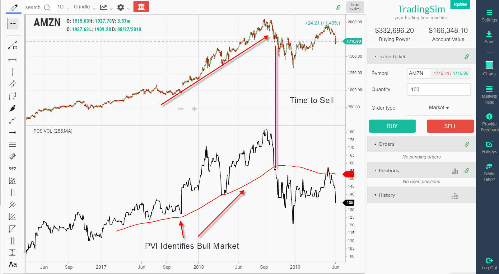
Positive Volume Index Chart Example
The indicator is easy to assess on the chart. It almost makes you wonder if it’s really necessary or if you can continue to use a simple 200-period SMA on the chart and call it a day.
Within TradingSim you need to apply a daily day trading chart timeframe in order to display the indicator as it is a long-term trading indicator.
PVI Chart Example
Above is a chart of Amazon. Notice hos the PVI is able to track the bull market of AMZN as the stock screams higher. There are a couple of key items I want to highlight on this chart.
First, on the runup, there was a nasty rundown of the PVI to the 255 MA. This was one of the first signs that the bull market run was possibly in danger.
Next, after the break of the SMA on the PVI it was the sign to either close the long position or to lighten up the position.
The most recent price action while positive appears to be testing the Amazon’s swing high while the positive volume index is backtesting its 255-SMA.
Extreme PVI Readings
In the next chart example, I will cover is when there are extreme readings on the positive volume indicator.
PVI Extreme Reading
Notice how PVI backtests the SMA 255 a few weeks before the breakdown.
FFIN then had a massive 40% drop a few weeks later. This rapid selloff resulted in FFIN falling into the seventies. Now, this doesn’t mean that FFIN couldn’t have a rally after such a steep selloff, but what it does mean is the stock’s primary trend is bearish.
Higher Readings Does Not Equal Higher Prices
PVI Readings
In the above chart example of MYOV, you can see the PVI made a strong push higher throughout 2018 and the first half of 2019. However, the price was stuck in a trading range for this time period. To make matters worse, the price ultimately broke down in the summer of 2019, leading to the PVI breaking its yearly average.
So, what does this tell us about the indicator?
Not a Timing Tool
You should not use the indicator to time market action on a daily or intraday level. The indicator is great for giving you a view into the strength of a stock, but it’s not a measure of how high price will perform.
PVI and Volatile Penny Stocks
PVI is a lagging indicator as trade signals since it factors in 255 trading days. This presents real trouble when trading volatile penny stocks as the moves are swift and unpredictable.
PVI and Penny Stocks
The positive volume indicator does not give any real indication of the massive gap down that took the stock back down to the strong move that began in 2017.
The PVI never broke the 255 moving average, but you would have given back all of the gains made on the first run-up. The stock ultimately moved higher over 2018 and into 2019; however, with such volatile price swings, the indicator provides little forecasting ability.
Summary
In summary, the PVI is a great tool for staying on the right side of the market when trading low volatility stocks. However, if you are planning on trading penny stocks or fast movers, you will want to use indicators that are more reactive and are leading.
How Can TradingSim Help?
You can practice using the PVI indicator in Tradingsim to see if it’s a good fit for your trading style. You can practice with stocks and futures until you find a strategy that works.
Have you just heard about the volume at price and are wondering what’s the big deal? Well, you have landed at the right place.
In this post, I will discuss how to interpret signals from the indicator when trading. I will take the lens as a day trader, but the same rules apply to other forms of trading, it’s just on a higher time frame.
If you are familiar with volume you will remember the indicator always below the price chart by default in most charting applications.
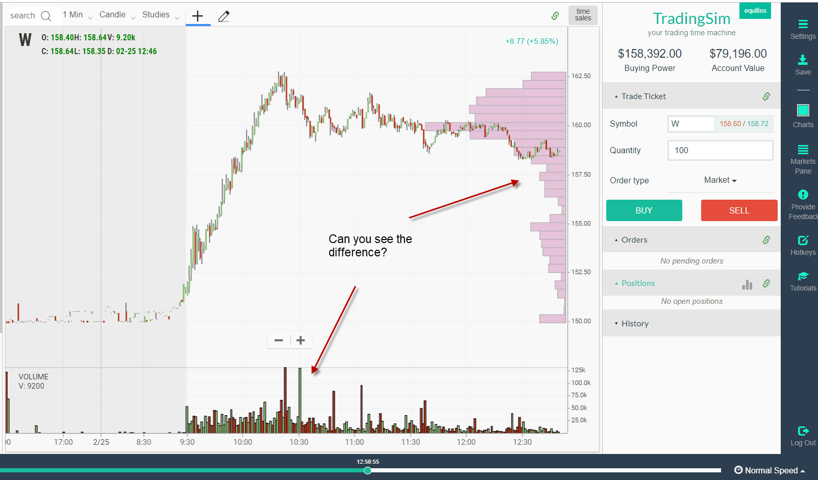
Well, volume at price is slightly different; you will notice the volume is on the y-axis where the price resides and is often an add-on for most charting services. Let’s take a look at a chart example so you can see the contras between volume and volume at price.
Difference Between Volume Indicators
Can you see the difference between the indicators?’
Differences Between Standard Volume and Volume at Price
These are both volume indicators, yet they tell two very different stories.
Standard Volume
The volume on the x-axis which you are likely most accustomed to viewing shows the volume of shares traded as the stock moves forward in time.
Therefore, you will see volume spikes at key price levels where bulls and bears duke it out to see who will win.
You will also see volume dry up as the stock moves from morning to midday trading and then another increase by the end of the day.
This gives the volume on the chart a sort of crescendo or “U” shape.
Volume at Price
Volume at price is void of the concept of time. The indicator is more focused on informing you what shares were traded at a specific price level.
Why is this important?
Well, it can show you where the majority of investors are placing their bets. This insight will let you see how much support or resistance is present at a certain price level.
How Analysis Techniques Will Differ
Now that we have covered the basics let’s dive into how analysis using each indicator will yield different results.
Large Volume Zones
As you review a chart, you will notice large volume zones. Think of these as areas of major activity on a chart. This activity can take place over a few hours or a few days if you are active trading.
The one thing these areas will have in common is that they are consolidation areas.
As a trader, you will want to observe these areas and look for breakout or breakdown opportunities.
The key is to observe if a level is broken, how many traders are looking to fight you on the other side of the trade.
Volume at Price Breakout
In the above chart of STMP, notice how the consolidation zone had significant volume and was then broken in the morning with strength.
Next, notice how above the resistance level of $87 the volume at price is non-existent. This is a clue that there weren’t as many sellers bringing the price down to its low area prior to the consolidation,
These are the breakouts you want to target as you have both little price or volume resistance fighting you on the way to profits.
The key difference in the analysis with volume at price as you can see is that I was not overly concerned about the volume of one individual candlestick. My focus was on the bigger picture of both the consolidation range and the overhead resistance.
How Volume at Price Can Identify False Breakouts
Valid Price Breakout
You can see how volume in this next example of the stock BLK was able to clear resistance with heavy volume. The stock then went on a parabolic run.
However, notice how as the stock approached the next breakout level the day after, the volume never materialized.
Where is the volume?
With this overwhelming lack of volume, what do you think happened next? That’s right, BLK rolled over.
The stock then developed a tight range with a considerable amount of volume throughout the remainder of the day. Once this level was breached the next morning, the stock plunged lower.
How Can Volume at Price Mislead You?
When you are looking at static charts at the end of the day, the volume at price will appear so obvious. You will see every opportunity as clear as day.
However, remember in real-time, the volume levels are printing as the stock is moving. So, there will be head fakes which occur that you have to be aware of.
To protect yourself from these fake signals, focus on the big areas of consolidation. You can wait for the breakout and then look at the standard volume on the x-axis to see if the volume is high.
This will let you know that there is a higher probability the stock will continue in the direction of the breakout.
Also, do your homework in the pre-market. If you are looking to day trade morning breakouts, keep an eye on what levels the stock is setting up to clear if the pre-market momentum continues.
Looking at pre-market data will also allow you to look at the volume of price from the prior day, which gives you a “fixed” chart to review. It just makes for easier analysis as you can focus on the setup without having to worry about the distraction of scanners and charts printing.
How Can Tradingsim Help?
We have volume at price as a part of our standard indicator set within Tradingsim. You can practice trading the setups identified in this article to see if the indicator is a good fit for your trading style.
Also, check out this awesome white paper by MIT which goes into painful detail of how volume impacts price. You can also use the methods from this write-up to help develop your trading strategy.
The key thing to remember if you decide to test out the indicator is that volume during the day moves in a standard fashion. There are peaks of volume in the morning. Then things get quiet from around 11 thru 2 to 2:30. Then the end of day trading picks up and volume makes its final push for the day.
Good Luck!
As stated in its name, the volume weighted moving average (VWMA) is similar to the simple moving average; however, the VWMA places more emphasis on the volume recorded for each period. A period is defined as the time interval preferred by the respective trader (i.e, 5, 15, 30).
Therefore, if you place a 20-period simple moving average (SMA) on your chart and at the same time, a 20-period volume weighted moving average, you will see that they pretty much follow the same trajectory. However, on further review, you will notice the averages do not mirror each other exactly.
The reason for this discrepancy, as we previously stated is the VWMA emphasizes volume, while the SMA only factors the average of the closing price per period.
VWMA versus SMA
The above chart is of Microsoft from September 25, 2015. On the chart, we have placed a 20-period simple moving average (red) and a 20-period volume weighted moving average (blue). At the bottom of the chart, you will also see the volume indicator, which we will use in order to demonstrate how the VWMA responds to volume. In the green circles on the chart and on the volume indicator, we have highlighted the periods of high volume. Notice, that wherever we have a big volume candlestick, the blue volume weighted moving average starts moving away from the trajectory of the red simple moving average. Then, whenever we have lower market volumes, the red simple moving average and the blue volume weighted moving average are very close in value.
Can you see the difference now?
What is the Volume Weighted Moving Average good for and what signals can we get out of it?
The VWMA has the ability to help discover emerging trends, identify existing ones and signal the end of a move.
#1 – Discovering Emerging Trends
If the volume weighted moving average switches below the simple moving average, this implies a bearish move is on the horizon. This could lead to a weakening in the bullish trend or an outright reversal. If the price is able to break through both the VWMA and the SMA a bearish trend is confirmed and a short position can be initiated.
Conversely, if the volume weighted moving average moves above the simple moving average, a bullish trend change is likely around the corner. Once the price is able to break both the VWMA and the SMA to the upside, one can open a long position.
The below chart illustrates these trade setups.
Breakout through VWMA and SMA
This is a M2 chart of Deutsche Bank from August 5, 2015. On the chart, I am using the 30 SMA and 30 VWMA. As you see, after the market was range-bound for a period of time, we notice an increase in the distance between the volume weighted moving average and the simple moving average. At the same time, the price breaks out of the range, which gives us an additional bullish signal. We go long with the second bullish candle after the breakout of the range and we enjoy the impulsive move higher.
#2 – Identifying Current Tends
Here we have a simple rule, if our volume weighted moving average is between the chart and the simple moving average, then we have a signal for a trending market. Note that sometimes the volume weighted moving average will test the simple moving average as a support and resistance, depending on the primary direction of the security. These tests can be considered as an implication of a potential trend reversal. Take a look below:
Trend Following and VWMA
This is a M5 chart of Google from July 22nd, 23rd and 24th from 2015. We use the same 30 SMA and 30 VWMA as in the previous chart example.
In the green circle, you will see the moment where the price breaks the 30 SMA and the 30 VWMA in a bearish direction. At the same time, the blue VWMA further separates from the SMA and is between the SMA and the candlesticks. This is a clear “short it” signal. If you check a half an hour later, you will see that the blue VWMA is still below the red SMA, which means that the bearish trend is still intact.
The arrows show the moments, where the VWMA provided a signal for the continuation of the bearish trend. If we were to go short at any of these points, we would not be disappointed. The last red arrow shows us the moment when the bearish trend shows signs of slowing down as the VWMA and SMA begin to hug one another.
#3 – Detecting the End of a Trend
This signal is pretty much the same as when we had to discover emerging trends. The difference is we are looking for a contrary signal to the primary trend. For example, you have taken a long position and you notice a tightening in the distance between the VWMA and the SMA. This is the moment where you might want to consider the option to get out of the market and to collect your profits.
Trend Reversal and VWMA
The above chart is of Facebook from July 16th – 22nd. Facebook begins the week with a strong gap up with high volume. After the gap, we have a solid bullish candle and a large distance between the 30-period VWMA and the 30-period SMA. Therefore, we go long with the closing of the first bullish candle. Facebook keeps increasing until the volume drops and the market enters a correction phase. This is when the blue VWMA interacts with the red SMA and we get a “caution” signal. Fortunately, with the next candle, the trading volume increases and the VWMA moves again above the SMA.
Still in the game! Bullish we are!
We hold our position for about 20 more periods and we nearly double in our long position. Then, the blue VWMA switches below the red SMA (red circle) and refuses to go above for about 8-9 periods. We believe 3-4 periods of waiting are enough in order to realize that this is the right moment to close our position. After we exit our position, the price of Facebook starts to rollover and eventually breaks down through the moving averages. Exiting Facebook at the right time brought us a profit of about 55 bullish pips! Viva les Market Volumes!
#4 – The VWMA Divergence
Yes, that is correct! You can discover divergences between the volume weighted moving average and the general chart. You will say, “How could this be possible? This is not an oscillator!”
Nevertheless, the volume weighted moving average could be in a divergence with the chart, and the secret is in the second moving average we advised you to use. When you have for example a simple moving average in addition to the chart, the volume weighted moving average will switch above and below your simple moving average depending on trade volume. Therefore, whenever the volume weighted moving average is closer to the chart than the simple moving average, we can say that the market is trending and volumes are increasing! Still not getting “the divergence”, let’s walk through a chart example.
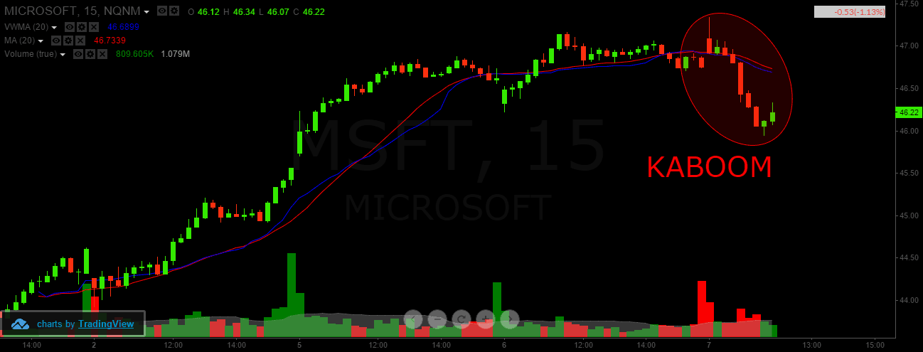
Divergence and VWMA
Above is an M15 chart of Microsoft from the first seven days of October, 2015. As you see, after a strong bullish movement, the blue volume weighted moving average moves below the red simple moving average. Therefore, we expect to see a decrease on the chart. Although the bullish movement loses its intensity, the price of Microsoft still manages to close higher for a few candlesticks. This all happens while the blue volume weighted moving average stays beneath the red simple moving average, thanks to the bigger trading volumes shown on the bottom of the chart. This is a bearish divergence, which you could use as an opportunity to go short.
Divergence and VWMA – 2
KABOOM! The result is 100 bearish pips and a successfully traded bearish divergence between the chart and your 20-period volume weighted moving average. Note, the high bearish volumes at the bottom, which appeared right after the divergence and right before the drop of the price. These bearish volumes also confirm the authenticity of our bearish divergence.
In Summary
In conclusion, we could say that although the volume weighted moving average looks complicated at times, it is not!
If you have difficulties understanding the VWMA, just open a volume indicator at the bottom of your chart. It will give you a better picture explaining the “chaotic” movement of the VWMA in comparison to the SMA.
The volume weighted moving average places a greater emphasis on periods with higher market volume.
The volume weighted moving average is a better indicator when combined with another trading instrument for trading signals.
The simple moving average is a great tool to combine the volume weighted moving average.
VWMA can provide the following signals
A trend is coming!
A trend it is!
The trend is ending!
The VWMA can also identify divergence in the market
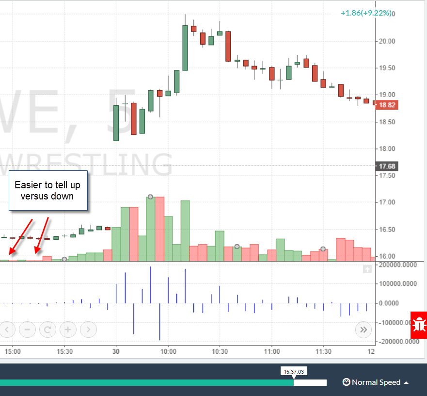
net volume indicator
I quite frequently perform research on technical indicators and to be honest, net volume never peaked my interest. Therefore, I have decided to explore in this article why I am not enamored with the indicator.
Unlike other indicators discussed on Tradingsim, net volume is easy to calculate. If the stock finishes up for the period, then the net volume is positive. If the stock is down from the previous close, then the net volume is negative.
In this article I will cover the 5 reasons I think net volume is my least favorite of volume indicators.
#1 – Too Simple
I am all for simplifying my life, starting with my trading indicators. However, there needs to be a little more to the net volume indicator. For starters, the indicator does not factor in a look back period like the volume weighted moving average or cumulative figures like the on balance volume (OBV) indicator.
The net volume simply looks at the current volume statistics for one candlestick. Now you could be thinking, well it is the trader’s responsibility to determine the look back period and this is a true statement.
But, what about the crazy idea that your indicator should provide a consistent way of analyzing the market and not totally leaving it up to you to interpret.
net volume indicator look back period
As you can see in the above chart, what is the net volume telling us? You can see the spikes higher on the lows set, but the stock is clearly in a downtrend, so no surprises there.
Again, how far do you look back? This performance period will ultimately determine how you should interpret the data and without that my friend, the indicator is way too subjective.
#2 – Positive versus Negative Readings
When you read articles and books on the net volume, there is a lot of mention about gauging if there is more positive or negative readings, which could implicate the strength of the trend.
This is a faulty assumption, as you could have a stock float lower or higher with low volume. Therefore, the net volume could continuously print a positive value on the indicator as a stock is rising, but this is no indication of the strength of the trend.
The positive reading could represent the fact the strong hands are letting the small fish drive up the stock, only to enter a significant sell order at a loftier price.
To further illustrate this point, let’s take a look at the charts.
net volume bigger view
Notice how after the push higher into the noon or lunch time reversal zone, the stock then begins to trade lower. Next, notice how the volume on the downside is much lighter, yet the stock continued lower for over 2 hours.
So, the net volume indicator showed a ton of low volume negative readings, but did it mean anything? Did price all of a sudden stop because the volume was no? No, it was a slow bleed down if you bought in right around noon.
#3 – Lacks Predictive Capabilities
The net volume is a snap shot view indicator, candlestick by candlestick. Now you can make general assumptions that the stock will continue higher if the trend is up, but isn’t that something you can assess with the price chart?
Meaning, how does the net volume further help you to identify the true nature of a stock’s trend or pending breakout?
If anything, the net volume can be used as a lagging indicator to validate price action. Therefore, if you see a breakout and the net volume is high on the upside, then this may lead you to believe the trend will continue.
However, the net volume indicator in no way will tell you that a stock is somehow overbought or oversold. If you are looking for this level of forecasting capabilities within the net volume, you will be sadly disappointed.
#4 – Visually Hard to Interpret
When you look out into the world, everything is in 3 dimensions. You are also looking at the world right side up.
What throws me off about the net volume indicator is the fact the histogram or columns (depending on your settings) will print above and below the 0 line. I find it extremely difficult to then assess the trend as the spikes of the net volume indicator could be on opposite sides of the plane.
To see the indicator print side-by-side, makes it easier to assess the strength of the volume relative to each bar. This becomes increasingly challenging to assess when there are volume spikes.
net volume indicator missing bars
I totally get the fact the bars are there, but it just feels like something is missing when the bars don’t print next to each other. Having this visual break in data, is almost like trying to pick a book back up again after you haven’t read a page in weeks. You know you are picking up where you left off; the story just feels fresh because you didn’t read it every day.
#5 – Plain Volume is Just Better
In life, some things are better just left alone. The volume indicator by itself provides more than enough information to traders. I get all of the information provided by the net volume and I also can see the indicator more clearly on the chart.
net volume versus volume
When I look at the above example, it’s practically impossible to see the net volume indicator readings. Not that the volume indicator is a cake walk either, but I can at least make out the color of the volume bars and the wider width makes it easier to see as well.
In Summary
I know this article was pretty tough on the net volume indicator, but we as traders need to be more critical of our tools. You need to constantly review and challenge the need for every item on your chart.
If I am still unable to sway you away from the net volume indicator, feel free to visit our homepage to see how you can practice using the indicator on real market data.