Diamond Chart Pattern Definition
A diamond chart formation is a rare chart pattern that looks similar to a head and shoulders pattern with a V-shaped neckline. Diamond chart reversals rarely happen at market bottoms, it most often occurs at major tops and with high-volume. Since diamonds are a variation of head and shoulders tops, you have to resist the desire to classify every head and shoulders top as a diamond formation. The reason you will want to avoid this is because the diamond will signal a break in trend much earlier than a head and shoulders pattern, which could result in a premature short position. To calculate the breakout potential for a diamond formation, you will want to take the distance between the highest and lowest point in the diamond formation and add it to the breakout point. However, in most occurrences a breakout from the diamond chart formation will carry stocks much further.
Diamond Chart Pattern Example

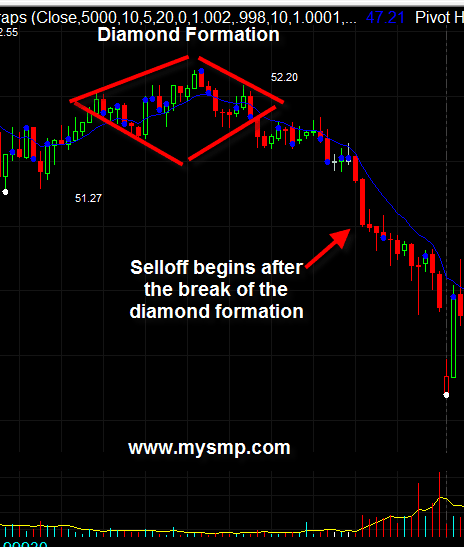
Above you see an example of a diamond shape pattern.
The breakout of the diamond appears when the price goes through the lower right side of the pattern.
The red arrow on the image shows the moment when the minimum potential of the pattern is reach, which represents the total size of the diamond formation from the breakdown point.
How to Trade the Diamond Chart Pattern
Identifying the Pattern
Below you will see a false diamond chart pattern, which appears to be an inverted head and shoulders pattern.

See that the inverted head and shoulders pattern contains the price action. The false diamond on the right creates sides which are too sharp.
In this manner, the diamond pattern is invalid and we confirm an inverted head and shoulders on the chart.
Now let’s review a real diamond chart pattern:

Again, we have similar price action as our previous example.
This time, the shoulders of the pattern are not as sharp. Hence, the lower sides of the diamond are more symmetrical to the opposite ones. This validates the structure of the diamond formation passes the “sniff” test.
Now, look at the right image. See that the two shoulders are mainly formed by candlewicks and not candle bodies. At the same time, the candles in the head and the second shoulder are relatively big.
This means that the stock is volatile, because volumes are high. As you probably noticed, this is something, which is not present in the previous example where the candle bodies are smaller and the price action is not as volatile.
Diamond Pattern Trade Entry
Every chart formation has its trigger line, which provides a point of where a trade decision should be made.
For the head and shoulders pattern, this is the neck line between the two shoulders. For the diamond chart pattern, this is the lower right side of the bearish diamond pattern and the upper right side of the bullish diamond pattern.

Above is an example of a bearish diamond pattern. The red circle shows the moment when the price action breaks the lower right side of the diamond. When this line is breached, you should open a trade in the direction of the breakout depending on the type of diamond you have on the chart.
In this case, we have to short sell the stock, since the diamond pattern is bearish and the breakout is also to the downside.
Diamond Pattern Stop Loss
You should always use a stop loss order when trading the diamond pattern.
The proper location of your stop should be above the last top inside the diamond for bearish setups and below the last low of inside the diamond for bullish setups.

In the above case, we have a bearish diamond formation.
Therefore, the stop loss order should be placed above the last top inside the pattern. The image above shows the right place of a stop loss order of a diamond trade.
Another option is to place your stop loss order above the highest high of the diamond, but this will increase the risk for the trade.
How to Book Profits from the Diamond Pattern
As we said above, the minimum price move expected from the diamond chart pattern equals the size of the formation.
For example, if the distance between the upper and the lower edge of the diamond equals $1.50 per share, then you should pursue a move of $1.50 per share.

This is the same diamond example from the cases above. However, this time we have added the minimum target of the pattern.
The first blue line measures the size of the diamond pattern. The second blue arrow equals the size of the first blue arrow, but it is applied over the price action. The green horizontal line indicates the minimum target we should place when we trade this pattern. The moment the price breaks this level, we have the option to exit the trade.
However, that’s not all. We also said that in many cases the minimum target of the diamond is not the end of the price move.
Therefore, a good approach to extend your diamond’s target is to add a volume weighted moving average. Since the stock volumes are crucial for the confirmation of the diamond pattern, they are also important for determining exit points. When you enter a diamond trade, you should hold your position until the price breaks the VWMA in the opposite direction or until your stop loss is hit.
Diamond Pattern Trading Strategy
Let’s now apply these trading rules into a complete diamond pattern strategy.
We will confirm the presence of a diamond shape on the chart. Then we will enter the market when the trigger line of the diamond is broken, placing a stop loss beyond the last top/bottom inside the pattern.
We will stay into the trade for a minimum price move equal to the diamond itself. We will disregard the VWMA breakouts prior to reaching the minimum target.
After the target is reached, we will stay in the market until the VWMA is broken in the opposite direction.
Below is an example of an actual trade:

You are looking at the 3-minute chart of Boeing from June 13, 2016.
The image illustrates a diamond bottom pattern (black figure), which reverses the bearish price move.
Since the potential of the pattern is bullish, we are working with a bullish diamond pattern.
The two blue arrows on the chart measure and apply the size of the diamond as a minimum target of our trade. We have also added a volume weighted moving average on the chart in order to extend potential profits from the trade.
At the bottom of the chart, we also have a volume indicator in order to monitor the trading volumes of Boeing.
See that the chart image starts with a price decrease. Suddenly, the price action enters a consolidation phase and develops into a diamond on the chart.
During the creation of the diamond, the volumes are relatively high. The shape of the price action is far away from the inverted head and shoulders.
Therefore, we have confirmed the presence of a bullish diamond pattern on the chart.
After the price action breaks the upper right side of the shape, we go long placing a stop loss below the last bottom of the pattern. The proper location of the stop loss order is shown with the red horizontal line on the chart.
The price starts a bullish move afterwards. Three periods after we open our long trade, the price action fulfills the minimum target.
This is when we start following the signals of the VWMA. The price continues with the increase and we extend our gains. Forty minutes after the price completes the minimum target, the price action closes with a big bearish candle, which breaks the VWMA downwards.
We receive an exit signal on the chart and we close our trade.
The minimum target has brought a price increase of $0.11 per share. The extended target accounted for an additional $0.08 per share. All in all, we have generated a profit equal to 0.15% for less than an hour.
Let’s now approach a bullish diamond pattern trade:

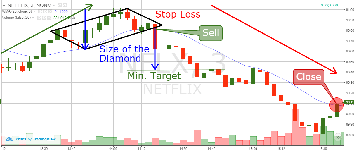
Our next example is of one of the most volatile stocks in recent times – Netflix.
The chart is from June 22, 2016 and it is a black bearish diamond pattern. Since Netflix is more volatile and accounts for bigger daily price moves, we increase the periods of our VWMA to 20.
The image starts with a price increase, which ends with a diamond top pattern.
The pattern is confirmed when the price breaks the lower right side of the pattern. This gives us a signal to sell Netflix. We short sell NFLX and we place a stop loss above the last top inside the pattern as shown on the image.
Then we create the blue arrows on the chart, which measure the minimum price target of the figure.
The price starts decreasing afterwards. Twenty minutes after we short Netflix, the price action reaches the minimum target. However, we have the option to extend our profits by staying in the trade longer.
As you see, the price decreases further. See that the volumes are growing at that time, which gives further confirmation of the Diamond pattern and the presence of a bearish trend.
1 hour after the minimum target was reached the price action breaks the 20-period VWMA upwards. This gives us a bullish signal on the chart, which means that we need to collect our gains and exit the trade.
The minimum target completed a price move of $0.38 per share. The extended price move brought additional $0.33 per share. In this manner, the overall results from our trade equal to a bearish price move of $0.70 per share, which equals to a profit of 0.77% on the amount invested.
Conclusion
- The Diamond pattern is a rare, but reliable chart pattern.
- It looks like a rhombus on the chart. However, it could easily be mistaken for a head and shoulders pattern.
- The diamond pattern has a reversal characteristic:
- Bullish Diamond Pattern (Diamond Bottom)
- Bearish Diamond Pattern (Diamond Top)
- In stock trading, the bearish diamonds on the top of bullish trends are more common. The diamond bottoms are rare.
- When you trade a bearish diamond chart pattern, you should comply with the following rules:
- Confirm the diamond pattern by discovering relatively big trading volumes. Make sure the pattern is more horizontal, rather than vertical. If the shape is more vertical than horizontal, then you are probably looking at a head and shoulders chart pattern.
- Sell when the price breaks the lower right side of the diamond.
- Place a stop loss order above the last top inside the diamond shape on the chart.
- Stay in the trade for a minimum bearish move equal to the size of the diamond pattern.
- You can extend profits by simply adding a volume weighted moving average. When the price breaks the VWMA upwards after completing the minimum target, you should exit the trade. If the stock is known to be more volatile, use a bigger VWMA.

