6 Bollinger Bands® Trading Strategies + Video

Bollinger Bands

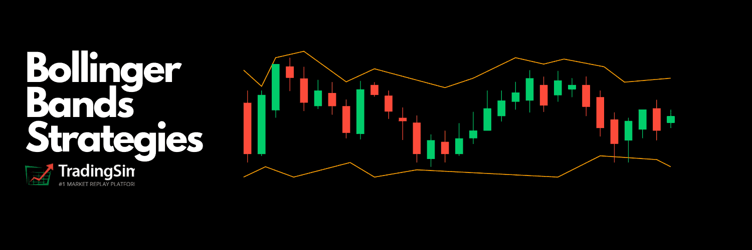
Bollinger Bands are a powerful technical indicator created by John Bollinger. The bands encapsulate the price movement of a stock, providing relative boundaries of highs and lows. The crux of the Bollinger Band indicator is based on a moving average that defines the intermediate-term “trend” based on the time frame you are viewing.

But how do we apply this indicator to trading and what are the strategies that will produce winning results?

In this post we’ll provide you with a solid foundation on the bands, plus six trading strategies you can test to see which works best for your trading style.

But before we do, check out this quick tutorial as a primer for the more advanced concepts discussed below.

Bollinger Bands Overview

Most stock charting applications use a 20-period moving average for the default settings. The upper and lower bands are then a measure of volatility to the upside and downside. They are calculated as two standard deviations from the middle band.

Bollinger Bands Calculation: [1]

Upper Band = Middle band + 2 standard deviations

Middle Band = 20-period moving average (most charting packages use the simple moving average)

Lower Band = Middle band – 2 standard deviations.

The below chart illustrates the upper and lower bands.

Bollinger Bands
Bollinger Bands

In essence, the Bollinger Band indicator was created to contain price the vast majority of the time. In fact, Investopedia claims that the bands actually contain the price 90% of the time [2].

It is rare for a security to trade outside of the bands. For this reason, it can be used to find an edge in the market.

What is the Ideal Bollinger Bands Settings?

Regardless of the trading platform, you will likely see a settings window like the following when configuring the indicator.

Bands Settings
Bands Settings

If you are new to trading, you are going to lose money at some point. This process of losing money often leads to over-analysis. While technical analysis can identify things unseen on a ticker, it can also aid in our demise as traders.

In the old days, there was little to analyze. Therefore, you could tweak your system to a degree, but not in the way we can continually tweak and refine our trading approach today.

We make this point in regard to the settings of the bands. While the configuration is far simpler than many other indicators, it still provides you with the ability to run extensive optimization tests to try and squeeze out the last bit of juice from the stock.

The problem with this approach is that after you change the length to 19.9 (yes people will go to decimals), 35 and back down to 20; it still comes down to your ability to manage your money and book a profit.

Our strong advice to you is not to tweak the settings at all. It’s better to stick with 20, as this is the value most traders are using to make their decisions, versus trying to look for a secret setting.

Now that we have covered the basics, let’s shift our focus over to the top 6 Bollinger Bands trading strategies.

Bollinger Band Trading Strategies

Many of you have heard of the classic technical analysis patterns such as double tops, double bottoms, ascending triangles, symmetrical triangles, head and shoulders top or bottom, etc.

Bollinger Bands can add that extra bit of firepower to your analysis by assessing the potential strength of these formations.

Let’s unpack each strategy, so you can identify which one will work best with your trading style.

#1 Strategy – Double Bottoms

A common Bollinger Band strategy involves a double bottom setup.

John himself stated [3], “Bollinger Bands can be used in pattern recognition to define/clarify pure price patterns such as “M” tops and “W” bottoms, momentum shifts, etc.”

The first bottom of this formation tends to have substantial volume and a sharp price pullback that closes outside of the lower Bollinger Band. These types of moves typically lead to what is called an “automatic rally.” The high of the automatic rally tends to serve as the first level of resistance in the base building process that occurs before the stock moves higher.

After the rally commences, the price attempts to retest the most recent lows that have been set to challenge the vigor of the buying pressure that came in at that bottom.

Many Bollinger Band technicians look for this retest bar to print inside the lower band. This indicates that the downward pressure in the stock has subsided and there is a shift from sellers to buyers. Also, pay close attention to the volume; you need to see it drop off dramatically.

Bollinger Bands Double Bottom

Above is an example of the double bottom outside of the lower band which generates an automatic rally. On the secondary test, TRCH tested a new low with a 40% drop in traffic from the last swing low. Also, the candlestick struggled to close outside of the bands.  This led to a sharp 100% rally over the next day.

#2 Strategy – Reversals

Another simple, yet effective trading method is to fade stocks when they begin printing outside of the bands.  We’ll take this one step further and apply a little candlestick analysis to this strategy.

For example, instead of shorting a stock as it moves up through its upper band limit, wait to see how that stock performs.  If the stock goes parabolic or gaps up and then closes near its low while near the outside of the bands, this is often a good indicator that the stock will correct on the near-term.

You can then take a short position with three target exit areas depending on where the stock finds support: (1) upper band, (2) middle band or (3) lower band.  

Using the same chart from above, we can see that the rally off the first low created a near term overbought scenario.

Bollinger Reversal
Bollinger Reversal

As you can see from the chart, the first red candle after the highs was a bearish engulfing candle.  The stock quickly rolled over and took an almost 5% dive in under 30 minutes.

#3 Strategy – Riding the Bands

The single biggest mistake that many Bollinger Band novices make is that they sell the stock when the price touches the upper band or buy when it reaches the lower band.

Bollinger himself stated a touch of the upper band or lower band does not constitute a buy or sell signal. In his book, John states, “During an advance, walking the band is characterized by a series of tags of the upper band, usually accompanied by a number of days on which price closes outside of the band.” [4]

Look at the example below and notice the tightening of the bands right before the breakout.

To the earlier point, price penetration of the bands alone cannot be a reason to short or sell a stock.

Notice how the volume exploded on the breakout and the price began to trend outside of the bands; these can be hugely profitable setups if you give them room to fly.

Riding the bands
Riding the bands

Notice above in the AMC chart (#3 Strategy) how the Bollinger price expanded on the early breakout.

It immediately reversed with an engulfing candle pattern, and all the breakout traders were head-faked. Along these lines, you don’t have to squeeze every penny out of a trade. Wait for some confirmation of the breakout and then go with it. If you are right, it will go much further in your direction. Notice how the price and volume broke when approaching the head fake highs (red line).

The Middle Band

Just as a reminder, the middle band is set as a 20-period simple moving average in many charting applications.

The middle line can represent areas of support on pullbacks when the stock is riding the bands. You could even increase your position in the stock when the price pulls back to the middle line.

Regarding identifying when the trend is losing steam, failure of the stock to continue to accelerate outside of the bands indicates a weakening in the strength of the stock. This would be a good time to think about scaling out of a position or getting out entirely.

#4 Strategy – Bollinger Band Squeeze

Another trading strategy is to gauge the initiation of an upcoming squeeze.

John created an indicator known as the band width. This Bollinger Band width formula is simply (Upper Bollinger Band Value – Lower Bollinger Band Value) / Middle Bollinger Band Value (Simple moving average).

The idea, using daily charts, is that when the indicator reaches its lowest level in 6 months, you can expect the volatility to increase. This goes back to the tightening of the bands that I mentioned above. This squeezing action of the Bollinger Band indicator often foreshadows a big move.

You can use additional signs such as volume expanding, or the accumulation distribution indicator turning up.

These other indications add more evidence of a potential Bollinger Band squeeze.

We need to have an edge when trading a Bollinger Band squeeze because these setups can head-fake even the best of us.

Example 1

To the point of waiting for confirmation, let’s look at how to use the power of a Bollinger Band squeeze to our advantage.  Below is a 5-minute chart of NIO.  Notice how leading up to the morning gap down the bands were extremely tight.

Tightening of the bands

Now some traders can take the elementary trading approach of shorting the stock on the open with the assumption that the amount of energy developed during the tightness of the bands will carry the stock much lower.  Another approach is to wait for confirmation of this belief.

So, the way to handle this sort of setup is to (1) wait for the candlestick to come back inside of the bands; (2) make sure there are a few inside bars that do not break the low of the first bar; and (3) short on the break of the low of the first candlestick.

Example 2

Based on reading these three requirements you can imagine this does not happen very often in the market, but when it does, it’s powerful.  The below chart depicts this approach.

Gap down squeeze
Gap down squeeze

Example 3

Now let’s look at the same sort of setup but on the long side.  

Below is a snapshot of NIO from October 29, 2020. Notice how NIO gapped up over the upper band on the open, had a small retracement back inside of the bands, then later exceeded the high of the first candlestick.  These sorts of setups can prove powerful if they end up riding the bands.

Gap up strategy

#5 Strategy – Snap Back to the Middle of the Bands

This strategy is for those of us who like to ask for very little from the markets. Essentially you are waiting for the market to bounce off the bands back to the middle line, which carries a high winning percentage over time.

In this setup, you are not obsessed with getting in a position for it to swing wildly in your favor. Nor are you looking to be a prophet of sorts and try to predict how far a stock should or should not run.

By not asking for much, you will be able to safely pull money out of the market on a consistent basis and ultimately reduce the wild fluctuations of your account balance, which is common for traders that take big risks.

The key to this strategy is waiting on a test of the mid-line before entering the position.  You can increase your likelihood of placing a winning trade if you go in the direction of the primary trend and there is a sizable amount of volatility.

Middle of the bands pullback

As you can see in the above example, notice how the stock had a sharp run-up, only to pull back to the mid-line.  You would want to enter the position after the failed attempt to break to the downside.

You can then sell the position on a test of the upper band.  If you have an appetite for risk, you can ride the bands to determine where to exit the position.

#6 Strategy – Trade Inside the Bands

This is our favorite of the strategies.

Most of the money to be made in the market, with minimal risk, is in the margins.

The same way we say football is a game of inches, trading is the same.

You, of course, can make a ton of money placing big bets, but these types of traders usually do not make it over a long trading career (20+ years).

Example

First, you need to find a stock that is stuck in a trading range. The greater the range, the better.

Trading Range
Trading Range

Now, looking at this chart, you may feel a sense of boredom overcoming you. That’s because it’s far more entertaining to tell yourself and others you crushed a 20% day trade in one day.

However, from experience, the traders that take money out of the market when it presents itself, are the ones sitting with a big pile of cash at the end of the day.

In the above example, simply buy when a stock tests the low end of its range and the lower band. Conversely, you sell when the stock tests the high of the range and the upper band.

Bands Help Identify Ranges

The key to this strategy is a stock having a clearly defined trading range. This way you are not trading the bands blindly but are using the bands to gauge when a stock has gone too far.

You could argue that you don’t need the bands to execute this strategy. However, by having the bands, you can validate that a security is in a flat or low volatility phase, by reviewing the look and feel of the bands.

A simpler way of saying this is that the bands help validate that the stock is stuck in a range.

So, instead of trying to win big, you just play the range and collect all your pennies on each price swing of the stock.

What if the Bands Fail?

This section is going to feel like a nice cold splash of water right in your face.

Surely you didn’t think Bollinger Bands would paint this rosy picture of trading bliss, did you?

Like anything else in the market, there are no guarantees. No doubt, Bollinger Bands can be a great tool for identifying volatility in a security, but it can also prove to be a nightmare when it comes to newbie traders. Don’t skip ahead, but I will touch on this from my personal experience a little later in this article.

Like any other trade signal, you will need to exit your position without reservation.

The stock market pain meter

Not exiting your trade can almost prove disastrous as three of the aforementioned strategies are trying to capture the benefits of a volatility spike.

For example, imagine you are short a stock that reverses back to the highs and begins riding the bands. What would you do?

Let me help you out if you are confused – kill the trade!

While bands do a great job of encapsulating price movement, it only takes one extremely volatile stock to show you the bands are nothing more than man’s failed attempt to control the uncontrollable.

While there is still more content for you to consume, please remember one thing – you must have stops in place!

Which Strategy Works Best?

This is the important question for anyone reading this article. But it is such a tough question to answer.

To that end, I’ll offer my own personal experiences. For me, there are two strategies that I prefer to use – 5 and 6.

This doesn’t mean the others might not work well for you. But we all have different personalities and trading styles.

Both of these work well, but in two very different types of markets.

Strategy #5 – Snap Back to the Middle of the Band

This Strategy will work in very strong markets. It affords you the flexibility of jumping on a hot stock while lowering your risk as you wait for the pullback.

I have been a breakout trader for years. But I will be the first to tell you that most breakouts fail. Not to say pullbacks are without their issues, but you can at least minimize your risk by not buying at the top.

Strategy #6 – Trade Inside the Bands

This approach will work well in sideways markets and will also have a high winning percentage.

How do I know it has a high winning percentage?

Because you are not asking much from the market in terms of price movement. From my personal experience of placing thousands of trades, the more profit you search for in the market, the less likely you will be right.

Now, while strategies 5 and 6 work best for me, what say you?

Since trading is a personal journey, we’ve created this strategy/profile matrix to help you uncover which might work best for you.

Strategy Profile Matrix

  1. Strategy #1 Double Bottom – for the pure technician.  The trader that is going to scan the entire market looking for a particular setup. It will require a lot of patience to identify the setup since you need the second bottom to breach the bands to generate a powerful buy signal.
  2. Strategy #2 Reversals – calling all risk takers! This approach is fantastic when you get it right because the reversal will pour money into your account. However, get things wrong, and the pain can often leave you paralyzed from taking any action. You must be quick on your toes and willing to cut a loser without blinking.
  3. Strategy #3 Riding the Bands – for the home run hitters. You must have the sheer will to only average a 20% to 30% win ratio because you will make all of your money on the big moves. That sounds easy, doesn’t it? Well, I have tried systems that have low win percentages, and I have failed every time. This is because I am a sore loser. Therefore, I can’t handle being wrong that infrequently. So, if you want to take less action and can seriously handle being wrong eight out of ten times, this system will be perfect for you.
  4. Strategy #4 The Squeeze – this is the best setup for the traders that want the profit potential of riding the bands but can take quick money as things go in your favor. You can take one of two approaches with the squeeze strategy. For the riskier traders, you can jump in before the break and capture all of the gains. More conservative traders can wait for the break and then look for a pullback setup in the direction of the primary trend.
  5. Strategy #5 Playing the Moving Average – this is for the dip buyers. You are looking for stocks that are trending strongly and then react back to the 20-period moving average. This setup works lovely when day trading the Nikkei and usually develops a little after forty-five minutes into the session.
  6. Strategy #6 Trading the Range – for the edge traders. For me, it comes down to the simple fact markets are range bound 80% of the time. So, if you need thrills, this strategy will put you to sleep. You will likely want to focus on #2, #3, or #4.

Bollinger Bands and Cryptocurrencies

In addition to strategies, there are a few items related to bands I need to cover that will provide you with a full picture of the indicator.

Don’t worry; I’m not about to go on a history lesson on cryptocurrencies with details of where David Chaum went to college.

Instead, I want to center this piece of the article on how you can use bands to trade bitcoin.

Bitcoin Volatility

I was reading an article on Forbes, and it highlighted six volatile swings of bitcoin starting from November 2017 through March 2018. The swings vary from gains of 223% to losses of 40%.

Doing my research, I looked at some of these price swings of Bitcoin in the Tradingsim platform.

3 Recent Bitcoin Market Swings

These price swings are breathtaking!

Let’s dig deeper into this price action by looking at the charts.

Bitcoin 2017 Holiday Rally

Let’s look at the period of December 22, 2017, to December 27, 2017. During this period, Bitcoin ran from a low of 12,265 to a high of 16,545. This represents a run of ~35%.

Surprisingly, these gains were largely made over three days’ worth of trading.

That kind of money that fast can be hard to grasp. The psychological warfare of the highs and the lows become unmanageable.

So, it got me thinking, would applying bands to a chart of bitcoin futures have helped with making the right trade?

Bitcoin with Bollinger Bands

I indicated on the chart where bitcoin closed outside of the bands as a possible turning point for both the rally and the selloff. But let’s be honest here, this is a 60-minute chart of a highly volatile security.

You must honestly ask yourself if you will have the discipline to make split-second decisions to time this trade, just right.

The one thing the bands manages to do as promised is contain the price action, even on something as wild as bitcoin.

Daily Price Chart

As you can see, the 60-minute chart is busy, so let’s take things up to the daily level.

For this example, let’s review the rally from the low of 5,980 on 2/6/2018 to a swing high of 11,785 on 2/20/2018.

Bitcoin 97% Gain in 11 Days

I honestly find it hard to determine when bitcoin is going to take a turn looking at the bands. This chart is illustrating a 97% run over an 11-day period.

It’s not that the bands are doing anything wrong or not working. Bitcoin is just illustrating the harsh reality when trading volatile cryptocurrencies that there is no room for error.

I do not trade bitcoin. But after looking at the most recent price swing using bands, a couple of things come to mind:

  1. Honor your stops. Sometimes we talk ourselves into thinking that “things will work out,” but with volatile securities, you are essentially gambling.
  2. Only invest money you are willing to lose. Losing should never be your goal, but you shouldn’t risk your home or life savings trading cryptocurrencies.
  3. Short with caution. Cryptocurrencies can go on massive runs in a short period, so you need to make sure you honor those stops and have enough cash on hand to avoid margin calls.

Combining Bollinger Bands and Bollinger Bands Width

Pairing the Bollinger Band width indicator with Bollinger Bands is like combining the perfect red wine and filet mignon.

In the previous section, we talked about staying away from changing the settings. Well, if you think about it, your entire reasoning for changing the settings in the first place is in hopes of identifying how a security is likely to move based on its volatility.

A much easier way of doing this is to use the Bollinger Bands width. In short, the BB width indicator measures the spread of the bands compared to the moving average to gauge the volatility of a stock.

Why is this important to you?

Essentially, you have an actual reading of the volatility of a security. You can then look back over months or years to see if there are any repeatable patterns of how price reacts when it hits extremes.

Example

To see this in action, look at the below screenshot using both the Bollinger Bands and Bollinger Band width.

Bollinger Bands with Bollinger Bands width
Third Time’s the Charm – Bollinger Band Width

Notice how the Bollinger Bands width tested the .0087 level three times. The other point of note is that on each prior test, the high of the indicator made a new high, which implied the volatility was expanding after each quiet period.

As a trader, you need to separate the idea of a low reading with the Bollinger Bands width indicator with the decrease in price. Remember, Bollinger Band width is informing you that a pending move is coming, the direction and strength are up to the market.

In this example, the 5-minute chart ofSciclone Pharmaceuticals (SCLN) had a huge runup from $9.75 to 11.12.

If you had just looked at the bands, it would be nearly impossible to know that a pending move was coming. You would have no way of knowing that .0087 was a level that existed, let alone a level that could trigger such a large price movement.

This is just another example of why it’s important to pair Bollinger Bands with other indicators and not use it as a standalone tool.

Can Bollinger Bands Predict Huge Price Moves?

This is always a fun question: Can an indicator somehow provide you clues of a major price swing?

With the bull market in full force in 2018, volatility dropped to a multi-year low.

Big Run in E-Mini Futures

The above chart is of the E-Mini Futures. I want to dig into the E-Mini because the rule of thumb is that the smart money will move the futures market which in turn drives the cash market.

It is probably a little hard to see the explosion in volatility at the top of this chart, so let’s zoom in a bit.

S&P 500 E-mini top
Who Knew A Top was In?

Looking at the chart of the E-mini futures, the peak candle was completely inside of the bands. Other than the fact the E-mini was riding the bands for months, how would you have known there was a big break coming?

Now that I have built up tremendous anticipation let’s see if there is a way to identify an edge.

Remember in Chapter 4, the Bollinger Band width can give an early indication of a pending move as volatility increases.

Volatility Breakout

In the above example, the volatility of the E-Mini had two breakouts prior to price peaking. First, the Bollinger Band width had been coiling for approximately five months before breaking out.

If that wasn’t enough to convince you, then the second break above the 8-month swing high of the Bollinger Band width indicator was your second sign.

After these early indications, the price went on to make a sharp move lower and the Bollinger Band width value spiked.

Applying Bollinger Bands to a Volatility Indicator

The inspiration for this section is from the movie Teenage Mutant Ninja Turtles, where Michelangelo gets super excited about a slice of pizza and compares it to a funny video of a cat playing chopsticks with chopsticks.

The point is, it’s so far out there you have to actually try it out to see if it works.

To this point, we applied bands to the Proshares VIX Short-Term Futures to see if there were any clues before the major price movement we discussed earlier.

VIXY Chart w/ bollinger bands
VIXY Chart

Does anything jump out that would lead you to believe an expanse in volatility is likely to occur?

Look hard and resist the urge to scan a few inches down the page for the answer.

It’s clear that the VIXY had a breakout by 2/2/2018. But at this point, you would have missed a large portion of the initial breakdown in price.

Being Late

When you are trading in real-time, the last thing you want to do is show up late to the party. More times than not, you will be the one left on cleanup after everyone else has had their fun. In other words, you’ll be left holding the bags.

Breakout of VIXY
Breakout of VIXY

It was very subtle, but you can see how the bands were coiling tighter and tighter from September through December. During this time, the VIXY respected the middle band.

There was one period in late November when the candlesticks slightly jumped over the middle line. But there was no follow through and it immediately rolled over.

However, in late January, you can see the candlesticks not only closed above the middle line but also started to print green candles.

One could argue that this wasn’t enough information to make a trading decision. And that might be a fair statement.

You would need a trained eye and have a good handle with market breadth indicators to know that this was the start of something real.

There was one other clue on the chart. Can you see it?

This one is a little more obvious and it’s the pickup in volume.

U Shape Volume
U Shape Volume

There is the obvious climactic volume which jumps off the chart, but there was a slight pickup in late January, which was another indicator that the smart money was starting to cash in profits before the start of the correction.

Helpful Bollinger Bands Resources and My Personal Experience with Bollinger Bands

Before we jump into my personal experience, look at the below infographic titled ’15 Things to Know about Bollinger Bands’.

The information contained in the graphic will help you as a reminder of the strategies we’ve discussed, plus give you more ideas and resources.

15 Things to Know about Bollinger Bands

My Journey with the Bands

It’s safe to say Bollinger Bands is probably one of the most popular technical indicators in any trading platform.

If memory serves me correctly, Bollinger Bands, moving averages, and volume were my first indicators as a beginner trader.

Nowadays, I no longer use bands in my trading.  That doesn’t mean they can’t work for you, but my trading style requires me to use a clean chart.

So, why did I end up abandoning the bands?

I tend to over analyze setups; it’s just what I do.

Therefore, the more signals on the chart, the more likely I am to act in response to a signal. This is where the bands expose my trading flaw.

For example, if a stock explodes above the bands, what do you think is running through my mind? You guessed right, sell!

The stock could just be starting its glorious move to the heavens, but I am unable to mentally handle the move because all I can think about is the stock needs to come back inside of the bands.

Day Trading in 2007

Flashback to 2007, when I was just starting in day trading; I had no idea what I was doing.

Instead of taking the time to practice, I was determined to turn a profit immediately and was testing out different ideas.

One of the first indicators I put to the test was Bollinger Bands.

Why? It’s one of the most popular indicators.

I decided to scalp trade. I would sell every time the price hit the top bands and buy when it hit the lower band. It’s really bad, I know. Shaking my head….

From what I remember, I tried this technique for about a week, and at the end of this test, I had made Tradestation rich with commissions.

The key flaw in my approach was that I did not combine the bands with any other indicator. This left me putting on so many trades that at the end day my head was spinning.

What it Takes to Trade with Bollinger Bands

To truly harness the power of the indicator, you need to learn how the bands interact with the price of a security. At the end of the day, bands are a means for measuring volatility. So, it’s not something you can just pick up and use for buy and sell signals.

Just as you need to learn specific price patterns, you also need to find out how bands respond to certain price movements.

This ability to identify the setups will help you avoid the false signals from the real ones.

This level of mastery only comes from placing hundreds, if not thousands of trades in the same market.

Bollinger Bands in the Trading Community

I went onto Amazon to search for the most popular books to see who the leaders are in the space.

No surprise, John Bollinger had the most popular book – “Bollinger on Bollinger Bands.”

The thing that surprised me is that I couldn’t find many other famous authors or experts in the space. I’m not sure if this is because there aren’t many people interested or if other traders stay out of the bands arena because John is so actively evangelizing his own indicator.

The books I did find were written by unknown authors and had less material than what I have composed in this article. The other hint that made me think these authors were not legit is their lack of using the registered trademark symbol after the Bollinger Bands title, which is required by John for anything published related to Bollinger Bands.

Conversely, when I search on Elliott Wave, I find a host of books and studies both on the web and in the Amazon store.

I am still unsure what this means exactly.  With there being millions of retail traders in the world, I have to believe there are a few that are crushing the market using Bollinger Bands.

I just struggled to find any real thought leaders outside of John. I write this not to discredit trading with bands, just to inform you of how bands are perceived in the trading community.

What are the Best Time Frames for Trading with Bollinger Bands?

Bollinger Bands work well on all time frames. Remember, price action performs the same, just the size of the moves are different.

What are the Best Markets for Bollinger Bands?

Without a doubt, the best market for Bollinger Bands is Forex.  Currencies tend to move in a methodical fashion allowing you to measure the bands and size up the trade effectively.

Next, I would rank futures because again you can begin to master the movement of a particular contract.

Last on the list would be equities. The captain obvious reason for this one is due to the unlimited trading opportunities you have at your fingertips.

It’s one thing to know how the E-mini contract will respond to the lower band in a five-day trading range.

It’s another thing to size up one stock from another in terms of how it will respond to the bands.

Conclusion

These are but a few of the great methods for trading with bands.

The key point to remember is that Bollinger Bands gets you into the habit of thinking about volatility.

In order to take your Bollinger Bands trading strategies to the next level, we recommend the following:

  1. Settle on a market you want to master (i.e., futures, equities, forex). If you try to learn all three at the same time, you are going down a painful road.
  2. Figure out what time frame works best for you.
  3. Learn to master one strategy before attempting to tackle them all. Any of the strategies mentioned can work given the right market environment and your willingness to honor your trading plan. However, similar to points one and two above, learn how to focus on getting one thing right before complicating things.

To practice the Bollinger Bands trading strategies detailed in this article, please visit our homepage at Tradingsim.com.

We provide a risk-free environment to practice trading with real market data over the last 3 years.

To continue your research on the Bollinger Bands indicator, please visit John Bollinger’s Official website. Here you will see a number of detailed articles and products.

External References

  1. Bollinger Bands Formula. Wikipedia
  2. Bollinger, John. Bollinger Bands Rules [Blog Post]. Bollingerbands.com
  3. Hayes, Adam. (2019). Bollinger Band Definition [Blog Post]. Investopedia.com
  4. Bollinger, John. (2002). ‘Bollinger on Bollinger Bands‘. The Mc-Graw Hill Companies, Inc. p. 113

SMA Trading Strategies Video Tutorial

Before you dive into the content, check out this video on moving average crossover strategies. You’ll also learn how the SMA is formed. The video is a great precursor to the advanced topics detailed in this article.


The SMA – Not Always So Simple

Why the simple moving average?  Once you begin to peel back the onion, the SMA might be simple to calculate, but isn’t as simple to trade.

Not surprisingly, the simple moving average is a popular technical indicator. Perhaps the most popular indicator in all of trading. But like most indicators, it isn’t a cure-all for trading.

If you’re familiar with the indicator, it isn’t so difficult to see why it can be challenging to trade with simple moving averages. After all, just a quick Google search will turn up dozens of day trading strategies.

But how do we know which ones will work?

That is our goal in this post — to show you everything you need to know about simple moving averages. We’ll cover various trade examples, charts, and videos. In addition, we’ll cover the simple moving average formula, popular moving averages (5, 10, 200), real-life examples, crossover strategies, and personal experience with the indicator.

By then end, you should be able to identify the system that will work best for your trading style.

Simple Moving Average Formula

The simple moving average formula is the average closing price of a security over the last “x” periods. Calculating the SMA is not something limited to technical analysis of securities. This formula is also a key tenet to engineering and mathematical studies.

To that end, this detailed article from Wikipedia [1] delves into formulas for the simple moving average, cumulative moving average, weighted moving average, and exponential moving average.

SMA Forumula

Example

Let’s look at a simple moving average formula example.  The last five closing prices for XYZ stock are:

28.93+28.48+28.44+28.91+28.48 = 143.24

Quite simply to calculate the simple moving average formula, you divide the total of the closing prices by the number of periods.

5-day SMA = 143.24/5 = 28.65

As you can see, the SMA is just simple math.

In fact, every indicator is based on math. However, the SMA is not a proprietary calculation with trademark requirements.

It is simple addition and division, for the entire world to share.

Popular Simple Moving Averages

Theoretically there is an infinite number of simple moving averages. In fact, some traders like to throw a myriad of these averages onto the charts in an SMA “cloud.”

This may work for some traders. However, generally speaking, the more popular indicators will work better for you. It is critical to use the most common SMAs as these are the ones many other traders will be using daily.

Along those lines, we do not advocate you following the crowd. Nonetheless, it is essential to know what other traders are looking at for clues. 

According to Toni Turner, author of the A Beginner’s Guide to Day Trading Online, the major popular moving averages used by most traders are the 10, 20, 50, 100 and 200. [2]

Examples of the More Popular SMAS

The 5 – SMA – For the hyper trader.  

The shorter the SMA, the more signals you will receive when trading.  The best way to use a 5-SMA is as a trade trigger in conjunction with a longer SMA period.

5-period simple moving average

The 10 – SMA – popular with short-term traders; great for swing traders and day traders. Mark the difference between the 5SMA shown above and the 10SMA shown below on the same chart.

10 period simple moving average

The 20 – SMA – the last stop on the bus for short-term traders.

Beyond the 20SMA, you are looking at primary trends.

20 period simple moving average

The 50 – SMA – used by traders to gauge mid-term trends.

50 period simple moving average

The 200 – SMA – welcome to the world of long-term trend followers.  Most investors will look for a cross above or below this average to represent if the stock is in a bullish or bearish trend.

200 period simple moving average

And just for the sake of visualizing their differences, let’s compile all 5 onto one chart. This way you can see how they represent a multitude of time-frames and trading styles:

Combined SMAs
Combined SMAs

As you can see, a chart can get busy quickly with too many indicators. But this gives you an idea of how to properly view the most popular simple moving averages.

SMA Trading Basics

Now that you can see the foundation of how the SMA is formed, it is time to put together some basic strategies and rules.

In general, you’ll find two overarching criteria for trading the SMA. Either join the primary trend, or fade it. In other words, trading the front side or back side of the trade.

SMA basic trends front side back side
Trading SMA Trends

Let’s look at some of these rules in depth and the accompanying examples.

Longing the Primary Trend

  1. Look for stocks that are breaking out strongly.
  2. Apply the following SMAs: 5,10,20,40,200 to see which time period is “minding” price the best.
  3. Once you have identified the correct SMA, wait for the price to test the SMA successfully. Then look for price confirmation that the stock is resuming the direction of the primary trend.
  4. Enter the trade on the next bar.

Fading the Primary Trend

  1. Locate stocks that are breaking down strongly.
  2. Select two simple moving averages to apply to the chart (ex. 10 and 20).
  3. Make sure the price has not touched the 10 SMA or 20 SMA excessively in the last 10 bars.
  4. Wait for the price to close below both moving averages in the counter direction of the primary trend on the same bar.
  5. Enter the trade on the next bar.

Strategy #1 – Example of going long with the primary trend

Below is a play-by-play for using a moving average on an intraday chart.  In the example, we will cover staying on the right side of the trend after placing a long trade.

Recently, SGOC had a breakout around midday and continued to push higher. A breakout trader would use this as an opportunity to jump on the train and place their stop below the low of the consolidation.

We discuss this setup in our post on Volatility Contraction Patterns.  

Simple Moving Average Example

At this point, you can use the moving average to gauge the strength of the current trend created during the opening range or VCP pattern.  In this chart example, we are using the 10-period and 20-period simple moving average.

Simple Moving Average – When to Sell

Now looking at the chart above, how do you think you would have known to sell at the $12.30 level using the simple moving average?

What’s the magic formula?

In all honesty, you wouldn’t have a clue.

Far too many traders have tried to use the simple moving average to predict the exact sell and buy points on a chart.  A trader might be able to pull this off using multiple averages for triggers, but one average alone will not be enough.

To that point, save yourself the time and headache and use the averages to determine the strength of the move, not proper buy and exits.

Now take another look at the chart pattern below.  Do you see how the stock is starting to rollover as the average is beginning to flatten out?

Simple Moving Average Example

A breakout trader would want to stay away from this type of activity. Now again, if you were to sell on the cross down through the average, this may work some of the time. But in the long run, you’ll likely end up losing money.

Why would you lose money? Because the majority of the time, a break of the simple moving average just leads to choppy trading activity.

Flat Simple Moving Average

Remember, if trading were that easy, everyone would be making money hand over fist. Take this chart of AAPL as an example of the chop you might expect.

The Holy Grail Setup

Next, let’s take another look at the simple moving average and the primary trend.  This is often referred to as the holy grail setup, popularized by Market Wizard Linda Raschke.

Perhaps you’ve seen this strategy in books and seminars. Essentially, you buy on the breakout of a pullback to the 20sma. Sell when the stock crosses down beneath the price action.

Below is an intraday chart of Apple. Look at how the price chart stays cleanly above the 20-period simple moving average.

Simple Moving Average - Perfect Example
Simple Moving Average – Perfect Example

Isn’t that a beautiful chart?  You buy on the original breakout at $144 and sell on the close at $144.60.

A quick $0.65 profit in one day and you didn’t to do much for it.

Strategy #2 – Example of going against the primary trend

Another simple moving average trading strategy is to go counter to the trend.

Believe it or not, one of the higher probability plays is to go counter to extreme gap moves.

Regardless of the time in history, (60s flat line, late 90s boom, or volatility of the 2000s), it’s a safe assumption that gaps will fill 50% of the time.  So, off the bat no matter how new you are to trading, you at least have a 50% shot of being on the right side of the trade using this approach.

But remember this: another validation a trader can use when going counter to the primary trend is a close under or over the simple moving average.  

In the example below, SGOC had a solid gap of approximately 40%. After the gap, the stock trended up strongly.

SGOC trend change through simple moving average

There is one caveat: you must be careful with countertrade setups.  If you are on the wrong side of the trade, you and others with the same position will be the fuel for the next leg up.

Thankfully that wasn’t the case with SGOC. Let’s fast forward a few hours on the chart.

SGOC countertrend trade

Whenever you go short, and the stock does little to recover and the volatility dries up, you are usually in a good spot.  Notice how SGOC continued lower throughout the day; unable to put up a fight.

Now let’s jump forward one day.

Guess what happened?

SGOC Gap Fill
SGOC Gap Fill

You got it, the gap filled.

Strategy #3 – Simple Moving Average Crossover

Simple Moving Average Crossover Strategy

Moving averages by themselves can give you a great roadmap for trading the markets.

But what about moving average crossovers as a trigger for entering and closing trades?

When considering this, you need to understand that the moving average by itself is a lagging indicator. If you layer in the idea that you have to wait for a lagging indicator to cross another lagging indicator, there is an obvious delay.

If you look around the web, the most popular simple moving averages to use with a crossover strategy are the 50 and 200 smas.  When the 50-simple moving average crosses above the 200-simple moving average, it generates a golden cross.

Conversely, when the 50-simple moving average crosses beneath the 200-simple moving average, it creates a death cross.

These two strategies are particularly applicable for long-term investing. However, they can be modified for daytrading. We’ll run through some basic daytrading crossover strategies.

Day Trading Moving Average Crossovers

Two Simple Moving Average Crossover Strategies

In order to day trade crossover, the first decision you have to make is to select two moving averages that are somehow related to one another.

For example, 10 is half of 20.  Or, the 50 and 200 are the most popular moving averages for longer-term investors. Or, taking the 20 and 50 as near and intermediate term indicators.

The second thing of importance is coming to understand the trigger for trading with moving average crossovers.  A buy or sell signal is triggered once the smaller moving average crosses above or below the larger moving average, respectively.

1. Buying on a Cross Up

In the below charting example of SGOC from 7/12/2021, the 10-period SMA crossed above the 20-period SMA.  After that, you will notice that the stock had a nice intraday run from $13.61 up to $29.05.

10/20 Moving Average Crossover

Isn’t that just a beautiful chart? 

The 10-period SMA is the blue line, and the purple is the 20-period.  In this example, you would have bought once the red line closed above the blue which would have given you an entry point slightly above $13.80.

2. Selling a Cross Down

Let’s look when a sell action is triggered. In this example, a sell action was triggered when the stock gapped down the next morning.

Moving Average Crossover

Now in both examples, you will notice how the stock conveniently went in the desired direction with very little friction.

This won’t always be the case.  If you look at moving average crossovers on any symbol, you will notice more false and sideways signals than high return ones.  This is because most of the time stocks move in a random pattern.

Remember this: it is the job of the big money players to fake you out at every turn to separate you from your money.

With the rise of hedge funds and automated trading systems, for every clean crossover play you find, you’ll probably see another dozen or more that don’t play out well. 

For this reason, you need to have a firm understanding of candlestick patterns and price and volume analysis to confirm your moving average strategies.

Simple Moving Average Trading Strategy Case Study Using Cryptocurrencies

If you have been looking at cryptocurrencies any time in the last few years, you are more than aware of the violent price swings. With this in mind, we decided to do a case study to answer a few questions.

Are there any indicators that can give a trader an edge, or is Bitcoin so volatile that, in the end, everyone loses at some point if you try to actively trade the contract?

We decided to see how the SMA would hold up against Bitcoin.

For this study, we are using the golden cross and death cross strategies, which consists of the 50-period and 200-period simple moving averages. For those of you not familiar with these strategies, the goal is to buy when the 50-period crosses above the 200-period and sell when it crosses below.

To make things more interesting, the study will cover the 15-minute time frame so that we can get more signals.

The study starts on January 26th, 2018 and runs through March 29th, 2018.

Will you Take Every Trade?

As you can imagine, there are a ton of buy and sell points on the chart. To be clear, we are not advocates for staying in the market all the time. You can get crushed during long periods of low volatility.

BTC-Golden Cross 1
BTC-Golden Cross

The golden cross/death cross strategies on a 15-minute chart generated several trade signals in a little under two weeks.

First Trade Signal

The first trade was a short at 10,765, which we later covered for a loss at 11,270. Herein lies the problem with crossover strategies. If the market is choppy, you may suffer from “death by a thousand cuts.”

Second Trade Signal

Thankfully the second signal produced a massive short trade from 10,500 down to 8,465.

That move down is beautiful, and you would have reaped a huge reward, but what is not reflected on this chart are the whipsaw trades that occurred before this particular day.

Do you think you have had what it takes to make every trade regardless of how many losers you would have encountered?

You Will Always Feel Like You Were Sold a Lemon

The other telling fact is that on the second position you would have exited the trade 2,450 points off the bottom. Herein lies the second challenge of trading with lagging indicators on a volatile issue.

By the time you get the trade signal, you could be showing up to the party late.

Third Trade Signal

The next move up is one that makes every 18-year-old kid believe they have a future in day trading – simply fire and forget.

BTC-Golden Cross
BTC-Golden Cross

More Trade Signals

After this sell signal, bitcoin had several trade signals leading into March 29th, which are illustrated in the below chart.

BTC-Golden Cross 2
BTC-Golden Cross Multiple Times

Notice how bitcoin is not too choppy, but the gains/losses are small. If you go through weeks of trading results like this, it may become difficult to execute your trading approach flawlessly. Giving up all of those gains, can make you feel beaten down.

However, due to the volatility of bitcoin, it’s apparent that your gainers are far larger than the losers.

In Summary

Much to our surprise, a simple moving average allows bitcoin to go through its wild price swings, while still allowing you the ability to stay in your winning position. The below infographic visualizes the details of this case study.

bitcoin golden cross trading strategy

My Personal Journey Day Trading Simple Moving Averages

Now that you have all the basics, I’d like to walk you through my experience day trading with simple moving averages.

My Journey Day Trading with Simple Moving Averages

You could be saying to yourself, “Why do I care about this guy’s experience? Mine will be different?”

In theory, yes, but there are likely parallels between our paths, and I can hopefully help you avoid some of my mistakes.

#1 – Newbie

It was spring 2007, and I was just starting in day trading.

In my mind, volume and moving averages were all I needed to keep me safe when trading. I read all the books and browsed tons of articles on the web from top “gurus” about technical analysis.

From what I could see, price respected the 10-period moving average “all” the time.

I didn’t understand at this point that you see what you want to in charts, and that, for every winning example, there are likely dozens that will fail.

If the stock closed below the simple moving average and I was long, I thought I should look to get out. But, if the stock could stay above the average, I should just hold my position and let the money flow to me.

Example

Let’s walk through a few chart examples to get a feel for my delusions of grandeur.

Riding the simple moving average

I saw hundreds, and I mean hundreds of charts with this pattern.

The pattern I was fixated on was a cross above the 10-period moving average and then a rally to the moon.

I remember feeling such excitement of how easy it was going to be to make money day trading this simple pattern.

Now, shifting gears for a second; anyone that knows me knows that I have a strong analytical mind.

I love review numbers and then run them all over again to make sure everything nets out.

Hence my second phase on this journey.

#2 – Three Lines

By the summer of 2007, I am placing some trades and trying different systems, but nothing with great success.

I continue using the 10-period simple moving average, but in conjunction with Bollinger Bands and a few other indicators.

It’s not quite a “spaghetti chart” just yet, but it’s definitely a little busy.

Too many indicators on a chart

So, after reviewing my trades, I, of course, came to the realization that one moving average is not enough on the chart.

The need to put more indicators on a chart is almost always the wrong answer for traders, but we must go through this process to come out of the other side.

I felt that if I combined a short-term, mid-term and long-term simple moving average, I could quickly validate each signal.

To that end, I would use the short-term to pull the trigger when it crossed above or below the mid-term line. The long-term line I would use to ensure I was on the right side of the trend.

Did that just confuse you a little?

Example

Let’s illustrate this strategy on the chart.

Three Simple Moving Averages - My Journey
Three Simple Moving Averages – My Journey

In the above example, the blue line is a 5-period SMA, the red line is a 10-period SMA, and the purple line is a 20-period SMA.

You are welcome to use any setting that works best for you. The point is that each moving average should be a multiple or two from one another to avoid chaos on the chart.

I used the shortest SMA as my trigger average. When it crossed above or below the mid-term line, I would have a potential trade.

The sign I needed to pull the trigger was if the price was above or below the long-term moving average.

Going back to the chart, the first buy signal came when the blue line crossed above the red while the price was above the purple line. This would have given us a valid buy signal.

Then after a nice profit, once the short line crossed below the red line, it was our time to get out.

Did this mean we should have gone short?

No. Notice that the price was still above the purple line (long-term), so no short position should have been taken.

The purple (long-term) prevents us from always being in a long or short position like in the cryptocurrency case study mentioned earlier.

Looking back many years later, it sounds a bit confusing, but I do have to compliment myself on just having some semblance of a system.

How do you think this all played out?

Don’t worry; I’m going to tell you now.

#3 – Buy and Sell Signals

At this point of my journey, I feel I am still in a good place.

It’s around late summer at this point, and I was ready to roll out my new system of using three simple moving averages.

It became apparent to me rather quickly that this was much harder than I had originally anticipated.

First off, it was tough trying to figure out which stocks to pick.

Once I landed on trading volatile stocks, they either gave false entry signals or did not trend all day.

This level of rejection from the market cut deeply. I remember staring at the screen thinking, “Why is this not working?”

Charts began to look like the one below, and there was nothing I could do to prevent this from happening.

Multiple Signals
Multiple Signals

What do you think I did next?

That’s right, my analytical side kicked in, and I needed to review more data.

#4 Settings

Anyone that has been trading for longer than a few months using indicators has likely started tinkering with the settings. Well, I took that concept to an entirely different level.

I was using TradeStation at the time trading US equities, and I began to run combinations of every time period you can imagine.

I would then run TradeStation’s report optimizer to see how things would have worked out. Here are a few examples of just a few crazy settings I tried:

45 simple moving average
Two period simple moving average
Two-period simple moving average

As you can see, these were desperate times. I was running all sorts of combinations until I felt I landed on one that had decent results.

Now, one point to note, I was running these results on one stock at a time.

The goal was to find an Apple or another high-volume security I could trade all day using these signals to turn a profit.

Similar to my attempt to add three moving averages after first settling with the 10-period as my average of choice, I did the same thing of needing to add more validation checks this time as well.

Instead of just moving forward with the settings I had discovered based on historical data (which is useless the very next day, because the market never repeats itself), I wanted to outsmart the market yet again.

My path to this trading edge was to displace the optimized moving averages.

This must be painful to read; it surely is painful for me to relive this experience.

It’s important to note that I was feeling pretty good after all this analysis. I felt that I had addressed my shortcomings and displacing the averages was going to take me to the elite level.

#5 Displace

For those of you not familiar with displaced moving averages, it’s a means for moving the average before or after the price action.

You can offset the number of periods higher to give the stock a little more wiggle room.

Conversely, you can go negative on the offset to try and jump the trend.

I’m not going to belabor the concept in this article, though, as the focus of this discussion is around simple moving average trading strategies.

The point is, I felt that using the averages as a predictive tool would further increase the accuracy of my signals.  This way I could jump into a trade before the breakout or exit a winner right before it fell off the cliff.

To illustrate this point, check out this chart example where I would use the same simple moving average duration, but I would displace one of the averages to jump the trend.

Displaced Moving Average Sell Signal

The reality is that I would jump into trades that would never materialize or exit winners too soon before the real pop.

This, of course, left me feeling completely broken and lost. I don’t say that lightly.

I mean the feeling of despair was so real; you feel like quitting, to be honest.

I think this feeling of utter disgust and wanting to never think about trading again is part of the journey to consistent profits.

AL Hill

Going back to my journey, at this point it was late fall, early winter and I was just done with moving averages.

#6 More Indicators

Technical indicators and systems lead to more indicators to try and crack the ever-elusive stock market.

Confusion

This is the awful curse of technical analysis.

I too fell victim to this horrible symptom of pain from the markets.

This was by far my darkest period of the journey with moving averages.

Not regarding losses, but just in feeling lost with my trading system and overall confidence.

I would try one system one day and then abandon it for the next hot system. This process went on for years as I kept searching for what would work consistently regardless of the market.

This included me trying every indicator from Bollinger Bands, MACD, slow stochastics – you name it, I tried it.

If you get anything out of this article, do not make the same mistake I did with years of worthless analysis. You will make some traction, but it’s a far better use of your time to zone in on yourself and how you perceive the market.

#7 – 20 Period Simple Moving Average

After many years of trading, I have landed on the 20-period simple moving average. At times I will fluctuate between the simple and exponential, but 20 is my number.

This is because I have progressed as a trader from not only a breakout trader but also a pullback trader.

I use the 20-period moving average to gauge market direction, but not as a trigger for buying or selling.

It all comes down to my ability to size up how a stock is trading in and around the average.

At times a stock will crack right through the average, but I don’t panic that a sell-off is looming. I just wait and see how the stock performs at this level.

It’s funny to think that I have essentially reverted to exactly what I was looking at over ten years ago – one average.

You may ask “Are you upset that it took you this long to come to this conclusion?”

Absolutely not. It wasn’t all death and gloom along the way, and the simple moving average is just one component of my trading toolkit.

In other words, mastering the simple moving average was not going to make or break me as a trader.

However, understanding how to properly use this technical indicator has positioned me to make consistent profits.

Disadvantages of Trading with the Simple Moving Average

There are three disadvantages that come to mind for me when trading with simple moving averages.

The first two have little to do with trading or technicals. Both disadvantages deal with the mental aspect of trading, which is where most traders struggle.

The problem is rarely your system.

1. Closing Position Remorse

This is something I touched on briefly earlier in this article, essentially with a lagging indicator, you will never get out at the top or bottom.

Thinking back to our cryptocurrency example, there were times where we left over 10% or more in paper profits on the table because we did not exit the position until the SMA cross.

You might be thinking, well if we make money that is all that matters. And that’s true, if only your brain worked that way.

You could fall into the trap of doing look backs on your trading activity and languishing at all the loss revenue from exiting too early.

How do you fight this demon? How do you let go of the potential that never was meant to be?

The more results you have for your trading system, the more you’ll be willing to trust it, despite the drawdowns.

Otherwise, you try to let go. You stop obsessing about what you did not receive and start being thankful for what you have.

The Emotional Toll of Letting Winners Run

The other very real disadvantage is the intestinal fortitude required to let your winners run.

You are going to feel all kinds of emotions that are telling you to just exit the position. Or that you have made enough. Or that the pullback is going to come, and you will end up giving back many of the gains.

Money is made by sitting, not trading. -Jesse Livermore-

You must find some way of just charging through all of that and letting the security do the hard work for you. We have been conditioned our entire lives to always work hard towards something.

The market is a lot like sports. A lot of the hard work is done at practice, not during game time.

When you are in a winner, you must let them run.

The Lag

The obvious bone of contention is the amount of lag for moving averages. This becomes even more apparent when you talk about longer moving averages.

In this Forbes article, ‘If You Want to Time the Market, Ignore Moving Averages, Michael Cannivet highlights the issue with using moving averages [4].

First, Cannivet points to a study by Meb Faber. Accoriding to the study of Cambria Investment Management from 1901 to 2012, exiting stocks when the S&P 500 closed below its 200-day moving average, “would have more than doubled your ultimate returns – and cut your risks by at least a third” [5].

However, Cannivet highlights that if hedge fund managers bought when the S&P 500 SPDR ETF closed above its 200-day moving average and shorted when it closed below its 200-day moving average, this would have net a loss of 20.4% from the period of June 2014 to June 6, 2019.

The takeaway here is to use the longer averages to gauge if a stock is in a bullish or bearish trend. However, with the pace of trading in today’s environment, realize the lag can prove detrimental to your bottom line.

Simple Moving Average versus Exponential Moving Average

We would be remiss not to discuss this, as the comparison of the simple moving average to the exponential moving average is a common question in the trading community.

The formula for the exponential moving average is more complicated as the simple only considers the last number of closing prices across a specified range.

The exponential moving average, however, adjusts as it moves to a greater degree based on the price action. To learn more about the exponential moving average and its calculations, please visit our article – ‘Why Professional Traders Prefer Using the Exponential Moving Average‘.

Now shifting our focus back to the comparison of the two averages, the bottom line is the exponential moving average will stay closer to the price action, while the simple moving average has a slower/smoothed arc.

To see an actual example of how the formulas differ, check out this article from dummies.com.[6]

Example 1

It is going to come down to your preference. If you like clean charts, stick to the simple moving average. If you feel that you need to try and capture more of your gains, while realizing you may be shaken out of perfectly good trades- the exponential moving average will suit you better.

Below is a charting example that illustrates how each average responds to price.

Are you able to guess which line is the exponential moving average? If it’s not obvious, the red line is the EMA.  You can tell because even though the SMA and EMA are set to 10, the red line hugs the price action a little tighter as it makes its way up.

As you can see from the chart, the difference in the values isn’t very dramatic.

10SMA vs 10EMA
10SMA vs 10EMA

The price will ultimately respect the line in the same way whether you are using the SMA or EMA. The only time there is a difference is when the price breaks.

What’s slightly confusing is that when the price does break, it will likely penetrate the SMA first. This is because the SMA is slower to react to the price move and if things have been trending higher for a long period of time, the SMA will have a higher value than the EMA.

Example 2

I know that sounds a bit confusing so let’s look at a different chart example.

Price Closing Above SMA First

As you can see, the EMA (red line) hugs the price action as the stock sells off. But then something happens as the price flattens.

The slower SMA is weighing all the closing prices equally. Therefore, it continues to decline at a faster rate.

Conversely, the EMA accounts for the most recent price movement and begins to climb upwards pulling away from the stock’s price as it is in a bottoming formation.

This pulling away by the EMA ultimately results in price breaking the EMA after a close above the SMA.

So, you may be asking yourself, “Well when will the EMA get me out faster?” The answer to that question is when a stock goes parabolic. The EMA will stop you out first because a sharp reversal in a parabolic stock will not have the lengthy bottoming formation as depicted in the last chart example.

Simple Moving Average Trading Strategies Recap

Hopefully by now you understand that the simple moving average is not an indicator you can use as a standalone trigger.

That doesn’t mean that the indicator can’t be a great tool for monitoring the direction of a trend or helping you determine when the market is getting tired after an impulsive move.

Think of the SMA as a compass. Road signs, if you will. If you want detailed coordinates, you will need other tools, but you at least have an idea of where you are headed. With that in mind, here are the four key points to remember when trading with SMAs:

4 Key Takeaways
  1. The fewer SMAs on the chart, the better.
  2. Do not make buy or sell signals based on the price closing above or below the simple moving average.
  3. You should use the simple moving average, as the indicator is arguably the most popular technical analysis tool.
  4. Focus on observing how the stock interacts with the simple moving average, as this is often a head fake tool for algorithms and more sophisticated traders.

Additional Resources

Hopefully we’ve helped with your understanding of how simple moving averages work. Like with any strategy, we hope you’ll test them out in a simulator before putting real money to work.

Best of luck, and here’s to good fills!

External References

  1. Turner, Toni. (2007). ‘A Beginners Guide to Day Trading Online, Second Edition‘. Adams Media. p. 246
  2. Moving Average. Wikipedia
  3. Droke, Clif. (2001). ‘Moving Averages Simplified‘. Marketplace Books. p. 38
  4. Cannivet, Michael. If You Want To Time The Market, Ignore Moving Averages [Blog post]. Forbes.com
  5. Faber, Meb. A Quantitative Approach to Tactical Asset Allocation [Study].
  6. Griffis, M. & Epstein, L. How to Calculate Exponential Moving Average in Trading [Blog post]. Dummies.com