The Golden Cross Explained + Three Easy Strategies

Golden Cross Banner

In this article, we’ll uncover one of the most important and popular setups using moving averages – the golden cross.

We’ll provide an explanation of the signal and then dive into three trading examples.

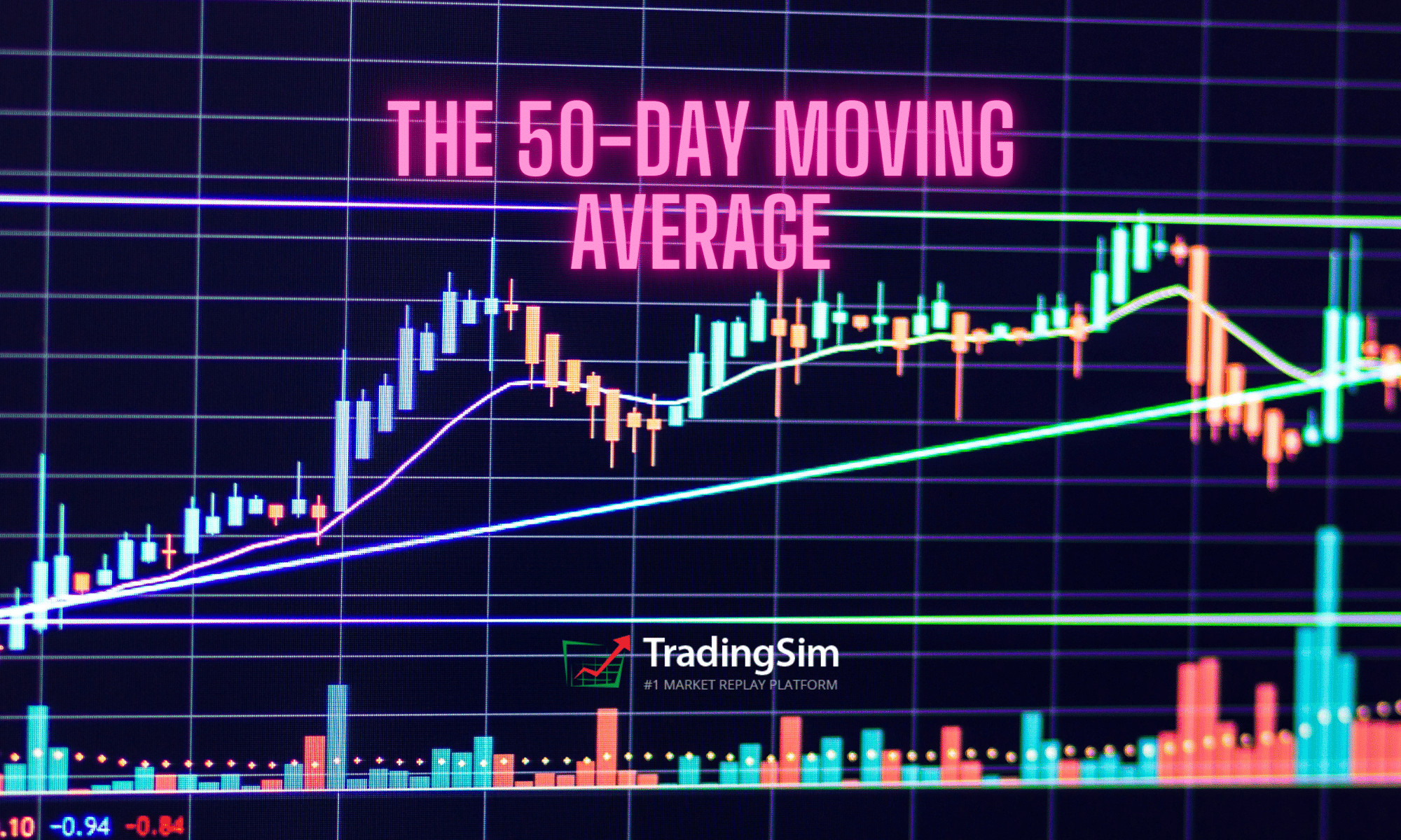
What Is a Golden Cross?

A golden cross occurs when a faster-moving average crosses a slower moving average. Sounds simple enough right? However, the key point is the moving averages which constitute the cross, and the direction in which they cross.

Specifically, you need the 50-period and 200-period simple moving averages. Anything other than these two periods and it is not a true golden cross.

Directionally, a golden cross happens when a 50-day moving average for an asset trades higher than a 200-day moving average. In other words, prior to the the cross, the 50 moving average would have been below the 200sma. You can see this in the example below:

AMC 200 and 50 moving average cross

What this tells traders and investors is that momentum could be changing when the cross occurs. When the speed of the upward movement in a shorter time-frame is faster than the longer-term speed, that’s taken as a sign that investors might want to buy.

That is, with high trading volumes and higher trading prices, the golden cross is possibly a sign that the stock market, and individual stocks, are poised for recovery.

What are the three stages of a golden cross?

There are three stages of a golden cross.

  1. As the downtrend in the stock market ends, the short-term 50-day moving average moves below the 200- day moving average.
  2. In a crossover, when a stock recovers,  the short-term moving average crosses over the long-term moving average. That’s where the term golden cross comes from, when the two average lines cross on a chart.
  3. In the last stage, the short-term moving average continues to move upward.  That’s usually a sign that the stock market is on a bullish trend.
The three stages of the golden cross

Is a golden cross a sign that investors should buy?

Golden crosses are not a guarantee of a bullish future in the stock market. Ari Wald is head of Technical Analysis at Oppenheimer & Co. He doesn’t see golden crosses as an absolutely bullish signal for the markets.

“All big rallies start with a golden cross, but not all golden crosses lead to a big rally,” he says.

Brian Shannon is the founder of AlphaTrends.net. He also agrees that golden crosses are not a definite timing signal to buy.

According to Shannon, “They tend not to be timing signals, but more for confirmation of a move that has been in place.”

In contrast, Jon Boorman sees golden crosses as good trading indicators. However, he also advises caution for investors as well.

“They’re perfectly valid, but people treat them all as individual trades rather than being part of a system. If you’re going to take one trade, take them all. You can’t pick one and then when it doesn’t work say ‘so much for that’. It’s an absurd thing for short-term traders and business TV to take notice of,” said Boorman.

“Just like any trend-following system, it will have plenty of whipsaw losing trades, but the winners will more than make up for those. It’s easy to pick holes in it, but very few have the discipline to execute it. Which is why it works,” added Boorman.

Is the golden cross an indicator of a bull market?

While financial analysts are skeptical about the golden cross being the start of a bull market, there is data to support the belief that it could be a good indicator. Schaeffer’s Senior Quantitative Analyst Rocky White found that there were gains in the stock market after a golden cross

White found that the S&P 500 had healthier returns a few months after the first golden cross.

“The S&P has averaged healthier-than-usual returns looking one, three, six, and 12 months out, ” said Schaeffer’s Senior Quantitative Analyst Rocky White.

“For instance, the index has averaged a three-month gain of 4.07% after a golden cross, and was higher more than three-quarters of the time. That’s compared to an average anytime three-month return of 2.12% since 1950, with a positive rate of just 65.9%,” said White.

Financial expert Jeffrey Marcus also noted the positive impact on the stock market after golden crosses. 

“On Thursday, the S&P 500’s 50-DMA crossed above the 200-DMA . Such is known as a “Golden Cross” and has now happened 25-times over the past 50-years. The long term performance of the S&P 500 following such an occurrence is unabashedly positive,” said Marcus.

“TPA calculated the performance of the S&P 500 10, 20, 40, 80, 160, and 320 days following each of the 25 Golden Crosses since 1970. The average performance is 0.88%, 0.98%, 3.25%, 6.73%, 9.57%, and 15.70%, respectively.

“The positive cross has happened 6-times in the past 10-years. The averages for 10, 20, 40, 80, 160, and 320 days following each was 0.53%, 0.89%, 2.64%, 8.17%, 10.45%, and 20.95%, respectively,” added Marcus.

Golden Cross Signal

Golden Cross Example

The above chart of $TSLA displays a classic golden cross trading example. The blue line on the chart is a 50-period SMA and the red line is the 200-period SMA.

The chart begins with a strong downtrend, where the price action stays beneath both the 50-period and 200-period SMA.

Suddenly, the direction of the trend changes and price begins making a move to the upside. Naturally, the 50-period SMA reacts faster to the price change as it has a greater sensitivity to the most recent price action.

Once the 50-period SMA crosses the 200-period SMA to the upside, we have a golden cross.  We have highlighted this in the grey circle.

Profit Potential of the Golden Cross Pattern

The profit potential will depend on the stock and the setup going into the trade. Sorry to be so vague, but that’s the reality of trading.

Death Cross

One option is to wait for a cross of the 50 back below the 200 as another selling opportunity. The only issue with this approach is you are likely to give back a sizeable portion of your profits since moving averages are a lagging indicator.

Death Cross

Here is an example of the “Death Cross” after riding a nice gain in Chipotle (CMG).

Golden and Death Cross Buy/Sell Signals

Notice that the sell signal comes as the market was already plunging. While you would have still had a nice gain, you must be ok with not “selling at the top.”

Prior Support

What you can also do is look for areas of resistance overhead which will act as selling opportunities for longs that have been holding the stock for a long period of time. Typically, bag holders from higher prices will be glad to get out at break-even.

Here is an example with CMG. We took the daily chart Golden Cross entry from above, then flipped to a weekly to see the target areas. Notice how close the exit would have been to the death cross still circled.

Selling at Resistance

A caveat to this strategy is that the stock may consolidate and push higher. You may want to hold part of your position and consider a potential breakout from the prior resistance area.

Trendline Break

If the golden cross is real, the signal will likely generate a strong buying opportunity. You can then use the first couple of reactionary lows to create an uptrend line. You then hold the stock until this trendline is broken.

Let’s look at an example of this below.

Bullish Golden Cross Pattern Example

Here we have a bullish golden cross stock pattern when the faster SMA on the chart breaks up and through the slower SMA in a bullish direction.

Trend Break Sell Signal

This is the same type of golden cross trading signal from the previous chart. However, this time we demonstrate the strength of the signal and the potential run a stock can make after a golden cross materializes.

If you don’t want to wait for the 50sma to break the 200sma on a death cross, you could have taken gains on the trend line break.

In this particular example for NVR, the stock went on a 100% run in 7 months.

Not a bad 7-month return for all you swing traders out there!

3 Strategies for Trading the Golden Cross

Strategy #1 – Look for Setups After a Long Down Trend

All golden cross setups are not equal. One method you can use is to wait for a stock that has had a long sustainable downtrend and then look for a stock that is ready to make a move higher.

There is so much bearishness in the stock that the signal has tremendous significance as a reversal.

Long down trend leads to bullish cross

The power of this signal is that the cross happens after a multi-month downtrend. By having such a long bearish trend, in order to get a bullish cross, there has to be a basing period. This basing period is the battle between the bulls and the bears.

Therefore, once the stock breaks to the upside, you know there is juice behind the move.

You can buy that initial breakout after the base, but realize you could still be in the thick of a bear market, so don’t get married to the stock. Look for opportunities as the stock rises to secure your gains.

Strategy #2 – Avoid Wide Spreads Between Moving Averages

At times the averages will have a wide spread. This will present a cup-and-handle-like formation of the averages. On the surface, it’s going to look really bullish.

However, if you look at the price action, you will notice the pattern is unhealthy. First, the price is shooting straight up. What happens when a stock goes parabolic into a strong primary trend? It usually reverses.

Golden Cross to avoid

What does this chart example teach us?

You cannot ignore price action. Parabolic reversals should be treated with caution. This is especially true when you have a large overhead gap acting as resistance.

For these types of golden crosses, you may want to avoid them. While it might be considered a valid golden cross, there are better opportunities in the market with smoother, less volatile entry signals.

So, what’s the trade here? Well, there isn’t one.

As traders, we have to remember that sometimes the best action is no action at all.

Strategy #3 – Combine Double Bottom Pattern with Golden Cross

The last strategy we will cover combines the double bottom chart formation with the golden cross.

Here is the setup.

  1. Look for a double bottom on the chart. The second low should be lower than the first.
  2. Next wait for the golden cross formation. Lastly, wait for the price to retest the 200 simple moving average.
  3. You want to buy the test of the 200 moving average with a stop below the low of the double bottom.

The below chart illustrates this formation.

Golden Cross + Double Bottom

Conclusion

The golden cross is a powerful trade signal, but this does not mean you should buy every cross of the 50-period moving average and the 200.

You will need to bring a higher level of sophistication to the setup, to ensure you are buying into a trade with real opportunity.

How Can Tradingsim Help?

Tradingsim is the best market replay platform on the web. You can cycle through thousands of charts and replay the data to see which golden cross setup works best for your trading style.

the 50-day moving average banner chart

The 50-day moving average indicator is one of the most important and commonly used tools in stock trading. Considered an “intermediate term” indicator, it is a multiple of the longer-term 100 and 200 moving averages. It’s use is ubiquitous on any time frame.

Therefore it goes without saying we need to unpack the relevance of this average and how you can use it when trading.

To this point, we will give a brief overview, elaborate on the six tips, and then show some real trading examples using the indicator. Lastly, we will show you where the indicator can fail you, so you are prepared for when things do not go as planned.

Why Use a Moving Average?

The moving average is a trading indicator used to smooth the price action on the chart. The moving average indicator takes into account a certain number of periods when calculating its value.

These periods can be adjusted, which also modifies the appearance of the line on the chart. The more periods it takes into consideration, the smoother the line.

Let’s say we want to calculate the 5-period moving average for the following values:

3.00
4.00
8.00
10.00
12.00

The 5-period simple moving average would equal:

(3+4+8+10+12)/5 = 7.4

For each new period, the formula accounts for the additional data point.

Therefore, the moving average is a lagging indicator. [1] The reason for this is that the moving average needs a given number of data points based on prior periods to print a value.

5-Day Moving Average
5-Day SMA

The purple curved line on the chart is a 5-period simple moving average. This line is not smooth at all. This is because five periods is such a small time frame and will result in many trade signals; more signals than most would care to track.

Now that we have provided a visual of a moving average let’s dig into the 50-day to see a longer time frame.

What is a 50-Day Moving Average?

The 50-day moving average indicator is one of the most common SMAs in stock trading.

This makes trade signals around this line pretty reliable based on the number of eyes monitoring the trading activity at this level. Not only will retail traders be watching this indicator, but professionals and institutions use it as wel.

Below, you will see a 50-day moving average on the chart.

50-Day Moving Average

As you can see, the 50-day SMA is much smoother than the 5-period moving average.  This will naturally result in less trading signals and an increased significance on breaches of the average. [2]

6 Tips for How to Use the 50-Day Moving Average

Now that we have discussed the structure of the 50-day moving average, let’s dive into the six essential tips for how to use the indicator.

  1. Stock price above the 50-day moving average is usually considered bullish.
  2. Stock price below the 50-day moving average is usually considered bearish.
  3. If the price meets the 50 day SMA as support and bounces upwards, consider a long entry.
  4. Stock price meets the 50-day SMA as resistance and bounces downwards, consider a short entry.
  5. If the price breaks the 50-day SMA downwards, you should switch your opinion to bearish.
  6. If the price breaks the 50-day SMA upward, you should switch your opinion to bullish.

These six rules are crucial for understanding the character of the 50-day simple moving average indicator. They may sound like they are all saying the same thing, but they’re not.

Notice how we never said that you should just buy and sell based on the 50 moving average. Trading doesn’t require an advanced degree, but we are here to tell you that buying and selling solely on the 50 is not a strategy for success.

However, having a base understanding of these six principles will help you better navigate how to trade with the average. Next, we will explore these strategies and areas where the indicator can fail you if not used properly.

50-Day Moving Average Trading Strategy

In this trading strategy, we will layout the entry, exit and stop loss when trading. You’ll likely notice that this strategy resembles a trend following strategy.

50-Day Moving Average Trade Entry

To enter a 50-day moving average trade, you should wait for a breakout.

Whenever the price breaks the 50-day SMA, you should open a trade in the direction of the breakout. In most cases, the price action will continue in the direction of the breakout.

50-Day Moving Average Stop Loss

Every 50-day moving average trade should be protected with a stop-loss order. Nothing is sure in stock trading. The 50-day moving average strategy is no different. In the long-term, we expect the price action to continue in the direction of the breakout. However, there will be cases when the price action will surprise us.

The price action could sometimes rapidly shoot in the opposite direction with a big candle. This could happen due to the release of some unexpected report.

The ideal place for our stop loss is beyond a price edge created prior to the signal we use to enter the trade.

If the price breaks the 50 SMA upwards, we need to go long, placing a stop below a bottom prior to the breakout. The opposite is true for bearish trades.

If the price breaks the 50 SMA downwards, we need to short the stock placing a stop below the bottom prior to the breakout.

50-Day Moving Average Profit Targets

The rule to close 50-day moving average trades is very simple. Hold your trades until the price action breaks your 50-day moving average in the direction opposite to your trade.

If you are long, you close the trade when the price breaks the 50-day SMA downwards. If you are short, you close the trade when the price breaks the 50-day SMA upwards.

Trading Example with the 50-Day Moving Average

Now let’s approach a real 50-day moving average trading example:

50 Day Moving Average Trading Example

Above you see the 50-day moving average chart of Bank of America. The blue curved line on the graph is the 50-day SMA.

The action on the chart comes at the moment when the price breaks the 50-period SMA downwards. The breakout is shown in the red circle on the image. See that the price first attempts a couple of times to break the SMA downwards.

However, we need to wait until the price action breaks the level in order to get a valid bearish signal. Therefore, we short the stock when we see a sharp decrease through the last two price bottoms below the 50-day SMA.

Stop Loss Order

We place a stop-loss order above the last big top on the chart. The right location of your stop-loss order is shown with the red horizontal line on the chart.

See that the price creates a very sharp decrease afterward and enters a bearish trend. We need to stay in the trade as long as the price is located below the 50-period SMA.

The blue channel on the chart displays when the price breaks the 50-day SMA and we close the trade.

However, this is also a long signal and we enter the market with a new trade, which is bullish. We place a stop-loss order below the last major bottom on the chart as shown on the image.

The price then returns and tests the SMA as support. A bullish bounce appears afterward, which resumes our bullish hopes. The price experiences a few bumps along the way, but the 50 SMA sustains the price action.

The price then creates a top, which is lower than the previous on the chart (pink line). Then we see a breakout through the 50-day moving average. Therefore, we close the trade on the assumption that the price action will reverse and this is exactly what happens.

This case is an example of two 50 day moving average trades, which differ in terms of their profitability.

The first trade is short and it brings a solid profit of 15.60% for three-and-a-half months. However, the second trade brings only 0.22% for about three months.

Your trading results will vary.  This is a cost of doing business and is simply unavoidable in the market.

The key is knowing that your system will win in the long run and sticking to your convictions.

50-Day Moving Average vs. 200-Day Moving Average

Another important moving average is the 200-day moving average. We mention this tool because it creates a very strong signal when used in conjunction with the 50-day moving average.

This signal is known as the golden cross.

The golden cross is a signal created by the 50-day moving average crossing through 200-day moving average to the upside [3].

A good golden cross trading strategy is to open trades in the direction of the golden cross and to hold them until a break in the opposite direction.

Golden Cross - Trading Example
Golden Cross – Trading Example

Above is the daily chart of Google. The blue line on the chart is a 50-day moving average. The red line on the chart is the 200-day moving average.

In the green circles, we have highlighted golden crosses.

The first golden cross is bullish and we use it to buy Google.

We place a stop-loss order below the bottom prior to the cross. The trade needs to be held until the two moving averages create a bearish sell signal.

This long trade with Google generates a profit of 22.28% for one year.

50-Period Moving Average on Intraday Charts

The one area you may not think of the 50-day moving average indicator is on intraday charts. This is because when you think of day trading, you think of fast-paced trades going in and out of stocks all day.

And technically, it would no longer be called the 50-Day Moving Average. It would simply be called the 50-period SMA.

So, where does the 50-period moving average indicator come into play? Well, the 50 can be used as a larger time frame to keep an eye on for support and or resistance intraday.

50 Moving Average Intraday

Above is a 5-minute chart of Apple. Whether you know it or not, the 50-period average is a big deal as you can see by the price action on the chart.

You can see that even during pre-market trading price respected the 50-period moving average. After crossing lower, Apple respected the average all the way into late-day trading.

Where the 50-Day Moving Average is Likely to Fail

Breaking the Average

The 50 is a major trend following average to use on the chart. To this point, what you do not want to do is overreact if a stock breaks the average on one or two candlesticks. We like to call this “porosity”.

It’s like a cow leaning through the fence to see if the grass is greener on the other side, only to return back to the same pasture.

This is often a rookie mistake to make as the stock will likely recover and continue in the direction of the primary trend.

Minor Breach of the Average

Do you see how the traders “in the know” might play these silly games with you? A way to handle these situations denoted by the circles on the chart is to give a certain amount of wiggle room where you will allow the stock to go beyond the moving average and you stick to your guns.

Many traders will continue to hold as long as a stock does not close beyond the average. This is also great advice. However, over time you will notice that stocks will close beyond the average literally one or two candlesticks, then return.

The real kicker is that after this close beyond the average and subsequent continuation of the primary trend – this is where the lion share of the profits are made in the trade. Think of it like a shake out.

Day Trading Breakouts in the Morning

If you are trading volatile stocks in the morning, you have no business trading with a moving average above 20, to be honest. The price action is so fast that you’ll want to use a lower time frame and moving average to catch the right moves.

While you can use a 50sma or higher to gauge the strength of the market, you should not use the average to make buy and sell decisions.

This becomes overly apparent when you trade extremely volatile stocks as the 50-period average will likely push your risk parameter beyond any acceptable level.

50-period moving average and volatility

As you can see, giving this much space on a trade is not a good idea. Do yourself a favor and do not try and force a longer-term average on a short-term volatile stock. Again, the 50 moving average can work as long as you use the indicator on stocks with less volatility.

It is better suited to trending stocks.

Conclusion

  • The moving average is an indicator which smoothes the price action on the chart by averaging previous periods.
  • The 50-day moving average is one of the most commonly used indicators in stock trading.
    1. It averages 50 periods of a stock on any time frame.
    2. Many investors and traders look at the 50-day moving average.
    3. Therefore, the 50-day SMA is a psychological level, which can act as a support and resistance.
  • To trade with the 50-day SMA, you should remember these rules:
    1. When the price breaks the 50-period SMA, you should trade in the direction of the breakout.
    2. You should place a stop-loss order beyond a bigger top/bottom before the breakout.
    3. You should stay in the trade until the price action breaks the 50-day moving average in the opposite direction.
  • The 50 day SMA combines well with the 200 day SMA:
    1. The crossover of the 50-day moving average vs. 200-day moving average is called a golden cross.
    2. When you see a golden cross, you should look to get long.
    3. You should place a stop loss beyond a bigger top/bottom prior to the cross.
    4. You should hold the trade until the 50-period SMA is broken to the downside.

Additional Resources

Check out this great case study on both the 50-day and 200-day moving averages on the S&P 500 if you want to learn more. The study covers a longer-term view of the indicator but it is still a great read and will provide some insights into your trading activity.

In addition, you can practice trading the strategies listed in this article by using Tradingsim. You can apply the 50-day moving average to both stocks and futures to get a feel for what works for you.

Better yet, we’ve added a new scan filter that allows you to filter stocks to within a certain percentage of the 10, 20, 50 or 200 moving averages.

Take a look:

Scan filter for 50 moving average

Using this great tool can help you narrow your results and scan specifically for stocks nearing their 50-day moving average. This way, you can practice your edge and analyze your trades more efficiently.

Be sure to check out our post on the 20 Moving Average Pullback Strategy, it really complements the 50ma and might help you discover an edge. Also, How to Catch Trending Stocks builds on the 50 moving average and offers even more examples of great trades.

External References

  1. Parets, JC. (2017). This is How I Use Moving Averages. allstarcharts.com
  2. Moving Averages. FinViz.com
  3. Golden Cross Signals. Yahoo Finance