Three Fibonacci Trading Strategies + Infographic & Video Explanation

Fibonacci banner

At times it feels like traders give the Fibonacci trading sequence an almost mystical power. Yet, despite its mysterious accuracy in trading and in nature, Fibonacci is nothing more than simple retracement levels. These levels are the only representative of where a security could have a price reaction, but nothing is etched in stone.

What is the Fibonacci trading strategy?

In the stock market, the Fibonacci trading strategy traces trends in stocks.  When a stock is trending in one direction, some believe that there will be a pullback, or decline in prices.  Fibonacci traders contend a pullback will most likely happen at the Fibonacci retracement levels of 23.6%, 38.2%, 61.8%, or 76.4%. As we’ll discuss below, a pullback is also possible at 50%.

For instance, if GE (NYSE:GE) is selling at $20 and rises to 21, the pullback will be 23, 38, 50, 61, or 76 cents. Fibonacci traders will expect support at these levels.

On the contrary, some day trading experts see these Fibonacci numbers as a short-sell strategy. For instance, if GE stock is at $21 and falls to $20.62, some Fibonacci traders may see the 38 cent drop as a good sign to short the stock.

For all intents and purposes, the Fibonacci retracement is a valid trading strategy to trade stocks. However, Fibonacci numbers aren’t always the best indicators of a trend.

What do trading experts say about Fibonacci trading?

Chris Svorcik is a forex trader who often uses Fibonacci trading. He says that traders can use the Fib method, but says that they need more experience to master Fibonacci trading. 

“I am a huge fan of EW[Elliott Wave, another trading strategy] and Fibs, but it does require some experience to handle it. Using moving averages does in my view shorten the learning curve. Also using price swings or EW as a support tool rather than a main trading tool, I think, makes it less complicated, ” said Svorcik.

Daniel Leboe, an analyst with Zach’s, also likes using the Fibonacci retracement. However, he also advises caution to traders when using the trading strategy. 

“Fibonacci retracement is a good tool to use when deciding if now is a good time to buy, but do not look at it as the holy grail. In this volatile market, we are prone to blow through levels. Make sure you have a shopping list of stocks you like ready so that you can pull the trigger when the time comes,” said Leboe.

“Fibonacci queen” says traders should have a plan with trading strategy

Experienced trader Carolun Boroden trades so often with the Fibonacci strategy that she’s been dubbed the “Fibonacci Queen.” She says that even if traders follow the Fibonacci strategy, they should still have a specific trading plan.

“You [need] a specific plan that describes what your trade setups are; how you’re going to get into the trades; what you are going to risk; how you’re going to manage the trade and take profits; how you’re going to have certain targets, or you’re going to trail a stop.”

Carolun Boroden

Does the Fibonacci trading strategy predict stock market trends?

While some financial experts are skeptical of the Fibonacci strategy, it has predicted other downturns before. In February before the COVID-19 crisis, the Dow Jones retraced about 50% before the economic crash. Andrew Adams is a technical analyst at Saut Strategy. He wrote in a research note that the pullback at that ratio meant an end to the previous bull market.

“Rallies of all sizes do regularly eventually pull back at least to the 38.2%-50% Fibonacci levels,” wrote Adams.

Not long after that retracement, the bear market devastated the stock market.

While the strategy has predicted a bearish market, it can also predict a bullish market as well.  According to CNBC’s Jim Cramer, Boroden’s Fibonacci strategy predicted a stock market recovery in May.  

“The charts, as interpreted by Carolyn Boroden, suggest that the major averages are still in rally mode, but it’s a precarious rally where you need to proceed with caution if we fail to break out from these levels and slip back to where we were not that long ago,” said Cramer.

“She thinks the S&P is a buy right here. There’s too much going right in her charts for her to say anything else. However, she says you should be ready to sell if we fail to break out over the 200-day moving average, eventually,” added Cramer.

While the Fibonacci trading strategy isn’t exact, if used correctly, it can predict major stock market trends. The different Fibonacci trending strategies will be explored in this article.

Fibonacci Trading Personas

Before we go into the gritty details about Fibonacci trading strategies, it is worth our time to discuss the different types of fibonacci trading personas you might encounter. While mostly fictitious, these three personas do an awesome job of summarizing common trading practices.

Fibonacci Persona Infographic

Which Persona Best Describes You

You must first ask yourself the question of how you plan on leveraging Fibonacci in your trading regimen. If you haven’t done so already, think about writing a trading plan to review before, during, and after the market closes.

Depending on what the market is offering, you might fluctuate between the low and high volatility Fibonacci trader. Or, you may find yourself only using Fibonacci as an ancillary tool to support your trade plan thesis.

Fibonacci assists in seeing hidden levels of support and resistance to help you determine you entry and exit targets. To what degree you emphasize these levels depends upon your own conviction with the tool.

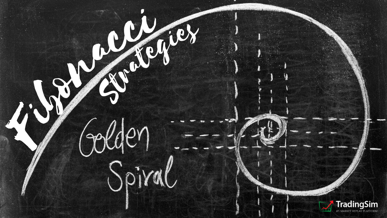
Chapter 1: Origin of the Fibonacci Sequence

Does this numbering scheme mean anything to you – 0, 1, 1, 2, 3, 5, 8, 13, 21, 34, 55, 89, 144, 233, 377? Not really, right?

Well, don’t be surprised, not many recognize the pattern. These numbers are the root of one of the most important techniques for identifying psychological levels in life and in trading.

Behold the mighty Fibonacci ratios!

Hundreds of years ago, an Italian mathematician named Fibonacci described a very important correlation between numbers and nature. He introduced a number sequence starting with two numbers: 0 and 1.

Building a Fibonacci Sequence [1].

Again, we start with 0 and 1.

0, 1

The sequence requires you to add the last two numbers to get the next number in the sequence. Following this logic, we get the following equation:

0 + 1 = 1

Now we have our third number in the sequence – 1. See below for the updated sequence.

0, 1, 1

Now we add the last number in the sequence to the previous number once again:

1 + 1 = 2

We again update our sequence with the number 2.

0, 1, 1, 2

and then…

1 + 2 = 3

and then…

0, 1, 1, 2, 3

and then….

0, 1, 1, 2, 3, 5

and then….

0, 1, 1, 2, 3, 5, 8

and then….

0, 1, 1, 2, 3, 5, 8, 13

This process goes on to infinity.

Chapter 2: Key Fibonacci Ratios

Fibonacci discovered every number in the sequence is approximately 61.8% of the next number in the sequence.

55 / 89 = 0.6179775280898876 = 61.8%

233 / 377 = 0.6180371352785146 = 61.8%

144 / 233 = 0.6180257510729614 = 61.8%

This is not the only correlation. Fibonacci also uncovered that every number in the sequence is approximately 38.2% of the Fibonacci number two steps ahead.

(13, 21, 34)

13 / 34 = 0.3823529411764706 = 38.2%

(21, 34, 55)

21 / 55 = 0.3818181818181818 = 38.2%

(55, 89, 144)

55 / 144 = 0.3819444444444444 = 38.2%

(144, 233, 377)

144 / 377 = 0.3819628647214854 = 38.2%

Also, we have another ratio! Every number in the Fibonacci sequence is 23.6% of the number after the next two numbers in the sequence:

(55, 89, 144, 233)

55 / 233 = 0.2360515021459227 = 23.6%

Pretty cool, huh?

Chapter 3: Fibonacci Ratios Everywhere

Fibonacci Sea Shell

Fibonacci Sea Shell

Here is an example of the Fibonacci in nature with this sea shell. The volume of each part of the shell matches exactly the Fibonacci numbers sequence. Thus, each part of this shell is 61.8% of the next.

It works the same way with this aloe flower:

Aloe Flower Fibonacci sequence
Aloe Flower Fibonacci

If we separate the aloe flower into even particles, following the natural curve of the flower, we will get the same 61.8% result.

This ratio is not only found in animals and flowers. This ratio is literally everywhere around us. It is in the whirlpool in the sink, in the tornados when looked at through satellite in space or in a water spiral.

The Fibonacci ratio is constantly right in front of us and we are subliminally used to it. Thus, the human eye considers objects based on the Fibonacci ratio as beautiful and attractive.

On that token, big corporations like Apple and Toyota have built their logos based on the Fibonacci ratio. After all, these are two of the most attractive and engaging logos in the world.

Still not a believer, check out this study from Harvard’s math department where they cite a study from Dr. Rowland from Merrimack College on how to tie knots using Fibonacci [2].

Chapter 4: Fibonacci Ratios in Trading

Coming back to the markets, trading with Fibonacci isn’t all that complicated.

A logical method for entering a trade is when the stock is going through a pullback.

Well, where would you think to place your entry?

Without knowing anything about Fibonacci trading, you would likely say 50%.

That my friend makes you a Fibonacci trader.

That’s what Fibonacci trading is about, understanding stocks do not move in a linear fashion. Fibonacci helps new traders understand that stocks move in waves and the smaller the retracement, the stronger the trend.

Now, it’s time to take you to the level of an intermediate Fibonacci trader. To do this, you need to know the other two critical levels – 38.2% and 61.8% retracement.

Price action must be analyzed at these levels to understand if the countertrend move will stop and the trend will resume.

Fibonacci retracement levels are used by many retail and floor traders [3], therefore whether you trade using them or not, you should at least be aware of their existence.

Some advanced traders will take it a step further and add Fibonacci arcs and Fibonacci fans to their trading arsenal in search of an edge. We will touch on these later.

Chapter 5: How to Interpret Fibonacci Levels

Defining the Primary Trend

Strong Uptrend

Defining the primary trend with Fibonacci requires you to measure each pullback of the security. If you see a series of new highs with retracements of 50% or less, you are in a strong uptrend.

strong-uptrend
Strong Uptrend

The above chart is of Alphabet Inc., on a 5-minute chart. Notice how Google doesn’t have any retracement greater than 50%. These successive new highs with minor pullbacks are the sign you are in a strong uptrend.

Choppy Market Fib Levels

Here is another example of a trend with Chipotle (CMG).

Choppy Market
Choppy Market

Do you see how each pullback is greater than 78.6% from the initial range? This level of retracement repeatedly produces a choppy pattern. Therefore, you would not want to have lofty profit targets on a trade while the stock is in a tight trading range.

78.6% is not a hard-fast rule. If you see retracements of 61.8% or 100%, the stock is likely in a basing phase before the next move.

That’s it, you now understand how to use Fibonacci to define the strength in the market.

Remember, the market is either trending or flat.

A general rule of thumb for the overall market is it trends 20% of the time and is range bound the other 80%.

Chapter 6: Three Simple Fibonacci Trading Strategies

#1 – Pullback Trades

First, you want to identify a security in a strong trend.

A strong trend can be defined as a stock with successive highs with pullbacks of less than 50%.

If you are day trading, you will want to identify this setup on a 5-minute chart 20 to 30 minutes after the market opens.

After identifying a strong uptrend, observe how the stock behaves around the 38.2% and 50% retracement levels from the morning highs by looking at the time and sales and Level 2.

Once you see the trading activity slowing down or turning, enter the trade.

You can use the most recent high or a Fibonacci extension level as a target point to exit the trade.

38.2% retracement example
38.2% retracement fibonnaci trading example

In the above chart, notice how LGVN stays above the 38.2% retracement level before making a higher high.

Where Can Things Go Wrong?

[youtube_async]SELtAvSv_GI[/youtube_async]

The chart above looks so clean and safe. The reality is that you will likely have a 40%-70% hit rate depending on your ability to honor your rules and manage your emotions.

Therefore, you need to prepare for when things go wrong. In a pullback trade, the likely issue will be the stock will not stop where you expect it to. It may pullback to a full 100% retracement, or it could even go negative on the date.

I have had situations trading the Nikkei where a stock will have a 15% or greater swing from the morning highs.

You can protect yourself from this scenario by doing the following:

Trade Low Volatility Stocks

Penny stocks look great when a trader is discussing their 30% gain in one hour. However, it’s brutal if you are on the other side of the trade. Trade stocks with high volume and some volatility because we need to make a living, but don’t feel like you must trade with the other gunslingers.

Max Time Loss

Look back over your winning trades and determine how long it takes you to turn a profit with 85% confidence.

If that is 5 minutes or one hour, this now becomes your time stop. If there is only a 15% chance you will walk away a winner, just exit the trade with a predetermined allowable loss percentage or right at market.

Max Stop Loss

There is no way around it, you will have blowup trades. I do not care how good you are, at some point the market will bite you. To this point, have a max stop loss figure in mind.

As a general rule, we prefer 10%. But since we only use a small portion of the account size for each position, this keeps a total portfolio loss of under 2%. With lower volatility stocks, this may trigger a stop only once or twice a year.

The point is you, need to be prepared for the inevitable.

#2 – Breakout Trades

Breakout trades have one of the highest failure rates in trading. To help these odds, we’ll give you a few things you can do to up the chances of things working out.

[youtube_async]VMnIEIn3F2U[/youtube_async]

Clearing a Fibonacci Extension Level

Fibonacci extensions are just that, once price clears the 100% retracement and presses on.

You want to find a stock clearing this extension level with volume.

Clearing Fibonacci Extension Levels

It’s not enough to just buy the breakout.

Therefore, you want to make sure as the stock is approaching the breakout level, it has not retraced more than 38.2% of the prior swing. This will increase the odds the stock is set to go higher.

Where Can Things Go Wrong?

In terms of where things can go wrong, it’s the same as we mentioned for pullback trades. The one difference is that you are exposed to more risk because the stock could have a deeper retracement since you are buying at the peak or selling at the low.

So, to mitigate this risk, you will need to use the same mitigation tactics as mentioned for pullback trades.

#3 Trading with Indicators

[youtube_async]7OGoKZmOSs0[/youtube_async]

You can use Fibonacci as a complementary method with your indicator of choice. Just be careful you do not end up with a spaghetti chart.

Fibonacci Retracement + MACD

This Fibonacci trading strategy includes the assistance of the well-known MACD. Here we will try to match the moments when the price interacts with important Fibonacci levels in conjunction with MACD crosses to identify an entry point.

We hold the stock until we receive a crossover from the MACD in the opposite direction.

Fibonacci Retracement w/ MACD
Fibonacci MACD

This is the 60-minute chart of Yahoo.

The two green circles on the chart highlight the moments when the price bounces from the 23.6% and 38.2% Fibonacci levels.

At the same time, the green circles on the MACD show a cross up of the indicator.

Thus, we go long every time we match a price bounce with a bullish MACD crossover.

The red circles show the close signals we receive from the MACD.

We open two long positions with Yahoo and we generate a profit of $5.12 per share.

Fibonacci Retracement + Stochastic Oscillator + Bill Williams Alligator

In this Fibonacci trading system, we will try to match bounces of the price with overbought/oversold signals of the stochastic. When we get these two signals, we will open positions.

If the price starts trending in our favor, we stay in the market if the alligator is “eating” and its lines are far from each other. When the alligator lines overlap, the alligator falls asleep and we exit our position.

Fibonacci Alligator Stochastics combination
Fibonacci Alligator

This is the 30-minute chart of TD Bank.

The price drops to the 61.8% Fibonacci level and starts hesitating in the green circle. Meanwhile, the stochastic gives an oversold signal as shown in the other green circle.

This is exactly what we need when the price hits 61.8% and we go long! A few hours later, the price starts moving in our favor. At the same time, the alligator begins eating!

We hold our position until the alligator stops eating. This happens in the red circle on the chart and we exit our long position. This trade brought us a total profit of $2.22 per share.

Fibonacci and Volume

We saved this one for last because it’s our favorite go-to with Fibonacci. Volume is honestly the one technical indicator even fundamentalist are aware of.

Fibonacci and Volume

We mention this a little later in the article when it comes to trading during lunch, but this method works really during any time of the day.

As a trader, when you see the price coming into a Fibonacci support area, the biggest clue you can look to is the volume to see if that support will hold. Notice how in the above chart the stock had a number of spikes higher in volume on the move up, but the pullback to support at the 61.8% retracement saw volume plummet.

This doesn’t mean people are not interested in the stock, it means that there are fewer sellers pushing the price lower.

This is where longs come in and accumulate shares in anticipation for the rally higher.

Chapter 7: Advanced Fibonacci Trading Topics

Fibonacci Speed Resistance Arcs

Fibonacci Arcs are used to analyze the speed and strength of reversals or corrective movements. To install arcs on your chart you measure the bottom and the top of the trend with the arcs tool.

The arcs appear as half circles under your trend, which are the levels of the arc’s distance from the top of the trend with 23.6%, 38.2%, 50.0%, and 61.8% respectively.

Each of the Fibonacci arcs is a psychological level where the price might find support or resistance.

Fibonacci Arc

This is the 30-minute chart of Apple.

I have placed Fibonacci arcs on a bullish trend of Apple. The arc we are interested in is portrayed 38.2% distance from the highest point of the trend.

When the price starts a reversal, it goes all the way to the 38.2% arc, where it finds support. This is the moment where we should go long.

Lastly, we recommend placing a stop right below the bottom created on the arc.

Fibonacci Time Zones

Fibonacci time zones are based on the length of time a move should take to complete, before a change in trend. You need to pick a recent swing low or high as your starting point and the indicator will plot out the additional points based on the Fibonacci series.

Fibonacci Time Zones

Notice, in this case, Apple’s price undertakes a move based on Fibonacci numbers 0, 1, 2, 3, 5, and 8.

Do you remember when we said that Fibonacci ratios also refer to human psychology? This also applies to time as well.

Negatives of Trading with Fibonacci

Increased Expectations

Unfortunately, with Fibonacci trading, you begin to expect certain things to happen. For example, if you see an extension as the price target, you can become so locked on that figure you are unable to close the trade waiting for bigger profits.

If you are trading pullbacks, you may expect things to bounce only for the stock to head much lower without looking back.

Therefore, if you are trading with Fibonacci at the core of your system, expect things not to work out about 40% of the time.

Take that in for a second. That is quite a bit of times where you’ll be wrong. This means it is absolutely critical you use proper money management techniques to ensure you protect your capital when things go wrong.

Closing Too Soon

The other scenario is where you set your profit target at the next Fibonacci level up, only to see the stock explode right through this resistance. Thus, resulting in you leaving profits on the table.

Leaving it on the Table

What Are We to Do?

Fibonacci will not solve your trading woes. Again, you can hope to be right 60% to 70% of the time. This is not only when you enter bad trades, but also exiting too soon.

So, what are we to do?

The answer is to keep placing trades and collecting your data for each trade. You will have to accept the fact you will not win on every single trade.

Trading During Lunch

Talk to any day trader and they will tell you trading during lunch is the most difficult time of day to master.

The reason lunchtime trading is so challenging is that stocks tend to float about with no rhyme or reason. Volume and range trail off considerably.

So, how can you profit during the time when others like to get lunch? Simple answer – Fibonacci levels.

Often times, during the lunch hour, a stock will make a pullback to a key Fibonacci support level. For bigger corrections, that might be 78.6%.

Ken Chow of Pacific Trading Academy, also mentions the benefit of a lower-risk entry at the 78.6% level.[4]

However, everyone isn’t as pessimistic as Ken, so you can go with 50% or 61.8%. It all depends on what the stock is actually doing.

Midday Pullback Example

Fibonacci Lunch Time Trading

The above chart is of the stock GEVO. Notice how the stock gapped up in the morning and then formed a nice base at the 50% retracement level.  Now at this point of the day, you want to see two things happen: (1) volume drop to almost anemic levels and (2) price stabilize at the Fibonacci level.

The combination of these two things almost guarantees volatility also will hit lower levels. You want to see the volatility drop, so in the event you are wrong, the stock will not go against you too much.

Managing the Trade

So, naturally, the question is how do you manage the trade.

First, you want to see the stock base for at least one hour. Then you want to see higher lows in the tight range. In the GEVO example, you want to place your buy order above the range with a stop underneath.

Curious to see what happened?

400 Percent in One Day

Of course, this doesn’t happen all the time. So, please do not say we are pushing lunch breakouts that can run 400%.

This is just a real-life example that shows the power of Fibonacci levels providing support during the middle of the day.

Now, remember, you have to exercise extreme caution with the middle of the day trading.

Not so much from the perspective of the market going against you, as you can see you have tight stops.

It’s more around the fact these setups fail a lot.

So, again, keep tight stops and always have realistic expectations.

Conclusion

  • The Fibonacci sequence starts from 0; 1, and every number thereafter is built by the sum of the previous two.
  • Every number in the Fibonacci sequence is 61.8% of the next number.
  • Numbers in the Fibonacci sequence are 38.2% of the number after the next in the sequence.
  • Every number in the Fibonacci sequence is 23.6% of the number after the next two numbers in the sequence.
  • The deeper the retracement on a pullback, the less likely the stock will break out to new highs
  • Fibonacci levels are critical in equity trading because they represent a trader’s behavior and psychological reaction to price changes.
  • The most common Fibonacci trading instrument is the Fibonacci retracement, which is a crucial part of the equity’s technical analysis.
  • Other Fibonacci trading tools are the Fibonacci speed resistance arcs and Fibonacci time zones
  • Whether you trade pullbacks, breakouts or indicators; you must have a trading plan to manage your position.

Like anything else in life, to get good at something you need to practice. So, if you have a second check out Tradingsim.com.

Here you can practice all of the Fibonacci trading techniques detailed in this article on over 11,000 stocks and top 20 futures contracts for the last 2.5 years. Our customers are able to test out strategies by placing trades in our market replay tool and not just relying on some computer-generated profitability report to tell them what would have happened.

As we all know, looking at results of a report and placing trades are two totally different things!

External References

  1. Reich, Dan. The Fibonacci Sequence, Spirals, and the Golden Mean. Department of Mathematics, Temple University
  2. Twisting with Fibonacci [Study]. Harvard College Mathematics Review. p.66
  3. Fibonacci Retracement. Wikipedia
  4. Chow, Ken. Trading with Fibonacci Ratios [Blog Post]. Pacific Trading Academy

Photo Credit

Aloe Flower
Shell 

The Red Dog Reversal is named, endearingly, after Scott Redler. Red Dog has been his nickname in some circles for years — perhaps dating back to his bartending days.

Redler is loved in the trading community. He’s known as a great family man, an accomplished athlete, and an incredible teacher and trader. His technical expertise has been shared on CNBC, Fox Business, and other popular financial networks.

As a professional trader and Chief Strategic Officer at T3Live, Scott knows a thing or two about short term trading. He’s famous for his 8 moving average strategies, trend lines, and 6am strategy calls to all the early morning followers he has.

Today we want to pay homage to one of his great strategies, the Red Dog Reversal. We’ll take what we can from Scott’s teachings and apply them to the markets and the simulator to find out how we can practice this strategy for explosive short term gains.

But before we get started, if you want to hear about the strategy from the man, himself, check out this quick clip of our interview with Scott:

The History of the Strategy

Legend has it that Scott grew up under the tutelage of Greg Capra in the 90s. Capra is known for his Pristine Method of Trading in the markets, which has evolved over the years and no longer taught except for the likes of Sami Abusaad or others at T3Live. Still, it was foundational for a lot of what Redler created on his own.

Within the method are reversal signals like bottoming tails and topping tails. Redler found that these were lucrative opportunities with a high time-value. They also offer defined risk levels.

Throw in the cool Red Dog name, add the reversal, and you’ve got a popular strategy made mainstream by a great personality.

The Theory Behind the Red Dog Reversal

The psychology behind the Red Dog Reversal is pretty simple on paper. Redler describes it in the following way:

This is a battle between the Bears and the Bulls – the Bears think it’s going lower and are shorting it, and all of a sudden it goes below [the prior low] then comes back above, so they’ll want to cover. It could bounce.

Scott Redler

Sounds pretty simple doesn’t it? It’s essentially buying the reversal at the prior day pivot on a stock that has been trending downward for some time. Shorts will be keen to cover and take their profits, while bulls jump on the bounce.

Along those lines, here are the steps for taking an entry:

Red Dog Reversal Buy Strategy

In order to get a full understanding, we’ll give a few examples below. We’ll also take a look at the short side of this strategy.

Red Dog Reversal Example 1: AMD

We’ll start with the daily chart of AMD. Focus your attention on a few things to start with:

  • The steady near term downtrend that AMD has formed
  • The first candle to reverse the down trend

We’ve delineated these down days with numbers so you can get a feel for the trend. If that isn’t enough, check the trendline across the top.

AMD Red Dog Reversal

You may even spot that AMD was starting the base of a downtrend channel as it touched $87s on the 19th, the day of the reversal. All of these contextual clues help us setup the trade.

To that point, we want to draw our attention to the price on this 5th down day as it starts above the the prior day (4), breaks lower and touches the lower trend channel (not drawn), then proceeds to reverse.

As astute traders, we might have set an alert on our charts at $88.21, knowing that this was the prior day (4) candle’s closing low.

Intraday Chart

In the morning action, this what that would have looked like on a 1 minute chart:

AMD Intraday Red Dog Reversal

Notice that the we got a long washout on the first few swings down on this morning. It’s all about the anticipation and making sure you have a clear setup to define your risk. Once we break the prior day low, our antenna are up, waiting for the reversal.

If you had taken the first breach and reclaim, you might have been stopped out. Even in this strategy, you might want to wait for a proper entry like a head and shoulders or “higher low, higher high” to form.

Perhaps you want to wait and see the $106.80 from the prior day breached and hold as support first. This way, we get at least one higher low and higher high, thus defining rut risk after the low of day is set.

Thankfully, for this trade, we had a great secondary washout long that then rallied. It never took out the day’s low after that, so we weren’t stopped out.

This trade would have given us a $2 move on the first day, and another $6 as we retest the trading channel highs the next day.

Managing the Trade

This is somewhat discretionary. If you are a day trader, you could be looking to find the best risk to reward setup and take your profits for that day.

However, the beauty of this strategy, as you can see, is that it often gives multi-day moves. To that end, you may want to consider hanging on to a portion of your position to see what happens the next day. In the chart above, we’ve given you an example of what it would look like to take a partial near the 8ma on the 3rd day and then close out the position the 4th day.

Red Dog Reversal Example #2: AMD Re-entry

Sometimes, you might get lucky with another quick opportunity to trade the same setup. AMD was no exception to this in the example above.

Let’s look at how this could have set us up for another entry using the RDR.

AMD Secondary Red Dog Reversal Opportunity

What makes this a great trade is three things.

  1. We’ve already had a significant reversal off the lows of the down trend (our first trade).
  2. We are retesting the levels of that significant day on lower volume.
  3. The rally persists and breaks the down trend.

A lot is going in our favor for this trade. The down trend is at least a few weeks into its maturity. And for a stock like AMD, this could be overextended.

Then, all of the other factors for a reversal line up for us. As Scott often notes, you want to take advantage of the trade when it presents itself. Amateur traders may be wary to take the trade because of the retracement from the first trade.

Professional traders see this as a natural retest, a potential double-bottom, and a chance to catch a big move higher. Plus, if the trade signals a long, we have to take it. It’s all a game of numbers.

Just like our first trade, we wait for the trade to reclaim the prior day low, go long, and set our stop at low of the current day.

Management of the Trade

If this turns into a broader rally, you’ll want to manage your position in order to squeeze the most out of the trade.

Here are a few ways Redler likes to do this.

  1. Take short term profits along the way into any nice rallies
  2. Use a “three day” rule-of-thumb
  3. Hold remaining shares to see how they react to support
  4. Employ an 8 moving average for near term trend

Just like with steady 3, 4, 5+ day downtrends, you want to consider the same with your uptrends. Eventually there will be a reversal. So, if you’re long, keep this in mind.

With that, let’s look again at the chart to see what it would look like as our stock rallies.

AMD Red Dog Reversal Management

As the stock pushed higher the second day or third day, perhaps you would take profits, then hold a small core for any pullbacks. By the 5th day, the price moves above the 8ma. Notice how it was resistance before. This gives a potential re-add to the position.

Re- Adds and Trend Break

If you added on the break through the 8ma or support, you’d then move your stop up close to the new average you have as a break-even. We’ve show this support line as the second red line near the 8ma. Just as we did in the first rally, we want to pay ourselves when the market gives it to us.

After the re-add we’ve numbered the rally days. Clearly, this move had decent velocity, but there was some selling pressure as it broke the channel high. As a swing trader, you might have taken some profits into the 1st day of the re-add.

The stock then surfs a solid trend noted by the small diagonal line. As it broke this area, you could have taken all of your profits with a trailing stop.

Take your profits, or hold a small position for the break below the 8ma that comes a few days later. All in all, you banked about $7/share!

Red Dog Reversal Intraday Example: AMC

The RDR works great for swing trades, but we set out to see if it would work for an “intraday swing.” Sure enough, we’ve found evidence that this works well on intermediate time frames like the 5 minute chart.

Here is one such example with AMC:

Red Dog Reversal Intraday

On this 5 minute chart, we’ve added the 8ma and VWAP. Take a moment to analyze all the elements of the RDR. The open slightly above, dip below, and rally back above the prior candle close. You could have employed the exact same RDR tactics that we used on the daily for a short term intraday scalp, or rode the stock’s 8ma all the way back to vwap.

Like our other example, we find that the 8ema worked great on this 5-minute time frame as support once the trend changed. Noted on the chart is an 8ma support area for a potential add-on.

Profits could have been held into the vwap push, or with a trailing stop along the 8ma.

Red Dog Reversal Short Example: AAPL

Like most strategies, there is a long and short side. The RDR can work great for short term selloffs.

In this example with AAPL, we get the perfect opportunity to take advantage of a reversal to the short side. Notice the stock was trending very strongly upward into a climactic overextended gap in the prior days. Then, we get a nice candle after the gap that opens below this day, trades above it, then retraces.

What we have left is a hanging man candle.

Red Dog Reversal Short Strategy

When the signal is there, we have to take it. In this example, the next day was sideways. However, you could have taken some profits into the dip on the second day. Remember, the initial stop is above the RDR candle. Likely, you wouldn’t have stopped out if you were minding your stop and giving some breathing room.

Luckily we got a nice gap down the next day. When we the market gives us an opportunity like this, as short term traders, we take it.

This trade would have resulted in a nice $6 move in just over a week.

Second Opportunity

If the first trade weren’t enough for you, AAPL gave a second RDR a few weeks later. Can you spot it on the chart above without cheating and looking below?

Look closely.

Here’s where it occurred:

2nd RDR Shorting Example

If you see the big picture here, you’ll notice that many of these opportunities form around trading ranges and consolidations. Reversals at the highs and the lows can create great short term trades.

Like the first short trade, we take our profits as the stock capitulates and gaps down on day three.

How to Practice the Red Dog Reversal

The best way to practice any strategy in the market is to turn over enough stones that you discover a pattern. After all, that’s what we’re seeing here, thanks to the work of Scott Redler. He’s traded enough of these to know his probability of success.

And that’s your call to action. If reversal strategies are your thing, be sure to check out our other posts, especially the ones covering candlestick reversals. Then spend time in the simulator training your chart eye and taking enough trades to study your analytics on the pattern.

With plenty of trades for a nice subset, you’ll have the confidence to know when the RDR works, and when it doesn’t. Then it’s time to put your real cash to work.

So here’s to good fills! We hope you sniff out some great reversals in the market!

Oh! And be sure to give Scott a like on Twitter. He’s always putting out great free content for the community!

Most anchored vwap strategies are centered around swing trading. However, the strategies used on daily charts can also become major support or resistance for day traders.

In this post, we’ll show you how to develop your edge with three anchored vwap strategies and explain the theory behind the indicator. But before we do, take a moment to watch the video below on how to apply this indicator to your trading tool belt.

VWAP vs. Anchored VWAP

What’s the difference between the two?

VWAP

For starters, you need some understanding of what vwap is. It stands for the volume weighted average price. As a lagging indicator, it tells you where the majority of buys and sells for any given ticker have occurred on average as price evolves throughout the day.

It’s generally used for day trading.

As an example, imagine a stock that runs from $2-$5 and then regresses to $2 by the end of the day. If the majority of the volume came at the highs, then your vwap indicator will likely remain high on the day’s close. Whereas, a simple moving average will fluctuate more as it is based only on the price.

SPRT 50ma vs vwap
SPRT 50ma vs vwap

Notice in the image above, the red vwap is much smoother than the yellow 50 moving average. The addition of volume in the formula adds a different weighting element than moving averages.

For a deep dive on vwap, be sure to check out our ultimate guide on the subject.

Anchored VWAP

How the two differ involves the anchor. VWAP is a moving indicator used intraday – starting with the first bar and ending with the last of the day. Anchored vwap, on the other hand, is tethered to a specific bar and displays the cumulative struggle of bulls and bears from that bar.

Developed by Brian Shannon, CMT, the anchored vwap (similar to traditional vwap) is more of a trend indicator. Shannon discovered the idea that certain days on a chart were more important than others. By anchoring vwap to a specific day, it could reveal the longer term support or resistance of bulls or bears who may have initiated positions either on that day or near the avwap later on.

These events could be anything from earnings to news releases, or simply high volume days on the chart. Similar to a pivot point or vwap boulevard in that it is often a firm psychological resistance level in the market, it differs in that it isn’t as static. Anchored vwap, while it sounds stationary, evolves as price and volume change. The fixture is simply the starting point of the calculation.

What Does Anchored VWAP tell us?

Much like volume at price, anchored vwap can tell us the price at which most traders are commonly positioned. Let’s use a visual example to explain this:

Anchored VWAP for SPRT

In this example, we anchored vwap to the largest prior volume day on the chart. Volume is significant, and whatever catalyst caused this move is inconsequential. The important thing is the volume traded on the day.

When we anchor vwap to this day, months down the road it becomes significant again. SPRT had a very high short interest — above 60%. This is significant, especially if any institutions were shorting the stock on the large volume day in March. As the months went by, we see that there are few opportunities for all of those shares to be covered.

In other words, liquidity dried up. That is, until July and August came around and demand for the stock began to push it higher.

As price reached the prior anchored volume weighted average price, we begin to see a lot of turmoil in the price at this level. Resistance first, then support, and support again – shown by the arrows.

The Significance of Anchored VWAP

The significance here is the underlying revelation of who is underwater and who is comfortable. Shorts had the upper hand for months, but once the price of the stock began to climb back to their “average” price, it became clear that shorts were in trouble. Millions of shares aren’t covered easily when a stock float is as small as 15 million, like SPRT.

This begins the game of averaging up to salvage the position. But with every effort to re-average, the pot of water gets hotter. And if the demand doesn’t let up, the end result can be catastrophic as margin calls pour in and brokers start cutting their losses by covering their client’s position. For more information on this, see our post on float rotation.

This can work in favor of shorts as well. If buyers and bag holders are averaged above the current avwap levels, it is likely the key average might provide resistance on any rallies into it. Will discuss this in an example below.

Three Anchored VWAP Strategies with Real Examples

Let’s take a look at three specific strategies you can use with the anchored VWAP indicator.

1. Red to Green Moves

This is a very simple strategy like the example we used above with SPRT. The strategy revolves around a move from being below the avwap to being above it. In other words, what was once resistance has become support, or longs who were red, are now green.

Let’s look at a recent example with AMD. Notice how AMD had a huge run up and then stalled. First, we anchored the vwap to the all-time high candle. Then, we allow time for the stock to pullback and consolidate. Here is what this looks like on a daily and hourly chart.

AMD red/green anchored vwap strategy

Notice that the avwap resisted the price for a number of days until the last two days. The astute trader could have kept this on radar, watching the consolidation, waiting to buy the “red to green” breakout at avwap.

The volume picked up on the break through this avwap level. Much like we saw with SPRT above, the importance of this level is on display as buyers step in and shorts realize they need to cover in case their average diminishes with any further price movement upward.

Other Signals to Consider

As with any strategy and indicator, the more favorable signals you can find, the better. In the example above, you also have a reverse head and shoulders pattern forming, along with a nice Volatility Contraction Pattern and a Pocket Pivot as well.

We won’t go into those in detail here, but rest assured you can find any number of other signals like moving averages or patterns to help confirm your avwap strategies.

2. Green to Red Moves

The great thing about vwap is that it typically becomes the precipice of a move in either direction. To that end, you can play avwap to the short side once a support is broken. Hence, the longs that were once green are now in the red.

AMC is a hot momentum stock catching a lot of popularity lately. It provided such an opportunity to go short as YOLOers and HODLers piled in as it ripped to new highs. Later it failed at the anchored vwap. Here is the chart:

AMC Green to Red avwap strategy

As you study the chart, pay close attention to the story it is telling you. From where we anchored vwap at the highest volume and price candle bar, a lot of retail buying is occurring here as shares are being sold by those who’ve been holding from a much lower price.

Shares are being dumped, but are also being bought. The result is a tug of war in the ensuing weeks. As you can see, avwap tried to defend, but bears eventually won.

The avwap gives us the backdrop for the story between the bulls and the bears.

Intraday Trades

Over the course of the next few weeks, we see that this anchored VWAP level provided some support but was eventually overcome by too much supply at these high prices.

Interposing this important line on your intraday chart could have alerted you to a perfect shorting opportunity as AMC retested the underside of the avwap line on July 6 denoted by the blue downward pointing arrow.

AMC 1 Hour Chart
AMC 1 Hour Chart

Looks pretty clean, eh? We think so, too.

Now look at the one minute chart at this level. A bit uncanny how accurate it can be.

Anchored vwap resistance

Like taking kid from a candy, the stock tried to rally into this red anchored VWAP level, but couldn’t survive the supply.

Later on in August, as the consolidation continued and matured, a rally brought the price of the stock back to this avwap level. Let’s look at it one more time to see what happened:

AMC Green to Red avwap strategy

One of two strategies could have been employed here. If you were long for the rally, it provided a perfect profit target. If you’re short biased, it provided yet another opportunity for an intraday short.

3. Range Based Trades Using Anchored VWAP

Range trading can provide fantastic opportunities for short term trades. Often, trading ranges can be easily denoted by a quick glance at a chart identifying support and resistance. But with avwap, you’ve got an extra layer of confirmation to add to your trades.

In the example below, we’ve tethered vwap to the prior high made before the trading range began. This gives us a nice base for the range as it consolidates for the next move. Then with the formation of our first retest of those highs at the blue downward arrows, we can anticipate the upper bounds of the range by drawing a line.

Here’s what it looks like:

AMD anchored VWAP trading range strategy

As you can see, this would’ve generated multiple trade signals as price bounced between the highs and lows of the range. Each level provided support or resistance for a number of weeks.

It is within these predictable patterns that short term swing trades and day trades can rack up significant profits before breakouts occur.

How to Practice With the AVWAP

Practice is the key to success in the markets. It isn’t worth putting your hard-earned money to risk in the markets until you’ve mastered a pattern.

One of the best ways to practice with avwap is to throw it on your charts and move the “anchor” around and see what happens. Where does it support? Where does it break? Can multiple avwaps on a chart give bigger clues to where long term money is located?

Like Brian Shannon, we recommend taking the indicator and tagging it to the significant areas of the chart like highs, lows, big volume days, events, etc.

When practicing in the simulator, you can find anchored VWAP in the studies tab. It will pop up a settings window that will allow you to enable other features like standard deviations, anchor selector, color, and more.

Anchored VWAP Indicator

As with any indicator, the default settings are usually the most popular, but it never hurts to play with it to get a feel.

Conclusion

We hope you’ve found this helpful. Be sure to give these strategies a go in the simulator and let us know how successful you find them to be!

3 Bar play pattern

The 3 Bar Play is the natural progression to the strategies we’ve discussed lately regarding the market open. It’s a great addition to the 1 Minute ORB and the other Opening Range Breakout strategies we discuss in the blog. Not only that, but it’s a popular strategy used by many day traders like Jared Wesley from LiveTraders, Oliver Velez from iFundTraders, or Sami Abusaad from T3Live.

Today we’ll cover the rules and criteria for spotting this pattern, along with the context you need for a successful trade. It can be a powerful strategy for managing risk during the volatility of the market open, and can lead to really nice gains.

But before diving in, be sure to check out this quick tutorial we’ve put together on how to practice this great strategy:

Rules for the 3 Bar Play

First off, you may be wondering why we’ve shown a few examples above with 4 bars instead of only 3. Technically, the pattern can have either. Sometimes it might have 5 bars as long as they are all in tact and constructive.

Yes, you’d call it a 4 Bar Play if it has 4 bars. But for all intents and purposes, this strategy is known as the 3 Bar Play or 3-bar strategy.

The thing to keep in mind with this strategy is that the pullback bar(s), whether 1 or 2 of them, need to be few and they need to be tight.

To that end, let’s look at the three main rules for identifying a 3 bar play.

  1. The first bar needs to be an “igniting” bar — a very wide range candle, ideally on high volume.
  2. The pullback bar, or bar 2 (& 3), must not exceed 50% retracement of the 1st bar and have relatively equal highs.
  3. The trigger bar (or expansion candle) should also be a nice marubozu candle to new highs or lows.

Entry is taken on the break of the smaller “inside candles” with a stop below them.

Here’s what this might look like for both long and short entries:

The 3 Bar Play entry and stop

Notice that this provides traders with a definable risk about halfway into the first igniting bar, or “Elephant bar” as Velez calls them. As a continuation play, you want to play in the primary direction of the gap or trend from the premarket.

Let’s look at handful of examples to build context for this strategy.

3 Bar Play Long Examples

Like we discussed above, the best scenario for these setups is as a continuation pattern. That is, if the stock is gapping up, ideally you want a continuation above resistance from either a daily or premarket level. A combination of both scenarios would be even better!

To that end, let’s look at this PBTS example.

PBTS 2 minute chart 3 Bar Play

On this morning, the stock was gapping considerably in the premarket with a nice consolidation into the open. On the open, the stock ramps up on the first 2 minute candle. It consolidates for one bar, then continues in the direction of the gap.

The second candle of the pattern was a tidy pullback on lower volume. Ideally, you set your entry just above this candle and the 1st candle. The breakout provided a nice gain of 16% from our entry in about 15 minutes.

Long Example #2: TSLA

In this example, we are using the 1-minute chart to find our 3 Bar Play. Before we do, it is important to note that Tesla exploded out of a consolidation on the daily chart, which provided us the impetus to get long on this 3 bar play.

Notice the daily chart first with the resistance line drawn:

TSLA key levels daily

Zooming in now on the premarket and opening bell, we see that this line was a key level in the premarket as well. The importance here is that if this line is broken, we have nothing but “green pastures” above us.

TSLA 3 Bar Play
TSLA 3 Bar Play

Just as we have in our other examples, we get an igniting bar moving up and through resistance, a slight pause, and then a continuation.

Keep in mind, that the “pause” candle can be red or green, it doesn’t really matter. The important thing is that it doesn’t retrace too much of the first candle and forms near the top of that candle.

In this example with TSLA, we had a nice opportunity for a nearly $10 gain in a short amount of time. Great odds!

3 Bar Play Short Example

The great thing about the 3 Bar Play strategy is that it can be played in either direction. Just as you might look for stocks that are gapping up and/or breaking out on a daily time frame, the same can be applied for stocks breaking down.

To that end, let’s take a look at this example of OCGN.

Notice that the daily chart here has a beautiful gap down through prior support. This sets the tone for us in the premarket.

OCGN daily chart gap down

The great thing about this strategy is that it’s easy to scan for gaps in the morning. All we have to do is analyze the bigger time frames for a nice continuation move once the market opens.

On that token, let’s look at the premarket and open for this particular day with OCGN:

OCGN 2 minute 3 Bar Play

On this 2 minute chart, OCGN broke through premarket support at $7.50 very easily. We got a quick pause, then resumed with a beautiful trigger candle. This led to a quick $1.25 gain. Not bad for 15 minutes worth of work.

How to Manage a 3 Bar Play Position

At this point, you may be wondering how to manage a position when trading this strategy. There are a few things to consider for this.

If you are a beginner who is still exploring and educating himself on volume and price action, you may want to set hard and fast targets and stops.

We discuss this in other posts, but here are a handful of approaches you can take.

Take Profit at Specific R-values

R-values are basically your risk/reward calculation. Let’s use the OCGN example above and say you entered short at $7.22. Using the $7.44 area as your stop noted on the chart, this means you’d be risking $0.22 for the trade.

To calculate your reward, you may think that a 2R or a 3R or a 4R is acceptable. If that is the case, you simple double, triple, or quadruple your risk.

For this example, a 3R trade would be 3 x $0.22 = $0.66. That means, from your entry, you’re looking to take profits at $7.22 – $0.66 = $6.56.

Therefore you would have set an order to take profits and cover at $6.56, which would have been towards the bottom of the second long-bodied red candle on the chart after your entry. Here’s what that would look like:

OCGN 3R 3 Bar Play
OCGN 3R 3 Bar Play

In other words, your trade was 1 risk unit to 3 reward units. And if this suits your personality, then stick to it. Granted, it’s a bit of an “all or nothing” type of strategy and you may stop out if your target isn’t hit and the stock reverses. But that’s the name of the game.

Over time, you may want to adjust your profit-taking rules to include trailing stops.

Now, you may be thinking, “But, look how much meat we left on that trade!”

Let’s take a look at how a higher time frame may have helped you gain more profit on this trade.

Higher Time-frame Support and Resistance

Returning to the daily chart of OCGN we can clearly see that it is “filling the gap” on the daily and running into potential support at this $6 level. As traders, we can use these levels to set potential targets.

OCGN daily support
OCGN daily support

Often times a stock is wont to find support at daily levels. This $6 level, which is also a “whole dollar” psychological level, did just that for OCGN. It coincided with the last candle high before the gap, as annotated on the chart.

Knowing this, the astute trader could have set this as a target regardless of the R-value. Or, he or she could have taken a partial at the 3R level at $6.56, and then taken the rest at this key level. It proved to be the bottom for OCGN on this day before reversing.

Even more advanced traders could have added to their position on the first pullback as the stock continued lower.

Either way, it’s usually best to keep things simple and pay yourself along the way.

Other Methods of Trade Management

Fibonacci lines and Pivot Points can be another great set of tools to identify areas to sell or cover. We cover those strategies in depth in the links provided.

To keep things simple, though, there is an old adage you should remember, “sell into strength.” The point here is to identify stocks that are “oversold” or “overextended” and sell or cover into those moves.

OCGN’s selloff was fast and furious off the open that morning. This kind of selling pressure isn’t sustainable for any normal stock.

Recognizing this, most traders will sell or cover into the excessive strength or weakness, knowing that a rally could be just around the corner.

OCGN extension from 10 moving average

One way you might visualize an overextension is to judge how extended a stock is from its 10 or 20 moving averages. As shown in the chart above. OCGN was considerably extended from the blue 10ma on the chart. This is a good sign that the stock will reverse at some point.

There are a myriad of ways to manage trades, and all of them have their pros and cons. It’s really up to you to practice what works best for you in order to identify profit targets and take the emotions out of trading.

Practicing the 3 Bar Play

That brings us to our last point. No strategy is going to be perfect, but unless you know your probability for success through simulated trades, you’re literally gambling.

Untold amounts of stress and failure in the markets can be attributed to trading without an edge. For that reason, we suggest you do a quick search in the simulator for stocks that are gapping up or down in the premarket with some volume. Then, take that list of stocks and identify the best candidates for a 3 Bar Play.

Here is an example of what that scan filter might look like for gap ups:

Morning Gappers

In this filter example, we’ve chosen stocks above $5 with a premarket gap minimum of 2% and at least 100k shares traded.

The rest is up to you. As we mentioned at the beginning of the article, there are a lot of great educators who teach this strategy through live trading and great video resources. Sami Abusaad, Jared Wesley, and Oliver Velez are just a few.

Be sure to check out their YouTube pages and give them a like.

Here’s to good fills!

Day trading scans are an integral part to any day trading strategy. How else will you know what to trade? Yet, in a universe of thousands of stocks, finding the best candidates each morning can be a daunting task. In this post, we’ll share our top 4 criteria for finding the best tickers to trade each day.

In addition, we’ve created this quick tutorial for how to use the TradingSim scanning tools. Be sure to check it out as a primer for the content below.


Why Scan for Stocks?

On any given day, you’ve got the option to trade somewhere between 6000-8000 publicly listed companies. Not to mention all the OTC stocks, derivatives, and more.

No one can trade that many securities at once, for obvious reasons. Nor would you want to. You want to find the best tickers that will bring you the biggest reward.

Day trading scans offer a way to funnel that list into proper categories of equities that match your trading style or system. This way, you can focus on patterns you recognize, and discard the rest.

To that end, let’s look at few reasons why you might want to scan for stocks:

  1. Volatility/Momentum
  2. Volume/Liquidity
  3. Short or Long Bias
  4. Strategy

This is just a short list, but it encompasses a lot of what day traders are looking for each day as they scan the markets. Let’s take each one and look at why it is important, plus offer some scanning tips.

1. Volatility and Momentum

Day traders want to make the most of their money in the shortest amount of time. As opposed to swing trading, day traders expect to earn a decent percentage of their portfolio by buying and selling during the day. By the end of the day, they are back in cash.

Whereas a swing trade may take days or weeks or months to realize a big return, day traders scan for and capitalize on big moves each day.

Therein lies the importance of volatility and momentum.

Volatility and momentum are important for two reasons:

  • Without volatility, large intraday swings are not likely
  • Momentum gives the trader a big picture setup

Meme Stock Example

Meme stocks have been all the rage in 2020 and 2021. Stocks like AMC, GME, and others, have catapulted from their meager single digit values, to double and even triple digit per share valuations.

Take a look at the range that some of these daily candles have on AMC and GME:

AMC and GME volatility

On one day in January of 2021, GME gapped to $500+ and then fell almost $400 in a that same day. Likewise, AMC doubled its value in a single day in June 2021.

Now that is extreme volatility!

And as you can see, it can run both ways, up or down.

While these might be “outlier” moves in a normal market, they are perfect examples of the results you should seek for day trading scans — if volatility and momentum fit your strategy.

Filtering for Volatility and Momentum

In keeping with the meme stock examples above, let’s use our TradingSim scanner and see how we could have narrowed our results to include these big days.

An easy way to scan for volatility and momentum is to filter for %gain or %loss on high volume. What this tells us is that the stock is either gapping up or down with a lot of interest from speculators.

A simple premarket scan on January 28, 2021, filtering for %loss and highest volume, gives us the following results:

Top Volume + % Loss day trading scans

In the results populated, we see GME in both columns. GME had the 14th highest amount of shares traded in the premarket that day, for the entire market. It was also the 5th biggest % decline at -24.06% by the time of market open.

That is a big fluctuation!

And now that you have your scan results, it is up to you to look at the chart and decide when and how you want to trade the ticker.

Scanners and filters don’t tell you how to trade, they simply show you the best opportunities for the day.

By the time 9:30am came around, GME had doubled in value, then retraced that entire move:

GME momentum up and down

This is a perfect representation of how volatility and momentum complement each other. The extraordinary intraday swings create a myriad of opportunities for the nimble day trader.

2. Volume and Liquidity

Volume and liquidity determine how easily you can get into and out of a position. In general, the higher the liquidity and volume, the easier it is to place larger orders at will.

In our GME example, over 5 million shares had been traded in the premarket for that day. That’s over $2,000,000,000 in shares traded in the premarket alone!

By the end of the day, it had traded over 23 million shares.

Why Volume and Liquidity Matter

Scanning for day trades with high volume and liquidity is important for a handful of reasons. Without proper liquidity, you may find yourself in one of the following predicaments:

  1. You won’t get filled when trying to sell limit orders.
  2. Market orders may experience massive slippage.
  3. You might ended up being a bag holder.
  4. You’ll be tempted to average down to support your position.

None of these options are ideal.

In similar fashion to volatility and momentum, volume and liquidity give you the steady stream of buying and selling you need to enter and exit positions.

To give an analogy, if volatility and momentum are the class 5 rapids you’re floating down, volume and liquidity are the water that keeps you from running aground.

Turn the volume off, the momentum stops.

Low Liquidity Example

To visualize this imagine trying to trade INS on this day in June 2021. Crickets are chirping and no one is home.

INS low volume example

At only 26,600 shares traded on the day, what’s the point in even placing an order? You’ll be down $0.20 – $0.30 immediately, and good luck getting filled on anything with size.

Hopefully you can see the difference between low liquidity like the example above, and high liquidity like the GME example.

Filtering for High Volume and Liquidity

There are a number of ways to scan for volume and liquidity. We’ve shown two ways in the volatility example above.

However, if you want to increase your filter criteria, we suggest searching for stocks with higher market caps.

Scanning for larger cap liquidity

In the day trading scan above, we pick stocks with a minimum of $1 billion market cap or higher with a minimum of 100k shares traded over the past three months and 100k shares traded in the premarket. We’ve also limited the results to only stocks traded in the S&P 500.

We then sort those by highest volume, name the filter, then click save.

This way, you’re eliminating smaller cap stocks of lower valuation. Plus, the volume criteria eliminates a lot of the thinly traded stocks in the market.

3. Short or Long Bias

The great thing about filtering your day trading scans is that you can limit your results to a directional bias. Not all traders want to go long, and not all traders want to go short.

Depending on your preference, the market may be presenting more opportunities in one direction or the other. Thankfully, we can filter for either direction.

Long Scan Ideas

The simple method for scanning for long ideas is to look for premarket gappers. Here are a couple of methods you can use to scan for either % gain or $ gain.

$Gain and %Gain day trading scans

This populates a great starting list to narrow down your trade ideas for the day. As we’ve said before, not all the stocks will be great trading candidates.

It will be up to you to run through the charts and identify your setups, volume, and other criteria you like.

The reverse side to this scan is simply the $ Loss and % Loss scans. Run these if you’re looking for an opportunity to short a continuation move, or go long on an oversold bounce.

More Long/Short Scan Ideas

Perhaps you want to get a bit more granular on the daily chart before you zoom into the intraday price action. That’s a great plan.

Maybe you like to play breakout plays, or you only want to trade stocks that are breaking down?

Here is an example of scanning for 52-week highs with similar criteria from the last scan:

Select the 52 week high button, filter by top volume, name your scan, and then save! The results will populate with potential breakout plays, as seen in this example of EGY below.

52 week high day trading scan result

On the left, we have our list of stocks. Selecting the first one, we see a potential breakout candidate on the daily chart.

Now, it is just a matter of matching the stock’s intraday action with our own day trading strategies.

To do the opposite of this scan, simply choose the 52-week low option.

4. Scanning for Strategies

Speaking of strategies, we’ve come to our fourth and final tip for narrowing down day trading scan results. In all honesty, though, the other scan tips we’ve already mentioned are centered around strategies:

And that’s just to name a few.

The great thing about scanning for day trades, is that just a handful of simple filters can generate a myriad of ideas. It all depends on what you want to trade.

Perhaps you want to run scans based on a vwap strategy? How about MACD? Moving Averages?

There are so many ways to scan for stocks, the list could go on forever.

Nonetheless, let’s pick one more powerful strategy before we wrap things up.

Short Squeeze Strategy

Have you ever heard of a short squeeze? In light of the meme stock craze lately, short squeezes are becoming a household phrase.

Generally speaking, a short squeeze occurs when too many traders are betting that the stock will go down. They borrow the shares to sell from their broker, and hope to buy back those shares at a lower price, expecting to make money in the opposite direction of bulls.

However, sometimes the bulls smell an opportunity. The more demand they create, the more they “squeeze” the traders betting against the upward momentum.

As short traders are forced to “buy back” the shares they were selling short, the stock price is driven higher and higher.

The GME discussion above was a great example of a catastrophic short squeeze. Many institutions blew up their funds in that trade.

Bloomberg short squeeze headline

But if you want to be long and take advantage of these events, you need to be able to find stocks with a high short interest.

Here’s how we do that:

Filtering for Short Squeezes

Inside the TradingSim simulator, we create a new filter.

Short % of Float Scanner

We select a high “short % of float” amount, like greater than 20% in this case. Then we order our results by top volume so as to filter out thinly traded stocks.

The alternative order would be to simply choose “%Gain”. Either one should give good results.

Give the scan a name and save it.

The results should give you plenty of stocks that are being shorted heavily by institutions, but which are also trading with high volume.

Short Squeeze List Results

For the list we’ve created, notice that the top candidate on our list is MRIN. In the daily chart provided here, we’ve forwarded the time stamp to the end of the day so that you can see just how powerful the move was.

The short interest and demand pressure squeezed shorts for almost a 100% gain that day!

Conclusion

Day Trading Scans can offer traders a multitude of different ways to narrow their focus for the day.

That being said, we understand that not every trader is going to have the same strategy, bias, or techniques. However, we’ve hopefully created some very simple, generalized, yet effective ideas for you.

Feel free to put these filters to the test in our simulator as you practice your day trading strategies, and leave us some feedback on how they’re working for you!


Are you an indicator trader? If yes, then you will enjoy this comprehensive guide to one of the most widely used technical trading tools – the moving average convergence divergence (MACD).

In this tutorial, we will cover 5 trading strategies using the indicator and how you can implement these methodologies within your own trading system.

Beyond the strategies, we will explore if the MACD stock indicator is appropriate for day trading and how well the MACD stock indicator stacks up against moving averages.

How To Pronounce “MACD”

There are two ways you can pronounce MACD.

The first is by spelling out each letter by saying M – A – C – D. The more popular option is to say “MAC-D”.

In order for the trading community to take you seriously, these are the sorts of things we have to get right off the bat!

With that aside, let’s dig into the content.

Chapter 1: What is the MACD Stock Indicator?

moving average convergence divergence

The moving average convergence divergence calculation is a lagging indicator used to follow trends. It consists of two exponential moving averages and a histogram.

Formula & Period

The default values for the indicator are 12,26,9.

It is important to mention many traders confuse the two lines in the indicator with simple moving averages. Remember, the lines are exponential moving averages and thus will have a greater reaction to the most recent price movement, unlike the simple moving average (SMA).

Thus, the MACD lines are represented as follows:  12-period EMA and 26-period EMA.

If you want to learn more about the MACD stock indicator formula, check out the early part of this blog post [1] from Rayner over at TradingwithRyner.com.

This period can be changed to represent a slower or faster moving average (i.e. 5-minute, 60-minute, daily).

Smooth Line and Trigger Line

The MACD calculation generates a smoothed line as depicted by the blue line in the chart below.

MACD Line

Next up is the red line in the chart, is most commonly referred to as the trigger line.

The red line is the 9-period EMA of the MACD line.

This may sound a little confusing, but it’s simply an average of an average. This 9-EMA is then plotted on the chart with the MACD line. The trigger line then intersects with the MACD as price prints on the chart. 

To learn more about how to calculate the exponential moving average, please visit our article which goes into more detail.

Trigger Line
Trigger Line

The last component of the MACD is the histogram, which displays the difference between the two EMAs of the indicator (12 and 26). Thus, the histogram gives a positive value when the fast EMA (12) crosses above the slow EMA (26) and negative when the fast crosses below the slow.

Histogram
Histogram

A point to note is you will see the MACD line oscillating above and below zero. We will discuss this in more detail later, but as a preview, the size of the histogram and whether the MACD stock indicator is above or below zero speaks to the momentum of the security.

Chapter 2: Proper MACD Settings

Here is a chart of Amazon with default MACD stock indicator settings applied below the price action.

Standard MACD - Amazon
Standard MACD w/ 12,26,9 – Amazon

What would happen if we were to lower the settings on the trigger line to a shorter period?

As you can see from the revised AMZN chart below, the number of trade signals increased when we lower the moving average period from 12,26,9 to 6,20,10.

Fast MACD w/ 6,20,10 - Amazon
Fast MACD w/ 6,20,10 – Amazon

Generally speaking, more trade signals is not always a good thing and can lead to overtrading.

On the flip side, you may want to consider increasing the trigger line period, so you can monitor longer-term trends.

Just make sure the context matches the MACD parameters if you decide to play around with the default time periods. Otherwise, this can lead down a slippery slope of “analysis paralysis.”

Chapter 3: MACD Stock Indicator Trading Signals

moving average convergence divergence Stock Indicator Trading Signals

Moving Average Cross

You have likely heard of the popular golden cross as a predictor of major market changes. Well, when it comes to the MACD trading strategy we don’t need such a significant crossing to generate valid trade signals.

The most important signal of the moving average convergence divergence is when the trigger line crosses the MACD up or down. This gives us a signal that a trend might be emerging in the direction of the cross.

Context is everything, though. While the MACD may provide many cross signals, you do not want to act on every signal.

Have you ever heard of the quote “The Trend is Your Friend”?

Well, the MACD trading strategy is firmly rooted in this old trading adage.

Zero Line Filter

As a general rule of thumb, if the MACD is below the zero line, do not open any long positions. Even when the trigger line crosses above the MACD line.

Conversely, if the MACD stock indicator is above the zero line, do not open any short positions. Even when the trigger crosses below the MACD line.

To further illustrate this point, let’s check out a chart of Bitcoin.

Bitcoin MACD Signals

Notice how the MACD stock indicator stayed above the zero line during the entire rally from the low 6000 range all the way above 11,600.

No doubt many traders would have thought Bitcoin was way overbought and would have potentially shorted every time the trigger line crossed below the MACD stock indicator. This approach would have proven disastrous as Bitcoin kept grinding higher.

What would have kept you from being squeezed?

That’s right, you should ignore sell signals when the MACD stock indicator is above zero.

Divergences

Does a divergence between the MACD and stock price lead to trend reversals?

If you see price increasing and the MACD recording lower highs, then you have a bearish divergence.

Conversely, you have a bullish divergence when the price is decreasing and the moving average convergence divergence is recording higher lows.

Out of the three basic rules identified in this chapter, this can be the most difficult to interpret. Not that it doesn’t work, but you can receive multiple divergence signals before price ultimately shifts.

Therefore, if your timing is slightly off, you could get stopped out of a trade right before price moves in the desired direction.

moving average convergence divergence
MACD Divergence

This is a one-hour chart of Bitcoin. The selloff in Bitcoin was brutal. As the price of Bitcoin continued lower, the MACD was making higher highs.

Divergence may not lead to an immediate reversal, but if this pattern continues to repeat itself, a change is likely around the corner.

Moving Average Overbought/Oversold Conditions

Since the MACD stock indicator has no upper or lower limit, traders do not often think of using the tool as an overbought/oversold indicator.

However, to identify when a stock has entered the overbought/oversold territory, you can look for a large distance between the fast and slow lines of the indicator. 

According to Charles Langford, PhD., when the price increases between the short and long average, [2] “the price trend is solid and continues in the same direction.”

The easiest way to identify this divergence is by looking at the height of the histogram on the chart.

MACD Extension

This divergence can lead to sharp rallies counter to the preceding trend.  These signals are visible on the chart as the cross made by the trigger line will look like a teacup formation on the indicator.

Again, the MACD stock indicator has no limits, so you need to apply a longer look-back period to gauge if the security is overbought or oversold.

To illustrate this point, let’s take a look at the S&P 500 E-mini Futures contract.

moving average convergence divergence Overbought vs Oversold
MACD Overgought_Oversold

We’ve selected the S&P 500 E-mini contract because the security is less volatile and has consistent price moves. This will help reduce the extreme readings of the MACD.

Next, we looked for levels above and below the zero line where the histogram would retreat in the opposite direction. This is where using the MACD trading strategy as an overbought/oversold indicator gets tricky.

At any given point, a security can have an explosive move and what historically was an extreme reading, no longer matters.

If you decide to use the MACD trading strategy as a means to gauge overbought/oversold areas, you must adhere to strict stops. Again, the MACD is a momentum indicator and not an oscillator – there is no “stop button” once things get going.

To find more information on stops, you can check out this post on how to use the parabolic SAR to manage trades. The indicator’s sole purpose is to provide stop protection when in a trade.

Chapter 4: 5 Trading Strategies Using the MACD:

Now that we understand the basics of the MACD stock indicator, let’s dive into five simple strategies you can test out. We’ve decided to take the approach of using less popular indicators for these strategies to see if we can uncover some hidden gems.

5 Unique moving average convergence divergence Trading Strategies

Feel free to stress test each of these strategies to see which one works best with your trading style. For each of these entries, we recommend you use a stop limit order to ensure you get the best pricing on the execution.

#1 – MACD + Relative Vigor Index

Why the Relative Vigor Index (RVI)? The RVI is an oscillator that correlates a security’s closing price to its price range.

The calculation is a bit complicated. but to simplify things, think of the RVI as a second cousin of the Stochastic Oscillator. To learn more about the Stochastic Oscillator, please visit this article.

By adding an oscillator in the mix, it can provide greater context of overbought/oversold conditions. This adds context to the MACD stock indicator which confirms if the momentum or strength of the trend is intact.

The basic idea behind combining these two tools is to match crossovers.

In other words, if one of the indicators has a cross, we wait for a cross in the same direction by the other indicator. When this happens, we buy or sell the equity.

To manage the position, we hold until the moving average convergence divergence gives us a signal to close the trade.

The below image illustrates this strategy:

MACD + Relative Vigor Index

This is the 60-minute chart of Citigroup. It shows two short and one long positions. Each were opened after a crossover from the MACD and the RVI.

These crossovers are highlighted with the green circles. Also note the red circles on the MACD highlight where the position should have been closed.

From these three positions, we would have gained a profit of $3.86 per share.

#2 – MACD + Money Flow Index

Next up, the money flow index (MFI). The money flow index is another oscillator, but this oscillator focuses on both price and volume.

The MFI will generate less buy and sell signals compared to other oscillators because the money flow index requires both price movement and surges in volume to produce extreme readings.

In this strategy, we will combine the crossover of the MACD stock indicator with overbought/oversold signals produced by the money flow index (MFI).

When the MFI gives us a signal for an overbought stock, we wait for a bearish cross of the MACD lines. If this happens, we go short.

Similarly, it acts the same way in the opposite direction. An oversold MFI reading and a bullish cross of the MACD lines generates a long signal.

Therefore, we stay with our position until the signal line of the MACD breaks the trigger line in the opposite direction. The below image illustrates this strategy:

MACD + MFI
MACD + MFI

This is the 10-minute chart of Bank of America.

The first green circle highlights the moment when the MFI is signaling that BAC is oversold. 30 minutes later, the MACD stock indicator has a bullish signal and we open our long position at the green circle highlighted on the MACD.

We hold our position until the MACD lines cross in a bearish direction as shown by the red circle on the MACD. This position would have brought us profits of 60 cents per share for about 6 hours of work.

#3 – MACD + TEMA

Let’s turn our attention now to the Triple Exponential Moving Average (TEMA) indicator!

We decided to go with the TEMA because as traders we love validation. What better tool for this than an indicator that smooths out 3 exponential moving averages?

We also went with 50-period moving averages to capture the bigger moves. To that end, we reduce the number of trade signals provided with this strategy.

Trade signals are generated when the fast line crosses the MACD stock indicator and the security price breaks through the TEMA.

We will exit our positions whenever we receive contrary signals from both indicators.

Although the TEMA can produce more signals in a choppy market, we will use the moving average convergence divergence to filter these down to the ones with the highest probability of success.

The image below gives an example of a successful MACD + TEMA signal:

MACD + TEMA
MACD + TEMA

This is the 10-minute chart of Twitter.

In the first green circle, we have the moment when the price switches above the 50-period TEMA. The second green circle shows when the bullish TEMA signal is confirmed by the MACD stock indicator. This is when we open our long position.

The price increases and in about 5 hours we get our first closing signal from the MACD stock indicator. 20 minutes later, the price of Twitter breaks the 50-period TEMA in a bearish direction and we close our long position.

This trade would have brought us a total profit of 75 cents per share.

To learn more about the TEMA indicator, please read this article.

#4 – MACD + TRIX indicator

Building upon the concept of a triple exponential moving average and momentum, we introduce to you the TRIX indicator.

The TRIX is a nice pairing with the MACD stock indicator because it is an oscillator, but more importantly, it is a momentum oscillator. To learn more about the TRIX, please read this article.

This time, we are going to match crossovers of the moving average convergence divergence formula and when the TRIX indicator crosses the zero level. When we match these two signals, we will enter the market and await the stock price to start trending.

Exits

This strategy gives us two options for exiting the market:

  • Exiting the market when the MACD stock indicator makes a cross in the opposite direction

This is the tighter and more secure exit strategy. We exit the market right after the trigger line breaks the MACD in the opposite direction.

  • Exiting the market after the MACD stock indicator makes a cross, followed by the TRIX breaking the zero line

This is a riskier exit strategy. If there is a significant change in trend, we are in our position until the zero line of the TRIX is broken. Since the TRIX is a lagging indicator, it might take a while for that to happen.

At the end of the day, your trading style will determine which option best meets your requirements.

Here is an example of these two scenarios:

MACD + TRIX
MACD + TRIX

This is the 30-minute chart of eBay.

The first green circle shows our first long signal, which comes from the MACD stock indicator. The second green circle highlights when the TRIX breaks zero and we enter a long position.

The two red circles show the contrary signals from each indicator. Note in the first case, the moving average convergence divergence gives us the option for an early exit, while in the second case, the TRIX keeps us in our position.

Using the first exit strategy, we would have generated a profit of 50 cents per share. The alternative approach would have yielded 75 cents per share.

#5 – MACD + Awesome Oscillator

This strategy requires the assistance of the well-known Awesome Oscillator (AO).

For those unfamiliar with the awesome oscillator, it is obviously an oscillator. But it’s an oscillator without boundaries. It’s simply the difference of a 5-period simple moving average and a 34-period simple moving average.

To learn more about the awesome oscillator, please visit this article.

We will both enter and exit the market only when we receive a signal from the MACD stock indicator, confirmed by a signal from the AO.

The challenging part of this strategy is that often we will receive only one signal for entry or exit, but not a confirming signal. Have a look at the example below:

MACD + Awesome Oscillator

This is the 60-minute chart of Boeing. The two green circles give us the signals we need to open a long position. After going long, the awesome oscillator suddenly gives us a contrary signal.

Yet, the moving average convergence divergence does not produce a bearish crossover, so we stay in our long position.

The first red circle highlights when the MACD has a bearish signal.  The second red circle highlights the bearish signal generated by the AO. Thus, we close our long position.

Furthermore, notice that during our long position, the moving average convergence divergence gives us a few bearish signals. Yet, we hold the long position since the AO is pretty strong.

This long position would have brought us a profit of $6.18 per share.

Chapter 5: Is the MACD Trading Strategy appropriate for Day Trading?

The simple answer is yes; the MACD trading strategy can be used to day trade any security.

The MACD stock indicator is based on whatever time frame you are trading. Therefore, it’s effectiveness or lack thereof has nothing to do with intraday trading versus daily charts.

The one thing you should be concerned about is the level of volatility a stock or futures contract exhibits. The greater the volatility, the less likely the MACD stock indicator or any other indicator, for that matter, will accurately forecast price movement.

Chapter 6: MACD vs. MA (Bonus Strategy)

How do these two indicators compliment one another?

You can use the moving average as a validation tool for the price action in conjunction with the MACD indicator.

In the below trading example of the S&P500 E-mini futures, notice how the contract performs as it approaches the 20-period moving average.

MACD vs MA
MACD vs MA

Simply wait for the security to test the 20-period moving average and then wait for a cross of the trigger line above the MACD.

This basic strategy will allow you to buy into the pullbacks of a security that has strong upward momentum.

Chapter 7: Best MACD Trading Strategy Books

We had a tough time finding the best MACD book on Amazon. Mos were self-published. There was no obvious MACD trading strategy evangelist like John Bollinger with Bollinger Bands.

So if you are looking to dominate the space with a good book – now is the time.

However, here are a few you might consider:

MACD Book
MACD Book
MACD Book
MACD Book
 
The best information on MACD trading strategy still appears in chapters in popular technical analysis books, or via online resources like the awesome article you are reading now. At any rate, I want to be as helpful as possible, so check out the below carousel which has 10 MACD trading strategy books you can check out for yourself.
 
To view more information about these books, please check out the external links in the external resources [3-8] section at the end of the article.

Chapter 8: Using MACD to Forecast Major Trend Changes

Whatever time frame you use, you will want to take it up 3 levels to zoom out far enough to see the larger trends. For example, if you are using a 5-minute chart, you will want to jump up to the 15-minute view.

It is extremely difficult to predict major market shifts. For example, there have been bears calling for the collapse of the current bull run in US equities for nearly every year since the market began.

With that in mind, let’s look at the sell-off in early 2016 with the S&P500 E-mini Futures.

MACD Forecasting Major Price Moves

The E-mini had a nice W bottom formation in 2016. Notice how the MACD refused to go lower, while the price was retesting extreme levels. This divergence ultimately resulted in the last two years of another major leg up of this bull run.

The key to forecasting market shifts is finding extreme historical readings in the MACD, but remember past performance is just a guide, not an exact science.

For more information on calling major market bottoms with the MACD stock indicator, check out this article published by the Department of Mathematics from Korea University.[9]

Within the study, the authors go through painstaking detail of how they optimized the MACD stock indicator to better predict stock price trends.

In summary, the study further illustrates the hypothesis of how, with enough analysis, you can use the MACD stock indicator for macro analysis of the market.

Chapter 9: Recommendations

  • We prefer combining the MACD stock indicator with the Relative Vigor Index or with the Awesome Oscillator may .
    • The RVI and the AO do not diverge greatly from the moving average convergence.
    • RVI and AO are less likely to confuse you, yet provide the necessary confirmation to enter, hold or exit a position.
  • The TEMA also falls in this category, but I believe the TEMA could get you out of the market too early and you could miss extra profits.
  • Regrettably, we find the MACD + TRIX indicator strategy too risky. Yet, it could be suitable for traders with a greater appetite for risk.
  • All things considered, the Money Flow index + MACD generates many false signals, which we clearly want to avoid.

    Independent of these 5 strategies, our personal favorite is the bonus strategy, which combines the MACD trading strategy with the 20-period moving average.

Conclusion

We hope you’ve found the information in this guide helpful. Indicators and strategies can be a bit daunting when first starting out as a trader. Yet, with the proper education and experience, they can be helpful tools to augment our trading.

As with any strategy, we recommend practicing with a simulator before putting real money to work. If you don’t have a subset of trades and a known probability of success for each strategy, you’re just gambling.

Here’s to good fills and trading success! Stay in touch!

External References

  1. Dr. Langford. (2010). The MACD Indicator [Blog post]. Desjardins – Online Brokerage
  2. Raynor Teo. (2019). The Complete Guide to MACD Indicator. tradingwithraynor.com
  3. Patterson, Jackie. ( 2014).’ Truth About MACD, What Didn’t Work, And How to Avoid Mistakes Even Experts Make (Beat The Crash)‘. Own Mountain Trading Company
  4. Appel, Gerald. (2008). ‘Understanding MACD (Moving Average Convergence Divergence)‘. Trader Press Inc.
  5. Wilhelm, John. (2014). ‘MACD/Divergence Trading: How to Build a Profitable Trading System Using Moving Average Convergence-Divergence‘. Zantrio, LLC.
  6. Abraham, Andrew. (2013) MACD Trading Indicator – Follow the Trend & Where Trends Possibly Start and Stop (Trend Following Mentor).
  7. Wheatley, Dale. (2009). MACD Paycheck: Simple Trading Laws for Extraordinary Wealth 1st Edition [DVD-ROM]. Wiley Trading Video
  8. Sincere, Michael. (2011) ‘All About Market Indicators’. McGraw Hill
  9. Wang, Jian & Kim, Junseok. (2018). Predicting Stock Price Trend Using MACD Optimized by Historical Volatility [Study]. Korea University
  10. External Link – create the moving average convergence divergence formula in excel.  This one is for all you bookworms that need to see exactly how the indicator works.