First Hour of Trading – How to Trade Like a Seasoned Pro + Video Tutorial!

Assuming you have either started day trading or are looking to get into the game, we are going to shock you in this article.  What we’ll cover will hopefully save you many months of headaches and help you learn how to trade the first hour of trading like a pro.

Before we dive in, check out this short video from our founder: professional day trader, Al Hill.


Recent studies have shown the majority of trading activity occurs in the first and last hour of trading [1].  As you begin to only focus on the first hour of trading, watch how simple it all becomes.

Chapter 1: Why the First Hour of Trading

Simply, the first hour of trading provides the liquidity you need to get in an and out of the market. On average, the market only trends all day less than 20% of the time.

Most new day traders think that the market is just this endless machine that moves up and down all day. In reality, the market is boring if you know what you are doing as a day trader or have technical trading signals sent to you.

The one time of day which consistently delivers on sharp moves with volume is the morning.  Assuming you are doing this for a living, you will need some serious cash.  Day trading isn’t something you should undertake with your lunch money.

If you were trading with $100,000 per trade, how much volume do you think your stock needs? Your first response should have been, “what’s the price of the stock?”

Assuming you were already thinking that, you need tens of thousands of shares trading hands every 5 minutes. The reason for this is that you need enough volume to enter the trade, but also enough that you can potentially turn around in a matter of minutes and close out the same trade you just put on.

Let’s Get more Granular on Time Frames

The First 5 Minutes

Now that the market has opened. the first noticeable increment of time is the first five minutes. We have no study to back this one up, but from our own experience and talking with other day traders the 5-minute chart is by far the most popular time frame.

Within the first 5-minutes you will see a number of spikes in both price and volume as stocks gap up or down from the previous day’s close. This will often be driven by some sort of earnings announcement or pre-market news. This first five minutes is arguably the most volatile time of day.

There is no defined range and odds are the previous day’s range has been eclipsed by the gap. With no clear boundaries for where to go, to short or buy after the first 5 minutes, is nothing more than a gambler’s paradise. If you are serious about your trading career, stay away from placing any trades during the first 5 minutes.

We will say there might be one exception to this rule, the 1 Minute Opening Range Breakout. Feel free to study this in your spare time.

Chart Examples of First Hour of Trading

Below is a chart of NII Holdings (NIHD) which is one of the more volatile stocks on the Nasdaq.  NIHD gapped up on the open to a high of 9.05, only to close at 8.73 5 minutes later.  How do you think NIHD trended over the next hour?

First 5 minute bar
First 5-minute bar

Let me not keep you waiting too long.  All of you advanced day traders will say that the stock continued lower because the stock had such an ugly candlestick on the first 5 minutes.  Well, guess what, in this instance, you would be correct.

5 minute reversal bar
5-minute reversal bar

Remember we are day traders. You are probably saying to yourself, well I can place a buy order above the first 5-minute candlestick and a sell short order below the low of the candlestick.  You may even take it one step further and place your stop order neatly behind the high/low of the first candlestick to box in your risk.

Sounds simple enough right?  Wrong!

This is nothing more than saying to yourself that you are going to gamble your money within a defined framework. While using simple strategies increases your likelihood of consistent execution, this approach is too unpredictable.

9:30am – 9:50am

The 9:30 – 9:50 am time segment will look odd to you because it is.  Some traders will wait out the first half an hour and for a clearly defined range to setup.  If a stock is going to head fake you, it will often do it at the 10 am hour.

Another reason we like 9:50 as the completion of the high low range is that it allows you to enter the market before the 15-minute traders second candlestick prints and before the 30-minute traders have their first candlestick print.

After the completion of the 9:30 – 9:50am range, you will want to identify the high and low values for the morning.

The importance of identifying the high and low range of the morning provides you clear price points that if a stock exceeds these boundaries you can use this as an opportunity to go in the direction of the primary trend which would be trading the breakout.

Or you can go against the primary trend when these boundaries are reached with an expectation of a sharp reversal.

9:50am Chart Example

Below is another example of the stock NIHD after it sets the high and low range for the first 20-minutes.

High Low Range
High Low Range

At this point, you have one of two options.  Your first option is to buy the break of the 9:50 candlestick and go in the direction of the primary trend. However, we believe when you see stocks b-line like this for the first 20 or 30 minutes, the odds of the stocks continuing in that fashion are slim to none. For this reason, we like a stock to bounce around a bit and build cause before going after the high or low range.

Your second option is to short the stock with the expectation NIHD will reverse around the 10 am time block. If you decide to do this, we recommend trying this as a subset of trades in the sim first, to determine your success for the strategy.

So, looking at NIHD what would you do at this point?  The correct answer is you should stay in cash.

Range Holds during first hour of trading
Range Holds

As you can see in the above chart, NIHD floated sideways for the remainder of the first hour of trading.  Do you see how sizing up the trade properly would have allowed you to miss all this nonsense?

9:50 to 10:10am First Hour of Trading

The 9:50 to 10:10 time slot is where you will want to enter your trade based on a break or test of the highs and lows from the first 20 minutes.  Now that we have already had our head fake example earlier in the article, let’s focus on one that follows the happy path.

Break Down during first hour of trading
Break Down

This is a clean example from Newmont Mining.

Notice how the stock was able to shoot down and build steam as the stock moved lower.  In theory, waiting for a breakout after an inside bar or a tight range will often lead to consistent profits.  The key thing to remember is 9:50 to 10:10 is the only window for opening new trades.

If you place a trade at let’s say 10:15 and you are trading the first hour, it only provides you 15 minutes to close your position.  Unless you are trading ticks, which I think is a sure way to make your broker rich, you simply don’t have enough time for the market to move in your desired direction.

10:10 – 10:30

The last twenty minutes is where you let the stock move in your favor.  This doesn’t sound like a lot of time, but if you step back for a second, this represents a potential of 40 minutes from the time you first entered the trade at 9:50.

Now there is no law against you holding a stock beyond 10:30. The key point is you get out of the mindset of letting your profits run.

In today’s world, there are way too many automated systems and retail investors all clamoring over pennies, stocks no longer move in a linear fashion where you can sit back and place your trades on cruise control. The amount of head fakes and erratic behavior is just over the top.

Setting Targets in the First Hour of Trading

A clear profit target is the best way to ensure taking money out of the market consistently.  If you want to read more on this topic you can check out any of the following articles: Day Trading Targets and Trading Plan – Key to a Successful Trading Business.  Each of these articles will clearly break down the importance of getting in a rhythm of taking profits.

The last 20 minutes of the first hour of trading is not the time to hang out and see how things go. This is the time where you need to be on the lookout for closing your position and you must have some idea of where you want to close the position.

You could have a set percentage target that you’re shooting for, while others may adjust this value based on the volatility of the stock.  It really doesn’t matter over the long run because you will adapt your trading strategy to your performance. The key thing is making sure you are coming from a place of wanting to pull profits from the market.

Why 11:00 am is usually a bad time

11 AM is a Bad Time
11 AM is a Bad Time

Most of you reading this article will say to yourselves, this makes sense.  I should trade during the first hour when I have the greatest opportunity to make a profit since there is the greatest number of participants trading.

Some of you reading this will be thinking, “I can make money all day”.  This is a true statement.  You can make money all day. The only problem is the majority of people do not.

You will see that around 11:00 am the volume just dries up in the market. This is because the institutional investors and hedge funds realize that there is far more work and risk to be had during the middle of the day than potential profits.

The resulting price action when the true stock operators are away from their desk is basically a lot of sideways action.

Stocks will breakout only to quickly rollover.  Stocks will begin to move in one direction with nominal volume for no apparent reason. Lastly, while there may be price movements, they are so small that after commissions and time spent fighting the market it’s just not worth the headache.

Check out this great video from SMB trading where Mike Bellafiore describes how some of his traders fight the desire to trade during the slow midday period. [2]

Hopefully it will save you from pulling your hair out!

Chapter 2: The Quality of the Trades

Quality over Quantitiy
Quality over Quantity

Think about it, in any line of work, you want to follow the most successful people. Don’t try to fight the market so you can tell your family members and friends you were trading all day.

You are in the business of making money, not working long hours. If you think my experience isn’t enough reason to caution you, Thomson Reuters did a study and have concluded that 58% of all volume on the NYSE occurs during the first and last hour of trading.

So, we at Tradingsim wanted to see if that study would still hold up years later. We pulled trade/volume data for the NYSE for one week to analyze the numbers.

NYSE First Hour of Trading Volume
nyse hourly trading volume

What did our mini-case study show us?

Results of First Hour of Trading Study

The first thirty minutes is on average twice the size of the 10 am to 10:30 am time slot. We did not perform a volatility test on these times, but you can assume where there is that much smoke, there is a fire.

The trading volume by time slot visual was inspired by our solar system and it’s clear the first 30 minutes and last 30 minutes are Queen of the Jungle! The one thing that was quite alarming is that the last half an hour is just monstrous.

To reinforce the point of not trading after 11, we compared volume from 9:30 to 11 and 11 to 3.

The simple calculation is 240 minutes/90 minutes, which tells us the midday time slot is 2.6 times greater than the morning trading session.

However, when we reviewed the volume numbers for the week, the midday session was only 31% greater in terms of volume. This is evidence that if you are trading during the middle of the day, you will likely give yourself a major headache.

It becomes harder to find a needle in a haystack in terms of locating the trades that are going to move in such a dull market environment.

Take a Midday Break!

If you get anything from this graphic, think of all the fun you can have from 11 am to 3 pm.

Walk your dog, hit the gym, get some beauty rest.

Just do your best to stay away from your computer.

If you cannot resist the urge for whatever reason, at least hold off until 3:00. If you are day trading this presents another dilemma as you should be exiting your trades at 4 pm. This means you have less than one hour to enter and exit your trade.

You must discipline yourself if you are really going to stay true to this rule.

If there is any chance you could start holding trades overnight as a day trader, then focus on the first 1:30 hours of trading. There is more than enough action.

Chapter 3: How Much Volatility is Enough?

While the market open presents the greatest number of trade opportunities, you also need to determine the level of volatility you are willing to trade on the open.

While volatility is required to make money, profitable traders have a limit of what they are willing to trade. It’s not to say you can’t make money trading penny stocks, it just requires enormous discipline and money management to avoid blowup trades.

Me personally, I try to avoid stocks that are printing a lot of 2% and 3% candlesticks. Reason being, the stock will likely trip my stop loss order before I am able to realize my profit target. Also, there is a greater chance I will end up in a blowup trade if things go against me swiftly.

Let’s review a few examples where volatility is just too much.

High Volatility during first hour of trading
High Volatility 1
High Volatility 2 during first hour of trading
High Volatility 2

You can trade volatile stocks, but you need to reduce the amount you invest per trade to limit your risk. If a stock is three times as volatile of your average trades, only use a third of your normal size.

The reason we are touching upon these ridiculously volatile stocks is that they are available for you to trade but are risky. You need the discipline to avoid chasing the big win because at some point it will result in the blow-up trade.

Chapter 4: Pre-Market Trading

We don’t recommend you trade in the pre-market due to the low volatility and wide spreads. However, pre-market data can provide insights into the trading range of a security. Post-covid, we admit that many stocks are trading with high volume in the pre-market as well. Just be selective.

Why is this important?

Well if you are buying a morning breakout, the pre-market high can be your first target for the price move.

Conversely, if a key pre-market support level is breached, you can anticipate the pending move lower. Most platforms provide the ability to include pre-market data on the chart if you look at your chart property settings. We also allow pre-market and post-market trading in TradingSim.

Buy the Pre-Market Breakout

This strategy has been talked about on the TradingSim blog quite a bit, but essentially you are looking for low float stocks that have the potential to make big moves.

You can also trade big-name stocks, but you just need to be prepared to accept smaller gains.

Pre-market breakout during first hour of trading

Wait for the Morning Pullback during First Hour of Trading

The other method you can use for trading the morning pre-market data is to wait for the first pullback. This obvious advantage to this approach is that you can lower your risk by purchasing the stock at a lower price.

Secondly, you have a clear exit target with the most recent high.

Now what you will miss by excluding the pre-market data are the trend lines and moving averages that provide support for the pullback.

Pre market breakdown
Pre-market breakdown

You can see in the above chart the clear run-up in the pre-market. Then you can see how the stock broke down below the morning lows only to plummet lower.

Now let’s take a look at that same chart without pre-market data.

Breakdown without pre-market data

Now you could say you would just short sell the break of the low on the 1-minute chart, but it’s now where near as convincing without the pre-market data.

You are unable to see the clear range and hence would be operating on a hunch rather than clear patterns in the chart.

Chapter 5: Where Things Go Wrong in the First Hour of Trading

Let’s talk about where things can go wrong trading in the morning. While there is consistent money to be made, the reality is that morning trading is not for everyone.

#1 – Things Can Get Out of Hand Quickly

One thing that morning trading does not afford you is the ability to ignore stops. Think about the chart of the breakdown above. GBR dropped from $12 dollars down to a low of $6.15 by 9:43 am.

This represents a total percentage drop of ~49% in 13 minutes! Take that in for a second.

Of course, if you had placed your stop right below the low of the pre-market range, you would have exited with a 10% loss. Now that’s still huge, but is nothing in comparison to 50%.

A Wall Street Journal article touched on the fact the morning has the greatest spread between what buyers and sellers are willing to make a transaction.

The author Dan Strumpf states, “Rising stock-market volatility is proving especially costly for retail investors who typically buy and sell stocks soon after the market opens—often the most perilous time of the trading day.” [3]

#2 – Even When You Are Right, You Have to be Fast

If you are trading the morning movers you will need to use 1-minute, 2-minute or 3-minute charts.

The action is so fast 5-minute or 15-minute charts will have you missing the action. Therefore, as the stock is moving in your desired direction, take some money off the table.

#3 – Do Not Worry About Guessing Tops and Bottoms

You will inevitably come to a point in your trading career where you will want to nail tops and bottoms. The reality is you will be chasing a ghost.

The morning more than any other time of day is really difficult to call these turning points in the market.

Reason being, again the action is so fast. So, the best thing you can do is focus on making sure your profit versus what you are risking is always greater and you give the market time to settle.

This way, over a large enough sample set, you will beat the market.

But we strongly caution you against reviewing old trades and only focusing on the biggest winners. This will create a sense of greed inside of you. A better approach is to track the profits and losses on each trade, so you can begin to develop a sense of the averages you can hope to make based on the volatility of the security you are trading.

#4 Stops Can Still Trigger Big Losses

If you are trading low float stocks, you need to be prepared for the possibility of 6% to 10% losses. A classic approach you can use is to place your stops below the breakout candle and even this at times can present mid to high single-digit percentage losses.

I’m not saying this to scare you away from low float, but you should be realistic in terms of how much money you use on each low float stock trade.

The other option is to use sub-one-minute charts (30 and 15-second intervals) in order to place tighter stops. If you really want to go granular you can use tick charts in order to further manage the price swings [4].

As mentioned earlier, a 5-minute or even 1-minute bar could have you risking a sizeable amount of money.

In Summary

Hopefully, you have found this article useful and it has provided some additional insight into first-hour trading and some basic approaches you can take in your day trading strategies to capitalize on the increased volume in the morning session.

For all you history buffs, check out this article which touches upon the history of the market hours. Can you believe back in the 1800s, there was no set closing time!

Now take a minute and visit our site, Tradingsim and check out how you can use our day trading simulator to trade the first hour. You can toggle between regular session hours and pre-market to see all of the hidden levels to learn which patterns work best for your trading style.

External References

  1. Wigglesworth, Robin. (2018). The 30 Minutes That Have An Outsized Role in US Stock Trading. Financial Times
  2. Bellafore, Mike. Midday Trading: How to Prevent Overtrading and Maximize This Trading Period [Video]. SMB Training
  3. Strumpf, Dan. (2015). Why Morning Is the Worst Time to Trade Stocks. The Wall Street Journal
  4. Burns, Barry. (2017). Tick Charts Give You A Winning Edge In Day Trading [Video]. TopDogTrading
Avoid trading banner

We all love to trade. That’s a fact. There’s just something about waking up each day to new opportunities and fresh trades waiting for us. But what happens when the market shifts, and suddenly the momentum has died. That’s a red flag, and it is one of the reasons why most traders should avoid trading during slow markets.

In this post, we’ll discuss a handful of reasons you should avoid trading.

Avoid Trading when the Market Slows

It goes without saying that the majority of stocks follow the general market. There will always be exceptions to the rule, but if the market is in a correction, you can expect 90% or more stocks to be in a correction as well.

This is why it is so important, even for day traders, to be in tune with the general market. Ask yourself questions like:

  • Are we in an uptrend?
  • Is there momentum?
  • Are big operators putting money in or is the action just slow?
  • How many opportunities are showing up each day?

Depending on your answer to some of these questions may determine whether or not you need to take a break with the market. It doesn’t always pay to play. Sometimes, it’s best to take the time the market is giving you to do just that: play!

QQQ in correction
QQQ in correction

These can be great times to spend with family, go on vacation, or find some other quality stimulus to fill your time with.

As our friend, Dr. Brett Steenbarger says:

The bottom line is that most of us should be trading less.  Much less.  Activity born of true passion *gives* us energy.  If you’re finding yourself drained by the work of trading, you are probably shortchanging the rest of your life and jeopardizing your returns with the overtrading that results from lack of focus.

Dr. Brett Steenbarger ph.d.

This is why it is so imperative to step away from the desk at times.

Avoid Trading when the Setup Isn’t There!

Despite what the general market is doing, you may find that your prized strategy hasn’t been working lately.

Now, that doesn’t mean you can’t find some sort of edge in the market, or that you might need to adapt a little. However, we find that when your setup isn’t “showing up,” it’s time to take a step back.
For newer traders, if you even have a setup, you’ll be inclined to “put on a trade” just to “see what happens.”

This isn’t trading. This is gambling, and it is reckless with your money. “Let’s see what happens” isn’t a strategy. It is a sign of boredom.

If the volume doesn’t meet your criteria, the momentum, the price action, etc., then sit on your hands. Get up, walk away. There is no reason to force trades when the setup you know and love isn’t presenting itself.

Take a Break after a Series of Losses

As a general rule of thumb, we like to give ourselves three strikes before we bench ourselves. If you can’t place one winning trade out of three, something is bad wrong.

  1. You’re not in tune with the market
  2. There’s something you’re missing
  3. Emotions are out of touch
  4. Strategy isn’t working
  5. You’re being undisciplined

Whatever the case may be, three strikes is a good reason to go sit on the bench and review the pitches you swung at. Why didn’t the trades work? What did you not see? Was something in the broader sector weak?

Sometimes, the review process is more important than trying to force more trades and revenge your way out of a slump.

When this happens, take a step back and realize that it might not be you. We’re all human, and it takes reflection to gain insight into our trades and why they went wrong. Get back to the sim, analyze your trades, and wait for the dust to settle before you put money to work again.

Avoid Trading when You Aren’t Rested

We’ve spoken about this in our blog titled 7 Physical Habits That Impact Trading Performance. Most people don’t understand that trading is a performance activity, akin to any kind of sport or artistitic work.

To that end, you must be ready to perform. If you didn’t sleep well, exercise, eat well, etc., you may not be on top of your game. There are so many things that go into trading well that we don’t realize.

One of those things is feeding the frontal cortex. When we don’t sleep well, our amygdala steals the blood flow from our frontal cortex, which is recipe for disaster. Responsible for the fight or flight syndrome, the amygdala is not what we want to be using when we need to be calm and logical.

So, consider that if you aren’t rested or physically prepared for trading, it may be best to set some rules for your trades, or avoid trading altogether.

Avoid Trading when You’re Emotional

Aside from physical habits, emotional habits can also wreak havoc on your trading. For this reason, it’s best to avoid trading when you’re angry, tired, bored, or even excited.

Trading well requires an even keel. Too much anger and you’ll try to force trades or revenge trade. Too much apathy and you’ll put on trades for no reason. Too much excitement and you’re liable to overtrade just for the thrill of it.

Take inventory throughout your trading day of your emotions. Make notes of how you feel during trades and rate yourself on a 1-10 scale so that you can keep track of your emotional state. Awareness is always the first step.

Once you get a grip on your emotional issues, learn to take breaks when those markers are being hit.

Summary

We hope this short piece helps you the next time you find yourself trading when you really shouldn’t be. Trading is a performance activity and requires a very high level of expertise in more than just technical chart skills. Take some time to compile a list of criteria for yourself. Make rules for when you will step away and avoid trading.

What was Bill Williams [1] thinking when he came up with the name awesome oscillator?

With names floating around as complex and diverse as moving average convergence divergence and slow stochastics, perhaps Bill was attempting to separate himself from the fray. To learn more about the awesome oscillator indicator from its creator, check out Bill’s book [2] titled ‘New Trading Dimensions:  How to Profit from Chaos in Stocks, Bonds, and Commodities‘.

In this article, we are going to attempt to better understand why Bill felt his indicator should be considered awesome by evaluating the three most common AO trading strategies and a bonus strategy, which you will only find here at Tradingsim.

So, what is the Awesome Oscillator Indicator?

Awesome Oscillator
Awesome Oscillator

Well by definition, the awesome oscillator is just that, an oscillator.  Unlike the slow stochastics, which is range bound from +100 to -100, the awesome oscillator is boundless.

While on the surface one could think the awesome oscillator indicator is comprised of a complicated algorithm developed by a whiz kid from M.I.T., you may be surprised to learn the indicator is a basic calculation of two simple moving averages. That’s right folks, not an EMA or displaced moving average, but yes, a simple moving average.

Awesome Oscillator Indicator Formula

If you have a basic understanding of math, you can sort out the awesome oscillator equation. The formula compares two moving averages, one short-term and one long-term. Comparing two different time periods is pretty common for a number of technical indicators.

The one twist the awesome oscillator adds to the mix, is that the moving averages are calculated using the mid-point of the candlestick instead of the close.

The value of using the mid-point allows the trader to glean into the activity of the day. If there was a ton of volatility, the mid-point will be larger. If you were to use the closing price and there was a major reversal, you would have no way of capturing the volatility that occurred during the day.

The fact Bill saw the need to go with the mid-point, well is a bit awesome.

Fast Period = (Simple Moving Average (Highest Price + Lowest Price)/2, x periods)

Slow Period = (Simple Moving Average (Highest Price + Lowest Price)/2, x periods)

Awesome Oscillator = Fast Period – Slow Period

One point to clarify, while we listed x in the equation, the common values used are 5 periods for the fast and 34 periods for the slow.

Williams stated in his book, “It is, without doubt, the best momentum indicator available in the stock and commodity markets. It is as simple as it is elegant. Basically, it is a 34-bar simple moving average subtracted from a 5-bar simple moving average.” [3]

You, however, reserve the right to use whatever periods work for you, hence the x in the above explanation.

Awesome Oscillator on the Chart

Depending on your charting platform, the awesome oscillator indicator can appear in many different formats.  Nevertheless, the most common format of the awesome oscillator is a histogram.

The awesome oscillator indicator will fluctuate between positive and negative territory.  A positive reading means the fast period is greater than the slow and conversely, a negative is when the fast is less than the slow.

The one item to point out is that the color of the bars printed represent how the awesome oscillator printed for a period.  Hence, you can have a green histogram, while the awesome oscillator is below the 0 line.

Awesome Oscillator Histogram

Basic Awesome Oscillator Trading Strategies

Now that we are all grounded on the awesome oscillator, let’s briefly cover the 4 most common awesome oscillator strategies for day trading.

#1 – Cross Above or Below the Zero Line

If you use this strategy by itself, you will lose money. To trust an indicator blindly without any other confirming analysis is the quickest way to burn through your cash.

Therefore, the strategy, if you want to call it that, calls for a long position when the awesome oscillator goes from negative to positive territory. Conversely, when the awesome oscillator indicator goes from positive to negative territory, a trader should enter a short position.

Without doing a ton of research, you can only imagine the number of false readings you would receive during a choppy market.

Let’s look at a chart example to see the cross of the 0 line in action.

Awesome Oscillator 0 Cross

In the above example, there were 7 signals where the awesome oscillator indicator crossed the 0 line.  Out of the 7 signals, 2 were able to capture sizable moves.

This 5-minute chart of Twitter illustrates the main issue with this strategy, which is that the market will whipsaw you around like crazy.  Choppy markets plus oscillators equal fewer profits and more commissions.

For this reason, we give the cross of the 0 line an F.

#2 – Saucer Strategy

The saucer strategy received its name because it resembles that of a saucer.  The setup consists of three histograms for both long and short entries.

Long Setup

  1. Awesome Oscillator is above 0
  2. There are two consecutive red histograms
  3. The second red histogram is shorter than the first
  4. The third histogram is green
  5. A trader buys the fourth candlestick on the open

Short Setup

  1. Awesome Oscillator is below 0
  2. There are two consecutive green histograms
  3. The second green histogram is shorter than the first
  4. The third histogram is red
  5. Trader shorts the fourth candlestick on the open

Without going into too much detail, this sounds like a basic 3 candlestick reversal pattern that continues in the direction of the primary trend.

Awesome Oscillator Saucer Strategy

Explanation:

In the above example, AMGN experienced a saucer setup and a long entry was executed. The stock drifted higher; however, we have noticed from glancing at a number of charts, the buy and sell saucer signals generally come after a little pop. If you trade the saucer strategy, you have to realize you are not buying the weakness, so you may get a high tick or two when day trading.

The saucer strategy is slightly better than the 0 cross, because it requires a specific formation across three histograms.  Naturally, this is a tougher setup to locate on the chart.

However, you can find this pattern when day trading literally dozens of times throughout the day.

Although we are attempting to locate a continuation in the trend after a minor breather in the direction of the primary trend, the setup is just too simple. It doesn’t account for trend lines or the larger formation in play.

Due to the number of potential saucer signals and the lack of context to the bigger trend, we give the saucer strategy a D.

#3 – Twin Peaks

Now, this is not the restaurant for all you chicken wing and brew fans out there.

This is a basic strategy, which looks for a double bottom in the awesome oscillator indicator.

Bullish Twin Peaks

  1. The awesome oscillator is below 0
  2. There are two swing lows of the awesome oscillator and the second low is higher than the first
  3. The histogram after the second low is green
Twin Peaks
Twin Peaks

Bearish Twin Peaks

  1. The awesome oscillator is above 0
  2. There are two swing highs of the awesome oscillator and the second high is lower than the first
  3. The histogram after the second peak is red
Bearish Twin Peaks Example

As you have probably already guessed, of the three most common awesome oscillator strategies, we vote this one the highest. The reason being, the twin peaks strategy accounts for the current setup of the stock.  The twin peaks are also a contrarian strategy as you are entering short positions when the indicator is above 0 and buying when below 0.

Therefore, the verdict is in and we give the twin peaks strategy a solid C+.

#4 – Bonus Strategy

You will not find this strategy anywhere on the web, so don’t waste your time looking for it.

Going back to the crossing of the 0 line, what if we could refine that a little to allow us to filter out false signals, as well as buy or short prior to the actual cross of the 0 line.

This approach would keep us out of choppy markets and allow us to reap the gains that come before waiting on confirmation from a break of the 0 line.

We’re going to coin the setup as the Awesome Oscillator (AO) Trendline Cross

Long Setup – AO Trendline Cross

  1. Awesome Oscillator has two swing highs above the 0 line
  2. Draw a trendline connecting the two swing highs down through the 0 line
  3. Buy a break of the trendline
AO Trendline Cross
AO Trendline Cross

As you can see in the above example, by opening a position on the break of the trendline prior to the cross above the 0 line, you are able to eat more of the gains.

The other point to note is that the downward sloping line requires two swing points of the AO oscillator and the second swing point needs to be low enough to create the downward trendline.

Bearish Setup – AO Trendline Cross

  1. Awesome Oscillator has two swing lows below the 0 line
  2. Draw a trendline connecting the two swing lows up through the 0 line
  3. Sell Short a break of the trendline
Bearish AO Trendline Cross

In this example the cross down through the uptrend line happened at the same time there was a cross of the 0 line by the AO indicator. After the break, the stock quickly went lower heading into the 11 am time frame.

Where Can the Awesome Oscillator Go Wrong?

When testing strategies, we like to go through indicators and find where things fail. Finding the blind spots of an indicator can be just as helpful as displaying these beautiful setups that always work out.

So, to this point, let’s walk through a few examples where the trusted awesome oscillator indicator will have you on the wrong side of the trade.

#1 High Awesome Oscillator Values Beget Higher Price Values

If you are a contrarian trader, a high value in the AO may lead you to want to take a trade in the opposite direction of the primary trend.

It’s natural to see the extremely high reading and then say to yourself, there is no way the stock can go any higher.

This is where things can get really messy for you as a trader. Even if the AO keeps you on the right side of the trade with a high winning percentage, you only need one trade to get away from you and blow up all of your progress for the month.

Papa John's Failed Short
Papa John’s Failed Short

Can you identify the three peaks in the AO indicator? As you can see in the chart, we entered the trade on the open at $50.62.

Any short trader would have had enough reason with the negative news on Papa John’s founder at the time to short the morning pop. In addition, the AO was spiking like crazy and the rally did appear sustainable.

Well, guess what happened – Papa John’s peaked at $55.83 before consolidating. This would have represented a move against us of 10.2%. Now if you are day trading and using a lot of leverage, it goes without saying how much this one trade could hurt your bottom line.

How to prevent yourself from getting caught in this situation? First, a major expansion of the awesome oscillator indicator in one direction can signal a really strong trend. So, do yourself a favor and do not stand in front of the bull.

Secondly, use stops when you are trading. There is no reason you should ever let the market go against you this much.

#2 AO Readings on Low Float Stocks Can Get Tricky

Many of you may trade larger caps rather than low float stocks, because you’re able to scale in with larger size with low volatility plays. However, we know low float movers are a big deal in the day trading community.

So, how does the AO indicator handle low float movers?

Well like most indicators – not well.

Low Float - False Signals
Low Float – False Signals

This is one of those charts that would have you pulling your hair out. It’s like everything that could go wrong with the indicator did, in fact, go wrong!

First, if you shorted the opening spike, similar to our Papa John’s example, this would have caused you serious pain. Next, EGY spikes lower giving the impression the stock was going to fill the gap. Wrong again, as EGY only consolidates leaving you with a short position that goes nowhere.

Lastly, EGY breaks the morning high all the while displaying a divergence with the awesome oscillator and the price action.

In every instance, the indicator is giving off false signals and leaving you on the wrong side of the trade.

Well, it’s not all the fault of the AO indicator.

You as a trader need to be prepared for the harsh reality of trading low float stocks. These securities will move erratically, with volume and in a very short period of time.

In a related article on Stocktwits Blog [4], see how day trader Dave Kelly describes trading low float stocks and the level of volatility with these securities.

We’re not saying ditch the AO indicator altogether but be prepared to combine the AO with other indicators. Also, lower your expectations about how accurately the oscillator can create price boundaries which a low float will respect.

Awesome Oscillator and the Futures Markets

Shifting gears to where the awesome oscillator is likely to give you more consistent signals – the futures markets. More specifically the S&P E-mini futures contracts.

The reason the awesome oscillator indicator works so well with the e-Mini is that the security responds to technical patterns and indicators more consistently due to its lower volatility.

Sell Signals
Sell Signals

Notice how these AO high readings led to minor pullbacks in price. Now, these are not going to make you rich, but you can capitalize on these short-term trends.

There were still a few signals that did not work out, so you will need to keep stops as a part of your trading strategy to make sure your winners are bigger than your losers.

In Summary

So out of the trading strategies detailed in this article, which one works best for your trading style?

You may find that you like the idea of drilling into where the awesome oscillator indicator fails to uncover trading opportunities.

No matter what strategy you lock in on, you will want to make sure you use stops in order to protect your profits. Also, be sure to look at different types of securities to see which one fits you the best.

To recap these types of securities, please see the below list:

  • low float
  • low volatility
  • futures contracts

Here’s to good fills!

External References

  1. Bill Williams. Wikipedia
  2. Williams, Bill. (1998). ‘New Trading Dimensions:  How to Profit from Chaos in Stocks, Bonds, and Commodities‘. John Wiley and Sons, Inc.
  3. Williams, Bill. (1998). ‘New Trading Dimensions:  How to Profit from Chaos in Stocks, Bonds, and Commodities‘. John Wiley and Sons, Inc., pg. 85
  4. A Conversation About Low Float Stocks and Why Traders Should Understand Them [Blog Post]. Stocktwits.com

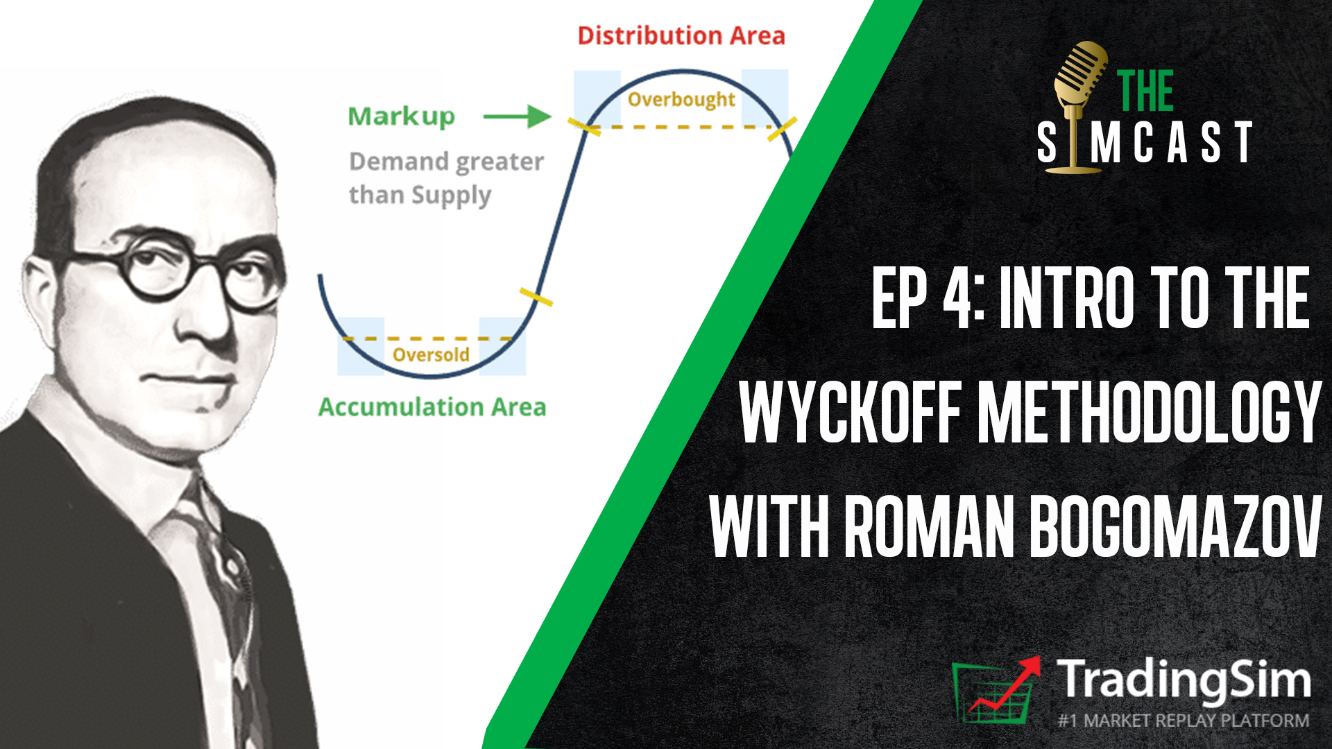
In Part 2 of our series with Roman Bogomazov, we jumped right into the basics of the Wyckoff Methodology. Roman has studied all the titans of technical analysis, from Dow to Gann, but Wyckoff is by far his favorite.

If you’re unfamiliar with the tenets of the Wyckoff Methodology, this episode dives into what makes it such a foundational, scalable technique to discern the markets. We discuss the history of Wyckoff and his interactions with Jesse Livermore and others.

Wyckoff Schamatics

We also dive into the schematics of Wyckoff trading ranges and how they give us a framework for almost all price movements. Later, Roman gives us his most recent analysis with Bitcoin and a few trades he’s made, both day and swing.

Episode 4: Wyckoff Basics Chapters and Topics

  • Intro
  • Who was Wyckoff — 1:38
  • Composite Operator — 9:50
  • Wyckoff Framework — 16:00
  • Bitcoin Schematics — 26:40
  • Roman’s Trades — 39:45
  • Outro 1:05:55

Pay close attention to the way in which Roman dissects his own trades. We think you’ll not only be amazed, but inspired by the way he applies Wyckoff’s principles of technical analysis. Our hope is that this will encourage you on your path to mastery.

Be sure to watch our Part 1 with Roman, if you haven’t already watched that interview.

5m Charts Banner

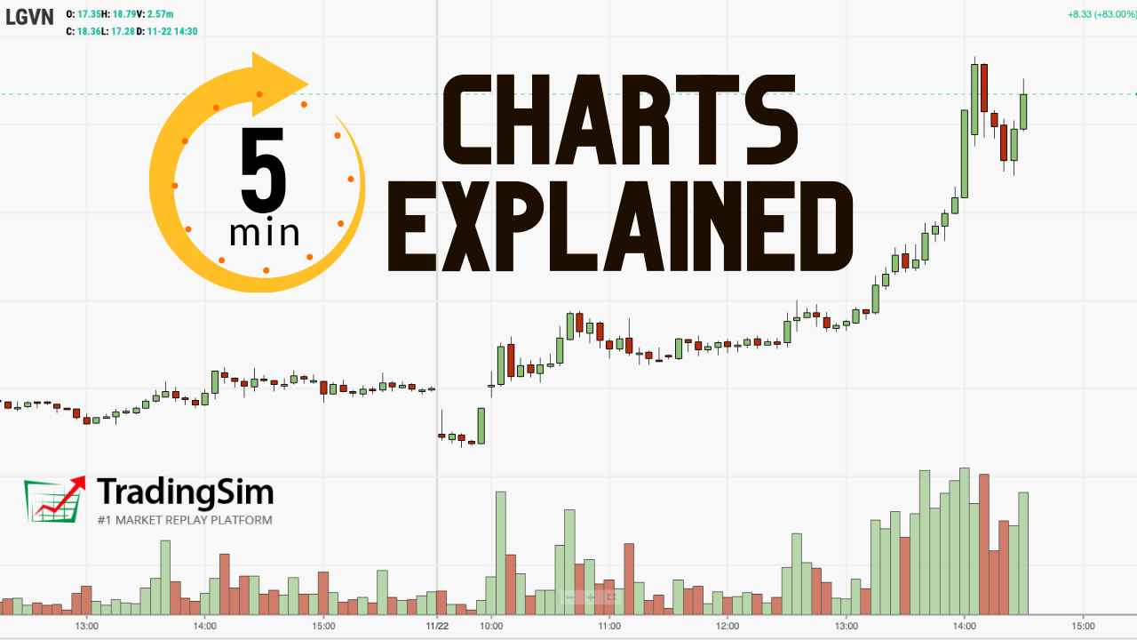
In this article, we will cover everything you need to know about 5-minute charts. First, we will touch on the basics of the 5-minute chart. Next, we will move onto two popular chart patterns using the 5-minute charts. Lastly, we will cover advanced trading techniques of combining indicators and multiple time frames.

5-Minute Bar Definition

5-minute charts illustrate the summary of a stock’s activity for every 5-minute period within the trading session.  The core market session is 6.5 hours per day [1]; therefore, a 5-minute chart will have 78 five minute bars printed for every full trading session. 

Day traders are commonly trading 5-minute charts to identify short-term trends and execute their trading strategy of choice.

Where to Select the 5-Minute Time Frame

Most trading applications will allow you to select the time frame to analyze price data. Within the Tradingsim platform, you can select the 5-minute interval directly above the chart.

How to Select 5 minute candles
Select 5 Minutes

The close on 5-minute charts gives insight into the immediate market direction of the trend for a stock.  When a stock closes at the low or high of the 5-minute bar, there is often a short-term breather where the stock will go in the opposite direction. 

The psychology behind this is that the stock has been pushed to an extreme as other active traders chase the price trend. This breather can mark a major reversal, but in the majority of cases, it creates the environment for a counter move.

How Do You Trade 5 Minute Charts?

Bar any exhaustive scientific studies, we would dare to say the 5-minute chart is one of the most popular time frames for day traders.

5-minutes provides you with the right mix of monitoring the details, without scalping, and conversely allowing you to avoid waiting for 10, 15, 30 or 60-minutes to pull the trigger as well.

It’s that fine line where most traders feel comfortable within this time unit of measure. It also quietens the noise of 1 and 2 minute charts.

Now, let’s dive into a few strategies you can use with this time frame.

The Morning Reversal Strategy

Most of the liquidity and trading activity in the market occurs in the morning and near the close [2].

In the morning, stocks will trend hard for the first 20-30 minutes into the 10 am reversal time zone. Day traders that are looking to go opposite to the trend can wait for a close at the high or low of the 5-minute bar to go opposite to the morning move.

The morning reversal short has a high success rate. There is something about the retail trading market in the morning that brings a fresh batch of bag holders chasing the market for quick gains every morning.

The smart money will grab the breakout and ride the market for quick profits. However, new traders will either hold on too long or jump on the bandwagon too late, perhaps on a breakout that fails like this OCUP example below:

Bearish Engulfing Morning Reversal on 5 minute charts
Bearish Engulfing Morning Reversal

The 5-minute chart time frame is often too large to capture the volatility of the move heading into the 10 am reversal. This can be a blessing or a curse depending on how you like to trade.

Candlestick Patterns Can Help

Notice that in the example given above with OCUP the failed breakout candle on the 5 minute chart is a bearish engulfing candle.

We won’t go into great detail on these strategies in this article, but we have a great resource for identifying bullish patterns and bearish candlestick patterns on the site.

Let’s review another chart example of a morning reversal where the stock climbs higher, only to reverse lower. This pattern is actually more common than you would think.

Morning Reversal Strategy
Morning Reversal

This is the 5-minute morning reversal you are going to see most often. There is a slight pop in the morning and then after a move higher, a sharp reaction lower.

As you can see from the spinning top at the 6th 5 minute bar of the day, we have supply entering the market. We then get a breakout from that level that fails — a great opportunity to get short.

As always, treat trading 5-minute charts in the morning seriously, especially on the short side. Always put your stops in.

Trading Breakouts

In addition to pullback trades, breakout trades are also a big part of active trading. For these setups, you want to find stocks that are up considerably in the pre-market or with volume right off the open.

Next, you want to make sure they have little to no overhead resistance.

If you are open to more risk and would like to reap more rewards, then you will want to set your eyes on low float stocks.

If you are looking to play things a little safer, then look to stocks with a float north of 100 million shares.

But no matter your risk appetite, the key to success is cutting your losers and letting your winners run.

5 Minute Chart Morning Breakout Example 1:

Morning Breakout of 5 Minute Chart

If you trade pre-market, then your range can develop in the early am and you could be in a trade as early as 9:31 in the morning. However, if you do not use pre-market data, you will want to focus on the opening range.

You might also find a solid breakout strategy using our small account building setup.

Next, you want a stock with volume that can push the price higher [3].

Lastly, you shouldn’t fall in love with these high flyers. Most of them will run their course in ten to thirty minutes.

So, remember to keep your stops tight and to take profits as the stock goes higher.

5 Minute Chart Morning Breakdown Example:

5 Minute chart breakdown

These breakout trades also work on short positions. In the above chart, notice how VLON broke down after already having a strong gap to the downside.

After a while, certain patterns will emerge that you can use to improve the accuracy of the trades you place.

In the next section, we are going to go beyond chart patterns and dig into various indicators you can use with 5-minute charts to find profitable setups.

How to Enter and Exit Trades on a 5-Minute Chart with Oscillators and Fast Lines

Oscillators do just that, they oscillate between high and low extremes.

Yet, oscillators give many fake signals.

According to Martha Stokes, CMT from technitrader.com,

“Most traders are told to use Stochastic as an Overbought exit or sell short signal, and an Oversold entry or buy signal. This simplistic approach worked well prior to the 1990s and the advent of electronic trading plus massive institutional trading activity. However, this is far too simple an approach for the faster-paced more dynamic and complex marketplace of today, where short term trading dominates more than ever.” [4]

Since they are leading indicators, oscillators point out that a trend might emerge, but it is no guarantee.

For this reason, oscillators are one of the most attractive tools for day traders as timing is of the essence.

Nevertheless, if not used properly, they often lead to failure. Therefore, we recommend combining two oscillators when trading on a 5-minute timeframe in order to validate trade signals.

Personally, we like oscillators only for trade entry and not trade management.

Therefore, we recommend you include a fast line on your chart in order to attain exit points on 5-minute stock charts. Some of these lines could be a regular Moving Average, DEMA, TEMA, Hull MA, Least Squares MA, Arnaud Legoux MA, etc.

In this section, we will cover 3 simple strategies you can use with 5-minute charts and indicators.

Strategy #1 – Stochastic Oscillator + RSI + Triple EMA

This simple strategy uses a three-pronged approach across two oscillators and an on-chart moving average indicator.

Entering a Trade

Trade entry signals are generated when the stochastic oscillator and relative strength index provide confirming signals.

Trade Exit

You should exit the trade once the price closes beyond the TEMA in the opposite direction of the primary trend.

There are many cases when candles move partially beyond the TEMA line. We disregard such exit points and we exit the market when the price fully breaks the TEMA. Have a look at the example below:

5-minute chart with oscillators

This is the 5-minute chart of General Motors. The two instruments at the bottom of the chart are the Stochastic Oscillator and the RSI. The TEMA is the green curved line on the chart. The green pairs of circles are the moments when we get both entry signals.

How to Use the Indicators

First, we spot overbought signals from the RSI and the stochastic and we enter the trade when the stochastic lines have a bearish crossover. We go short and we follow the bearish activity for 15 full periods, which is a relatively long period of time for a day trader. Good for us!

We exit the trade once the price closes above the TEMA. This short position generated a profit of $0.43 (43 cents) per share, which is a decent amount even for advanced trading strategies.

Later, we receive a few more overbought/oversold signals from the stochastic, but they are not confirmed by the RSI. Thus, we stay out of the market until the next RSI signal.

Our second trade comes when the RSI enters the oversold area just for a moment. This long signal is confirmed by the stochastic, so we go long. The bullish move that ensued is minor, but still in our favor!

We hold this trade for 9 periods before closing the position. We exit the market when a bigger bearish candle closes below the TEMA with its full body. This long trade brought us a profit of $0.09 (9 cents) per share.

On the next day, we manage to identify another long signal from the stochastic and the RSI.

We hold the long position open for 14 periods before one of the bearish candles on the way up close below the TEMA. This long position generated a profit of $0.46 (46 cents) per share.

Strategy Results

  • 3 Positions
  • 2 long
  • 1 short
  • Time in the market: 3 hours and 10 minutes
  • Total profit: $0.98 (98 cents) per share

Strategy #2 – MACD + MFI

For this next strategy, we will combine the Moving Average Convergence Divergence with the Money Flow Index. We will enter the market when we receive confirming signals of the MACD and the MFI.

However, for how long will we hold the trades?

Notice that in this stock trading setup we have no on-chart trading indicator for identifying exit points.

The reason for this is that the MACD does a pretty good job of this itself.  We will simply exit the market whenever the MACD has a crossover in the opposite direction!

Notice that when using the MACD for exit points, you stay in the market for a longer period of time.

5-minute chart + MACD + MFI

This is the 5-minute chart of McDonald’s for Sep 30, 2015. The two instruments at the bottom of the chart are the MACD and the Money Flow Index. The green circles indicate the entry signals we receive from the two indicators. The red circles indicate the moment when the MACD tells us to get out of the market.

Notice that in this example, the exit point of a position is the entry point of the next one. Thus, the red and the green circles match in three cases.

How to Use the Indicators

In the first trade, we have matching bearish entry signals from the MFI and the MACD. We short McDonald’s.

Although there is strong hesitation in the price movement, no exit signal is provided from the MACD and we hold our position. Later on, the price moves in our favor and we close the trade when the MACD has a bullish crossover. We were short for 34 periods and generate a profit of $0.33 (33 cents).

As we said, in this strategy example, we often open a contrary position right after closing the trade. Therefore, once we received the exit crossover from the MACD, the MFI gave us a long signal.

We stay in the market for 36 periods until the MACD gives us a bearish crossover. We collect a profit of $0.56 (56 cents) per share from this trade – slightly better than the previous example.

The MFI is already high and we immediately open a short position after the MACD crossover from the previous position. McDonald’s starts to move in our favor, but the direction changes rapidly. Yet, the two lines of the MACD interact, but they do not create a crossover. Thus, we hold our short position for 39 periods.

In this trade, we accumulated a profit of $0.81 (81 cents) per share – much better!

With the exit of the previous position came the entry point for the next trade. This is so because the MFI was already down when the MACD exit crossover appeared. Thus, we go long and we enter the best trade of the four! We hold McDonald’s for 27 periods before the MACD gives us a bearish crossover. This long position generated a profit of $0.88 (88 cents) per share. Well, that my friend is a good trade!

Strategy Results

  • 4 Positions
  • 2 long
  • 2 short
  • Time in the market: 11 hours and 20 minutes
  • Total profit: $2.58 per share

Strategy #3 – Klinger Oscillator + RVI + 12-Period Least Squares MA

This 5-minute chart strategy involves the Klinger Oscillator and the Relative Vigor index for setting entry points. We try to match long and short signals with the two oscillators, which will be an indication to trade the equity. When we get these two signals, we open a position and we hold it until we see a candle closing beyond the 12-period LSMA.

5-minute chart + KO + RVI + LSMA

This is the 5-minute chart of Yahoo. The two instruments at the bottom are the RVA and the Klinger. The blue curved line on the chart is the 12-period LSMA. On this chart, we have four trades. The green circles show the four pairs of signals we get from the RVA and the Klinger.

How to Use the Indicators

First, we get a bullish signal from the Klinger, which is confirmed by the RVA after 4 periods. When we get the confirmation, we go long. We manage to hold the trade for four candles before we see a bearish candle below the LSMA. We get $0.10 (10 cents) per share from this trade.

Four periods later, the Klinger and the RVA give us bearish signals at once and we go short. We get a slight bearish move of four periods before a candle closes below the LSMA. We generate $0.12 (12 cents) per share more.

The third trade is the most successful one.

Six periods after the previous position, we get matching bullish signals from the Klinger and the RVA. Thus, we go long with Yahoo. We manage to stay for 9 periods in this trade before a candle closes with its full body below the 12-period LSMA.

Notice that at the end of the bullish move, there is another bearish candle, which closes below the LSMA, but not with its full body. Therefore, we disregard it as an exit signal. This long position brings us a profit of $0.37 (37 cents) per share.

With the next candle, we get bearish signals from the RVA and the Klinger and we go short with the closing of the previous long position. We get out of this trade after 5 periods when a bigger bullish candle closes above the LSMA. This trade generated a profit of only $0.03 (3 cents) per share.

Strategy Results

  • 4 Positions
  • 2 long
  • 2 short
  • Time in the market: 2 hours and 10 minutes
  • Total profit: $0.62 (62 cents) per share

Which 5-minute bar trading setup is better?

The trading strategy we prefer when trading 5-minute charts is the MACD + MFI. The reason for this is that this strategy distributes the trading along the entire trading day.

In the example above, we covered the whole day with only 4 trades. Furthermore, we generated an impressive amount per share!

In the other two strategies, the number of trades per day will be significantly more. As you see with MACD + MFI, we traded 4 positions for 11 hours, while with Klinger, RVI, and LSMA, we traded 4 positions for only 2 hours.

Yet, some of you will like fast-paced trading and will like to exit the market more frequently. Just remember in trading, more effort does not equal more money.

Using Multiple Timeframes

One thing you will want to do with 5 -minute charts is to use multiple time frames to help support your point of view.

In reality, 5-minute charts are great for stocks with lower volatility. However, if you are trading low float stocks you will want to use a one-minute or two-minute chart to track price movement.

While you are monitoring price movement on a lower level, you will also need to monitor the bigger trends.

To do this, you will want to look at a daily or hourly chart.

So, when you are setting up your trading desk, have multiple charts up of the same stock. Below is a screenshot from Tradingsim of an example of how you need to view stocks on multiple time frames.

Multi-time Frame View

In the above chart, notice how VLON has three time frames, 2-minute, 5-minute and daily.

The 5-minute chart is your anchor and was showing a consolidation was taking place. The two-minute chart also displayed a similar consolidation pattern.

Lastly, the daily chart shows that after a nice run-up, VLDN was starting to stabilize after a retracement of the rally.

So, in this example, as a trader, the big thing you are looking for is alignment of the same narrative across multiple time frames.

Summary

Even if you are not trading 5-minute charts, it is essential that you keep an eye on them.  The majority of day traders are using 5-minute charts to make their trading decisions.  Therefore, these traders tend to control the action. 

If you are trading with 15-minute charts, be mindful that a sharp counter-trend move can occur at the close of a 5-minute bar.

Remember, a close at the high or low of a 5-minute bar is a potential indication that a minor reversal is in play.  Day traders should not immediately exit their winning position but should rather look at this as a sign of a potential trend change.

Be sure to study candlestick patterns to help with your strategies.

Also, the morning is where all the action takes place in the market. If you are going to trade during this time of day, remember the two most common setups – pull back and the breakout.

Lastly, 5-minute charts can’t do it all by themselves. You will need to assist help from other time frames. The one minute chart for very volatile stocks and the daily charts to identify long-term trends for support and resistance levels.

External References

  1. Holidays and Trading Volumes. New York Stock Exchange
  2. Lee, Justina and Peterseil, Yakob. (2019).Wall Street Fights Stock Machines With Trend-Chasing on Steroids. Bloomberg.com
  3. Sincere, Michael. (2011). ‘Start Day Trading Now: A Quick and Easy Introduction to Making Money While Managing Your Risk‘. Simon & Schuster. p. 41
  4. Stokes CMT, Martha. (2015). ‘How To Use Stochastic Ideally‘. Seeking Alpha.com
Fibonacci banner

At times it feels like traders give the Fibonacci trading sequence an almost mystical power. Yet, despite its mysterious accuracy in trading and in nature, Fibonacci is nothing more than simple retracement levels. These levels are the only representative of where a security could have a price reaction, but nothing is etched in stone.

What is the Fibonacci trading strategy?

In the stock market, the Fibonacci trading strategy traces trends in stocks.  When a stock is trending in one direction, some believe that there will be a pullback, or decline in prices.  Fibonacci traders contend a pullback will most likely happen at the Fibonacci retracement levels of 23.6%, 38.2%, 61.8%, or 76.4%. As we’ll discuss below, a pullback is also possible at 50%.

For instance, if GE (NYSE:GE) is selling at $20 and rises to 21, the pullback will be 23, 38, 50, 61, or 76 cents. Fibonacci traders will expect support at these levels.

On the contrary, some day trading experts see these Fibonacci numbers as a short-sell strategy. For instance, if GE stock is at $21 and falls to $20.62, some Fibonacci traders may see the 38 cent drop as a good sign to short the stock.

For all intents and purposes, the Fibonacci retracement is a valid trading strategy to trade stocks. However, Fibonacci numbers aren’t always the best indicators of a trend.

What do trading experts say about Fibonacci trading?

Chris Svorcik is a forex trader who often uses Fibonacci trading. He says that traders can use the Fib method, but says that they need more experience to master Fibonacci trading. 

“I am a huge fan of EW[Elliott Wave, another trading strategy] and Fibs, but it does require some experience to handle it. Using moving averages does in my view shorten the learning curve. Also using price swings or EW as a support tool rather than a main trading tool, I think, makes it less complicated, ” said Svorcik.

Daniel Leboe, an analyst with Zach’s, also likes using the Fibonacci retracement. However, he also advises caution to traders when using the trading strategy. 

“Fibonacci retracement is a good tool to use when deciding if now is a good time to buy, but do not look at it as the holy grail. In this volatile market, we are prone to blow through levels. Make sure you have a shopping list of stocks you like ready so that you can pull the trigger when the time comes,” said Leboe.

“Fibonacci queen” says traders should have a plan with trading strategy

Experienced trader Carolun Boroden trades so often with the Fibonacci strategy that she’s been dubbed the “Fibonacci Queen.” She says that even if traders follow the Fibonacci strategy, they should still have a specific trading plan.

“You [need] a specific plan that describes what your trade setups are; how you’re going to get into the trades; what you are going to risk; how you’re going to manage the trade and take profits; how you’re going to have certain targets, or you’re going to trail a stop.”

Carolun Boroden

Does the Fibonacci trading strategy predict stock market trends?

While some financial experts are skeptical of the Fibonacci strategy, it has predicted other downturns before. In February before the COVID-19 crisis, the Dow Jones retraced about 50% before the economic crash. Andrew Adams is a technical analyst at Saut Strategy. He wrote in a research note that the pullback at that ratio meant an end to the previous bull market.

“Rallies of all sizes do regularly eventually pull back at least to the 38.2%-50% Fibonacci levels,” wrote Adams.

Not long after that retracement, the bear market devastated the stock market.

While the strategy has predicted a bearish market, it can also predict a bullish market as well.  According to CNBC’s Jim Cramer, Boroden’s Fibonacci strategy predicted a stock market recovery in May.  

“The charts, as interpreted by Carolyn Boroden, suggest that the major averages are still in rally mode, but it’s a precarious rally where you need to proceed with caution if we fail to break out from these levels and slip back to where we were not that long ago,” said Cramer.

“She thinks the S&P is a buy right here. There’s too much going right in her charts for her to say anything else. However, she says you should be ready to sell if we fail to break out over the 200-day moving average, eventually,” added Cramer.

While the Fibonacci trading strategy isn’t exact, if used correctly, it can predict major stock market trends. The different Fibonacci trending strategies will be explored in this article.

Fibonacci Trading Personas

Before we go into the gritty details about Fibonacci trading strategies, it is worth our time to discuss the different types of fibonacci trading personas you might encounter. While mostly fictitious, these three personas do an awesome job of summarizing common trading practices.

Fibonacci Persona Infographic

Which Persona Best Describes You

You must first ask yourself the question of how you plan on leveraging Fibonacci in your trading regimen. If you haven’t done so already, think about writing a trading plan to review before, during, and after the market closes.

Depending on what the market is offering, you might fluctuate between the low and high volatility Fibonacci trader. Or, you may find yourself only using Fibonacci as an ancillary tool to support your trade plan thesis.

Fibonacci assists in seeing hidden levels of support and resistance to help you determine you entry and exit targets. To what degree you emphasize these levels depends upon your own conviction with the tool.

Chapter 1: Origin of the Fibonacci Sequence

Does this numbering scheme mean anything to you – 0, 1, 1, 2, 3, 5, 8, 13, 21, 34, 55, 89, 144, 233, 377? Not really, right?

Well, don’t be surprised, not many recognize the pattern. These numbers are the root of one of the most important techniques for identifying psychological levels in life and in trading.

Behold the mighty Fibonacci ratios!

Hundreds of years ago, an Italian mathematician named Fibonacci described a very important correlation between numbers and nature. He introduced a number sequence starting with two numbers: 0 and 1.

Building a Fibonacci Sequence [1].

Again, we start with 0 and 1.

0, 1

The sequence requires you to add the last two numbers to get the next number in the sequence. Following this logic, we get the following equation:

0 + 1 = 1

Now we have our third number in the sequence – 1. See below for the updated sequence.

0, 1, 1

Now we add the last number in the sequence to the previous number once again:

1 + 1 = 2

We again update our sequence with the number 2.

0, 1, 1, 2

and then…

1 + 2 = 3

and then…

0, 1, 1, 2, 3

and then….

0, 1, 1, 2, 3, 5

and then….

0, 1, 1, 2, 3, 5, 8

and then….

0, 1, 1, 2, 3, 5, 8, 13

This process goes on to infinity.

Chapter 2: Key Fibonacci Ratios

Fibonacci discovered every number in the sequence is approximately 61.8% of the next number in the sequence.

55 / 89 = 0.6179775280898876 = 61.8%

233 / 377 = 0.6180371352785146 = 61.8%

144 / 233 = 0.6180257510729614 = 61.8%

This is not the only correlation. Fibonacci also uncovered that every number in the sequence is approximately 38.2% of the Fibonacci number two steps ahead.

(13, 21, 34)

13 / 34 = 0.3823529411764706 = 38.2%

(21, 34, 55)

21 / 55 = 0.3818181818181818 = 38.2%

(55, 89, 144)

55 / 144 = 0.3819444444444444 = 38.2%

(144, 233, 377)

144 / 377 = 0.3819628647214854 = 38.2%

Also, we have another ratio! Every number in the Fibonacci sequence is 23.6% of the number after the next two numbers in the sequence:

(55, 89, 144, 233)

55 / 233 = 0.2360515021459227 = 23.6%

Pretty cool, huh?

Chapter 3: Fibonacci Ratios Everywhere

Fibonacci Sea Shell

Fibonacci Sea Shell

Here is an example of the Fibonacci in nature with this sea shell. The volume of each part of the shell matches exactly the Fibonacci numbers sequence. Thus, each part of this shell is 61.8% of the next.

It works the same way with this aloe flower:

Aloe Flower Fibonacci sequence
Aloe Flower Fibonacci

If we separate the aloe flower into even particles, following the natural curve of the flower, we will get the same 61.8% result.

This ratio is not only found in animals and flowers. This ratio is literally everywhere around us. It is in the whirlpool in the sink, in the tornados when looked at through satellite in space or in a water spiral.

The Fibonacci ratio is constantly right in front of us and we are subliminally used to it. Thus, the human eye considers objects based on the Fibonacci ratio as beautiful and attractive.

On that token, big corporations like Apple and Toyota have built their logos based on the Fibonacci ratio. After all, these are two of the most attractive and engaging logos in the world.

Still not a believer, check out this study from Harvard’s math department where they cite a study from Dr. Rowland from Merrimack College on how to tie knots using Fibonacci [2].

Chapter 4: Fibonacci Ratios in Trading

Coming back to the markets, trading with Fibonacci isn’t all that complicated.

A logical method for entering a trade is when the stock is going through a pullback.

Well, where would you think to place your entry?

Without knowing anything about Fibonacci trading, you would likely say 50%.

That my friend makes you a Fibonacci trader.

That’s what Fibonacci trading is about, understanding stocks do not move in a linear fashion. Fibonacci helps new traders understand that stocks move in waves and the smaller the retracement, the stronger the trend.

Now, it’s time to take you to the level of an intermediate Fibonacci trader. To do this, you need to know the other two critical levels – 38.2% and 61.8% retracement.

Price action must be analyzed at these levels to understand if the countertrend move will stop and the trend will resume.

Fibonacci retracement levels are used by many retail and floor traders [3], therefore whether you trade using them or not, you should at least be aware of their existence.

Some advanced traders will take it a step further and add Fibonacci arcs and Fibonacci fans to their trading arsenal in search of an edge. We will touch on these later.

Chapter 5: How to Interpret Fibonacci Levels

Defining the Primary Trend

Strong Uptrend

Defining the primary trend with Fibonacci requires you to measure each pullback of the security. If you see a series of new highs with retracements of 50% or less, you are in a strong uptrend.

strong-uptrend
Strong Uptrend

The above chart is of Alphabet Inc., on a 5-minute chart. Notice how Google doesn’t have any retracement greater than 50%. These successive new highs with minor pullbacks are the sign you are in a strong uptrend.

Choppy Market Fib Levels

Here is another example of a trend with Chipotle (CMG).

Choppy Market
Choppy Market

Do you see how each pullback is greater than 78.6% from the initial range? This level of retracement repeatedly produces a choppy pattern. Therefore, you would not want to have lofty profit targets on a trade while the stock is in a tight trading range.

78.6% is not a hard-fast rule. If you see retracements of 61.8% or 100%, the stock is likely in a basing phase before the next move.

That’s it, you now understand how to use Fibonacci to define the strength in the market.

Remember, the market is either trending or flat.

A general rule of thumb for the overall market is it trends 20% of the time and is range bound the other 80%.

Chapter 6: Three Simple Fibonacci Trading Strategies

#1 – Pullback Trades

First, you want to identify a security in a strong trend.

A strong trend can be defined as a stock with successive highs with pullbacks of less than 50%.

If you are day trading, you will want to identify this setup on a 5-minute chart 20 to 30 minutes after the market opens.

After identifying a strong uptrend, observe how the stock behaves around the 38.2% and 50% retracement levels from the morning highs by looking at the time and sales and Level 2.

Once you see the trading activity slowing down or turning, enter the trade.

You can use the most recent high or a Fibonacci extension level as a target point to exit the trade.

38.2% retracement example
38.2% retracement fibonnaci trading example

In the above chart, notice how LGVN stays above the 38.2% retracement level before making a higher high.

Where Can Things Go Wrong?

[youtube_async]SELtAvSv_GI[/youtube_async]

The chart above looks so clean and safe. The reality is that you will likely have a 40%-70% hit rate depending on your ability to honor your rules and manage your emotions.

Therefore, you need to prepare for when things go wrong. In a pullback trade, the likely issue will be the stock will not stop where you expect it to. It may pullback to a full 100% retracement, or it could even go negative on the date.

I have had situations trading the Nikkei where a stock will have a 15% or greater swing from the morning highs.

You can protect yourself from this scenario by doing the following:

Trade Low Volatility Stocks

Penny stocks look great when a trader is discussing their 30% gain in one hour. However, it’s brutal if you are on the other side of the trade. Trade stocks with high volume and some volatility because we need to make a living, but don’t feel like you must trade with the other gunslingers.

Max Time Loss

Look back over your winning trades and determine how long it takes you to turn a profit with 85% confidence.

If that is 5 minutes or one hour, this now becomes your time stop. If there is only a 15% chance you will walk away a winner, just exit the trade with a predetermined allowable loss percentage or right at market.

Max Stop Loss

There is no way around it, you will have blowup trades. I do not care how good you are, at some point the market will bite you. To this point, have a max stop loss figure in mind.

As a general rule, we prefer 10%. But since we only use a small portion of the account size for each position, this keeps a total portfolio loss of under 2%. With lower volatility stocks, this may trigger a stop only once or twice a year.

The point is you, need to be prepared for the inevitable.

#2 – Breakout Trades

Breakout trades have one of the highest failure rates in trading. To help these odds, we’ll give you a few things you can do to up the chances of things working out.

[youtube_async]VMnIEIn3F2U[/youtube_async]

Clearing a Fibonacci Extension Level

Fibonacci extensions are just that, once price clears the 100% retracement and presses on.

You want to find a stock clearing this extension level with volume.

Clearing Fibonacci Extension Levels

It’s not enough to just buy the breakout.

Therefore, you want to make sure as the stock is approaching the breakout level, it has not retraced more than 38.2% of the prior swing. This will increase the odds the stock is set to go higher.

Where Can Things Go Wrong?

In terms of where things can go wrong, it’s the same as we mentioned for pullback trades. The one difference is that you are exposed to more risk because the stock could have a deeper retracement since you are buying at the peak or selling at the low.

So, to mitigate this risk, you will need to use the same mitigation tactics as mentioned for pullback trades.

#3 Trading with Indicators

[youtube_async]7OGoKZmOSs0[/youtube_async]

You can use Fibonacci as a complementary method with your indicator of choice. Just be careful you do not end up with a spaghetti chart.

Fibonacci Retracement + MACD

This Fibonacci trading strategy includes the assistance of the well-known MACD. Here we will try to match the moments when the price interacts with important Fibonacci levels in conjunction with MACD crosses to identify an entry point.

We hold the stock until we receive a crossover from the MACD in the opposite direction.

Fibonacci Retracement w/ MACD
Fibonacci MACD

This is the 60-minute chart of Yahoo.

The two green circles on the chart highlight the moments when the price bounces from the 23.6% and 38.2% Fibonacci levels.

At the same time, the green circles on the MACD show a cross up of the indicator.

Thus, we go long every time we match a price bounce with a bullish MACD crossover.

The red circles show the close signals we receive from the MACD.

We open two long positions with Yahoo and we generate a profit of $5.12 per share.

Fibonacci Retracement + Stochastic Oscillator + Bill Williams Alligator

In this Fibonacci trading system, we will try to match bounces of the price with overbought/oversold signals of the stochastic. When we get these two signals, we will open positions.

If the price starts trending in our favor, we stay in the market if the alligator is “eating” and its lines are far from each other. When the alligator lines overlap, the alligator falls asleep and we exit our position.

Fibonacci Alligator Stochastics combination
Fibonacci Alligator

This is the 30-minute chart of TD Bank.

The price drops to the 61.8% Fibonacci level and starts hesitating in the green circle. Meanwhile, the stochastic gives an oversold signal as shown in the other green circle.

This is exactly what we need when the price hits 61.8% and we go long! A few hours later, the price starts moving in our favor. At the same time, the alligator begins eating!

We hold our position until the alligator stops eating. This happens in the red circle on the chart and we exit our long position. This trade brought us a total profit of $2.22 per share.

Fibonacci and Volume

We saved this one for last because it’s our favorite go-to with Fibonacci. Volume is honestly the one technical indicator even fundamentalist are aware of.

Fibonacci and Volume

We mention this a little later in the article when it comes to trading during lunch, but this method works really during any time of the day.

As a trader, when you see the price coming into a Fibonacci support area, the biggest clue you can look to is the volume to see if that support will hold. Notice how in the above chart the stock had a number of spikes higher in volume on the move up, but the pullback to support at the 61.8% retracement saw volume plummet.

This doesn’t mean people are not interested in the stock, it means that there are fewer sellers pushing the price lower.

This is where longs come in and accumulate shares in anticipation for the rally higher.

Chapter 7: Advanced Fibonacci Trading Topics

Fibonacci Speed Resistance Arcs

Fibonacci Arcs are used to analyze the speed and strength of reversals or corrective movements. To install arcs on your chart you measure the bottom and the top of the trend with the arcs tool.

The arcs appear as half circles under your trend, which are the levels of the arc’s distance from the top of the trend with 23.6%, 38.2%, 50.0%, and 61.8% respectively.

Each of the Fibonacci arcs is a psychological level where the price might find support or resistance.

Fibonacci Arc

This is the 30-minute chart of Apple.

I have placed Fibonacci arcs on a bullish trend of Apple. The arc we are interested in is portrayed 38.2% distance from the highest point of the trend.

When the price starts a reversal, it goes all the way to the 38.2% arc, where it finds support. This is the moment where we should go long.

Lastly, we recommend placing a stop right below the bottom created on the arc.

Fibonacci Time Zones

Fibonacci time zones are based on the length of time a move should take to complete, before a change in trend. You need to pick a recent swing low or high as your starting point and the indicator will plot out the additional points based on the Fibonacci series.

Fibonacci Time Zones

Notice, in this case, Apple’s price undertakes a move based on Fibonacci numbers 0, 1, 2, 3, 5, and 8.

Do you remember when we said that Fibonacci ratios also refer to human psychology? This also applies to time as well.

Negatives of Trading with Fibonacci

Increased Expectations

Unfortunately, with Fibonacci trading, you begin to expect certain things to happen. For example, if you see an extension as the price target, you can become so locked on that figure you are unable to close the trade waiting for bigger profits.

If you are trading pullbacks, you may expect things to bounce only for the stock to head much lower without looking back.

Therefore, if you are trading with Fibonacci at the core of your system, expect things not to work out about 40% of the time.

Take that in for a second. That is quite a bit of times where you’ll be wrong. This means it is absolutely critical you use proper money management techniques to ensure you protect your capital when things go wrong.

Closing Too Soon

The other scenario is where you set your profit target at the next Fibonacci level up, only to see the stock explode right through this resistance. Thus, resulting in you leaving profits on the table.

Leaving it on the Table

What Are We to Do?

Fibonacci will not solve your trading woes. Again, you can hope to be right 60% to 70% of the time. This is not only when you enter bad trades, but also exiting too soon.

So, what are we to do?

The answer is to keep placing trades and collecting your data for each trade. You will have to accept the fact you will not win on every single trade.

Trading During Lunch

Talk to any day trader and they will tell you trading during lunch is the most difficult time of day to master.

The reason lunchtime trading is so challenging is that stocks tend to float about with no rhyme or reason. Volume and range trail off considerably.

So, how can you profit during the time when others like to get lunch? Simple answer – Fibonacci levels.

Often times, during the lunch hour, a stock will make a pullback to a key Fibonacci support level. For bigger corrections, that might be 78.6%.

Ken Chow of Pacific Trading Academy, also mentions the benefit of a lower-risk entry at the 78.6% level.[4]

However, everyone isn’t as pessimistic as Ken, so you can go with 50% or 61.8%. It all depends on what the stock is actually doing.

Midday Pullback Example

Fibonacci Lunch Time Trading

The above chart is of the stock GEVO. Notice how the stock gapped up in the morning and then formed a nice base at the 50% retracement level.  Now at this point of the day, you want to see two things happen: (1) volume drop to almost anemic levels and (2) price stabilize at the Fibonacci level.

The combination of these two things almost guarantees volatility also will hit lower levels. You want to see the volatility drop, so in the event you are wrong, the stock will not go against you too much.

Managing the Trade

So, naturally, the question is how do you manage the trade.

First, you want to see the stock base for at least one hour. Then you want to see higher lows in the tight range. In the GEVO example, you want to place your buy order above the range with a stop underneath.

Curious to see what happened?

400 Percent in One Day

Of course, this doesn’t happen all the time. So, please do not say we are pushing lunch breakouts that can run 400%.

This is just a real-life example that shows the power of Fibonacci levels providing support during the middle of the day.

Now, remember, you have to exercise extreme caution with the middle of the day trading.

Not so much from the perspective of the market going against you, as you can see you have tight stops.

It’s more around the fact these setups fail a lot.

So, again, keep tight stops and always have realistic expectations.

Conclusion

  • The Fibonacci sequence starts from 0; 1, and every number thereafter is built by the sum of the previous two.
  • Every number in the Fibonacci sequence is 61.8% of the next number.
  • Numbers in the Fibonacci sequence are 38.2% of the number after the next in the sequence.
  • Every number in the Fibonacci sequence is 23.6% of the number after the next two numbers in the sequence.
  • The deeper the retracement on a pullback, the less likely the stock will break out to new highs
  • Fibonacci levels are critical in equity trading because they represent a trader’s behavior and psychological reaction to price changes.
  • The most common Fibonacci trading instrument is the Fibonacci retracement, which is a crucial part of the equity’s technical analysis.
  • Other Fibonacci trading tools are the Fibonacci speed resistance arcs and Fibonacci time zones
  • Whether you trade pullbacks, breakouts or indicators; you must have a trading plan to manage your position.

Like anything else in life, to get good at something you need to practice. So, if you have a second check out Tradingsim.com.

Here you can practice all of the Fibonacci trading techniques detailed in this article on over 11,000 stocks and top 20 futures contracts for the last 2.5 years. Our customers are able to test out strategies by placing trades in our market replay tool and not just relying on some computer-generated profitability report to tell them what would have happened.

As we all know, looking at results of a report and placing trades are two totally different things!

External References

  1. Reich, Dan. The Fibonacci Sequence, Spirals, and the Golden Mean. Department of Mathematics, Temple University
  2. Twisting with Fibonacci [Study]. Harvard College Mathematics Review. p.66
  3. Fibonacci Retracement. Wikipedia
  4. Chow, Ken. Trading with Fibonacci Ratios [Blog Post]. Pacific Trading Academy

Photo Credit

Aloe Flower
Shell