6 Guidelines for How to Use the 50 Moving Average

the 50-day moving average banner chart

The 50-day moving average indicator is one of the most important and commonly used tools in stock trading. Considered an “intermediate term” indicator, it is a multiple of the longer-term 100 and 200 moving averages. It’s use is ubiquitous on any time frame.

Therefore it goes without saying we need to unpack the relevance of this average and how you can use it when trading.

To this point, we will give a brief overview, elaborate on the six tips, and then show some real trading examples using the indicator. Lastly, we will show you where the indicator can fail you, so you are prepared for when things do not go as planned.

Why Use a Moving Average?

The moving average is a trading indicator used to smooth the price action on the chart. The moving average indicator takes into account a certain number of periods when calculating its value.

These periods can be adjusted, which also modifies the appearance of the line on the chart. The more periods it takes into consideration, the smoother the line.

Let’s say we want to calculate the 5-period moving average for the following values:

3.00
4.00
8.00
10.00
12.00

The 5-period simple moving average would equal:

(3+4+8+10+12)/5 = 7.4

For each new period, the formula accounts for the additional data point.

Therefore, the moving average is a lagging indicator. [1] The reason for this is that the moving average needs a given number of data points based on prior periods to print a value.

5-Day Moving Average
5-Day SMA

The purple curved line on the chart is a 5-period simple moving average. This line is not smooth at all. This is because five periods is such a small time frame and will result in many trade signals; more signals than most would care to track.

Now that we have provided a visual of a moving average let’s dig into the 50-day to see a longer time frame.

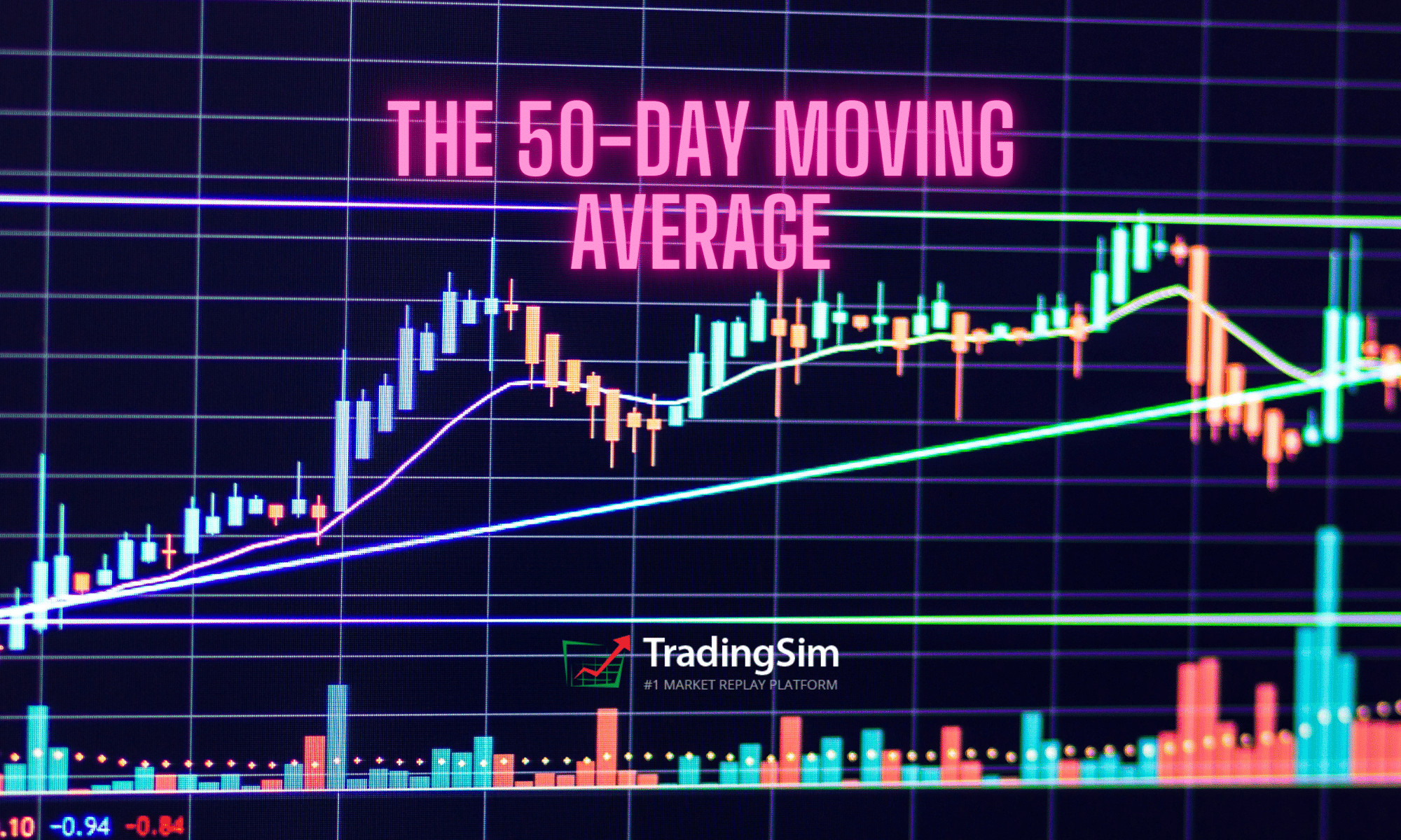
What is a 50-Day Moving Average?

The 50-day moving average indicator is one of the most common SMAs in stock trading.

This makes trade signals around this line pretty reliable based on the number of eyes monitoring the trading activity at this level. Not only will retail traders be watching this indicator, but professionals and institutions use it as wel.

Below, you will see a 50-day moving average on the chart.

50-Day Moving Average

As you can see, the 50-day SMA is much smoother than the 5-period moving average.  This will naturally result in less trading signals and an increased significance on breaches of the average. [2]

6 Tips for How to Use the 50-Day Moving Average

Now that we have discussed the structure of the 50-day moving average, let’s dive into the six essential tips for how to use the indicator.

  1. Stock price above the 50-day moving average is usually considered bullish.
  2. Stock price below the 50-day moving average is usually considered bearish.
  3. If the price meets the 50 day SMA as support and bounces upwards, consider a long entry.
  4. Stock price meets the 50-day SMA as resistance and bounces downwards, consider a short entry.
  5. If the price breaks the 50-day SMA downwards, you should switch your opinion to bearish.
  6. If the price breaks the 50-day SMA upward, you should switch your opinion to bullish.

These six rules are crucial for understanding the character of the 50-day simple moving average indicator. They may sound like they are all saying the same thing, but they’re not.

Notice how we never said that you should just buy and sell based on the 50 moving average. Trading doesn’t require an advanced degree, but we are here to tell you that buying and selling solely on the 50 is not a strategy for success.

However, having a base understanding of these six principles will help you better navigate how to trade with the average. Next, we will explore these strategies and areas where the indicator can fail you if not used properly.

50-Day Moving Average Trading Strategy

In this trading strategy, we will layout the entry, exit and stop loss when trading. You’ll likely notice that this strategy resembles a trend following strategy.

50-Day Moving Average Trade Entry

To enter a 50-day moving average trade, you should wait for a breakout.

Whenever the price breaks the 50-day SMA, you should open a trade in the direction of the breakout. In most cases, the price action will continue in the direction of the breakout.

50-Day Moving Average Stop Loss

Every 50-day moving average trade should be protected with a stop-loss order. Nothing is sure in stock trading. The 50-day moving average strategy is no different. In the long-term, we expect the price action to continue in the direction of the breakout. However, there will be cases when the price action will surprise us.

The price action could sometimes rapidly shoot in the opposite direction with a big candle. This could happen due to the release of some unexpected report.

The ideal place for our stop loss is beyond a price edge created prior to the signal we use to enter the trade.

If the price breaks the 50 SMA upwards, we need to go long, placing a stop below a bottom prior to the breakout. The opposite is true for bearish trades.

If the price breaks the 50 SMA downwards, we need to short the stock placing a stop below the bottom prior to the breakout.

50-Day Moving Average Profit Targets

The rule to close 50-day moving average trades is very simple. Hold your trades until the price action breaks your 50-day moving average in the direction opposite to your trade.

If you are long, you close the trade when the price breaks the 50-day SMA downwards. If you are short, you close the trade when the price breaks the 50-day SMA upwards.

Trading Example with the 50-Day Moving Average

Now let’s approach a real 50-day moving average trading example:

50 Day Moving Average Trading Example

Above you see the 50-day moving average chart of Bank of America. The blue curved line on the graph is the 50-day SMA.

The action on the chart comes at the moment when the price breaks the 50-period SMA downwards. The breakout is shown in the red circle on the image. See that the price first attempts a couple of times to break the SMA downwards.

However, we need to wait until the price action breaks the level in order to get a valid bearish signal. Therefore, we short the stock when we see a sharp decrease through the last two price bottoms below the 50-day SMA.

Stop Loss Order

We place a stop-loss order above the last big top on the chart. The right location of your stop-loss order is shown with the red horizontal line on the chart.

See that the price creates a very sharp decrease afterward and enters a bearish trend. We need to stay in the trade as long as the price is located below the 50-period SMA.

The blue channel on the chart displays when the price breaks the 50-day SMA and we close the trade.

However, this is also a long signal and we enter the market with a new trade, which is bullish. We place a stop-loss order below the last major bottom on the chart as shown on the image.

The price then returns and tests the SMA as support. A bullish bounce appears afterward, which resumes our bullish hopes. The price experiences a few bumps along the way, but the 50 SMA sustains the price action.

The price then creates a top, which is lower than the previous on the chart (pink line). Then we see a breakout through the 50-day moving average. Therefore, we close the trade on the assumption that the price action will reverse and this is exactly what happens.

This case is an example of two 50 day moving average trades, which differ in terms of their profitability.

The first trade is short and it brings a solid profit of 15.60% for three-and-a-half months. However, the second trade brings only 0.22% for about three months.

Your trading results will vary.  This is a cost of doing business and is simply unavoidable in the market.

The key is knowing that your system will win in the long run and sticking to your convictions.

50-Day Moving Average vs. 200-Day Moving Average

Another important moving average is the 200-day moving average. We mention this tool because it creates a very strong signal when used in conjunction with the 50-day moving average.

This signal is known as the golden cross.

The golden cross is a signal created by the 50-day moving average crossing through 200-day moving average to the upside [3].

A good golden cross trading strategy is to open trades in the direction of the golden cross and to hold them until a break in the opposite direction.

Golden Cross - Trading Example
Golden Cross – Trading Example

Above is the daily chart of Google. The blue line on the chart is a 50-day moving average. The red line on the chart is the 200-day moving average.

In the green circles, we have highlighted golden crosses.

The first golden cross is bullish and we use it to buy Google.

We place a stop-loss order below the bottom prior to the cross. The trade needs to be held until the two moving averages create a bearish sell signal.

This long trade with Google generates a profit of 22.28% for one year.

50-Period Moving Average on Intraday Charts

The one area you may not think of the 50-day moving average indicator is on intraday charts. This is because when you think of day trading, you think of fast-paced trades going in and out of stocks all day.

And technically, it would no longer be called the 50-Day Moving Average. It would simply be called the 50-period SMA.

So, where does the 50-period moving average indicator come into play? Well, the 50 can be used as a larger time frame to keep an eye on for support and or resistance intraday.

50 Moving Average Intraday

Above is a 5-minute chart of Apple. Whether you know it or not, the 50-period average is a big deal as you can see by the price action on the chart.

You can see that even during pre-market trading price respected the 50-period moving average. After crossing lower, Apple respected the average all the way into late-day trading.

Where the 50-Day Moving Average is Likely to Fail

Breaking the Average

The 50 is a major trend following average to use on the chart. To this point, what you do not want to do is overreact if a stock breaks the average on one or two candlesticks. We like to call this “porosity”.

It’s like a cow leaning through the fence to see if the grass is greener on the other side, only to return back to the same pasture.

This is often a rookie mistake to make as the stock will likely recover and continue in the direction of the primary trend.

Minor Breach of the Average

Do you see how the traders “in the know” might play these silly games with you? A way to handle these situations denoted by the circles on the chart is to give a certain amount of wiggle room where you will allow the stock to go beyond the moving average and you stick to your guns.

Many traders will continue to hold as long as a stock does not close beyond the average. This is also great advice. However, over time you will notice that stocks will close beyond the average literally one or two candlesticks, then return.

The real kicker is that after this close beyond the average and subsequent continuation of the primary trend – this is where the lion share of the profits are made in the trade. Think of it like a shake out.

Day Trading Breakouts in the Morning

If you are trading volatile stocks in the morning, you have no business trading with a moving average above 20, to be honest. The price action is so fast that you’ll want to use a lower time frame and moving average to catch the right moves.

While you can use a 50sma or higher to gauge the strength of the market, you should not use the average to make buy and sell decisions.

This becomes overly apparent when you trade extremely volatile stocks as the 50-period average will likely push your risk parameter beyond any acceptable level.

50-period moving average and volatility

As you can see, giving this much space on a trade is not a good idea. Do yourself a favor and do not try and force a longer-term average on a short-term volatile stock. Again, the 50 moving average can work as long as you use the indicator on stocks with less volatility.

It is better suited to trending stocks.

Conclusion

  • The moving average is an indicator which smoothes the price action on the chart by averaging previous periods.
  • The 50-day moving average is one of the most commonly used indicators in stock trading.
    1. It averages 50 periods of a stock on any time frame.
    2. Many investors and traders look at the 50-day moving average.
    3. Therefore, the 50-day SMA is a psychological level, which can act as a support and resistance.
  • To trade with the 50-day SMA, you should remember these rules:
    1. When the price breaks the 50-period SMA, you should trade in the direction of the breakout.
    2. You should place a stop-loss order beyond a bigger top/bottom before the breakout.
    3. You should stay in the trade until the price action breaks the 50-day moving average in the opposite direction.
  • The 50 day SMA combines well with the 200 day SMA:
    1. The crossover of the 50-day moving average vs. 200-day moving average is called a golden cross.
    2. When you see a golden cross, you should look to get long.
    3. You should place a stop loss beyond a bigger top/bottom prior to the cross.
    4. You should hold the trade until the 50-period SMA is broken to the downside.

Additional Resources

Check out this great case study on both the 50-day and 200-day moving averages on the S&P 500 if you want to learn more. The study covers a longer-term view of the indicator but it is still a great read and will provide some insights into your trading activity.

In addition, you can practice trading the strategies listed in this article by using Tradingsim. You can apply the 50-day moving average to both stocks and futures to get a feel for what works for you.

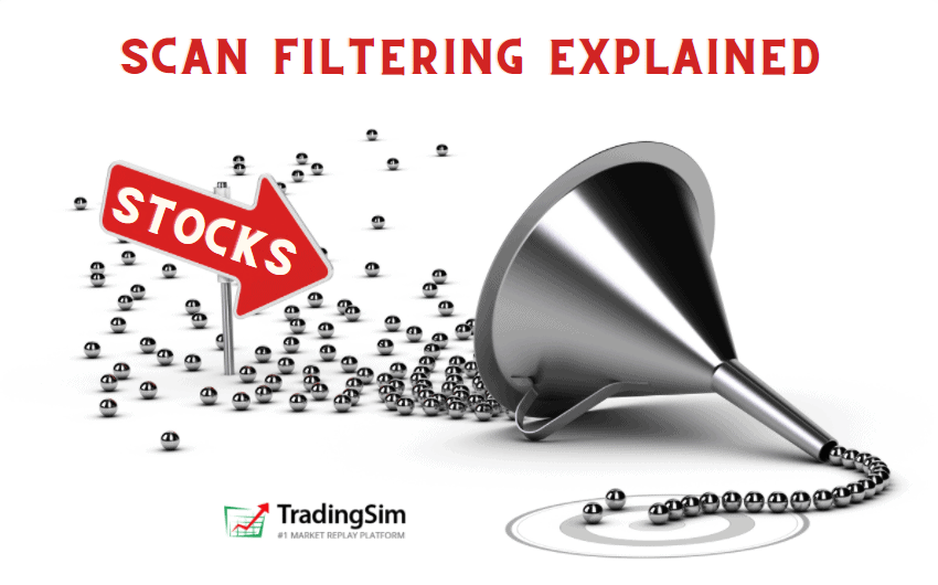
Better yet, we’ve added a new scan filter that allows you to filter stocks to within a certain percentage of the 10, 20, 50 or 200 moving averages.

Take a look:

Scan filter for 50 moving average

Using this great tool can help you narrow your results and scan specifically for stocks nearing their 50-day moving average. This way, you can practice your edge and analyze your trades more efficiently.

Be sure to check out our post on the 20 Moving Average Pullback Strategy, it really complements the 50ma and might help you discover an edge. Also, How to Catch Trending Stocks builds on the 50 moving average and offers even more examples of great trades.

External References

  1. Parets, JC. (2017). This is How I Use Moving Averages. allstarcharts.com
  2. Moving Averages. FinViz.com
  3. Golden Cross Signals. Yahoo Finance
3 Bar play pattern

The 3 Bar Play is the natural progression to the strategies we’ve discussed lately regarding the market open. It’s a great addition to the 1 Minute ORB and the other Opening Range Breakout strategies we discuss in the blog. Not only that, but it’s a popular strategy used by many day traders like Jared Wesley from LiveTraders, Oliver Velez from iFundTraders, or Sami Abusaad from T3Live.

Today we’ll cover the rules and criteria for spotting this pattern, along with the context you need for a successful trade. It can be a powerful strategy for managing risk during the volatility of the market open, and can lead to really nice gains.

But before diving in, be sure to check out this quick tutorial we’ve put together on how to practice this great strategy:

Rules for the 3 Bar Play

First off, you may be wondering why we’ve shown a few examples above with 4 bars instead of only 3. Technically, the pattern can have either. Sometimes it might have 5 bars as long as they are all in tact and constructive.

Yes, you’d call it a 4 Bar Play if it has 4 bars. But for all intents and purposes, this strategy is known as the 3 Bar Play or 3-bar strategy.

The thing to keep in mind with this strategy is that the pullback bar(s), whether 1 or 2 of them, need to be few and they need to be tight.

To that end, let’s look at the three main rules for identifying a 3 bar play.

  1. The first bar needs to be an “igniting” bar — a very wide range candle, ideally on high volume.
  2. The pullback bar, or bar 2 (& 3), must not exceed 50% retracement of the 1st bar and have relatively equal highs.
  3. The trigger bar (or expansion candle) should also be a nice marubozu candle to new highs or lows.

Entry is taken on the break of the smaller “inside candles” with a stop below them.

Here’s what this might look like for both long and short entries:

The 3 Bar Play entry and stop

Notice that this provides traders with a definable risk about halfway into the first igniting bar, or “Elephant bar” as Velez calls them. As a continuation play, you want to play in the primary direction of the gap or trend from the premarket.

Let’s look at handful of examples to build context for this strategy.

3 Bar Play Long Examples

Like we discussed above, the best scenario for these setups is as a continuation pattern. That is, if the stock is gapping up, ideally you want a continuation above resistance from either a daily or premarket level. A combination of both scenarios would be even better!

To that end, let’s look at this PBTS example.

PBTS 2 minute chart 3 Bar Play

On this morning, the stock was gapping considerably in the premarket with a nice consolidation into the open. On the open, the stock ramps up on the first 2 minute candle. It consolidates for one bar, then continues in the direction of the gap.

The second candle of the pattern was a tidy pullback on lower volume. Ideally, you set your entry just above this candle and the 1st candle. The breakout provided a nice gain of 16% from our entry in about 15 minutes.

Long Example #2: TSLA

In this example, we are using the 1-minute chart to find our 3 Bar Play. Before we do, it is important to note that Tesla exploded out of a consolidation on the daily chart, which provided us the impetus to get long on this 3 bar play.

Notice the daily chart first with the resistance line drawn:

TSLA key levels daily

Zooming in now on the premarket and opening bell, we see that this line was a key level in the premarket as well. The importance here is that if this line is broken, we have nothing but “green pastures” above us.

TSLA 3 Bar Play
TSLA 3 Bar Play

Just as we have in our other examples, we get an igniting bar moving up and through resistance, a slight pause, and then a continuation.

Keep in mind, that the “pause” candle can be red or green, it doesn’t really matter. The important thing is that it doesn’t retrace too much of the first candle and forms near the top of that candle.

In this example with TSLA, we had a nice opportunity for a nearly $10 gain in a short amount of time. Great odds!

3 Bar Play Short Example

The great thing about the 3 Bar Play strategy is that it can be played in either direction. Just as you might look for stocks that are gapping up and/or breaking out on a daily time frame, the same can be applied for stocks breaking down.

To that end, let’s take a look at this example of OCGN.

Notice that the daily chart here has a beautiful gap down through prior support. This sets the tone for us in the premarket.

OCGN daily chart gap down

The great thing about this strategy is that it’s easy to scan for gaps in the morning. All we have to do is analyze the bigger time frames for a nice continuation move once the market opens.

On that token, let’s look at the premarket and open for this particular day with OCGN:

OCGN 2 minute 3 Bar Play

On this 2 minute chart, OCGN broke through premarket support at $7.50 very easily. We got a quick pause, then resumed with a beautiful trigger candle. This led to a quick $1.25 gain. Not bad for 15 minutes worth of work.

How to Manage a 3 Bar Play Position

At this point, you may be wondering how to manage a position when trading this strategy. There are a few things to consider for this.

If you are a beginner who is still exploring and educating himself on volume and price action, you may want to set hard and fast targets and stops.

We discuss this in other posts, but here are a handful of approaches you can take.

Take Profit at Specific R-values

R-values are basically your risk/reward calculation. Let’s use the OCGN example above and say you entered short at $7.22. Using the $7.44 area as your stop noted on the chart, this means you’d be risking $0.22 for the trade.

To calculate your reward, you may think that a 2R or a 3R or a 4R is acceptable. If that is the case, you simple double, triple, or quadruple your risk.

For this example, a 3R trade would be 3 x $0.22 = $0.66. That means, from your entry, you’re looking to take profits at $7.22 – $0.66 = $6.56.

Therefore you would have set an order to take profits and cover at $6.56, which would have been towards the bottom of the second long-bodied red candle on the chart after your entry. Here’s what that would look like:

OCGN 3R 3 Bar Play
OCGN 3R 3 Bar Play

In other words, your trade was 1 risk unit to 3 reward units. And if this suits your personality, then stick to it. Granted, it’s a bit of an “all or nothing” type of strategy and you may stop out if your target isn’t hit and the stock reverses. But that’s the name of the game.

Over time, you may want to adjust your profit-taking rules to include trailing stops.

Now, you may be thinking, “But, look how much meat we left on that trade!”

Let’s take a look at how a higher time frame may have helped you gain more profit on this trade.

Higher Time-frame Support and Resistance

Returning to the daily chart of OCGN we can clearly see that it is “filling the gap” on the daily and running into potential support at this $6 level. As traders, we can use these levels to set potential targets.

OCGN daily support
OCGN daily support

Often times a stock is wont to find support at daily levels. This $6 level, which is also a “whole dollar” psychological level, did just that for OCGN. It coincided with the last candle high before the gap, as annotated on the chart.

Knowing this, the astute trader could have set this as a target regardless of the R-value. Or, he or she could have taken a partial at the 3R level at $6.56, and then taken the rest at this key level. It proved to be the bottom for OCGN on this day before reversing.

Even more advanced traders could have added to their position on the first pullback as the stock continued lower.

Either way, it’s usually best to keep things simple and pay yourself along the way.

Other Methods of Trade Management

Fibonacci lines and Pivot Points can be another great set of tools to identify areas to sell or cover. We cover those strategies in depth in the links provided.

To keep things simple, though, there is an old adage you should remember, “sell into strength.” The point here is to identify stocks that are “oversold” or “overextended” and sell or cover into those moves.

OCGN’s selloff was fast and furious off the open that morning. This kind of selling pressure isn’t sustainable for any normal stock.

Recognizing this, most traders will sell or cover into the excessive strength or weakness, knowing that a rally could be just around the corner.

OCGN extension from 10 moving average

One way you might visualize an overextension is to judge how extended a stock is from its 10 or 20 moving averages. As shown in the chart above. OCGN was considerably extended from the blue 10ma on the chart. This is a good sign that the stock will reverse at some point.

There are a myriad of ways to manage trades, and all of them have their pros and cons. It’s really up to you to practice what works best for you in order to identify profit targets and take the emotions out of trading.

Practicing the 3 Bar Play

That brings us to our last point. No strategy is going to be perfect, but unless you know your probability for success through simulated trades, you’re literally gambling.

Untold amounts of stress and failure in the markets can be attributed to trading without an edge. For that reason, we suggest you do a quick search in the simulator for stocks that are gapping up or down in the premarket with some volume. Then, take that list of stocks and identify the best candidates for a 3 Bar Play.

Here is an example of what that scan filter might look like for gap ups:

Morning Gappers

In this filter example, we’ve chosen stocks above $5 with a premarket gap minimum of 2% and at least 100k shares traded.

The rest is up to you. As we mentioned at the beginning of the article, there are a lot of great educators who teach this strategy through live trading and great video resources. Sami Abusaad, Jared Wesley, and Oliver Velez are just a few.

Be sure to check out their YouTube pages and give them a like.

Here’s to good fills!

Scalping 101 banner

Today we are going to cover one of the most widely known, but misunderstood strategies – scalp trading, a.k.a scalping. If you like entering and closing trades in a short period of time, then these strategies will definitely suit you best.

We’ll touch on the basics of how to scalp trade, then dive into specific trading examples. At the end, we’ll cover more advanced scalp trading strategies and techniques that will help increase your odds of success.

Scalp Trading Definition

Scalp trading can be one of the most challenging styles of trading to master. It requires unbelievable discipline and trading focus. Despite the trend in high frequency trading these day, scalping has been around for a while.

Traders are usually attracted to scalp trading for the following reasons:

  • less potential exposure to longer-term risk
  • higher frequency trading — you can place up to a hundred trades or more per day
  • ability to fight the greed, since your day trading profit targets are very small
  • a greater number of trading opportunities

The Decimal System

Years ago, when stocks were quoted in fractions, there was a standard spread of 1/16 of a dollar or a “teenie”. This spread allowed scalp traders to buy a stock at the bid and immediately sell at the ask. Hence the teenie presented clear entry and exit levels for scalp traders.

Bucket Shops
1892 Trading Bucket Shops

The scalp trading game took a turn for the worse when the market converted to the decimal system. The decimal system closed the “teenie” often times to within 1 penny for high volume stocks. Overnight, this shifted the strategy for scalp traders.

A scalp trader now had to rely more on instincts, level II quotes, and the time and sales window.

How to Scalp Trade

A scalp trader can look to make money in a variety of ways.

One method is to have a set profit target amount per trade. This profit target should be relative to the price of the security and can range between .1% – .25%.

Another method is to track stocks breaking out to new intra-day highs or lows and utilizing Level II to capture as much profit as possible. This method requires an enormous amount of concentration and flawless order execution.

Level II montage gif
A Level II montage. Source: CenterPoint Securities

Lastly, some scalp traders will follow the news and trade upcoming or current events that can cause increased volatility in a stock.

Winning is Critical

Unlike a number of day trading strategies where you can have a win/loss ratio of less than 50% and still make money, scalp traders must have a high win/loss ratio. This is due to the fact that losing and winning trades are generally equal in size. The necessity of being right is the primary factor scalp trading is such a challenging method of making money in the market.

Now that we have covered the basics of scalping, let’s explore a few scalping strategies you can test for yourself.

Scalp Trading Strategies

Strategy #1 – Pullbacks to the Moving averages

We discuss this in detail in a post on 20 Moving Average Pullbacks. It can be a very lucrative strategy on any time frame.

In a nutshell, it is a scalping strategy that is focused on joining a trend in either direction by jumping into a stock as it pulls back to a popular moving average.

This method has been popularized by legendary traders like Linda Raschke.

The criteria you want to look for in this strategy are as follows:

  1. Strong momentum in either direction
  2. A clear trend
  3. Pause in the trend with constructive/light pullback volume
  4. The ability to enter at the 20 moving average
  5. Reclaim of the prior trend

Here is an example of what this might look like with ticker symbol SGOC.

20 moving average pullback

As you can see, the stock is minding the 20 moving average the entire time, until the top around 11:15. Profits can be taken along the way as you add and sell around a core position.

#2 – Scalp Trading with the Stochastic Oscillator

One of the most attractive ways to scalp the market is by using an oscillator as the indicator leads the price action.

Yes, it sounds pretty simple; however, it is probably one of the hardest trading methodologies to nail down.

Since oscillators are leading indicators, they provide many false signals. The reality is that if you scalp stocks with one oscillator, most likely you are going to accurately predict the price action 50% of the time.

This is literally the equivalent to flipping a coin.

While 50% may prove a profitable ratio for other strategies, when scalping, you need a high win to loss ratio due to the increased commission costs.

Let’s dig a little deeper.

Stochastics

The slow stochastic consists of a lower and an upper level. The lower level is the oversold area and the upper level is the overbought area.

When the two lines of the indicator cross upwards from the lower area, a long signal is triggered. When the two lines of the indicator cross downwards from the upper area, a short signal is generated.

The below image further illustrates these trade signals.

PYPL with Stochastics scalp trades
Stochastic Scalp Trade Strategy

This is the 5-minute chart of Paypal. At the bottom of the chart, we see the stochastic oscillator. The circles on the indicator represent the trade signals.

In this case, we have 4 profitable signals and 6 false signals. The 4 profitable signals generate $16.00 per share of Paypal. However, the losses from the 6 false signals generate a loss of almost $10.00 per share.

You are probably asking yourself, what went wrong?

The bottom line is the stochastic oscillator is not meant to be a standalone indicator.  You need some other form of validation to strengthen the signal before taking a trading opportunity.

#3 – Scalp Trading with Stochastics and Bollinger Bands

In the next trading example, we will combine the stochastic oscillator with Bollinger bands.

We will enter the market only when the stochastic generates a proper overbought or oversold signal that is confirmed by the Bollinger bands.

In order to receive a confirmation from the Bollinger band indicator, we need the price to cross the red moving average in the middle of the indicator. We will stay with each trade until the price touches the opposite Bollinger band level.

Stochastic and Bollinger Band Scalp Strategy

Above is the same 5-minute chart of PYPL. This time, we have included the Bollinger bands on the chart.

Trade Signals

We start with the first signal which is a short trade. Notice that the stochastic generates a bearish signal. Also, the price does break the 20-period moving average on the Bollinger band. Therefore, the signal is good.

The second signal is bullish on the stochastic and we flip long until the price touches the upper Bollinger band.

At the end of this bullish move, we receive a short signal from the stochastics after the price meets the upper level of the Bollinger bands for our third signal. A price decrease occurs, but the moving average of the Bollinger bands isn’t broken to the downside.

We get a series of fake outs, and then the stochastics finally cross a fifth time, this time with confirmation on the bollinger band as well. You may be thinking, but what about that one cross of the median during the chopfest.

You may have take a small loss here depending on whether you took this trade or not. The second signal provided a re-entry in that case.

The third trade provides a short opportunity after the stall at the highs. We have a short signal confirmation and we open a trade.

This lasts until the double bottom reversal long signal.

The stochastic generates a bullish signal and the moving is broken to the upside, therefore we enter a long trade. We hold the trade until the price touches the upper Bollinger band level.

False Signals

As you can see on the chart, there are quite a few false signals in a row.  Talk about a money pit!

The good thing for us is that the price never breaks the middle moving average of the Bollinger band, so we ignore all of the false signals from the stochastic oscillator, except for maybe one.

If we compare the two trading methodologies, we realize that with the Bollinger bands we significantly neutralized all the false signals.

Profits

With a $10,000 bankroll with day trading leverage of 1:4, we have a buying power of $40,000. If we then invest 15% of our buying power in each trade ($6,000), below are the results:

First trade: 23 shares x $3 = $70 profit.

Total bankroll: $10,000 + $70 = $10,070.00

Second trade: 23 shares x $2 = $50 profit

Total bankroll: $10,070 + $50 = $10,120.00

Third trade (Stop Out): 23 x -$0.50 = -$11.50 profit

Total bankroll: $10,074.52 – $11.50 = $10,108.50

Fourth trade: 23 shares x $5 = $115 profit

Total bankroll: $10,108.50 + $115 = $10,223.00

Fifth trade: 23 shares x $1 = $23 profit

Total bankroll: $10,223.00 + $23 = $10,246.00

We were able to generate $246.00 of profit with four scalp trades and one stop loss. Each of these trades took between 20 and 25 minutes.

While these trades had larger percentage gains due to the increased volatility in Paypal, the average scalp trade on a 5-minute chart will likely generate a profit between 0.2% to 0.3%.

As you can see, the stochastic oscillator and Bollinger bands complement each other nicely. The stochastic oscillator says “get ready!” and the Bollinger bands say “pull the trigger!”

#4 – Scalp at Support and Resistance

This a very popular strategy that comes from the teachings of Richard D. Wyckoff and his trading range theories. Simply put, you fade the highs and buy the lows.

You really need the following two items (1) low volatility and (2) a trading range.

The low volatility reduces the risk of things going against you sharply when you are first learning to scalp. The trading range provides you a simple method for where to place your entries, stops, and exits.

In the next example, let’s take a look at the S&P Futures E-mini contract to identify scalping opportunities.

Why the E-mini contract? Well, it has low volatility, so you have a lower risk of blowing up your account if you use less leverage and the E-mini presents a number of trading range opportunities throughout the day.

S&P Mini Futures Scalp Trades
E-mini Scalp Trades

Notice how the tight trading range provides numerous scalp trades over a one-day trading period. Later on in this article, we will touch on scalping with Bitcoin, which presents the other side of the coin with high volatility.

To learn more about stops and scalping trading futures contracts, check out this thread from the futures.io community.

Advanced Scalping Techniques

Risk Management when Scalp Trading

We discussed a profitable scalp trading strategy with a relatively high win/loss ratio. We also suggested leveraging 15% of the buying power for each scalp trade. Now we need to explore the management of risk on each trade to your trading portfolio.

Since you are a scalp trader, you aim for lower returns per trade, while shooting for a higher win/loss ratio.

Therefore, your risk per trade should be small, hence your stop loss order should be close to your entry.

To this point, try not to risk more than .1% of your buying power on a trade.

Let’s see how a tight stop would impact the stochastic/Bollinger bands scalp trading strategy.

Example: ORCL

Stop Loss Orders - Scalp Trading
Stop Loss Orders – Scalp Trading

For this example, we had a total of 3 trades.

For the first trade, the stochastic crossed below the overbought area, while at the same time the price crossed below the middle moving average of the Bollinger band.

We shorted Oracle at $39.06 per share, with a stop loss at $39.09, 0.1% above our entry price. The price began decreasing and 14 minutes later, ORCL hit the lower Bollinger band. We exited the trade at 38.95, with a profit of 0.28%.

After hitting the lower Bollinger band, the price started increasing. The stochastic lines crossed upwards out of the oversold area and the price crossed above the middle moving average of the Bollinger band.

We went long on this signal at $39.04. Our stop loss is located at $39.00, 0.1% below the entry price. This trade proved to be a false signal and our stop loss of .1% was triggered 2 minutes after entering the trade.

The third and final signal took over 40 minutes to develop.

After the price crossed above the oversold territory and the price closed above the middle moving average, we opened a long position.

We entered the market at $38.97 per share with a stop loss at $38.93, 0.1% below our entry price.

This time Oracle increased and we closed a profitable trade 2 minutes after entering the market when the price hit the upper Bollinger band, representing a 0.17% price increase.

Profitability

So, if we had a $10,000 bankroll leveraged to $40,000 buying power, these are the results from a 15% investment per trade:

First Trade: 6,000 x .28% = $16.80 profit.

Total bankroll: 10,000 + 16.80 = $10,016.80

Second Trade: 6,010.08 x -0.1% = $6.01 loss

Total bankroll: 10,016.80 – 6.01 = $10,010.79

Third Trade: 6,006.47 x 0.17% = $10.21 profit

Total bankroll: 10,010.79 + 10.21 = $10,021

These three trades generated a profit equal to $21. The total time spent in each trade was 18 minutes.

Scalp Trading and Commissions

Usually, when you scalp trade you will be involved in many trades during a trading session. Sometimes, scalp traders will trade more than 100 trades per session.

If you look at our above trading results, what is the one thing that could completely expose our theory?

You guessed it right, commissions.

If you have a flat rate of even 5 dollars per trade, this would make the exercise of scalp trading pretty much worthless in our previous examples.

This is why when scalp trading, you need to have a considerable bankroll to account for the cost of doing business.  You are going to find it extremely difficult to grow a small account scalp trading after factoring in commissions and the tax man at the end of the year.

The only thing you will end up doing after thousands of trades is lining your broker’s pocket.

Unlimited Monthly Trading

Just having the ability to place online trades in the late 90s was thought of as a game changer. Now fast forward to 2021 and there are firms popping up offering unlimited trades for free.

So, if you are looking to scalp trade, you will want to give some serious thought to signing up for one of these brokerage firms. Let’s say you place on average 10 trades per day. This would translate to approximately 2,400 day trades per year.

Assuming the average commission per trade is $4, this could run you over $12,000 per year.

Most brokerage firms do this, so you shouldn’t have a hard time finding one.

Focus on Profit to Risk Ratios and Limiting Your Number of Trades

This is going to sound counter to the entire idea of scalp trading.

What comes to mind when you hear scalp trader? You are likely going to think of a trader making 10, 20 or 30 trades per day.

Well, what if scalp trading just speaks to the amount of profits and risk you will allow yourself to be exposed to and not so much the number of trades.

Here is another story that references a study from FXCM [ 1] which showed profitability often came down to trading less. Also, if traders use proper risk-reward expectations – they will make more money over the long run.

So again, as a scalper or a person looking into scalp trading – you might want to think about cutting down on the number of trades and seeking trade opportunities with a greater than 1 to 1 reward to risk ratio.

Competing with the Algos

We can’t get through an article on scalp trading strategy and not touch on the topic of algorithmic trading. 20 years ago, you were trading against other humans.

Now there are open source algo trading programs anyone can grab off the internet. These algorithms are running millions of what-if scenarios in a matter of seconds.

It’s gotten to the point now that large hedge funds have entire quant divisions setup to find these inefficiencies in the market.

This may or may not matter to you and your style of trading. The only point we are trying to make is you need to be aware of how competitive the landscape is out there.

Now we all have to compete with the bots, but the larger the time frame, the less likely you are to be caught up in battling for pennies with machines thousands of times faster than any order you could ever execute.

In the book, Start Day Trading Now: A Quick and Easy Introduction to Making Money While Managing Your Risk, author Michael Sincere, touched on the topics of bots in trading.

Sincere interviewed professional day trader John Kurisko. In the interview Sincere states that Kurisko believes some of the reversals can be blamed on traders using high-speed computers with black-box algorithms scalping for pennies.

That’s one of the reasons many traders get frustrated with the market. The timing is not like it used to be, and many of the old rules don’t work like before,” he says. [2]

Taking Money Out of the Market

This is one positive regarding scalp trading that is often overlooked. In trading, you have to take profits in order to make a living.

This is much harder than it may seem as you are going to need to fight a number of human emotions to accomplish this task.

Well, this is where scalp trading can play a critical role in building the muscle memory of taking profits. Scalp trading requires you to get in and out quickly.

The keyword in that last sentence is out. The better you get at taking profits, the more consistent you’ll become.

Scalp Trading with Bitcoin

Scalp trading did not take long to enter into the world of Bitcoin. Traders in this growing market are forever looking for methods of turning a profit.

To this point, let’s review a few characteristics of Bitcoin that may prove challenging for scalp traders.

  • Bitcoin is really volatile with wild price swings [3]. Therefore, scalp trading will provide a number of trading opportunities, but you will need to adhere to strict stops to avoid getting in a jam.
  • There are many brokerage firms offering 15 to 1 leverage. Some even offer up to 50 to 1 leverage. While this may sound super exciting, in reality, this could expose you to the risk of blowing up your account.

So, as stated throughout this article, you will need to keep your stops tight in order to avoid giving back gains on your scalp trades.

Conclusion

Let’s review a few key points on scalping.

  • Scalp trading involves entering trades for a short period of time to catch swift price moves.
  • If you scalp trade, you need a win/loss ratio greater than 50%.
  • Oscillators could be very useful for your scalp trading system because they are leading indicators; however, oscillators are not meant to be a standalone indicator.
  • Try to find indicators that complement each other so you can validate trade signals.
  • Scalp trading money management is crucial:
    • – Invest around 15% of your buying power in each scalp trade.
    • Put a stop loss of 0.1% from your entry price.
    • Stay in the trades until the price hits the opposite Bollinger band
    • You will usually make between .2% and .3% per trade if you trade lower chart frames.
  • If you scalp on higher chart time frames (5-minute, or more) you targets might be higher.
  • You must have a solid bankroll to scalp trade. Small accounts will be eaten alive by trading commissions.

To practice scalp trading strategies and topics detailed in this article please visit the homepage https://tradingsim.com to see how we can help.

You can also simulate trading commissions to see how different tiers of pricing will impact your overall profitability.

Good luck!

External References

  1. Autochartist. 43 Million Trades Reveal the Secret of Profitable Traders [Blog Post].Autochartist.com
  2. Sincere, Michael. (2011). ‘Start Day Trading Now: A Quick and Easy Introduction to Making Money While Managing Your Risk‘. Simon & Schuster. p. 171
  3. Cheng CFP, Marguerita. (2018). Why Trading in Bitcoin or Other Cryptocurrencies is Playing with Fire [Article]. Kiplinger.com
The One Minute ORB

Most day traders have likely heard of the Opening Range Breakout (ORB) strategy popularized by Toby Crabel in his classic investing book Day Trading With Short Term Price Patterns and Opening Range Breakout. In prior posts, we discuss this strategy in detail regarding the popular 5, 15, or 30 minute opening range breakouts. However, the 1 minute ORB is gaining popularity thanks in part to the hyper-scalping techniques of traders like Andrew Aziz from BearBullTraders.com.

In this post, we’ll shed some light on this new take on an old strategy to uncover many of the criteria necessary to make these trades successful.

Before we do, take a look at this quick video as a primer on scanning for the 1 Minute ORB in TradingSim.

What is the 1 Minute ORB?

Essentially, the 1 minute ORB is a long or short strategy that is initiated once a stock breaks the first 1-minute candle of the trading day.

Granted, there are quite a few contextual caveats that must be considered, and which we will cover. But for all intents and purposes, you’ll have but a few seconds to a few minutes to make a decision to enter the stock long or short on this 1-minute candle break.

Here’s a quick visual of what this might look like:

APOP 1 minute ORB
APOP 1 minute ORB

Noticeably, the stock closes above the body of the first 1 minute candle of the morning, and then pushes higher by the third candle of the day.

This can also be replicated to the down side as a shorting strategy.

5 Long Criteria for the 1 Minute ORB

As with any setup, there are usually quite a few criteria that must confirm the trade. Call them signals, if you will. For a long entry, the qualifying criteria for the 1 Minute ORB are as follows:

  1. A decent gap: ideally 2% or more depending on the market cap and price
  2. Good liquidity: you want your orders to fill quickly and efficiently
  3. Clear directional trend: is it choppy or a potential continuation or bigger picture breakout
  4. Support at the open along an important moving average or VWAP
  5. A break of the 1 minute candle body or high/low

Let’s break each one of these down using chart analysis.

1. A Decent Gap

One of Andrew Aziz’s prior examples of a trade he took was APOP. It was an opportunity to play this strategy to the long side. We showed the chart of APOP above, but let’s look at it again and analyze the gap percentage for that particular day.

When looking at the premarket and the daily chart on APOP, we see that it is gapping around 65% by the time the market opens. Despite putting in some major swings in the premarket seen below, the prior close was $3.47 and the current open is $5.68.

APOP Gap
APOP Gap

This is plenty of gap. In fact, in some cases the gap could be so big that you might expect some resistance off the open. But the 1 minute ORB is a very short-time frame strategy that can give results on just a single candle.

In comparison, the longer time frame 5-minute ORB can often lead to bigger moves. This particular day eventually created a 5-minute ORB, but let’s zero in on the 2nd criteria for identifying the 1 minute ORB, first.

2. Good Liquidity

As Aziz notes in his book Advanced Techniques in Day Trading: A Practical Guide to High Probability Day Trading Strategies and Methods, volume is key. But not just any volume. Here’s how Andrew describes what he’s looking for:

I prefer stocks that have high volume, but also with numerous different orders being traded. If the stock has traded 1 million shares, but those shares were only ten orders of 100,000 shares each, it is not a liquid stock to trade. Volume alone does not show the liquidity; the number of orders being sent to the exchange is as important.

Andrew Aziz

With that in mind, let’s head back to our APOP stock and check out the volume.

Take into account that the daily chart on APOP rarely trades into the millions of shares. However, on this particular morning, whatever the catalyst, APOP was trading millions of shares before 9:30am. There was likely a huge retail and institutional interest on this day.

APOP volume preceding the 1 minute ORB

This gives the confidence that leading into the open, there should be plenty of liquidity to fill a decent size position if needed.

And this leads us to the 3rd criteria of direction.

3. Clear Direction

Notice in the image shared above that APOP has broken out of a consolidation in the premarket and is now trending higher before the bell.

Ideally, you’ll want to see the stock pause here briefly, then continue or start in the same direction once again.

Hindsight is 20/20, but this snapshot gives you the idea of what to look for:

APOP Trend Continuation

This, of course, is the ideal situation. However, there may be times when a stock gaps up or down and then reverses course. These can give excellent opportunities to flip your position if the context is right.

But for this particular scenario, APOP did, in fact, continue in the direction of the pre-market gap.

4. VWAP or Moving Average Support

You’ll notice a reddish-orange line in the images we’ve shared of APOP thus far. That line is the VWAP, or Volume Weighted Average Price. If you’re unfamiliar with this indicator, or its usefulness, be sure to check our Ultimate Guide to VWAP.

This line is a rough estimate of where the “average” price of most of the trading has taken place. What’s peculiar about this particular trade with APOP is that the price was trending drastically below this level until the market opened.

After reclaiming this important area around 9:20am, the stock dipped below VWAP at the bell, then reclaimed it by the second bar of the day. This is show by the orange arrow below:

APOP 1 minute ORB vwap

On the same token, APOP found support along one of the more popular moving averages, namely the 20 simple moving average.

20 Moving Average
20 Moving Average

Clearly you can see the stock “surfing” this purple line, and vwap, as it continues along its upward trajectory. Granted, the only opportunity you have to recognize this is the first pullback at 9:32am. The second pullback gave another opportunity for a 5 minute ORB.

For more information on 20 moving average pullbacks, be sure to check out this post.

And now that we have 4 of the 5 criteria met, all we need is for the second or third candle to break the first candle.

5. A 1-Minute Candle Break

Choosing when to enter can be a bit discretionary. After all, we’re talking seconds, and usually the most volatile part of the entire trading day.

To that end, hotkeys can be beneficial for these type of trades. Limit orders may or may not get filled.

It all depends on the size you are trading, the broker, the volatility of the stock, and your quickness.

Regardless of how you choose to place your orders, the generally accepted place to enter is on the close above the first 1 minute candle body or wick. Some traders, like Aziz, will often start in as he feels the stock’s strength or weakness.

You might add as the stock continues in your favor.

Ideally, you’ll want at least a 1/1 risk to reward ratio. And for this, you’ll need to place your stop at the low of the first candle, though Aziz sometimes cuts it sooner if the stock isn’t acting correctly.

Here’s a quick breakdown of how you could play this opening range:

1 Minute ORB entry and stop

In this image, you have the low and high of the 1st candle. Then you get an entry signal at the reclaim of vwap as a sign of strength and the ensuing break of the first candle body. Also, note that the candle body coincides with a pivot high from the premarket session drawn on the chart. This could add to any “early entry” criteria you might look for.

Profits can be taken into the strength of the 3rd candle, which set a new high.

Keep in mind this is all happening at a blistering pace.

The alternative would be to wait for the pullback and play a 5 minute ORB. This would have worked on this particular day as the 7th-minute candle broke to new highs.

Another 1 Minute ORB Long Example

Putting all of these criteria together, let’s look at another example of a 1 Minute ORB that worked well.

PBTS had a considerable gap of 35% on this particular day. Volume was well above normal range in the premarket as well. Have a look at the annotations on the chart to get a feel for where you would enter and what to look for.

PBTS 1 Minute ORB
PBTS 1 Minute ORB

You can also put a check mark by trend continuation, vwap support, and a break of the 1st one minute candle.

From the far left of the chart in the premarket, the trend was clearly upward. We then see a tight consolidation into the open and a quick reclaim of vwap on the first candle.

We then get a retest of vwap on lower volume, a bullish sign. Volume then returns pushing us to new highs and continuing the uptrend.

In this instance, even if you had taken the initial entry that broke the 1st candle, you’d still be in play without stopping out below the first candle. Otherwise, the pullback gave a great opportunity to go long or add to that position.

1 Minute ORB Short Example

Just as an Opening Range Breakout can work to the long side, so can an Opening Range Breakdown work to the short side. The great news is that the criteria are basically the same, just mirrored for selling pressure.

To illustrate this, take a look at this daily chart of AMD. On this particular morning, AMD was gapping down considerably below a prior daily support level as shown.

AMD gap down
AMD gap down

And as you can probably tell from the long wick below this candle, the open provided a fantastic opportunity to get short. The question is, was it a 1 minute ORB? It sure was. In fact, it presented with a perfect 3-Bar Play setup as well.

If unfamiliar with candlestick patterns, be sure to check out our tutorial and free cheat sheet.

Zooming in on the 1 minute chart, take a moment and pick apart the 5 criteria we want to look for.

AMD 1 Minute Opening Range Breakdown

Sure enough, all 5 of our criteria were taken care of. The gap, the trend continuation, the vwap resistance, a breakdown, and plenty of liquidity. Not bad for a $3.50 move in only 15 minutes!

You may be thinking, but what happens if the stock doesn’t break down? And that’s a great question.

Failed ORBs and Reversals

The lesson wouldn’t be complete without painting a realistic picture of what could happen. To that end, let’s look at a good example of a stock that was about to breakdown, but found support and reversed.

PYPL provides us with a great example of what could happen. Like AMD, it was gapping down on considerable volume on this particular day. Here is the daily chart:

PYPL 3% gap down
PYPL 3% gap down

So our criteria is set for the gap down. We also know that PayPal (PYPL) is an actively traded stock, so there should be no issues with liquidity. What we need to answer, though, is whether the remaining three criteria are being met.

To do that, let’s zoom and see what happens on the 1 minute chart around 9:30am.

PYPL 1 minute ORB
PYPL 1 minute ORB

Immediately we notice that the stock is trying to press lower through the premarket support levels. However, it appears to be struggling to do so. You might say it’s finding strength here at this key level. If it is going to be a proper ORB, it needs to breakdown soon.

The Reversal

Let’s see what happens next.

PYPL 1 minute ORB reversal

Clearly, PYPL didn’t want to go lower.

Be sure to compare this chart with the AMD example given above. You’ll notice some very specific details in the formation of the candles and the associated volume that will give you clues as to how to anticipate a reversal like this in the heat of the moment.

Now, what this doesn’t mean is that there is no trade to be taken here. In fact, if you are a nimble trader like Andrew Aziz, you may decide to flip your bias and go long. After all, there is still a 1 minute ORB in play, just not in the direction of the prevailing trend.

Andrew has a great video showing how he plays a similar move in PYPL here, so be sure to check that out.

Putting the 1 Minute ORB into Practice

Here at TradingSim, it is our goal to equip you with the tools necessary to become a consistently profitable trader. In order to do that, it requires intentional practice and identifying your edge through simulation.

To that end, we’ve created a scanning tool that will help you identify premarket gappers for each day spanning back for 3 years. You can narrow your results by market cap, float, and many other criteria.

Here is an example of what our scan filter looks like:

TradingSim Scan Filter

Notice we’ve created a filter for this example that has a price minimum of $5, premarket volume above 100k shares, and a premarket gap of at least 2%.

We then order our results by Top Volume, name it, and click save. This sets us up for the results given to us in our “live” replay pane on the left-hand side of the screen.

Scan results on left hand side

You, the trader, then have the ability to comb through the list looking for the best opportunities to fit your style. And then practice as though it were a real environment!

Conclusion

We hope you’ve found the information and resources in this tutorial useful. Be sure to subscribe to our blog for more great content and give us a follow on Twitter.

Also be sure to give Andrew Aziz a like and a follow for sharing this great strategy with the Fintwit community.

VWAP Boulevard has become all the rage in the fintwit community lately. Discovered, named, and taken mainstream by Twitter phenom @team3dstocks, thousands of day traders are now implementing this strategy to trade momentum stocks. In this post, we’ll uncover the long and short of the strategy, plus offer a few helpful real-life vwap boulevard trading examples.

If you’re unfamiliar with the basics of vwap, you might start with our Ultimate Guide to VWAP first. Also be sure to check out our complimentary articles on the Kill Candle and 1-3pm Bloodbath.

As a primer to the content below, watch this quick YouTube tutorial where we use our VWAP Boulevard drawing tool in TradingSim to practice this strategy!


The Mysterious Man Behind VWAP Boulevard

With any good strategy, an edge in the market starts with backtesting. You can either pay for the data and analyze it, or you can spend years collecting your own data as you trade.

Fintwit personality @team3dstocks, who goes by AllDayFaders, is the man who discovered the vwap boulevard strategy through years of collecting his own datasets.

Reading his Twitter posts are lot like getting a noogie from the uncle whose standards you know you can’t live up to. It hurts, the delivery’s a little crass, but you know it’s all true.

Other times, he’s like the older brother or dad you want to imitate. The successful one, giving you the advice you know you need to hear.

Ultimately, he’s very active and benevolent in the daytrading world, doling out his nuggets of wisdom only at the expense of your ego. So be sure to frame your questions wisely, he’s backed up 6 months in responding to his DMs.

In truth, a lot of his posts, especially the #beartipoftheday, can be very helpful and encouraging to anyone striving to be a consistent trader:

How It Got Started

When asked how he finally stumbled upon the strategy, he says “each time a low float ticker had the audacity to hit the scanners, I would add it to my database, then pick it apart after hours.”

“Like a mad scientist,” he goes on to say.

Excel spreadsheets galore. He’d break everything down that he possibly could, “analyze EVERYTHING” about the tickers he saw on the screen.

What is EVERYTHING, you’re wondering?

“The chart, the price action, the SEC filings, the fundamentals, the volume, etc.”

@team3dstocks discovered the vwap boulevard strategy
@team3dstocks talking about the work it takes to find an edge in the market

After years of analysis, it eventually led him to the highest volume days on small cap stocks. These securities that had been selling off or consolidating for a period of weeks or months after huge runs, would often gap again in the premarket many weeks or months down the road.

AllDayFaders (ADF) had discovered a pattern.

How to Find the Boulevard

These “penny stocks” as they are known to some, have a tendency to make huge intraday runs from time to time, sometimes doubling, tripling, or more in a single day, only to fade off and close lower the very same day.

VCNX runs into resistance at vwap boulevard after a 100%+ intraday run
VCNX runs into resistance at #vwapboulevard after a 100%+ intraday run

Similar in concept to Volume at Price or Anchored VWAP, but slightly different, ADF found that the low floaters hitting his scanners in the morning all had something in common.

They were running into an area of prior volume-weighted price resistance from previous high-volume days.

If he tracked backwards on the daily chart until he ran across a prior high volume run, he could use that day’s intraday vwap as a guide for the current day’s trading levels.

The Result

According to ADF, the probability is around 75-80% accuracy that the stock will run into serious resistance at these levels. And the reaction to the levels will dictate the action he needs to take — going long or short.

Along those lines, ADF has found that 70-80% of the “best faders” die in the premarket.[efn_note]https://twitter.com/team3dstocks/status/1372869249308491776?s=20.[/efn_note]. This might be a limiting factor for who can trade these type of securities. But for experienced day traders with the right tools, it can provide a great opportunity to profit before the market opens.

Outside of the premarket hours, ADF admits that the second best time to short extended stocks is “by 10am.” But only if the volume is climactic.

Those are some pretty decent odds for trading. And anyone who trades low float stocks knows how difficult they can be to trade. The temptation is there for quick and massive profits. But the risk of heavy losses looms large.

Knowing that, the #vwapboulevard strategy can be a good tool to increase your odds of success and mitigate risk. Let’s dig a bit deeper into it.

What is the VWAP Boulevard Formula

It’s quite simple actually.

Note that ADF uses and recommends ThinkorSwim for his calculation, so he references TOS a lot. Nonetheless, it can be found on just about any charting platform.

Without further ado:

That’s it.

Essentially identify the intraday vwap level for the prior highest volume days that the stock ran. Draw your line there, then wait for the current premarket or intraday action to reach and react to that level.

A simple formula right? In principle, yes. But that is definitely the simplified version.

GAP Percentage

As a rule of thumb, ADF also recommends only trading extreme gaps of 50% or more.

ADF explaining the gap percentage

Years of price action trading experience will likely help as well. After all, you will need to know how to interpret the security’s reaction to these levels and have the discipline to put on a successful trade.

Not to mention being able to handle extreme volatility.

Along these lines, in order to help qualify the trade better, ADF employs a volume forecasting indicator.

What Is a Volume Forecasting Indicator

A volume forecast is essentially a way to predict the “end of day” volume earlier in the trading session, and at different time intervals.

Niv Goren has done a fantastic job of explaining this unique indicator and how to create your own version on his site inthemoneyadds.com. Like others, his inspiration came from AllDayFaders’ influential Twitter posts.

Volume Forecast Indicator from inthemoneyadds.com

In his blog, Niv describes the step-by-step process of collecting data on prior high-volume, low-float runners, then choosing a predictive model with which to run the calculation. The results are then correlated “between different ratios and end of day results,” he says.

Interpreting Data

Understandably, running calculations like this for different time intervals, collecting the data, and analyzing it all may seem daunting. For that, Niv has created his own indicator that he sells through his site with tips on how to interpret it.

The goal with the indicator, however, is not necessarily to “know” the end-of-day volume. The goal is to understand how quickly the ratio is expanding between current volume and the end of day forecasted volume. Especially at the start of the session.

ADF coaching on how to use Volume Forecast

We then need to ask what this can tell us in relation to vwap boulevard and other factors. How quickly the forecast expands might tell us whether or not the stock may continue squeezing.

Predicting Tops

To understand the timing of his trades better, Niv has plotted a histogram to determine the time frame in which the majority of small cap stocks reach their intraday peak.

Interestingly enough, his findings are in line with AllDayFaders’ “by 10:00am” statistic.

Niv Goren’s histogram for timing the end of a small cap stock’s upward momentum[efn_note]https://inthemoneyadds.com/its-all-about-timing-everything-i-know-about-small-caps-times-of-day-backed-by-data/.[/efn_note]

Niv’s site includes a lot of varied and useful data, i.e. where you should cover your short, some special considerations, etc. Click the chart above, it’s worth a read if you have the time.

The last thing worth noting with the volume forecast indicator is how it might forecast float rotation.

Float Rotation

Serious small cap traders pay close attention to float data.

Professional day trader Nate Michaud of InvestorsUnderground.com coined the term after suffering a few losses earlier in his career. Nate describes it as

“the term we use referring to names with tightly held float when it begins to trade two, three, ten times and beyond the listed float causing shorts to ‘add add add’ in disbelief only to send it higher.”

Nate Michaud

So, what exactly does this mean and why is float rotation important?

Essentially, the available shares are being churned rapidly throughout the day. Contextually, if the stock is finding support at vwap boulevard and building sound bases on the way up, this could spell trouble for shorts who are, like Nate says, “add add adding” on the way up.

We’ll see an example of this in a moment.

Suffice it to say, that averaging up or down can be a very dangerous and fast way to lose money.

This goes back to ADF’s warning:

@team3dstocks tweet on getting squeezed
AllDayFaders warning on getting squeezed

Let’s take some examples from recent months to see how the pattern actually plays out.

VWAP Boulevard Long Examples

In order to visualize this and trade with the correct “boulevard lines,” we’ll take a few examples of longs and shorts at these levels and examine them.

Long Example 1 – SPI

First, let’s jump back in time to the morning of September 23, 2020. We run our premarket scan which includes market caps lower than 100m, or small cap stocks. We notice that SPI hits our %gainer list with a 200% gap in the premarket.

Here is a look at SPI’s premarket chart:

 SPI intraday chart 9/23/2020
SPI intraday chart 9/23/2020

The question now is what happens at the open, right?

Sure, we could likely place a trade with the information from this 1-minute premarket chart. There are some key levels in the premarket and so forth.

But why are they significant? Is there more to the story that could help us? There is.

Let’s now zoom out to the daily chart, and try to find our highest volume days.

Daily High Volume Bars

SPI daily chart highest volume days

As we can see from prior months, there are a number of really high volume spikes associated with big advances. These are the clues we’re looking for.

As part of your premarket routine, when a stock that fits your criteria hits the scanners, you’ll want to locate these days on the chart.

Now comes the fun part.

You should be able to overlay a vwap indicator and find the intraday vwap levels for each of these days. Most charting platforms will have this. AllDayFaders prefers TOS charts and finds them more accurate.

Adding VWAP Boulevard Lines

If you need to get a little more granular, you can go down to the hourly or 4-hour chart to find the intraday vwap levels for the prior high volume days.

We’ll do this now using the 4-hour chart below.

SPI 4-hour chart with vwap indicator

In the image above, VWAP is the red line. What we’ve done is drawn horizontal lines at these vwap levels that occur during the highest volume days on the chart, typically near the closing vwap price.

As you can see, we have significant volume at $1.70s on the low end, $3.30s, and the $4 area.

!!!Be sure to superimpose the horizontal lines on the smaller time frames you’ll be trading on!!!

Now that our #vwapboulevard lines are drawn, let’s get back to that 1-minute chart and see if these lines come into play with SPI’s premarket price action.

SPI intraday 1-minute with vwap boulevard lines

Sure enough, these lines end up being significant. Before the open, we have a test and fail at the upper vwap boulevard at $4, as well as some significant support and resistance with the $3.30 line.

Timeliness

Now, as ADF has stated, “if volume doesn’t fall off a cliff by 10am,” we want to either get out or look for a long setup. If the top line of $4 is our upper vwap boulevard, then we need to see lower prices soon if we are taking this short.

By 9:30am, we are on the “frontside” of the trade. In other words, we are making higher highs and higher lows.

Fast-forwarding to 10am, we see the action getting hotter as volume continues to persist. We put in a double bottom at one of our #vwapboulevard key support areas of $3.35 then retest the red vwap intraday line.

SPI 10am vwap test
SPI 10am vwap test

At this point, volume isn’t really breaking down yet, which should give us pause for concern if we are short from the top. At the very least, we’ve identified our stop loss areas depending on our short entries earlier.

Volume Forecast

Likewise, if we have employed the help of the volume forecasting tool, it might be a good time to check in and see what our percentage is, or how quickly we have or have not rotated the float.

On the flip side, bulls may be looking at this for an opportunity here, risking against the key $3.30s line and intraday vwap for a long entry.

Continuing forward in time, let’s see what happens by 10:30am:

SPI intraday at 10:30am 9/23/20

In the wise words of Scooby-doo, “ruh roh!”

It was supposed to fail wasn’t it? Volume is increasing. The stock is now up 342% percent. If you’re short, what do you do?

This is the purpose and benefit of the vwap boulevard strategy. Not all the key levels had broken down. Our guides were there giving us information to either cancel our short, or go long.

Who Is Trapped

In light of this, you should step back, look at the big picture now, and ask yourself, “who is trapped?

AllDayFaders explaining trapped shorts and trapped longs

That’s the beauty of vwap boulevard, according to ADF. It presents us with another layer of the market in order to hypothesize on this question.

In other words, what is the meta trade? Or, the trade behind the trade. What’s going on in the big scheme of things with buyers and sellers that can give us confidence going long or short.

@team3dstocks explains supply/demand

Using this thought process, whoever was averaged in short at the levels on the chart above are now in deep water.

At this point in the day, SPI has traded 82.1 million shares. It only has 16 million shares in the float. That means it has churned through the available shares over 5x since the day began.

That’s a lot.

Float Rotation

Let’s revisit why this is significant.

As Nate Michaud points out, a float rotation is like a “refresh of shareholders.” As this happens, “the stock’s trading behavior changes.”

In a great blog post on this subject, he gives the example that at each successive level you find new short sellers who replace the ones who’ve blown out at the prior levels.

ADF describes it this way:

Therefore, if longs are in control from below with a better average and a better foothold on the available shares, short sellers are really at their mercy. They are all scrambling for liquidity to cover their shorts.

This adds fuel to the fire as they average up, only to cover higher while the price continues to rise on lower supply. In the meantime, new shorts come in to sell the stock at higher prices believing it is too overbought, yet they are eventually squeezed, too.

The Carnage

Why does ADF recommend getting out of the way if you’re short when this happens near vwap boulevard?

See for yourself:

SPI 9/23/2020 massive short squeeze

At $40 those shorts near the $4 vwap boulevard are probably wishing they’d gone long instead. Or at least covered. Wouldn’t you say?

VWAP Boulevard Long Example 2 – EYES

The stock symbol EYES from March 5, 2020 gave us another great example of how important vwap boulevard can be. For the sake of time, I’ve identified the vwap level for the three highest volume bars on the daily below.

EYES daily chart with vwap boulevard lines

These levels occur at $1.70, $2.56, and $3.46, give or take a few cents. Again, this is what you do after you’ve seen EYES hit your small cap scanner in the premarket on considerable volume and %gain.

If you’re going to trade this strategy and don’t have a built-in indicator, you’ll need to draw these lines. At the time of publication, there are a few free vwap boulevard indicators available now, from scriptstotrade.com and thevwap.com.

The Premarket

Now, let’s look at the premarket:

EYES intraday premarket with #vwapboulevard lines

Notably, EYES hit resistance at the $2.50s level and gets rejected in the premarket. But like our SPI example above, it isn’t putting in lower lows yet.

ADF makes a note of this rejection on his Twitter feed on this day, calling out the exact levels we’ve drawn above:

ADF callout of VWAP Boulevard on EYES 3/5

Later that week, a follower of ADF notes the other level of $3.45 that we also identified above. It was a lower volume day, which ADF claims would likely have been less significant.

For this reason, we should assume that the $2.56 level was the key for our long or short thesis, but could still expect some turbulence at the $3.45 level if it got there.

Obviously this is Long Example 2, so there is no spoiler that the stock went higher. Let’s check out the move it made.

 EYES intraday at 10:10am March 5 2020
EYES intraday at 10:10am March 5 2020

Before we see the whole day, let’s pause here at 10:10am.

The Crossing

Like SPI, VWAP Boulevard couldn’t stop the bulls from crossing — no pun intended. And as we know that most of these should fail by this hour of the morning session, it was time to cover and walk away if you were short.

To that end, ADF tweeted at 10:10am with this exact warning: “Stop out immediately.”

https://twitter.com/team3dstocks/status/1367855008214048768?s=20

Wise words from the master himself, as EYES ripped higher throughout the day, all the way to $10 before noon.

Outlier Moves

We call these outlier moves. They happen from time to time. Nate Michaud does a great job explaining the thesis and fundamentals behind these moves in a great YouTube video.

For all intents and purposes, at 500% in a single day, EYES was definitely an outlier move.

EYES full intraday swing after crossing vwap boulevard

Before we move on to shorts, take another look at the last line we have drawn at the $3.46 level for EYES (the upper black line). As mentioned above, this area was a bit of a last resort for shorts from a prior day’s vwap.

It offered one more opportunity to trap shorts and then simply grinded higher.

And there you have the long side of the story.

Disclaimer

The above examples are outlier examples of what CAN happen. Not all low float stocks will make huge moves like this.

Keep that in mind and trade at your own risk.

Long Recap

  • Identify gappers in the premarket (ideally 50%+)
  • Filter by float size (smaller caps)
  • Target stocks with enough liquidity (volume)
  • Zoom out on the daily or hourly to find high volume days
  • Draw horizontal lines on the highest volume day’s vwap
  • Go long if vwap boulevard becomes support

VWAP Boulevard Short Examples

VWAP Boulevard wouldn’t be what it is without his namesake, AllDayFaders. After all, the larger percentage of these stocks fade hard after reaching their peak in the premarket, or by 10am.

With that in mind, let’s glean what we can from two real-life examples.

Short Example 1 – VCNX

Fading all day was certainly the case with VCNX on February 19, 2021.

Since we have already discussed how to find and set lines for vwap boulevard, we’ll just show the daily chart with them already plotted to get started.

VCNX 2/19/2021 VWAP Boulevaard

The Premarket

As can be seen in the next image, VCNX was gapping nicely in the premarket on heavy volume. By 9:30am EST, it was up over 100%.

However, it had not yet reached vwap boulevard:

VCNX intraday #vwapboulevard

This doesn’t mean that it is guaranteed to run into vwap boulevard. Obviously, there are no guarantees in the market.

Nonetheless, if this stock is on your radar from the premarket scan, you want to be aware of the key levels it could run to. If you’re watching multiple stocks or positions, price alerts can give you a heads up if it decides to rip higher without your eyes on it.

With levels set, if we get an exhaustive move into this prior resistance level, it could signal a short.

Replay

Let’s watch the quick replay:

VCNX vwap boulevard replay

With the help of bulls that morning, VCNX arrived right on time at our VWAP Boulevard level. 10am literally marked the top.

In the replay, at vwap boulevard you see a huge exchange of shares on the levell II. As noted in many of our other posts, this is a classic example of effort vs. result, and exhaustion.

@team3dstocks explaining bag holders

Long chasers were literally handing there shares over to short sellers who were absorbing the upward momentum. After one last push above vwap boulevard, the trend changed.

We get a red “kill candle” as bulls walk away and bears go looking for “blood,” as ADF would say.

The rest is history.

VCNX vwap boulevard rejection

Float Rotation

As a side note, VCNX had a float of around 15 million. By 10am that morning, it had already surpassed 100 million shares traded.

From the image above, it is quite clear that the majority of the shares traded occurred during the initial bull run to vwap boulevard. As ADF notes, the ideal “all day fader” will trail off considerably after 10am.

At that point, the momentum is lost, giving bears the confidence to ride it down.

Do yourself a favor: save your spot here and scroll up to compare the volume after 10am on the VCNX chart with the volume post 10am on the EYES chart above.

When To Cover

Returning for a moment to our discussion of Niv Goren and his analysis, we can find more data regarding the low of the day. This should help us with predicting a time to cover our short position.

According to Goren, a majority of these small cap / low float securities that fail according to plan will put in their ultimate lows in the last 30 minutes of the trading day.

Niv Goren's data on small cap stock low of trading day correlated with time. Taken from inthemoneyadds.com
Niv Goren’s data on small cap stock low of trading day correlated with time. Taken from inthemoneyadds.com

Niv’s article is worth a read as it outlines several key points that line up with ADF’s predictions, along with a few special circumstances that Goren backtested.

Generally speaking, this data makes sense of ADF’s strategy for holding these particular securities for the entire day as they are statistically more likely to make new lows by the end of the session.

VWAP Boulevard Short Example 2 – XSPA

For our last security, we’ll pick a premarket #vwapboulevard example. As ADF notes, stocks that reach this level and fail in the premarket are usually the most reliable all day faders.

XSPA did just that on March 8, 2021.

Per our premarket routine: once the security hits our premarket scanner, we pull up the daily chart and identify the prior highest volume days.

In this instance, using the January 28 intraday vwap level, we draw our line at $2.71

XSPA daily vwap boulevard levels

Once the lines are drawn, we head back to the premarket to plan our trade and see how it reacts to the levels.

With uncanny accuracy, the level proves worthy to short as bears reject the upward momentum and defend their boulevard. The stock never recovered and proceeded to sell off the entire day.

XSPA intraday #vwapboulevard rejection

And that is the short side of it.

Disclaimer

The above examples are typical examples of what CAN happen on the short side. Not all low float stocks will fade all day. There may be times when stocks squeeze end of day.

Keep that in mind and trade at your own risk.

Short Recap

  • Identify gappers in the premarket (ideally 50%+)
  • Filter by float size (smaller caps)
  • Target stocks with enough liquidity (volume)
  • Zoom out on the daily or hourly to find high volume days
  • Draw horizontal lines on the highest volume day’s vwap
  • Go short if vwap boulevard becomes resistance and trend reverses
  • Look for heavy volume before 10am and volume to fade off afterward

Scanning for Candidates

How do you find good candidates for VWAP Boulevard?

This will depend a lot on your trading platform and tools. Most charting and trading platforms have built in scanners. So the look and feel of your scanners will vary greatly.

We’ll save an in depth look at scanning for another day, but essentially, what you are looking to do is narrow your results by a few things:

  1. Market Cap less than 100 million
  2. Low Float
  3. Gap percentage over 50%
  4. Outlier Volume (RVOL 100% or more ideally)

Your premarket %gain scanner is great way to narrow these results. Then once you have a few good candidates, narrow them down by float. After that work is done, it is up to you to set the VWAP Boulevard lines.

However, if you’re looking to practice this strategy in a simulator, we have done a lot of the work for you. Our scanner can scan for premarket gainers with data going back 3 years. You can also narrow by float size, premarket gap %, and volume.

Here’s a quick look:

Scanner for low floats in TradingSim

Once you’ve saved your scan. Simply head back to the chart view and you’ll find your list narrowed to the top performing candidates for that day.

Low Float scan results in TradingSim

All that’s left to do is set your vwap boulevard lines with the drawing tool, and you’re set!

Be sure to re-watch the video at the start of this tutorial for more guidance on how to do that.

Considerations

There is a lot to consider with this unique strategy. Hopefully this guide has united a lot of the data for you and how it all comes together. It is certainly a more advanced day trading strategy for those comfortable with the nature of small cap securities and the volatility associated with them.

That being said, there are few points worth considering when shorting this type of strategy:

  1. Not all of these securities will be easy to borrow for shorting.
    1. Access to borrowing shares may be limited to certain brokers.
    2. Locating shares to short will have a cost associated.
  2. Trading the premarket can be risky without the right tools.
    1. The ability to use hotkeys for faster buy and sell orders may help.
    2. Liquidity issues can create highly volatile price movements.
    3. Lack of liquidity can create issues with large order fills.
    4. Stock offerings and other news releases can happen anytime.
  3. Stock halts happen frequently with volatile, low-float stocks.
    1. Depending on the halt criteria and opening price, this could result in substantial losses.

How To Find More Information

@team3dstocks has a wealth of knowledge in his tweets. He is often asked questions, but recommends simply doing a search for his tweets using Twitter search tools. Rest assured you’ll likely find an answer this way.

For example, a simple search of #vwapboulevard or #beartipoftheday will turn up a myriad of tweets on the subject. On that token, he is usually good about tagging his tweets for the very purpose of finding specific information — even for specific ticker symbols.

Here is an example of results for a quick search using #vwapboulevard:

AllDayFaders search results for #vwapboulevard

Regardless of all the information, it takes practice and time to become acquainted with the strategy and nuances of trading it with real money.

How To Practice #vwapboulevard

As always, we are big proponents of putting strategies to work in a realistic environment without the risk. Once you have a solid dataset of successful simulation trades, you can try your hand with real money.

Just know that emotions will affect your performance more often than not. It is for that reason that simulator training can be a great tool to increase your learning curve on what to expect before employing actual cash.

Here’s to good fills. And remember, look both ways when crossing the #vwapboulevard!

Day trading scans are an integral part to any day trading strategy. How else will you know what to trade? Yet, in a universe of thousands of stocks, finding the best candidates each morning can be a daunting task. In this post, we’ll share our top 4 criteria for finding the best tickers to trade each day.

In addition, we’ve created this quick tutorial for how to use the TradingSim scanning tools. Be sure to check it out as a primer for the content below.


Why Scan for Stocks?

On any given day, you’ve got the option to trade somewhere between 6000-8000 publicly listed companies. Not to mention all the OTC stocks, derivatives, and more.

No one can trade that many securities at once, for obvious reasons. Nor would you want to. You want to find the best tickers that will bring you the biggest reward.

Day trading scans offer a way to funnel that list into proper categories of equities that match your trading style or system. This way, you can focus on patterns you recognize, and discard the rest.

To that end, let’s look at few reasons why you might want to scan for stocks:

  1. Volatility/Momentum
  2. Volume/Liquidity
  3. Short or Long Bias
  4. Strategy

This is just a short list, but it encompasses a lot of what day traders are looking for each day as they scan the markets. Let’s take each one and look at why it is important, plus offer some scanning tips.

1. Volatility and Momentum

Day traders want to make the most of their money in the shortest amount of time. As opposed to swing trading, day traders expect to earn a decent percentage of their portfolio by buying and selling during the day. By the end of the day, they are back in cash.

Whereas a swing trade may take days or weeks or months to realize a big return, day traders scan for and capitalize on big moves each day.

Therein lies the importance of volatility and momentum.

Volatility and momentum are important for two reasons:

  • Without volatility, large intraday swings are not likely
  • Momentum gives the trader a big picture setup

Meme Stock Example

Meme stocks have been all the rage in 2020 and 2021. Stocks like AMC, GME, and others, have catapulted from their meager single digit values, to double and even triple digit per share valuations.

Take a look at the range that some of these daily candles have on AMC and GME:

AMC and GME volatility

On one day in January of 2021, GME gapped to $500+ and then fell almost $400 in a that same day. Likewise, AMC doubled its value in a single day in June 2021.

Now that is extreme volatility!

And as you can see, it can run both ways, up or down.

While these might be “outlier” moves in a normal market, they are perfect examples of the results you should seek for day trading scans — if volatility and momentum fit your strategy.

Filtering for Volatility and Momentum

In keeping with the meme stock examples above, let’s use our TradingSim scanner and see how we could have narrowed our results to include these big days.

An easy way to scan for volatility and momentum is to filter for %gain or %loss on high volume. What this tells us is that the stock is either gapping up or down with a lot of interest from speculators.

A simple premarket scan on January 28, 2021, filtering for %loss and highest volume, gives us the following results:

Top Volume + % Loss day trading scans

In the results populated, we see GME in both columns. GME had the 14th highest amount of shares traded in the premarket that day, for the entire market. It was also the 5th biggest % decline at -24.06% by the time of market open.

That is a big fluctuation!

And now that you have your scan results, it is up to you to look at the chart and decide when and how you want to trade the ticker.

Scanners and filters don’t tell you how to trade, they simply show you the best opportunities for the day.

By the time 9:30am came around, GME had doubled in value, then retraced that entire move:

GME momentum up and down

This is a perfect representation of how volatility and momentum complement each other. The extraordinary intraday swings create a myriad of opportunities for the nimble day trader.

2. Volume and Liquidity

Volume and liquidity determine how easily you can get into and out of a position. In general, the higher the liquidity and volume, the easier it is to place larger orders at will.

In our GME example, over 5 million shares had been traded in the premarket for that day. That’s over $2,000,000,000 in shares traded in the premarket alone!

By the end of the day, it had traded over 23 million shares.

Why Volume and Liquidity Matter

Scanning for day trades with high volume and liquidity is important for a handful of reasons. Without proper liquidity, you may find yourself in one of the following predicaments:

  1. You won’t get filled when trying to sell limit orders.
  2. Market orders may experience massive slippage.
  3. You might ended up being a bag holder.
  4. You’ll be tempted to average down to support your position.

None of these options are ideal.

In similar fashion to volatility and momentum, volume and liquidity give you the steady stream of buying and selling you need to enter and exit positions.

To give an analogy, if volatility and momentum are the class 5 rapids you’re floating down, volume and liquidity are the water that keeps you from running aground.

Turn the volume off, the momentum stops.

Low Liquidity Example

To visualize this imagine trying to trade INS on this day in June 2021. Crickets are chirping and no one is home.

INS low volume example

At only 26,600 shares traded on the day, what’s the point in even placing an order? You’ll be down $0.20 – $0.30 immediately, and good luck getting filled on anything with size.

Hopefully you can see the difference between low liquidity like the example above, and high liquidity like the GME example.

Filtering for High Volume and Liquidity

There are a number of ways to scan for volume and liquidity. We’ve shown two ways in the volatility example above.

However, if you want to increase your filter criteria, we suggest searching for stocks with higher market caps.

Scanning for larger cap liquidity

In the day trading scan above, we pick stocks with a minimum of $1 billion market cap or higher with a minimum of 100k shares traded over the past three months and 100k shares traded in the premarket. We’ve also limited the results to only stocks traded in the S&P 500.

We then sort those by highest volume, name the filter, then click save.

This way, you’re eliminating smaller cap stocks of lower valuation. Plus, the volume criteria eliminates a lot of the thinly traded stocks in the market.

3. Short or Long Bias

The great thing about filtering your day trading scans is that you can limit your results to a directional bias. Not all traders want to go long, and not all traders want to go short.

Depending on your preference, the market may be presenting more opportunities in one direction or the other. Thankfully, we can filter for either direction.

Long Scan Ideas

The simple method for scanning for long ideas is to look for premarket gappers. Here are a couple of methods you can use to scan for either % gain or $ gain.

$Gain and %Gain day trading scans

This populates a great starting list to narrow down your trade ideas for the day. As we’ve said before, not all the stocks will be great trading candidates.

It will be up to you to run through the charts and identify your setups, volume, and other criteria you like.

The reverse side to this scan is simply the $ Loss and % Loss scans. Run these if you’re looking for an opportunity to short a continuation move, or go long on an oversold bounce.

More Long/Short Scan Ideas

Perhaps you want to get a bit more granular on the daily chart before you zoom into the intraday price action. That’s a great plan.

Maybe you like to play breakout plays, or you only want to trade stocks that are breaking down?

Here is an example of scanning for 52-week highs with similar criteria from the last scan:

Select the 52 week high button, filter by top volume, name your scan, and then save! The results will populate with potential breakout plays, as seen in this example of EGY below.

52 week high day trading scan result

On the left, we have our list of stocks. Selecting the first one, we see a potential breakout candidate on the daily chart.

Now, it is just a matter of matching the stock’s intraday action with our own day trading strategies.

To do the opposite of this scan, simply choose the 52-week low option.

4. Scanning for Strategies

Speaking of strategies, we’ve come to our fourth and final tip for narrowing down day trading scan results. In all honesty, though, the other scan tips we’ve already mentioned are centered around strategies:

And that’s just to name a few.

The great thing about scanning for day trades, is that just a handful of simple filters can generate a myriad of ideas. It all depends on what you want to trade.

Perhaps you want to run scans based on a vwap strategy? How about MACD? Moving Averages?

There are so many ways to scan for stocks, the list could go on forever.

Nonetheless, let’s pick one more powerful strategy before we wrap things up.

Short Squeeze Strategy

Have you ever heard of a short squeeze? In light of the meme stock craze lately, short squeezes are becoming a household phrase.

Generally speaking, a short squeeze occurs when too many traders are betting that the stock will go down. They borrow the shares to sell from their broker, and hope to buy back those shares at a lower price, expecting to make money in the opposite direction of bulls.

However, sometimes the bulls smell an opportunity. The more demand they create, the more they “squeeze” the traders betting against the upward momentum.

As short traders are forced to “buy back” the shares they were selling short, the stock price is driven higher and higher.

The GME discussion above was a great example of a catastrophic short squeeze. Many institutions blew up their funds in that trade.

Bloomberg short squeeze headline

But if you want to be long and take advantage of these events, you need to be able to find stocks with a high short interest.

Here’s how we do that:

Filtering for Short Squeezes

Inside the TradingSim simulator, we create a new filter.

Short % of Float Scanner

We select a high “short % of float” amount, like greater than 20% in this case. Then we order our results by top volume so as to filter out thinly traded stocks.

The alternative order would be to simply choose “%Gain”. Either one should give good results.

Give the scan a name and save it.

The results should give you plenty of stocks that are being shorted heavily by institutions, but which are also trading with high volume.

Short Squeeze List Results

For the list we’ve created, notice that the top candidate on our list is MRIN. In the daily chart provided here, we’ve forwarded the time stamp to the end of the day so that you can see just how powerful the move was.

The short interest and demand pressure squeezed shorts for almost a 100% gain that day!

Conclusion

Day Trading Scans can offer traders a multitude of different ways to narrow their focus for the day.

That being said, we understand that not every trader is going to have the same strategy, bias, or techniques. However, we’ve hopefully created some very simple, generalized, yet effective ideas for you.

Feel free to put these filters to the test in our simulator as you practice your day trading strategies, and leave us some feedback on how they’re working for you!