Volume Candlesticks – How to Trade with this Powerful Indicator
Category: Indicators
The indicators category provides a wealth of information regarding technical indicators and how these should be properly used to trade the markets.
Volume candlesticks may sound a bit odd at first. After all, most of us are used to seeing price candlesticks separate from volume bars below on a chart. Perhaps you’ve even tried Volume Profile before, where volume is displayed horizontally? If so, volume candlesticks are simply a combination of volume and price to show the emphasis on the amount of effort that goes into each candle.
What are Volume Candlesticks?
Volume candlesticks are comprised of the following information: open, high, low, close and volume. The one difference from the standard candlestick structure is the obvious volume aspect. The volume then drives the size of the width of the candlestick.
Examples of Volume Candlesticks on the Chart
Volume Candlesticks
What are some of things that pop out at you when reviewing the above chart?
First, the large size of the candlesticks in the morning. This is something you will consistently see when day trading.
The other thing to note is how you can have small candles right after large ones. These inside bars are moments of reflection where bulls and bears are trying to figure out which way the action will break.
The last thing you will notice is how volume slowly drifted lower into the close on the prior day. Comparing the size of the candles from the prior day to the current day should give you a clear indication that more effort, more shares, were being traded on the current day.
Breakouts with Volume Candlesticks
Breakouts are one of the hardest patterns to trade in the market, but they are also one of the most rewarding in terms of profit potential. The key challenge with breakouts is determining when the breakout is real versus when it’s simply professional traders selling into the hands of other less informed retail traders.
Let’s review a few examples of breakouts and how volume candlesticks can help us dissect the action.
Breakout Example #1
In this first example, we are going to review a breakout to the downside.
Valid Breakdown
In the above chart, notice that when price breaks down it is followed by red candlesticks that are also large and wide. If the second candlestick after the breakout candle was small and unable to go lower, this might be your first sign that a reversal or at least a pause could be around the corner.
Rather, the expanding candles and volume tell us that more downside is likely imminent. After all, we’re simply looking for clues as to the path of least resistance.
Let’s take a look at another valid breakout example.
Breakout Example #2
One of the hardest things to do when day trading is placing trades during the middle of the day. Head fakes and choppiness abound once you get past 10 – 10:30am. The breakout momentum from the opening bell has usually dissipated and moves higher are often where the newbies are stuck holding shares from professionals that have sold off into the morning strength.
That being said, there are times when mid-day or late morning breakouts occur. We discuss these in our discussion of our favorite small account strategy.
Midday Breakout
Notice in the example above how the candle breaks through the $6.40 level with a solid white candle after about ten smaller back-and-forth candlesticks.
This large white candle shows you that price was able to break with volume. As the market contracts and expands, volume expansion on a breakout is generally considered positive. This is especially true with follow-through expansion on more than one candle.
Unlike the morning trade where you can buy breakouts almost purely based on price action because you know the volume always comes in, you will need to obsess over volume during the midday in order to increase the odds of your trades working out.
False Breakouts with Volume Candlesticks
Not all breakouts work. That’s an understatement. It will be up to you to study the characteristics of what typically works and what doesn’t. To that end, volume candlesticks can help with your observation of whether or not expansion comes into a breakout.
Failed Breakouts
As you can see in this example, the volume and price do not accompany the breakout. As mentioned earlier, with the midday breakouts you have to be patient and let that first 5-minute bar develop.
The method is simple: if the candle is red on the breakout and the width is small, there is a high likelihood of a reversal coming. We call this failed-follow-through. At this point, your alarms should be going off and shifting from offense to defense.
Trend Continuation with Volume Candlesticks
Another method for using volume candlesticks is to determine when to enter continuation patterns. This is a great method for jumping into a strong trend.
Pullback/Continuation Example
Pullback Volume Candlestick
In this example, FRC had a nice runup in the morning and then formed a doji. As you can see, the doji was small relative to the large white candle from the opening bell. We call this a retest, when price pulls back to a heavy demand area to see if that demand is still present.
So, how do we set up this trade?
Well, the doji also presents itself after four black crows (I know the candles are red). You want to buy the break of the last red candle with a stop below the doji.
Your profit target is the most recent high, which will give you a 3 to 1 risk reward ratio. Check out the below visual which illustrates this setup.
Pullback Setup – Volume Candlestick
For more great tips on how to spot “constructive” or “bullish” pullbacks, be sure to check our recent post on the subject.
Ride the Trend with Volume Candlesticks
Let’s explore how volume candlesticks can potentially help identify when the market is trending hard and when you need to hold on to your position for larger gains.
Riding the Trend
In this example, you can see that there are some up candles and when red candles do present themselves, they do so with little volume.
In these scenarios, you want to sit back and let the candles do the hard lifting. We don’t receive a large red candle until near the close, at which point you have already made a sizeable profit.
Strong Uptrend
The market continues to go higher in this next example with a few red candlesticks. Again, the key point is that there are no large red candlesticks showing up on the chart.
Granted a large red candlestick can always show up out of nowhere. for this reason, it is best to keep stops beneath key price levels to ensure you don’t give back gains in minutes that you have been accumulating all day riding a strong wave. You might also consider a trailing stop in this environment.
Conclusion
We really hope this brief tutorial helps you understand not only the significance of volume candlesticks, but also how to trade with them. Like with any indicator on a chart, there is no “perfect” tool for divining the markets. However, with practice, you can find the tools that suit you best as you train your chart eye to read the volume and price action.
How Can Tradingsim Help?
Tradingsim provides the most realistic and user-friendly application for replaying the markets. We also have a large inventory of indicators including volume candlesticks. Here is where to find the volume candles in TradingSim:
Feel free to test drive the strategies you see in this article and others from around the web, which can help you achieve your trading goals.
To see more on volume candles and candlesticks in general, we recommend Steve Nison’s website.
In this article, we’ll uncover one of the most important and popular setups using moving averages – the golden cross.
We’ll provide an explanation of the signal and then dive into three trading examples.
What Is a Golden Cross?
A golden cross occurs when a faster-moving average crosses a slower moving average. Sounds simple enough right? However, the key point is the moving averages which constitute the cross, and the direction in which they cross.
Specifically, you need the 50-period and 200-period simple moving averages. Anything other than these two periods and it is not a true golden cross.
Directionally, a golden cross happens when a 50-day moving average for an asset trades higher than a 200-day moving average. In other words, prior to the the cross, the 50 moving average would have been below the 200sma. You can see this in the example below:
AMC 200 and 50 moving average cross
What this tells traders and investors is that momentum could be changing when the cross occurs. When the speed of the upward movement in a shorter time-frame is faster than the longer-term speed, that’s taken as a sign that investors might want to buy.
That is, with high trading volumes and higher trading prices, the golden cross is possibly a sign that the stock market, and individual stocks, are poised for recovery.
What are the three stages of a golden cross?
There are three stages of a golden cross.
As the downtrend in the stock market ends, the short-term 50-day moving average moves below the 200- day moving average.
In a crossover, when a stock recovers, the short-term moving average crosses over the long-term moving average. That’s where the term golden cross comes from, when the two average lines cross on a chart.
In the last stage, the short-term moving average continues to move upward. That’s usually a sign that the stock market is on a bullish trend.
The three stages of the golden cross
Is a golden cross a sign that investors should buy?
Golden crosses are not a guarantee of a bullish future in the stock market. Ari Wald is head of Technical Analysis at Oppenheimer & Co. He doesn’t see golden crosses as an absolutely bullish signal for the markets.
“All big rallies start with a golden cross, but not all golden crosses lead to a big rally,” he says.
Brian Shannon is the founder of AlphaTrends.net. He also agrees that golden crosses are not a definite timing signal to buy.
According to Shannon, “They tend not to be timing signals, but more for confirmation of a move that has been in place.”
In contrast, Jon Boorman sees golden crosses as good trading indicators. However, he also advises caution for investors as well.
“They’re perfectly valid, but people treat them all as individual trades rather than being part of a system. If you’re going to take one trade, take them all. You can’t pick one and then when it doesn’t work say ‘so much for that’. It’s an absurd thing for short-term traders and business TV to take notice of,” said Boorman.
“Just like any trend-following system, it will have plenty of whipsaw losing trades, but the winners will more than make up for those. It’s easy to pick holes in it, but very few have the discipline to execute it. Which is why it works,” added Boorman.
Is the golden cross an indicator of a bull market?
While financial analysts are skeptical about the golden cross being the start of a bull market, there is data to support the belief that it could be a good indicator. Schaeffer’s Senior Quantitative Analyst Rocky White found that there were gains in the stock market after a golden cross.
White found that the S&P 500 had healthier returns a few months after the first golden cross.
“The S&P has averaged healthier-than-usual returns looking one, three, six, and 12 months out, ” said Schaeffer’s Senior Quantitative Analyst Rocky White.
“For instance, the index has averaged a three-month gain of 4.07% after a golden cross, and was higher more than three-quarters of the time. That’s compared to an average anytime three-month return of 2.12% since 1950, with a positive rate of just 65.9%,” said White.
“On Thursday, the S&P 500’s 50-DMA crossed above the 200-DMA . Such is known as a “Golden Cross” and has now happened 25-times over the past 50-years. The long term performance of the S&P 500 following such an occurrence is unabashedly positive,” said Marcus.
“TPA calculated the performance of the S&P 500 10, 20, 40, 80, 160, and 320 days following each of the 25 Golden Crosses since 1970. The average performance is 0.88%, 0.98%, 3.25%, 6.73%, 9.57%, and 15.70%, respectively.
“The positive cross has happened 6-times in the past 10-years. The averages for 10, 20, 40, 80, 160, and 320 days following each was 0.53%, 0.89%, 2.64%, 8.17%, 10.45%, and 20.95%, respectively,” added Marcus.
Golden Cross Signal
Golden Cross Example
The above chart of $TSLA displays a classic golden cross trading example. The blue line on the chart is a 50-period SMA and the red line is the 200-period SMA.
The chart begins with a strong downtrend, where the price action stays beneath both the 50-period and 200-period SMA.
Suddenly, the direction of the trend changes and price begins making a move to the upside. Naturally, the 50-period SMA reacts faster to the price change as it has a greater sensitivity to the most recent price action.
Once the 50-period SMA crosses the 200-period SMA to the upside, we have a golden cross. We have highlighted this in the grey circle.
Profit Potential of the Golden Cross Pattern
The profit potential will depend on the stock and the setup going into the trade. Sorry to be so vague, but that’s the reality of trading.
Death Cross
One option is to wait for a cross of the 50 back below the 200 as another selling opportunity. The only issue with this approach is you are likely to give back a sizeable portion of your profits since moving averages are a lagging indicator.
Here is an example of the “Death Cross” after riding a nice gain in Chipotle (CMG).
Golden and Death Cross Buy/Sell Signals
Notice that the sell signal comes as the market was already plunging. While you would have still had a nice gain, you must be ok with not “selling at the top.”
Prior Support
What you can also do is look for areas of resistance overhead which will act as selling opportunities for longs that have been holding the stock for a long period of time. Typically, bag holders from higher prices will be glad to get out at break-even.
Here is an example with CMG. We took the daily chart Golden Cross entry from above, then flipped to a weekly to see the target areas. Notice how close the exit would have been to the death cross still circled.
Selling at Resistance
A caveat to this strategy is that the stock may consolidate and push higher. You may want to hold part of your position and consider a potential breakout from the prior resistance area.
Trendline Break
If the golden cross is real, the signal will likely generate a strong buying opportunity. You can then use the first couple of reactionary lows to create an uptrend line. You then hold the stock until this trendline is broken.
Let’s look at an example of this below.
Bullish Golden Cross Pattern Example
Here we have a bullish golden cross stock pattern when the faster SMA on the chart breaks up and through the slower SMA in a bullish direction.
Trend Break Sell Signal
This is the same type of golden cross trading signal from the previous chart. However, this time we demonstrate the strength of the signal and the potential run a stock can make after a golden cross materializes.
If you don’t want to wait for the 50sma to break the 200sma on a death cross, you could have taken gains on the trend line break.
In this particular example for NVR, the stock went on a 100% run in 7 months.
Not a bad 7-month return for all you swing traders out there!
3 Strategies for Trading the Golden Cross
Strategy #1 – Look for Setups After a Long Down Trend
All golden cross setups are not equal. One method you can use is to wait for a stock that has had a long sustainable downtrend and then look for a stock that is ready to make a move higher.
There is so much bearishness in the stock that the signal has tremendous significance as a reversal.
Long down trend leads to bullish cross
The power of this signal is that the cross happens after a multi-month downtrend. By having such a long bearish trend, in order to get a bullish cross, there has to be a basing period. This basing period is the battle between the bulls and the bears.
Therefore, once the stock breaks to the upside, you know there is juice behind the move.
You can buy that initial breakout after the base, but realize you could still be in the thick of a bear market, so don’t get married to the stock. Look for opportunities as the stock rises to secure your gains.
Strategy #2 – Avoid Wide Spreads Between Moving Averages
At times the averages will have a wide spread. This will present a cup-and-handle-like formation of the averages. On the surface, it’s going to look really bullish.
However, if you look at the price action, you will notice the pattern is unhealthy. First, the price is shooting straight up. What happens when a stock goes parabolic into a strong primary trend? It usually reverses.
Golden Cross to avoid
What does this chart example teach us?
You cannot ignore price action. Parabolic reversals should be treated with caution. This is especially true when you have a large overhead gap acting as resistance.
For these types of golden crosses, you may want to avoid them. While it might be considered a valid golden cross, there are better opportunities in the market with smoother, less volatile entry signals.
So, what’s the trade here? Well, there isn’t one.
As traders, we have to remember that sometimes the best action is no action at all.
Strategy #3 – Combine Double Bottom Pattern with Golden Cross
The last strategy we will cover combines the double bottom chart formation with the golden cross.
Here is the setup.
Look for a double bottom on the chart. The second low should be lower than the first.
Next wait for the golden cross formation. Lastly, wait for the price to retest the 200 simple moving average.
You want to buy the test of the 200 moving average with a stop below the low of the double bottom.
The below chart illustrates this formation.
Golden Cross + Double Bottom
Conclusion
The golden cross is a powerful trade signal, but this does not mean you should buy every cross of the 50-period moving average and the 200.
You will need to bring a higher level of sophistication to the setup, to ensure you are buying into a trade with real opportunity.
How Can Tradingsim Help?
Tradingsim is the best market replay platform on the web. You can cycle through thousands of charts and replay the data to see which golden cross setup works best for your trading style.
VWAP Boulevard has become all the rage in the fintwit community lately. Discovered, named, and taken mainstream by Twitter phenom @team3dstocks, thousands of day traders are now implementing this strategy to trade momentum stocks. In this post, we’ll uncover the long and short of the strategy, plus offer a few helpful real-life vwap boulevard trading examples.
If you’re unfamiliar with the basics of vwap, you might start with our Ultimate Guide to VWAP first.Also be sure to check out our complimentary articles on the Kill Candle and 1-3pm Bloodbath.
As a primer to the content below, watch this quick YouTube tutorial where we use our VWAP Boulevard drawing tool in TradingSim to practice this strategy!
The Mysterious Man Behind VWAP Boulevard
With any good strategy, an edge in the market starts with backtesting. You can either pay for the data and analyze it, or you can spend years collecting your own data as you trade.
Fintwit personality @team3dstocks, who goes by AllDayFaders, is the man who discovered the vwap boulevard strategy through years of collecting his own datasets.
to be honest there's nothing special about it. u'd have the exact same understanding of the game if you poured in the same amount of time that i did. I was OBSESSED with trying to master all day faders. it used to consume my entire day. Put in the time = u'll get the same results https://t.co/u9paD18Dff
Reading his Twitter posts are lot like getting a noogie from the uncle whose standards you know you can’t live up to. It hurts, the delivery’s a little crass, but you know it’s all true.
Other times, he’s like the older brother or dad you want to imitate. The successful one, giving you the advice you know you need to hear.
Ultimately, he’s very active and benevolent in the daytrading world, doling out his nuggets of wisdom only at the expense of your ego. So be sure to frame your questions wisely, he’s backed up 6 months in responding to his DMs.
Questions to ask urself when tracking data:
✅how often does this setup occur ✅at what time does it usually occur ✅what is the avg range ✅what signal/indicator usually marks the top/bottom of this setup ✅what are the fundamentals usually like on this setup?#BearTipOfTheDay
In truth, a lot of his posts, especially the #beartipoftheday, can be very helpful and encouraging to anyone striving to be a consistent trader:
How It Got Started
When asked how he finally stumbled upon the strategy, he says “each time a low float ticker had the audacity to hit the scanners, I would add it to my database, then pick it apart after hours.”
“Like a mad scientist,” he goes on to say.
Excel spreadsheets galore. He’d break everything down that he possibly could, “analyze EVERYTHING” about the tickers he saw on the screen.
What is EVERYTHING, you’re wondering?
“The chart, the price action, the SEC filings, the fundamentals, the volume, etc.”
@team3dstocks talking about the work it takes to find an edge in the market
After years of analysis, it eventually led him to the highest volume days on small cap stocks. These securities that had been selling off or consolidating for a period of weeks or months after huge runs, would often gap again in the premarket many weeks or months down the road.
AllDayFaders (ADF) had discovered a pattern.
How to Find the Boulevard
These “penny stocks” as they are known to some, have a tendency to make huge intraday runs from time to time, sometimes doubling, tripling, or more in a single day, only to fade off and close lower the very same day.
VCNX runs into resistance at #vwapboulevard after a 100%+ intraday run
They were running into an area of prior volume-weighted price resistance from previous high-volume days.
If he tracked backwards on the daily chart until he ran across a prior high volume run, he could use that day’s intraday vwap as a guide for the current day’s trading levels.
The Result
According to ADF, the probability is around 75-80% accuracy that the stock will run into serious resistance at these levels. And the reaction to the levels will dictate the action he needs to take — going long or short.
Along those lines, ADF has found that 70-80% of the “best faders” die in the premarket.[efn_note]https://twitter.com/team3dstocks/status/1372869249308491776?s=20.[/efn_note]. This might be a limiting factor for who can trade these type of securities. But for experienced day traders with the right tools, it can provide a great opportunity to profit before the market opens.
Outside of the premarket hours, ADF admits that the second best time to short extended stocks is “by 10am.” But only if the volume is climactic.
Those are some pretty decent odds for trading. And anyone who trades low float stocks knows how difficult they can be to trade. The temptation is there for quick and massive profits. But the risk of heavy losses looms large.
Knowing that, the #vwapboulevard strategy can be a good tool to increase your odds of success and mitigate risk. Let’s dig a bit deeper into it.
What is the VWAP Boulevard Formula
It’s quite simple actually.
Note that ADF uses and recommends ThinkorSwim for his calculation, so he references TOS a lot. Nonetheless, it can be found on just about any charting platform.
Essentially identify the intraday vwap level for the prior highest volume days that the stock ran. Draw your line there, then wait for the current premarket or intraday action to reach and react to that level.
A simple formula right? In principle, yes. But that is definitely the simplified version.
GAP Percentage
As a rule of thumb, ADF also recommends only trading extreme gaps of 50% or more.
ADF explaining the gap percentage
Years of price action trading experience will likely help as well. After all, you will need to know how to interpret the security’s reaction to these levels and have the discipline to put on a successful trade.
Not to mention being able to handle extreme volatility.
Along these lines, in order to help qualify the trade better, ADF employs a volume forecasting indicator.
What Is a Volume Forecasting Indicator
A volume forecast is essentially a way to predict the “end of day” volume earlier in the trading session, and at different time intervals.
Niv Goren has done a fantastic job of explaining this unique indicator and how to create your own version on his site inthemoneyadds.com. Like others, his inspiration came from AllDayFaders’ influential Twitter posts.
Volume Forecast Indicator from inthemoneyadds.com
In his blog, Niv describes the step-by-step process of collecting data on prior high-volume, low-float runners, then choosing a predictive model with which to run the calculation. The results are then correlated “between different ratios and end of day results,” he says.
Interpreting Data
Understandably, running calculations like this for different time intervals, collecting the data, and analyzing it all may seem daunting. For that, Niv has created his own indicator that he sells through his site with tips on how to interpret it.
The goal with the indicator, however, is not necessarily to “know” the end-of-day volume. The goal is to understand how quickly the ratio is expanding between current volume and the end of day forecasted volume. Especially at the start of the session.
ADF coaching on how to use Volume Forecast
We then need to ask what this can tell us in relation to vwap boulevard and other factors. How quickly the forecast expands might tell us whether or not the stock may continue squeezing.
Predicting Tops
To understand the timing of his trades better, Niv has plotted a histogram to determine the time frame in which the majority of small cap stocks reach their intraday peak.
Interestingly enough, his findings are in line with AllDayFaders’ “by 10:00am” statistic.
Niv’s site includes a lot of varied and useful data, i.e. where you should cover your short, some special considerations, etc. Click the chart above, it’s worth a read if you have the time.
The last thing worth noting with the volume forecast indicator is how it might forecast float rotation.
Float Rotation
Serious small cap traders pay close attention to float data.
Professional day trader Nate Michaud of InvestorsUnderground.com coined the term after suffering a few losses earlier in his career. Nate describes it as
“the term we use referring to names with tightly held float when it begins to trade two, three, ten times and beyond the listed float causing shorts to ‘add add add’ in disbelief only to send it higher.”
Nate Michaud
So, what exactly does this mean and why is float rotation important?
Essentially, the available shares are being churned rapidly throughout the day. Contextually, if the stock is finding support at vwap boulevard and building sound bases on the way up, this could spell trouble for shorts who are, like Nate says, “add add adding” on the way up.
We’ll see an example of this in a moment.
Suffice it to say, that averaging up or down can be a very dangerous and fast way to lose money.
This goes back to ADF’s warning:
AllDayFaders warning on getting squeezed
Let’s take some examples from recent months to see how the pattern actually plays out.
VWAP Boulevard Long Examples
In order to visualize this and trade with the correct “boulevard lines,” we’ll take a few examples of longs and shorts at these levels and examine them.
Long Example 1 – SPI
First, let’s jump back in time to the morning of September 23, 2020. We run our premarket scan which includes market caps lower than 100m, or small cap stocks. We notice that SPI hits our %gainer list with a 200% gap in the premarket.
Here is a look at SPI’s premarket chart:
SPI intraday chart 9/23/2020
The question now is what happens at the open, right?
Sure, we could likely place a trade with the information from this 1-minute premarket chart. There are some key levels in the premarket and so forth.
But why are they significant? Is there more to the story that could help us? There is.
Let’s now zoom out to the daily chart, and try to find our highest volume days.
Daily High Volume Bars
SPI daily chart highest volume days
As we can see from prior months, there are a number of really high volume spikes associated with big advances. These are the clues we’re looking for.
As part of your premarket routine, when a stock that fits your criteria hits the scanners, you’ll want to locate these days on the chart.
Now comes the fun part.
You should be able to overlay a vwap indicator and find the intraday vwap levels for each of these days. Most charting platforms will have this. AllDayFaders prefers TOS charts and finds them more accurate.
Adding VWAP Boulevard Lines
If you need to get a little more granular, you can go down to the hourly or 4-hour chart to find the intraday vwap levels for the prior high volume days.
We’ll do this now using the 4-hour chart below.
SPI 4-hour chart with vwap indicator
In the image above, VWAP is the red line. What we’ve done is drawn horizontal lines at these vwap levels that occur during the highest volume days on the chart, typically near the closing vwap price.
As you can see, we have significant volume at $1.70s on the low end, $3.30s, and the $4 area.
!!!Be sure to superimpose the horizontal lines on the smaller time frames you’ll be trading on!!!
Now that our #vwapboulevard lines are drawn, let’s get back to that 1-minute chart and see if these lines come into play with SPI’s premarket price action.
SPI intraday 1-minute with vwap boulevard lines
Sure enough, these lines end up being significant. Before the open, we have a test and fail at the upper vwap boulevard at $4, as well as some significant support and resistance with the $3.30 line.
Timeliness
Now, as ADF has stated, “if volume doesn’t fall off a cliff by 10am,” we want to either get out or look for a long setup. If the top line of $4 is our upper vwap boulevard, then we need to see lower prices soon if we are taking this short.
By 9:30am, we are on the “frontside” of the trade. In other words, we are making higher highs and higher lows.
Fast-forwarding to 10am, we see the action getting hotter as volume continues to persist. We put in a double bottom at one of our #vwapboulevard key support areas of $3.35 then retest the red vwap intraday line.
SPI 10am vwap test
At this point, volume isn’t really breaking down yet, which should give us pause for concern if we are short from the top. At the very least, we’ve identified our stop loss areas depending on our short entries earlier.
Volume Forecast
Likewise, if we have employed the help of the volume forecasting tool, it might be a good time to check in and see what our percentage is, or how quickly we have or have not rotated the float.
On the flip side, bulls may be looking at this for an opportunity here, risking against the key $3.30s line and intraday vwap for a long entry.
Continuing forward in time, let’s see what happens by 10:30am:
SPI intraday at 10:30am 9/23/20
In the wise words of Scooby-doo, “ruh roh!”
It was supposed to fail wasn’t it? Volume is increasing. The stock is now up 342% percent. If you’re short, what do you do?
This is the purpose and benefit of the vwap boulevard strategy. Not all the key levels had broken down. Our guides were there giving us information to either cancel our short, or go long.
Who Is Trapped
In light of this, you should step back, look at the big picture now, and ask yourself, “who is trapped?”
AllDayFaders explaining trapped shorts and trapped longs
That’s the beauty of vwap boulevard, according to ADF. It presents us with another layer of the market in order to hypothesize on this question.
In other words, what is the meta trade? Or, the trade behind the trade. What’s going on in the big scheme of things with buyers and sellers that can give us confidence going long or short.
@team3dstocks explains supply/demand
Using this thought process, whoever was averaged in short at the levels on the chart above are now in deep water.
At this point in the day, SPI has traded 82.1 million shares. It only has 16 million shares in the float. That means it has churned through the available shares over 5x since the day began.
That’s a lot.
Float Rotation
Let’s revisit why this is significant.
As Nate Michaud points out, a float rotation is like a “refresh of shareholders.” As this happens, “the stock’s trading behavior changes.”
In a great blog post on this subject, he gives the example that at each successive level you find new short sellers who replace the ones who’ve blown out at the prior levels.
ADF describes it this way:
Imagine u're short 100K shares on a lowfloat stock that can rip a few cents on just 10K share orders.
Ur avg is $3.00 and the stock rips to $4.00.
There's no way in hell u're covering that high (the slippage will be massive, not to mention u're scared to cover at the top). https://t.co/dzFOIxIBFz
Therefore, if longs are in control from below with a better average and a better foothold on the available shares, short sellers are really at their mercy. They are all scrambling for liquidity to cover their shorts.
This adds fuel to the fire as they average up, only to cover higher while the price continues to rise on lower supply. In the meantime, new shorts come in to sell the stock at higher prices believing it is too overbought, yet they are eventually squeezed, too.
The Carnage
Why does ADF recommend getting out of the way if you’re short when this happens near vwap boulevard?
See for yourself:
SPI 9/23/2020 massive short squeeze
At $40 those shorts near the $4 vwap boulevard are probably wishing they’d gone long instead. Or at least covered. Wouldn’t you say?
VWAP Boulevard Long Example 2 – EYES
The stock symbol EYES from March 5, 2020 gave us another great example of how important vwap boulevard can be. For the sake of time, I’ve identified the vwap level for the three highest volume bars on the daily below.
EYES daily chart with vwap boulevard lines
These levels occur at $1.70, $2.56, and $3.46, give or take a few cents. Again, this is what you do after you’ve seen EYES hit your small cap scanner in the premarket on considerable volume and %gain.
If you’re going to trade this strategy and don’t have a built-in indicator, you’ll need to draw these lines. At the time of publication, there are a few free vwap boulevard indicators available now, from scriptstotrade.com and thevwap.com.
The Premarket
Now, let’s look at the premarket:
EYES intraday premarket with #vwapboulevard lines
Notably, EYES hit resistance at the $2.50s level and gets rejected in the premarket. But like our SPI example above, it isn’t putting in lower lows yet.
ADF makes a note of this rejection on his Twitter feed on this day, calling out the exact levels we’ve drawn above:
ADF callout of VWAP Boulevard on EYES 3/5
Later that week, a follower of ADF notes the other level of $3.45 that we also identified above. It was a lower volume day, which ADF claims would likely have been less significant.
$EYES Correct. jan 26's vwap ($2.56) had 20M volume, and was the next closest bagholder level.
Dec 23 's vwap ( $ 3.41) only had about 5M shares traded that day.
Which day do u think would have the most bagholders?
For this reason, we should assume that the $2.56 level was the key for our long or short thesis, but could still expect some turbulence at the $3.45 level if it got there.
Obviously this is Long Example 2, so there is no spoiler that the stock went higher. Let’s check out the move it made.
EYES intraday at 10:10am March 5 2020
Before we see the whole day, let’s pause here at 10:10am.
The Crossing
Like SPI, VWAP Boulevard couldn’t stop the bulls from crossing — no pun intended. And as we know that most of these should fail by this hour of the morning session, it was time to cover and walk away if you were short.
To that end, ADF tweeted at 10:10am with this exact warning: “Stop out immediately.”
Wise words from the master himself, as EYES ripped higher throughout the day, all the way to $10 before noon.
Outlier Moves
We call these outlier moves. They happen from time to time. Nate Michaud does a great job explaining the thesis and fundamentals behind these moves in a great YouTube video.
For all intents and purposes, at 500% in a single day, EYES was definitely an outlier move.
EYES full intraday swing after crossing vwap boulevard
Before we move on to shorts, take another look at the last line we have drawn at the $3.46 level for EYES (the upper black line). As mentioned above, this area was a bit of a last resort for shorts from a prior day’s vwap.
It offered one more opportunity to trap shorts and then simply grinded higher.
So the stock pullsback & just stalls around $3.50 . This forms a flag pattern, attracting more FOMO bulls.
Game over.
Now the shorts are bent. They cant get out. That's how squeezes begin. That's how winter comes for shortsellers.
The above examples are outlier examples of what CAN happen. Not all low float stocks will make huge moves like this.
Keep that in mind and trade at your own risk.
Long Recap
Identify gappers in the premarket (ideally 50%+)
Filter by float size (smaller caps)
Target stocks with enough liquidity (volume)
Zoom out on the daily or hourly to find high volume days
Draw horizontal lines on the highest volume day’s vwap
Go long if vwap boulevard becomes support
VWAP Boulevard Short Examples
VWAP Boulevard wouldn’t be what it is without his namesake, AllDayFaders. After all, the larger percentage of these stocks fade hard after reaching their peak in the premarket, or by 10am.
With that in mind, let’s glean what we can from two real-life examples.
Short Example 1 – VCNX
Fading all day was certainly the case with VCNX on February 19, 2021.
Since we have already discussed how to find and set lines for vwap boulevard, we’ll just show the daily chart with them already plotted to get started.
VCNX 2/19/2021 VWAP Boulevaard
The Premarket
As can be seen in the next image, VCNX was gapping nicely in the premarket on heavy volume. By 9:30am EST, it was up over 100%.
However, it had not yet reached vwap boulevard:
VCNX intraday #vwapboulevard
This doesn’t mean that it is guaranteed to run into vwap boulevard. Obviously, there are no guarantees in the market.
Nonetheless, if this stock is on your radar from the premarket scan, you want to be aware of the key levels it could run to. If you’re watching multiple stocks or positions, price alerts can give you a heads up if it decides to rip higher without your eyes on it.
With levels set, if we get an exhaustive move into this prior resistance level, it could signal a short.
Replay
Let’s watch the quick replay:
VCNX vwap boulevard replay
With the help of bulls that morning, VCNX arrived right on time at our VWAP Boulevard level. 10am literally marked the top.
In the replay, at vwap boulevard you see a huge exchange of shares on the levell II. As noted in many of our other posts, this is a classic example of effort vs. result, and exhaustion.
@team3dstocks explaining bag holders
Long chasers were literally handing there shares over to short sellers who were absorbing the upward momentum. After one last push above vwap boulevard, the trend changed.
We get a red “kill candle” as bulls walk away and bears go looking for “blood,” as ADF would say.
The rest is history.
VCNX vwap boulevard rejection
Float Rotation
As a side note, VCNX had a float of around 15 million. By 10am that morning, it had already surpassed 100 million shares traded.
From the image above, it is quite clear that the majority of the shares traded occurred during the initial bull run to vwap boulevard. As ADF notes, the ideal “all day fader” will trail off considerably after 10am.
At that point, the momentum is lost, giving bears the confidence to ride it down.
Do yourself a favor: save your spot here and scroll up to compare the volume after 10am on the VCNX chart with the volume post 10am on the EYES chart above.
When To Cover
Returning for a moment to our discussion of Niv Goren and his analysis, we can find more data regarding the low of the day. This should help us with predicting a time to cover our short position.
According to Goren, a majority of these small cap / low float securities that fail according to plan will put in their ultimate lows in the last 30 minutes of the trading day.
Niv Goren’s data on small cap stock low of trading day correlated with time. Taken from inthemoneyadds.com
Niv’s article is worth a read as it outlines several key points that line up with ADF’s predictions, along with a few special circumstances that Goren backtested.
Generally speaking, this data makes sense of ADF’s strategy for holding these particular securities for the entire day as they are statistically more likely to make new lows by the end of the session.
VWAP Boulevard Short Example 2 – XSPA
For our last security, we’ll pick a premarket #vwapboulevard example. As ADF notes, stocks that reach this level and fail in the premarket are usually the most reliable all day faders.
XSPA did just that on March 8, 2021.
Per our premarket routine: once the security hits our premarket scanner, we pull up the daily chart and identify the prior highest volume days.
In this instance, using the January 28 intraday vwap level, we draw our line at $2.71
XSPA daily vwap boulevard levels
Once the lines are drawn, we head back to the premarket to plan our trade and see how it reacts to the levels.
With uncanny accuracy, the level proves worthy to short as bears reject the upward momentum and defend their boulevard. The stock never recovered and proceeded to sell off the entire day.
XSPA intraday #vwapboulevard rejection
$XSPA damn.. i wonder where the decisive price for today is..
The above examples are typical examples of what CAN happen on the short side. Not all low float stocks will fade all day. There may be times when stocks squeeze end of day.
Keep that in mind and trade at your own risk.
Short Recap
Identify gappers in the premarket (ideally 50%+)
Filter by float size (smaller caps)
Target stocks with enough liquidity (volume)
Zoom out on the daily or hourly to find high volume days
Draw horizontal lines on the highest volume day’s vwap
Go short if vwap boulevard becomes resistance and trend reverses
Look for heavy volume before 10am and volume to fade off afterward
Scanning for Candidates
How do you find good candidates for VWAP Boulevard?
This will depend a lot on your trading platform and tools. Most charting and trading platforms have built in scanners. So the look and feel of your scanners will vary greatly.
We’ll save an in depth look at scanning for another day, but essentially, what you are looking to do is narrow your results by a few things:
Market Cap less than 100 million
Low Float
Gap percentage over 50%
Outlier Volume (RVOL 100% or more ideally)
Your premarket %gain scanner is great way to narrow these results. Then once you have a few good candidates, narrow them down by float. After that work is done, it is up to you to set the VWAP Boulevard lines.
However, if you’re looking to practice this strategy in a simulator, we have done a lot of the work for you. Our scanner can scan for premarket gainers with data going back 3 years. You can also narrow by float size, premarket gap %, and volume.
Here’s a quick look:
Scanner for low floats in TradingSim
Once you’ve saved your scan. Simply head back to the chart view and you’ll find your list narrowed to the top performing candidates for that day.
Low Float scan results in TradingSim
All that’s left to do is set your vwap boulevard lines with the drawing tool, and you’re set!
Be sure to re-watch the video at the start of this tutorial for more guidance on how to do that.
Considerations
There is a lot to consider with this unique strategy. Hopefully this guide has united a lot of the data for you and how it all comes together. It is certainly a more advanced day trading strategy for those comfortable with the nature of small cap securities and the volatility associated with them.
That being said, there are few points worth considering when shorting this type of strategy:
Not all of these securities will be easy to borrow for shorting.
Access to borrowing shares may be limited to certain brokers.
Locating shares to short will have a cost associated.
Trading the premarket can be risky without the right tools.
The ability to use hotkeys for faster buy and sell orders may help.
Liquidity issues can create highly volatile price movements.
Lack of liquidity can create issues with large order fills.
Stock offerings and other news releases can happen anytime.
Stock halts happen frequently with volatile, low-float stocks.
Depending on the halt criteria and opening price, this could result in substantial losses.
How To Find More Information
@team3dstocks has a wealth of knowledge in his tweets. He is often asked questions, but recommends simply doing a search for his tweets using Twitter search tools. Rest assured you’ll likely find an answer this way.
For example, a simple search of #vwapboulevard or #beartipoftheday will turn up a myriad of tweets on the subject. On that token, he is usually good about tagging his tweets for the very purpose of finding specific information — even for specific ticker symbols.
Here is an example of results for a quick search using #vwapboulevard:
AllDayFaders search results for #vwapboulevard
Regardless of all the information, it takes practice and time to become acquainted with the strategy and nuances of trading it with real money.
How To Practice #vwapboulevard
As always, we are big proponents of putting strategies to work in a realistic environment without the risk. Once you have a solid dataset of successful simulation trades, you can try your hand with real money.
Here’s to good fills. And remember, look both ways when crossing the #vwapboulevard!
Ultimate Oscillator Overview
Take a guess what type of indicator the ultimate oscillator is? That’s right, an oscillator.
It was created by none other than Larry Williams the king of oscillators. Larry is also known for the Williams %R and the Stochastics oscillators. To learn more about Larry and his other indicators, check out his Wikipedia page here.
The indicator was first released in 1976 and at the time, “ultimate” was a really catchy way to brand a new indicator. Remember at this time, Larry had already released a number of other indicators and he needed to make sure this one stood out.
How to Calculate the Ultimate Oscillator
The one immediate standout for the ultimate oscillator is that it factors in 3 input periods 7, 14 and 28. This is different from other oscillators that have one input period, for example, 14 that looks back over “x” range.
The indicator is centered around two key inputs – buying pressure and true range.
Ultimate Oscillator Formulas
[1]
Buying Pressure (BP) = Close – Min (Low or Previous Close)
True Range (TR) = Max (High or Previous Close) – Min (Low or Previous Close)
Average 7 Periods = Sum of BP over the last 7 periods / Sum of TR over the last 7 periods
Average 14 Periods = Sum of BP over the last 14 periods / Sum of TR over the past 14 periods
Average 28 Periods = Sum of BP over the last 28 periods / Sum of TR over the past 28 periods
Ultimate Oscillator = 100 * [(4 * Average 7 Periods) + (2 * Average 14 Periods) + Average 28 Periods] / (4 + 2 + 1)
What is Buying Pressure?
The buying pressure is all about seeing how well a stock closes relative to its current low and the previous low. This lets you know if there is any buying interest in the security. If the close is near the low point of both the current and previous period, then that’s an indication there is little to no buying pressure.
What is the True Range?
The true range measures the high to low range of the current high or prior close to the current low or prior close. [2]
How is the Ultimate Oscillator Plotted?
The indicator oscillates between 0 and 100. When the indicator is said to have a high reading over 70 and a low reading below 30.
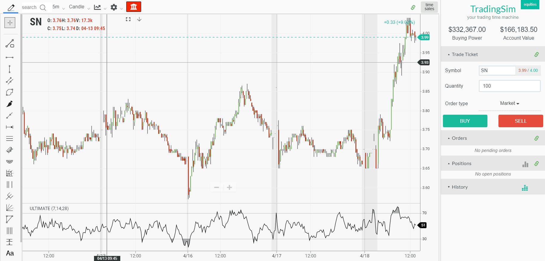
Ultimate oscillator
Above is a 5-minute chart and you can see the clear overbought and oversold readings on the chart. Seems simple enough right?
Just buy when the indicator is below 30 and sell when the indicator is over 70? Wrong.
Since we know this is a bad idea, let’s walk through 2 strategies you can test out.
Strategy #1 – Exploit the Divergence
Let’s first start with how to use the indicator with trending markets. This is where oscillators have the toughest time forecasting market direction.
A stock could give a sell signal as the indicator goes well above 70, but this does not mean the stock is going to roll over immediately. A stock can remain in an overbought state for an extended period of time.
Overbought Stays Overbought
This is where oscillators can really get you in trouble. An overbought stock can stay just that – overbought. Now in defense of the ultimate oscillator, you are going to face this reality regardless of your oscillator of choice. It’s just the nature of the beast.
The reason is that a stock can oscillate from overbought to the midline around 50 indefinitely. This is great if you are long and riding the trend higher.
However, if you are short, it can lead to the death of a thousand cuts as the stock drags higher, slowly draining your account value.
This can also play out on the downside as well. If you step out front and catch a falling knife, it can just continue lower and if you are long it’s not a good feeling.
The Setup
So, how do you use the oscillator when the stock is trending hard? Simple, you don’t assume just because the ultimate oscillator is above 70 you should go out there and start shorting.
So, instead of just selling because the stock is overbought on the oscillator, use it as an opportunity to see if you can jump on board with the trend.
Divergence is About Timing
It’s going to feel counterintuitive, but if a stock makes a high and then breaches that high again, it could be ripe for a breakout trade. The problem is that the ultimate oscillator may have a lower reading on the break of the recent high.
All of the experts will tell you that you should sell the divergence, but it’s not that simple. While divergence is in play, who knows when the divergence will lead to a selloff.
Therefore, you could try buying the break and then using a stop management system to protect yourself and then ride the wave higher. Even in the example above, there was a clear divergence but the stock nevertheless climbed higher.
Defy Divergence
Remember It’s About Timing
Again, please do not read this and say divergence means buy or sell. You have to size up the trade. But what I am saying is that if a divergence presents itself, it does not mean it is going to instantly playout in the market. The divergence could be a result of the fact the first move was so strong, it reflects a significant change in trend that is not meant to be exceeded by the indicator on the short-term.
Strategy #2 – Buy or Sell the Panic
One of the hardest things to do is to buy the panic. I don’t have the right mindset to jump out in front of the train, but if you do it can prove valuable.
It’s rather simple, you are buying as everyone is panic selling and once the panic selling subsides, the stock will make some sort of run higher.
This does not mean it will exceed the days high if you are day trading, but it does mean you are likely to see a move.
The Setup
One strategy you can use when trading with the ultimate oscillator is to identify a panic selling point at support. You want to see a spike down in the ultimate oscillator to extreme levels. It’s not enough for the oscillator to hit 45. You need to see it tank.
Then wait for the stock to reclaim the level. You then buy the break back into that level and place your stop below the recent low.
The stop is critical because if the stock rolls over and goes lower, you have to take your lumps in order to live to fight another day.
Chart Example
Here is a chart example of the stock VRAY. The stock was in a clear trading range for 5 days before having a panic selloff on the sixth day. This panic selling quickly subsided and the stock was able to regain the prior support level. Guess what happened next?
That’s right, the stock stabilized and moved higher. Ultimately the next day the stock shot up in a parabolic fashion
Buy the Panic
In Summary
While the name may make you feel it’s beyond reproach, the ultimate oscillator is just like any other indicator. It has its strengths and weaknesses. As you can see from this article we took a different approach rather than reciting the same strategies repeated over and over again on the internet. It doesn’t mean those can’t work but in trading, you will need to find an edge.
It’s not enough to just sell divergence or place a buy order just because the indicator goes below 30. You have to be smarter than that and you are.
How Can Tradingsim Help?
Interested in exploring the ultimate oscillator further but need a place to test your ideas? You can use Tradingsim to practice trading with the indicator using real tick data for the past 2 years.
You can test the strategies detailed in this article as well as make up your own.
We have discussed many technical indicators on the Tradingsim blog. We have gone through many trading signals and strategies for increasing profit potential. However, nothing in trading is 100% and no one knows for sure the future of price action.
After all, if everyone could predict the trajectory of stock prices, we would all be millionaires and billionaires. The truth is that every technical indicator fails and we all need to know how to handle this reality.
Lagging Indicators
Lagging Indicators give you a confirmation signal. This is why they are called trend confirming, or trend following indicators. The signal from this indicator comes after the event occurred on the chart. In this manner, lagging Indicators “lag” the price action. The most popular lagging Indicators are the SMA and the MACD. These indicators give false signals for sure, but not that often. Let me show you:
Lagging Technical Indicators
Although the simple moving average is a lagging indicator it can also lure you in many losing trades in a row. The image above is the 2-minute chart of Oracle from May 5, 2016. The blue line on the graph is a 30-period simple moving average. This number of periods should reduce the noise; however, look what happens on the chart.
While the price tests our 30-period SMA as a support, it suddenly switches below the indicator. This gives a short signal on the chart. Six periods later, the price switches above the SMA, giving the opposite signal.
Then immediately we see Oracle slip back below and then above the SMA. We see one last false bearish signal before the price breaks the SMA upwards and enters a real trend.
In this example, we saw five false signals in a row caused by a 30-period SMA. Each of these false signals could lead to significant losses when trading on margin.
Now, let me show you a few false MACD signals:
Lagging Technical Indicators 2
Next we have the 2-minute chart of Ford. At the bottom of the chart you will see the MACD indicator, which gives three false signals.
The image starts with a price decrease. At the same time, the MACD indicator creates a bearish crossover. We interpret this as a bearish signal on the chart. However, the price enters a range and then begins to increase.
Later, the price creates two bearish crossovers after the price started increasing. Each of these two signals could be taken as a bearish indication on the chart. However, the price doesn’t start a bearish move and continues higher.
In this example, we have three bearish signals, which could lure us into three false trades in Ford. Each of these trades could bring a number of small losses to our account.
You will often see this type of trading activity during the midday trading session. If you get caught in these nonsense back and forth price action, you will surely bleed your account.
This is why it is so critical to either lower your profit targets for midday trading or work to identify the small number of volatile issues.
Leading Indicators
These are the indicators which give you the trend signal right in the beginning of the move. This is why they are called leading – because they lead the price action. Isn’t that great? You are able to hop in the trend right in its beginning and ride it all the way up!
However, the leading indicators give many false signals. Two of the most popular leading Indicators are the stochastic oscillator and the relative strength index. These two indicators have their own struggles with accuracy. Let me demonstrate to you:
Leading Technical Indicators
This is the 2-minute chart of Amazon from June 17, 2016. At the bottom of the chart, you see the relative strength index.
The chart begins with a price decrease. At the same time, the RSI is decreasing as well.
Suddenly, the RSI line enters the oversold area. The line then quickly breaks the oversold zone upwards. This gives a long signal on the chart. However, instead of increasing, the price has a small drop. Three periods after the oversold signal, the RSI line enters the oversold zone again. This creates another oversold signal on the chart. Then the indicator breaks the oversold zone upwards, which accounts for the price increase.
This is another strong bullish signal on the chart. Yet, the price stays flat. Meanwhile, the RSI indicator increases slowly. This supports the bullish outcome on the chart. However, the price then ends the range and drops rapidly. If traded, this RSI signal was definitely a loser.
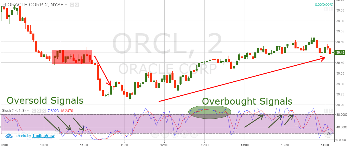
Let’s now review a few false signals from the stochastic oscillator:
False Technical Signals
Above is the 2-minute chart of Oracle from May 9, 2016. At the bottom of the chart is the stochastic oscillator.
The chart starts with a decrease when the stochastic suddenly provides a strong oversold reading.
Furthermore, three times in a row the indicator breaks the oversold area upwards. These are all buying signals; however, the price stays flat. Shortly after the third signal, the price actually falls sharply lower.
This is completely counter to the signals we receive from the stochastic oscillator.
Later we receive strong overbought signals. As you can see, these signals did little to pull down the price of Oracle.
If you are unable to identify when to ignore price signals, you will constantly run into this challenge when trading the markets.
Again, I especially see the manipulation of stock prices during midday trading. This is when the volume is at its lowest, and smaller traders are able to move stocks higher and lower with ease.
Why Technical Indicators Fail
You should never forget that at their core, technical indicators gather past price data to determine oversold/overbought readings.
The technical data on the chart and the price action in general are formed by the clash of buyers and sellers of the respective stock. If there are more buyers, the price is likely to increase. If there are more sellers, the price is likely to decrease.
But who knows for sure who will win the battle? Nobody! We can only guess. In this manner, technical indicators always imply what might be the possible outcome. They technically cannot be 100% accurate.
Why is Technical Analysis Difficult?
In addition to all the factors we discussed above, we also need to briefly touch on the topic of high frequency trading. 20+ years ago, technical analysis worked somewhat reliably. Many retail traders would read up on their favorite chart pattern and a good portion of the time, things would play out as intended.
Stocks would easily hit their targets for formations such as head and shoulders pattern or ascending triangles.
Well, fast forward to today and we now have machines placing millions of buy and sell orders every minute. This in essence makes reading the tape and price action more difficult than ever.
Have you ever noticed how right when you place your order to sell short on a breakdown, the stock will inevitably reverse and go higher? Even though the formation on the chart was perfect?
This is the reality of the world within which we live now and until our government’s do something about it, it will be the norm for the foreseeable future.
Does Technical Analysis Really Work?
Have you ever experienced downswings in trading? You definitely have!
I would bet many times, you have been lured into losing trades by technical indicators, right? Then you change the indicators you use and your strategy, but it is still not working! Many people who appear to be in this situation simply quit trading and give up. I bet that many times you have asked yourself the question “Does technical analysis really work?” It is normal to have doubts when things are not going your way.
On the web, many so-called “experts” will say “technical analysis is nonsense!” without actually having a clue why. Some people think that if a chart pattern fails once, then it will always fail! Thus, the next time you ask yourself this question simply remember this: technical analysis does work!
However, you never know in which case your technical indicator will give you a valid signal. So, how exactly can a technical indicator for day trading bring you profits? The answer to this question is very simple. You can profit from technical analysis by adding to your strategy the basic concept of risk management.
Risk Management
You should always know the success rate of your trading strategy. At the same time, you can always control the amount you risk with a stop loss order. This means, you have full control over your trading strategy in the long term. You maybe don’t understand this. Let me explain further.
No matter what your strategy or what technical indicator you use, you and only you determine how much you are going to lose per trade.
In this manner, you have to know your edge and figure out what strategy you can use for managing your losses that will result in a positive net return.
Still not believing me?
I have been using the same trading approach with the Nikkei for the last 3 months. I would have some up days and some down days. But my consistency was lacking due to the different market conditions and rules on the Nikkei compared to the US market.
Well, one day I decided that enough was enough. I started to tighten my stops and quit for the day if I was up or down a certain amount. This discipline regarding how much I risk per trade and per day, has resulted in a win rate on the day of 80%.
Now this does not mean I am winning 80% of my trades, but just that I am able to walk away with cash in my pocket 4 out of 5 trading days.
So again, I ask you, does technical analysis still work?
Conclusion
Technical Indicators will fail and fail often.
Leading Indicators fail more than lagging indicators.
Technical indicators fail because nothing in trading is 100%.
Technical analysis and technical indicators do work once you take responsibility for your trading decisions. Remember, you do not have to take every trade.
However, to succeed with your trading strategy you need to learn how to properly manage the risk on each trade.


![VWAP Boulevard Indicator: The Ultimate Guide [#vwapboulevard]](https://app.tradingsim.com/wp-content/uploads/2021/06/vwapboulevard1-2.png)