Candlestick Patterns Explained [Plus Free Cheat Sheet]

Candlestick Pattern Quick Reference Guide

Trading without candlestick patterns is a lot like flying in the night with no visibility. Sure, it is doable, but it requires special training and expertise. To that end, we’ll be covering the fundamentals of candlestick charting in this tutorial. More importantly, we will discuss their significance and reveal 5 real examples of reliable candlestick patterns. Along the way, we’ll offer tips for how to practice this time-honored method of price analysis.

Also, feel free to download our Candlestick Pattern Quick Reference Guide!

Why Do Candlestick Patterns Matter?

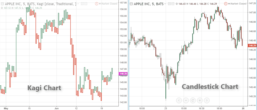
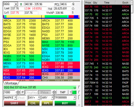
After all, there are traders who trade simply with squiggly lines on a chart. Astonishingly, some don’t even look at the charts! Instead, they pay attention to the “tape” — the bids and offers flashing across their Level II trading montage like numbers in The Matrix.

Level II montage gif
A Level II montage. Source: CenterPoint Securities

No doubt, there are countless ways to make money in the stock market. In fact, there is no right or wrong way to read a chart. But unless you are just a gambler, you need some form of data to make informed decisions.

We believe the best way to do this is by understanding candlestick patterns.

For newer traders, even reading candlestick charts can seem like an insurmountable learning curve. There appears no rhyme or reason, and no end to the amount of price and volume data being thrown your way.

It’s daunting, for sure. Especially when you’re just getting started.

But be of good cheer! There is a method to the madness. The method is in the patterns. The patterns reveal probabilities. And the right probabilities create opportunities.

More importantly, the right opportunities can create profits.

This is where candlestick patterns come in handy. They help us to decipher the patterns of the market. They’re like little road signs on crowded streets. And with enough repetition, enough practice, you just might find yourself a decent chart reader.

That’s why you’re here, right? To learn to navigate the murky waters of the market?

Trust us, it is a worthwhile endeavor.

Who Discovered the Idea of Candlestick Patterns?

According to Investopedia.com, it is commonly believed that candlestick charts were invented by a Japanese rice futures trader from the 18th century. His name was Munehisa Honma.[efn_note]Farley, A. (2021, April 29). The 5 Most Powerful Candlestick Patterns. Investopedia.Com. https://www.investopedia.com/articles/active-trading/092315/5-most-powerful-candlestick-patterns.asp.[/efn_note]

Honma traded on the Dojima Rice Exchange of Osaka, considered to be the first formal futures exchange in history.[efn_note]NinjaTrader. (2019, April 17). Candlestick Charting: Legend of Munehisa Homma. NinjaTrader.Com. https://ninjatrader.com/blog/candlestick-charting-legend-of-munehisa-homma/.[/efn_note]

As the father of candlestick charting, Honma recognized the impact of human emotion on markets. Thus, he devised a system of charting that gave him an edge in understanding the ebb and flow of these emotions and their effect on rice future prices.

Honma actually wrote a trading psychology book around 1755 claiming that emotions impacted rice prices considerably.[efn_note]Beyond Candlesticks: New Japanese Charting Techniques Revealed, Steve Nison , Wiley Finance, 1994, ISBN 0-471-00720-X.[/efn_note]

When all are bearish, there is cause for prices to rise.

Munehisa Honma[efn_note]Beyond Candlesticks: New Japanese Charting Techniques Revealed, Steve Nison , Wiley Finance, 1994, ISBN 0-471-00720-X, p14.[/efn_note]

In recent history, Steve Nison is widely considered the foremost expert on Japanese candlestick methods. After all, he wrote the book that catapulted candlestick charting to the forefront of modern market trading systems.

Beyond Candlesticks: New Japanese Charting Techniques Revealed, is one of his most popular books and a definitive resource for candle patterns.

Since the 90s, this method of charting has become pervasive throughout all financial markets: equities, futures, forex, and more.

In his books, Nison describes the depth of information found in a single candle, not to mention a string of candles that form patterns. It truly puts the edge in favor of a skilled chartist.

The Story That Candlesticks Tell

Candlesticks are telling us a story. The story is a reflection of what buyers and sellers are doing.

Emotions and psychology were paramount to trading in the 1700s, just as they are today. This is the foundation of why candlesticks are significant to chart readers.

How so?

Every candle reveals a battle of emotions between buyers and sellers.

As the great trading psychologist Brett Steenbarger notes, “proper training is the best source of discipline and the most effective safeguard against intrusive anxiety and impulsivity.”

With this in mind, understanding the emotional story within candlesticks is a great place to start that training.

How are Candlesticks Formed?

There are three types of candlestick interpretations: bullish, bearish, and indecisive. This is painting a broad stroke, because the context of the candle formation is what really matters. But for all intents and purposes, we’ll stick with these three categories.

The elements of a candlestick graph
The elements of a candlestick

What Is a Candlestick?

The formation of the candle is essentially a plot of price over a period of time. For this reason, a one minute candle is a plot of the price fluctuation during a single minute of the trading day. The actual candle is just a visual record of that price action and all of the trading executions that occurred in one minute.

Similarly, a daily or weekly candle is the culmination of all the trading executions achieved during that day or that week.

The open tells us where the stock price opens at the beginning of the minute. The close reveals the last recorded price of that minute. The wicks (also known as shadows or tails) represent the highest and lowest recorded price from the open and close.

According to Nison, the Japanese placed much less emphasis on the highs and lows of individual candles. For them, as it is for modern technicians, the opening and closing prices were more relevant.[efn_note]Beyond Candlesticks: New Japanese Charting Techniques Revealed, Steve Nison , Wiley Finance, 1994.[/efn_note]

Essentially, the broader context of candles will paint the whole picture.

What Is a Bullish Candle?

A bullish candle is formed when the price at the closing of the candle is higher than the open. This can be on any time frame: from a 1-minute candle to a 1-month candle. It will all be the same.

A bullish candle explanation
A bullish candle opens low and closes high.

Typically these candles close with a green or white body color, though most charting platforms allow for customization these days.

What Is a Bearish Candle?

Conversely, a bearish candle is assumed when the closing price is lower than the opening price. In other words, the price dropped in the amount of time it took for the candle to form.

A bearish candle explanation
A bearish candle opens high and closes low.

By default, most platforms will show a red or black candle as bearish.

What Does the Candle Formation Tell Us?

This is the real question we need to ask ourselves. It isn’t enough to know that the candle opened and then closed lower, or vice-versa.

As renowned trader and best-selling author Dr. Alexander Elder explains, “The main advantage of a candlestick chart is its focus on the struggle between amateurs who control openings and professionals who control closings.”[efn_note]Elder, A. (2014). The New Trading for a Living: Psychology, Discipline, Trading Tools and Systems, Risk Control, Trade Management (Wiley Trading) (1st ed.). Wiley.[/efn_note]

Dr. Elder may be referring to daily candles, but his point is still important. The candle represents a struggle between buyers and sellers, bulls and bears, weak hands and strong hands.

Every trader wants to understand the price action and read it well to improve their trading. Studying candlestick patterns helps us understand the price action and where the stock is more likely to go the next minute or the next few minutes.

Armed with that knowledge, let’s dig in and see what picture those little candles are trying to paint for us.

The High of the Candle

The high of each candle, whether it is the tip of the wick at the top, or if the body closes at the top, represents the maximum effort of bulls. If it is a daily candle, buyers could not push the price of the stock one cent more during that day.

Why is that important? There are two reasons:

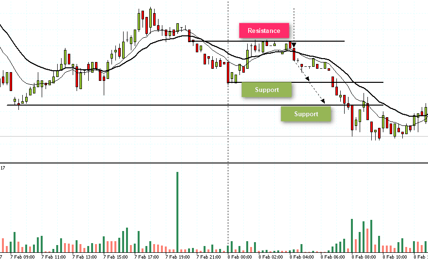
  1. This could represent a near term level of resistance which will have to be broken for the price to move higher.
  2. In order to find enough demand to push through that resistance, the stock may need to consolidate lower until enough shares are accumulated.
Inside a bullish candle pattern

The Low of the Candle

Just as the high represents the power of the bulls, the low represents the power of the bears. The lowest price in the candle is the limit of how strong the bears were during that session.

Why is this important? Again, two reasons:

  1. This could represent a near term level of support where bulls were able to stop the downward momentum
  2. To move lower, more supply may need to enter the market at higher prices.
Inside a bearish candle explanation

The Closing Price of Each Bar

This is where the story gets interesting.

When a candle closes above its opening price, we can assume that the bears won in some form or fashion. How much it closes above the open tells us with what intensity the bulls were in control during that session.

Let’s look at few examples to better understand this:

In this chart, we see the “Three White Soldiers,” which is a candlestick pattern describing three bullish candlesticks in a row. What can we interpret from this?

Three White Soldiers candlestick pattern

It is clear to see that the candles open low and close high. Bulls were clearly in control during each session with very little energy from the bears.

Now contrast that with what we see in the next example. Ask yourself, who was in control during this session?

Bullish Doji Candle explanation

Apparently there is indecision as to who is in control. How do we know? Think about the story behind this “Spinning Top” candle:

The stock opens, proceeds lower as bears are in control from the open, then rips higher during the session. But after putting in a decent high, the bulls settle back and give the bears some control into the close.

Are you beginning to see how the story unfolds?

These are the stories that candles tell us on charts. Who is in control (greed), who is weak (fear), to what extent they are in control, and what areas of support and resistance are forming.

The Range between the Open and Closing Price

This is one of the most important aspects of interpreting candles. As Dr. Elder notes, the range between open and close “reflects the intensity of conflict between bulls and bears.” [efn_note]Elder, A. (2014). The New Trading for a Living: Psychology, Discipline, Trading Tools and Systems, Risk Control, Trade Management (Wiley Trading) (1st ed.). Wiley. p 53.[/efn_note]

In day trading, momentum is everything. On this token, the character of the candles can tell us if there is demand or if a stock is sleepy and uninteresting — whether we are about to launch, fall off a cliff, or just grind sideways.

Additionally, the nature of the candles can tell us when to enter with tight risk. Or, when to take profits into climactic candles.

In the end, it all boils down to context and the story of buyers and sellers behind the tape.

5 Real Examples of Reliable Candle Patterns

Without practice, none of this information really matters. It takes screen time and review to interpret chart candles properly. There are no free lunches in the markets.

With that being said, let’s look at some examples of how candlestick patterns can help us anticipate reversals, continuations, and indecision in the market.

1. The Hammer / Hanging Man

The hanging man  occurs at tops and the hammer occurs at bottoms.

The Hanging Man is a candlestick that is most effective after an extended rally in stock prices. The story behind this candle tells us that there were extensive sellers in the formation of the candle, signified by the long wick.

It is usually accompanied by heavy volume.

The Hanging Man pattern
The Hanging Man appears at the top of an extended uptrend before reversing.

The Hammer is another reversal pattern that is identical to the The Hanging Man. The only difference is the context. The Hammer occurs at the end of a selloff, signifying demand or short covering, driving the price of the stock higher after a significant selloff.

Like the Hanging Man, you want to see a solid volume signature associated with these candles.

The Hammer pattern
Hammer candles appear at the bottom of a downtrend before a reversal

2. Engulfing Patterns

Engulfing patterns offer a great opportunity to go long while keeping risk defined to a minimum. As you can see in the example below, the prior bearish candle is completely “engulfed” by the demand on the next candle.

A bullish engulfing candlestick pattern
A bullish engulfing candle at the market open.

Another example of engulfing patterns is the Bearish Engulfing Sandwich. Here we have what appears to be a bearish reversal, but the next candle completely swallows the supply from that red candle:

A bearish engulfing sandwich, also know as a stick sandwich
A bearish engulfing sandwich pattern, also know as a stick sandwich

3. The Morning Star

The Morning Star is yet another reversal signal. It can be found at the end of an extended downtrend or during the open. It takes 3 candles to confirm the setup.

  1. The first candle must be a strong downtrending candle.
  2. The second candle is the star. It’s usually a narrow body candle that, ideally, does not touch the body of the prior candle.
  3. The third candle is a strong bullish candle confirming the new uptrend.
The morning star candlestick pattern explained at the open
The morning star candlestick pattern at the open

4. The Evening Star

Similar to the Morning Star, the Evening Star is its bearish cousin. It forms at the top of parabolic or extended bullish runs. Much like the Morning Star, the body of the candles should not touch.

Here are three criteria for spotting the shooting star:

  1. The bodies do not overlap
  2. The third candle is a strong bearish candle closing into the body of the first candle
  3. Volume should increase from left to right in the pattern
The Evening Star explained on GME
The Evening Star candlestick pattern on GME

As with all of these formations, the goal is to provide an entry point to go long or short with a definable risk. In the example above, the proper entry would be below the body of the shooting star, with a stop at the high.

5. Indecision Candles

The doji and spinning top candles are typically found in a sideways consolidation patterns where price and trend are still trying to be discovered.

Indecision candle patterns
Indecision candlestick patterns

The “doji’s pattern conveys a struggle between buyers and sellers that results in no net gain for either side,” as noted in this great article by IG.com.

Will it continue upward? Go sideways? Or reverse?

With indecision candles, we typically need much more context to answer these questions.

The Gravestone Doji is a perfect example of this:

The Gravestone Doji indecision candlestick explanation
Gravestone Doji candles can represent indecision on a chart.

Note the trend is mostly sideways in this first circled example. For this reason, waiting for the reaction to these candles is usually best for risk management.

Eventually, the price falls in this particular case as the trend becomes more extended into the rally. Correspondingly, the Shooting Star that occurs just beyond the Gravestone Doji is confirmation of that falling price action.

The Best Way to Practice with Candlestick Patterns

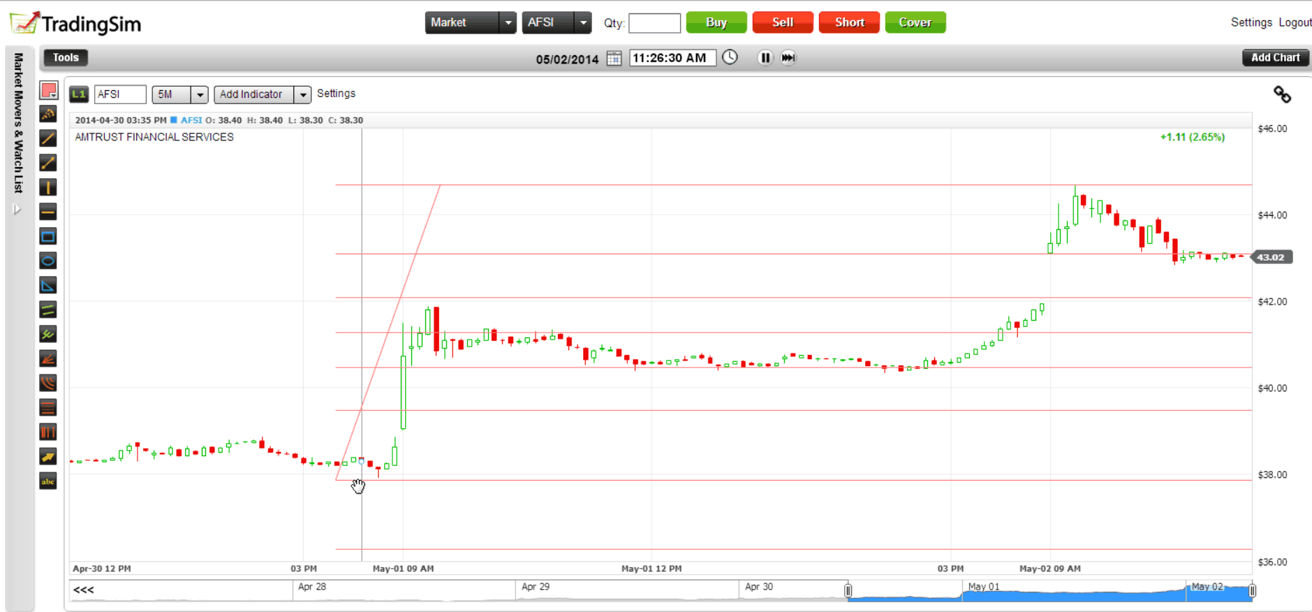
As always, it is best to practice a strategy before putting money to work in the market. There is no better way to do this than with a simulator.

One of the best methods to train your “chart eye” to see these patterns is to simply replay the market, noting each time you see a particular candle.

As you put in deliberate practice, ask yourself the following questions:

  • What candle formation is this?
  • What is the context? Uptrend? Down trend? Sideways?
  • Does this candle meet the criteria for a proper reversal?
  • Where could I enter with the least amount of risk?
  • What would confirm the pattern?

We have a wealth of knowledge on many different candlestick patterns, so be sure to check out those lessons, too!

Overview

As a day trader, a common question asked is should you trade daily charts?

The root of the question comes down to the fact you are trading intraday, so why care about what’s happening on higher timeframes?

In this article, we will explore many aspects of day trading with daily charts to see if it’s a good fit for you.

Using Daily Charts Can Simplify Things

Please do not interpret simplify as easy.

What I mean by this is that by going to a higher timeframe, the chart does not give you as many signals. Let’s dive into a three trading setups utilizing daily charts to further illustrate this point.

#1- Normal Daily Buying and Selling Opportunities

There are going to be those of you that like to day trade normal buying and selling opportunities. These are trades that setup on the daily bar, but there isn’t necessarily anything special about the price action.

It comes down to an opportunity displaying itself on a day trading daily chart and you go along for the ride.

Long and Short Trades

Below are two examples of a short and a long trade based on price action and technical analysis.

The point is that you don’t fire and forget after making your trade, but more the daily chart gives you a clue that traders on a higher timeframe are taking a position.

For example, in the below chart where you see a short signal, this doesn’t mean you sell short and hold.

What it means is that if you are going to trade the stock, you should take a short position. Conversely, the next trading opportunity is a long after a breakout of the inside bar.

Again, you will still need to do the hard work of looking at the charts on an intraday timeframe.

Day trading on the daily chart time frame

#2 – 52-Week Highs/Lows

Another simple approach for trading daily charts is to look for new 52-week highs or lows.

For example, if a stock makes a new 52-week high this is a prime opportunity to get long.

Now swing traders may look at this as an opportunity to buy and hold. As a day trader, you can alternatively look to buy the breakout in the morning and hold through lunch.

This way you can capture the bulk of the move on the breakout day, but not be committed to holding the stock for weeks or months.

#3 – First Big Green/Red Day

In this trading example, you want to identify the first big green or red day.

If it’s a big green day, you will want to get long the stock. If it’s red you will want to get short.

First Big Green Days

Now, I do not trade high flying stocks because I stick to the lower volatility plays.

However, that doesn’t mean these are not great trade opportunities.

In the above chart, you will see the stock produces a number of large green bars. As a day trader, you can then locate these moves and over a one to two week period, continuously day trade the setups as they present themselves.

So Is Day Trading with Daily Charts Worth It?

I do not use daily charts on a consistent basis. The largest timeframe I am currently using is 15 minutes and I zoom way out to see if I am hitting any key levels.

But there are times when I will zoom way out to daily and even weekly charts if it appears a stock is testing a significant level.

For me, it comes down to the fact adding daily charts all of the time gives me information overload.

However, if you plan on watching daily, you will need to watch many other timeframes and this will require you to have multiple monitors.

At the end of the day, trading is all about making a profit and if you can do so with daily charts – stick with it.

How Can TradingSim Help?

Tradingsim has over 14 different timeframes for you to practice day trading. We also have daily and weekly timeframes for you to zoom out on the action in order to find prime trading opportunities.

Every stock chart contains two axes –  x-axis  to plot time and y-axis to plot price.

There are basically two ways to plot price – linear and logarithmic.

While most traders are unaware of how the price scale is set, there are some key points every trader should consider when it comes to logarithmic scale vs linear scale.

In this article, we will discuss the five key differences between semi-log and linear scale on price charts.

1. Measuring Price – Linear vs. Log-scale

Linear Scale<.h3>

There are some traders who expect to see an equal distribution of price values on the y-axis – linear scale.

For example, a linear price chart could have an equal distance of 5 units on the y-axis (i.e. 0, 5, 10, 15).

The chart below shows an example of the linear scale chart for Apple (AAPL). You can see that the price chart has a y-axis with a .20 unit of measure.

Example of linear scale chart with distance of $0.20

Example of linear scale chart with distance of $0.20

Logarithmic Scale

Conversely, the logarithmic chart displays the values using price scaling rather than a unique unit of measure.

With a logarithmic chart, the y-axis is structured such that the distances between the units represent a percentage change of the security. For example, this percentage difference can be 5%, 10% or 15%.

The next chart shows the same Apple stock chart but with logarithmic scale enabled.

Example of log scale chart with distance of 0.30% approximately

While prices look rather congested at the bottom, such as 140.40, 140.70 and so on, the distribution becomes spread out further apart as price values progresses.

This is because as the values increase in size, the preceding units of measure are smaller and thus visually look smaller on the chart.

Now imagine a stock that first traded at $50 dollars and over time trades north of $300 dollars (i.e. Netflix). The early years of trading at the lower price levels will look like rooftops when you are looking out of the window of an airplane before you land.

2. More Volatility = Logarithmic Scale

If a security has small price moves and choppy trading action, a linear chart would probably be the best method for charting the stock.

However, we know price movement for penny stocks and biotechs is anything but boring.

For these types of securities, the logarithmic price chart makes more sense as it can visually capture the significance of the larger price moves.

The next chart shows a comparison of a linear and logarithmic chart for Intel (INTC).

Comparison of the linear and logarithmic scales for INTC price chart

Although both the linear and the log-scale might look very similar, the differences stand out when you closely review the distribution of the price on the y-axis.

It is evident that the linear price chart shows a more curved line. You can also see the linear chart somewhat depicts the idea that price moved rather slowly in the initial periods before price started to move more rapidly in the latter parts.

This distortion occurs because the price is in absolute dollar terms. On the other hand, the logarithmic chart shows a steady 1% approximate percentage change in the values and shows a more uniform scale of price change over the period of time.

Therefore, a logarithmic chart is more suited in the above example as it depicts the growth of the stock price on a steady note with a fairly straight trajectory. When the pace of growth starts to change, the logarithmic chart also adjusts accordingly and depicts the change accordingly, which isn’t the case with a linear chart because the values remain the same, regardless of whether price moved  just $0.50 or 5%.

3. Logarithmic Scales are Useful for Long-Term Perspective

To quickly recap, the price scale is equal with linear charts. This means that a move from $100 to $150, which represents a 40% move is the same as a move from $200 to $250.

You can see that the distribution here is $50 per unit, but in percentage terms, you have a 40% move initially (from $100 to $150) and a 22% approximate move from $200 to $250.

In such cases, large price movements are better with logarithmic charts which focus on the percentage of the move.

4. Linear Scale for Day Traders

On the other hand, a linear price scale is more applicable to analyze a security that is moving in a tight range or within a short time frame such as intraday trading sessions.

Linear scale is ideal for intraday charts or short term charts

The above chart example shows a 10-minute price chart for AAPL using a linear price scale. Again, the units are an equal distance of $0.20 cents. You can also see an example of a simple breakout method relatively easy to spot and trade.

Because of the equal distribution in absolute dollar terms, the $0.20 price range that was established in the sideways market gives the upside and the downside target at a distance of $0.20 making it relatively easy to trade the short term price charts.

Even if you would use a logarithmic scale on the intraday charts, because the price movements are typically confined, you will get the same results as using the linear scale chart.

5. Which Price Scale to Use?

When it comes to analyzing stocks, the price of the security is usually analyzed in relative terms. Metrics such as price earnings ratio, price book values are popular financial ratios. Thus, when depicting the price of the security in question, it makes more sense to represent or analyze the security’s stock movement in percentage terms rather than in absolute values.

Therefore, chances are that traders are automatically shown the appropriate price scale without even knowing the difference between the two types of price scales.

At the end of the day, the security dictates whether you should choose a linear price scale or a semi-log chart or a logarithmic scale chart.

Even within stocks, not all securities behave similarly. While on one hand there are stocks that have explosive price movements, there are also stocks that are typically confined to a range over years.

Bonus – 6. Trends are Better with a Log-scale Chart

I decided to update this article with a sixth section covering trend lines on two chart types.

Let’s start with a simple example of drawing trend lines for the same security and compare how the trend lines evolve between a linear and logarithmic chart.

Trend lines plotted on a linear and a logarithmic chart

The above chart shows Intel Corp (INTC). On the left we have a linear price chart and on the right is the logarithmic chart.

The trend lines plotted on both charts are exactly the same.

This brings us to the question of which of the two charts depicts the trend accurately? It is the logarithmic price scale chart on the right side which shows the trend lines much better as compared to the trend lines from the left.

The answer to this question I’m going to leave up to you.

In Summary – Logarithmic Scale vs Linear Scale: Which Scale is Better?

The answer to this question depends on a number of factors such as the security in question and how price behaves and of course the time frame as well. However, the log scale or the semi-logarithmic price scale is more popular than the linear scale.

Nearly all charting platforms default to the logarithmic scale as the units are equally spaced in percentage terms, making it easier to use the log scale as a base chart across any security that a trader wants to analyze.

As illustrated above in some of the examples, there are clearly certain scenarios where using one type of price scale is definitely better. At the end of the day the type of and its price behavior will determine the right price scale.

What are Renko Charts

You can trace renko chart’s origins to Japan and they were first introduced to the West by Steve Nison in his book “Beyond Candlesticks”.

The actual word renko is derived from the Japanese word renga, which means bricks. Renko charts are similar to kagi charts and the three-line break charts except that the renko chart is drawn in the direction of the primary trend and have a fixed size.

Renko charts are also similar to point and figure charts as each brick is the same size.

So, in order to generate an opposite color, the fixed brick size of the Renko must be exceeded. This of course classifies renko charts as a lagging indicator and in choppy markets can lead to a number of false signals.

Renko Chart Example

Renko charts are used to determine potential changes in price trend. Below is a chart pattern example with renko bars.

Renko Charts
Renko Charts

Constructing Each Brick

The first thing you need to do is construct each brick which are the “building blocks” (get it…) of the chart type.

There are two primary methods for building each brick: (1) ATR and (2) set price point.

ATR

The ATR is a volatility indicator that measures the volatility of a security over a set period of time. To read more on the ATR, please visit this article, which goes into great detail.

Average True Range
Average True Range

The average true range looks at the high and low ranges of a security of the default 14-day period which creates the red line you see above.

ATR and Renko Charts

One of the challenges of charting Renko chart patterns or point and figure charts is that the size of each building block needs to be dynamic.

What does this mean?

Well if I set a box price when a security is 8 dollars, then should I keep the same box size when the security is 50 dollars?

As you can imagine, if I set the box size to 25 cents, I will have far more building blocks print when the value of the security is at 50 versus 8.

This is where the ATR helps close the gap.

Essentially you look at the ATR value and use this as a dynamic means for creating the Renko brick size.

So, if the ATR value is 15, then that is the size of the brick. This size value is again dynamic as the security prints ATR values.

Renko with ATR
Renko with ATR

This brick size is based on the closing price of the security.

High/Low Close Range

You can also select the option to have the renko chart pattern constructed based on the high and close range for the day. To see this, check out the below chart.

ATR with High Low Range

The above chart has more bricks due to the expanded price action that can occur between highs and lows.

If you are looking for a more accurate reflection of the price action, you will want to use the high low method to construct the brick.

Set Value

The next approach you can use is to construct the brick based on a set value. The value you select is solely up to you and should capture the price move of the security.

Renko with Set Price

In the above example, we used a set value of 20 points per brick. As you can see, the number of bricks increased as Google broke 1,000.

Set Percentage

What I personally like the most to do is to set the price based on a set percentage of the security itself. This way if you develop a price target based on a number of bricks, this target will hold up as your security moves higher.

Using a set percentage gives you the flexibility of a dynamic brick, but it’s more relative to the actual price of the security and not based on a technical indicator like the ATR.

So Why Use Renko Charts?

Now that you understand how the bricks are created, the next thing we need to cover is why use Renko charts?

I use candlesticks and point and figure charts, but I do understand why someone would trade with Renko chart patterns.

The real benefit of Renko charts is that it quiets all the noise in the market. If you haven’t figured it out yet, the market is one big game of head fakes.

Candlesticks, while the de facto standard, creates wicks and huge red candles that can shake the nerve of the best of us.

Well renko charts removes all the noise and allows the price action that matters to come through.

Ranges

Instead of looking to renko charts to determine price targets or applying moving averages to determine when a trend ends – what about simply looking at renko charts to identify ranges?

Why identifies ranges? Identifying the ranges further allows you to filter out trading activity of no-consequence.

Renko Range - Chart 1
Renko Range – Chart 1

Renko Range - Chart 2
Renko Range – Chart 2

You could be asking yourself, “Well can’t I see this on a candlestick chart?”.

The short answer is  yes, but there would be far more candlesticks printing on the chart which could lead you to misinterpret the action.

The key to the market is knowing when to not place a trade and the more you stare at the screen the more likely you are to feel the need to do something.

In the above examples of both GHDX and Apple, the key takeaway was to avoid placing any new long breakout trades until the stocks were able to clear their respective resistance levels.

As you can see, once these key levels were breached, each stock began strong upside moves.

Flaws of Renko Charts

Like any indicator, Renko charts are not perfect. While it is great at times to quiet all the noise, there are instances when details matter.

Trendlines

For example, if you are looking at an uptrend line, this could be completely missing from a Renko chart. Therefore, a dynamic support area could be right in front of you, but this line could be invisible to the eye.

Renko Trendlines
Renko Trendlines

Candlestick Trend lines

If you compare these two charts, you will notice how the second touch point on the support line at $87.50 never printed on the Renko chart. Also, the candlestick pattern developed a symmetrical triangle, while the Renko chart is in an uptrend channel.

These two patterns have two completely different price targets.

The symmetrical triangle will have a target the width of the pattern, while price will oscillate within a channel until breaking in one direction.

As you can see, trying to use both charts will likely lead to more confusion than clarity.

Therefore, as previously stated, you are best off using the Renko chart pattern as a method to identify ranges or support and resistance levels irrespective of time.

Setting Stops/Profit Targets

One of the most important things in trading is keeping the profits you have made on a trade. There is nothing worst then being up on a position, only to give back your gains.

Usually the time it takes to give back the money is much faster than it takes to accumulate it.

Parabolic Move
Parabolic Move

Renko Chart - Missing A Lot of Data
Renko Chart – Missing A Lot of Data

If you are a momentum trader do you see how much information is missing from the chart?

The tightness of the trading pattern makes for a mild ATR rating on the Renko chart, hence the brick is unable to capture the true strength of the trend.

Where would you place your profit target based on the Renko chart? How would you use the Renko chart to stop out of the position?

Renko charts make sense for a long-term investor as CODX is likely headed significantly higher. But for my Momo traders, the lack of data will likely turn a winning trade into a loser.

In Summary

Renko charts are a great tool for identifying major support and resistance levels.

However, if you are an active trader there is too much data missing from the chart that is critical to your trading success.

I am all for simplifying what is presented on the chart, but we can’t completely void ourselves of the trading decisions of the masses.

First Why Use Charts?

Before I start diving into this article, all you experienced traders out there can skip this one as I will be covering the basics of how to analyze a stock chart.

So, now that we have addressed the elitist – why use charts?  For me it’s about being able to quantify and qualify potential trading opportunities.  You can also try to perform this same function by looking at news events, trading boards, earnings report, etc.; however, charts provide you a clear view of the law of supply and demand in a graphical format.

While there are still a handful of traders that utilize fundamentals, the bulk of hedge fund managers and active traders use charts.  So, the old adage applies, if you can’t beat them, join them.

The standard Structure of a Stock Chart

A stock chart will consist of a number of key components (listed below) which I will detail throughout this article:

  1. Chart Type
  2. Time Scale or X-Axis
  3. Price Scale or Y-Axis
  4. On-Chart Indicators
  5. Off-Chart Indicators
  6. Timeframes
  7. Drawing Tools

Depending on your software of choice, this list can expand but in general these are the main focus areas of value.

Chart Type

There are a number of methods for plotting price data on a chart.  Below are the most popular:

  1. Line
  2. Candlestick (Most Popular)
  3. Point and Figure
  4. Open, Low, High, Close

Line Chart

A line chart is the most basic of the plotting methods listed above.  A line chart has one data point for each day or period of time which is the closing price for the respective time period.  While this creates a simplistic view of the market, you miss out on so much valuable data, that over time using line charts will prove challenging when competing against other traders.

Line Chart

Candlestick Chart

Candlestick charts are by far the most popular charting technique in the market.  If you read other trading blogs or look at screenshots of traders’ computers on the web, you will notice this charting style the most.

Candlestick charts allow the trader to quickly see the high, low and close of the stock, but it also has the concept of the body. The body represents how the stock closed relative to its open and is colored green for up days and down for red days.  The ability to show this level of price action is what makes candlesticks so popular.

Candlestick Chart

Point and Figure

Point and figure is not widely used in today’s trading circles, but for me point and figure charts was the key to letting my winners run.  Instead of the chart action being based on time, point and figure charts are based on the percentage movement of price.  This allows you to remove the element of market noise and zone in on the “true” intentions of the smart money.

Point and Figure Chart

Open, High, Low, Close (OHLC)

During the 70s and 80s, OHLC was the most popular charting method.  It essentially provided you all of the key data points for a day’s trading activity.  Once candlesticks arrived on the scene in the late 80s/early 90s, the technical gurus ate it up and the OHLC method became a thing of the past.

Open, High, Low, Close Chart

Now that we have covered the charting techniques, let’s shift our gears over to the actual layout of the chart itself.

X-Axis of a Chart

The x-axis on the stock chart is for time.  As you go to the left on the x-axis you are going back in time.  Depending on your timeframe, each marker on the x-axis could be ticks, minutes, days, months or years.  It really comes down to your preferred view.

Time Axis

Y-Axis of a Chart

The Y-axis is where the price action is plotted on the chart.  If you think about it, the concept of the y and x-axis is very similar to what you would have learned in middle school for how to find the slope of a line in a basic algebra class.

Price Axis

On-Chart Indicators

These are the indicators that you plot over the price chart.  Some of the more popular indicators are simple moving averages and Bollinger Bands.  The aim of these indicators is to provide confines to see how the price moves.  For example, does the stock find support at the 200-day moving average?

While you may have the urge to place a million indicators on your chart, the key thing to note is that less is more.

On-Chart Indicators

Off-Chart Indicators

Off-chart indicators are used to calculate overbought and oversold levels for a stock.  Examples of this are the slow stochastics and relative strength index (RSI).

Another example of an off-chart indicator, my personal favorite – volume.  Volume is critical because it shows the relationship of supply and demand.  Price action alone is simply not enough to make a judgment call on whether to buy or sell a stock.  Knowing how many shares traded hands at key levels helps to identify the significance of key price areas.

Off Chart Indicators

Timeframes

The timeframe you choose will ultimately dictate your style of trading.  Below are some basic guidelines:

Ticks to 30 minute – day trading

60 minute, daily and weekly – swing trading

Weekly and monthly – long-term investing

These are just rules of thumb, but as you can see, the shorter the timeframe the more active the trading.  Figuring out what timeframe or style best suits your personality will be one of the first challenges you experience when starting your trading career.

Drawing Tools

Drawing tools are where you the technician can begin to formulate your own ideas around what to plot on the chart.  The most popular drawing tool by far is the ability to draw lines.

The reason lines are so important is it allows you to draw boundaries that encapsulate the trading activity.  Some stocks will have uptrend or downtrend channels, which when a stock hits extremes within these channels, you can use as an opportunity to make buy or sell decisions.

Another popular drawing tool are Fibonacci retracement levels.  Fibonacci provides you the means to see how much a stock has retraced from a previous swing high or low.  The most popular level is the .618% retracement which is a point where many traders look to make buying or selling decisions.

Fibonacci Retracement

Tying it all Together

As you can see, there is a lot going on within a trading chart.  The one thing I want to alarm you against is the need to overload your chart with indicators, drawing tools, and multiple timeframes.  Information overload will make it virtually impossible for you to make a trading decision.  Or worst, you end up going from one analysis effort to the next in hopes of finding the perfect trading solution to your profit troubles; it doesn’t exist.  Your best bet is to stick to 1 or 2 timeframes, 2 off-chart indicators, and 2 on-chart indicators.

Using this sort of foundation will keep your chart “clean” which in-turn will provide you a clear head to make sound trading decisions.

1 – What are Kagi Charts?

Kagi chart is a type of chart that is used to track the price movements of a security. Unlike traditional stock charts such as the line, bar (OHLC) or candlestick charts, the Kagi chart pattern is unique. While time and price are two variables that are plotted on traditional stock charts, with Kagi, only price is considered.

Therefore, a Kagi chart has only price, which is plotted on the y-axis and not time, which is plotted on the x-axis. By removing the element of time, a Kagi chart pattern gives a clearer picture of what price of a security is doing. It eliminates, what is referred to as “noise” in the market, which is common to the candlestick and bar chart.

A Kagi chart pattern is unique as it plots price like a “snake” and in a continuous form. When price is falling, the line is plotted in red color and when price is rising, the Kagi line is plotted in green color, when the previous highs and lows are breached.

Traders use the Kagi chart pattern due to the way it represents price, eliminates noise and shows clear trends. A Kagi chart is mostly used in technical analysis and among day traders.

The first chart below shows an example of a Kagi chart for the AAPL stock chart.

Example of a Kagi Chart

You can see how different the Kagi chart looks like compared to one of the more traditional forms of stock charting. Although on the Kagi chart, you can see time; this is redundant and irrelevant to the concept of this type of chart.

2 – History of the Kagi chart

It is said that the Kagi chart was originally developed in Japan, during the 1870’s. This was around the time when the stock markets were introduced in the region. Kagi charts were originally used in Japan to track the price of rice. Back in the day, Kagi chart helped traders to understand the supply and demand levels. (Candlestick charts were also designed initially by the rice traders in Japan).

The fact that Kagi charts are still used to this day, and are commonly found on most charting platforms is a testament to the effectiveness of this type of analysis.

Kagi charts, along with a number of other time-independent chart types such as Point and Figure and Renko charts were introduced to the western world by Steve Nison.

Nison spent a considerable amount of time in Japan, studying the various unique chart types. He also published numerous books on the various charting techniques that are used today.

3 – How are Kagi charts constructed?

A Kagi chart is created by a series of vertical lines which depict price movement. These vertical lines are connected by a horizontal line. In some charting platforms, a Kagi chart can also change the thickness of the line. This occurs when price reaches the high or the low of a previous level.

With a Kagi chart, a predetermined price is used. For example, if you selected a value of 5, that would represent a $5 move in the security. Or a value of 0.10 would mean a $0.10 move in the price of the security.

A Kagi chart can also be configured on a percentage basis. A 4% setting for a Kagi chart would mean that when price reaches 4% movement, it will change the direction accordingly.

When there is a reverse price movement, a horizontal line is plotted.

A Kagi chart can also be configured by using the average true range (ATR) value. In this case, the 14-period ATR value is used as the setting for the Kagi chart. Of course, the downside being that when the ATR value changes, the Kagi chart setting also changes.

In the next chart below, we have an example of a Kagi chart for the AAPL stock price. Here, we use a value of $1 or just 1.

Kagi Chart with $1 reversal price on a 5-minute chart

In the Kagi chart, the main factor is the setting itself, which shows the reversal. So, going back to the above example, when price closes below the previous low, a bearish Kagi is drawn (depicted in red line) or when price closes above the previous high, a bullish Kagi (depicted in green line) is drawn.

The base time frame is also important in the Kagi chart. For example, referring back to the “Kagi chart with $1 reversal price on a 5-minute chart,” the closing prices are taken from the 5-minute close.

Typically tick data is used, but considering that this is not always available on most charting platforms, the 5-minute or even 1-minute base time frame can be used.

To understand how Kagi charts plot price, take a look at the above chart, where we have three price levels plotted.

In the first instance, price closes at $155.78.

Then, price falls to $154.37, which is a difference of $1.41. Because this is greater than the setting of $1 reversal, we have the Kagi chart that plots lower.

It is still “green” or bullish because the previous low was not breached.

Then price rallies to $155.90 from the low of $154.37. This is a difference of $1.53. Therefore, we have a bullish Kagi chart plotted here.

Later on, we see price dropping to $148.76. This is a drop of $7.14. Here, we have a bearish Kagi because it broke past the most recent low of $154.37 and the decline to $148.76 was greater than the $1 reversal setting.

What we can observe from the above example is that trends are clearly depicted on the Kagi chart. Of course, to wait for this trend, day traders will have to wait for the Kagi chart to evolve. The decline from $155.90 to $148.76 would have occurred over a prolonged period of time.

4 – How to use the Kagi chart for trading?

Right off the bat, it is clear that technical analysis can be a great fit for the Kagi chart. Most importantly, support and resistance levels are clearly seen on the Kagi chart. You can also look at trend lines which can show when price is breaching the trend.

Referring to the next chart below, you can see some support and resistance levels and some trend lines that are plotted on the chart.

Analysis with Kagi chart

In the above example, after the trend line break, price fell sharply breaking past the previous low and thus turning bearish. This depicts that a bearish trend is in place. This is also validated by a rising trend line break and a rather flat top.

The support levels are nothing but the most recent and significant support levels on the price chart.

Following the break of the trend line, the Kagi chart declined to $149.92 and then continued lower.

Besides price action based methods, you can also use the Kagi chart to plot technical indicators as well. In the next chart below, we have a 10-period exponential moving average. The trends and the price interaction with the 10-period EMA are quite evident.

A bullish trend is clearly seen with the Kagi chart above the 10-period EMA, while a bearish trend is clear when you see the Kagi chart trading below the 10-period EMA.

Kagi chart with technical indicators

Therefore, with Kagi charts, traders can also make use of technical indicators such as moving averages, or even oscillators such as the Stochastics or the MACD. Day traders should ensure that only the indicators that are based on price can work well on a chart type such as the Kagi chart.

Trading breakouts, especially from support and resistance levels is also another way of using the Kagi chart correctly.

Trading breakouts with Kagi chart

In the next example above, you can see the support and resistance levels that are plotted. From the example, we can see that when price breaks past the previous high and the resistance level of $147.26, we can take a long position, targeting the resistance zone at $149.92 – $150.84.

A reversal near the resistance zone could also offer a good level to sell the decline.

Alternately, if the price of the security failed to break past the immediate resistance level of $147.26, then we could expect price to fall back lower, potentially towards the previously established support zone of $142.71 – $142.32 (In the above chart, we use a $0.50 reversal size).

5 – Key differences between the Kagi chart and the candlestick chart

There are many differences between the Kagi and the Candlestick chart. Some of the key differentiating factors are listed below.

  • A candlestick chart accounts for both time and price. Each candlestick represents one session. One session could be as low as 1-minute or even 1-week
  • A Kagi chart accounts only for price and does not consider time
  • There are no settings involved with a candlestick chart. But with a Kagi chart, the reversal price is an important setting to make
  • A Kagi chart shows only price movement, whereas a Candlestick chart shows how price moved within a particular session. A candlestick chart shows the high and low prices as well, which is missing with the Kagi chart. Only closing prices are shown on the Kagi chart
  • The Kagi chart plots the vertical lines connected by horizontal lines. When price breaks past a previous high, a bullish Kagi line is drawn, while a break down below a previous low results in a bearish Kagi line that is drawn
  • A Kagi chart can be applied to any market, similar to a candlestick chart
  • Both Kagi and Candlestick charts originated in Japan

The next image below shows a Kagi chart to the left and the Candlestick chart to the right. This comparison gives a better view of how different the Kagi and the Candlestick charts are and the way they behave.

Kagi Chart vs. Candlestick Chart

6 – What to watch for when using Kagi charts for technical analysis?

When using the Kagi chart for technical analysis, day traders should ensure that they are using the right reversal size. If this setting is too high, traders will remain on the sidelines and will have to wait for prolonged periods of time (weeks or even months) for price to depict a bearish or a bullish trend.

Using too small a size can result in a lot of whipsaws in the market (including spreads that needs to be considered).

One should also bear in mind that the reversal size will affect one’s trade management as well. There is obviously a big difference between using a $1 reversal box size or a $5 reversal box size.

The volatility of the security is another factor to consider. For some large cap stocks a $2 or a $3 price movement is not that difficult. While for some small cap stocks, a $1 move is the best that can be expected over a period of time.

Therefore, traders should not make the mistake of using a uniform Kagi setting for different securities.

7 – When should you use Kagi charts?

Using Kagi charts trading strategies requires a mix of both fundamentals and technical analysis. For one, time is not a factor.

Therefore, traders will need to pay close attention to how price is plotted on the Kagi chart. The base time frame also plays a key role. Obviously, a 5-minute chart shows the closing prices every 5-minutes, while a daily chart will show closing prices just once a day.

To be successful with Kagi charts trading strategies, it is important to understand how price action works.

Having a good trading strategy can be important for day traders. Price action based trading is also essential as you can clearly identify patterns such as double tops and bottoms, trend lines and horizontal support and resistance lines.

One should also know that volume is calculated differently if you must use it with a Kagi chart. The volume here is based on the entire volume that is made up of the price movement.

So typically, while you will see new volume bars plotted with new sessions, with a Kagi chart, you will see combined volume for a $1 reversal for example.

To conclude, the Kagi charts are very unique and requires a bit of understanding on how price works and how it is plotted on the Kagi charts. Traders will need to be very familiar with Kagi charts before they can expect any results from this form of analysis.

Do not make the mistake that Kagi charts will give you an edge in the markets. Price is price, regardless of whether you are analyzing the security using a Kagi chart or a candlestick chart. The main difference is that by eliminating noise, a Kagi chart can help traders to understand trends better.