Liquidity is a measure of how easily one can buy and sell a position in the market, and it is a very fundamental element of trading, especially day trading. There are a few steps you can take in your day trading to make liquidity nothing but a small concern.
If your account is a boat, then liquidity is the stream. When you put that boat out onto the market’s waters, you expect to be able to move and turn as you wish.
The drier the stream, the slower the boat can move. And this can be dangerous, especially for larger boats.
When day trading, you need to make sure that your boat can always float easily and cleanly without being too large for the stream.
What is Liquidity?
Aside from the boat analogies, let’s use the real estate market. Certain times of the year, people are typically looking for homes to buy. This may fluctuate depending on the season, the location, the type of home, etc.
Ideally, you want a “liquid” home if you are trying to sell it. In other words, if your home is in the right market, the right spot, at the right time, you may actually find an offer higher than your asking price! And that’s great.
Compare that to a slow market.
Nothing is moving, nothing is selling. Your location is bad, and the house might need work. You go through agent after agent trying to sell your home.
Mark down after mark down, and you finally get rid of it for a loss.
The stock market is no different. And unless you are a long term investor willing to hold out through the dry spells, you want to avoid these markets.
For day trading, this can also spell trouble if you are oversized for the amount of liquidity available that day. Here are a handful of things that could go wrong:
You won’t get filled when trying to sell limit orders.
Market orders may experience massive slippage.
You might ended up being a bag holder.
You’ll be tempted to average down to support your position.
Like trying to sell a home in a bad market, you’ll try all kinds of gimmicks and tricks to get out of your position, only to lose.
Where to Find Liquidity
Just like finding a home in an up and coming neighborhood, within a popular city, in a growing area, you want to look for stocks with the same momentum.
Though volume and liquidity are not entirely related, liquidity is still most often found in markets and stocks with the highest volume. High volume means there is significant investment and speculative interest in a market.
At any given time, you should be able to buy into and sell out of positions at will.
Along those lines, high volume stocks, bonds, exchange-traded funds or currencies will have the greatest number of market makers.
Market Makers
This is important because they are matching buyers with sellers and ensuring the market flows easily.
Exchange Traded Funds (ETFs)
Exchange-traded funds can generally be a great source of liquidity to investors.
Since an exchange-traded fund is usually a combination of stocks or commodities bundled together and sold in a package, investment banks and algorithmic trading computers help keep the price of exchange-traded funds in line with their underlying products.
In doing so, hundreds of thousands of shares are bought and sold, adding to the number of buyers and sellers, and ultimately, day trading liquidity.
The popular SPY ETF, made to track the performance of the S&P500, generates daily volume of nearly 200 million shares.
In an eight hour trading day, that means that 25 million shares are traded per hour. This is 416,000 shares per minute or nearly 7,000 shares per second!
SPY 180 million share day.
Finding day trading liquidity here should not be an issue.
Be advised, however. There are some low volume and low liquidity exchange-traded funds. However, since these are often unprofitable for fund issuers, there are only a few on the market at any given time.
Most illiquid day trading ETFs are of the currency tracking variety.
Blue Chip Stock Liquidity
Blue chip stocks are also a common source for stock trading liquidity.
Popular names like MSFT, AAPL, GOOG, NFLX, among others, are a haven for day trading professionals.
They attract investment banks and other institutions that trade millions of shares per day.
Often, day trading professionals will pick a few stocks and trade them exclusively.
Most often these shares are those of larger companies like the ones mentioned above, or TSLA, GE, and others.
Low Float Stock Liquidity
For the most part, low float stocks have extremely low liquidity. However, there are occasions when these lower priced, lower float stocks have “outlier” days.
EYES “outlier” 500 million liquidity day
Like the example above, some news or event triggers an entourage of day traders chasing a fast buck. A stock like this, which was averaging only 500k shares per day, traded over 500 million in a single day.
The end result for these events can often be ugly. But for the nimble day trader, these can actually provide decent liquidity.
The currency markets often have the best liquidity, as up to $3 trillion in currencies trade hands on any one day. Plus, since the currency markets attract worldwide interest, there are far more market actors and investors to buy and sell amongst each other.
Stocks, in contrast, usually attract mostly domestic interest.
Practice Scanning for Liquidity
Here at TradingSim, our built-in market scanner does most of the work for you. Aside from our custom scanner, we give you the ability to scan for the top performing volume profiles on any given day.
Top Volume filter for TradingSim Scanner
This gives you an advantage while practicing your day trading strategies by filtering out any lower liquidity stocks.
If that isn’t enough, we now offer the ability to filter your scan results by average daily volume, float, market cap, index and more!
TradingSim Scanner
Conclusion
Most traders should be able to find liquidity in the names and financial products they want to trade the most.
Since the invention of at-home and online trading, more traders have been brought into the markets. Most financial products attract enough interest to stay liquid, even little-known small caps these days.
It just sounds menacing, doesn’t it? And for good reason.
If you’ve ever been caught in one on the long side, you understand the pain.
What Is A Kill Candle?
Day trading legend Bao Nguyen, @modern_rock on Twitter as he is known, prefers to call it a death candle. His education service MyInvestingClub covers this candle in a few of his popular shorting courses.
But regardless of what you call it, death candle or kill candle, the result is bloody for bulls.
This pattern has become so notorious that professional day trader @rocketcatchnbob, who airs his trading day live to thousands of viewers, made “kill candle” t-shirts for his followers.
@rocketcatchnbob’s kill candle t-shirts
As transparent as he is, @rocketcatchnbob admits giving up a $100k profit day, settling for $10k after getting caught in one of these red daggers — just to show how brutal these candles can be. His accompanying video is a great tutorial on what to watch out for.
Yet for every kill the candle makes, there is always a short trader making a killing on the flip side. And depending on the setup and the skill of the trader, this candle pattern can actually be anticipated.
The Flip Side
As bulls were getting slaughtered on COCP at 2pm that day, someone else was profiting.
More often than not, they’re centered around the formation of one of these kill candles.
To that point, on this infamous day in May, COCP fit the bill for his 2-3pm “Bloodbath setup.” As ADF likes to say, “it always arrives on time.”
COCP Kill Candle
Who knew trading could be so scary? 21% of the stock’s value gushing out in a single 1-minute candle.
Such is the world of low float, high volatility momentum trading.
But putting aside the gore, carnage and disappointment, there is a method to the madness here, as with most patterns in the market.
Our goal in this post is to highlight some key characteristics of these candles and uncover three strategies that may help you uncover significant profits if you decide to trade them.
Or, at the very least, learn to anticipate and side step the carnage.
How To Spot One
A kill candle does what you would assume. It kills the upward momentum of a trend at the very least. The best ones reverse the trend in a single candle.
Criteria To Look For In Kill Candles
A large-bodied red candle
High Volume
Bearish engulfing characteristics
Distribution leading up to the candle print
(Usually) a failed breakout attempt
When we say a large-bodied red candle, we don’t mean “just any ‘ol red candle.” We mean something significant — more than likely the most bearish candle on the chart, accompanied by the heaviest (or heavy) volume signature on the chart.
It should look something like these examples:
2-3pm Selloff + Kill Candle:
Here are two examples of the end of day strategy that @team3dstocks uses often. It is also known as a “late day fade”.
COCP Kill Candle
LEXX 2-3pm bloodbath setup
10am VWAP Boulevard + Kill Candle
We cover this strategy in detail in a different post that is well worth your time. Another one from @team3dstocks, it has a very high success rate when all the criteria are met.
VWAP Boulevard kill candle example
Range Bound Multiple Kill Candles
Not all kill candles will work immediately, as was the case with BLRX. Keep in mind that algorithms, institutions, chat rooms, and deep-pocketed traders can “manipulate” stocks with such low floats.
BLRX Multiple Kill Candles
Sometimes you may see more than one kill candle. BLRX had multiple flushes, and they all occurred at the highs. As with any setup, if the trade recovers, respect your stops.
Kill Candles At The Opening Bell
Opening Bell Kill Candle
Kill Candles can present themselves at the open as well. Opening Range Breakdowns are a great strategy for the open and can often include a nice kill candle after buyers get stuffed.
As you can see, kill candles can show up just about anywhere. That being said, there are a few caveats when trading this strategy:
Kill candles are more predictable and volatile with small caps
Larger caps usually require some news or other impetus
Without hotkeys, you may have a hard time trading them
The 2-3pm Bloodbath Setup
We’ll take the time now to dig a bit deeper into the setups associated with the kill candle.
No doubt many momentum day traders have probably seen this pattern play out in the afternoon. It goes by a few different names, like “late day faders,” “2-3pm selloff,” or the dramatic “2-3pm bloodbath” popularized by AllDayFaders.
For more info on this, we have a post entirely dedicated to the strategy.
Float and Institutions
Regardless the name, there are a few criteria to consider. The most important being the float size and the shares traded. AllDayFaders notes why this is very important for the strategy:
According to ADF, institutions must close their positions before the end of the day, otherwise it is considered a “holding” and has to be filed.
If this is the case, then it makes sense for a proprietary trading firm, hedge fund, or insiders manipulating the float to support the bid up until the bloodbath. Once time is expired, the bid collapses and the fund walks with whatever shares it had, giving it enough time to liquidate down before the close.
It is for this reason that lower float stocks fit the criteria for the pattern as opposed to higher float, larger cap stocks which are harder to manipulate.
Regardless of what institutions are behind the stock movement, the tape doesn’t lie. We can see the footprints leading up to the dump.
What do we mean by that?
Plain and simple. Distribution.
Example
ACY Kill Candle example
In this example, we have a low float runner topping out around $16 for the high of the day. With the image we have shown, you can see that major selling pressure came in at the highs (indicated by the circles).
As the day wore on, the big players continued to prop the bid (demand) in order to make the stock look like a squeeze was imminent. Retail traders bought into the dip or covered there shorts. But time runs out, and 3:00pm and 3:11pm marked the last of the uptrend.
The big buyers walked away and the stock retraced half its value in a short amount of time.
We also like to call this “walking the plank.” A lot of the violent drops occur at the pivot line of an ascending lower channel marker. Others might call these bear flags.
Kill candles that appear at the open can be great shorting opportunities. The best occur as bulls are pushing the stock higher only to be met with a wall of selling pressure.
In a recent trade on ticker CRSR, we see a perfect example of how bulls were trapped into buying a breakout at the open, only to watch the price immediately reverse.
Opening Bell CRSR kill candle.
As a trader, you can anticipate the breakdown if you are nimble with a trading platform geared for fast order-entry. The wick above the breakout line on the chart is our indication that price is stalling and distribution is flooding into the heavy buying pressure.
There is so much selling, in fact, that it overwhelms any bullish demand trying to move the stock upward. The result? A kill candle.
To learn more, MyInvestingClub does a great job explaining this type of setup with their free “Death Line” YouTube webinar.
The Chat Pump Exit
In the small world of momentum day trading, there are a lot of influencers on small cap stocks. Just as CNBC, or well-respected analysts might influence the movement of larger cap names, the small cap world has its chat rooms, social media, and other influencers.
Example of a day trading chat room
Regardless of where the influence comes from, our goal as traders is to simply be aware of the price action on the chart.
To that point, if a chat room with thousands of retail traders is calling out buying opportunities, you can expect that with a small amount of shares available in low float stocks, you’ll see plenty of movement on the chart.
Sometimes, this can provide underlying demand for successful long plays. Other times, bears are lying in wait for the exhaustion, using the opportunity as a “liquidity event” to initiate large short positions.
And at the end of the day, it is all about who won: supply or demand.
And hopefully, there is enough meat on the bone for everyone to get a win.
Example
VCNX is an example of a stock that was being heavily pumped to its members, starting in the premarket and continuing into the regular session.
VCNX Kill Candle at VWAP Boulevard
Admittedly, the bulls had a fantastic run! However, the momentum was eventually exhausted at a prior day’s resistance line we call vwap boulevard, credit to AllDayFaders.
Within seconds of the chat room moderator announcing that he was selling his remaining shares, the bottom fell out of the stock.
VCNX lost 16% of its value in 1 candle. It never recovered that day.
Other Considerations
When trading kill candles, it is important to note that volatility is at an extreme. This may not suit your trading personality or risk profile.
The candles move swiftly, as you can see, and the ability to get filled may be an issue depending on the broker and platform you trade with. Even with specialized trading tools, you may not get filled properly in such a fast-moving environment.
Along the same lines, not all of these securities will be available to short. For that reason, many professional traders use specialized brokers and trading platforms in order to locate shares at a fee.
DAS Short Locate Window
Lastly, it is important to note that these are just a few examples. As you study this pattern over time, you’ll find that the more criteria you can find to support your trade plan, the better.
As with any strategy, it is worth practicing until you can’t get it wrong.
Daytrading is risky enough as as seasoned professional. Make sure you know what you’re doing and have a plan for all of your trades.
Once you’ve created a large enough subset of simulated trades to know your success rate, then you might consider putting real money to work in the market.
Until then, stick to a risk-free environment for learning these strategies and protect your hard-earned money. Save the gambling for Vegas.
As day traders, the biggest dilemma we will ever face is our own errors. That is, knowing what not to do, and yet still doing it. Lack of discipline, if you will. Therein lies the importance of finding the backside of a trade before going short.
Here’s Why
Most newer traders are impatient. A lot like babies, really. You want what you want, when you want it, and you want it right now! Profits galore! This trade to work!
And when it doesn’t work, frustration sets in. Then doubt. Then fear. And you finally hit rock bottom. No wonder so few make it in this industry.
Meanwhile, veteran traders smile and they smile — because they’ve been there. They know the pain of averaging up, and up, and up, only to be stopped out of a trade the moment it turns. Don’t take our word for it, listen to Professional Trader Nate Michaud’s own advice when you have time.
Guys like Nate are veteran traders for a reason. They learned long ago to stop beating their heads against the same old stubborn walls, thankfully before they went broke.
With discipline as our backdrop, we are setting the tone for the importance of understanding the backside of a short trade. As with any trade, you want to have a plan, a thesis, confirmation of that thesis, and all the necessary components to line up before you risk your hard-earned capital.
The Risk
Jumping in too early can mean the difference between a profitable day, or a losing month. Heck, it can be the difference between a profitable day, or no longer being able to trade because you’ve blown up your account.
Shorting is risky because your reward is limited but your risk can be limitless. Unlike going long, where your risk is limited, and your reward is limitless.
If that doesn’t make sense, imagine shorting a stock with 100% of your capital at $5. If that stock goes to $10, $20 or more, you’ve lost more than your account had to begin with. That’s when brokers liquidate your positions and call wanting their money back.
Don’t think this can happen? Think again. It only takes one black swan event to change your life for better or worse. Don’t take our word for it, listen to this sobering reminder from Alex Salfetnikov in our podcast interview with him.
SPI on September 23, 2020 going from $1 to over $40 in one day.
Now, that definitely looks scary, doesn’t it. But the great thing is, when shorting is done properly, it can lead to solid gains in the market. After all, stocks don’t always go up. So, why not capitalize on the opportunities when they fall?
In order to do so, it is imperative that you know what to look for and when to time the entry correctly.
Let’s look at a few high level explanations of what to look for, then we’ll dig in deeper with more examples later.
What is NOT the Backside
Frontside vs. Backside
Let’s get visual, shall we?
At a minimum, a stock has not entered the back side of a bullish run until it is no longer putting in higher highs and higher lows on at least a 1, 2, 3, or 5 minute chart.
Notice the new highs that are circled and the higher lows that are boxed in this CAN example below:
CAN Frontside Higher Highs and Higher Lows
This doesn’t mean that if you employ a scalping strategy, you can’t take a small short from the new highs back to the new lows — granted you are skillful with such a tactic.
Nonetheless, if you step back and view the big picture, it becomes clear that we are on the front side of the bigger move.
What IS the Backside?
Depending on the the type of reversal you’re studying, this can vary to some degree. But, for all intents and purposes, a stock is not on the backside of an intraday run until it has either exhausted its upward momentum in such a way that it cannot move higher, or it begins to put in lower highs and lower lows.
Or both…
CAN Backside of Trade
On the back side of this CAN example, we notice the boxed lower highs and the circled lower lows.
Of course, the question is “when can you enter and anticipate these lower lows?”
There are many different ways to indicate this, but we’ve picked 8 of the more common and simpler methods.
8 Criteria for Confirming the Backside Short
1. Climactic Volume and Price Action (Exhaustion Volume)
Sticking with our CAN example above, let’s go back and analyze the price and volume action.
CAN Frontside price action analysis
Notice two things on this chart: Effort (volume) and Result (Price). That’s really what we want to pay attention to when it comes to analyzing Volume and Price Action trading.
Using the callouts on the chart, what can we glean?
As effort increases to push the stock higher, we begin to see upper wicks on the candles at those new highs (circled). Thus we can assume supply is entering the market here.
For each new push to the highs, we see diminishing result (a correction on lower volume).
What this tells us is that there is distribution going into the upward movement, despite some re-accumulation or short covering occurring at the lows. Overall, this could lead the price increase to eventually stall.
2. Multiple Time Frame Extension
In order to qualify the overextended character of the stock in play, we ought to check other time frames as well. The above examples were taken with a 2 minute chart. For this example, lets examine the 5-minute chart:
CAN 5-minute parabolic candles
As a good rule of thumb, for a stock to be considered “parabolic” you want to see at least 3 large marubozu candles (like you see in the Three White Soldiers pattern) in a row, speeding to new highs on heavy volume.
Judging from the chart above, we have just that.
Not only does the stock go parabolic here, but it reaches the upper bounds of its regression channel for that morning — a good indicator of a potential reversal.
CAN 5 minute chart regression channel
Now we have at least a few criteria met as we begin to anticipate the reversal: overbought conditions with supply increasing on heavy volume; parabolic on multiple time frames; and hitting our regression lines.
3. Waves and Diminishing Force
Without getting too detailed on “wave theory” or indicators and such, suffice it to say that most market moves occur in waves. It is something that anyone with just a quick glance can see on a chart.
CAN 5 impulse waves
Here on the front side of CAN, we see 3 mature waves higher culminating in the “V” at the top and 2 consolidation waves that follow. As traders, it isn’t necessary to draw the lines, or even count the number of waves.
You can do that if you want, but the goal here is to mentally anticipate the “late innings” of the bull run. Being aware of the number of waves up, and the force with which those waves are moving can tell us a lot about where the stock may be going next. Especially if we spot exhaustion.
Bulls can’t run forever.
In the example with CAN, it indicates we are due for a pause at the very least.
4. Daily/Weekly Resistance Levels
Resistance levels on higher time frames can be super important when timing your entries. It doesn’t necessarily mean that these levels will work 100% of the time, but when you have multiple criteria lining up, these key levels become an important part of the recipe.
As we zoom out here on CAN to look at the 1 hour and daily charts, notice the arrows we have drawn around the rectangular “support/resistance” zone.
CAN daily and 1-hour resistance levels.
Looking left on the chart, we notice that prior support areas from over a month ago (indicated by the blue arrows) have now become resistance areas during recent trading sessions (more blue arrows).
In fact, this level lines up with the very top of our intraday chart:
CAN resistance levels on the daily representing the back side of the trade.
As we are building our thesis for the short trade we want to take, this rejection of a key daily price level only adds to our confidence.
Levels like this can lead to really big gains when trading small cap stocks using the VWAP Boulevard strategy. If you haven’t read about it, be sure to check out our Ultimate Guide when you have more time.
5. Candlestick Pattern Reversal
Now we are getting into the nitty gritty of the of the price action. Candlestick Patterns are extremely useful for “reading” the psychology of the trade.
It is the candlestick patterns that tell us the story behind the action between bulls and bears.
Bearish engulfing two-minute candle pattern
On the 5 – minute chart we showed earlier, we saw three extremely climactic bars. When we spot that, we want to narrow our focus to see if we can find any other confirmation candles on lower time frames.
Here on the 2 – minute chart we see a bearish engulfing candle pattern. This occurs when a bearish candle completely engulfs a bullish candle next to it.
In fact, on just about any lower time frame, the 1 minute, 2 minute, 3 minute, or 5 minute, you’ll like find one of the above candle patterns to confirm the reversal.
Why is this important? Is this the backside confirmation?
No. It is just one of many confirmations.
However, as this article is covering the question of “how to find the backside,” it if the speculative trader wants to find an “early entry,” this would be the spot.
With diminishing force, three-waves up, daily resistance, and now a bearish reversal candlestick pattern, you could enter the trade on the close of the engulfing candle and risk against the high of the day.
6. MACD Cross
For the MACD indicator, what we want to look for is an extension, a divergence, and a cross.
On the 5 minute chart of CAN, we get all three.
CAN MACD indicating backside
Pay attention first to the light blue line drawn from the top of the first MACD extension down to the second. What this tells us is that we have a divergence with the price of the stock and the force of the trend.
As the force of the trend is putting in a lower high, the price was putting in a higher high. This gives us pause for concern that any further price advances can happen.
In addition, we get a “convergence,” or cross, shortly after CAN puts in a top at the daily resistance levels. The short period (12) moving average crosses the 26 period — a bearish cross.
Both of these act as confirmation that we are topping.
7. Moving Average Cross
In addition to the MACD, moving averages can be a fantastic “change of trend” indicator.
The more popular intermediate moving averages for determining trends are the 20-period and the 50-period. Using these two, let’s impose them on the CAN chart and see where the trend changes.
CAN backside moving average confirmation for short trade
In this 2 minute chart, notice how CAN is riding the blue 20ema for the entirety of the move. Likewise, the red 50sma is trending below the 20.
It isn’t until the top is formed and we have put in a lower low and lower high that we see a bearish cross of the two moving averages. This is the confirmation we need for the reversal.
If you want to try to time the reversal a bit early you might try a 1 minute chart. Just keep in mind that you will find more “noise” and false signals on lower time frames because of the volatility.
CAN backside short confirmation
As you can see, the 1-minute chart crosses at least once before reaching the top. But if you can combine these lower time frames with each other, it can lead to better pilot entries in anticipation of more confirmation.
Or, you can wait for the higher time frames to form a bearish cross. Many times a stock will bounce back into those resistance levels offering a chance to enter on the brief rallies.
8. Lower Highs, Lower Lows
The last bit of confirmation is quite obvious. Like we mentioned at the beginning. With all the above criteria lining up for your trade. You want to see the stock begin to put in lower lows and lower highs.
Lower highs and lower lows on the CAN backside short
Just as we had on the front side of the move, we now have a trend forming on the back side. A good trend will often mind the bounds of a channel, and CAN is no exception here.
We ride the new trend down until it changes on us.
And that is the anatomy of the backside of a short trade. The more “criteria boxes” you can check off, the more successful the trade will likely be.
As with any entry in a security, you want your thesis and trade plan to be supported by evidence. After that, it is a matter of mitigating risk by setting a stop loss if the plan goes awry.
The rest is just trade management. Follow the trend until it changes again!
Other Considerations When Going Short
Market Environment
As with any trade, it is always a good to check what the general market is doing. Are the indexes bullish? bearish? trending sideways?
When you watch for the indexes or other industry names associated with the stock you are trading, you can be more aware of shifting sentiment.
As an example, let’s pull up a few other stocks similar to CAN and see how they were performing on this day.
CAN compared to FTFT, BTBT, RIOT
See any similarities?
Clearly, there were more stocks running in the “blockchain” industry that day. This is what we mean by keeping track of broader-related sentiment, industries, and indexes.
One stock’s movement can often signal a change in the others.
Liquidity
As with any stock, you want to make sure there are enough shares being traded so that you can get in and out with the size you want. As a rule of thumb we don’t recommend trading stocks with liquidity below a million shares traded on the day.
Not only will they move more slowly, but your fill prices will likely be affected negatively.
Float
Keep an eye the float of the stock that you are trading. The lower the float, the more volatile — as a general rule.
Imagine a stock with only 5 million shares available to trade. If those shares are being churned through every 15 minutes, you can imagine that the price will fluctuate considerably.
Compare this to a stock like AAPL, which has billions of shares available to trade. Obviously, AAPL will move much slower.
Time of Day
We talk about this in a great post explaining a strategy called VWAP Boulevard. In that post, we outline how the strategy is “time-centric”.
In other words, if volume is not exponentially climactic before 10am and then drastically diminished afterward, the pattern could be broken. Our trading expert Aiman Almansoori also talks about this in his Reversal Webinar on our YouTube, so be sure to check that out.
While shorts can setup any time of day, there are a few generally accepted “best times” to trade. Those are considered the “reversal hour” around 10:30 – 11am and the 2-3pm “profit taking” time.
As always, backtest your strategy in a simulator to find the best times.
Availability of Shares
Not all securities will be available to your broker for shorting. We call these issues “hard to borrow” stocks. Often, you’ll have to locate shares to trade with your broker and this may cost a fee.
Ultimately, we want to ride the downward momentum of the stock until the character and trend changes.
Backside Indicators for Download
As of the time of publication, there is one known “backside indicator” that has been coded by scripstotrade.com in an effort to make “spotting the backside” easier.
We have not used the indicator, so be sure to test it out before using real capital.
How to Practice Finding the Backside
It has always been our goal here at TradingSim to build the most realistic learning environment for trading the stock market without real capital.
With over 3-years of tick-by-tick data, you can find more intraday examples to learn the “backside” of a trade than you actually have time for.
And that should be your goal.
Use our built-in scanners to scan for stocks that are going parabolic intraday. Watch them, identify your criteria as outlined above, and make the trades.
Analyze a set of at least 20 trades and determine your profitability. Once you see a winning success rate, take it live.
The Harami candlestick pattern is usually considered more of a secondary candlestick pattern. These are not as powerful as the formations we went over in our Candlestick Patterns Explained article; nonetheless, they are important when reading price and volume action.
For a detailed webinar on this pattern and many other powerful candlestick patterns, visit our YouTube tutorial by expert Aiman Almansoori
Like other candlestick patterns, the Harami can signal that a reversal may be at hand. This article will focus on these patterns and how to trade them.
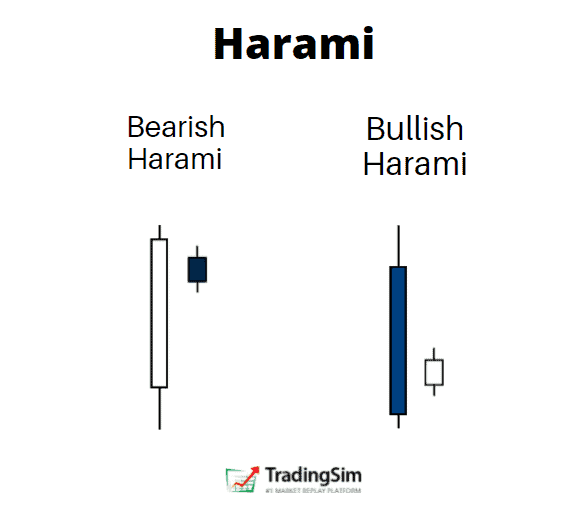
What is a Harami candle
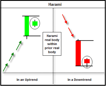
When the harami candlestick pattern appears, it depicts a condition in which the market is losing its steam in the prevailing direction. The harami candlestick pattern consists of a small real body that is contained within the preceding large candles’ real body.
The preceding candle tends to be very large in relation to the other candles around it. This is important.
Harami
What does a harami tell us about the condition of the market? During a bullish move, the harami candlestick indicator tells us that strength in the previous candle is dissipating.
Bulls who have made gains in the stock may be taking a breather to either accumulate more shares or sell out of their existing positions. The large preceding candle would signify climactic conditions in that regard.
In order to understand this, compare the Harami candle above against the Three White Soldiers below:
The obvious difference here is follow through versus hesitation after that first bar.
An Exception
While the bias of the harami candlestick pattern indicates a reversal, the appearance of a harami formation in day trading can actually be quite bullish if the highs of the bar prior to the harami are broken to the upside.
This would indicate that there was, in fact, buying going on within the harami bar.
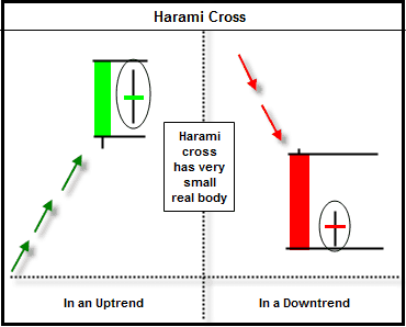
Harami Cross
The harami cross is a more powerful version of the harami. It is characterized by having a very small real body almost to the point of being a doji.
Harami Cross
The smaller the real body, the better for this formation.
The lack of a real body after a strong move in the prior candle tells us with more certainty that the previous trend is coming to an end and that a reversal may be at hand.
Bulls could not continue the upper hand and bears are putting on heavy selling pressure.
The high or low of a harami cross setup tends to provide resistance or support for any further price moves. Let’s take a look at a simple example that a day trader could have profited handsomely off of.
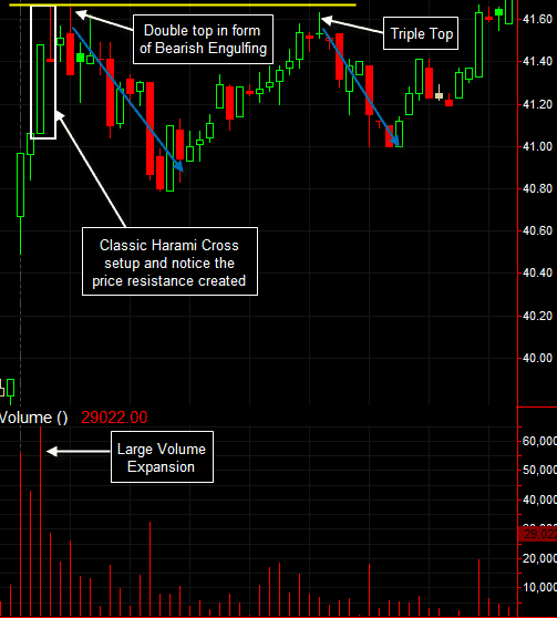
Harami Cross Example
As you can see, this was a perfect harami cross setup. But the important point was the fact that we saw other candlestick formations confirm what the harami cross was telling us.
Context is everything when interpreting candlestick patterns.
The double top that came in the form of a bearish engulfing candlestick gave us that added confirmation that we really did see a top of some sort.
Later, a triple top came in the form of a shooting star which also led us to believe that we could be in store for yet another pullback.
This is the power of candlesticks and using various methods to confirm each other.
Trading the Harami
Now that we have covered the basics of the harami candlestick pattern, it’s now time to dive into tradeable strategies. Please note all of the subsequent examples are on a 5-minute time frame, but the rules apply to other time frames just as well.
#1 – Trading Harami with Price Action
Since the harami candlestick pattern is a price action component in itself, we should always include price action analysis in our strategies.
Trading with price action means to rely fully on the price action on the chart. This means: no indicators, no oscillators, no moving averages, etc. You rely solely on chart patterns, candle patterns, support, resistance, and Fibonacci levels.
This is the 5-minute chart of Facebook from Sep 29, 2015. On the chart, you will see many colorful lines illustrating different price action patterns.
Harami + Price Action Trading
The Harami
First, we start with the red circle at the beginning of the chart. This is a 100% Harami candle! Yet, we do not enter the market, because the next set of candles do not validate a reversal.
We get one tiny red candle and the next one is a strong bullish candlestick. However, after the big green candle that follows, we get a second tiny red candle.
Notice how its body is contained by the bigger bullish candle. It is a bearish Harami!
Confirmation
In addition, with the next two red candles we confirm a Three Black Crows candle pattern, shown in the green circle. This is when we sell Facebook short and begin to follow the price action.
Within the orange lines, you will see a consolidation, which looks like a bearish pennant. Suddenly, Facebook’s price breaks the pennant to the downside and thus we continue to hold our short position.
Harami + Price Action Trading
Temporary Resistance
The further decrease in price then creates a bottom, marked with a green line. Then, we see a resistance level develop – the blue line. These are our next support and resistance levels for Facebook.
If the price breaks the support, we hold our position. If the price breaks the resistance, we exit the trade – literally that simple!
The price breaks the green support and we continue holding our short position. The new bottom after the decrease is now marked with a yellow line.
Note that the price retraces to the blue resistance level and then bounces back. Did you notice that we now have two tops on the same line and two bottoms on the same line? This is how we draw our bearish channel.
Capitulation
The price breaks the yellow support in a bearish direction giving us the confidence to hold our short position.
Harami + Price Action Trading
The price then drops to the lower level of the channel and starts to form a bottom. This looks like a regular correction, doesn’t it?
However, the blue lines at the end of the chart show how the price confirms a double bottom pattern. The double bottom is an early indication that price is likely to stabilize and lead to a potential rally.
The Exit
On that token, the next price increase confirms the double bottom pattern and the price closes outside of the downtrend channel, which has held the price down the entire trading day. At this point, the writing is on the wall and we exit our short position.
This short trade with Facebook brings us a profit of $3.30 per share for about 5 hours of work. What a great trade!
#2 – Trading Harami with a Fast EMA and Fibonacci Levels
This time, we will combine the Harami candle chart pattern with an exponential moving average and Fibonacci levels.
When you spot a Harami candlestick pattern, the key here is to use the moving average to set an entry point.
If the price moves in your favor, follow the retracement with the Fibonacci levels. Similarly, close the position when the price breaks a key Fibonacci support level or when the exponential moving average is broken in the opposite direction of the primary trend.
Harami + Fast EMA + Fibonacci Levels
This is a 5-minute chart of Apple from Nov 19, 2015. I am using a 5-period EMA for this example.
The first black line shows the overall bullish trend. At the top, we spot a bearish Harami candlestick pattern, which leads us to place the Fibonacci levels on the chart.
Confirmation
Two candles later, Apple’s price breaks the 5-period EMA downwards. This is when we go short.
Notice that there is definitely a strong support around the 23.6% Fibonacci level (the shaded red to green area of the chart). However, the price doesn’t close above the EMA with its full body.
For this reason, we hold our trade.
Capitulation and Exit
Eventually, Apple breaks 23.6% and keeps decreasing. A new drop to the 38.2% Fibonacci level appears (the bottom of the green shaded area). This is exactly when we close our position.
The reason for this is that we see a hammer candle after the price touches 38.2%. This gives us a sign to exit the position. Otherwise, we could hold until the price closes above the EMA.
This trade brought us a profit of $.77 cents per share in less than an hour.
#3 – Trading Harami with a Fast Oscillator
Since the Harami is a reversal pattern, we need a way to measure the likelihood of successful signal to reduce the noise. This is where a fast oscillator can be of great assistance in terms of trade validation.
Oscillators Explained
In daytrading, a fast oscillator can give more signals than the slower ones, so focus on these.
If you use the money flow or the price oscillator, the chance to match a Harami with an overbought/oversold signal is minimal. The stochastic oscillator on the other hand is great for trading haramis.
If you have an uptrend and you get a bearish harami candle, try confirming this signal with the stochastic. In this case, you will need an overbought signal from the stochastic.
Confirmation
Once you receive this additional signal, open a trade – a short position in our case. Then you can stay in the market until you get a contrary signal from the oscillator at the other end of the trade.
Let’s now see how this strategy works with the help of the stochastic oscillator:
Harami + Fast Oscillator
This is the 5-minute chart of Citigroup from Nov 19, 2015.
After a steady price increase, a bearish harami develops which is shown in the green circle on the chart. At the same time, the stochastic at the bottom of the chart has already been in the overbought area for about 7 periods.
This gives us a short signal.
Now that we are short Citigroup, we wait for an opposite signal from the stochastic. 5 periods later, the blue stochastic line hops into the oversold area for a moment.
Exit
This is the signal we were waiting for in order to close our trade. We exit the position and collect a profit of $.30 cents per share for 25 minutes of work.
#4 – Trading Harami with Bollinger Bands
In this trading strategy, we will combine the harami with bollinger bands. We will only trade the haramis that form at the outer edges, when the price touches a level of the upper or lower bollinger bands.
Entry & Exit
Once the price touches the upper bollinger band at the same time a harami is formed, open a short position. Likewise, hold the position until the price touches the lower bollinger band.
Harami + Bollinger Bands
This is the 5-minute chart of IBM from Dec 8, 2015.
The first black arrow shows an increase of IBM and price interaction with the upper bollinger band. In the green circle, you see a bearish harami candle.
This gives us a short signal and we open the trade.
We hold our trade until the price meets the lower bollinger band level –closing our position when the price closes the first bullish candle after touching the lower bollinger band level.
This happens 28 periods later, almost 2 hours after we entered the trade. This trade makes us a total profit of $1.07 per share on IBM.
Which strategy is better?
All four strategies are great for trading candlestick reversal patterns like the harami. Yet, according to our in-house trading expert Al Hill, if he had to pick a strategy, he’d prefer trading haramis with bollinger bands.
“I believe that bollinger bands are likely to give you less false signals and keep you in winning trades longer.”
Al Hill
Price action trading is often insufficient for making a trading decision, as it requires years of experience mastering chart patterns.
The EMA plus Fibonacci strategy is strongly profitable, but sometimes the fast EMA could knock you out of a winning trade relatively early.
Although the stochastics are one of the faster oscillators, it might take forever until you match your candle pattern with an overbought/oversold signal.
Consideration
One point to note is that these four trading strategies can be used in combination with all other candlestick reversal patterns.
Therefore, candlestick patterns like doji, hammer, inverted hammer, hanging man, shooting star, morning star, evening star, engulfing, etc. will provide you similar trading results as the harami candlestick pattern.
The harami candlestick pattern has trend reversal characteristics.
We confirm a harami at the end of a trend when a candle’s body fully contains the size of the next candle.
Since a harami is a secondary candle pattern, we need to confirm its signals with additional trading tools.
The four strategies covered in this article are applicable to other candlestick reversal patterns.
How to Practice
As with any pattern or strategy in the stock market, it takes time and effort to recognize them in real-time.
We recommend trading in a simulator with at least 20 successful attempts on this reversal pattern before employing real money in the market. The best part is that TradingSim has all the indicators you need to practice this strategy!
Once you have your dataset, you can measure your success. Then you will have confidence to take the trade knowing your ratio of wins to losses.
We have discussed a number of candlestick patterns on the Tradingsim blog. If you haven’t checked out our other resources be sure to do so, you’ll find a really nice candlestick pattern cheat sheet to help with your training. But for today, we’ll focus on the long and short side of the Abandoned Baby candlestick pattern.
In this post, you will learn how to spot both bearish and bullish abandoned baby patterns, how to trade them, and some caveats to watch out for.
If you would like to watch a video tutorial on how to trade candlestick patterns, subscribe to our Youtube channel. Our trading expert Aiman Almansoori has put together a great webinar on the topic.
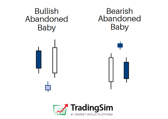
Abandoned Baby Definition
The abandoned baby candlestick pattern is a three bar reversal pattern. It is similar to the morning and evening star formations and is a very reliable reversal signal when it occurs after a sharp rise or drop.
While it is very similar to the morning star and evening star, it has one key difference. The real bodies and shadows cannot overlap from bar 1 to 2 and 2 to 3. This makes this pattern very unique, rare, and reliable at the same time.
Structure
The first candlestick is in the direction of the primary trend
The second candle is a doji which gaps in the direction of the primary trend, exhibiting no overlap with the real body or shadow of the previous candle
The third candle is in the opposite direction of the first day and gaps in the opposite direction of the doji.
When you think of the psychology of a candlestick pattern, it is best to think about the “story” between the bulls and bears. This can really help your confidence in knowing when to take the trade and understanding the context behind the pattern.
For example, during rallies off the bottom of an extended downtrend, a abandoned baby bottom can be very rapid as short sellers will be forced to cover fast.
Conversely, during declines after extended uptrends, the abandoned baby top can be just as fast as many longs sell their positions, aiming to keep most of their profits.
To that point, the abandoned baby represents a crossroads, or “indecision” at the top or bottom of a trend reversal. Within the candle is usually a lot of activity between retail buyers and institutional sellers, or vice versa. The result is typically a large amount of volume.
That volume tells us that a lot of effort went into the candle, but with little result, signaling the reversal.
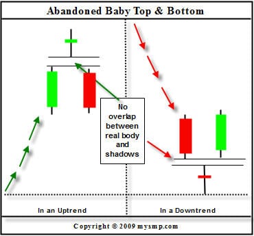
Chart Example
Abandoned Baby
In the above candlestick charting example, notice how the abandoned baby top comes in after a strong uptrend. This leaves the bulls trapped at the top of the formation with very little time to exit their winning positions, especially if they were buying at the top.
To the right of this formation is the abandoned baby bottom. This is the exact opposite of the abandoned baby top and is often the sight of a sharp short squeeze.
Congratulations! You are now familiar with the structure and characteristics of the abandoned baby candlestick pattern. Now it is time to apply trading techniques to the strategy with real market examples.
Trading the Abandoned Baby Candlestick Pattern
Bullish Example #1
We will now review a couple of chart examples, which show the price behavior after an abandoned baby candlestick pattern.
Bullish Abandoned Baby – Trend Increase
This is the 5-minute chart of Bank of America from June 2, 2015.
There is a clear downtrend, followed by an abandoned baby candlestick pattern, which is shown in the green rectangle.
After we identified the pattern, a strong uptrend emerges and BAC’s stock price increases a total of $0.25 per share. This may not sound like much of an increase, but Bank of America is a Titanic of a stock.
With larger cap stocks, what you are giving up in profits you don’t have to worry about in terms of risk.
Bullish Example #2
Let’s now review another example of this unique candlestick pattern.
Abandoned Baby – Trend Decline
This is the 5-minute chart of Netflix from May 5, 2015.
In the chart above, we see a bearish trend followed by an abandoned baby reversal candle pattern. You can see the formation in the green rectangle.
This time, the abandoned baby is a doji candle, which gives additional reliability to the pattern. The next candle opens with a gap from the abandoned baby, which confirms the pattern.
The followed bullish move is so strong, that even the next candle after the confirmed pattern opens with a bullish gap.
This trend reversal leads to a $3.42 price increase in Netflix.
Bearish Abandoned Baby Example
The lesson wouldn’t be complete without seeing this pattern play out bearishly.
Before the Covid Crash of 2020, the QQQ etf produced a beautiful climactic abandoned baby pattern before crashing for the next 4 weeks.
QQQ bearish abandoned baby chart
As you can see, this topping pattern occurred at the very top of an extended bull run, signaling the reversal. Perhaps the astute trader could have foreseen the crash if he’d known about this pattern?
Trading the Abandoned Baby
The good thing about the abandoned baby candlestick pattern is that if you spot it on the chart, you can trade it right away!
It is not necessary to use additional trading indicators to confirm the signal, because the pattern is pretty reliable.
This doesn’t mean that the pattern will work 100% of the time, so don’t go overboard!
Stop Loss Orders
When you trade the pattern you should always protect your trade with a stop loss order. The proper location of your stop should be or below the middle candle of the formation, depending on the direction of your trade.
Also, feel free to put the stop as tight as possible.
Profit Targets
You can always use a moving average or an oscillator to exit a trade. The other option is to rely on basic price action rules to close your profitable position.
In order to understand how this works, we’ll show you how to implement a few techniques when trading the pattern:
Abandoned Baby – Stop Loss
Above is the 5-minute chart of Electronic Arts from Oct 20, 2015.
After a strong price decrease, we see a candle which gaps down from the bearish trend (green rectangle). The next candle gaps up and we confirm a bullish abandoned baby.
We go long when the last candle of the pattern closes the period. Lastly, we put a stop loss order right below the lower wick of the abandoned candle as shown on the image.
EA’s stock price begins an impulse move higher and we start following the price action. Notice that the first candle from the pattern and the previous candle form a resistance area (blue horizontal line).
On its way up, EA breaks this resistance level. The price starts consolidating and the previous resistance begins acting as support (See the black arrows on the chart for reference).
The price starts increasing afterwards and breaks the high of this congestion area.
Notice that the two low wicks during the price hesitation help us build a bullish trend line – starting from the abandoned candle. The EA price tests the trend a couple more times without breaking it.
For this reason, we stay with our long position until the market closes.
In this trade, we generated a profit of $0.74 (74 cents).
Money Management when trading the Abandoned Baby Pattern
The abandoned baby candlestick pattern is one of the most reliable patterns.
As shown above, you can place tight stop loss orders when trading abandoned babies. This is because even a small contrary move will indicate that the pattern is false.
In the trade above, our stop loss was 0.42% from our entry price. Therefore, if you were to invest $40,000 of your buying power, a false pattern will lead to a maximum loss of $168.
However, the trade was successful and lead to a profit of 1.1% which translates to $440.
Managing with Moving Averages
Let’s now review another abandoned baby trade. This time though, we will rely on an exponential moving average to exit our trade.
Abandoned Baby – Profit Targets
Above you see the 5-minute chart of JP Morgan Chase & Co. from Nov 3, 2015. I have placed a 30-period exponential moving average on the chart, which is the blue curved line.
The chart begins with a price decrease, marked with the red arrow. At the end of the price decrease, we see a candle gapping down. This should be a signal for us that a potential abandoned baby candlestick pattern might occur on the chart.
Entry
The next candle gaps up and we confirm the pattern with its closing – we go long!
Let’s say we have a bankroll of $25,000. Since we have a day trading account we have a maximum buying power of $100,000.
Since the bullish and the bearish abandoned baby candlestick patterns are considered very reliable, we will invest 20% of our buying power. So, we invest $20,000 in a long trade based on an abandoned baby signal.
Stop Loss
Our stop loss is set below the lower candle wick of the abandoned candle. This is shown on the image above. In this trade, the stop is -0.45% from the entry price. This way, if our trade is unsuccessful, we will lose $90 (20,000 x 0.0045).
Abandoned Baby – Profit Targets
After the confirmation of the pattern, JPM stock begins increasing. JPM reaches $65.86 and starts a corrective move. Notice that the price decreases, but it finds support at our 30-period EMA.
JPM price expands and breaks the $65.86 top and shoots to $66.06. Then we see a new decrease to the 30-period EMA. The price starts crawling on the exponential moving average afterwards; however, the level sustains the pressure of the price and we notice a new bounce from the 30-period EMA.
Exit
Although the price makes more of a sideways move rather than an increase, we see a new top at $66.10. The followed price action is in a bearish direction. The JPM stock price breaks the 30-period EMA, which is our signal to exit the trade.
In this trade, we managed to catch a .71% increase in JPM. This breaks down to a profit of $142 while risking $90. This gives us a 1: 1.58 risk-to-return ratio. Although this doesn’t look very impressive, $142 dollars here or there can add up to a mortgage payment at the end of the month.
Although the example above only uses 20% of your buying power, you can always invest more if you have really tight stops.
In comparison to other patterns, where you sometimes risk 2%, the abandoned baby candlestick pattern does not require you to have wide stops.
Just remember: you must use a stop loss order when trading abandoned babies. If you don’t place a stop, an unlucky trade might lead to tremendous losses, since you are leveraging your capital.
Recap
The abandoned baby is a three candle formation.
It resembles the evening and the morning star.
The doji candle needs to gap from the two candles which sandwich the pattern.
There should be no overlaps between the middle candle and the two candles surrounding it.
The abandoned baby is one of the rarest candle patterns.
A stop loss order should always be used when trading the abandoned baby candlestick pattern.
Stop loss proper location is at the end of the lower candlewick of the abandoned candle.
You can invest more than you usually invest in your deals when trading abandoned baby candle figures. There are two basic reasons for this:
The abandoned baby is a pattern with a very high success rate.
The stop loss when trading abandoned baby figures is usually placed very tightly. In some cases, you will risk less than 0.5% of your investment.
For this reason, there is no better way to practice than a stock simulator.
Be sure to ask yourself questions along the way, like these:
Is the trend in my favor?
Is it time for a reversal?
Does volume confirm my thesis?
Is the stock at an area of support or resistance?
Do multiple timeframes align with my idea?
What will I risk to, and where should I target for profit taking?
In time, you’ll find yourself confident in the pattern. Good luck!
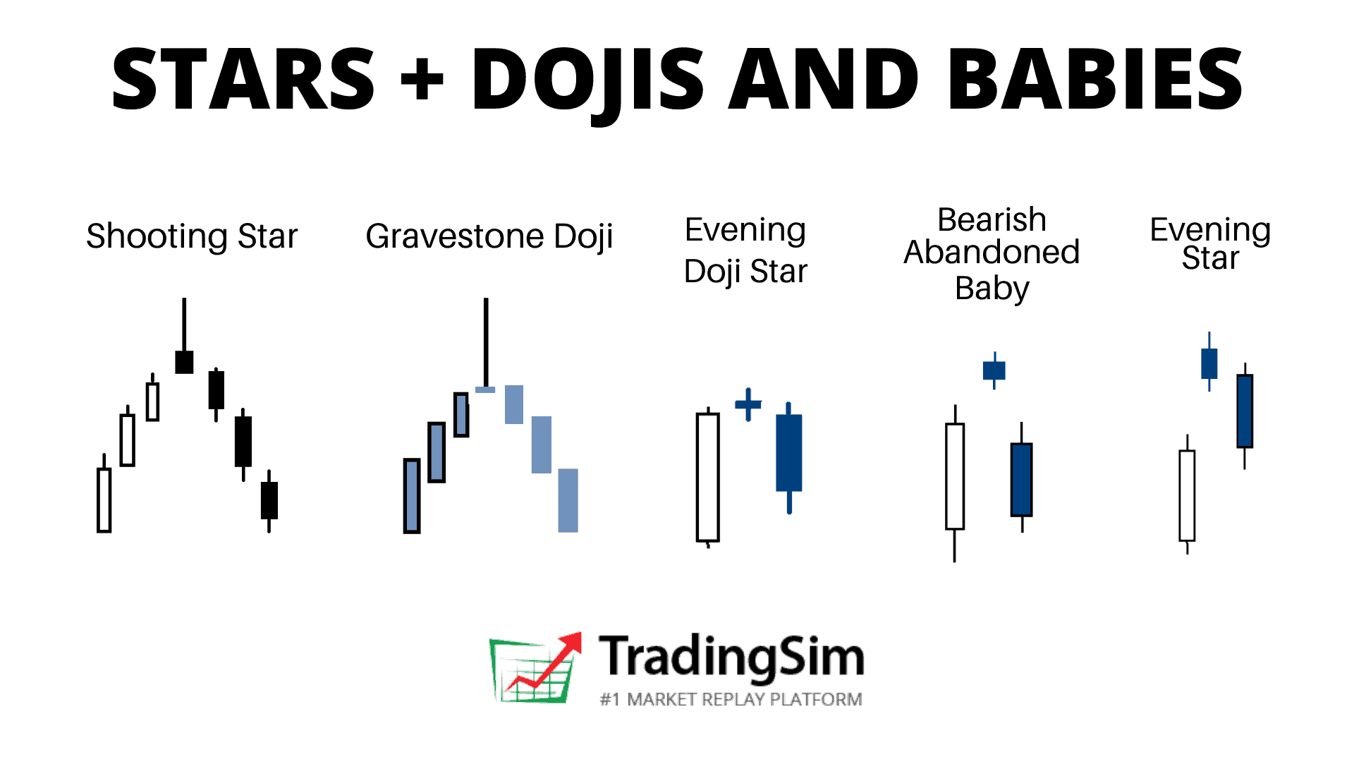
Candlestick patterns can have some crazy names sometimes. Stars, dojis, and abandoned babies? The Japanese were fond of naming candlestick patterns after real-life visual representations. Shooting stars, morning stars, evening stars and abandoned babies are all examples of indecision reversal candle patterns. We’ll introduce you to them in this post.
If you haven’t checked out our complete explanation of candlestick patterns, be sure to do so. In it, we cover the construction of a candlestick chart, the history of candlesticks, and common candlestick reversal patterns. It also has a link to a free cheat sheet that includes the stars, dojis, and baby patterns.
What are Candlestick Stars?
As noted above, stars are a type of indecision candle. Typically we want to trade them as a powerful reversal pattern. But as with all candlestick patterns, context is everything.
Types of Candlestick Stars
The key rule to a star is that its real body does not overlap the previous candles real body. There are several variations of the star pattern:
morning star
evening star
doji star
shooting star
The Body
Stars will typically have a small body. This is particularly important for psychological reasons which we’ll get into in a moment. But for now, suffice it to say that stars usually open and close very tightly.
The small body of a star candle
Of course, these candles can appear anywhere on a chart. With the examples below, we’ll teach you the proper context where they should appear for profitable reversal patterns.
Exhaustion Gaps
On a daily chart, the Candlestick Stars will typically appear with a gap at the highs of an extended run, or the lows of an extended sell off. This is the key to the reversal patterns
Candlestick Stars will typically be associated with increased volume at these climactic ends as well. This also is part of the psychology of the pattern.
Psychology of the Candlestick Star Pattern
As a star has a small real body, it represents indecision by bulls and bears.
How so?
Think about it this way:
When a stock is trending upward aggressively, strong hands and institutions will be selling into that strength. Meanwhile, retail traders may be buying here unaware that the stock is about to turn.
Likewise, because the stock is so extended, short sellers will be initiating their positions as well, adding more supply to the stock.
As all of this occurs at once, we get a star candle that can’t seem to make up its mind on moving higher or lower. A lot of activity, but not much movement in either direction. That is, until the next candle.
While the primary trend is still intact, the presence of the star is the first sign that the trend could turn. Think of it like a crossroads.
It is the second candle that will tell us whether the reversal pattern is confirmed or not.
Candlestick Star Variations
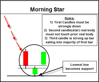
Morning Star
Morning Star
The morning star candle is a bottom reversal signal that comes after an extended downtrend.
This pattern is a three candle reversal setup. The first two bars are the typical star setup discussed above. The major difference with this pattern is the third candle in the formation.
It is a very strong green candle, which does not have to be a gap and closes at least halfway into the first candle.
Assessing the Strength of the Morning Star Signal
The further the green reversal candle closes into the first bar (the red bar preceding the star), the more bullish the formation.
On that note, outside of the morning star candlestick pattern revealing itself, look for other indications that this pattern is confirming. For example, you want to see high volume in the third candle, indicating strength.
Additionally, the morning star works very well when it occurs at previous support levels. The more criteria you can find, the better.
On the other side of the coin, if you buy a stock that prints the morning star, be prepared for some sort of pullback.
It is not uncommon for that to happen nearly 50% of the time. If there is a violation of the lows, then the morning star is failed.
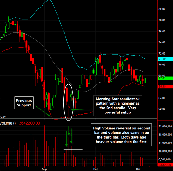
Let’s take a look at the morning star candlestick at work with a live trading example.
Morning Star Trading Example
VLO Morning Star
This is a beautiful morning star setup.
First of all, the morning star came in at previous support near the 60.37 level. The star candle came in the form of a hammer.
There was high volume that came along with the hammer, and this was an even bigger sign that this level would hold as support. The following day, the stock accelerated with a gap higher and closed well into the top half of the first bar.
As mentioned earlier, the presence of this pattern does not indicate an immediate rally. As you can see, the gap created from the second to the third bar was backfilled.
Smaller gaps, such as this one, tend to fill in the short term. Even if one had waited for the high of the third candle in morning star to be broken above, five points could have been made in that short amount of time.
Evening Star
The evening star candlestick is the bearish version of the morning star.
Bearish Star Candle
It is a top reversal pattern that occurs after a sustained uptrend. The evening star is also a three candle pattern.
Evening Star Formation
The first candle is a strong bullish candle. The second candle is the star, and the third is a red body that closes well into the first candle.
Again, as with the bullish morning star, the third candle in the evening star does not have to be a gap.
Here are a couple of factors that increase the chances of this pattern succeeding:
The real bodies of all three candles do not overlap
The third candle closes well into the first one; preferably regaining 75% of the candle
Volume should lighten up on the first candle and increase on the third.
Just as the lows of the morning star pattern provide support, the highs of the evening star candle formation serve as resistance to any further upside movement.
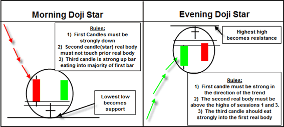
Doji Stars
A candlestick doji pattern is a candle that lacks a real body. This means the open and close of the bar are essentially the same. It has a strong significance after substantial advances or declines.
The lack of direction is a potent reversal signal, especially if it is followed by a candle in the anticipated direction, and at the end of a trend.
When a doji is the star within the morning star and evening star candlestick patterns, the formations are known as the morning doji star and evening doji stars.
Doji Star
Notice, the Evening Doji star image above is an abandoned baby top, while the morning doji star is not. We’ll explain why below.
Abandoned Baby Candle
Another extremely powerful version of the doji star is the abandon baby top or abandon baby bottom. This pattern is the equivalent to what some know as the island reversal.
Abandoned Baby Patterns
The abandoned baby candlestick has a doji as the second candle with a gap on both sides.
If you think about the psychology of this setup, the first gap came in an exhaustive fashion.
The stock was already in a strong uptrend or downtrend, and then it made a gap which closed near its open. This was the first sign that the directional pressure was fading.
Now, with the third candle gapping in the opposite direction of the trend, we have confirmation that a more significant trend reversal has taken place.
The Shooting Star
Shooting Star
The final star variation we will discuss is the shooting star, which occurs after a strong uptrend (or the inverted hammer that occurs after a strong move down).
The shooting star has a long upper shadow with a small real body at the lower end of the candle. This pattern usually presents itself as a sign of a short term correction rather than a more potent reversal signal.
Along those lines, it is telling us that the market’s rally could not be sustained. The market opened at or near its lows, shot up much higher and then reversed to close near the open.
The Body
Ideally, the real body of the shooting star should gap away from the previous candles’ real body. While it is not necessary, it adds confirmation to the validity of the impending reversal.
Why? Again, it all has to do with exhaustion in either direction.
Additionally, take a look at the previous candles; many times you will see overhead shadows on those candles as well. This indicates that the stock is struggling to go higher; just another clue as to what might happen.
When a shooting star forms near a resistance level, a very powerful resistance level is created.
As mentioned before, the shooting star is a short term topping formation, and any break above the high of this candle is a failed confirmation.
Variations
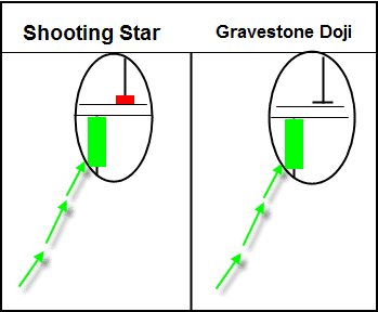
Shooting Star and Gravestone Doji
There is one variation to the shooting star you should consider; it is known as the gravestone doji. The gravestone doji is a shooting star with virtually no real body, the open and close are exactly the same.
This formation is more powerful than the typical shooting star and portends a more serious reversal.
Summary
Candlestick patterns are a great way to assess the trend of a stock. The key to its secret is the fact that candlesticks are a visual representation of price action.
These reversal candles can help the astute trader anticipate a trend change or continuation. Just remember, you need other validation points. These can come in the form of a technical indicator or other chart patterns.
How Can Tradingsim Help?
You can use Tradingsim to scan the markets and locate these candle reversal patterns. You can then apply your own trading strategy to find the optimum setups for profits.
Work on developing your own specific rules for entries, stops, and targets.
As always, be sure to ask yourself the following questions when practicing any setup:
what qualities work for each particular setup
what criteria were met, or not met
how was volume associated with the pattern
where could you have set your risk and profit target