Averaging down is the popular way to describe buying more of a position as a stock goes down. It’s akin to seeing something you think is valuable in a supermarket getting marked down over and over again. And because you believe it is undervalued, you buy more of it as the price plummets.
But is the averaging down trading strategy profitable over the long-term? How about when day trading? What are the pitfalls?
In this post, we will cover the basics of the averaging down trading strategy and why this approach can be dangerous for your portfolio. We’ll also look at why “averaging up” on a short position can be even more dangerous. Lastly, we’ll give an example of when averaging down might work.
What is Averaging Down?
Averaging down is the process of adding to a position as it goes counter to your initial transaction. You can also “average up” in a position when you are trying to short it. In other words, you sell more shares short as the price rises — moving your average price up as you go.
In theory, this makes sense because it will allow you to obtain the same asset at a better price. Therefore, you can average down or up on the entry price and, in turn, increase the profits when you close out the position.
That being said, there is one major flaw in this strategy. You have no clue which trades will go in your favor and which will continue to slide against you.
A Competing Theory
Opponents of this strategy point to the old adage of cutting your losers and letting your winners run. This sounds easy enough, but why is this so hard to do?
The answer to that question is rooted in the fundamental human nature to hope. Just like other parts of our ordinary lives, we tend to want to hang on to things too long, hoping they’ll change for the better.
For this reason, when we see a stock is no longer going in our favor, instead of taking the loss, we do what we think is the “smart” thing and add to the position. It’s all based upon our ego and not wanting to be wrong.
Yet while change may inevitably come, all too often that hope may take us on a ride far longer and more costly than we ever imagined.
If you can accept a loss for what it is, then trading becomes one of the most straightforward business operations you could ever undertake. But instead of treating our trades like a business decision, we get stuck in the emotional attachment of holding on.
Investors use phrases like averaging down to justify their risky actions of not only holding onto a losing position but adding to them.
To understand the psychology of it all, let’s step back from the trading game for a second and look at the concept another way.
Would You Average Down with any Other Business?
To simplify the concept of averaging down, let’s say you owned a small housewares shop. In this shop, you sell all types of products.
But you recently added a new style of toaster that is going to change how people eat their breakfast.
Placing the toaster in your front window with banners and ribbons, you think the toasters will fly off the shelf. You believe in the product.
However, to your surprise, you were only able to sell one toaster in an entire week.
You look over your inventory sheet, and you realize that you have 499 toasters left to sell, so you begin to worry a little and place a phone call to the supplier.
Somehow Things Get Worse
The supplier empathizes with your concerns.
To help you out, they offer an additional 20% discount to improve your margins. This time, you know that things will be better because you can average down on the price you paid for the toaster.
Perhaps the only reason the toaster is not selling is due to the sale price.
With that in mind, you take the supplier up on their offer. You now own 1,000 toasters. 2/3 of your inventory are priced at the discounted rate — a better average price.
You mark the price down slightly, but to your surprise, there is no additional interest. You are still unable to sell any toasters.
What would you do at this point? Would you average down again?
Take a look at what this activity would look like on a stock chart. Imagine if these shares of Citigroup were toasters:
As you can see, trading is just like any other business. So, why expose your trading account to this risky behavior?
2008 Mortgage Crisis – Example of Averaging Down
For those of you that can remember the bear market in 2008, it was nothing short of brutal. The market fell off a cliff and just kept going.
As an investor, you may have decided to buy the Dow Jones as it was tanking. This is what it would have looked like:
As we all know, the Dow is now trading back over 30,000. However, it has taken 13 years to get there. Why not let others clamor for the bottom in pricing, while you pick up the pieces once they’re exhausted?
Only Average Down from a Position of Strength
This may sound a bit contradictory at first? Let’s explain.
A position of strength means you are buying into the dips of a strong trend.
You can get a better feel for the concept through chart illustrations. Let’s examine a few.
Comparing the two charts below, which stock would you want to average down on?
Strong UptrendWeak Uptrend
You are probably thinking, well you can’t average down in the first one because it’s at highs and showing real strength.
Well, that’s precisely what we want to see.
You just need to go to a lower time frame, like 5 minutes for example, to find an opportunity where you can average down in the stock. The $23 level was finding support on the daily chart, so we zoom into the 5min chart and place our “dip buys” there.
Average Down on 5 Minute Chart
Remember, this stock was at multi-month highs on a daily chart. So, buying into this stock would be buying right as it is breaking out on an intraday and daily basis.
We call these constructive pullbacks. They are different from reversals and capitulations. Ideally, they occur in a young, strong uptrend, where we expect more highs.
This is how you buy from a position of strength.
To reiterate: averaging down can be very risky. But, if you are going to do it, you have to buy into a stock that is trending strongly.
Closing Trades You’ve Averaged Into
There are two choices you have when deciding how to close out your trades. Please review each approach in detail and think back to your trades to see which one will work best for you.
Close Out the Position in Pieces
If you fid yourself in the position of having averaged down on a trade, it may make sense to close the position out in pieces.
For example, if you had four buys into a falling stock, you would have the same four sells to exit the trade.
Now, this is where it gets a bit tricky.
If you are up on the position and you want to scale out as things go in your favor, this makes total sense. You are never going to go broke taking money out of the market as things go your way.
Scaling Out
In the above chart example, you can see three entries and three sells. This scenario would be the best you can hope for with this approach.
Averaging down would have allowed you to gain a better average share price, while you are then later able to scale out of the position at much higher prices.
Again, this is assuming the entries were from a constructive overall pullback.
Two Things Required to Close Out in Pieces
There are two pieces to this puzzle you need in your favor.
Firstly, as you average down, you need the stock to hold up and not continue lower. In other words, a constructive pullback into an area of support like we mentioned earlier.
Secondly, the rally not only turns a profit for you but rallies strongly enough that you can sell out in equal pieces.
This even more challenging of a concept when you factor in day trading, as the morning high set within the first hour of trading is often the high for the entire day.
Again, this can be a risky trade if the stock doesn’t bounce. Imagine the example below:
ALF average down
In this event, how do you scale out of a losing position? Assuming you didn’t sell at the bottom.
This is where paralysis could set in and as stated earlier, you now take a massive loss as you are carrying a large position after averaging down and you are completely vulnerable.
Close Entire Position
If you are closing your entire position, you are doing so for one of two reasons: (1) you have hit your target price or (2) you are getting crushed, and your stop loss was triggered.
Hit Your Target Price
Buying from a position of strength means being in a stock that is going in your favor soon after your entry. This is ideal.
As we mentioned earlier, this typically occurs in a strong uptrend, or right after a constructive pause in that trend.
Nice and Easy
In these slow and steady stocks, it is easier to sit tight until your target is reached.
The benefit of holding your entire position until you reach your target is reaping all the profits at the highest price. The downside is you are completely exposed until your goal is reached.
Stop Loss Exit
This one typically hurts the most for amateur traders. But for experienced traders, it doesn’t hurt as badly.
Why?
Disciplined traders only put on trades when all their criteria are met. This doesn’t mean they have a 100% chance of success in the trade. It just means they have a high probability of success.
So when their stop losses are hit. They don’t take it personally. They chalk it up to the 15% of trades they know they’ll lose.
On the other hand, the amateur trader is averaging down during this process. And depending on how you averaged down will determine how much pain you are feeling as the stock goes against you.
However, like the professional trader, if you have a set amount you use on every trade and you scale in, then while you will take a loss, it may still be manageable.
Now, if you use a set amount per trade, but have gone beyond your standard per trade amount and have doubled or tripled your exposure when averaging down – you are in trouble.
Regardless of the amount of pain due to the loss, closing out the position at your predetermined stop is the right decision.
In Summary
Ultimately, averaging down or up is your decision as a trader. As we have recommended, if you are going to average down, do it from a position of strength.
Better yet, we encourage you to track your results over a minimum of 20 trades or more in a simulated environment.
See if averaging down has helped improve your bottom line before you put real money to risk.
Good luck!
We have discussed a number of candlestick patterns on the Tradingsim blog. If you haven’t checked out our other resources be sure to do so, you’ll find a really nice candlestick pattern cheat sheet to help with your training. But for today, we’ll focus on the long and short side of the Abandoned Baby candlestick pattern.
In this post, you will learn how to spot both bearish and bullish abandoned baby patterns, how to trade them, and some caveats to watch out for.
If you would like to watch a video tutorial on how to trade candlestick patterns, subscribe to our Youtube channel. Our trading expert Aiman Almansoori has put together a great webinar on the topic.
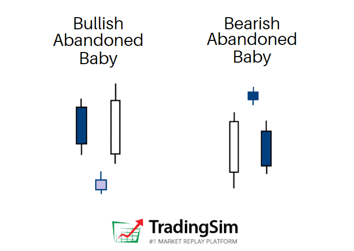
Abandoned Baby Definition
The abandoned baby candlestick pattern is a three bar reversal pattern. It is similar to the morning and evening star formations and is a very reliable reversal signal when it occurs after a sharp rise or drop.
While it is very similar to the morning star and evening star, it has one key difference. The real bodies and shadows cannot overlap from bar 1 to 2 and 2 to 3. This makes this pattern very unique, rare, and reliable at the same time.
Structure
The first candlestick is in the direction of the primary trend
The second candle is a doji which gaps in the direction of the primary trend, exhibiting no overlap with the real body or shadow of the previous candle
The third candle is in the opposite direction of the first day and gaps in the opposite direction of the doji.
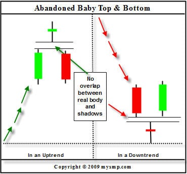
When you think of the psychology of a candlestick pattern, it is best to think about the “story” between the bulls and bears. This can really help your confidence in knowing when to take the trade and understanding the context behind the pattern.
For example, during rallies off the bottom of an extended downtrend, a abandoned baby bottom can be very rapid as short sellers will be forced to cover fast.
Conversely, during declines after extended uptrends, the abandoned baby top can be just as fast as many longs sell their positions, aiming to keep most of their profits.
To that point, the abandoned baby represents a crossroads, or “indecision” at the top or bottom of a trend reversal. Within the candle is usually a lot of activity between retail buyers and institutional sellers, or vice versa. The result is typically a large amount of volume.
That volume tells us that a lot of effort went into the candle, but with little result, signaling the reversal.
Chart Example
Abandoned Baby
In the above candlestick charting example, notice how the abandoned baby top comes in after a strong uptrend. This leaves the bulls trapped at the top of the formation with very little time to exit their winning positions, especially if they were buying at the top.
To the right of this formation is the abandoned baby bottom. This is the exact opposite of the abandoned baby top and is often the sight of a sharp short squeeze.
Congratulations! You are now familiar with the structure and characteristics of the abandoned baby candlestick pattern. Now it is time to apply trading techniques to the strategy with real market examples.
Trading the Abandoned Baby Candlestick Pattern
Bullish Example #1
We will now review a couple of chart examples, which show the price behavior after an abandoned baby candlestick pattern.
Bullish Abandoned Baby – Trend Increase
This is the 5-minute chart of Bank of America from June 2, 2015.
There is a clear downtrend, followed by an abandoned baby candlestick pattern, which is shown in the green rectangle.
After we identified the pattern, a strong uptrend emerges and BAC’s stock price increases a total of $0.25 per share. This may not sound like much of an increase, but Bank of America is a Titanic of a stock.
With larger cap stocks, what you are giving up in profits you don’t have to worry about in terms of risk.
Bullish Example #2
Let’s now review another example of this unique candlestick pattern.
Abandoned Baby – Trend Decline
This is the 5-minute chart of Netflix from May 5, 2015.
In the chart above, we see a bearish trend followed by an abandoned baby reversal candle pattern. You can see the formation in the green rectangle.
This time, the abandoned baby is a doji candle, which gives additional reliability to the pattern. The next candle opens with a gap from the abandoned baby, which confirms the pattern.
The followed bullish move is so strong, that even the next candle after the confirmed pattern opens with a bullish gap.
This trend reversal leads to a $3.42 price increase in Netflix.
Bearish Abandoned Baby Example
The lesson wouldn’t be complete without seeing this pattern play out bearishly.
Before the Covid Crash of 2020, the QQQ etf produced a beautiful climactic abandoned baby pattern before crashing for the next 4 weeks.
QQQ bearish abandoned baby chart
As you can see, this topping pattern occurred at the very top of an extended bull run, signaling the reversal. Perhaps the astute trader could have foreseen the crash if he’d known about this pattern?
Trading the Abandoned Baby
The good thing about the abandoned baby candlestick pattern is that if you spot it on the chart, you can trade it right away!
It is not necessary to use additional trading indicators to confirm the signal, because the pattern is pretty reliable.
This doesn’t mean that the pattern will work 100% of the time, so don’t go overboard!
Stop Loss Orders
When you trade the pattern you should always protect your trade with a stop loss order. The proper location of your stop should be or below the middle candle of the formation, depending on the direction of your trade.
Also, feel free to put the stop as tight as possible.
Profit Targets
You can always use a moving average or an oscillator to exit a trade. The other option is to rely on basic price action rules to close your profitable position.
In order to understand how this works, we’ll show you how to implement a few techniques when trading the pattern:
Abandoned Baby – Stop Loss
Above is the 5-minute chart of Electronic Arts from Oct 20, 2015.
After a strong price decrease, we see a candle which gaps down from the bearish trend (green rectangle). The next candle gaps up and we confirm a bullish abandoned baby.
We go long when the last candle of the pattern closes the period. Lastly, we put a stop loss order right below the lower wick of the abandoned candle as shown on the image.
EA’s stock price begins an impulse move higher and we start following the price action. Notice that the first candle from the pattern and the previous candle form a resistance area (blue horizontal line).
On its way up, EA breaks this resistance level. The price starts consolidating and the previous resistance begins acting as support (See the black arrows on the chart for reference).
The price starts increasing afterwards and breaks the high of this congestion area.
Notice that the two low wicks during the price hesitation help us build a bullish trend line – starting from the abandoned candle. The EA price tests the trend a couple more times without breaking it.
For this reason, we stay with our long position until the market closes.
In this trade, we generated a profit of $0.74 (74 cents).
Money Management when trading the Abandoned Baby Pattern
The abandoned baby candlestick pattern is one of the most reliable patterns.
As shown above, you can place tight stop loss orders when trading abandoned babies. This is because even a small contrary move will indicate that the pattern is false.
In the trade above, our stop loss was 0.42% from our entry price. Therefore, if you were to invest $40,000 of your buying power, a false pattern will lead to a maximum loss of $168.
However, the trade was successful and lead to a profit of 1.1% which translates to $440.
Managing with Moving Averages
Let’s now review another abandoned baby trade. This time though, we will rely on an exponential moving average to exit our trade.
Abandoned Baby – Profit Targets
Above you see the 5-minute chart of JP Morgan Chase & Co. from Nov 3, 2015. I have placed a 30-period exponential moving average on the chart, which is the blue curved line.
The chart begins with a price decrease, marked with the red arrow. At the end of the price decrease, we see a candle gapping down. This should be a signal for us that a potential abandoned baby candlestick pattern might occur on the chart.
Entry
The next candle gaps up and we confirm the pattern with its closing – we go long!
Let’s say we have a bankroll of $25,000. Since we have a day trading account we have a maximum buying power of $100,000.
Since the bullish and the bearish abandoned baby candlestick patterns are considered very reliable, we will invest 20% of our buying power. So, we invest $20,000 in a long trade based on an abandoned baby signal.
Stop Loss
Our stop loss is set below the lower candle wick of the abandoned candle. This is shown on the image above. In this trade, the stop is -0.45% from the entry price. This way, if our trade is unsuccessful, we will lose $90 (20,000 x 0.0045).
Abandoned Baby – Profit Targets
After the confirmation of the pattern, JPM stock begins increasing. JPM reaches $65.86 and starts a corrective move. Notice that the price decreases, but it finds support at our 30-period EMA.
JPM price expands and breaks the $65.86 top and shoots to $66.06. Then we see a new decrease to the 30-period EMA. The price starts crawling on the exponential moving average afterwards; however, the level sustains the pressure of the price and we notice a new bounce from the 30-period EMA.
Exit
Although the price makes more of a sideways move rather than an increase, we see a new top at $66.10. The followed price action is in a bearish direction. The JPM stock price breaks the 30-period EMA, which is our signal to exit the trade.
In this trade, we managed to catch a .71% increase in JPM. This breaks down to a profit of $142 while risking $90. This gives us a 1: 1.58 risk-to-return ratio. Although this doesn’t look very impressive, $142 dollars here or there can add up to a mortgage payment at the end of the month.
Although the example above only uses 20% of your buying power, you can always invest more if you have really tight stops.
In comparison to other patterns, where you sometimes risk 2%, the abandoned baby candlestick pattern does not require you to have wide stops.
Just remember: you must use a stop loss order when trading abandoned babies. If you don’t place a stop, an unlucky trade might lead to tremendous losses, since you are leveraging your capital.
Recap
The abandoned baby is a three candle formation.
It resembles the evening and the morning star.
The doji candle needs to gap from the two candles which sandwich the pattern.
There should be no overlaps between the middle candle and the two candles surrounding it.
The abandoned baby is one of the rarest candle patterns.
A stop loss order should always be used when trading the abandoned baby candlestick pattern.
Stop loss proper location is at the end of the lower candlewick of the abandoned candle.
You can invest more than you usually invest in your deals when trading abandoned baby candle figures. There are two basic reasons for this:
The abandoned baby is a pattern with a very high success rate.
The stop loss when trading abandoned baby figures is usually placed very tightly. In some cases, you will risk less than 0.5% of your investment.
For this reason, there is no better way to practice than a stock simulator.
Be sure to ask yourself questions along the way, like these:
Is the trend in my favor?
Is it time for a reversal?
Does volume confirm my thesis?
Is the stock at an area of support or resistance?
Do multiple timeframes align with my idea?
What will I risk to, and where should I target for profit taking?
In time, you’ll find yourself confident in the pattern. Good luck!
Today we will dive deep into the significance of Pivot Points for day trading. When you finish reading this article, you will understand the 5 reasons why day traders love using them for entering and exiting positions, and how you can employ them as a part of your overall trading plan.
Feel free to watch our free tutorial on Pivot Points by in-house daytrading expert, Al Hill. Al is a 20-year trading veteran.
What Are Pivot Points
As a technical analysis indicator, a pivot point uses a previous period’s high, low, and close price for a specific period to define future support. In addition, other small calculations determine the “outside” points.
Together, these can determine the bounds of a stock price over different time periodsgiving traders an edge on the market.
7 Pivot Point Levels Explained
There are seven basic pivot levels on the chart:
7 key Pivot Points explained
History of Pivot Points
Pivot points were originally used by floor traders on stock exchanges. They used the high, low, and close prices of the previous day to calculate a pivot point for the current trading day.
This calculation helped them notice important levels throughout the trading day. Pivot points have predictive qualities, so they are considered leading indicators to traders.
The main pivot point is the most important price level for the day. Essentially, it represents the balance between bullish and bearish forces.
In other words, when prices are above the pivot point, the stock market is considered bullish. If prices fall below the pivot point, the market is considered bearish.
While pivot points were originally used by floor traders, they’re now used by many retail traders, especially in equities and forex.
5 Reasons Why Day Traders Love Pivot Points
1) Unique for Day Trading
The pivot points formula takes data from the previous trading day and applies it to the current trading day. In this manner, the levels you are looking at are applicable only to the current trading day. This makes the pivot points the ultimate unique indicator for day trading.
2) Short Time Frames
Since the pivot points data is from a single trading day, the indicator can only be applied to shorter time frames. The daily and the 30-minute chart will not work, because it will show only one or two candles.
The best timeframes for the pivot point indicator are 1-minute, 2-minute, 5-minute, and 15-minute. Hence, its use for day traders.
3) High Accuracy
The pivot point indicator is one of the most accurate trading tools. The reason for this is that the indicator is used by many day traders, professional and retail alike.
This will allow you to trade with confidence and the flow of the market.
4) Rich Set of Data
Pivot points on charts provide a rich set of data. As we discussed above, the indicator gives seven separate trading levels. This is definitely enough to take a day trader through the trading session.
5) Easy to Use
The PP indicator is an easy-to-use trading tool. Most of the trading platforms offer this type of indicator. This means that you are not required to calculate the separate levels; in fact, the Tradingsim platform will do this for you. Your only job will then be to trade the bounces and the breakouts of the indicator.
Pivot Point Calculation
Daily pivot points are calculated based on the high, low, and close of the previous trading session.
When you add the seven pivot levels, you will see 7 parallel horizontal lines on the chart.
Pivot Points
The above chart is zoomed out in order to show all 7 pivot levels.
Let’s now discuss the way each of the seven pivot points is calculated. First, we need to start with calculating the basic pivot level (PP)– the middle line.
PP Calculation
Below is the formula [1] you should use to determine the PP level on your chart:
Pivot Point (PP) = (Prior Daily High + Low + Close) / 3
R1 R2 S1 S2 Pivot Levels Calculation
Now that we know how to calculate the PP level, let’s proceed with calculating the R1, R2, S1, and S2 pivot levels:
R1 = (2 x Pivot Point) – Prior Daily Low
R2 = Pivot Point + (Prior Daily High – Prior Daily Low)
S1 = (2 x Pivot Point) – Prior Daily High
S2 = Pivot Point – (Prior Daily High – Prior Daily Low)
R3 S3 Pivot Levels Calculation
We are almost done with the pivot point calculation. There are two more levels to go – R3 and S3.
R3 = Daily High + 2 x (Pivot Point – Prior Daily Low)
S3 = Daily Low – 2 x (Prior Daily High – Pivot Point)
See that the formulas for R1, R2, R3, S1, S2, and S3 all include the PP value.
This is why the basic pivot level is crucial for the overall pivot point formula. Therefore, you should be very careful when calculating the PP level. After all, if you incorrectly calculate the PP value, your remaining calculations will be off.
Pivot Points 2
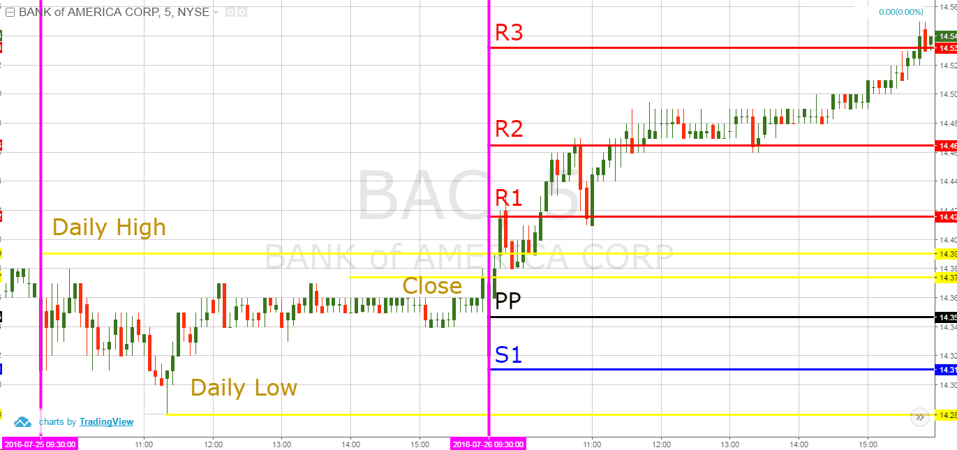
You are now looking at a chart, which takes two trading days. Each trading day is separated by the pink vertical lines. We use the first trading session to attain the daily low, daily high, and close.
Daily High = 14.39
Daily Low = 14.28
Close = 14.37
Then we apply the three values in the formulas above, and we get the following results:
PP = 14.35
R1 = 14.42
R2 = 14.46
R3 = 14.53
S1 = 14.31
S2 = 14.24 (not visible)
S3 = 14.20 (not visible)
5 Different Kinds of Pivot Points
Here are five types of the most popular pivot points.
1. Standard pivot points
Standard pivot points are the most basic pivot points that day traders can calculate. First, traders start with a base pivot point. That’s the average of the high, low, and close from a previous period.
Below is the complete calculation for standard pivot points.
To calculate the Base Pivot Point:
(P) = (High + Low + Close)/3 calculate the First Support Level: Support 1 (S1) = (P x 2) – High
When calculating the Second Support Point:
Support 2 (S2) = P – (High – Low)
To calculate the First Resistance Level:
Resistance 1 (R1) = (P x 2) – Low
When calculating the Second Resistance Level:
Resistance 2 (R2) = P + (High – Low)
2. Fibonacci Pivot Points (The Most Popular)
The Fibonacci pivot point is perhaps the most popular among traders.
Fibonacci extensions, retracements, and projections are commonly used in forex, but are used with equities as well. The Fibonacci retracement levels are named after a mathematical sequence.
Ken Ribet is professor of mathematics at the University of California, Berkeley. He points out that a Fibonacci number started out having a simple formula.
“A lot of things in mathematics and probably in the real world are governed by simple recursive rules, where each occurrence is governed by a simple formula in terms of the previous occurrence. And a Fibonacci number has the simplest possible formula, just the sum of the previous two.”
In the her speech, Stockton points out that Fibonacci levels can become so “widely followed level that…there becomes some self-fulfilling property to it.”
Here is the calculation for the Fibonacci pivot point.
To calculate the Base Pivot Point:
Pivot Point (P) = (High + Low + Close)/3
When calculating the First Support Level:
Support 1 (S1) = P – {.382 * (High – Low)}
To calculate the Second Support Level:
Support 2 (S2) = P – {.618 * (High – Low)}
When calculating the First Resistance Level:
Resistance 1 (R1) = P + {.382 * (High – Low)}
To calculate the Second Resistance Level:
Resistance 2 (R2) = P + {.618 * (High – Low)}
When calculating the Third Resistance Level:
Resistance 3 (R3) = P + {1 * (High – Low)}
3. Woodie’s Pivot Point
Woodie’s pivot points place more weight on the closing price. However, the calculation is similar to the standard pivots formula.
The calculation is as follows:
R2 = PP + (High – Low)
R1 = (2 X PP) – Low
PP = (High + Low) + (2 x Closing Price) / 4
S1 = (2 X PP) – High
S2 = PP – (High + Low)
4. Camarilla Pivot Points
Another pivot point that traders use are Camarilla pivot points. Nick Scott invented the Camarilla pivot point in the 1980s.
It’s similar to the Woodie’s pivot point. However, there are four resistance levels and four support levels. In contrast, the Woodie pivot point has two Resistance levels and two Support levels.
This is the calculation for the Camarilla pivot point:
R4 = Closing + ((High -Low) x 1.5000)
R3 = Closing + ((High -Low) x 1.2500)
R2 = Closing + ((High -Low) x 1.1666)
R1 = Closing + ((High -Low x 1.0833)
PP = (High + Low + Closing) / 3
S1 = Closing – ((High -Low) x 1.0833)
S2 = Closing – ((High -Low) x 1.1666)
S3 = Closing – ((High -Low) x 1.2500)
S4 = Closing – ((High-Low) x 1.5000)
5. Demark Pivot Points
Demark pivot points have a different relationship between the opening and closing prices. Noted trader Tom Demark introduced this version.
The Demark pivot point uses the number X to calculate the lower level line and the upper resistance level. It also emphasizes recent price action. The calculation is as follows:
If Close > Open, then X = (2 x High) + Low + Close
If Close < Open, then X = High + (2 x Low) + Close
If Close = Open, then X = High + Low + (2 x Close)
Pivot Point = X/4
Resistance 1 = X/2 – Low
Support 1 = X/2 – High
How to Draw the Pivot Point Stock Market Indicator
The pivot point stock market indicator should be applied to the chart as follows:
PP level
R1 and S1
R2 and S2
R3 and S3
When you follow this order there is a small chance that you might mistakenly tag each level. To avoid this potential confusion, you will want to color-code the levels differently.
For example, you can always color the PP level black. Then the R1, R2, and R3 levels could be colored in red, and S1, S2, and S3 could be colored in blue. This way you will have a clear idea of the PP location as a border between the support and the resistance pivot levels.
Thankfully, these days many charting platforms have a built-in pivot point indicator. This means that the indicator could be automatically calculated and applied on your chart with only one click of the mouse.
This will definitely save you a ton of time.
How Pivot Points Work
Pivot points provide a standard support and resistance function [2] on the price chart.
When price action reaches a pivot level it could be:
Supported/Resisted
Extended (breakouts)
All things considered, if you see the price action approaching a pivot point on the chart, you should treat the situation as a normal trading level. Nonetheless, if the price starts hesitating when reaching this level and suddenly bounces in the opposite direction, you might then trade in the direction of the bounce.
However, if the price action breaks through a pivot, then we should expect the action to continue in the direction of the breakout. This is called a pivot point breakout.
Day Trading with Pivot Points
Now that we understand the basic structure of pivot points, let’s now review two basic trading strategies – pivot level breakouts and pivot point bounces.
1. Pivot Point Breakout Trading
To enter a pivot point breakout trade, you should open a position using a stop limit order when the price breaks through a pivot point level. These breakouts will mostly occur in the morning.
If the breakout is bearish, then you should initiate a short trade. If the breakout is bullish, then the trade should be long.
Always use a stop loss when trading pivot point breakouts.
A good place for your stop would be a top/bottom which is located somewhere before the breakout. This way your trade will always be secured against unexpected price moves.
You should hold your pivot point breakout trade at least until the price action reaches the next pivot level.
How it works:
Pivot Point Breakout Strategy
This is the 5-minute chart of Bank of America from July 25-26, 2016. The image illustrates bullish trades taken based on our pivot point breakout trading strategy.
The first trade is highlighted in the first red circle on the chart when BAC breaks the R1 level. We go long and we place a stop loss order below the previous bottom below the R1 pivot point. As you see, the price increases rapidly afterwards.
For this reason, we hold the trade until the price action reaches the next pivot point on the chart. When this happens, the price creates a couple of swing bounces from R2 and R1.
After bouncing from R1, the price increases and breaks through R2. This creates another long signal on the chart. Therefore, we buy BAC again.
There is a long lower candlewick below R2, which looks like a good place for our stop loss order.
The price then begins hesitating above the R2 level. In the last hours of the trading session, BAC increases again and reaches R3 before the end of the session.
This is an exit signal and we close our trade.
2. Pivot Point Bounce Trading
This is another pivot point trading approach. Instead of buying breakouts, in this pivot point trading strategy we emphasize the examples when the price action bounces from the pivot levels.
If the stock is testing a pivot line from the upper side and bounces upwards, then you should buy that stock.
Conversely, if the price is testing a pivot line from the lower side and bounces downwards, then you should short the security.
As usual, the stop loss order for this trade should be located above the pivot level if you are short and below if you are long.
To be clear, pivot point bounce trades should be held at least until the price action reaches the next level on the chart.
How it works:
Pivot Point Bounce Strategy
Above is a 5-minute chart of the Ford Motor Co. The image shows a couple of pivot point bounce trades taken according to our strategy.
Our pivot point analysis shows that the first trade starts 5 periods after the market opening. The price goes above R2 at the opening bell. Then we see a decrease in supply and a bounce from the R2 level. This creates a long signal on the chart and we buy Ford placing a stop loss order below the R2 level.
Immediately following, the price enters a bullish trend. Because of this, we stay with the trade until Ford touches the R3 level.
At this point, we close the trade.
However, the price bounces downwards from the R3 level after the second test. This is another pivot point bounce, so we short Ford security as stated in our strategy.
A stop loss order should be placed above the R3 level as shown on the chart.
After a short consolidation and another return and a bounce from the R3 level, the price enters a bearish trend. We hold the short trade until Ford touches the R2 level and creates our exit signal.
5 Common Mistakes when Trading with Pivot Points
Trades that Clear S4 or R4
These are the setups you really want to hone in on.
Think about it, why buy a stock that has resistance overhead. You can just as easily invest in a stock that has the wind to its back and you can ride the wave higher.
If there is no one looking to sell at a pivot point resistance level and there are no swing highs – that equals odds in your favor.
Even when things go wrong, you are still likely to come out even or at least have a fighting chance.
This going with the trend, of course, works just as well with shorts that clear S4 support.
Here is a real example of this pivot point trading strategy with Advanced Auto Parts (AAP).
Pivot Points and Fibonacci Levels
Is there anything different on the chart that you weren’t expecting to see?
If you can’t point it out, it’s the Fibonacci levels in the upper left of the chart.
Fibonacci Levels
Once a stock has cleared all of the daily pivot points, the next thing you need to look for are the overhead Fibonacci extension levels and swing highs from previous moves.
These levels can be used as your target areas for your trades. You can then use these levels to calculate your risk-reward for each trade.
After purchasing the stock on the break of both the pre-market and intra-day high, it’s now about holding on and riding the trend up to the next Fibonacci level at around 261.8% (2.618) retracement.
At this point, you do not want to get greedy. You should always look to clean off your trade slightly below that level.
Try applying these techniques to your charts to identify the levels tracked by professional traders.
Pivot Points and High Float Stocks
Nowadays many gurus are talking about low float, momo stocks that can return big gain. There may be a place for trading those stocks if you are highly experienced and accustomed to volatility and high risk.
However, when it comes to Pivot Points, high float stocks are still in vogue [3].
The beautiful thing about higher float stocks is that these securities will adhere to and trade in and around pivot point levels in a predictable fashion.
If you are a trader just starting out with pivot points and want to get a handle on things, you will want to start with these large-cap stocks. Once you get a handle on things, you can always progress to the penny stocks.
How Pivot Points Help Build Consistency
Do you find yourself obsessing about when to exit your trades. Maybe your entries are solid but you always have sellers remorse.
You either regret getting out too early or holding on too long.
This is something many traders struggle with for years.
To this point, including pivot points in your trading could be like going from the dark and stepping into the light. The beauty of using pivot points is that you have three clear levels:
where to enter the trade
when to exit the trade
how to place your stop
If you are the type of person that has trouble establishing these trading boundaries, pivot points can be a game-changer for you.
To further illustrate this point, check out the below charts
Entry, Exit, StopsEntry, Exit, Stops – 2
Do you see the beauty of the pivot points on the chart?
If you struggle with where to place your stops, entries and profit targets, pivot points take care of all of that for you.
You do not need an expensive trading system or AI program to accomplish this goal.
The other major point to reiterate is that you can quickly eyeball the risk and reward of each trade. Therefore over time, you will inevitably win more than you lose, and the winners will be larger.
This, my friend, is how you build wealth – one trade at a time.
Knowing When You are In a Losing Trade with Pivot Points
If you are going long in a trade on a break of one of the resistance levels and the stock rolls over and retreats below this level – you are likely in a bad spot.
Cannot Hold the Level
This should give you pause for concern when it doesn’t pan out the way you had planned.
This does not mean you need to run for the hills, but it does mean you need to give the right level of attention to price action at this critical point.
Time Lapse
The other point is to consider the amount of time that passes after you have entered your position.
If your position is sitting below or right around the breakout level 30 minutes after entering the trade – the stock is screaming warning signals.
Too Much Time
Do not over think exiting bad trades. If you find yourself in a trade that is stalling or not holding a level, just exit the trade. Waiting around for something to happen can lead to more losses.
Beyond the money, the major issue you will face is the emotional turmoil of tacking such a loss. Remember, do not think – just close the trade!
Pivot Points from Prior Days
Most charting software will allow you to select whether you want to see the current day’s pivot points or if you would like to see pivot points from prior days.
At first glance, it’s easy to want to focus on the current day levels as it provides a clean chart pattern; however, prior days levels can trigger resistance on your chart.
R4 Level Cleared
In the above chart of NANO you can see that the R4 level was cleared. The next question you are likely to ask yourself is where will NANO stop?
Unfortunately, simply looking at the pivot points for one day gives you no way of making that determination.
Multiple Days of Pivot Point Levels
Now, let’s take another look at that example with more than one day’s worth of pivot point data.
Multiple Days of Pivot Points
As you can see in the chart, there are a number of resistance levels near our closing price on the day. Like any other indicator, there is no guarantee the price will stop on a dime and retreat.
The point of highlighting these additional resistance levels is to show you that you should be aware of the key levels in the market at play.
You will need to look at the level 2 or time and sales to see which level you need to focus on. This is the real challenge. If you immediately sell you might possibly forego big profits.
As an option, you could sell out at the next resistance level up. You might be leaving money on the table, but there is a greater risk of being greedy and looking for too much in the trade.
Placing Stops
Trading with pivot points allows you the ability to place clear stops on your chart. What you do not want to do is simply place your stops in line with the next level up or down.
You have to take more care when identifying your stop placement.
Remember, you are not the only one that is able to see pivot point levels.
Anyone with a charting application can know the R1, R2 and R3 levels.
So, how do you still protect your trade but without risking too much?
Beyond Key Psychological Price Levels
For starters, you could place your stop just beyond the levels. In other words, you will want to hide the stop behind logical price levels.
For example, if you have an S1 level at $19.65, then you will want to place your stop at $19.44. Why at this level? 50 cents is a big mental price level for stocks under $20 bucks.
Therefore, you will likely have a large number of stops right at the level. Therefore, if you place your stop slightly beyond this point, you might avoid being stopped out of the trade as a shake out.
Volume at Price
Another method is to look at the amount of volume at each price level. If you are long and are eyeing an S1 level to stop the selling pressure, you can also see how much volume has been traded at a certain price level.
The idea is to then place your stop slightly below or above these levels. Let’s look at a chart to illustrate this point.
Volume at Price – Pivot Points
In the above example, notice how the volume at the support level was light. This shows you that there was not a lot of selling pressure at this point and a rebound was likely to occur at this level.
Next, notice how the price barely breached the S3 level and then reversed higher. For this type of setup, you want to see the price hold support and then set your target at a resistance level that has accompanying volume.
After BLFS bounced, it ran up to the R1 resistance before consolidating which coincidentally had a decent amount of volume at the $19.15 price level.
If you were long, a stop directly below the S3 level would have kept you in the trade.
How to Practice with Pivot Points
Hopefully you now have an intimate knowledge about Pivot Points: their formulas, strategies, and usefulness for day traders.
As with any trading strategy, it takes time and practice to really gain the upper hand on the market. For this reason, there is no better way to practice Pivot Points than in a simulator.
We suggest trying at least a 20-trade sample of this strategy and analyzing those trades before putting real money to work.